About the Page Definition
A Page Definition is the basic building block of a page. You use the Page Definition to view, create, and edit the controls and application logic that define a page. Each page can have buttons and fields (called items), which are grouped into containers called regions. Pages can also have application logic (or processes). You can branch from one page to the next using conditional navigation; perform calculations (called computations); perform validations (such as edit checks); and display reports, calendars, and charts. You view, create, and edit the controls that define a page by accessing the Page Definition.
Accessing the Page Definition
You can view, create, and edit the controls that define a page through the Page Definition.
To access the Page Definition for an existing page:
-
On the Workspace home page, click the Application Builder icon.
The Application Builder home page appears.
-
Select an application.
The Application home page appears.
-
Select a page.
The Page Definition appears and is divided into the following sections:
-
Page Rendering. Page rendering is the process of generating a page from the database. This section lists user interface controls and logic that execute when a page is rendered. See "About Page Rendering".
-
Page Processing. Page processing occurs once a page is submitted. Typically a page is submitted when a user clicks a button. See "About Page Processing".
-
Shared Components. The Shared Components section lists common components that can be used by one or more pages within an application. See "About Shared Components".
-
About Page Rendering
Page rendering is the process of generating a page from the database. Use the Page Rendering section to modify controls that impact the rendering of a page, including page attributes, regions, buttons, items, page rendering computations, and page processes.
The sections that follow describe each subsection under Page Rendering.
Page
Page attributes control specific characteristics of a page such as the page name, display attributes such as the page title and the associated page template, header text, and the selected authorization scheme to name just a few. You access page attributes from the Page Definition.
See Also:
"Altering Page Attributes"Regions
A region is an area on a page that serves as a container for content. Each page can have any number of regions. The content of a region is determined by the region source. For example, a region may contain a report based on a SQL query you define, or it may contain static HTML.
You control the appearance of a region through a specific region template. You can use regions to group page controls (such as items or buttons). You can also create simple regions that do not generate additional HTML, or create elaborate regions that frame content within HTML tables or images.
See Also:
-
"Understanding Regions" for information about creating and editing regions
-
Oracle Database Advanced Application Developer's Guide for information about developing Web applications with PL/SQL
-
Oracle Database PL/SQL Packages and Types Reference for information about htp packages
Buttons
As you design your application, you can use buttons to direct users to a specific page or URL, or to enable users to submit a page. When you submit a page, the Application Express engine posts or processes information. A button can be implemented as an HTML button, an image, or by using a template. Buttons can be placed in predefined region template positions or among items in a form.
See Also:
"Creating Buttons"Items
Items are HTML form elements such as text fields, select lists, and check boxes with an associated session state. Item attributes affect the display and behavior of items on a page. For example, these attributes can impact where a label displays, how large an item will be, and whether the item will display next to, or below the previous item.
There are two categories of items: page items and application items. Page-level items are placed on a page and have associated user interface properties, such as Display As, Label, and Label Template. Application-level items are not associated with a page and therefore have no user interface properties. An application item can be used as a global variable.
Computations
Computations are units of logic used to assign session state to items. You can use computations to assign a value to an identified item when a page is submitted or displayed.
Application-level computations assign a value to an item each time a page is rendered. A page-level computation assigns a value to an identified item when a page is displayed or submitted (rendered and processed).
Processes
Processes are logic controls used to execute data manipulation language (DML) or PL/SQL. For example, you can use a process to populate session state at the time a page is rendered, to execute some type of logic (for example, using PL/SQL), or to make a call to the rendering engine. Typically a process performs an action. A process may be hand coded PL/SQL, or the invocation of a predefined process.
Dynamic Actions
Dynamic actions provide a way to define complex client-side behavior declaratively without the need for JavaScript. You can specify an action that is performed based on a defined set of conditions. You can also specify which elements are affected by the action as well as when and how they are affected.
See Also:
"Implementing Dynamic Actions"About Page Processing
Page processing is the process of submitting a page. A page is typically submitted when a user clicks a button. Use the Page Processing section of the Page Definition to specify application logic such as computations, validations, processes, and branches. In general, the Application Express engine runs this logic in the order it appears on the Page Definition.
The sections that follow describe each subsection under Page Processing.
Computations
Computations are units of logic used to assign session state to items and are executed at the time the page is processed.
See Also:
"Understanding Page Computations"Validations
Validations enable you to create logic controls to verify whether user input is valid. For example, a validation can check whether a date entered into a target completion date field is in the future.
Processes
Processes are logic controls used to execute data manipulation language (DML) or PL/SQL. Processes are executed after the page is submitted.
See Also:
"Understanding Page Processes"About Shared Components
The Shared Components section of the Page Definition contains common elements that can display or be applied on any page within an application. Note Shared Components only display on the Page Definition after you add them.
The sections that follow describe subsections that may display under Shared Components on the Page Definition.
See Also:
"Working with Shared Components"See Also:
"About the Page Definition", "About the Edit All Icon", and "About the Copy or Create Icons"Tabs
Tabs are an effective way to navigate between pages of an application. Application Builder includes two types of tabs: standard tabs and parent tabs.
An application having only one level of tabs uses a standard tab set. A standard tab set is associated with a specific page. You can use standard tabs to link users to other pages within your application. A parent tab set functions as a container to hold a group of standard tabs. Parent tabs give users another level of navigation and context (or sense of place) within the application.
See Also:
"Creating Tabs"Lists of Values
A list of values (LOV) is a static or dynamic definition used to display a specific type of page item, such as a radio group, check box, popup list, or select list. LOVs can be static (that is, based on a set of predefined display and return values) or dynamic (based on SQL queries that select values from tables). Once created, an LOV can then be referenced by one or more page items.
You define LOVs at the application level by running the LOV Wizard and adding them to the List of Values repository.
Breadcrumbs
A breadcrumb is a hierarchical list of links that is rendered using a template. For example, you can display breadcrumbs as a list of links or as a breadcrumb path.
See Also:
"Creating Breadcrumbs"Lists
A list is a collection of links that is rendered using a template. For each list entry, you specify display text, a target URL, and other attributes that control when and how the list entry displays. You control the display of the list and the appearance of all list entries by linking the list to a template.
See Also:
"Creating Lists"Theme
A theme is a named collection of templates that defines the application user interface. Each theme contains templates for every type of application component and page control, including individual pages, regions, reports, lists, labels, menus, buttons, and list of values.
See Also:
"Managing Themes"Templates
Templates control the look and feel of the pages in your application. As you create your application, you specify templates for pages, regions, reports, lists, labels, menus, buttons, and popup lists of values. Groups of templates are organized into named collections called themes.
See Also:
"Customizing Templates"Security
You can provide security for your application by specifying an authorization scheme. Authorization is a broad term for controlling access to resources based on user privileges.
Navigation Bar
Use a navigation bar to link users to various pages within an application. Typically a navigation bar is used to enable users to log in, log out, or link to Help text. The location of a navigation bar depends upon the associated page template. A navigation bar icon enables you to display a link from an image or text. When you create a navigation bar icon you can specify an image name, text, display sequence, and target location (a URL or page).
See Also:
"Creating a Navigation Bar Entry"About Tree and Component View
A page is the basic building block of an application. Each page has a page number, a name, and typically some text attributes such as a header, title, and footer. You add content to your page by creating page controls (regions, items, and buttons). Page templates and page region templates control the exact look and feel of each page.
There are two ways to view a page:
-
Tree view. See "About Tree View".
-
Component view. See "About Component View".
To change between views, see "Switching Between Tree and Component View".
In Tree view displays regions, page items, and application logic as nodes in a tree. Each tree groups components based on event sequence or how Oracle Application Express processes them when rendering a page. This organization enables you to better understand when a component is processed.
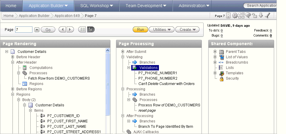
Description of the illustration pg_def_tree.gif
Key features of this view include:
-
Context menus. Each tree node features a custom context menu. To access a context menu, right-click.
-
Quick access to attributes pages. To edit attributes, double-click or press ENTER. If available, an attribute page appears.
-
Easy reorder of components. Reorder page items, report columns, processes, validations, branches, or computations by dragging and dropping to another display, processing point, or region.
-
Tooltips. Each tree node features a tooltip which displays basic information about the component, including item type, condition, authorization, and so on.
-
View component names or labels. Choose to view the components on a page using the component name or the label that displays when you run the page. (for example, an item named
P7_CUST_FIRST_NAME, but with the labelFirst Name). See "Switching Between Names or Labels" -
Identification of conditions, authorizations, and build options. If a component has a condition, authorization, or build option, then the tree node label displays in italic.
-
Direct access to default wizards. Each context menu includes actions that link to default wizards. For example, selecting Create Validation for an item displays the Create Validation Wizard.
To learn more, see, "Editing a Page in Tree View" and "Switching Between Tree and Component View".
Component view groups user interface elements and application logic by component type.
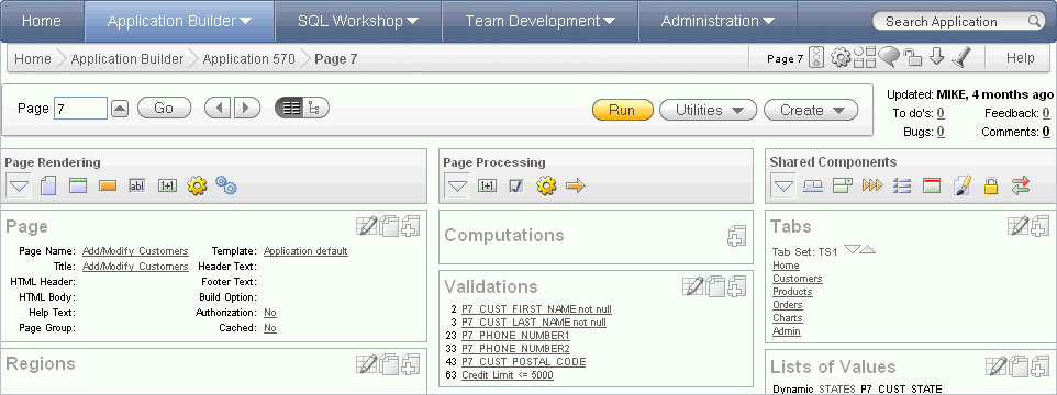
Description of the illustration pg_def.gif
To edit a component, drill down on the component name or click the icons. To learn more, see "Editing a Page in Component View" and "Switching Between Tree and Component View".
Switching Between Tree and Component View
There are two ways to view a page: Tree view and Component view.
To switch between views:
-
Navigate to the Page Definition. See "Accessing the Page Definition".
The Page Definition appears. By default, each page displays components as nodes in a tree.
-
To switch to Component view, click the Switch to Component View icon at the top of the page.
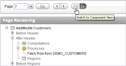
Description of the illustration switch_to_component.gif
-
To switch back to Tree view, click the Switch to Tree View icon.
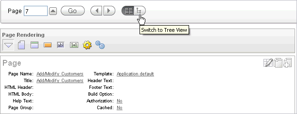
Description of the illustration switch_to_tree.gif
Editing a Page in Tree View
In Tree view displays regions, page items, and application logic as nodes in a tree. Each tree groups components based on event sequence or how Oracle Application Express processes them when rendering a page. This organization enables you to better understand when a component is processed.
About Tree View
In Tree view, the Page Definition displays each page component as a node in a tree.
Description of the illustration pg_def_tree.gif
Each tree groups components based on event sequence, or how Application Builder processes them when rendering or processing the page.
Moving your cursor over a component displays a tooltip. Tooltips display basic information about the component, including item type, condition, authorization, and so on.
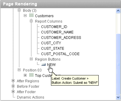
Description of the illustration pg_def_tree_tip.gif
Accessing Context Menus
To edit or add a component, right-click to display a context menu. The context menu changes, based on the component type. The following example includes the options Edit, Expand All, and Collapse All. However other options may also display depending upon the component type (for example, Copy, Edit All, and Delete).
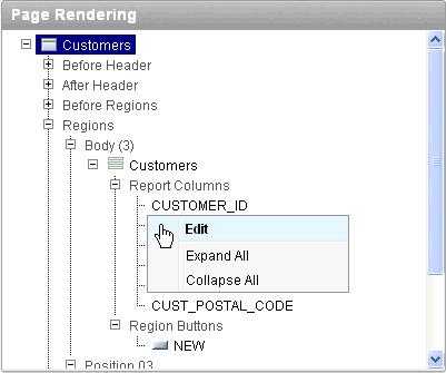
Description of the illustration pg_def_context_menu.gif
Creating New Components
You can create controls or components by right-clicking and selecting Create.
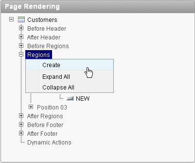
Description of the illustration pg_def_tree_create.gif
A wizard appears. Follow the online instructions
Reordering Page Components
You can quickly change the order in which page items, regions, report columns, computations, processes, validations, branches, and dynamic actions display by dragging and dropping to another display, processing point, or region.
Switching Between Names or Labels
You choose to view the components on a page using the component name or the label that displays when you run the page. (for example, an item named P7_CUST_FIRST_NAME, but with the label First Name).
To change the view:
-
Click the Utilities button.
-
Select Switch To and then one of the following:
-
Show Names
-
Show Labels
-
To learn more about the Utilities button, see "Common Elements of the Page Definition"
Editing a Page in Component View
A page is the basic building block of an application. Each page has a page number, a name, and typically some text attributes such as a header, title, and footer. You add content to your page by creating page controls (regions, items, and buttons). Page templates and page region templates control the exact look and feel of each page.
About Component View
Each Page Definition is divided into three sections: Page Rendering, Page Processing, and Shared Components. Each of these sections is broken into subsections with headings that identify the type of control, component, or application logic.
Description of the illustration pg_def.gif
To edit a component, drill down on the component name or click the icon described in the following sections.
About the Edit All Icon
You can edit all controls, components, or logic within a given subsection by clicking the Edit All icon that displays to the right of the subsection title. The Edit All icon resembles a small grid with a pencil on top of it.

Description of the illustration pg_def_editall_ico.gif
Clicking the Edit All icon displays pages that enable you to edit or delete multiple controls, components, or application logic simultaneously or view a history of recent changes.
For example, selecting the Edit All icon under Regions displays a summary report of all currently defined regions on the current page. You can use this summary view to:
-
Edit the multiple attributes at once by making selections from the available fields and select lists.
-
Link to a definition page by clicking the Edit icon.
You can access similar summary views on other pages by selecting a different page from the Page pop up list. To save your edits to any summary view, click Apply Changes.
You can also view the attributes of a specific control or component by selecting its name on the Page Definition. For example, suppose your Page Definition contains a region named Customers. Clicking the region name Customers would display a region definition page for that region.
About the Copy or Create Icons
You can copy or create controls or components by clicking the Copy and Create icons. The Copy icon resembles two small overlapping pages. Click the Copy icon to make a copy of an existing control or component.

Description of the illustration pg_def_copy_ico.gif
The Create icon resembles a plus (+) sign overlapping a small page. Click the Create icon to create a control or component.
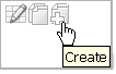
Description of the illustration pg_def_create_ico.gif
See Also:
"About the Edit All Icon"Reordering Page Components
You can quickly change the order in which regions, buttons, and items display using the Reorder icon on the Page Definition. The Reorder icon displays as a light gray downward arrow and upward arrow.
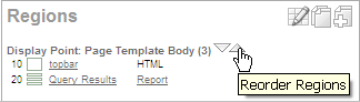
Description of the illustration reorder_regions.gif
To reorder page components, click the Reorder icon. When the Reorder page appears click the up and down arrows and then click Apply Changes.
Using Page Rendering Icons
Page rendering is the process of generating a page from the database. See "About Page Rendering".
In Component view, you can navigate to a specific subsection by clicking the icons beneath the heading. When you select one of these icons, the subsection appears and all other subsections are temporarily hidden. To restore the view, click Show All. The Show All icon resembles an inverted triangle.
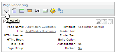
Description of the illustration page_rendering.gif
Using Page Processing Icons
Page processing is the process of submitting a page. A page is typically submitted when a user clicks a button. Use the Page Processing section of the Page Definition to specify application logic such as computations, validations, processes, and branches. In general, the Application Express engine runs this logic in the order it appears on the Page Definition.
Description of the illustration page_processing.gif
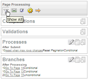
You can quickly navigate to a specific subsection by clicking the icons beneath the heading. When you select one of these icons, the subsection appears and all other subsections are temporarily hidden. To restore the view, click Show All. The Show All icon resembles an inverted triangle.
Using Shared Components Icons
The Shared Components section of the Page Definition contains common elements that can display or be applied on any page within an application.
Description of the illustration shared_components.gif
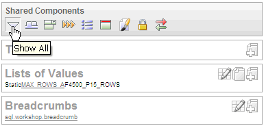
You can quickly navigate to a specific subsection by clicking the icons beneath the heading. When you select one of these icons, the subsection appears and all other subsections are temporarily hidden. To restore the view, click Show All. The Show All icon resembles an inverted triangle.
See Also:
"Working with Shared Components"Common Elements of the Page Definition
A Page Definition is the basic building block of a page. You use the Page Definition to view, create, and edit the controls and application logic that define a page. The sections that follow describe common UI elements of the Page Definition.
About the Developer Action Bar
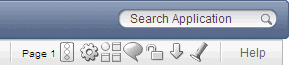
The Developer Action bar displays in the upper right corner, beneath the Search Application field.
Description of the illustration pg_def_icons.gif
The Developer Action bar contains the following icons: Run Page, Shared Components, Application Utilities, Developer Comment, Page Unlocked/Locked, Export Page, Find icon and Help.
Run Page Icon
The Run Page icon resembles a small traffic signal. Click this icon to render viewable HTML of the current page. If no page is selected, clicking this icon runs the first page in the application. When you run a page, the Application Express engine dynamically renders the page based on data stored in the database. See "Running an Application or Page".
Shared Components Icon
The Shared Components icon resembles a small mechanical gear. Click this icon to view a list of shared components and user interface controls that can display or be applied on every page within an application. See "Working with Shared Components".
Application Utilities
The Application Utilities icon resembles a circle and four small boxes. Click this icon to link to the Utilities page. See "Using Application Builder Utilities".
Developer Comment icon
The Developer Comment icon is the shape of a green balloon. Click this icon to record comments about an application, a specific page, or a group of pages. See "Adding Developer Comments".
Page Unlocked/Page Locked Icon
The Page Unlocked and Page Locked icon indicates whether a page is available for editing. If a page is unlocked, the icon appears as an open padlock. If the page is locked, the icon appears as a locked padlock. To change the lock status of a page, click this icon. See "Locking and Unlocking a Page".
Export Page Icon
The Export Page icon resembles a downward arrow. Click this icon to export the current page. See "Exporting a Page in an Application".
Find Icon
The Find icon resembles a flashlight. Click this icon to search for items, pages, queries, tables, PL/SQL, images, and cascading style sheets (CSS) within the current application or the schemas associated with the workspace. See "Using the Find Icon".
Help
Click the Help link to view online help for this page. See "About the Oracle Application Express Documentation".
Searching for Page Metadata
The Search Application field displays above the Developer Action bar.
Description of the illustration pg_def_icons.gif
Use this field to search for metadata within an application. By default, this field is case insensitive and supports regular expression syntax. For a regular search, enter P1_NAME to search for all occurrences of P1_NAME in the application
The following is an advanced regular expression search and will find all occurrence of P1_NAME or P2_NAME:
regexp:(P1_NAME)|(P2_NAME)
The Search Application field also supports a shortcut to quickly view a specific page. Simply enter the application and page number using the format page, application:page or application-page and press ENTER. Consider the following examples:
10
570-10
570:10
About the Navigation Bar
A navigation bar displays at the top of the page beneath the breadcrumb menu. Use this bar to navigate between pages within an application.
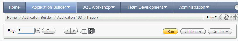
Description of the illustration pg_def_nav.gif
Use the Page field to navigate between pages. Enter a page number in the Page field and click Go.
The following buttons display on the right side: Run, Utilities, Create.
Click Run to dynamically render the page based on data stored in the database. "Running an Application or Page".
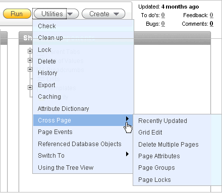
Description of the illustration pg_def_util.gif
Tip:
Some Utilities menu options only display in Tree view.Click the Utilities button to view the following menu:
-
Check. Links to Advisor. Use this tool to verify the integrity and quality of your Oracle Application Express application. See "Running Advisor to Check Application Integrity"
-
Clean up. Click this link to change the sequence page components.
-
Lock. Locks the current page. See "Locking and Unlocking a Page".
-
Delete. Deletes the current page. See "Deleting a Page".
-
History. Displays a report of changes to the current page.
-
Export. Links to Export page. See "Exporting an Application".
-
Caching. Displays the caching page. See "Managing Cached Regions".
-
Attribute Dictionary. Links to Manage Attribute Dictionary page. See "Using the Attribute Dictionary".
-
Cross Page contains links to:
-
Recently Updated. Displays a report of recently updated pages in the current application.
-
Grid Edit. Displays a report for editing multiple page attributes across multiple pages in a grid format.
-
Delete Multiple Pages. See "Deleting Multiple Pages".
-
Page Attributes. Displays a report of attributes, components, controls, and application logic by page.
-
Page Groups. See "Grouping Pages"
-
Page Locks. See "Locking and Unlocking a Page".
-
-
Page Events. Details all currently defined page controls and processes in the order in which the Application Express engine renders the page, invokes logic, and runs processes.
-
Referenced Database Objects. Identifies database objects referenced by the current application. See "Using the Database Object Dependencies Report".
-
Switch to (Tree view only). Choose whether to view the components on a page using the component name or the label that displays when you run the page. (for example, an item named
P7_CUST_FIRST_NAMEbut with the labelFirst Name). Select either Show Names or Show Labels. -
Using the Tree View. Displays an explanation about using Tree view. See "About Tree and Component View" and "Editing a Page in Tree View".
Click Create to add new page or component to the existing page. Available options include:
-
New page. See "About Creating Pages in a Database Application".
-
Region in this page. See "Understanding Regions"
-
Shared Component. See "Working with Shared Components".
-
New page as a copy. "Copying a Database Application Page".
-
Bug. See "Managing Bugs".
-
To Do. "Tracking To Dos".
-
Comment. see "Adding Developer Comments".
About the Developer Toolbar
The Application Express engine dynamically renders and processes pages based on data stored in database tables. To view a rendered version of your application, you run or submit it to the Application Express engine by clicking the Run icon.
See Also:
"Running an Application or Page"When you run an application from within the development environment, the Developer toolbar appears at the bottom of the page. The Developer toolbar offers a quick way to edit the current page, create a page, region, or page control, view session state, or toggle in and out of Debugging mode. You can control whether the Developer toolbar displays by changing the Status attribute on the Edit Definition page.
Description of the illustration d_toolbar.gif
The Developer toolbar consists of the following links:
-
Home links you to the Workspace home page. See "About the Workspace Home Page".
-
Application links you to the Application home page. See "About the Application Home Page".
-
Edit Page accesses the Page Definition for the current running page. See "About the Page Definition".
-
Create links to a wizard for creating a page, region, page control (item, button, branch, computation, process, or validation), or a shared control (navigation bar icon, tab, list of values, list, or breadcrumb). See "About Database Applications".
-
Session links you to session state information for the current page. See "Viewing Session State".
-
Caching links to the Caching page. See "Managing Cached Regions".
-
View Debug displays the Debug window. See "Accessing Debugging Mode".
-
Debug toggles the page between Debug and No Debug mode. See "Accessing Debugging Mode".
-
Show Edit Links toggles between Show Edit Links and Hide Edit Links. Clicking Show Edit Links displays a small orange icon next to each editable object on the page. Each icon is orange and contains a triangle with two rules beneath it. Clicking the link displays another window in which to edit the object.