Commerce Reference Store includes an instance of the SearchBox cartridge, called Search Box, that is rendered in the page header section on every page and provides a way for customers to enter keyword searches to retrieve content. Commerce Reference Store uses Oracle Endeca Commerce’s existing SearchBox cartridge with the configuration and modifications described below.
Auto-Suggest Functionality
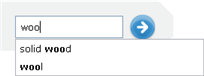
Commerce Reference Store uses the auto-suggest functionality that is incorporated into the SearchBox cartridge out of the box. When auto-suggest is enabled, the search box displays an auto-suggest panel with suggestions that match what the shopper is entering in the search term field. The auto-suggestions themselves are the display names of dimension values, from specified dimensions, that match the characters entered by the shopper. For example, Commerce Reference Store configures the product.features.displayName dimension as a source dimension for auto-suggestions. When a shopper enters “woo” in the search box, two auto-suggestions are rendered, “solid wood” and “wool,” both of which are dimension values in the product.features.displayName dimension.
The auto-suggest feature is rendered via three cartridges:
The
SearchBoxcartridge, where auto-suggest feature is enabledThe
AutoSuggestPanelcartridge, which defines the panel that contains the suggestions.The
DimensionSearchAutoSuggestItemcartridge, which supplies theAutoSuggestPanelwith suggestions.
Auto-suggest behavior is configured partly through the SearchBox cartridge and partly through the DimensionSearchAutoSuggestItem cartridge. The SearchBox cartridge enables the autosuggest panel’s display and has a setting for specifying the minimum number of characters that must be typed before the autosuggest panel appears. Commerce Reference Store sets this value to 3. The DimensionSearchAutoSuggestItem cartridge specifies the dimensions whose values are used to populate the panel. Commerce Reference Store configures the cartridge to use the product.brand and product.features.displayName dimension values.
Note: For more details on the customer-facing aspects of the search box implementation, see the Search and Guided Navigation chapter. Additional details on the AutoSuggestPanel and DimensionSearchAutoSuggestItem cartridges are also available at AutoSuggestPanel and DimensionSearchAutoSuggestItem, respectively.
Template
The XML template for the SearchBox cartridge is located in <ATG10dir>/CommerceReferenceStore/Store/Storefront/deploy/cartridge_templates/SearchBox-SearchBox.xml. To support the inclusion of auto-suggest functionality in the search box, the SearchBox-SearchBox.xml template has these properties:
autoSuggestEnabled: A boolean property that specifies whether or not auto-suggest functionality is enabled. If this property is set to false, the other auto-suggest properties are ignored.minAutoSuggestInputLength: Specifies the number of characters the customer must type before the auto-suggest panel displays. Out of the box, this is set to 3.contentCollection: The content collection that is used to populate the auto-suggest panel. Out of the box, this is set to/content/Shared/Auto-Suggest Panels.ruleLimit: Defines the number of content items to return when populating the auto-suggest panel. This property is set to 1 and cannot be altered in Experience Manager.
Including the SearchBox in the Page Header
The <crs:pageContainer> tag is responsible for retrieving the contents of the Search Box cartridge to render the search box that appears in the header portion of each page. To do this, the <crs:pageContainer> tag calls the /atg/endeca/assembler/droplet/InvokeAssembler servlet bean and passes in the full path to the cartridge:
<dsp:droplet name="InvokeAssembler">
  <dsp:param name="contentCollection"
             value="/content/Shared/Global Search Configuration/Search Box"/>
  <dsp:oparam name="output">
    <dsp:getvalueof var="searchBox"
                    vartype="com.endeca.infront.assembler.ContentItem"
                    param="contentItem" />
  </dsp:oparam>
</dsp:droplet>
In response to this code, the Assembler returns a ContentSlot object that contains a SearchBox content item. The <crs:pageContainer> tag uses the <dsp:renderContentItem> tag to locate the SearchBox.jsp renderer and render the SearchBox content item. More details on the SeachBox.jsp page are provided in the next section.
Note: See the ATG Endeca Integration Guide for detailed information on the <dsp:renderContentItem> tag.
JSP Renderer
The store.war/cartridges/SearchBox/SearchBox.jsp page renders the content in the SearchBox content item. This includes both the search box form itself and the auto-suggest panel, if one has been enabled.
The SearchBox.jsp page renders the auto-suggest panel inside a custom Dojo widget. The renderer uses the value of the contentItem.autoSuggestEnabled boolean to determine whether or not the auto-suggest widget should be initiated. When initiated, the widget retrieves, via AJAX calls, a list of potentially matching search terms (auto-suggestions) based on the characters the shopper enters in the search box. The widget displays the auto-suggestions as a list of clickable links below the search box. Clicking one of these links initiates a new search with the link’s term used as the keyword.
The auto-suggest widget’s dojotype is atg.store.widget.AutoSuggest. The JavaScript code that supports the widget is found in store.war/javascript/widget/template/AutoSuggest.js and the HTML markup for the widget <div> is found in store.war/javascript/widget/template/AutoSuggest.html. To make the AutoSuggest.js source available to Commerce Reference Store pages, the following script include tag is added to store.war/includes/pageStartScript.js:
<script type="text/javascript" src="${javascriptRoot}/widget/AutoSuggest.js"></script>
The SearchBox.jsp initializes the AutoSuggest widget with a set of input parameters, shown below. These input parameters allow the widget to build up and submit the URL that requests auto-suggest data from the Assembler. They also control the length of time that the auto-suggest panel is displayed.
Parameter | Type | Description | Default |
|---|---|---|---|
| String | Unique identifier for the | None |
| String | The URL used for AJAX requests that retrieve the auto-suggestions. | None |
| String | The path to the Endeca content collection that contains the | None |
| String | The context path for the URL that is used for AJAX requests, for example:
| None |
| String | The ID of the search box that the widget is attached to. | None |
| String | The ID of the Search button. The | None |
| Number | The number of characters the shopper must enter before the auto-suggest panel appears. | 3 |
| Number | The time, in milliseconds, taken to fade in and out the auto-suggest panel. | 500 |
The query the AutoSuggest widget sends to the Assembler specifies JSON as the format for the returned data. In response to the query, the Assembler returns an AutoSuggestPanel content item in JSON format. The AutoSuggestPanel content item contains DimensionSearchAutoSuggestItems sub-items; it is these sub-items that contain the actual auto-suggestions. The widget parses out the data in the DimensionSearchAutoSuggestItems sub-items and renders them as clickable links in the panel.
In addition to querying the Assembler for auto-suggestions, the AutoSuggest widget manages keyboard events and mouse clicks so that the shopper can move among auto-suggestion terms, select a term, or hide the auto-suggest panel. Also, note that the widget fails silently if the AJAX request times out or fails for any reason, as the use of the auto-suggest panel is not essential in order to perform a search.
To use the AutoSuggest widget, you must provide values, via attributes passed to the widget, for any initialization parameters that do not have defaults. For example, the SearchBox.jsp passes the following values:
<span dojotype="atg.store.widget.AutoSuggest"
              id="autoSuggest"
              ajaxUrl="${contextPath}/assembler"
              contentCollection="/content/Shared/Auto-Suggest Panels"
              siteContextPath="${contextPath}"
              searchBoxId="atg_store_searchInput"
              submitButtonId="atg_store_searchSubmit"
              minInputLength="${minAutoSuggestInputLength}"
              animationDuration="500">
        </span>
