Scatter charts show correlations, dependencies, and other relationships between pairs of forecasts and assumptions plotted against each other.
In its basic form, a scatter chart contains one or more plots of a target variable mapped against a set of secondary variables. Each plot is displayed as a cloud of points or symbols aligned in a grid within the scatter chart window. Figure 39, Scatter Chart, Scatter View, with Optional Lines and Correlations shows a set of all model assumptions plotted against a target forecast. In this case, the Material 3 Reliability forecast is the target.
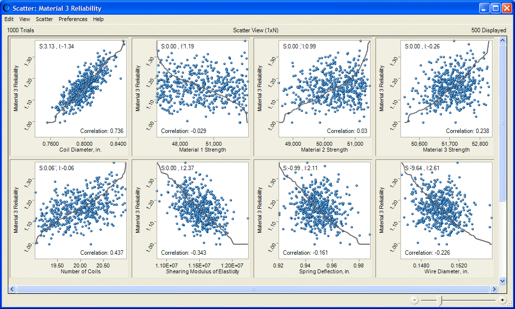
In Figure 39, Scatter Chart, Scatter View, with Optional Lines and Correlations, the line shows where the pairwise points would be displayed if they were sorted in ascending order. The closer the points conform to the line, the closer the relationship among the plotted variables. Lines sloped from lower values to higher (the lower left to the upper right) show positive relationships. If the relationship is negative, the line slopes from higher to lower values (the upper left to the lower right).
Figure 39, Scatter Chart, Scatter View, with Optional Lines and Correlations shows optional correlations displayed for each plot. Coil Diameter has the highest correlation with Material 3 Reliability, while Material 1 Strength has the lowest correlation.
In another form of scatter chart, the Matrix view, each selected variable is plotted against every other selected variable to show the relationships among them. Figure 40, Scatter Chart, Matrix View, with Optional Lines and Correlations shows intercorrelations among three forecasts in Matrix view. Material 2 Reliability and Material 3 Reliability have the highest intercorrelation while Material 1 Reliability and Material 2 Reliability have the lowest.
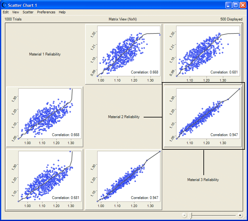
The axis labels are indicated by the text in the diagonal cells. The text is the x-axis label for all plots in the same column as the text. It is the y-axis label for all plots in the same row. For example, in Figure 40, Scatter Chart, Matrix View, with Optional Lines and Correlations, the y-axis label of the highlighted plot is Material 2 Reliability and the x-axis label is Material 3 Reliability.
You can plot scatter charts directly through the Analyze menu, or you can create a sensitivity chart and select Sensitivity, and then Open Scatter Chart to create a chart showing an exploded view of the effect each assumption has on the target forecast. The result is similar in form to Figure 39, Scatter Chart, Scatter View, with Optional Lines and Correlations.