 To create a scatter chart:
Click the Options tab and confirm that Store assumption values for sensitivity analysis is selected.
When the simulation stops, select View Charts, and then Scatter Charts,
 .
.In the Choose Data dialog, select two or more assumptions or forecasts to include in the scatter chart.
You can include up to 25 variables in a scatter chart. A warning message is displayed if you select more. If you try to create a scatter chart including an assumption but Store Assumption Values For Sensitivity Analysis is not selected in the Run Preferences dialog, select it, and then reset the simulation and run the simulation again.
Optional: To create a scatter chart in Scatter view, set a single assumption or forecast as the target. You do not need to set a target to display the chart in Matrix view.
To set a target, select the box in front of the target assumption or forecast, click its name, and then click Set As Target.
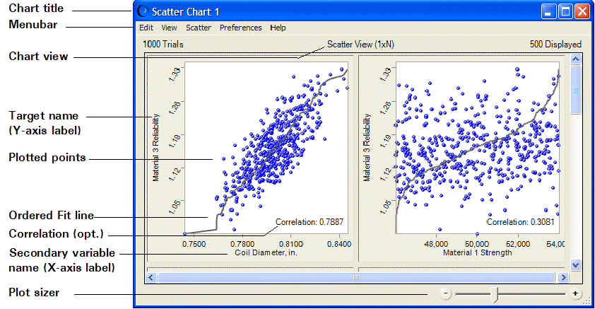
Click OK to create the new scatter chart (Figure 41, Scatter Chart for the Selected Target, Scatter View). In that figure, Material 3 Reliability is set as the target and all assumptions are selected as secondary variables.
Only a portion of the chart is shown in Figure 41, Scatter Chart for the Selected Target, Scatter View. For a view of the complete chart, see Figure 39, Scatter Chart, Scatter View, with Optional Lines and Correlations.
Note: | In complex models with many assumptions and forecasts, you may find it helpful to begin by creating a sensitivity chart and then creating a scatter chart from the data included in it. For example, you could open a forecast chart and select Forecast, and then Open Sensitivity Chart to view a sensitivity chart. Then, in the sensitivity chart, you could choose Sensitivity, and then Open Scatter Chart to creat a scatter chart using that forecast as the target. |
Information about features shown in Figure 41, Scatter Chart for the Selected Target, Scatter View:
Select Preferences, and then Chart Preferences to change the chart title.
To change the number of trials displayed in the plots, select Preferences, then Scatter, and then Criteria.
The Y-axis labels indicate the scatter chart target. Each X-axis label indicates the secondary variable plotted against the target.
The Ordered Fit line shows where the pairwise points would be displayed if they were sorted in ascending order. Optional: Select Preferences, then Chart Preferences, and then Chart Type to change it to a Linear Regression line, which uses a least-squares technique to show the linear relationship of the points.
Auto is the default color for all symbols. With color set to Auto, plots are colored according to the combination of variables included in them:
You can use the Plot Sizer to increase or decrease the size of all plots and the amount of detail shown within them. To focus on a single plot, drag the Plot Sizer pointer toward the right to enlarge the plot, and then use the scroll bars to center it.
In Scatter view, plots move to fill available window space when they are resized. In Matrix view, plots keep the same NxN configuration. You can scroll to view any plots that are not currently displayed onscreen.
Frozen forecasts and assumptions are not included in scatter charts.