The following sections provide descriptions and illustrations of each view:
Frequency, the default forecast view, shows a simple count of values (the frequency) for each interval on the x-axis. Figure 18, Forecast Chart—Frequency shows a frequency chart of net profit values for a simulation where there is a 75% probability of net profit falling between $0.00 and $27.4 million. The chart has a median of $8.4 million. This is also the 50th percentile. By default, there is a 50% probability that net profit will be at or below this value.
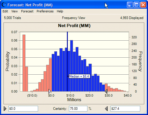
Figure 19, Forecast Chart—Cumulative Frequency shows the Net Profit forecast chart as a cumulative distribution. This chart shows the number or proportion (percentage) of values less than or equal to a given amount.
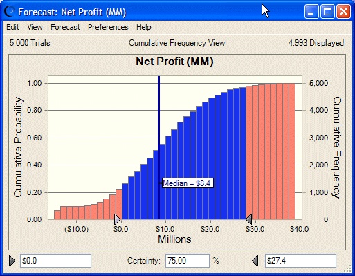
To create this chart, the frequencies are added cumulatively, starting from the lower end of the range, and then plotted as a cumulative frequency curve. To understand the cumulative distribution, look at a particular value, $8.4 million (in the previous example). The chart shows that the probability of $8.4 million is about 50%; approximately 50% of the values are less than $8.4 million, while approximately 50% are greater. This would be correct for a median value. Notice also that the chart shows that the probability for $27.4 million is about .95 while the probability for $0 is about .20. This is also correct, since the probability of Net Profit falling between those two values is .75 (.95 – .20 = .75) or Certainty = 75%.
Figure 20, Forecast Chart—Reverse Cumulative Frequency shows the Net Profit forecast chart as a reverse cumulative distribution. This chart shows the number or proportion (percentage) of values greater than or equal to a given amount.
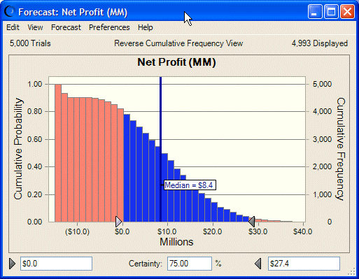
To create this chart, the frequencies are added cumulatively starting at the higher end of the range, and then plotted as a declining cumulative frequency curve. To understand the reverse cumulative distribution, look at a particular value, $8.4 million (in the previous example). The chart shows that the probability of $8.4 million is about 50%; approximately 50% of the values are less than $8.4 million, while approximately 50% are greater. This would be correct for a median value. Notice also that the chart shows that the probability for $27.4 million is about 0.05 (of having a greater value) while the probability for $0 is about .80. This is also correct, since the probability of Net Profit falling between those two values is .75 (.80 – .05 = .75) or Certainty = 75%. Notice in this chart that the reverse cumulative frequency values are complements of the cumulative frequency values: .20 + .80 = 1.00 and .95 + .05 = 1.0 (the probability values for $0.0 and $27.4 million, respectively).
You can display a full set of descriptive statistics for a simulation in the forecast window by choosing View, and then Statistics.
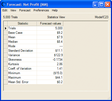
The example in Figure 21, Forecast Window—Statistics shows statistics for the entire range of values (100% of the forecast values, including extreme values excluded from the default display range). Statistical terms listed in this table are discussed in the Oracle Crystal Ball Reference and Examples Guideand the Glossary in this user's guide.
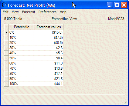
You can display percentile information in 10% increments in the forecast window by choosing View, then Percentiles. A percentile is the percent chance, or probability, of a forecast value being less than or equal to the value that corresponds to the percentile (the default). For example, Figure 22, Forecast—Percentiles View displays the percentile view of the Net Profit forecast, where the 90th percentile corresponds to $21.6 million, meaning that there is a 90% chance of a forecast value being equal to or less than $21.6 million. Another interpretation is that 90% of the forecast values are equal to or less than $19.3 million.
Notice that the Median in Statistics view is the same as the 50th percentile in Percentiles view — in this case, $8.4 million.
If the Precision Control feature is selected in the Run Preferences dialog and the forecast has Precision Control options set, the Precision column is displayed in the Percentiles view.
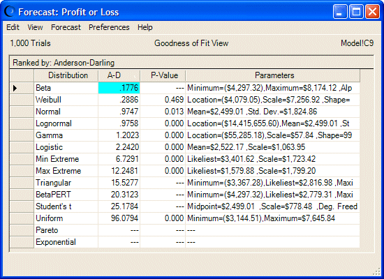
If you have selected distribution fitting, described in the next section, you can select the Goodness Of Fit view to display comparative fit statistics for each of the selected distribution types. The distributions are ordered according to the selected ranking method. Figure 23, Forecast—Goodness Of Fit View shows statistics for the Anderson-Darling ranking method and each continuous distribution type. Notice that Beta is ranked highest for this forecast.
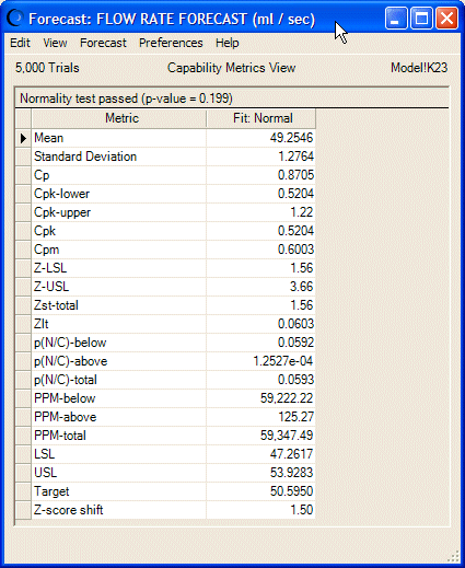
If the process capability features are activated on the Statistics tab of the Run Preferences dialog and if either an LSL, USL, or both are entered into the Define Forecast dialog, the Capability Metrics view is available for the forecast chart. For a definition of each statistic, see the capability metrics list in the Oracle Crystal Ball Reference and Examples Guide.
Split View shows forecast charts and related statistics onscreen at the same time. For more information, see Using Split View.