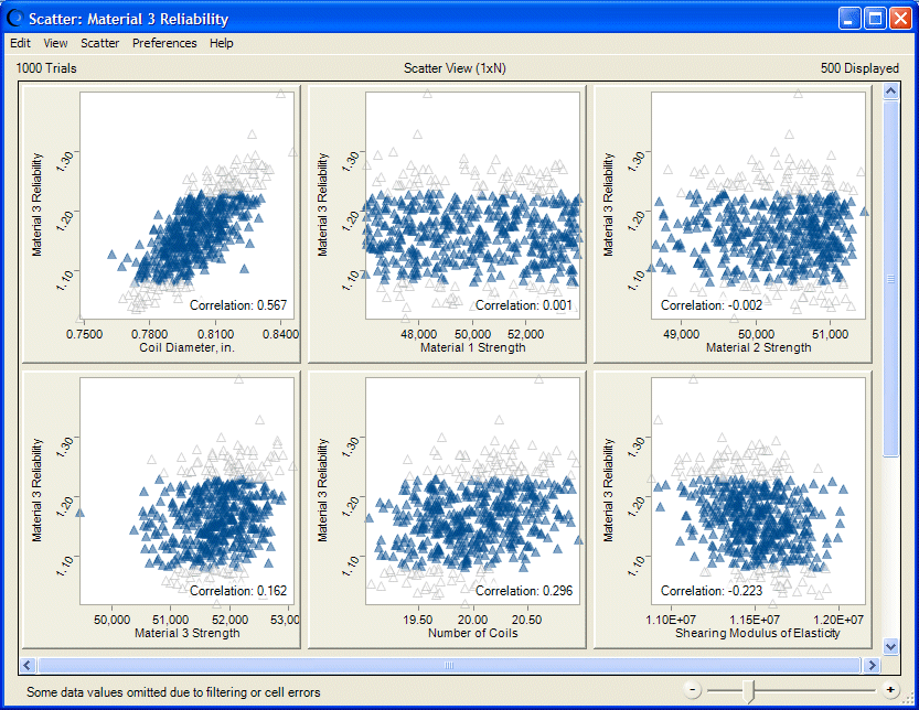
You can use the Filter tab of the Forecast Preferences dialog to include or exclude specific ranges of data from forecast charts (Filter Tab). If you include a filtered forecast in a scatter chart, you can select whether or not to show filtered points in the chart.
 To change this setting:
Figure 42, Scatter Chart Showing Filtered Points shows the same data as Figure 39, Scatter Chart, Scatter View, with Optional Lines and Correlations except Material 3 Reliability has been filtered to only include data between 1.08 and 1.23. Excluded data shows as very light triangles while included data is plotted normally, in this case as transparent blue triangles, size 4.