3 Designing Apps
This chapter describes how to insert and customize the components available in BI Mobile App Designer.
Video: Starting and Exploring BI Mobile App Designer
Tutorial: Creating Mobile Apps with Oracle BI Mobile App Designer Version 2
Tutorial: Creating an Advanced Mobile App with Oracle BI Mobile App Designer
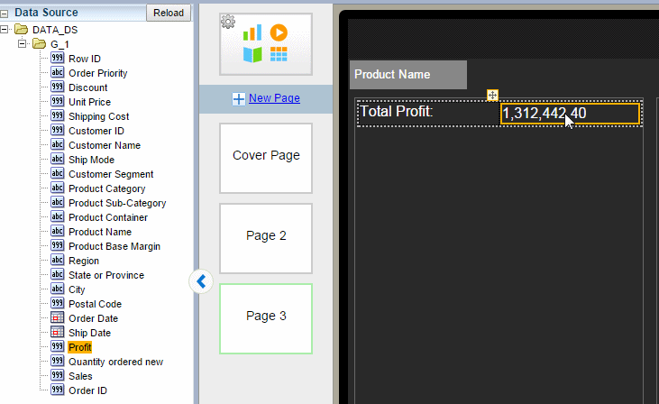
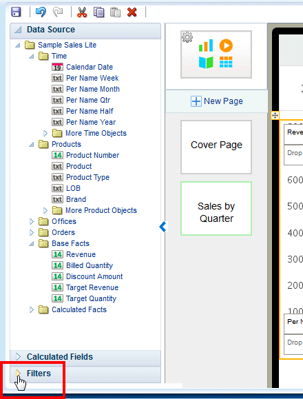
3.1 The Oracle BI Mobile App Designer Workspace
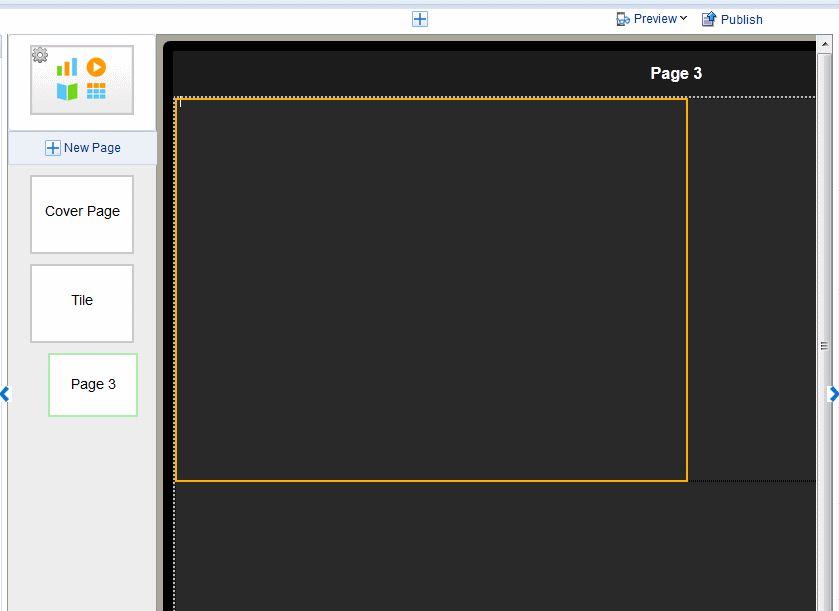
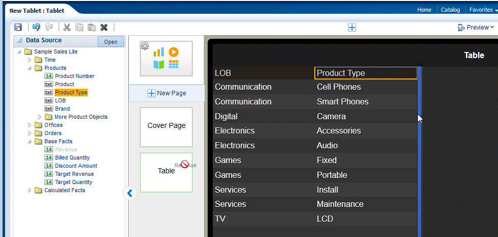
Figure 3-1 shows the Oracle BI Mobile App Designer workspace.
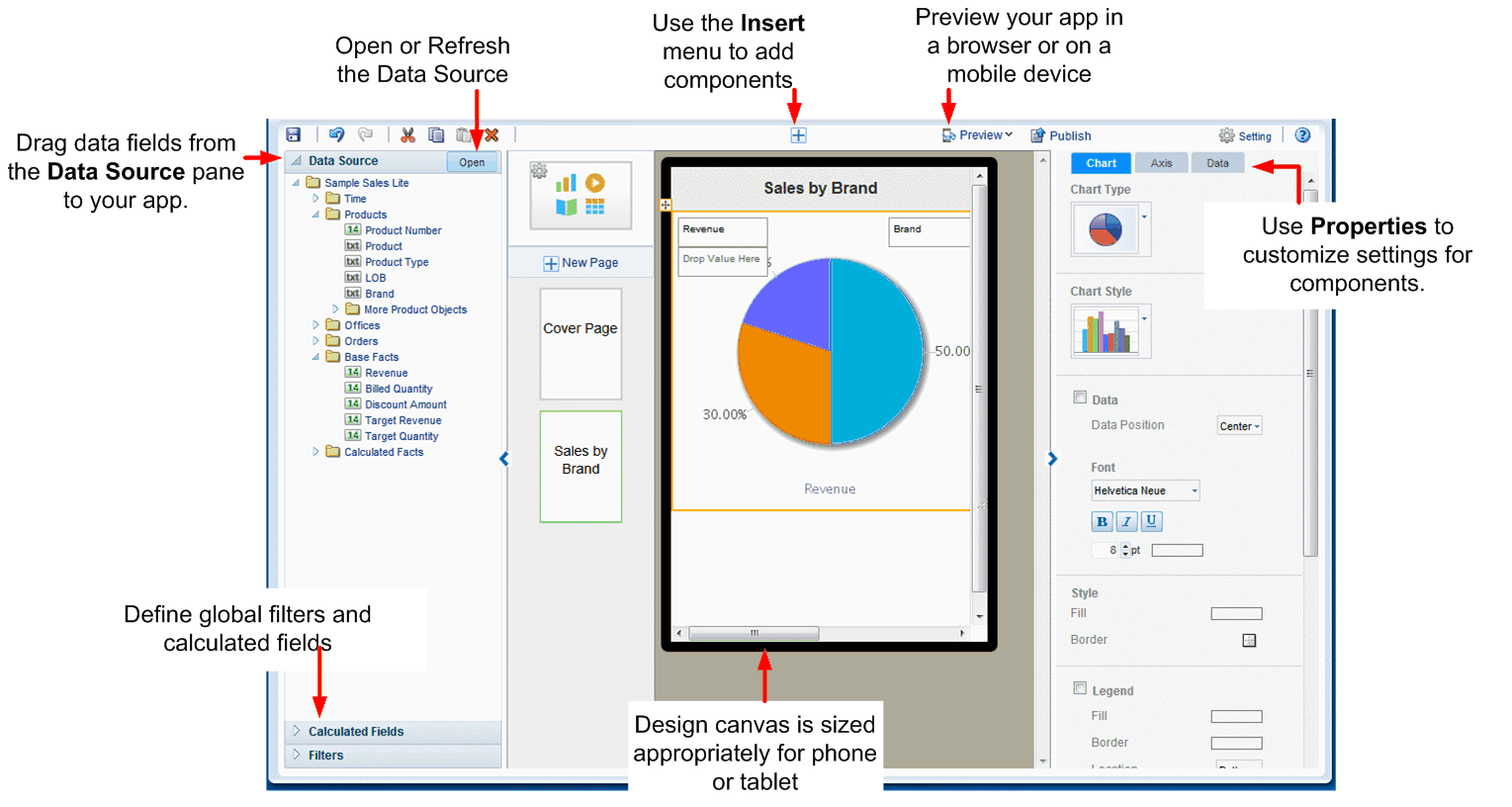
Note the following features of the app designer:
-
The workspace displays the canvas area as a phone or a tablet-sized screen depending on the target device type you chose. The tablet area is 1024 x 768 pixels. The phone area is 320 x 480 pixels. This design area size does not constrain the run time display. Mobile App Designer's responsive display engine detects the device screen size and adjusts the viewing area appropriately for the device an app is being viewed with.
-
Click Insert to add new components to your app.
-
The right hand pane is the Properties palette to modify and fine-tune settings for the component selected in the design area. You can collapse the Properties pane using the handle on the left edge.
-
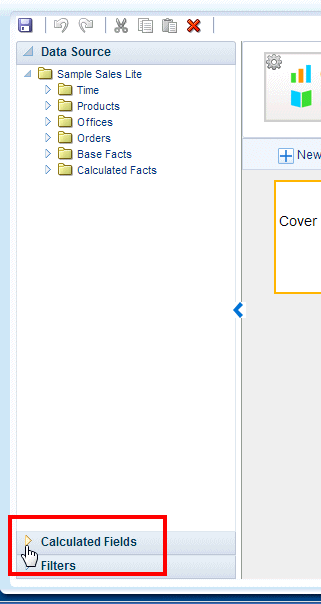
The left hand pane is an accordion pane that includes the Data Source pane, the Filters pane and the Calculated Fields pane. You can collapse the pane using the handle on the right edge.
-
Use the Data Source pane to select and drag data fields to the visualizations you insert to your app.
-
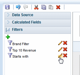
Use Filters to define filters that you can apply to multiple components throughout your app. For more information, see Global Filters.
-
Use Calculated Fields to construct calculated fields that you can reuse throughout your app. For more information, see Calculated Fields.
-
-
Preview your app at anytime during the design phase in the mobile device simulator, and even share the preview with others. See Chapter 4, "Previewing, Sharing, and Publishing Apps."
-
When your app is complete, click Publish to publish your app to your site's Apps Library to make it available to users. See Section 4.4, "Publishing Apps to the Apps Library" for more information.
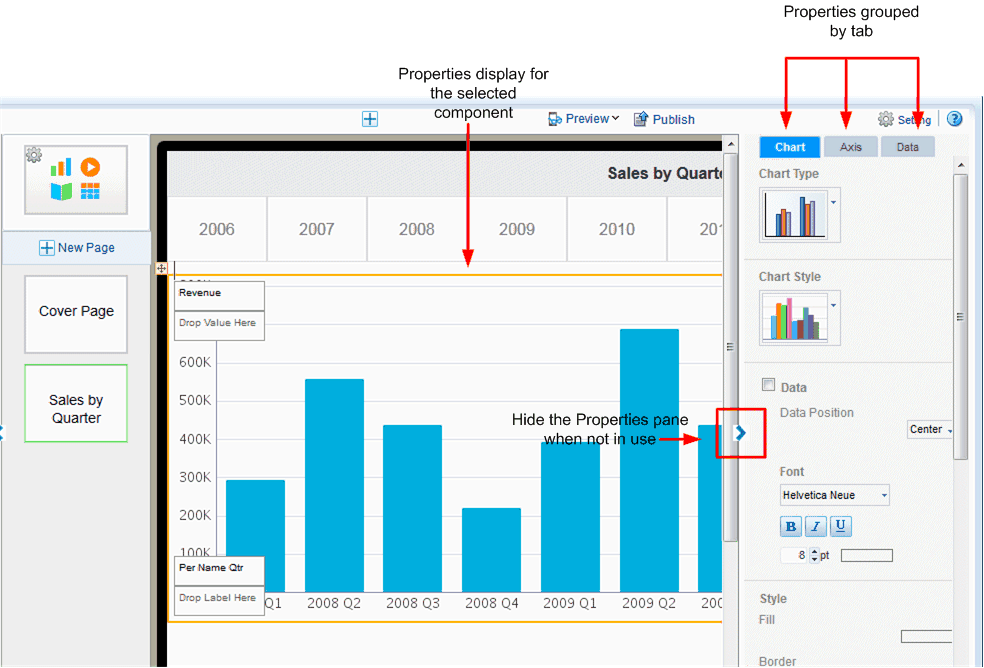
3.1.1 Setting Properties
The Properties pane or palette displays the properties for the component currently selected in the workspace. For example, when you select a table in the workspace, the Table properties display.
When not using the Properties palette you can hide it using the arrow handler on the left edge of the pane.
Components with many available property settings are organized on tabs within the Properties palette, for example, when you select a chart, the properties are organized by Row, Axis, and Data tabs.
The most commonly used settings are described in the sections for each component and in Chapter 5, "Component Property Features."
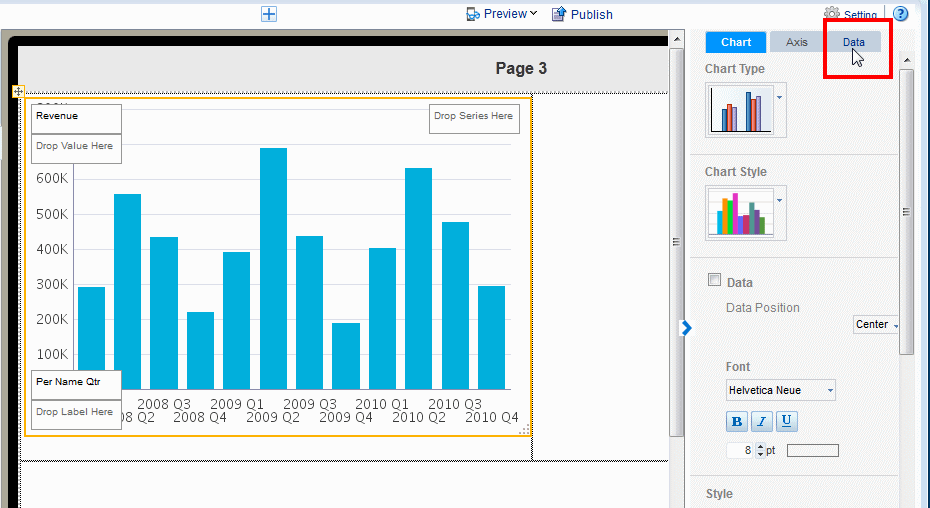
Figure 3-2 shows properties available for a Chart.
3.2 Setting App Properties
To set app-level properties, click the app icon at the top of the page list as shown in Figure 3-3.
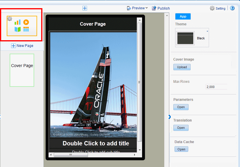
You can set the following for your app:
For information about the Parameters, Translation, and Data Cache settings, see Chapter 6, "Configuring App Settings."
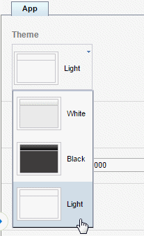
3.2.1 Setting the App Color Theme
You can set your app color theme to be black, white, or light. App components (charts, tables, filters, and so on) display complementary default coloring depending on your chosen theme.
Tip:
Ensure to choose your app color theme before you begin inserting components. Components take on the color theme at the time your insert them. If you change the color theme after inserting components, you may need to reinsert them to reset the coloring appropriately.To set the App theme:
-
Select the App icon to display the app properties.
-
From the Theme menu, select Black, White, or Light. (Note that the Light theme currently only governs the display of the Navigation page.
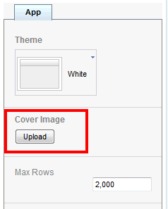
3.2.2 Adding a Cover Image
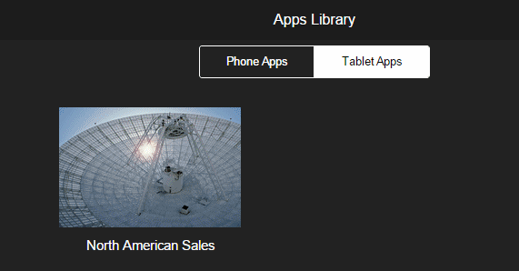
The cover image is the image that displays for your app in the apps library as shown inFigure 3-4.
To change the background image on the cover page of your app, see Customizing Background Images.
To add the cover image to display in the Apps Library:
-
Select the App icon to display the app properties.
-
Under the Cover Image property, click Upload.
-
Select the image (jpeg, gif, png, or bmp) file and click Upload.
3.2.3 Limiting Data Rows to Return for Design and Preview
The Mobile App Designer populates the components of your app with data from your data source during design and preview. If your data source is large, you can enhance design-time interaction by limiting the number of rows that are used for design and preview. By default, the Max rows is set to 2000.
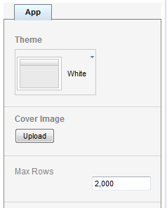
To edit this number, enter the number of rows to return in the app property setting.
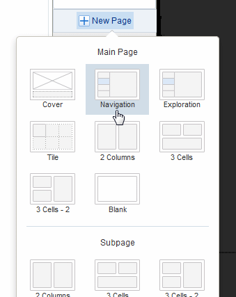
3.3 Adding and Editing Pages
Video: Adding Pages to Your App
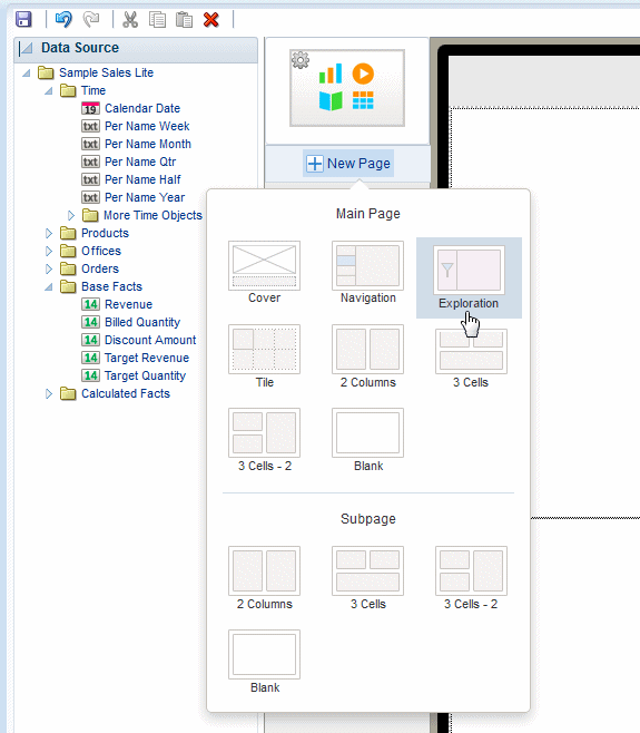
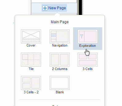
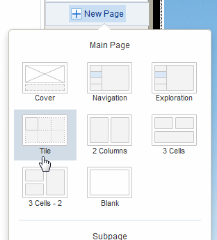
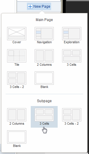
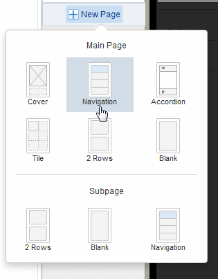
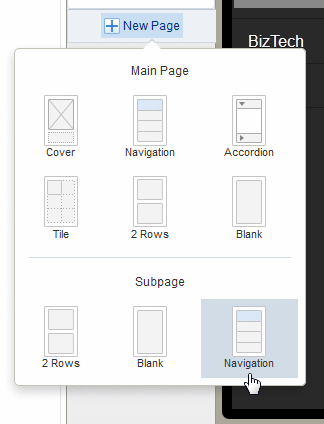
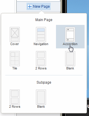
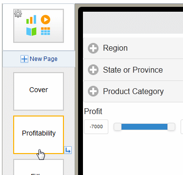
The New Page menu provides several preformatted page templates. When you insert a page, first choose a Main Page or a Subpage.
A main page is a page at the top level of your app. A main page displays in the app menu. You can navigate through the main pages of the app by swiping through the app sequentially, or you can navigate directly to a specific page using the page menu.
A subpage presents detail information of its parent page. A subpage does not display in the app page menu. Typically you navigate to a subpage by tapping a data item on its main page (such as a tile or a chart value). The data presented on the subpage is automatically filtered based on the item you tapped on the main page. When you access a subpage by swiping the previous page, the subpage displays all data received from the previous page.
When you create a subpage beneath another subpage, each subpage treats the subpage before it as its parent page; that is, the data presented on the subpage is automatically filtered based on the item you tapped on the previous subpage.
Video: Adding Detail Information Using Sidebars and Subpages
3.3.1 Selecting a Page Template
The Mobile App Designer provides several preformatted page templates to help you get started with your design:
-
Cover
The default cover page includes an image and headings. Use a cover page to introduce your app. See Editing the Cover Page to customize your cover page.
-
Navigation
A navigation page provides a master-detail interaction between a set of hierarchical filters that users select to control the display of the detail region of the page. The detail region contains visualizations you define that automatically update based on the selection in the navigation region. See Adding Navigation Pages.
-
Exploration (available for tablet apps only)
An exploration page provides dynamic filtering based on fields from your data source that you choose. This design provides your app consumers the most flexibility for exploring combinations of dimensions and measures. Users can easily mix and match filters in new and different ways to gain insights through exploration. See Adding Exploration Pages.
-
Tile
A tile page provides a set of dynamic, scrollable tiles containing visualizations that enable easy comparison of key measures across your data set. A tile is generated for each occurrence of a specific item in your data. See Adding Tile Pages.
-
Accordion (available for phone apps only)
The accordion page provides an expandable display of a specific data dimension and a key measure (such as Product and Revenue). Add visualizations to the expansion area that you can expand and collapse easily to accommodate the mobile device viewing area. See Adding Accordion Pages.
-
Columns or cells
Choose from several column-cell design patterns to arrange your app components.
-
Blank
To design a custom page layout, choose Blank. You can stack components by simply dragging and dropping them to the blank page or, insert Frames to create your own column and cell arrangement for side-by-side and more precise placement of components. See Inserting Frames.
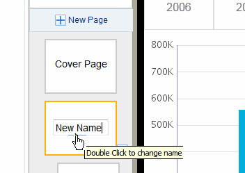
3.3.2 Changing the Page Name
The page name displays at the top of the page and in the app menu. To edit the page name:
-
Double-click the page name text on the page icon in the left column as shown in Figure 3-6 to enable the text for editing. Enter the new name.
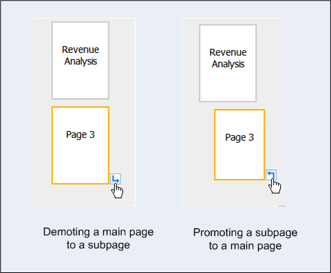
3.3.3 Changing Between Main Page and Subpage
A main page can be demoted to a subpage by clicking the right-arrow icon. A subpage can be promoted to a main page by clicking the left-arrow icon.
3.4 Editing the Cover Page
A cover page with a default image is included when you create an app. You can update the cover page image and title text; or, delete these default components and insert any other app component to the cover page.
Video: Changing Your App Cover Page
3.4.1 Updating the Cover Page Background Image
To update the cover page background image:
-
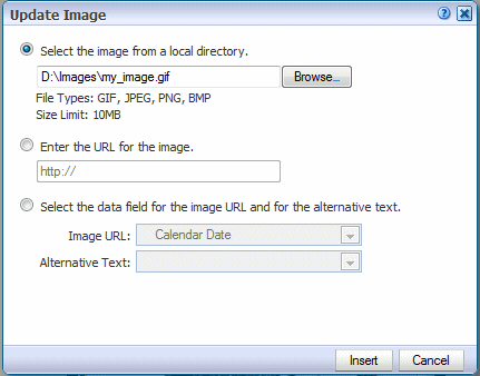
Double-click the image on the page.
-
In the Update Image dialog, specify one of the following sources for the image:
-
Select the image from a local directory: Click Browse to specify the file name and directory of the image on a local directory to upload the image.
-
Enter the URL for the image: Enter the URL where the image is stored.
-
Select the data field for the image URL and for the alternative text:
Image URL: Select the field from the data that contains a URL to an image.
Alternative Text: If your data includes a field that contains alternative text for the image, you can select that field to define the alternative text that is displayed for the image.
-
-
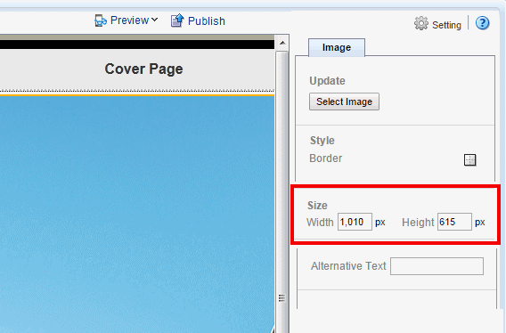
Optionally resize the image in one of these ways:
-
Drag the right bottom corner of the image. To preserve the aspect ratio when resizing an image, press and hold the Shift key before starting to drag the corner.
-
Modify the width and height in the Properties pane. With the image selected, you can enter precise height and width values in pixels.
-
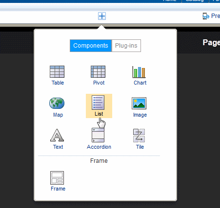
3.5 Inserting Components and Plugins to Your Pages
After adding a page you can start inserting visual components to the page. Mobile App Designer not only provides a full range of components such as charts, tables, and maps, but also provides a facility for you to extend the visualization capabilities by creating your own plugins.
To insert a component or plugin:
Click the Insert icon. Choose from the Components or Plugins.
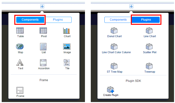
The components are documented in this chapter.
The plugins delivered with this release are samples to give you some ideas for designing your own. For additional descriptions see:
-
http://www.oracleappdesigner.com/2015/07/introduction-to-line-bar-chart-plugin.html -
http://www.oracleappdesigner.com/2015/07/plugin-donuts-chart.html
For information about creating your own custom plugins see Adding Custom Plugins.
3.6 Adding Exploration Pages
Use an Exploration page to provide your tablet app consumers the most flexibility in choosing combinations of data to visualize.
Video: Adding Exploration Pages to Filter Data
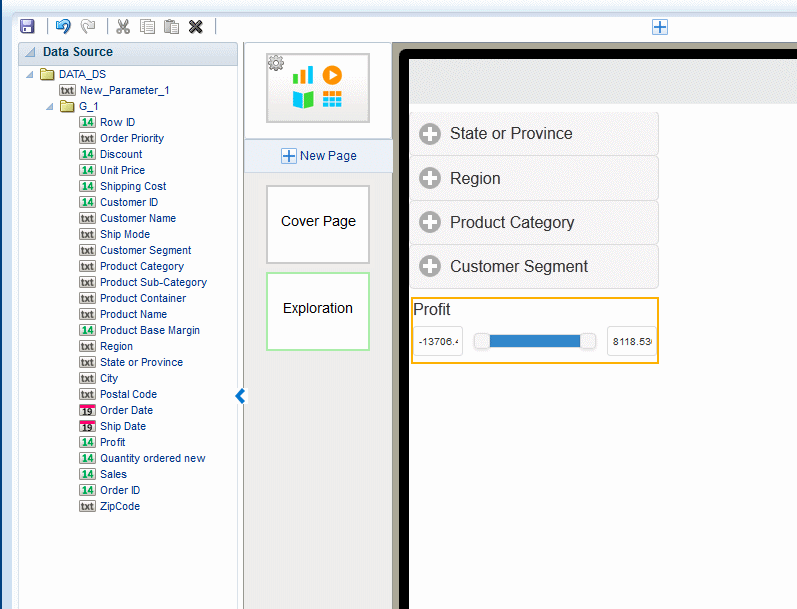
Exploration pages provide multiple filters to enable easy exploration of the data presented on the page. Any text or numeric fields (including calculated fields) can be added as filters enabling your users to mix and match the data that interest them to provide new and personal views of the data.
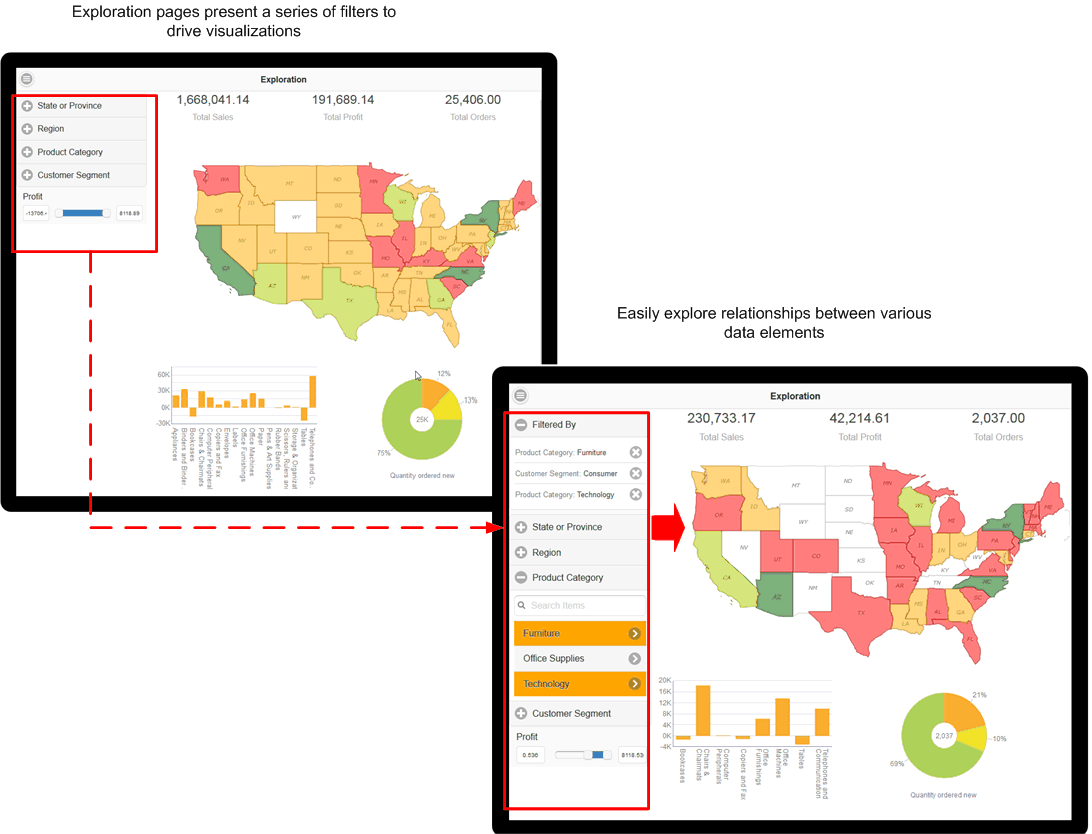
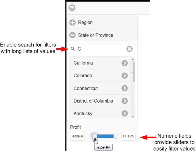
Numeric fields (such as Sales, Salary, Units Sold) are presented as sliders. You can customize the operator that defines the slider.
For text filters with long lists of values, you can enable a search option. The search option prompts you to start typing text to narrow the choices.
At run time you can select multiple values from each filter list. You can also define default values for filters so that when the page launches, it is initially filtered by one or more values.
Note that date fields are not supported.
-
Click New Page and then click Exploration.
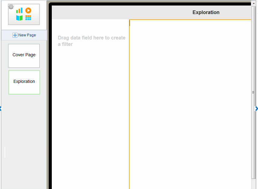
The inserted page is divided into two sections. The left section is where you drag data fields to create filters. The wider, right hand section is where you insert the visualizations that will be driven by the filters.
-
Drag text or numeric data fields from the Data Source pane or from the Calculated Fields pane and drop them on the left side of the page to create as many filters as desired for your app page.
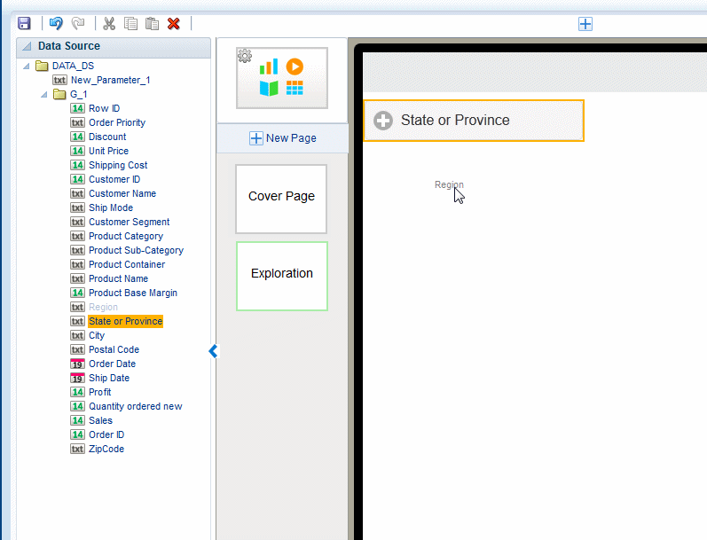
The field labels from the data source are displayed by default. You can update the filter label on the Properties pane. Numeric fields display as a slider-style filter.
-
Add the visualizations (charts, maps, tables) to the right side of the page. All the visualizations are filtered when you make selections on the left side.
-
Optionally customize the filters:
3.6.1 Customizing Text Filters on the Exploration Page
Use the Properties pane to apply the following customizations to text filters:
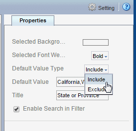
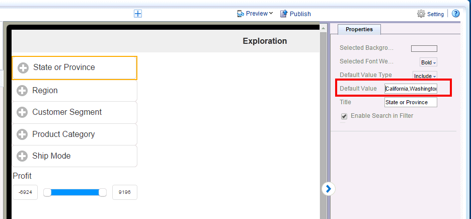
3.6.1.1 Specify Default Values for Text Filters
You can set default values for filters so that when users open the page specific values are already applied. You can remove the defaults as you explore the data, choosing different values. You can define values to include by default, or values to exclude by default.
To specify default values:
-
Select the Filter to display its Properties.
-
In the Default Value Type property, choose whether to Include or Exclude the specified values.
-
In the Default Value property, enter the values. Enter multiple values separated by a comma. (Important: Do not enter spaces between the values.)
3.6.1.2 Enable or Disable Search for Text Filters
By default text filters include the Search option (see Figure 3-14) to enable you to more easily navigate long lists of values. For shorter lists you can disable this feature by deselecting the Enable Search in Filter option.
3.6.1.3 Customize Selected Background Color and Font Weight
The selected background color and font weight define how the filters that are selected display in the list. Set these properties to highlight the active filters.
To change the default background color: On the Properties pane, click the Selected Background color bar, then choose a new color from the color picker.
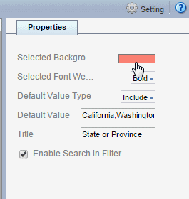
To change the default Selected Font Weight: On the Properties pane, select Bold, Light, or Normal from the list.
3.6.2 Setting the Operator and Values for Numeric Filters on the Exploration Page
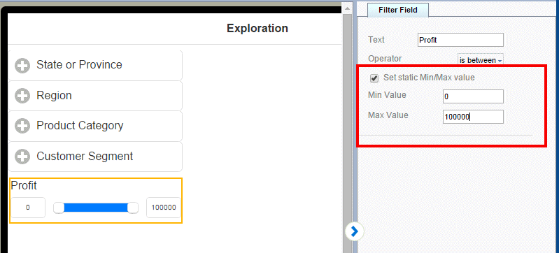
By default, the Operator "is between" is applied with the Minimum and Maximum values applied dynamically from the lowest and highest values present in the data. You can select a different operator as well as configure filters to display static minimum and maximum values.
To specify values and operator for numeric fields:
-
Select the numeric Filter to display its Properties.
-
To change the Operator, select from the list. Supported operators are:
-
is less than
-
is greater than
-
is less than or equal to
-
is greater than or equal to
-
is between (default)
-
-
To set absolute minimum and maximum values for the slider, rather than have the values set dynamically from the minimum and maximum values present in the data, select Set static Min/Max Value, and then enter the absolute minimum and maximum values.
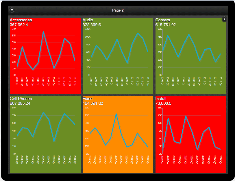
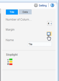
3.7 Adding Tile Pages
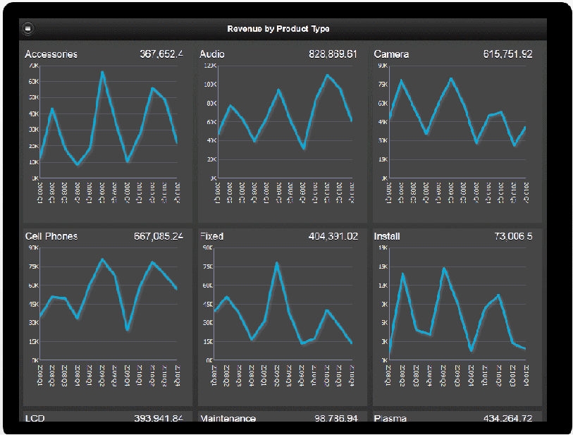
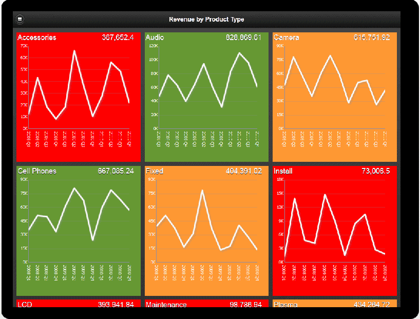
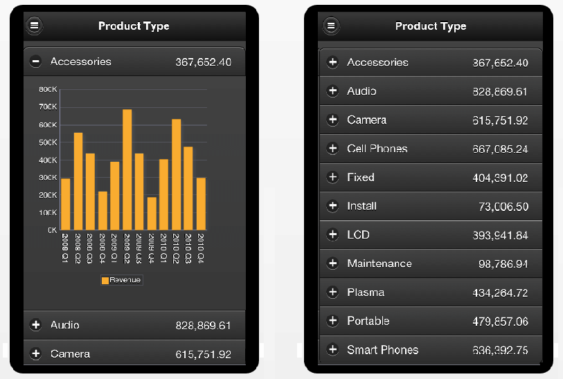
Tile pages provide a scrollable set of tiles each containing the same components repeated for a specific field in your data. Use a tile page to provide an instant view of a key measure across a specific dimension. This view not only provides a complete picture within each tile, but also enables an at-a-glance comparison across your data set.
Video: Adding Tile Pages to Apps
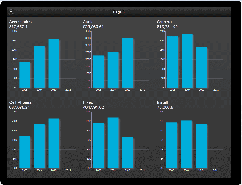
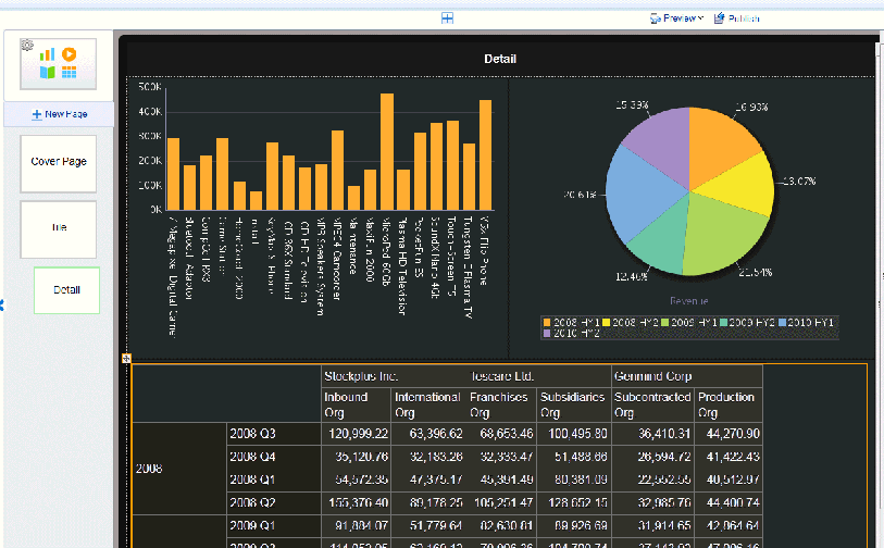
The example tiles shown in Figure 3-20 provide an overview of revenue for a set of products. Each tile displays the overall revenue and a chart showing revenue by quarter. When you design a tile page you can include any visualization in each tile.
To enhance the visual impact of the values represented in each tile, you can add stoplight formatting to highlight tiles with results that fall outside the range of specific threshold values.
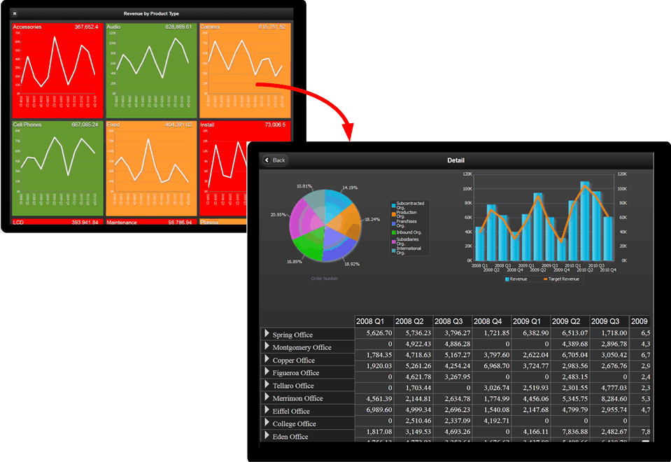
When a tile page is paired with a subpage, each tile is a touch point to open the subpage filtered by the tile value. This combination enables your users to quickly assess areas that require attention and drill down for deeper analysis.
Features of tile pages include:
-
Each tile is a touch point. When you associate a subpage with a tile page, tapping a tile opens the detail subpage.
-
Tiles load dynamically as you scroll down.
-
Tile width is based on the number of columns specified and your device type display area. You can define the number of columns up to four across.
-
You can customize the tiles to include any component.
3.7.1 Creating a Tile Page
When you insert a new page, Tile is available as a page template selection. You can also insert a tile into a specific page area using the option on the Add Component menu.
To insert a tile page:
-
Click New Page and then click Tile.
-
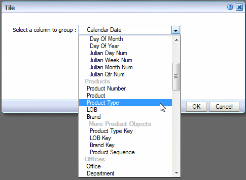
In the Tile dialog, choose the data field that you want grouped for each tile. The drop-down list includes all the fields from your data. The example tile page in Figure 3-23 will display one tile for each Product Type.
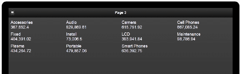
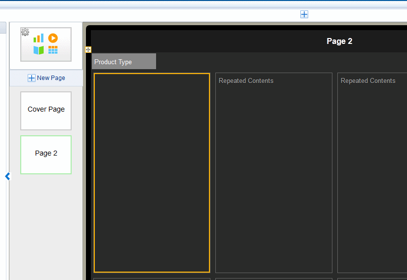
When inserted, the tiles display as shown in Figure 3-24. Note that in the app designer, only the first tile displays the contents. Use Preview when you want to see content across all tiles.
-
To add contents to the tiles, select the first tile, and drag the components from the Insert menu to the first tile.
Tip:
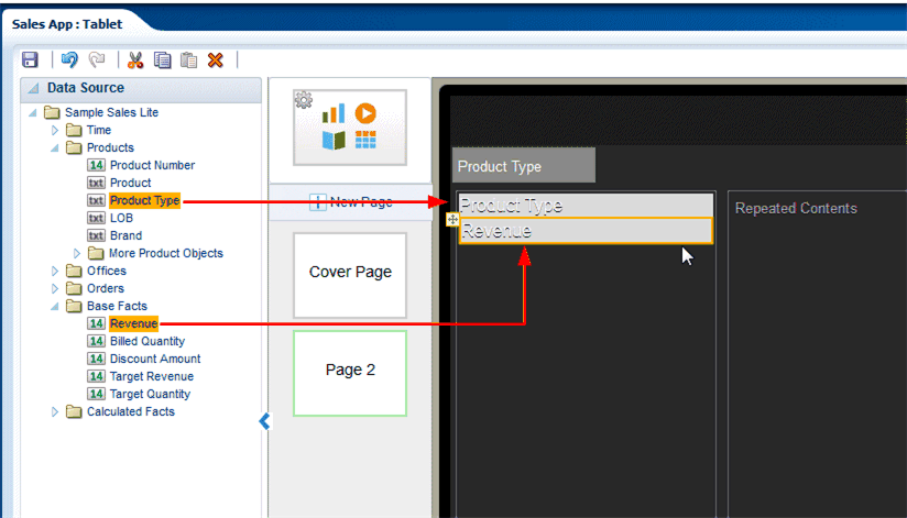
For precise placement of components within a tile, use Frames to position your contents. See Inserting Frames.A common use case is to add the data field label to the tile with a measure. For example, drag Product Type from the Data Source pane to the first tile and then drag Revenue from the Data Source pane to the first tile.
-
Preview your tile page to view the contents so far. Click Preview.
To finish your tile page, add the components to the first tile. For example, to add a chart, simply drag the chart component from the Insert menu and customize the chart as desired. An example is shown in Figure 3-26. For information about more customizations you can apply to your tile page, see Customizing Tiles.
3.7.2 Adding a Subpage to a Tile Page
A common use case is to add a subpage to a tile page to provide more detailed information about the data provided in a specific tile. The detail subpage opens when you tap a tile.
To add a subpage:
-
Select the Tile page.
-
Click New Page and then select one of the Subpage options from the menu.
-
The empty subpage is inserted for you to add content.
-
Add components to your subpage. The example in Figure 3-27 shows a subpage with two charts and a pivot table. At run time, when you tap a tile on the tile page, the components on this page show detail for the tapped item only.
3.7.3 Customizing Tiles
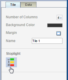
You can insert any combination of components to the tiles. To accommodate the components you choose you can apply the following customizations:
Select the first tile to display the Tile Properties pane.
3.7.3.1 Specify Number of Columns
To change the number of columns that display across the page, click the Columns option and select the number of columns. Supported values are one through four.
The column width automatically adjusts depending on the size and type of mobile device used to view the app.
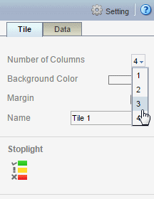
3.7.3.2 Apply a Background Color
To change the default background color: On the Properties pane, click the Background Color bar, then choose a new color from the color picker.
3.7.3.3 Apply Filters
Apply a filter to refine the items displayed in the tile page. For example, you can apply a filter to limit the display to only:
-
The top 10 salaries
-
The bottom 25 store sales
-
Employees in the IT department
-
Sales that are between $10,000 and $20,000 and in the Southern region
You can add multiple filters and manage the order in which they are applied to the tile page.
The Apply Filter option is available from the Data tab of the properties pane.
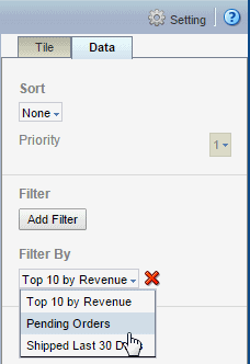
See Adding Global Filters for information about creating filters.
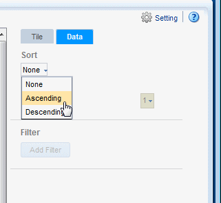
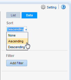
3.7.3.4 Sort
The Sort option sorts the tiles by the field you selected as the tile grouping field. For example, if you chose Product Type as the tile grouping field, and then select Sort ascending, the tiles will be sorted from A - Z by the Product Type name.
To sort the tiles:
-
Select the first tile to view the Tile properties.
-
In the Tile properties pane, click the Data tab.
-
From the Sort menu choose None to apply no sort, Ascending, or Descending.
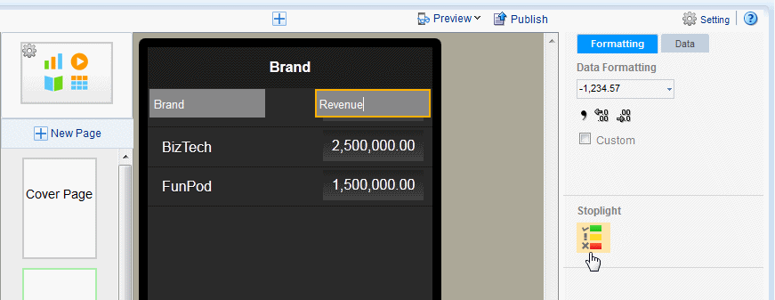
3.7.3.5 Add Stoplight Formatting
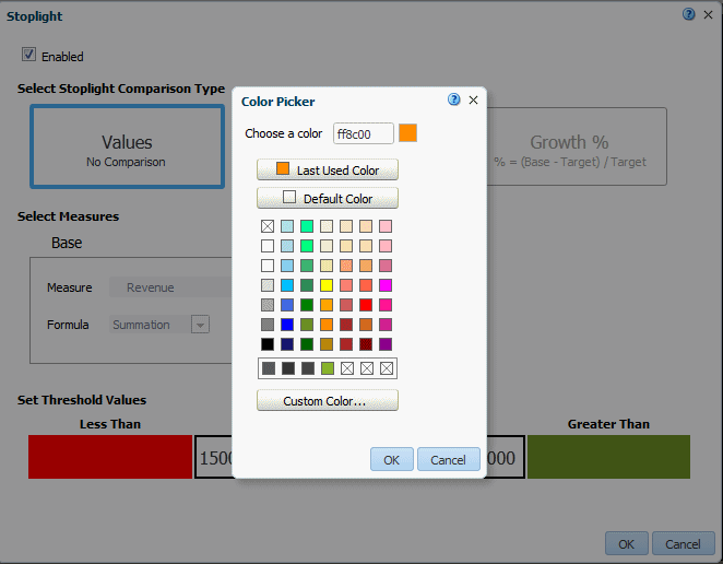
Stoplight formatting applies one of three distinct background colors to each tile depending on the value of a chosen aggregated field in your data. You can customize the colors or use the default colors red, amber, and green. Use stoplight formatting to quickly assess an indicator as unacceptable, acceptable, or desirable.
The Stoplight feature enables you to highlight values conditionally based on static threshold values, a comparison to a target value, or a comparison to another field.
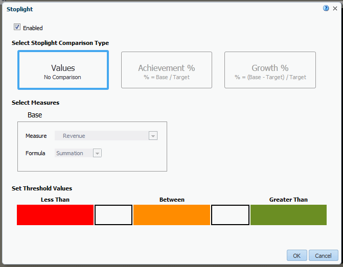
3.7.3.5.1 Apply Formatting Based on Static Values
Use this option when the unacceptable, acceptable, and desired values are the same for the aggregated field for all items. You can customize the colors for each range.
To apply conditional formatting based on static values:
-
Select the first tile to view the Tile properties. On the Tile properties pane, click Stoplight.
-
In the Stoplight dialog select Values.
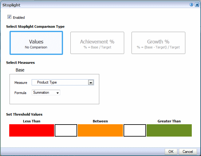
-
Select the Measure field on which to base the formatting and then select the formula to apply to the Measure.
For example, assume you have grouped tiles by Product Type. You want to apply formatting to each tile based on the value of Revenue for each product type. Select Revenue as the Measure and Summation as the Formula.
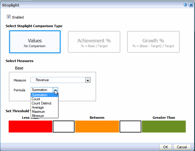
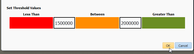
-
Enter the threshold values for the background colors. Values less than the left entry will display the Less Than background color. Values greater than the right entry will display the Greater Than background color. Values between display the Between color.
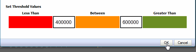
To change the default colors, see Customizing the Colors.
-
Click OK.
Note that for Tile pages the stoplight formatting does not display in the design workspace.
-
Click Preview to view how the formatting will display at run time.
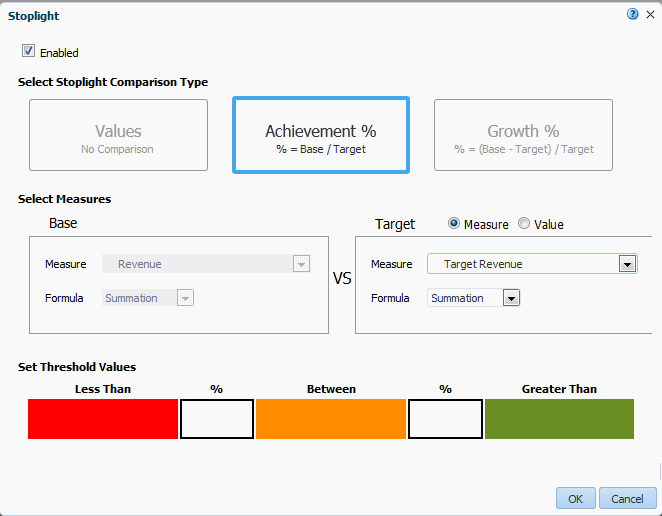
3.7.3.5.2 Apply Formatting Based on Percent Achievement
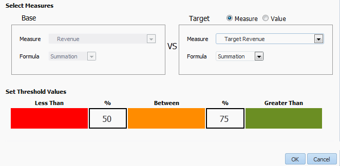
This option enables you to conditionally highlight the aggregate value based on the percentage of a target value. For example, you want to highlight sales that are less than 50 percent of target to display as red, sales that are 50-75 percent of the target as amber and sales that are greater than 75 percent of the target to display as green.
To apply conditional formatting based on the percent achievement of a target:
-
Select the first tile to view the Tile properties. On the Tile properties pane, click Stoplight.
-
In the Stoplight dialog select Achievement %.
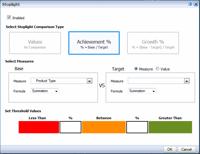
-
Select the Base Measure from the data field list and the Formula to apply to the measure field. In this example, Revenue will be summed for each tile to establish the base measure.
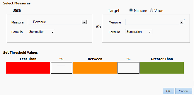
-
Choose the Target Measure or enter a Value.
-
Measure - select a field from the data to supply the target value for comparison.
-
Value - enter a static value to supply the target value for comparison.
The app calculates what percentage the calculated Base measure value is of the Target value. In the example below, the Revenue column (Base) is compared to the Target Revenue column (Target). The calculation performed is:
Revenue/Target Revenue X 100%
Therefore if your Revenue is $8,000 and your Target Revenue is $10,000, the percent achievement is:
8,000/10,000 X 100% = 80%
-
-
Enter the Less Than and Greater Than percentage values for the background colors.
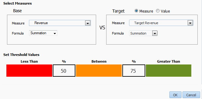
If the Base value percentage of the Target value is less than the percentage you enter on the left, the Less Than color displays. If the Base value percentage of the Target value is greater than the value you enter on the right, the Greater Than color displays.
-
To change the default colors, see Customizing the Colors.
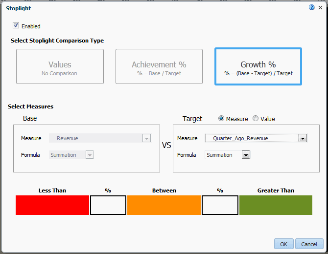
3.7.3.5.3 Apply Formatting Based on Percent Growth
This option enables you to conditionally highlight the aggregate value based on the percent difference of the base value from the target value. The calculation applied is:
(Base - Target)/Target X 100%
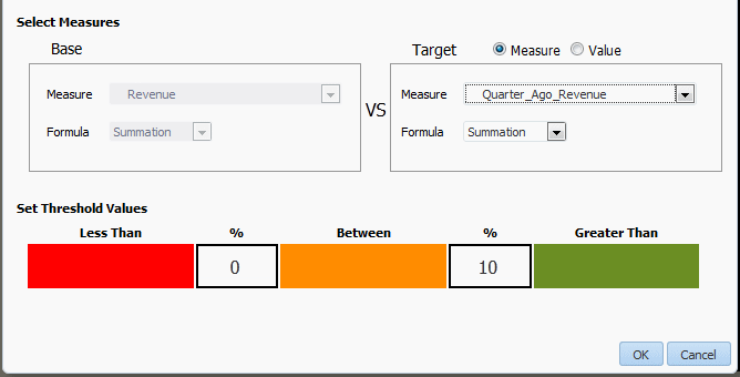
For example, you want to compare sales from the current and previous quarters and you want to see when sales in the current quarter showed less than 10% growth from the previous quarter. When sales showed 10% growth you want to display the value in green, when 0-10% growth display amber, and when less than 0% growth display red.
To apply conditional formatting based on percent growth:
-
Select the first tile to view the Tile properties. On the Tile properties pane, click Stoplight.
-
In the Stoplight dialog select Growth %.
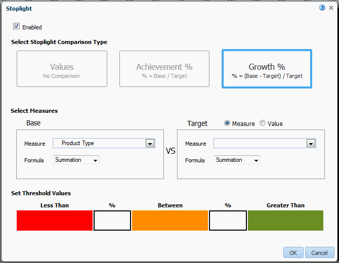
-
Select the Base Measure from the data field list and the Formula to apply to the measure field. In this example, Revenue will be summed for each tile to establish the base measure.
-
Choose Target Measure or Value.
-
Measure - select a field from the data to supply the target value for comparison.
-
Value - enter a static value to supply the target value for comparison.
The app calculates the percent difference that the Base column value is from the Target value. In the example below, the Revenue column (Base) is compared to the Quarter Ago Revenue column (Target). The calculation performed is:
((Revenue - Quarter Ago Revenue)/Quarter Ago Revenue) X 100%
Therefore if your Revenue is $11,000 and your Quarter Ago Revenue is $10,000, the percent growth is:
((11,000 - 10,000)/10,000) X 100% = 10%
-
-
Enter the Less Than and Greater Than percentage values for the background colors.
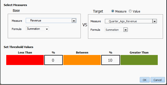
If the Base value percentage difference from Target value is less than the percentage you enter on the left, the Less Than color displays. If the Base value percentage difference from the Target value is greater than the value you enter on the right, the Greater Than color displays.
-
To change the default colors, see Customizing the Colors.
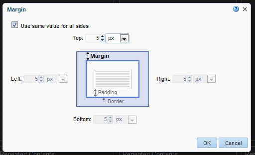
3.7.3.6 Resize Tile Margins
You can adjust the space around each tile to make the tiles closer together or further apart.
To customize the margin area between tiles:
-
Select the first tile to display the tile properties.
-
Click the Margin tool.
-
Enter the new margin values and select the unit of measurement.
-
Click OK.
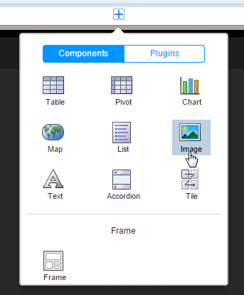
3.8 Inserting Images
The Mobile App Designer supports the following methods for including images in a page:
-
Static image: Upload a static image that is saved in the app. An uploaded image file must be in one of the following graphic file formats: GIF, JPEG, PNG, or BMP. The image file cannot be larger than 10 MB.
-
Static URL: Specify a static link to a URL where an image is stored. At run time the image is retrieved from the stored location.
-
Dynamic URL: When the image URL is provided in a data field, specify the field that contains the URL. The value of the data field is evaluated at runtime enabling dynamic insertion of an image.
To insert an image:
-
Click Insert, and then drag the Image component to the page.
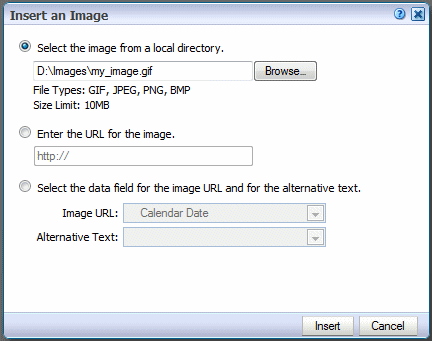
-
In the Insert an Image dialog, specify one of the following sources for the image:
-
Select the image from a local directory: Click Browse to specify the file name and directory of the image on a local or mapped drive to upload the image.
-
Enter the URL for the image: Enter the URL where the image is stored.
-
Select the data field for the image and for the alternative text:
Image URL: Select the field from the data that contains a URL of an image.
Alternative Text: If the data includes a field that contains alternative text for the image, then select that field to display alternative text.
-
-
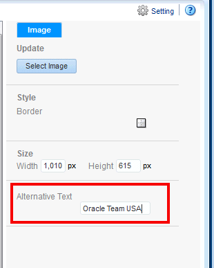
Add alternative text for the image. Click the Properties pane and enter text in the Alternative Text field as shown in Figure 3-31.
-
Optionally resize the image in one of these ways:
-
Drag the right bottom corner of the image. To preserve the aspect ratio when resizing an image, press and hold the Shift key before starting to drag the corner.
-
Modify the width and height in the Properties pane. The Properties pane enables you to enter precise height and width values in pixels, centimeters, inches, or points.
-
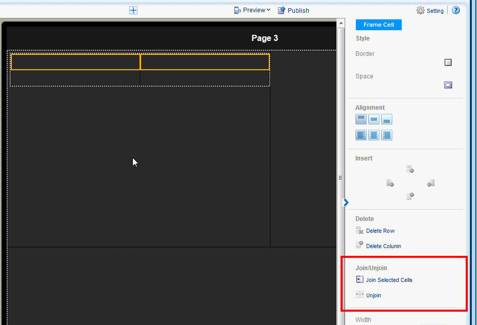
3.9 Inserting Frames
Use frames to divide your app page into sections for the precise positioning of components. When you start from a Blank page, typically you insert a frame before you begin inserting components. When you choose a preformatted template you can edit a default frame by selecting the frame and using the Frame properties. You can insert a frame inside another frame.
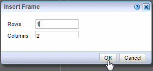
To insert a frame:
-
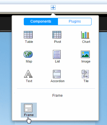
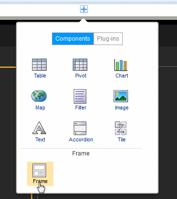
Select the area of the page where you want to insert the frame. On the Insert Component menu click Frame.
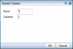
-
Enter the number of rows and columns for the frame and click OK.
Figure 3-34 shows the Insert Frame dialog.
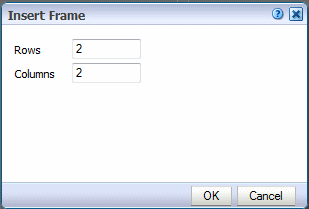
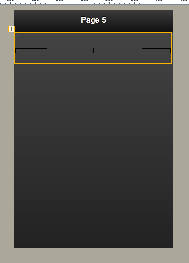
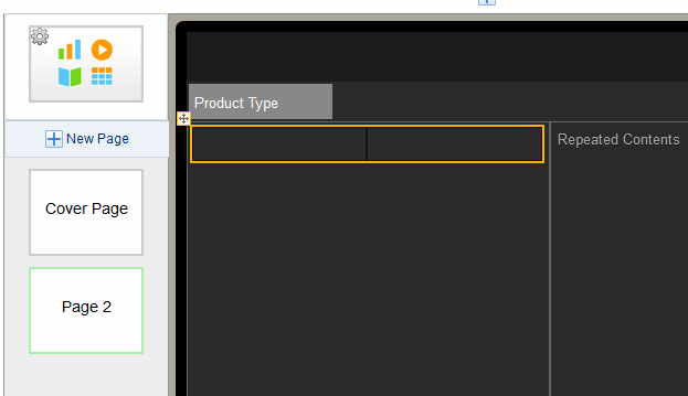
Figure 3-35 shows the inserted frame.
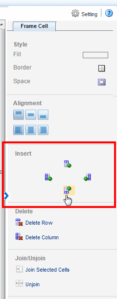
Features of frames include:
-
By default, frame columns are sized equally across the insertion area and frame row height defaults to the height of one row of text.
When you insert a component to a frame, the frame automatically resizes to accommodate the component.
-
You can adjust the column width and height by either positioning the mouse pointer over the border and dragging the blue resize bar, or by changing the frame column properties in the Properties pane.
-
You can insert a frame inside another frame.
When you select a frame cell, the Frame Cell properties display to enable additional customization of fonts, alignment, borders, and background colors.
3.9.1 Adding a Border or Background Color
By default, the gridlines are displayed in the design area only and are not shown during run time.
To display the gridlines in your app:
-
Select the frame to display the Frame Cell properties.
Click the Border icon.
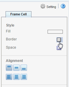
-
Choose the border style from the Border dialog. See Section 5.7, "Setting Borders" for more information about the Border dialog.
To add a background color to a frame cell:
-
Click the Fill color bar to launch the Color Picker.
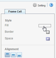
-
Select a color and click OK.
See also: Using the Color Picker.
3.10 Adding Navigation Pages
The creation process for the navigation page is different for tablets and phones. See the appropriate section for your app:
See also:
Video: Adding Navigation Lists for Investigating Data
3.10.1 Navigation Page for Tablet
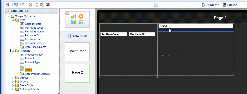
The Navigation page defines a master-detail relationship between a navigable set of filters and the visualizations displayed on the page. The navigation area of the page contains a hierarchy of filters that you tap through to drive the display on the detail side of the page. As you tap, you can see successively more refined sets of data, or you can stop within a level to see data just for its members, or a particular member. You can navigate up and down the hierarchical filters to see just the subset of data that interests you.
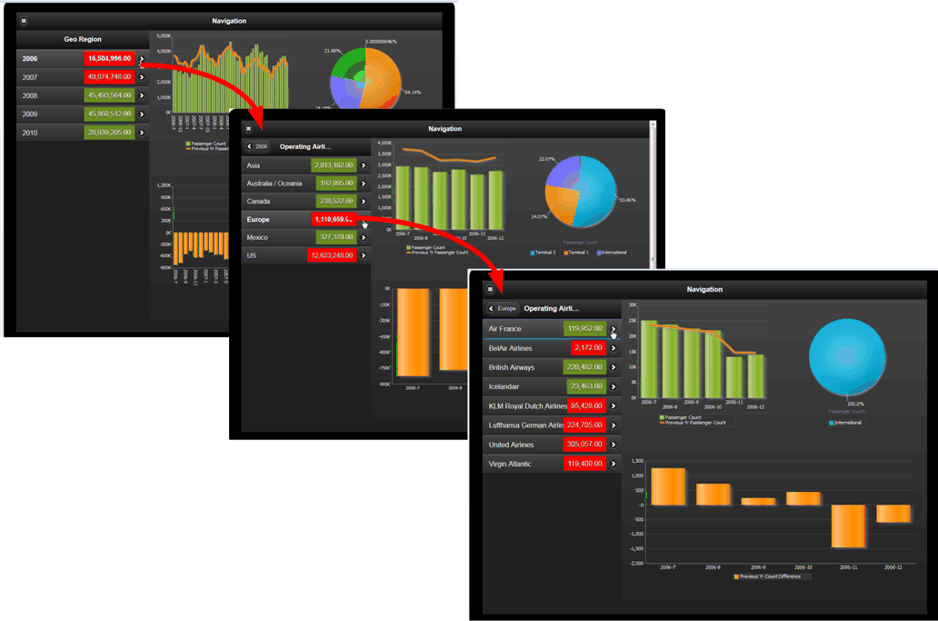
To insert a Navigation page:
-
Click New Page and then select Navigation.
-
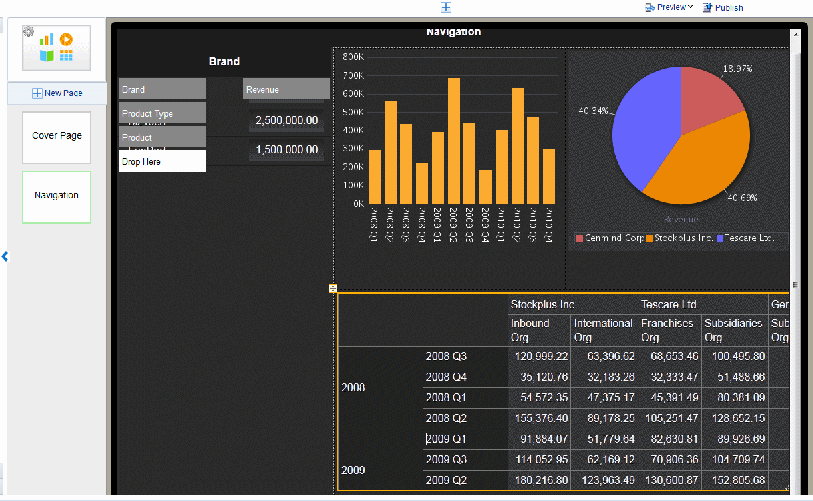
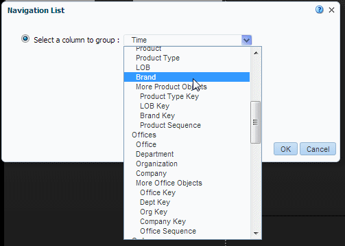
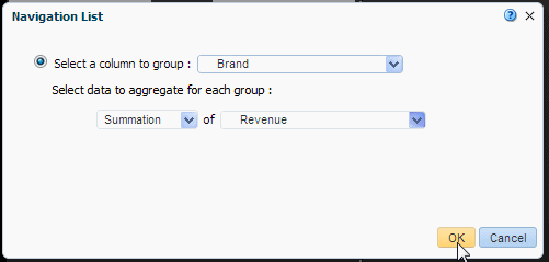
Select the data field from the list to define the top level of the navigation menu. In the example, the first level of the navigation list is grouped by Brand.
-
Next choose a data field to aggregate for the group element and then choose an aggregation function. In this example, the Revenue for each Brand will be summed.
When you click OK the members of the group by column you selected display as the navigation list along with the aggregated value for each member of the list.
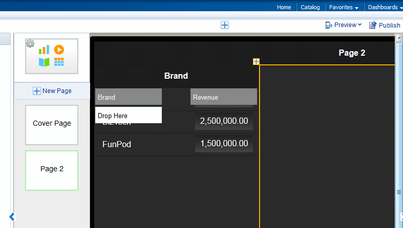
-
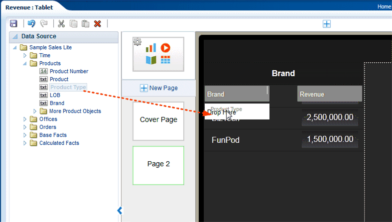
To add a second level to the navigation list, drag the element from the Data Source pane to the Drop Here box on the page.
-
Continue adding levels as needed by dragging the fields from the Data Source pane to the Drop Here box. To see the members of a specific level, click that level.
-
To add stoplight formatting to your navigation list, see Stoplight Formatting for Navigation and Accordion Pages.
-
Add the components to the detail region of the page. At run time, these components refresh as items on the navigation list are tapped. The example shows two charts and a pivot table.
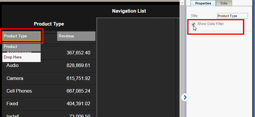
3.10.1.1 Adding a Search Filter
If a level in your navigation list includes many members (for example, States or Products) you can add a search filter to enable your app users to more easily find a specific item.
You can enable the search filter independently for each level.
To add a search filter to a navigation list level:
-
Select the navigation item for which you want to add a search filter.
-
In the Properties pane, enable the Show Data Filter property.
3.10.2 Navigation Page for Phone
The navigation page for phone enables you to create a hierarchical list of filters that you can navigate to see a detail display of the specific items that interest you.
Tutorial: Creating Navigation Pages for Phone Apps
-
Click New Page and then select Navigation.
-
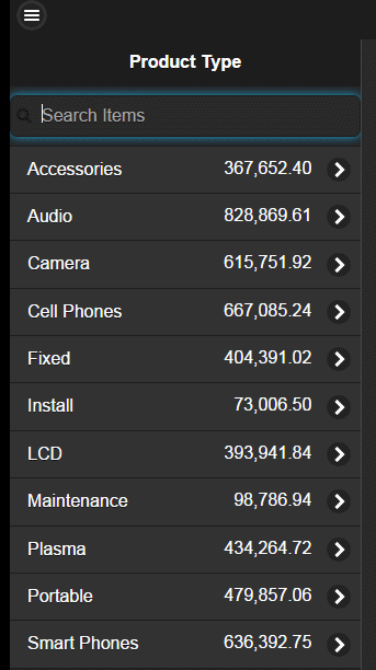
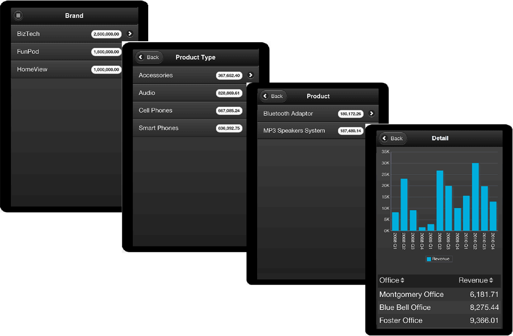
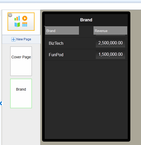
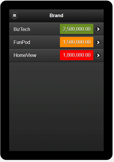
Select the data field from the list to define the top level of the navigation menu. In the example, the first level of the navigation list is grouped by Brand.
-
Next choose the measure field to aggregate for the group element. In this example, Revenue is summed for each Brand (shown in Figure 3-45).
When you click OK the data element you selected displays as a list with the aggregated measure as shown in Figure 3-46.
-
To add a second level to the navigation list, create a subpage under the first navigation list page as shown in Figure 3-47.
-
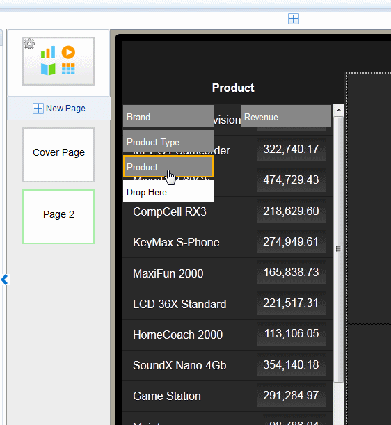
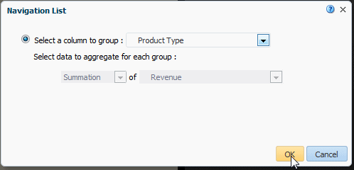
Select the data field to group for the second level of the navigation list. In this example (Figure 3-48), Product Type is the second level. Every child level uses the same aggregation selected for the first level. In the child levels the aggregation selection is for display only and cannot be updated.
When you click OK, your subpage displays the members of the group you selected as shown in Figure 3-49.
-
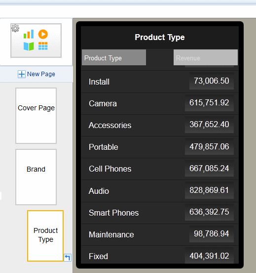
To create another level, add a Navigation type subpage under the subpage you just created. Select the group element for this page as described in the previous step. Figure 3-50 shows the navigation page created for the Product field.
You can continue adding subpages to create as many levels as your app requires.
-
To add a detail page with results driven by the selections on the previous pages, add a new subpage beneath the final navigation page.
-
Add components to the detail page. The following example shows a detail page with a chart and table.
3.10.2.1 Adding a Search Filter
If a level in your navigation list includes many members (for example, States or Products) you can add a search filter to enable your app users to more easily find a specific item.
You can enable the search filter independently for each level.
To add a search filter to a navigation list level:
-
Select the navigation item for which you want to add a search filter.
-
In the Properties pane, enable the Show Data Filter property.
3.10.3 Stoplight Formatting for Navigation and Accordion Pages
The Stoplight feature enables you to highlight values conditionally based on static threshold values, a comparison to a target value, or a comparison to another field.
See also:
Video: Formatting Navigation Lists
3.10.3.1 Apply Formatting Based on Static Values
Use this option when the unacceptable, acceptable, and desired values are the same for the aggregated field at each level of the navigation. You can customize the colors for each range.
To apply conditional formatting based on static values:
-
On the navigation or accordion page, select the measure field and click Stoplight. In this example the measure field is Revenue.
-
In the Stoplight dialog select Values. The Base Measure and Formula that you chose when you defined the navigation or accordion page are displayed, but are not editable.
-
Enter the threshold values for the background colors. Values less than the left entry will display the Less Than background color. Values greater than the right entry will display the Greater Than background color. Values between display the Between color.
To change the default colors, see Customizing the Colors.
-
Preview your app.
3.10.3.2 Apply Formatting Based on Percent Achievement
This option enables you to conditionally highlight the aggregate value based on the percentage of a target value. For example, you want to highlight sales that are less than 50 percent of target to display as red, sales that are 50-75 percent of the target as amber and sales that are greater than 75 percent of the target to display as green.
To apply conditional formatting based on the percent achievement of a target:
-
On the navigation or accordion page, select the aggregation field and click Stoplight. In this example the aggregation field is Revenue.
-
In the Stoplight dialog select Achievement %. The Base Measure and Formula that you chose when you defined the navigation or accordion page are displayed, but are not editable.
-
Choose Target Measure or Value.
-
Measure - select a field from the data to supply the target value for comparison.
-
Value - enter a static value to supply the target value for comparison.
The app calculates what percentage the Base column value is of the Target value. In the example above, the Revenue column (Base) is compared to the Target Revenue column (Target). The calculation performed is:
Revenue/Target Revenue X 100%
Therefore if your Revenue is $8,000 and your Target Revenue is $10,000, the percent achievement is:
8,000/10,000 X 100% = 80%
-
-
Enter the Less Than and Greater Than values percentage values for the background colors.
If the Base value percentage of the Target value is less than the percentage you enter on the left, the Less Than color displays. If the Base value percentage of the Target value is greater than the value you enter on the right, the Greater Than color displays.
-
To change the default colors, see Customizing the Colors.
3.10.3.3 Apply Formatting Based on Percent Growth
This option enables you to conditionally highlight the aggregate value based on the percent difference that the base value is from the target value. The calculation applied is:
(Base - Target)/Target X 100%
For example, you want to compare sales from the current and previous quarters and you want to see when sales in the current quarter showed less than 10% growth from the previous quarter. When sales showed greater than 10% growth you want to display the value in green, when 0-10% growth in amber, and when less than 0% growth in red.
To apply conditional formatting based on percent growth:
-
On the navigation or accordion page, select the measure field and click Stoplight. In this example the measure field is Revenue.
-
In the Stoplight dialog select Growth %. The Base Measure and Formula that you chose when you defined the navigation or accordion page are displayed, but are not editable.
-
Choose Target Measure or Value.
-
Measure - select a field from the data to supply the target value for comparison.
-
Value - enter a static value to supply the target value for comparison.
The app calculates the percent difference that the Base column value is from the Target value. In the example above, the Revenue column (Base) is compared to the Quarter Ago Revenue column (Target). The calculation performed is:
((Revenue - Quarter Ago Revenue)/Quarter Ago Revenue) X 100%
Therefore if your Revenue is $11,000 and your Quarter Ago Revenue is $10,000, the percent growth is:
((11,000 - 10,000)/10,000) X 100% = 10%
-
-
Enter the Less Than and Greater Than values percentage values for the background colors.
If the Base value percentage difference from Target value is less than the percentage you enter on the left, the Less Than color displays. If the Base value percentage difference from the Target value is greater than the value you enter on the right, the Greater Than color displays.
-
To change the default colors, see Customizing the Colors.
3.10.3.4 Customizing the Colors
When the default colors do not suit the needs of your app, you can customize them to any color you require. For example, in some apps, the Less Than values should display as green and the Greater Than values as red; or, you may choose to display a different color scheme altogether.
To customize a color:
-
Click the color bar to open the color picker and choose the color desired.
3.11 Adding Accordion Pages
The accordion page provides an expandable display of a specific data dimension and a key measure (such as Product and Revenue). Add visualizations to the expansion area that you can view and interact with easily from a mobile phone.
The Accordion page is available for phone apps.
The accordion component is available for insertion to a tablet page.
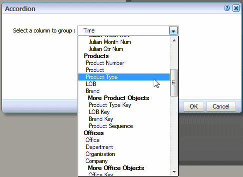
To create an accordion page:
-
Click New Page and then click Accordion.
-
Select the data column to define each section of the accordion. In this example, an accordion section is created for each Product Type.
-
Next select the measure field to aggregate for each section and select the aggregation type: Summation, Count, or Count Distinct. In this example, Revenue is summed.
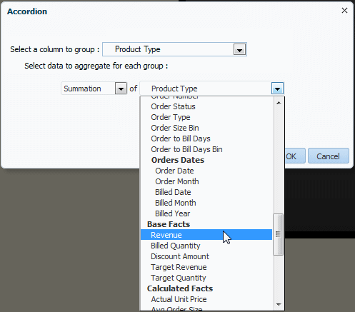
More formula types are supported for the measure field, see Section 5.6, "Features of Metric Fields."
-
Click OK to insert the accordion.
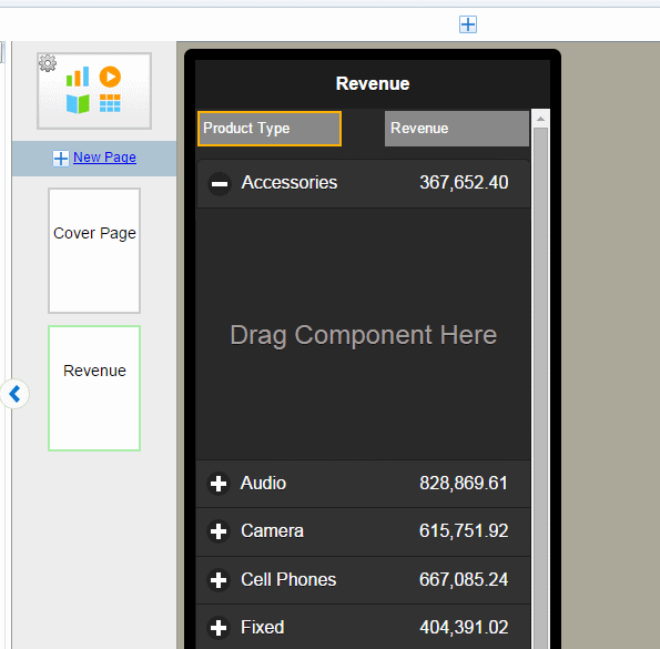
-
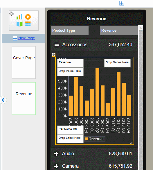
Now you can insert the components you want to display when each section is expanded. Simply drag the component to the Drag Component Here area of the first expanded accordion section and follow the procedures for inserting the specific component. To design your accordion page you only insert components in the first accordion section. In this example a chart showing revenue by quarter is inserted.
-
To preview your accordion page, click Preview. The example displays in the Preview page as shown in the figure. Expand and collapse the accordion sections to see the data for each section.
3.11.1 Adding Stoplight Formatting to the Accordion Page
See Stoplight Formatting for Navigation and Accordion Pages for steps on adding stoplight formatting to your accordion page.
3.12 Inserting Tables
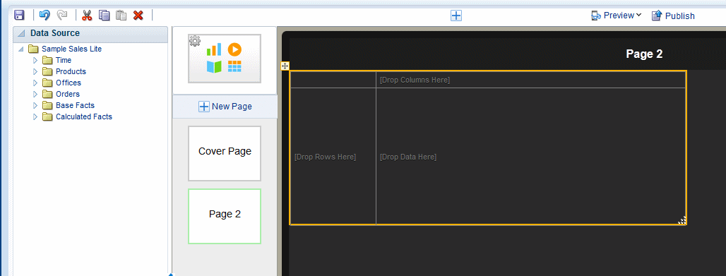
A default table includes a header, data columns, and a total row. The table supports "group left" functionality (outlines) that merges fields with the same values as well as subtotals, grand totals, and custom calculations.
For detailed information about table options see Section 5.1, "Working with Tables."
To insert a table:
-
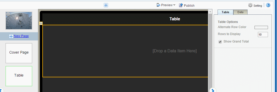
Click Insert, and then drag the Table component to the page.
Figure 3-58 shows an inserted, empty data table. Notice that the Table properties now display.
-
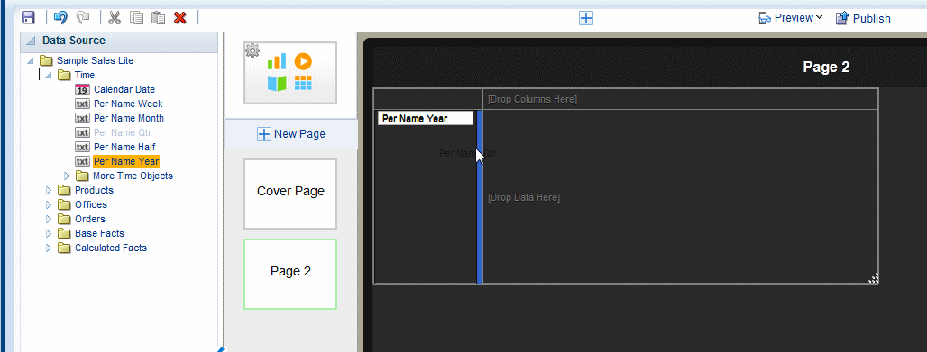
To add data columns to the table, select a field from the Data Source pane and drag it to the table.
Figure 3-59 shows adding columns to the table. Notice that when you drop a field on the table the sample data immediately displays.
-
Continue to drag the fields from the Data Source pane to form the columns of the table. If you must reposition a column that you have already added, select it and drag it to the correct position.
To resize columns, position the cursor over the column border until the cursor switches to a handler, then drag the column border to the desired width. Notice that as you drag the column edge the width in pixels displays to enable precise sizing.
Some formatting is applied to the table, specifically:
-
The inserted table includes a total row that displays the sum of the items in numeric columns. You can remove this row or edit the display and calculation applied. See Section 5.1.5, "Customizing Table Totals."
-
Numbers and dates display default formatting and alignment. To change the formatting, see Section 5.1.4.3, "Setting Table Data Formatting Options."
3.12.1 Customizing Tables
Edit the table properties using the Properties pane. As you select different areas of the table, notice that the Properties pane changes to display specific for properties for the area selected. The following palettes are available to customize the display of your table. For details see Section 5.1, "Working with Tables."
-
Table
-
Table Column Header
-
Column
-
Total Cell
3.13 Inserting Pivot Tables
A pivot table provides views of multidimensional data in tabular form. It supports multiple measures and dimensions and subtotals at all levels. Figure 3-61 shows a pivot table.
3.13.1 Inserting a Pivot Table
To insert a pivot table:
-
On the Insert tab, drag the Pivot component to the page. Figure 3-62 shows the empty pivot table structure.
-
Drag and drop data fields from the Data Source pane to the row, column, and data positions.
To create multiple dimensions, precisely drop each level to its position in the pivot table structure as shown in Figure 3-63.
You can stack multiple dimensions in both rows and columns.
-
Optionally resize the pivot table by clicking and dragging the handler in the lower right corner of the pivot table, as shown in Figure 3-64.
For more details about pivot table options, see Section 5.2, "Working with Pivot Tables."
3.14 Inserting Charts
The Mobile App Designer supports a variety of chart types and styles to present rich visualizations of your data.
After you insert a chart, you can edit the chart properties using the Properties pane. The Properties pane enables you to enter very specific custom settings for the following:
-
Chart Effect
-
Chart Legend
-
Chart Plot Area
-
Chart Title
-
Chart Label
-
Chart Values
Select the appropriate component in the map to see the available properties.
Topics:
3.14.1 Inserting a Chart
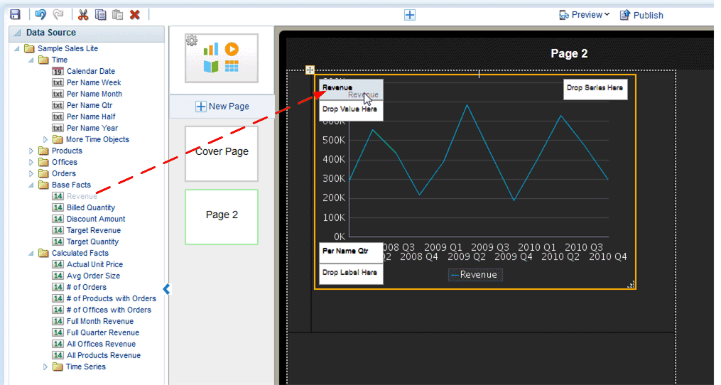
To insert a chart:
-
From the Insert menu, drag the Chart component to the page.
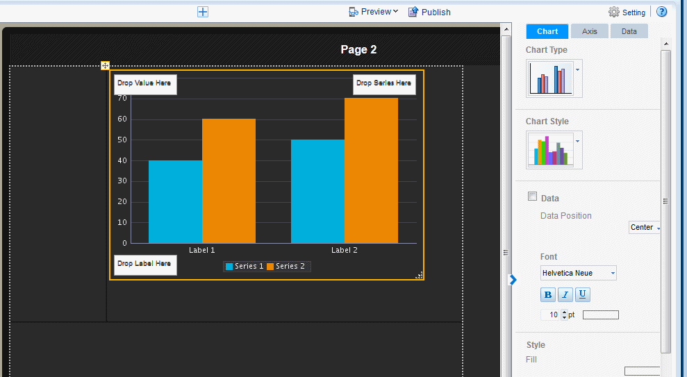
By default a vertical bar chart is inserted and the Chart properties are displayed, as shown in Figure 3-65.
-
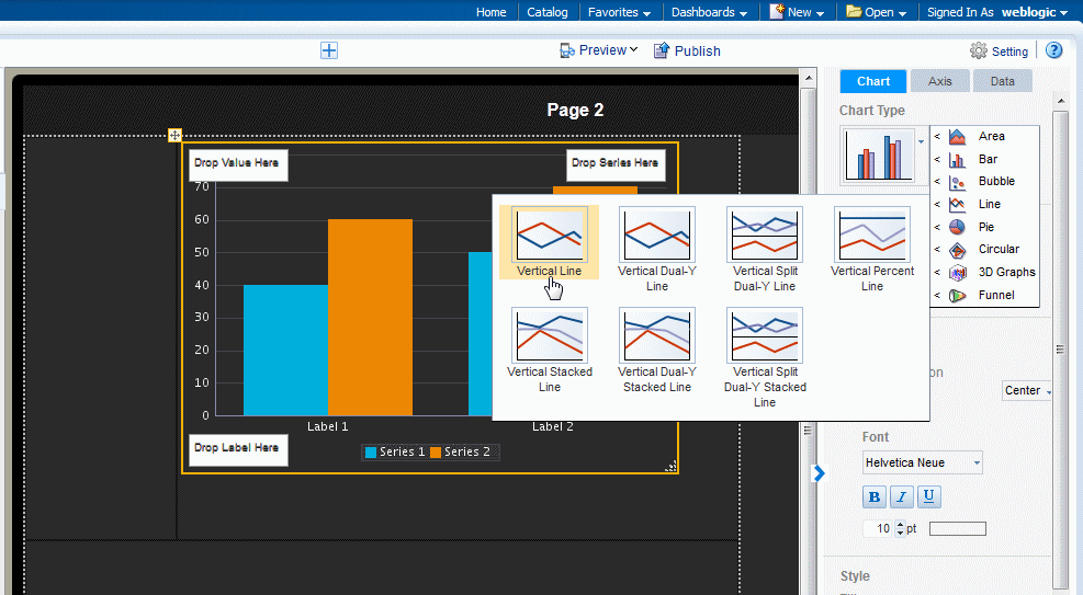
To change the chart type, click the Chart Type list to select the chart type required for your app. Figure 3-66 shows changing the chart type to Pie.
-
Drag the data fields from the Data Source to the appropriate areas in the chart. Where you drag a data element depends on the chart type and on the information you want to display.
For example, a vertical bar chart includes the following options:
-
Label
-
Value
-
Series
The chart immediately updates with the preview data, as shown in Figure 3-67
-
-
To resize the chart, drag and drop the resize handler on the lower right corner of the chart, as shown in Figure 3-68.
To preserve the aspect ratio when resizing a chart, press and hold the Shift key before dragging the handler.
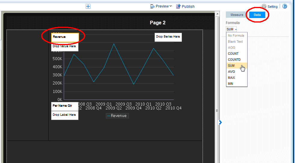
3.14.2 Changing the Formula Applied to a Chart Measure Field
By default, the chart displays a sum of the values of the chart measure. You can change the formula applied to a chart measure field using the Measure properties.
To change the chart measure field formula:
-
Select the measure field in the chart. This displays the Measure properties as shown in Figure 3-69.
-
Click the Data tab and select a formula from the Formula list. To include a more complex formula, use a Calculated Field. See Calculated Fields.
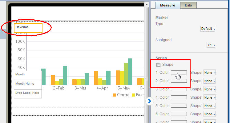
3.14.3 Changing the Series Color in a Bar or Line Chart
You can customize the appearance of your line or bar chart by updating the colors displayed.
To change the color of the lines or bars in a chart:
-
Select the measure field in the chart. This displays the Measure properties as shown in Figure 3-70.
-
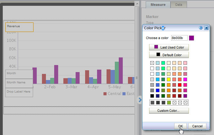
Click the Color box for the series member that you want to customize.
-
Use the Color Picker to select the color you want displayed in the chart. Repeat for each series member.
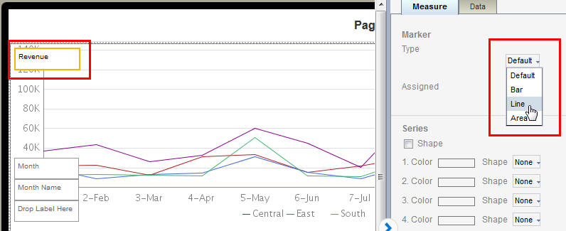
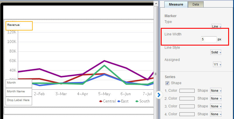
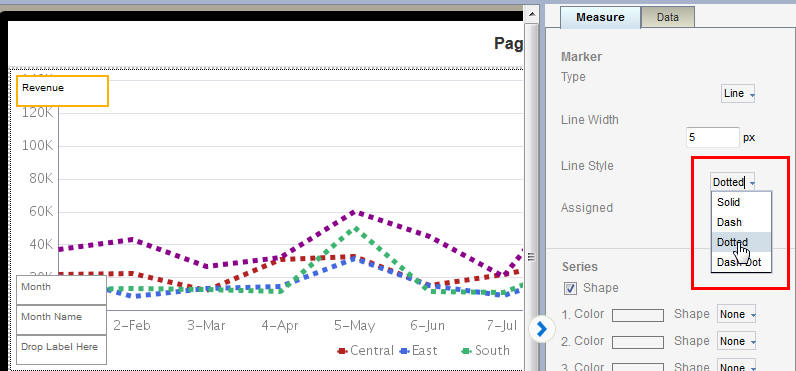
3.14.4 Changing the Width and Style of the Lines in a Line Chart
You can customize the appearance of your line chart by customizing the width and style of the lines.
To change the width of the lines in a line chart:
-
Select the measure field in the chart. This displays the Measure properties.
From the Type list, select Line as shown in Figure 3-72.
-
To customize the line width, update the pixel setting as shown in Figure 3-73.
-
To customize the Line Style, choose from Solid (default), Dash, Dotted, or Dot-Dash.
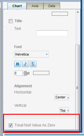
3.14.5 Setting the Treatment for Null Values
By default, null values are treated as a zero value. Depending on the nature of your data you may want to turn off this setting.
To turn off Treat Null Values as Zero:
-
Click within the chart to display the Chart properties tab.
-
Scroll to bottom of the Chart properties tab and deselect the Treat Null Values as Zero.
3.15 Inserting Maps
Use the map component to show how data is distributed across geographic locations.
Each map includes a preset region identifier that specifies how data is mapped to a region. For example, the region identifiers for the US States map are:
-
the full state name (for example, "Florida")
-
the two-letter state abbreviation (for example, "FL")
So if your data source identifies the state as "Florida" or "FL" the mapping engine correctly aggregates the data for Florida.
If your data does not include the region identifiers shown for the provided maps, you can edit the map files to meet your requirements.
The Locations map type uses latitude and longitude values to aggregate data for a location. To use the Locations map type, your data source must include latitude and longitude data values.
Mobile App Designer offers over fifty country and region maps that you can install and use. For the complete list and install instructions see the BI Mobile App Designer Maps Resource page at: http://www.oracle.com/technetwork/middleware/bi-foundation/map-code-2408077.html
To use custom maps with custom identifiers, see Section A.7, "Adding Custom Maps."
To help you get started using maps, watch the following videos:
3.15.1 Inserting a Map
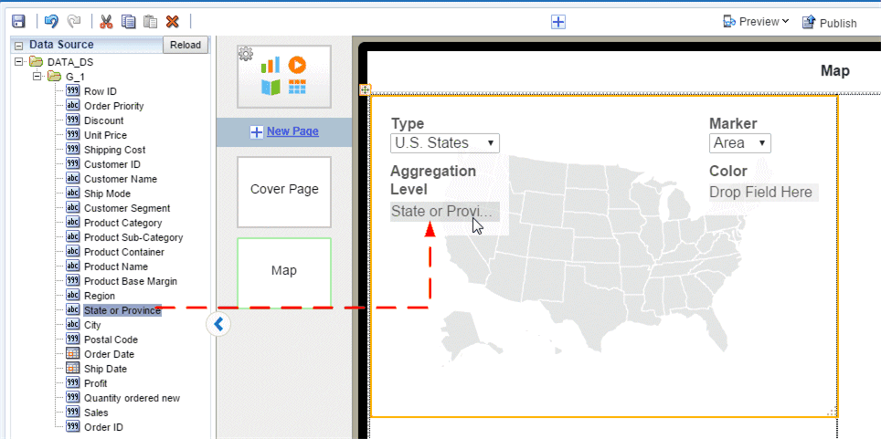
To insert a map on your app page:
-
Click Insert Component, and then drag Map to the area of the page you want to insert it.
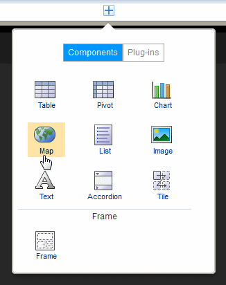
-
Select the Map Type.
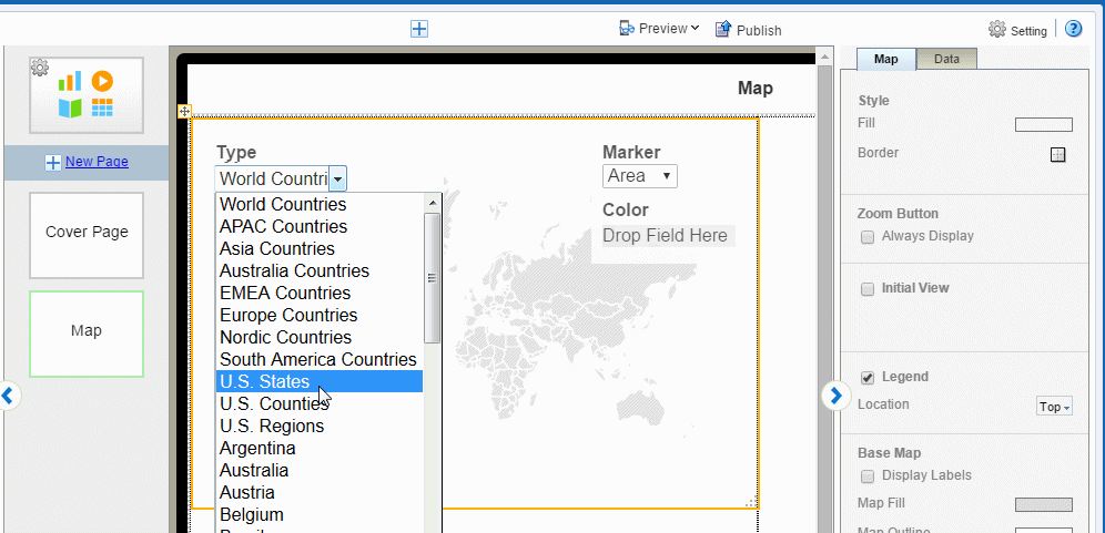
Mobile App Designer provides a set of maps. You may see more maps listed if your site has added custom maps.
-
Drag the data source field for which the data is to be aggregated to the Aggregation Level.
The Aggregation Level is the geographical entity for which data is aggregated. For example, in a United States map you would aggregate the data by state.
The values in your data for this field must match a supported region identifier for the map. For example, if you choose the US States map, the data field you assign to Aggregation Level must contain either the full state names (such as "Wyoming") or the two-letter state abbreviations (such as "WY").
Some examples are shown in the following table:
Map Type Aggregation Level Identifiers for the Aggregation Level World Countries Country Country Name, for example: "France" ISO3 three-letter country code, for example: "FRA"
ISO2 two-letter country code, for example: "FR"
US States State Full state name, example: "Wyoming" Two-letter state abbreviation, example: "WY"
US Counties County Two-letter state abbreviation _county name, for example: "IL_COOK" and "CA_ORANGE" Locations N/A Latitude and Longitude values, for example: "47N" and "122W" All others Varies See http://www.oracle.com/technetwork/middleware/bi-foundation/map-code-2408077.htmlIf your data does not include a supported identifier, you can edit the map files. See Section A.7, "Adding Custom Maps."
Longitude and Latitude (Locations Type Only)
If you selected the Locations map Type then your data source must include longitude and latitude values. Drag the appropriate data fields to the Longitude and Latitude positions in the map component.
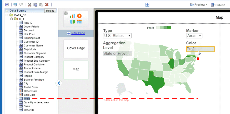
The Marker specifies how the aggregated data displays on your map. You can choose either Area or Circle (the Locations Map Type supports the Circle marker only).
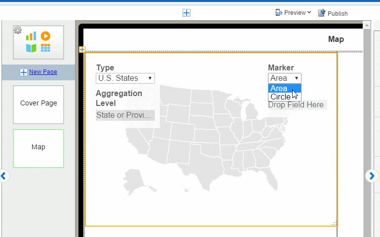
Area - In Area maps, the color of the region signifies the aggregated value. Drop the data value to be aggregated in the Color field. In the following example, the color of each State signifies the aggregated Profit.
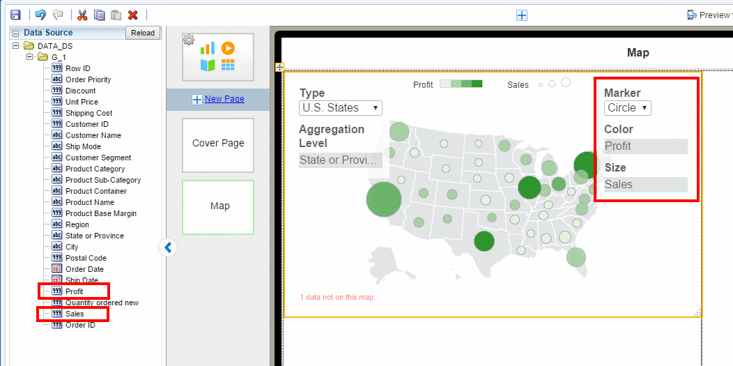
Circle - A circle displays at each location in the data that corresponds to the Aggregation Level. Circle markers can represent two dimensions by color and size.
In the following example, the color of the circle represents Profit while the size of the circle represents Sales.
3.15.2 Setting Map Properties
Properties you can set for maps include:
3.15.2.1 Setting the Initial Zoom Level and Map Center
You can configure how the map initially displays to users when the app opens by setting the zoom level and center location.
To configure the initial view settings:
-
Select the map to display the map properties.
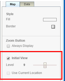
-
Select Initial View then set the Zoom level on the slider.
-
To set the center location, drag the map within the designer display area until the map is centered as desired. This setting is saved.
Use Current Location as Initial View
This option is enabled for Locations type maps only (maps that use latitude and longitude values). When you select Use Current Location as the Initial View, the app detects the user's current location from the browser and uses it as the center point of the map. For example, if you design a Sales app using latitude and longitude data, then when your app user gets off a plane in San Francisco and views the app, the map is centered in San Francisco. A different user of the same app getting off a plane in Chicago will see his map centered in Chicago.
3.15.2.2 Customizing the Base Map Display
You can customize your map to display a legend, the zoom buttons, and geographical labels.
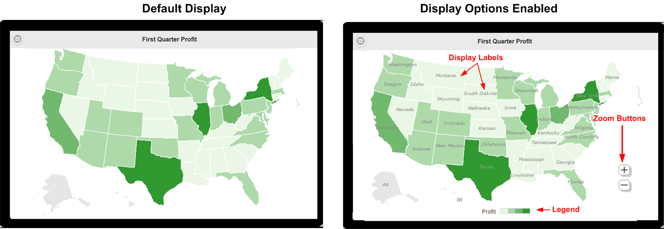
To set display options:
-
Select the map to display the map properties.
-
To display the Zoom Button, select Always Display.
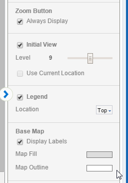
-
Legend - displays the legend to show the value of the markers. When Area marker is used, the color scale displays. When Circle marker is used, circle size scale displays as well.
You can set the Location of the legend to be the Top or the Bottom of the map,
-
Display Labels - displays the label (for example, Country Name or State Abbreviation) for each geographic element. The label used can be configured in the map configuration file (see Section A.7, "Adding Custom Maps").
-
3.15.2.3 Setting the Color Distribution of Circle or Area Markers
Use the color distribution properties to specify how the marker color is distributed across the data points.
The Cut Point sets the way the color distribution is calculated based on either an equal range of values or equal number of members.
By default the scale is Linear.
If your data points are mostly distributed near the maximum value, choose Power to enhance the color distinction between the higher numbers.
If your data points are mostly distributed near the minimum value, choose Square Root to enhance the color distinction between the lower members.
Scale cannot be set when the Cut Point is set to equal number of members.
Sets 0 as the center point of the color distribution.
Number of color steps between the lowest and highest values.
When set to Sequential, choose the Start and End colors to display. The lowest value displays the Start color and the highest values displays the End color. Values in between display color between the two according to your selections for Cut Point, Scale, and Number of Steps.
When set to Diverging, choose Start, Center, and End colors. The Center color is the mid point of the data values. The higher values diverge from the Center toward the End color, the lower values diverge from the Center color toward the Start color.
Set the slider to configure the opacity level.
3.15.2.4 Setting the Size Distribution of Circle Markers
You can configure how the circle size represents your data.
By default the scale is Linear.
If your data points are mostly distributed near the maximum value, choose Power to enhance the size distinction between the higher numbers.
If your data points are mostly distributed near the minimum value, choose Square Root to enhance the size distinction between the lower members.
Manually set the start (lowest value) and end (highest value) size of the circles in pixels.
3.16 Inserting Lists
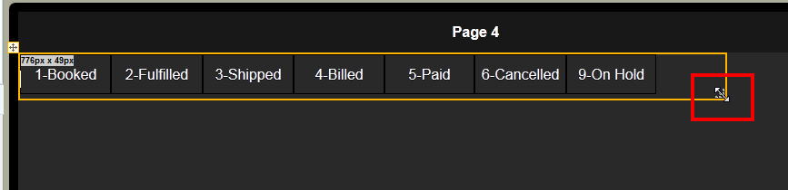
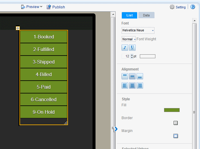
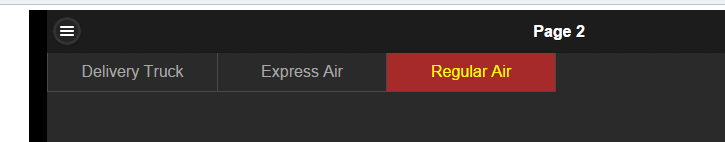
The List component displays all values of a data field in a vertical or horizontal interactive list that behaves as a filter for the other components on the page. Tap a list item to update the results in all other tables, charts, or other visualizations on the page. Figure 3-80 shows a page that displays two charts and a table. The list component across the top of the page displays order status. Tapping an order status updates the other components to show only results for the item tapped.
You can define default values for the list to be applied when a user first opens the page. This feature is useful when the unfiltered data set is large.
3.16.1 Inserting a List
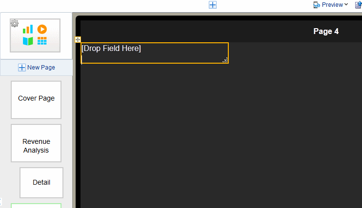
To insert a list:
-
Click Insert Component and then select List.
This inserts an empty list to the design area.
-
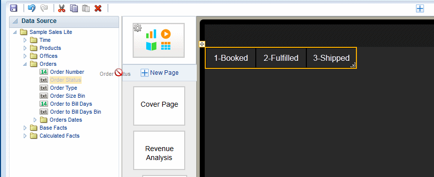
Drag an element from the Data Source pane and drop it on top of the empty list in the layout.
Figure 3-82 shows a list of Order Status values.
-
To change the size of the list in the page, click and drag the handler in the bottom right corner.
-
(Optional) Customize the appearance of the list and set defaults. See Customizing Lists.
3.16.2 Customizing Lists
Use the List Properties set to:
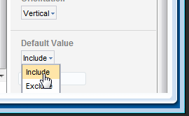
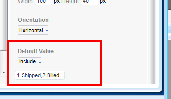
3.16.2.1 Specify Default Values for the List
You can configure your list to display only specific values when users first open the app page.
To specify default values:
-
Select the List to display its Properties.
-
In the Default Value property, choose whether to Include or Exclude the specified values.
-
Enter the default values. Enter multiple values separated by a comma. (Important: Do not enter spaces between the values.)
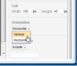
3.16.2.2 Change List Orientation
The list can display either horizontally across the page or frame or vertically down the page. To change the orientation of the list:
-
Select the List component on the page to display its Properties.
-
Under Orientation, select Horizontal or Vertical.
Figure 3-85 shows the Orientation property.
3.16.2.3 Customize Font and Background Styles
You can customize the list font and background styles for selected and nonselected modes.
To customize the font and background style when no list items are selected:
-
Select the list component in the design area to display its Properties.
-
Set the following properties in the Font region:
-
Font type and Font weight
-
Font Size
-
Border
-
Background Color
-
Font Color
-
The Selected Values properties control the appearance of the item in a list when it is selected. By default, the selected item displays as amber.
To customize the font and background style of the selected item:
-
Select the list component in the design area to display its Properties.
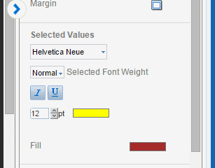
-
Set the following properties in the Selected Values region:
-
Font type, Weight, and Style
-
Font size
-
Font Color
-
Fill color when selected
-
3.17 Inserting Data Fields
You can insert a data field to display in your app by simply dragging it from the Data Source pane to the app page where you want it to display. To position data fields more precisely, or to insert fields side-by side, insert a frame first. See Inserting Frames.
3.17.1 Insert Data Fields
To insert a data field:
-
Select the area in the page where you want to insert the field.
-
Drag the field from the Data Source pane to the position in the app page.
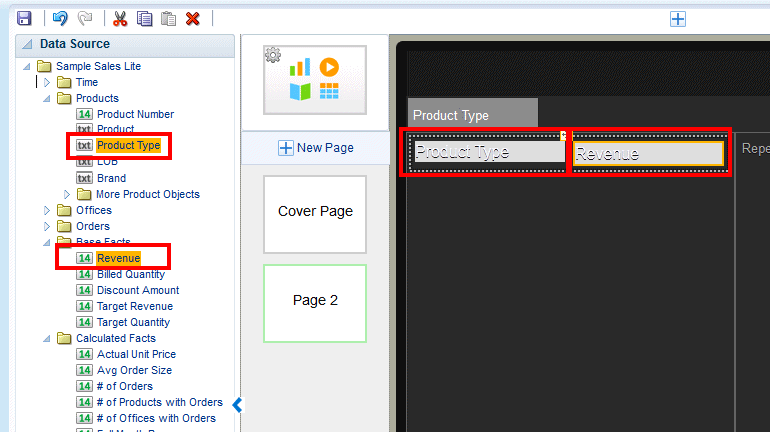
3.17.2 Display Data Fields Side-by-Side
To display data fields side-by-side as shown in Figure 3-89, insert a Frame first to position the data fields.
-
Select the area of the page to display the data fields. In this example, the area is a Tile.
-
On the Add Component menu, drag the Frame component to the desired position on the page (in this example, to the first tile).
-
In the Frame dialog, enter 1 Row and 2 Columns.
The Frame displays in the page.
-
Drag the data fields from the Data Source pane to the frame cells where you want the data to display.
3.18 Inserting Text
Use the text component to enter free-form text in the layout.
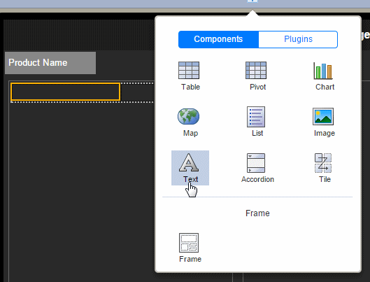
To insert text:
-
From the Add Component menu, select Insert Text.
-
Double-click the default inserted text to enter your text.
-
Use the Properties pane to customize the text display.
3.18.1 Display Text Items Side by Side
By default, when you insert a text item to a frame cell, the text box spans the length of the frame cell.
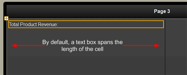
To arrange text fields side by side with data fields or other text fields, use a frame to align the elements. You can insert multiple frames inside outer frames.
Example: To display a data field in line with the text item:
-
Insert a frame.
-
Specify the columns and rows. This example uses a single row frame with two columns.
-
Select the frame cell and insert a text component.
-
Enter your text string in the Text field, for example: Total Profit.
-
Drop a data field inline with the text as shown in Figure 3-91.
3.19 Calculated Fields
The calculated fields feature enables you to create a calculated field using common expressions and then use it throughout your app. You define calculated fields by applying formulas or functions to the existing data fields in your app. You then drag this calculated field to the component in your app (charts, tables, tiles, sidebars) just as you would any other field in your data source.
Video: Adding Calculated Fields and Filters
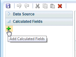
3.19.1 Adding Calculated Fields
To create a calculated field:
-
On the left-side accordion pane, click Calculated Fields.
-
Click Add Calculated Fields.
-
In the Calculated Fields dialog, enter a Name for your calculated field.
-
Select the functions and data fields to construct the calculated field:
Double-click the function name to add it to the calculation box. To add data fields, select the field and then use the shuttle button to position it in your formula.
When you select a function, the Syntax, Description, and an Example display on the right.
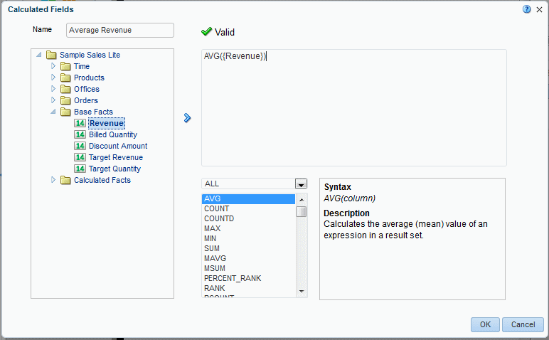
The expression is validated as you enter it.
-
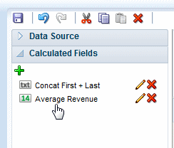
When you click OK the expression displays in the Calculated Fields list.
3.19.2 Adding Calculated Fields to App Components
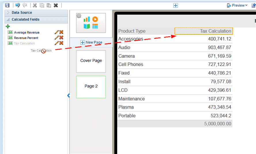
To add a calculated field to a component, simply drag and drop it from the Calculated Fields pane the same way you would a data field from the data source pane. Add calculated fields to tables, charts, lists, maps, pivot tables, sidebars, exploration page filters, and tile pages.
3.19.3 Editing Calculated Fields
To edit a calculated field:
-
Open the Calculated Fields pane.
-
Click the Edit icon.
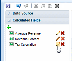
-
In the Calculated Fields dialog, edit the calculation and click OK. See Adding Calculated Fields for descriptions of the dialog fields.
3.20 Global Filters
You can define named, global filters and then apply these filters to charts, tables, and tiles throughout your app. Using global filters enables you to define a filter once and use it multiple times.
Video: Adding Calculated Fields and Filters
3.20.1 Adding Global Filters
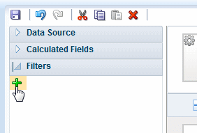
To add a global filter:
-
On the left-side accordion pane, click Filters to open the Filters pane.
-
Click Add Filter.
-
In the Filter dialog, enter the fields to define the filter.
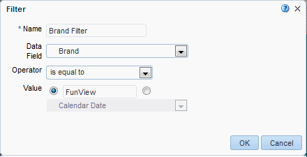
Table 3-1 Fields to Define Filters
Field Description Name
Enter a name for this filter.
Data Field
Select the data field to define the filter. All fields from your data source are available.
Operator
The available operators depend on the data type of the Data Field selected (numeric, text, or date). Not all operators listed display for each data type. Select the operator to define the qualifying criteria for your filter:
is equal to
is not equal to
is less than
is greater than
is less than or equal to
is greater than or equal to
is between
is in top
is in bottom
is null
is not null
is in
is not in
contains
not contain
starts with
ends with
is in last N days
is in next N days
Value
In the Value field, specify one or more values to use when applying the filter or condition. You can enter a static value or select a data field.
3.20.2 Applying Global Filters
You can apply global filters to charts, tables, tiles, and maps.
To apply a global filter to a chart, table, tile, or map:
-
Select the chart, tile, table, or map in the work area to display the properties for the component.
-
On the Properties palette, select the Data tab.
-
On the Data tab, click Add Filter.
-
Choose the filter to apply from the list.
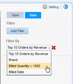
-
To apply more filters to the component, repeat steps 3-5. Filters are applied in the order you arrange them
3.20.3 Editing Global Filters
To edit a global filter:
-
Open the Filters pane.
-
Click the Edit icon.
-
In the Filters dialog, edit the criteria and click OK. See Adding Global Filters for descriptions of the dialog fields.
3.21 Customizing Background Images
You can add an image to an app page background and configure the display characteristics of the image. A background image enables you to add other app components on top of it.
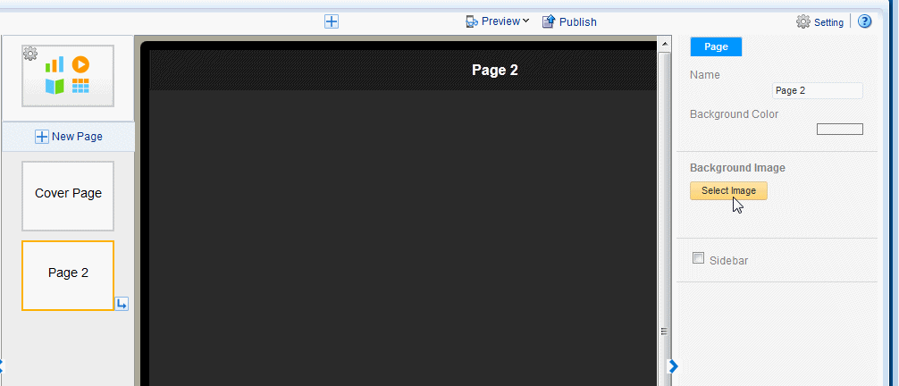
To add a background image to a page:
-
Select the page to enable the Page properties. The example in Figure 3-93 shows the Page properties.
-
Under Background Image, click Select Image to choose an image.
-
In the Insert an Image dialog, specify the source for the image:
-
Select the image from a local directory: Click Browse to specify the file name and directory of the image on a local or mapped drive to upload the image.
-
Enter the URL for the image: Enter the URL where the image is stored.
-
Select the data field for the image URL and for the alternative text:
Image URL: Select the field from the data that contains a URL to an image.
Alternative Text: If the data includes a field that contains alternative text for the image, then select that field to display alternative text.
-
-
Click Insert to insert the image to the app page. By default, the image is scaled to fit the page.
You can now add app components on top of the background.
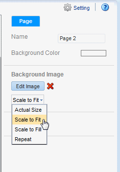
3.21.1 Sizing the Background Image
To configure the size of the background image:
-
Select the page to enable the Page properties
-
Select a fit option from the menu.
-
Actual Size - displays the image according to the actual pixel dimensions.
-
Scale to Fit - expands the image maintaining the scale until one dimension reaches the edge. If one dimension reaches the edge of the canvas and the other dimension has not, then that area of the canvas is not covered.
-
Scale to Fill - expands the image maintaining the scale to cover the entire canvas. If one dimension extends past the canvas for the other dimension to reach the edge, the image dimension that extends past the canvas is cropped.
-
Repeat - repeats the image at actual size to fill the canvas. Use this option to use a small image to create a pattern or texture in the background.
-
3.22 Adding Sidebars
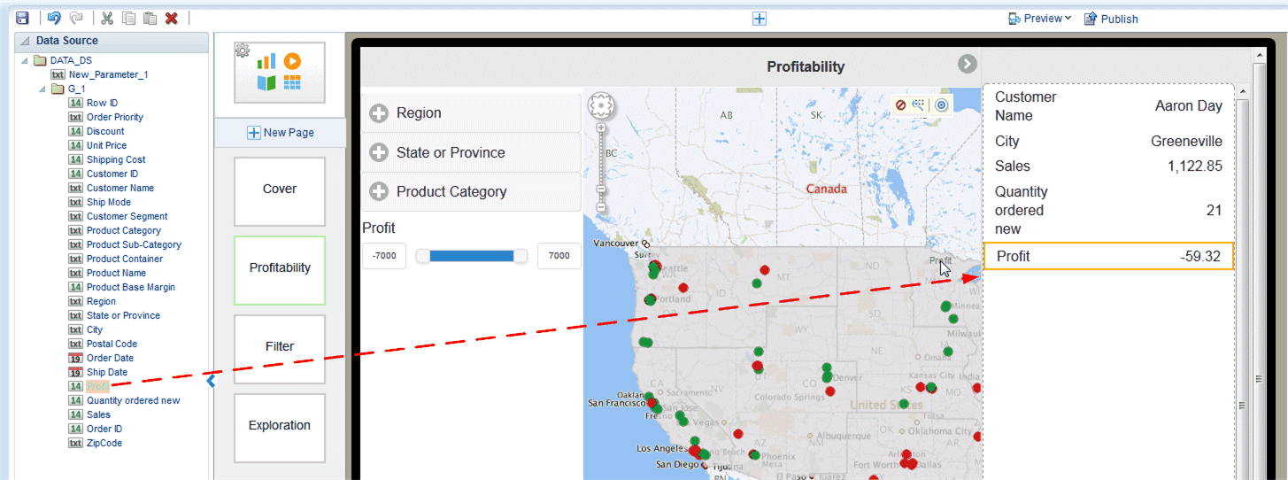
A sidebar provides pop-up detail information when you tap a chart, a map, or tile on ta page. The following figure shows a page with sidebar enabled. Tapping a value on the page, such as the city of Miami on the map, launches the sidebar on the right side of the page showing detail information for the selection.
Video: Adding Detail Information Using Sidebars and Subpages
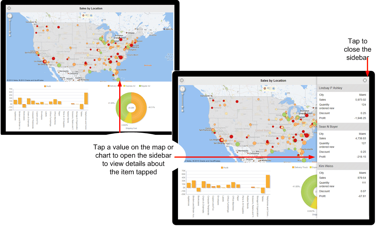
To close the sidebar, click the close icon in the upper right corner.
Use the sidebar when you want to provide a set of detail information about the values shown on your page and still maintain the context by staying on the app page. If you want to provide a full set of drill-down visualizations, consider using a subpage instead (see Main Pages and Subpages).
Design Note:
A page can support either a sidebar or a subpage, but not both. When designing your page, consider the amount and type of information you want to display from each touch point. If you want to supply a simple table-style list of additional data, then a sidebar is most likely appropriate. If you want to supply additional visualizations, such as charts and tables driven by the touch point, then a subpage would be more appropriate.Note the following about sidebars:
-
A sidebar is enabled at the page level. If you want every page of your app to display a sidebar, you must set up the sidebar for each page.
-
The sidebar is activated at run time when you tap a value on a chart, a map, or a tile.
-
You can define one sidebar per page; therefore, all items that can activate the sidebar display the same set of fields. In the example in Figure 3-97 the fields Customer, City, Sales, and so on display when you tap a value on either the charts or the map.
To add and customize a sidebar to your app page see the following sections:
3.22.1 Inserting a Sidebar
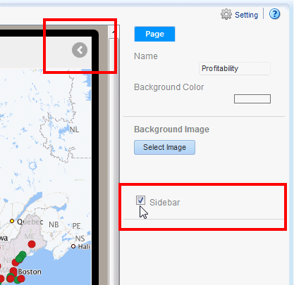
To add a sidebar to an app page:
-
Select the app page.
-
On the Properties pane, set the Sidebar property to True. After you set the property, the Sidebar indicator displays in the upper right corner of the page, as shown in the following figure.
-
Click the Sidebar indicator to open the sidebar panel for editing.
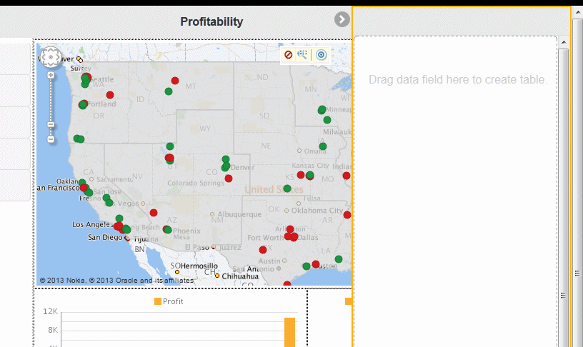
-
Drag the data elements that you want to provide detail for from the Data Source pane to the Sidebar panel.
The sidebar presents the data as a table. You can customize how the data displays and also apply grouping.
-
(Optional) Adjust the label field size for the sidebar label column. To adjust the space allowed for the label field
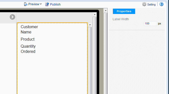
3.22.2 Adjusting the Label Field Width
By default the label field width is 100 pixels. The label field width is set for the entire sidebar and cannot be adjusted individually for data fields.
To adjust the label column width for the sidebar:
-
Click the edge of the sidebar component to select the entire component.
-
In the Properties pane, enter the width in pixels for the label field.
3.22.3 Customizing the Fields in the Sidebar
You customize each field in the sidebar individually. When you select a field, the Field properties display. Use the Field Properties set to group data fields and customize the display. You can perform the following for a data field in the sidebar:
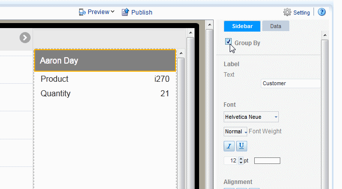
3.22.3.1 Group By a Data Field
The Group By feature groups occurrences of the specified data field together, aggregating the values of the other fields. For example, suppose in your sidebar you place the data fields:
-
Customer
-
Product
-
Quantity Ordered
If you Group By Customer, the sidebar shows one entry per customer with all the customer products grouped below the single entry. See the example in Figure 3-99. The ungrouped sidebar shows multiple entries for a single customer, the grouped entry creates one entry per customer.
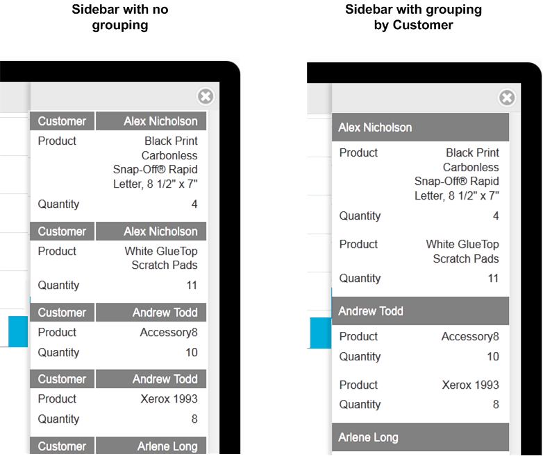
To group the fields in your sidebar:
-
Select the data field in the sidebar to display its Properties.
-
Select Group By.
3.22.3.2 Apply a Formula
By default, numeric fields are summed. You can change the formula in the Properties pane to a basic predefined formula.
To change the formula:
-
Select the data field in the sidebar to display its Properties.
-
Click the Data tab.
-
Choose from the list of formulas. The following formulas are supported: No Formula, Blank Text, Count Distinct, Sum, Average, Maximum, and Minimum.
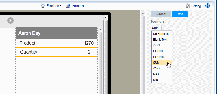
To apply a more complex formula to a data field, use the Calculated Fields feature to create the field then add it to the sidebar. See Calculated Fields.
3.22.3.3 Customize Data Formatting
Customize the formatting applied to a number, date, or currency field. See Section 5.6.1, "Apply Data Formatting."
3.22.3.4 Customize Labels, Fonts, and Background
Use the Properties for the sidebar Field for customizations such as:
-
Edit the label shown. The default label comes from the data, for example "Quantity ordered new". Use the Label property to edit the display name.
-
Edit font, font color, font background for both the data and the label.