A Decision Manager User Interface Reference
This appendix contains reference information for the main Decision Manager user interface screens and screen areas.
This appendix contains the following topics:
A.1 Decision Manager User Interface Schematic
Figure A-1 shows a general schematic for the Decision Manager user interface screen areas, after login. An annotated example of a Decision Manager screen, showing the details for a choice, appears in Section A.1.1.
Figure A-1 Schematic of the Decision Manager User Interface Screen Areas
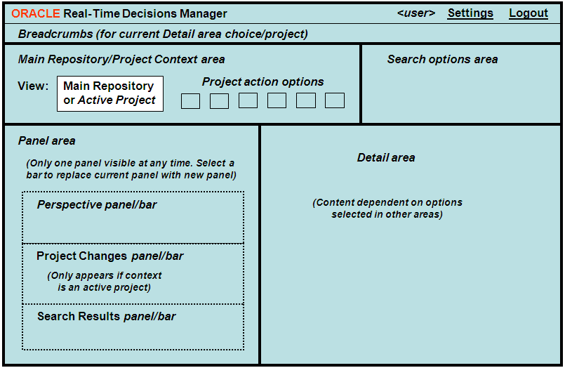
Description of "Figure A-1 Schematic of the Decision Manager User Interface Screen Areas"
While the relative position of each of the screens areas remains constant in a Decision Manager user session, the content of some screen areas depends on the operation being performed. Details of each of the screens areas, and how they are affected by user operations, appear later in this appendix.
A.1.1 Example of Decision Manager Screen
The Decision Manager screen example, Figure A-2, shows the details for a choice, Credit Watch Plus Banner Ad, with the main screen areas annotated.
Figure A-2 Annotated Example of Decision Manager Screen
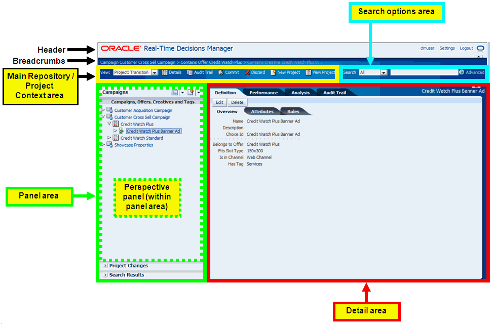
Description of "Figure A-2 Annotated Example of Decision Manager Screen"
Note that the annotations indicate the main generic use of the areas, which in general do not have specific fixed headings.
A.2 Header Area
The header area consists of two lines:
-
Header line
-
Breadcrumbs line
-
Application Name Banner (can be configured for individual applications)
-
User name
Name entered on the Login screen
-
Settings
General Settings for the application. Some settings are available only for users with specific administrative permissions.
See Section A.12, "Settings" for more details.
-
Logout
Breadcrumbs are only visible if choice details appear in the detail area, such as when the choice is being viewed or edited.
The parents shown in the breadcrumbs are based on the perspective and the current choice in the Perspective Panel/Bar.
For instance, for a Creative:
-
If the perspective is Campaigns, the breadcrumbs will show: Campaign grandparent campaign name > Contains Offer parent offer name > Contains Creative creative name
-
If the perspective is Channels (a perspective that does not include creatives), the breadcrumbs will show only: Creative creative name
The parents are based on the current project (the parents can be different in the Main Repository), and clicking a parent displays the parent in the Detail area based on the current project.
A.3 Main Repository/Project Context Area
The Main Repository/Project context area has the following components:
-
View
This box specifies the context in which the user wants to operate - either the Main Repository or an active project.
The Main Repository is the database containing the dynamic choices that may be accessed by and used for processing Oracle RTD decisions in customer applications. This set of choices is updated each time a project is committed.
The Main Repository context is mainly for viewing choices, viewing projects, and, if required, adding audit trail comments. You cannot create, edit, nor delete choices in the Main Repository context. With the correct permission, you can create a project, at which point, the context will automatically become that new project context.
In a project context, depending on your permissions:
-
You can create, edit, and delete choices
-
You can edit the current project and create other projects
All users can add audit trail comments.
-
-
Context Area Operations
The six possible operations are: Details, Audit Trail, Commit, Discard, New Project, and View Projects.
The first four operations - Details, Audit Trail, Commit, Discard - are enabled according to the context that is selected and the permissions that you have. New Project and View Projects are independent of the context. See Figure A-3 for an overview of the cases where each operation is enabled and examples of Main Repository and project context areas.
As Commit and Discard denote actions to be performed on a specific project, Commit and Discard are only enabled when the context selected in the View box is an active project.
Figure A-3 Main Repository/Project Context Area Elements
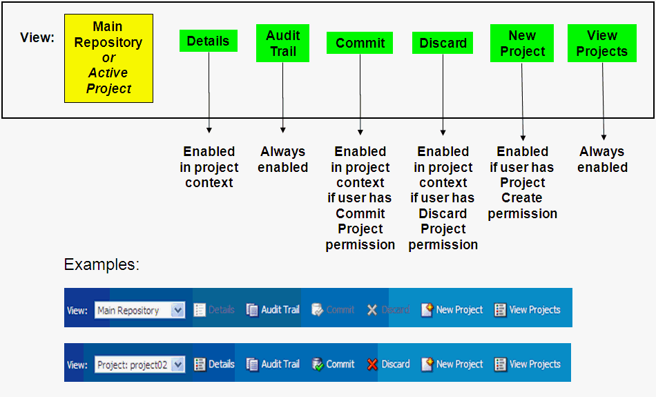
Description of "Figure A-3 Main Repository/Project Context Area Elements"
Note:
The operations View Projects and New Project (with user possession of the Project Create permission) can be used in either a Main Repository context or a project context. In a project context, they do not relate to the current project.If the Decision Manager user interface screen is wide enough, the operations appear as icons with accompanying text. If the screen width is reduced, some or all of the icons and text may not appear; instead, you can click the chevron icon at the right end of the Main Repository/Project context area (just before the Search area) to expose a dropdown list of the operations that did not appear as icons. Figure A-4 shows examples of "reduced screen" versions of the context area - for a Main Repository context and for a project context.
Figure A-4 Reduced Screen Versions of Context Area
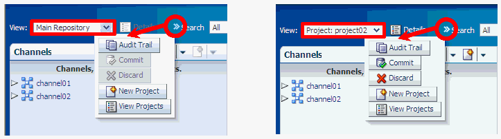
Description of "Figure A-4 Reduced Screen Versions of Context Area"
A.4 Panel Area
The panel area displays information about the current perspective choice, the changes in a project (if the current context is an active project), or the results of the most recent search.
Details of only one option appear in a panel, the other options appear as bar entries. You can toggle between the options to select which details to show in panel form.
Typically, most of the time in most Decision Manager user sessions, the panel area displays the choices in the current perspective, and the Project Changes and Search Results options appear as bars at the foot of the panel area.
This section contains the following topics:
A.4.1 Perspective Panel/Bar
Perspectives is a tree view of a subset of the choices and relationships defined in the Decision Graph for the Decision Management application.
For examples of perspectives defined for marketing organizations, see Section 2.2.2, "Oracle RTD for Marketing Optimization Perspectives."
The Perspective Panel body displays actual choices of each choice type, initially showing all the actual choices of the "top" choice type of the perspective - following the Campaigns perspective example, these are all the Campaign choices.
Folder Tree for Choice Group Relationships
In general, relationships between choice groups are represented by folders in the Perspective Panel through indented folders.
In the Perspective Panel body, choices can be expanded to display "lower-level" related choices, and, apart from "lowest-level" choices, collapsed as well. These options are available through right-clicking the icon immediately to the left of the choice (or the extreme right-hand side of the choice box, but not the choice itself).
An example of a Campaigns perspective illustrates the indented folders and the options to collapse and expand lower levels of the hierarchy tree:
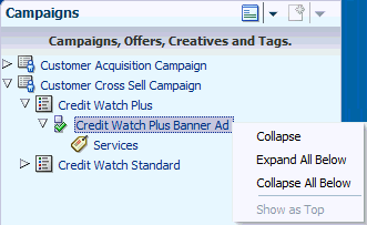
Description of the illustration foldc.gif
When each choice group in a perspective relates to only one other choice group, the successive folder indentations in the Perspective Panel simply reflect the relationships between the choice groups.
Multiple relationships can also be defined for one higher-level choice group to several other immediately-lower-level choice groups (for example, Slot Type to Creative and Slot Type to Slot). If all these choice groups appear in one perspective, you can configure extra, intermediate folders to appear in the perspective tree. These extra folders typically include the names of the different choice groups, as in the following example:
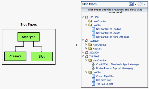
Description of the illustration fold_stcs.gif
If you choose not to have these intermediate folders, all lower-level choices appear directly under their higher-level choice. As in all perspectives, the choice group icon that appears to the left of each choice determines which type of choice it is.
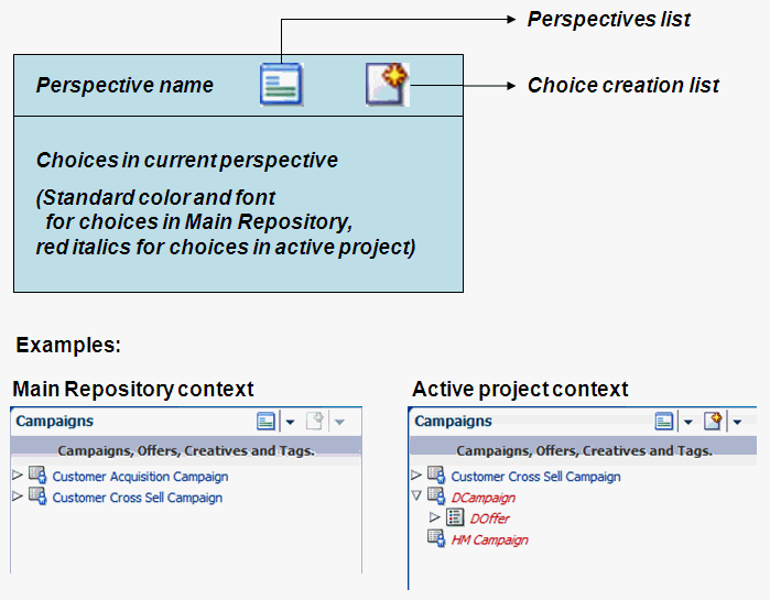
Perspectives List and Choice Creation List
Figure A-5 shows the general schematic for a perspective panel, with examples of two perspective panels, one for a Main Repository context, and one for an active project context.
The header for a Perspective panel is the perspective chosen from the Perspectives list icon. The default perspective is the first perspective in the Perspectives list.
When you want to create a choice for a choice group (which does not have to be in the current perspective), you can select your choice group from the Choice creation list.
The icons to the left of a choice enable you to expand and collapse choice hierarchies in the Perspective panael. Click the arrowhead icon (right-pointing or downward) to expand or collapse a choice, or select your Expand or Collapse option from the menu that appears when you right-click the icon immediately to the left of the choice.
Figure A-5 Perspective Panel Schematic and Examples
Description of "Figure A-5 Perspective Panel Schematic and Examples"
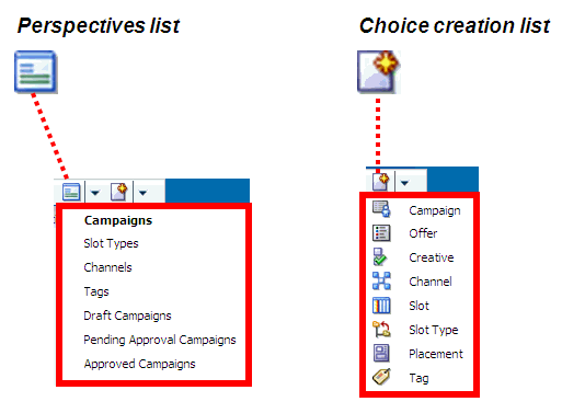
Figure A-6 shows examples of a Perspectives list and a Choice creation list.
A.4.2 Project Changes Panel/Bar
The Project Changes panel, when selected to be shown, displays a list of the changes in the current project.
A.4.3 Search Results Panel/Bar
The Search Results panel, when selected to be shown, displays the results of the most recent search.
A.5 Search Options Area
The Search options enable you to perform simple and advanced searches, as summarized in Figure A-7.
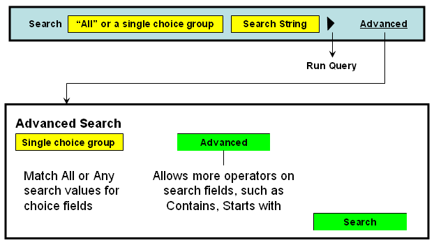
Results of a search appear in the Search Results panel which either opens up or refreshes in the panel area. The Detail area and the breadcrumbs are not altered by the search.
Simple searches are for strings that occur in choice names or choice descriptions (if your application is in the special mode "owership=on", then the search will also search on choice owner).
The context that you are in affects the extent of the search. For Main Repository context, searches are in the Main Repository only. For active project context, searches are in the Main Repository and in the active project.
In the first search box, select "All" to select across all choice group types, or select a single choice group to restrict the search to choices of that particular choice group type.
Enter your search parameters in the second box ("%" denotes wildcard), then click the Run Query icon.
By default, any string entered in the second box without "%" is treated as a "contains" search. For example, a search string of "amp" searches for objects that contain the string "amp" in either the choice name or the choice description.
The results appear in the Search Results panel.
The following example shows the effect of two simple searches, one that is restricted to the Main Repository only, the other that is performed in the context of the active project Retention Project.
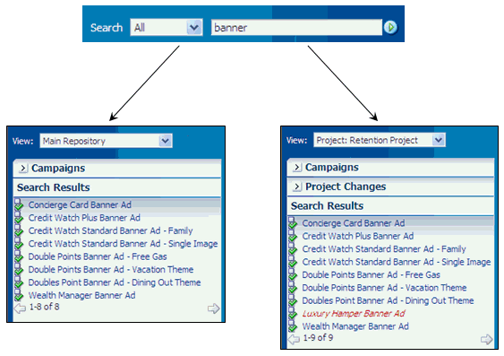
Description of the illustration simple_searches.gif
The context that you are in affects the extent of the search. For Main Repository context, searches are in the Main Repository only. For active project context, searches are in the Main Repository and in the active project.
Advanced searches enable you to search on any choice column value, and to include column conditions such as Starts with, Ends with, On or after (for date fields), Between, Does not contain.
Note:
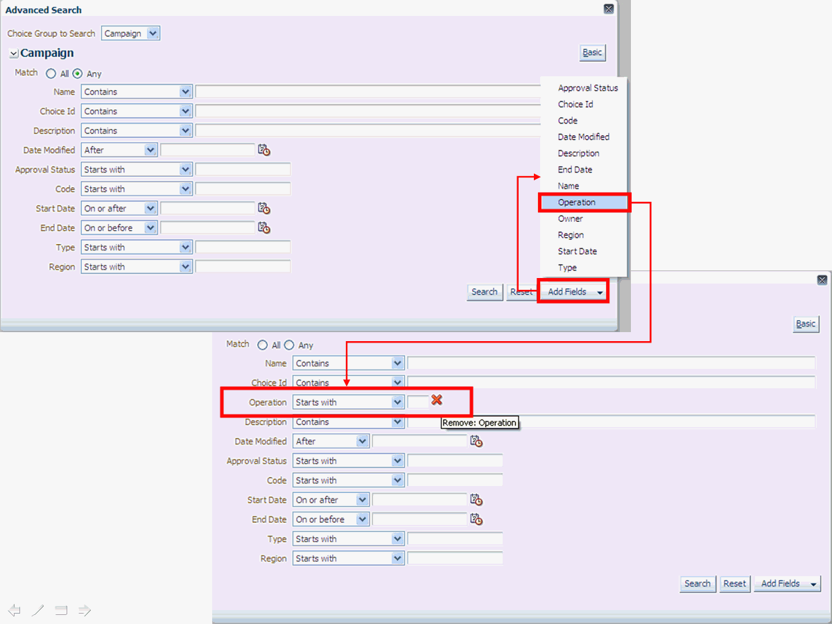
Advanced searches are always within a particular choice group type, that is, not across choice group types.Click Advanced and select a choice group type.
There are two levels of Advanced search. At the first level, enter one or more advanced search parameters and values. To use the wider range of column conditions, click Advanced again, and enter one or more advanced search parameters and values.
When you enter more than one search condition, you can control whether the search should match All or Any (that is, at least one) of your search conditions.
After you click Search, the results appear in the Search Results panel in the Panel area.
Note:
Each time that you perform an advanced search on a choice type in a single login session, the search parameters that you enter are retained and reappear in the Advanced Search window the next time that you perform an advanced search for the same choice type. The search parameters are not retained across sessions.Figure A-8 and Figure A-9 show examples of the two levels of Advanced Search for a Campaign search, and the extra options available for the Region field in the second level search.
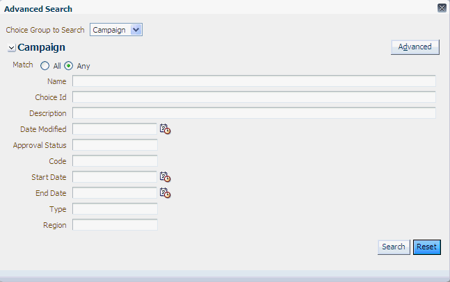
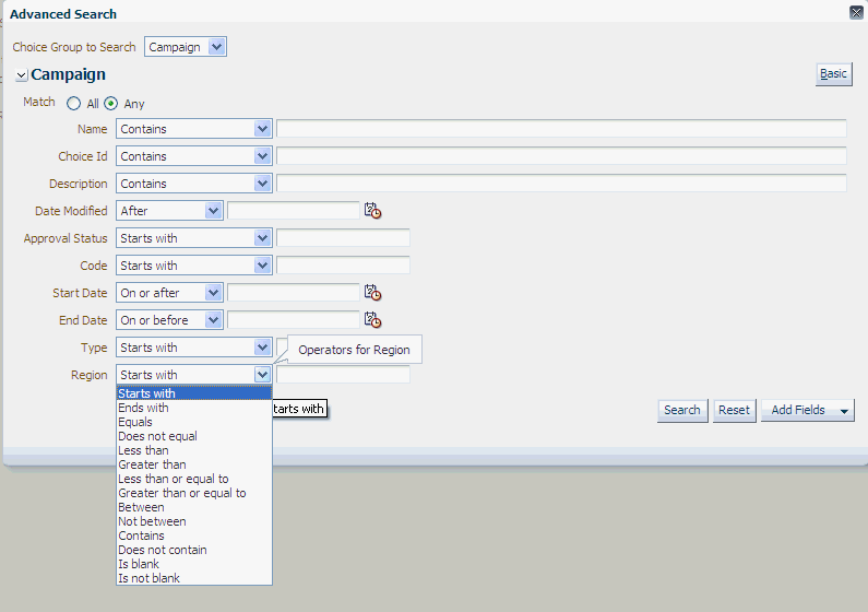
Figure A-10 shows an example of how you can add a field to the Advanced Search screen.
A.6 Detail Area
The detail area is the main work area for a Decision Manager user session. Contents of the detail area depend on options selected in other areas.
The main categories that control the layout and operations in the detail area are:
A.7 Create Project
The Create Project page enables you to create a new project.
To create a project, you must have the necessary permissions. For details, see the sections "Security XML Files" and "User Interface Metadata Tags" in Oracle Real-Time Decisions Base Application Decision Management Installation and Configuration Guide.
Click New Projects from the Main Repository/Project context area.
The Create Project page appears, with empty fields Name, Description, and Audit Trail Comment.
Other project attributes, such as Type, may also appear, depending on how the project choice view pages are configured.
Enter a value for Name, optionally Description, and Audit Trail Comment, and enter or select values for any other fields that have been configured to appear.
Based on your configuration, there could be multiple pages to go through, using the Next button, before the final OK.
Click OK to complete the project creation.
After successful completion of the project creation, the new project automatically becomes the new context.
The Perspective panel, if open, displays the choices for the current perspective as they exist in the Main Repository. If the Perspective panel is not open, you can click the perspective bar to display the panel and the perspective choices.
A.8 Project Details
The Project Details page enables you to view and edit an existing project.
To view and edit projects, you must have the necessary permissions. For details, see the sections "Security XML Files" and "User Interface Pages" in Oracle Real-Time Decisions Base Application Decision Management Installation and Configuration Guide.
Click Details from the Main Repository/Project context area - your context must be a project.
The Project Details page appears, displaying the current project field values. If you have permission to update the project, the Edit button also appears in the page.
If you click Edit, you can edit the project fields, then click OK (or Cancel to undo any changes).
Based on your configuration, there could be multiple pages you can edit before the final OK.
Any edits that you performed are logged in the Audit Trail for the project, but they do not appear in the Project Changes Panel/Bar, as they are not changes within the particular project.
A.9 View Projects
The View Projects page enables you to view details of current active and previously-committed projects.
The View Projects page appears when you log on to Decision Manager.
Subsequently, you can access it by clicking View Projects from the Main Repository/Project context area.
The top and bottom areas of the View Projects page display information and options for Active Projects and Committed Projects respectively, as in the following example:
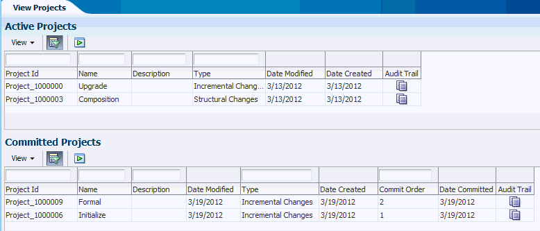
Description of the illustration view_worp_projs.gif
Depending on your configuration, additional project attribute columns could appear in the View Projects page.
In both the Active Projects and Committed Projects areas, you can search on project fields and project create and modification dates. You can also view choice-level audit trail comments on active projects or on previously-committed projects.
More details about accessing project information appear in the sections that follow:
A.9.1 Project Information Columns
Figure A-11 shows how you can control the columns that you want to appear in the Active Projects or Committed Projects areas.
Figure A-11 Project Search Column Control
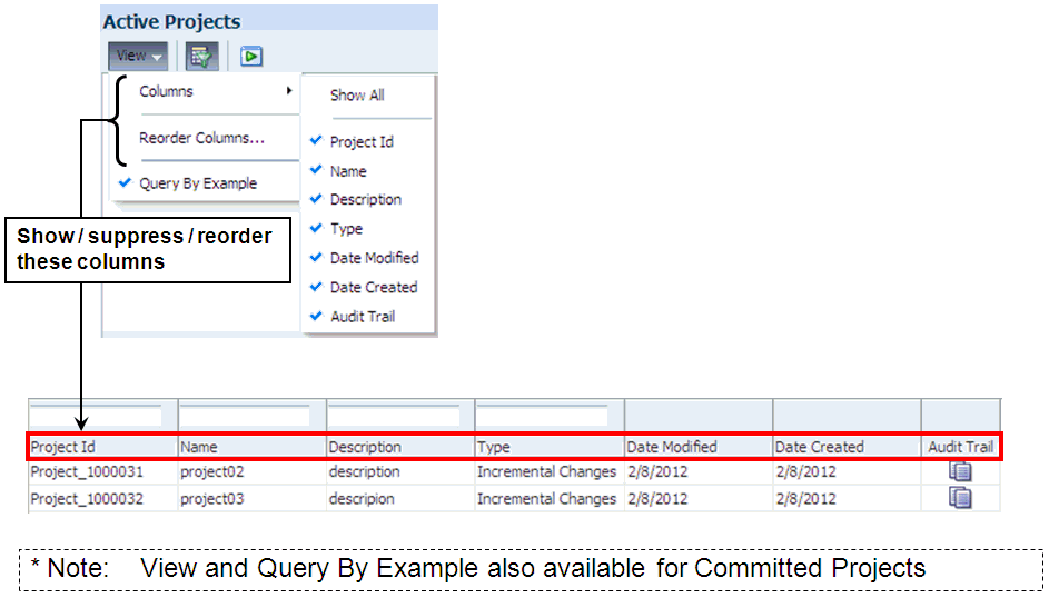
Description of "Figure A-11 Project Search Column Control"
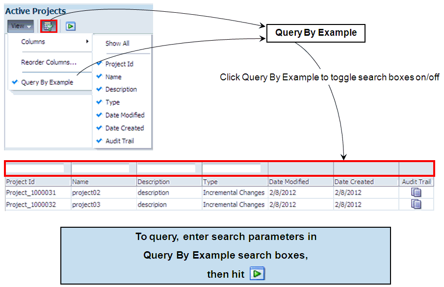
A.9.2 Project Information - Query By Example
Figure A-12 shows:
-
How you query projects
-
How you can toggle the project search boxes on and off
You can do this either from the View > Query By Example menu option or the Query By Example menu icon.
A.10 Create Choice
To create choices for a choice group, you must have the necessary permissions. For details, see the sections "Security XML Files" and "User Interface Pages" in Oracle Real-Time Decisions Base Application Decision Management Installation and Configuration Guide.
To create choices, you must follow a train of process stages, that appears at the top of the Create page.
To create a choice, in addition to having the right privilege, you must be in an active project context.
In the Perspective panel, click the Choice creation list icon, and select the choice group for which you want to create your choice.
Note that you can select any choice group from the dropdown Choice creation list. Your selection may be in the same perspective as shown in the current perspective panel, but it does not have to be.
The initial display of any choice is a Create selected_choice_group page. Under the Create... heading, there is a "page train", which determines the sequence of pages to be displayed during the create process.
The specific pages of the train and the content of those pages depend on how the choice was configured for Decision Manager.
Typical trains may be:
-
Overview - Attributes - Rules - Confirm
-
Overview - Rules - Confirm
-
Overview - Confirm
The following description assumes that the page train for the choice group is Overview - Attributes - Rules - Confirm.
The fields in the Overview dialog for you to fill in are Name (mandatory to fill in) and Description (optional).
If your choice group is a child group in one or more relationships, the Overview page can typically also contain widgets for relationships. For each mandatory relationship, represented by a widget marked with an asterisk, you must select a value.
If your choice group is in a many-to-many relationship, you may select one or more choices from an Available list into a Selected list.
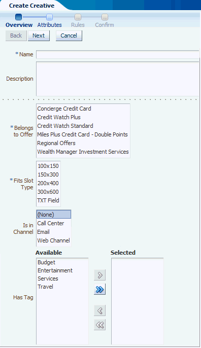
Description of the illustration cc1.gif
The following description assumes that the page train for the choice group is Overview - Attributes - Rules - Confirm.
In the Overview dialog, enter or select values for all mandatory widgets, and as many of the optional widgets as you require.
Click Next to proceed to the Attributes dialog.
In the Attributes dialog, enter or select values for all mandatory widgets, and as many of the optional widgets as you require.
Click Next to proceed to the Rules dialog.
For detailed information about entering rules, see the section "Using Rule Editors" in Oracle Real-Time Decisions Platform Developer's Guide.
Optionally enter the rules for your choice in the Rule Editor frame that appears.
Click Next to proceed to the Confirm dialog, then click OK.
After successful completion of the choice creation, the Detail area displays the Choice Details for the newly-created choice.
The newly-created choice will also appear in the Perspective panel in red italics, under the following conditions:
-
It belongs to one of the choice groups defined for the current perspective
-
It satisfies any filter conditions defined for that perspective
For examples of "filtered" perspectives, see Section 2.2.2, "Oracle RTD for Marketing Optimization Perspectives."
Note:
If the choice group for your newly-created choice is defined as a parent to other choice groups, the detail area shows extra Add choice-group buttons, to enable you to create choices in the associated child choice groups. For example, after creating an Offer, the Offer detail area displays an Add Creative button.You do not have to create the related choices immediately, you can do so in any later edit session for your choice.
A.10.1 Assigning Weights to Performance Goals
You can assign weights to performance goals of the service by using a performance goal editor widget.
For example, while creating a decision in the Base Marketing ILS, you can assign performance goal weights using the widget shown in the following example:
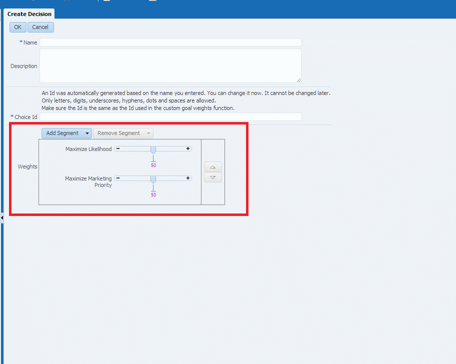
Description of the illustration perf_goals.gif
A.10.2 Adding Dynamic Filtering/Scoring Rules
You can add/edit filtering and scoring rules externally in Decision Manager, if the corresponding choice has option to do it.
While creating an Offer, at the end of the page train before Confirm, you can see Marketing Priority item which is a scoring rule. Scoring rule is an attribute which takes a numeric value according to certain conditions which can be specified through the interface.
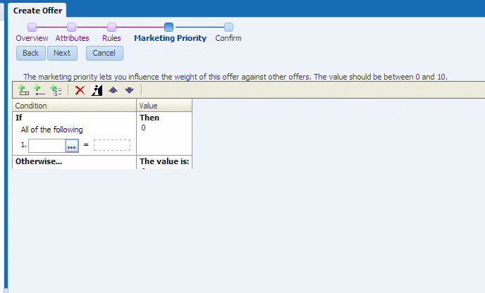
Description of the illustration dynafil_01.gif
While creating a Segment, in the Overview page of the train, you can enter Filtering Rules. Filtering rule is setting an attribute value to true if a set of conditions which can be specified through the interface.
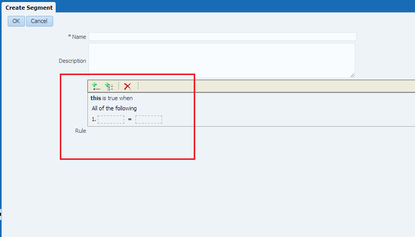
Description of the illustration dynafil_02.gif
A.11 Choice Details
The Choice details layout of the Detail area is the standard layout for viewing, editing, or deleting an existing choice. The Choice details layout appears for the current choice in the Perspective panel.
The description of the Choice details layout in this section, while largely generic, uses the following Regional Offers Overview area example as an illustrated reference.
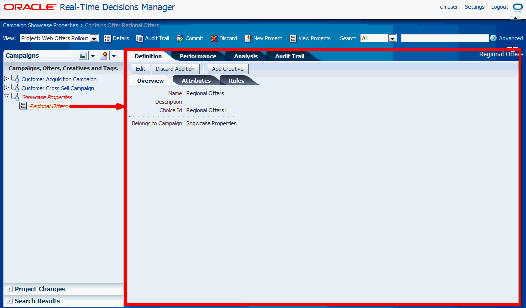
The Choice details layout generally consists of four tabs:
-
Definition
-
Performance (may be disabled)
-
Analysis (may be disabled)
-
Audit Trail
The Definition tab is where you can view the attributes, relationships, and rules for the current choice, and - in an active project context only - edit them. For more details, see Choice Details - Definition Tab.
In the Audit Trail tab, in both Main Repository and active project context, you can view and create audit trail comments. For more details, see Section A.11.4, "Choice-Level Audit Trail."
The rest of this section contains the following topics:
A.11.1 Choice Details - Definition Tab
The Definition tab enables you to view and, if you have the necessary permission, edit and delete choice details. Editing and deletion can only be done in the context of an active project. You can edit attributes, relationships, and rules for the current choice.
The Definition tab contains sub-tabs that display different information about the choice, by default, Overview, Attributes, and Rules. You can edit attributes, relationships, and rules for the current choice in these sub-tabs. For more details of the contents of these pages, see Section A.10, "Create Choice."
Note:
All choice creations, edit, and delete operations made in a project are in effect pending changes to the Main Repository. They remain "in the project" and do not change the Main Repository until the project is successfully committed to the Main Repository.Consider each change in the project as an "intention to change" in the Main Repository, until the project is committed or discarded.
The options available to you depend on whether you have all the necessary permissions and the operation that you are trying to perform.
Assuming you have the necessary permissions, the options are made available through buttons that appear in the Definition tab in different situations, as follows:
-
Choice created (and possibly edited further) in the project:
-
Edit button allows for further editing of the choice in the project.
-
Discard Addition button allows for removal of the choice from the project.
-
-
Main Repository choice not locked in any project and not yet edited in the current project:
-
Edit button allows for editing of the Main Repository choice in the project.
-
Delete button allows for the (intended) deletion of the choice from the Main Repository.
-
-
Main Repository choice already edited in the current project:
-
Edit button allows for editing of the Main Repository choice in the project.
-
Discard Changes button allows for the removal of the changes made to the choice in this project only.
-
Delete button allows for the (intended) deletion of the choice from the Main Repository.
-
-
Main Repository choice already "deleted" in the current project (through a previous use of the Delete button on this choice in the project):
-
Discard Deletion button (visible only when the "deleted" choice is selected in Project Changes panel) allows for the discarding of choice deletions in the project - the intention is to keep the choice in the Main Repository.
-
For illustrated examples of these situations, see the following sections:
If a choice can become the parent of another choice, as defined by the choice relationships, the Choice Details area displays extra "Add..." buttons to enable you to start the process of child choice creation from the Definition tab.
For example, Figure A-13 shows the Add Creative button in the Definition tab for the offer Regional Offers.
A.11.2 Choice Details - Performance Tab
Figure A-14, show the Performance Model Counts user interface in Decision Manager. It display the detailed counts table and graph of counts as per the default values mentioned in the Report Settings panel and by default, it would consider all choice outcomes (including base events and positive outcomes) to display the graph of counts and detailed counts table. The Choice Group Performance Counts shows the total counts for each choice or choice event occurrence in a choice group.
Figure A-14 Performance Model Counts Report
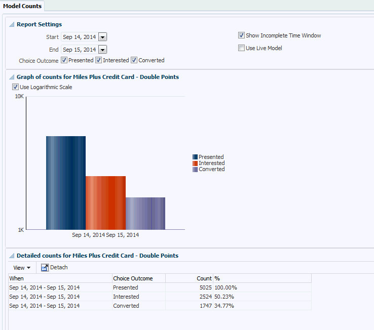
Description of "Figure A-14 Performance Model Counts Report"
A.11.3 Choice Details - Analysis Tab
The Choice Details - Analysis Tab shows the following reports:
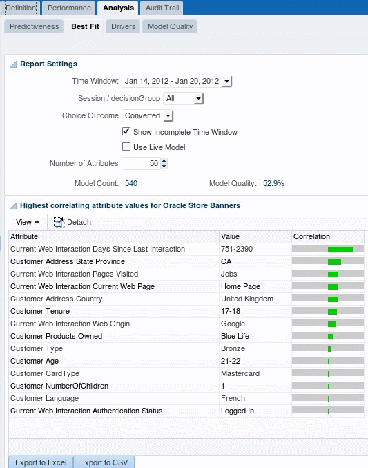
A.11.3.1 Analysis - Best Fit
Figure A-15 shows the Analysis/Best Fit report, which shows all the attributes and values that are most likely to predict the specified event outcome.
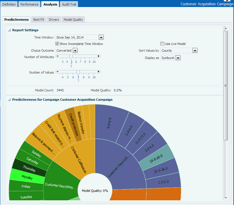
A.11.3.2 Analysis - Predictiveness
Figure A-16 shows the Analysis - Predictiveness report, which displays the result in two sections:
-
Atop bar showing the Model Count and Model Quality for the selected positive event and partitions.
-
A sunburst or treemap, which is based on the selected display as type:
-
If Display as is sunburst, the result would be displayed as sunburst chart.
-
If Display as is Treemap, the result would be displayed as Region and Squarer.
-
Region: each region represents one attribute, the size of the region is based on the predictiveness. The top x attributes are shown. The top is based on descending predictiveness, with one color for each.The label shows the attribute name. A tool-tip shows the predictiveness as a percentage of one digit.
-
Squarer: correlation: for the top x attribute values for each of the given attribute. Top based on the sort values by drop-down, descending; that is, for counts it will show the top counts, descending, for positive correlation it will show the top correlations, descending and for negative correlation it will show the bottom correlations, ascending. Label shows the attribute value. Tool-tip shows input count, count and correlation as a term.
-
.
-
Figure A-16 Analysis - Predictiveness Report
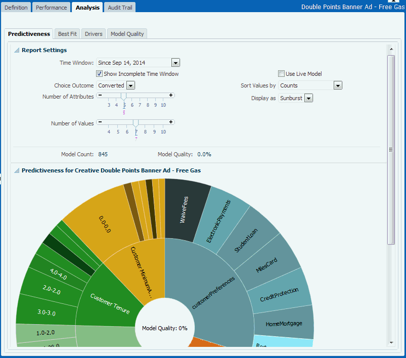
Description of "Figure A-16 Analysis - Predictiveness Report"
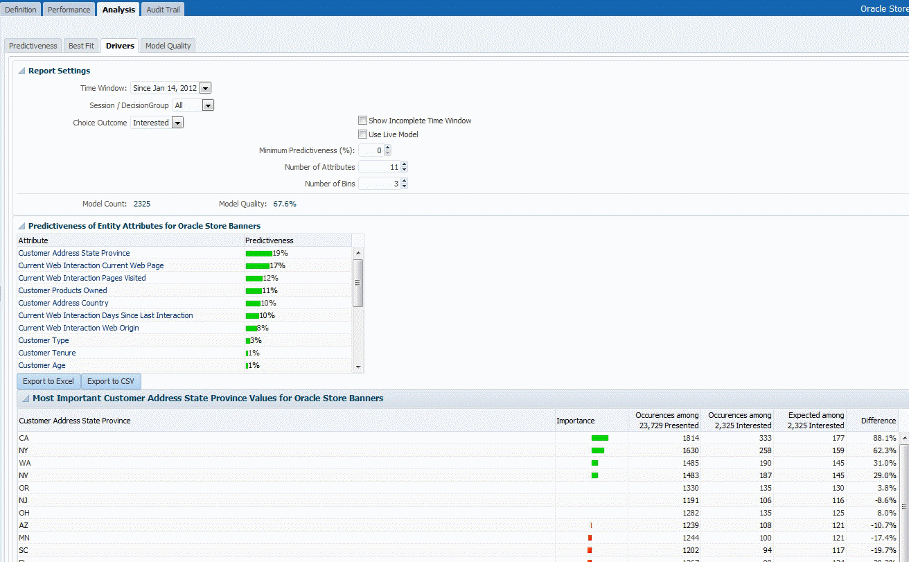
A.11.3.3 Analysis - Drivers
Figure A-17 shows the Choice Analysis Drivers report that identifies the attributes that are influential as drivers of predictiveness for each of the choices.
A.11.3.4 Analysis - Model Quality
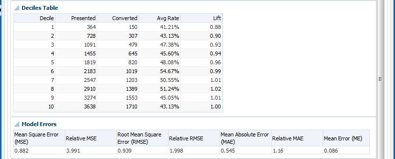
Figure A-18 through Figure A-20 show the Analysis/Quality and it displays in table form the result as cumulative gains and lift per deciles.
Figure A-18 Analysis - Model Quality (Report Settings and Cumulative Gains Graph)
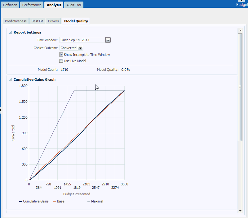
Description of "Figure A-18 Analysis - Model Quality (Report Settings and Cumulative Gains Graph)"
Figure A-19 Analysis - Model Quality (Deciles Table and Model Errors)
Description of "Figure A-19 Analysis - Model Quality (Deciles Table and Model Errors)"
Figure A-20 Analysis - Model Quality (Glossary)
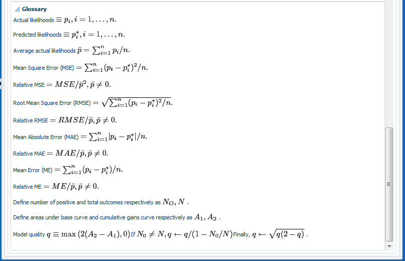
Description of "Figure A-20 Analysis - Model Quality (Glossary)"
A.11.4 Choice-Level Audit Trail
You can access choice-level audit trail comments either when you are working on a project or a choice.
Note:
Regardless of whether you are in Main Repository or active project context, you can view, search, and add choice-level audit trail comments.How to Access from the Projects View
When you click View Projects, you can access audit trail comments from both the Active Projects area and the Committed Projects area, as follows:
-
In the Active Projects area, in each row, click the Audit Trail icon
-
In the Committed Projects area, in each row, click the Audit Trail icon
How to Access from the Choice Details
When you are viewing the details for a choice, select the Audit Trail tab.
The general heading of the Project Audit Trail or (choice-related) Audit Trail area has the following display:

Description of the illustration att311_02.gif
Notes:
- The blue back-arrow icon is only visible in the Project Audit Trail area, accessed through View Projects, and enables returning to the View Projects tab.
-
While the choice-related audit trail features are common to both the Project Audit Trail and (choice-related) Audit Trail areas, this section concentrates on how to use these features in the choice-related Audit Trail area.
When you access the Audit Trail area, a query is automatically performed, and a number of audit trail rows may appear under the column headings.
Figure A-21 shows an example of the audit trail rows for a campaign Showcase Properties.
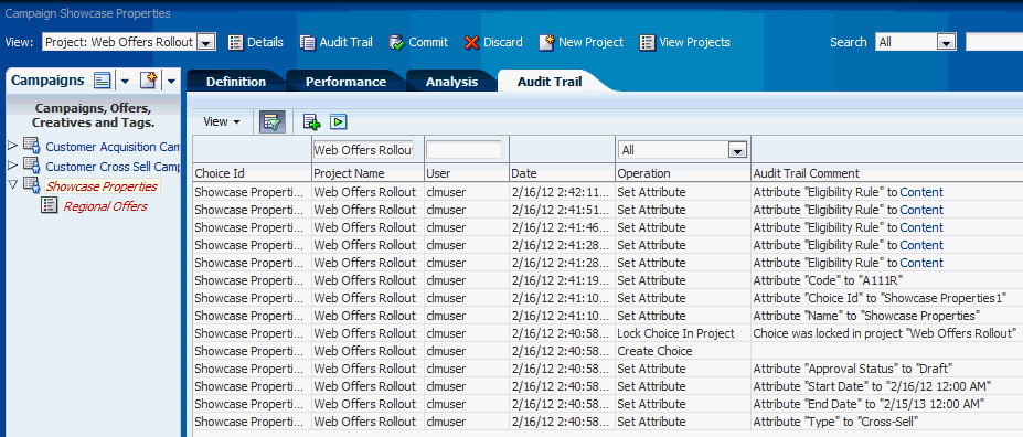
The icons in the Audit Trail area enable you to:
-
View, select, and reorder the search columns
-
Add an Audit Trail Comment
-
Go back to the previous display (visible only when accessed through View Projects)
-
Execute (run) the query
-
Toggle Query By Example
Switching Query By Example off means suppressing the search boxes above the column headings.
Figure A-22 shows how you can control the columns that you want to appear in the Audit Trail area.
Figure A-22 Audit Trail Search Column Control
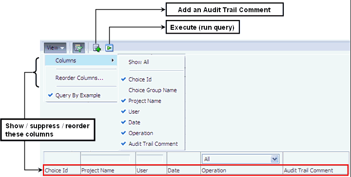
Description of "Figure A-22 Audit Trail Search Column Control"
Figure A-23 shows:
-
How you query audit trail comments
-
How you can toggle the Audit Trail search boxes on and off
You can do this either from the View > Query By Example menu option or the Query By Example menu icon.
Figure A-23 Querying Audit Trail Comments
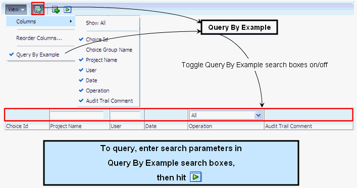
Description of "Figure A-23 Querying Audit Trail Comments"
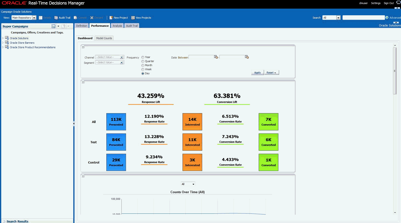
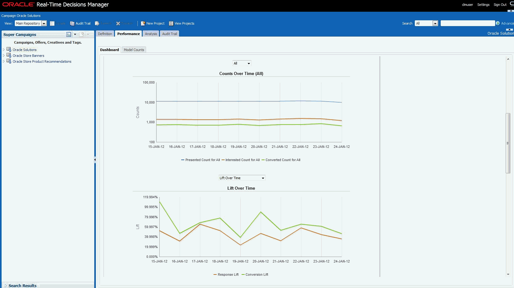
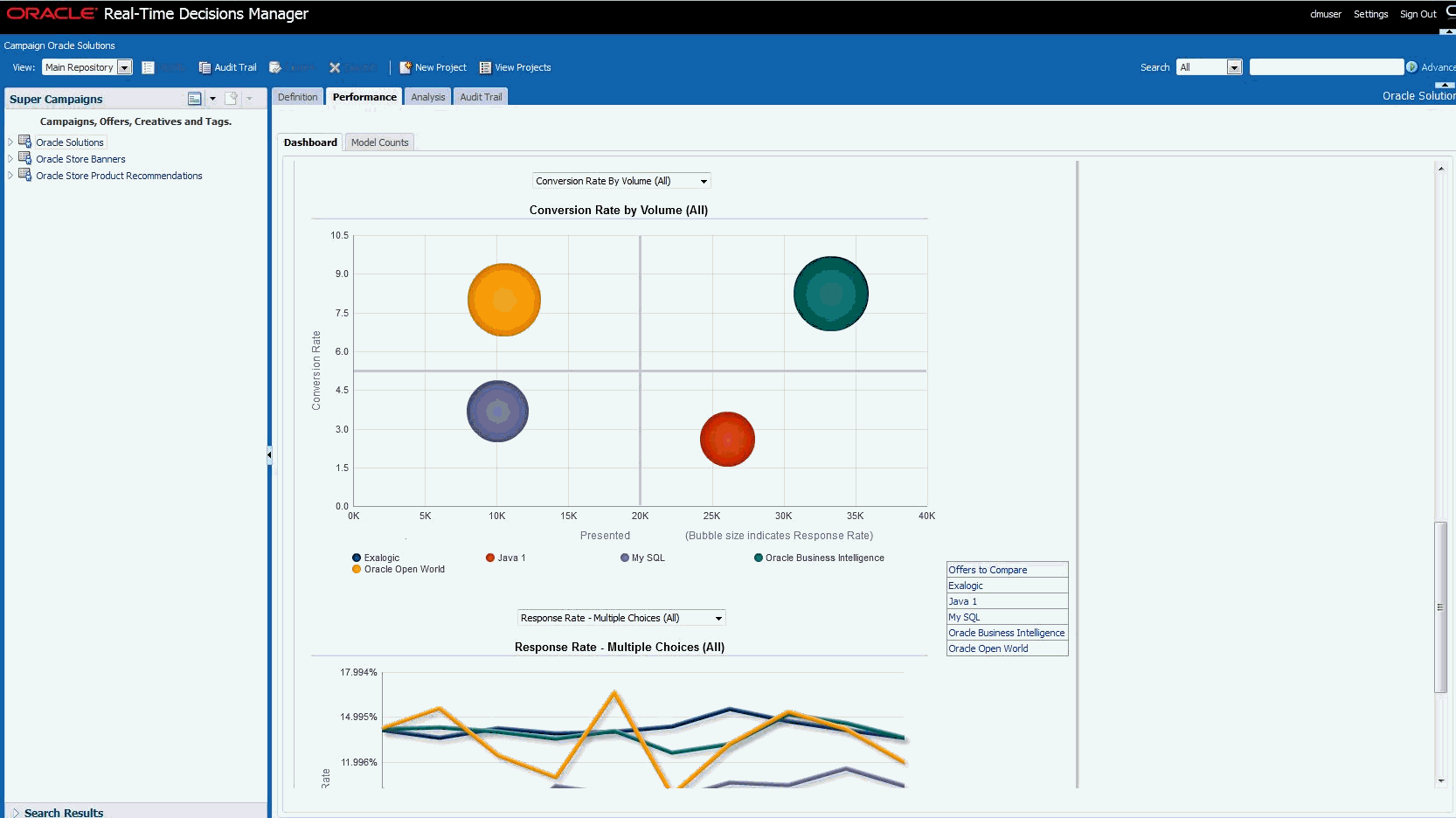
A.11.5 Performance/Dashboard
Decision Manager allows integration of the dashboards within its user interface's Performance/Dashboard tab, enabling you to view the transactional reports data under this tab. Figure A-24, Figure A-25, and Figure A-26 show the Dashboard report in Decision Manager.
A.12 Settings
Three options are available under the Settings menu in the header area:
A.12.1 Inline Service Configuration
This menu is only available to users with administrative permissions; however, changes apply to everyone. You can modify the inline services that Decision Manager uses. The default inline service is used for most areas of Decision Manager. The other ones are used only for reports. See Section A.12.2, "Report Settings" for how to specify the inline service used for reports.
When you select Inline Service Configuration, you see a list of inline services already configured.
Figure A-27 Inline Service Configuration Screen
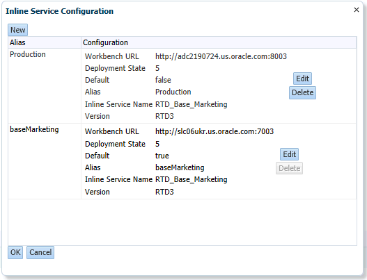
Description of "Figure A-27 Inline Service Configuration Screen"
Each Inline Service has the following configuration settings:
-
Workbench URL: the URL to the RTD server (using HTTP or HTTPS).
-
Deployment State: always 5.
-
Default: one of them must be true. This is the one used for most areas of Decision Manager. The other ones can be used for reports and are optional.
-
Alias: the alias for this configuration. The alias will appear in the Report Settings.
-
Inline Service Name: the name of the Inline Service.
-
Version: always RTD3
On this screen, you can do the following:
-
Click New to create a new configuration.
-
Click Edit to edit an existing configuration.
-
Click Delete to delete an existing configuration.
-
Click OK to save your changes. You will be logged out and asked to log back in.
-
Click Cancel to cancel your changes.
A.12.2 Report Settings
Every user has access to this menu; changes apply to the specific user, only. It lets users modify the settings used for reports.
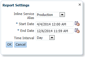
-
Inline Service Alias is the alias of the Inline Service specified in Section A.12.1, "Inline Service Configuration" Default is always present and means the default inline service. This setting applies to both OBIEE Dashboards and model reports.
-
Start Date is the default start date for OBIEE dashboards.
-
End Date is the default end date for OBIEE dashboards.
-
Time interval is the default time interval for OBIEE dashboards.
A.12.3 Clear RTD Cache
This menu is only available to users with administrative permissions; however, changes made here apply to everyone. If you change any type restrictions, performance goals or filtering rules in the Inline Service specified as default in the Inline Service Configuration, changes will not appear until the Oracle RTD cache is cleared.
A.13 Localization
The default locale for Real-Time Decisions Manager is English (US) although you can choose from these ten different locales for Decision Manager: They are:
-
Japanese
-
Korean
-
Portuguese (Brazil)
-
English
-
German
-
Italian
-
French
-
Spanish
-
Chinese (China)
-
Chinese (Taiwan)
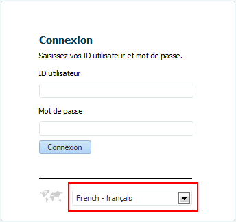
A.13.1 Login Page
A dropdown list on the log-in page lets the user choose the required locale. The dropdown menu lists each locale, with the English Name of the locale, along with its corresponding translated text; for example, French: français; German: Deutsch, and so on.
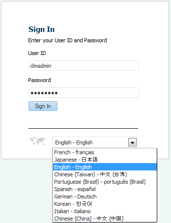
On selecting a particular locale, the log-in page gets localized and the entire text on this page gets translated according to the corresponding locale, in this example, French:
A.13.2 Decision Manager Home Page
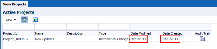
The interactive text in the interface of Decision Manager are translated according to the corresponding locale. This text includes, all labels, drop down menus, tooltips, buttons and so on. The date format is localized according to the selected locale. For example, in English locale, the date format is MM/DD/YYYY:
while in French locale, the date format is DD/MM/YYYY:
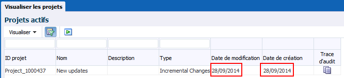
Description of the illustration loc_date_fr.gif
A.13.3 Choices and Choice Groups
Choice group names are also translated in Decision Manager. The following example shows the choice group name in English:
Figure A-32 Choice Groups Search Drop-Down: English
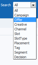
Description of "Figure A-32 Choice Groups Search Drop-Down: English"
While this example shows the corresponding choice group name for French locales:
Figure A-33 Choice Groups Search Drop-Down: French
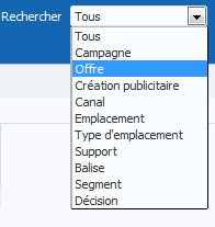
Description of "Figure A-33 Choice Groups Search Drop-Down: French"
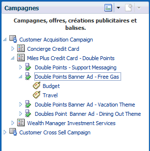
Choice Names and Identifiers are stored in the Decision Management database and thus are not translated. The Choice Group Names in the perspectives window are translated; for example, Campagnes is the French translation for Choice Group Campaign. The Perspectives Tooltip is also translated; for example, in the following image, Campagnes, offres, créations publicitaires et balises is the French translation for Campaigns, Offers, Creatives and Tags:
A.13.4 Model Reports
All the interactive text in the model reports, including labels, and table column labels are translated. However, the values that are fetched from database—for example, Presented, Interested, or Converted—are choice outcomes that are fetched from the database and are not translated by Decision Manager.
The following example shows Model Reports in an English locale:
This example shows Model Reports localized in French locale:

A.13.5 Slices
The Slices feature adds new user interface components which are localized according to the selected locale. The static labels on the new user interface components are translated.
A.13.6 UI Content Not Localized
You might have noticed in the preceding examples that some items on the UI are not localized; that is they appear in a different language from the that of the locale selected at login. These items come from the Inline Service and remain in the language in which it was set up. For example, in the following illustration, Decision Manager was localized at login to French but the Choice Outcome selections are in English. This is because these values came from the Inline Service and it was set up in English.
Figure A-37 UI Components Not Fully Localized
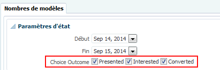
Description of "Figure A-37 UI Components Not Fully Localized"
In this release of Oracle RTD, these items are not localized:
-
Transactional reports
-
Data from the Inline Service
-
Documentation
-
Model Report data