Before You Begin
Purpose
MAX is the mobile application building’s part of Mobile Cloud Service (MCS)
Here, you will build a Mobile self service application for technicians to look at their Service Requests while on the road. You will build this application entirely in the browser, preview it in the browser and then deploy it to a mobile device.
In this part of the tutorial, you create a MAX application including the UI, page flow and data usage.
In the first part of the tutorial you create the application and beginning screens. Then, in the second section of the tutorial you work on the detailed layout of the screen. You add a few different components and define how they look when deployed to a mobile device. The third part of the tutorial focuses on adding business objects to the screen for three metric components. Each of the three metric components corresponds to the different levels of incident counts for the currently logged on technician. In the fourth and fifth parts of the tutorial you add data to display in an Area Chart and in a List screen. The sixth section shows you how to add a Details screen and then an Edit screen for the incidents. Finally, in the seventh and last section you'll add a screen to create incidents. Once the MAX application is created you can then test and deploy it. Details on how to do that are included in a follow-up tutorial.
In order to build this application, you need to have MCS populated with a custom API that is in the published state. If you do not have the Fix it Fast custom API imported into MCS, please follow the instructions found in MAX Prerequisites: Import and examine the MCS component definitions.
Step 1: Create the application and layout of the first screen
In this section, you create a new MAX application and set the general layout from some predefined options.
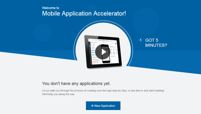
-
Launch MAX in a browser (e.g. http://<your_MCS_server>:<port>/max/ ) and click the New Application button (or you can launch it from the MCS Mobile Apps icon).
-
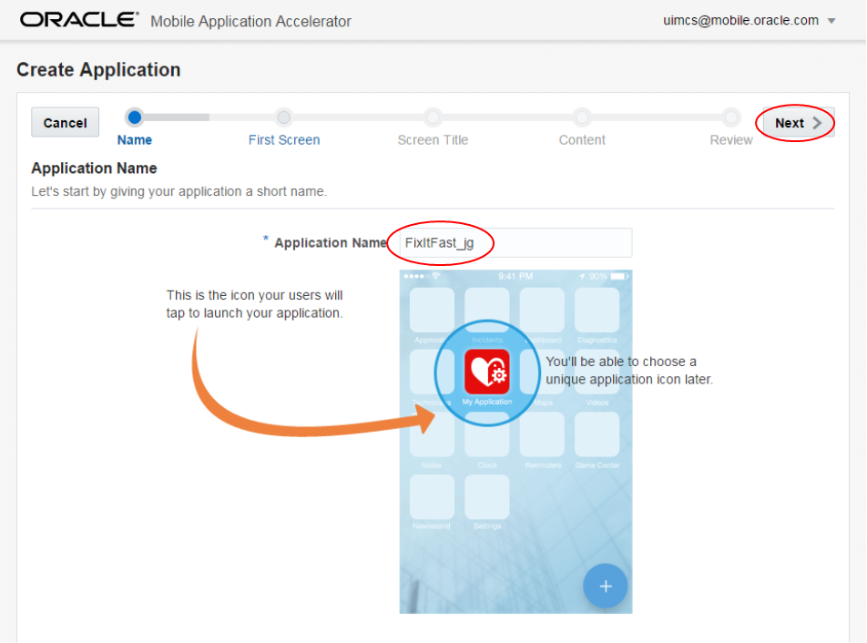
Enter FixItFast as the application name followed by an underscore and two unique characters, like your initials.
My application name is FixItFast_jg.
Then click Next.
-
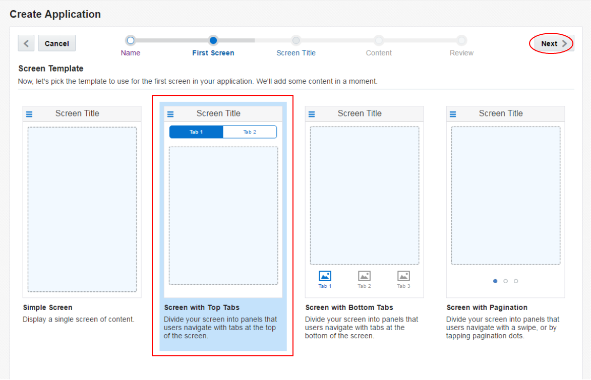
In the next step you determine which navigation paradigm do you want to use for the application? Do you want to use Tabs on the top, buttons on the bottom or FilmStrip. For our purposes, we'll use the Tabs option.
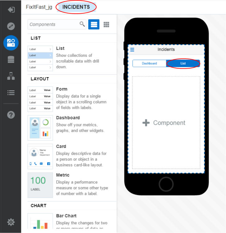
Select Screen with Top Tabs. With this option we will create two tabs: Dashboard and List.
Then click Next.
-
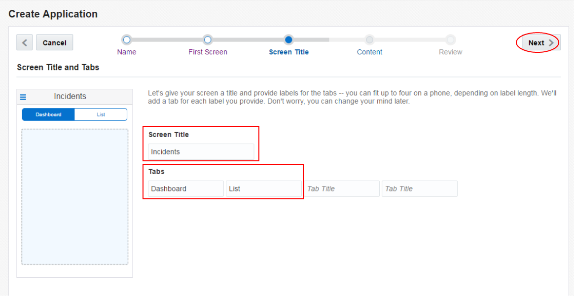
Name the screen Incidents (Screen Title) and set tab values to Dashboard and List.
Then click Next.
-
Here you set the content based on a set of preconfigured options. Select the Dashboard option and click Next.
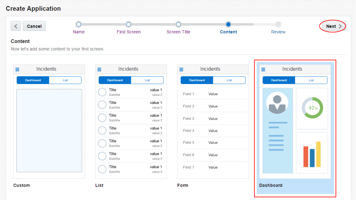
-
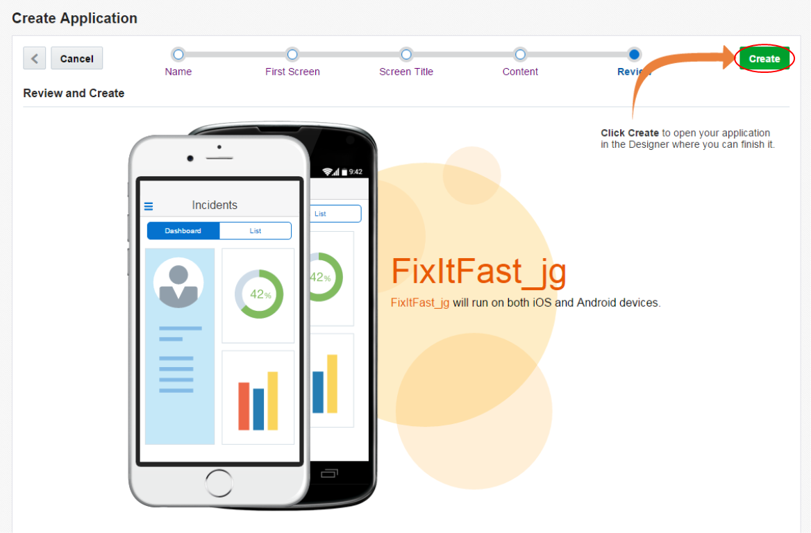
Finally click the Create button to create the application and you are taken to the Designer portion of the tool where you can work on the details layout and components.
Step 2: Design the first screen
In this part of the tutorial, you work on the detailed layout of the Dashboard screen. You add a few different components and define how they look when deployed to a mobile device.
-
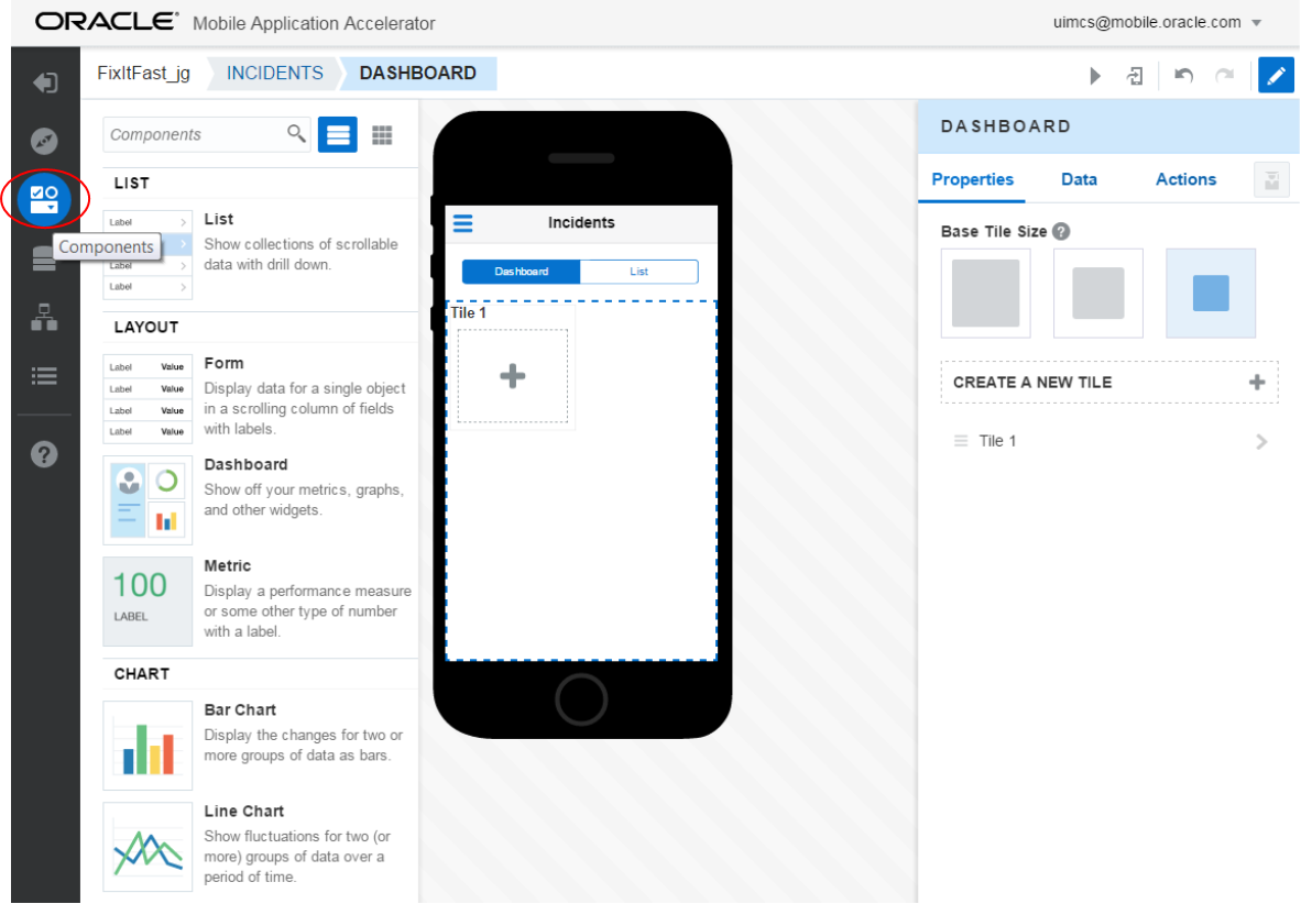
Once the MAX application is created, you are taken to the Designer part of the interface where you can refine the layout and content of the pages.
On the left are a series of components you may drag and drop onto your pages. In the center is a preview of the way the screen will look and on the right is where you can set the properties for the components you add.
Collapse the list of components. Do this by clicking Components icon (third icon from the top), on the left side of the page.
.
-
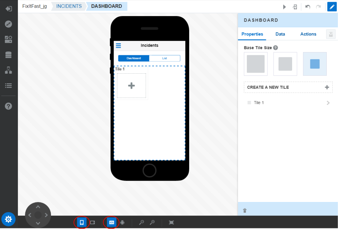
In the Designer, you see the preview of the design surface. Click the gear icon at the bottom left of the page. Some controls are exposed at the bottom to change the orientation and size of the preview.
Experiment with some of these options on the bottom of the screen. Changing the orientation.
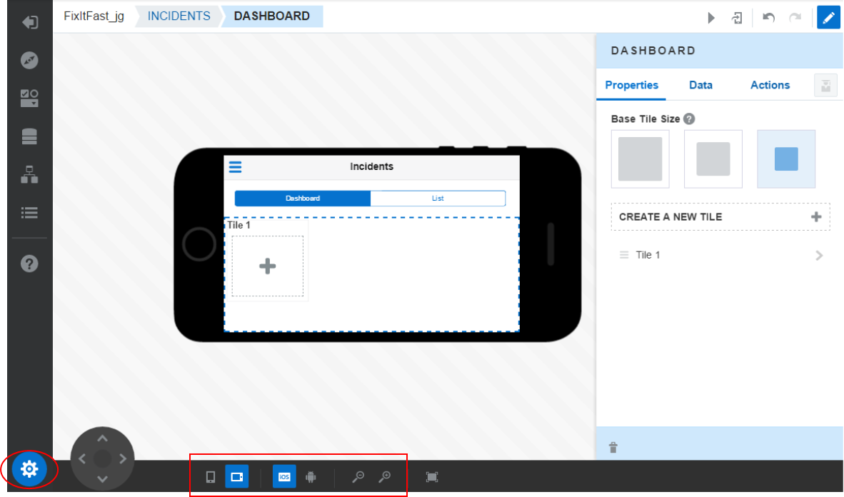
Change the device OS.
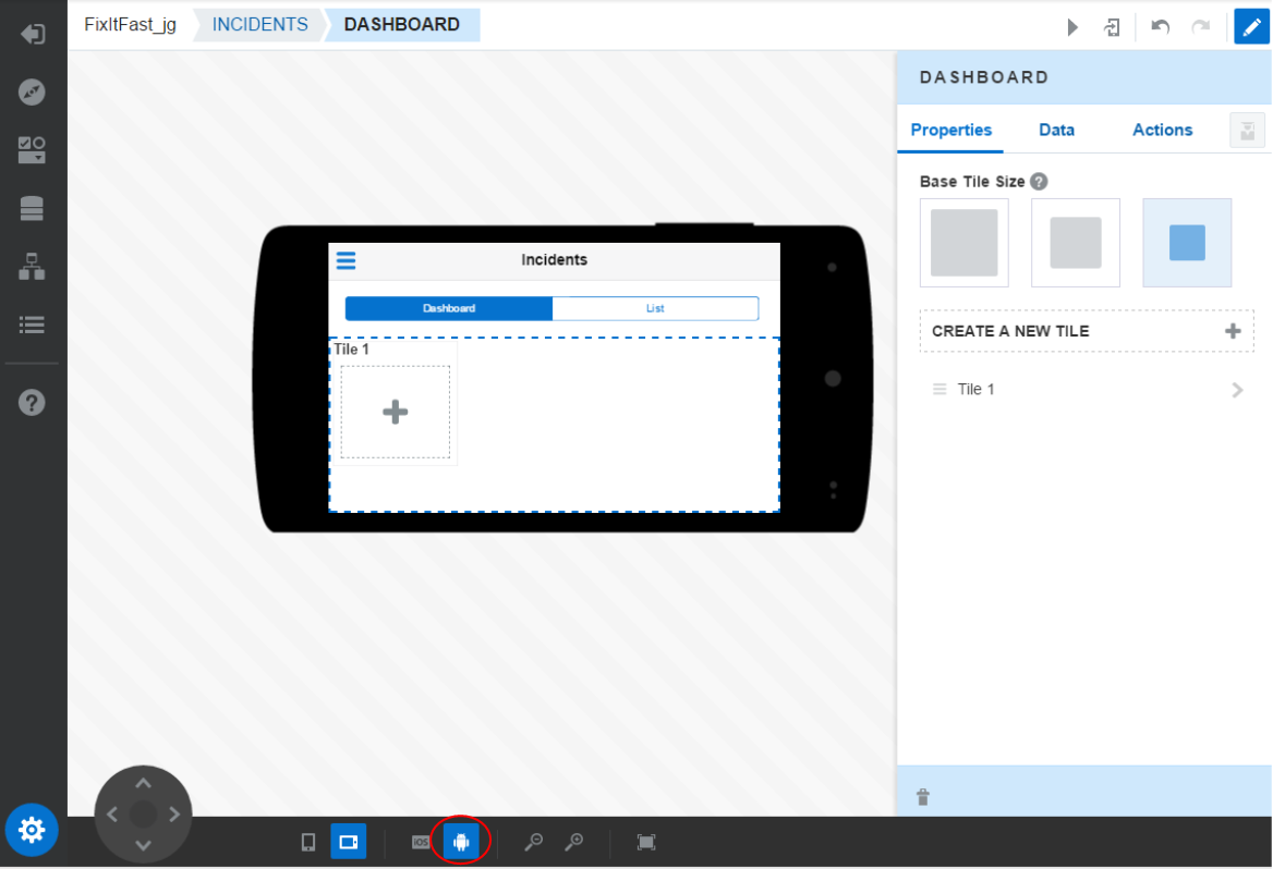
Reset the device to iOS and orientation to portrait.
-
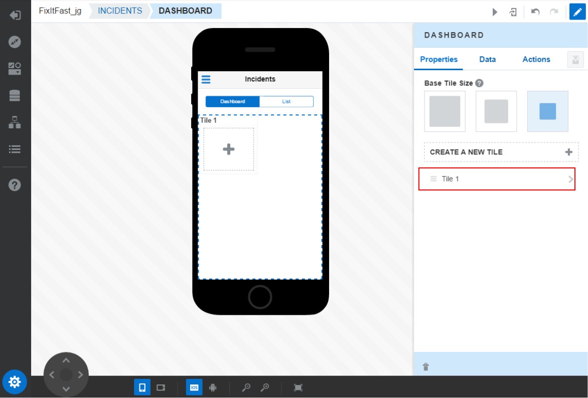
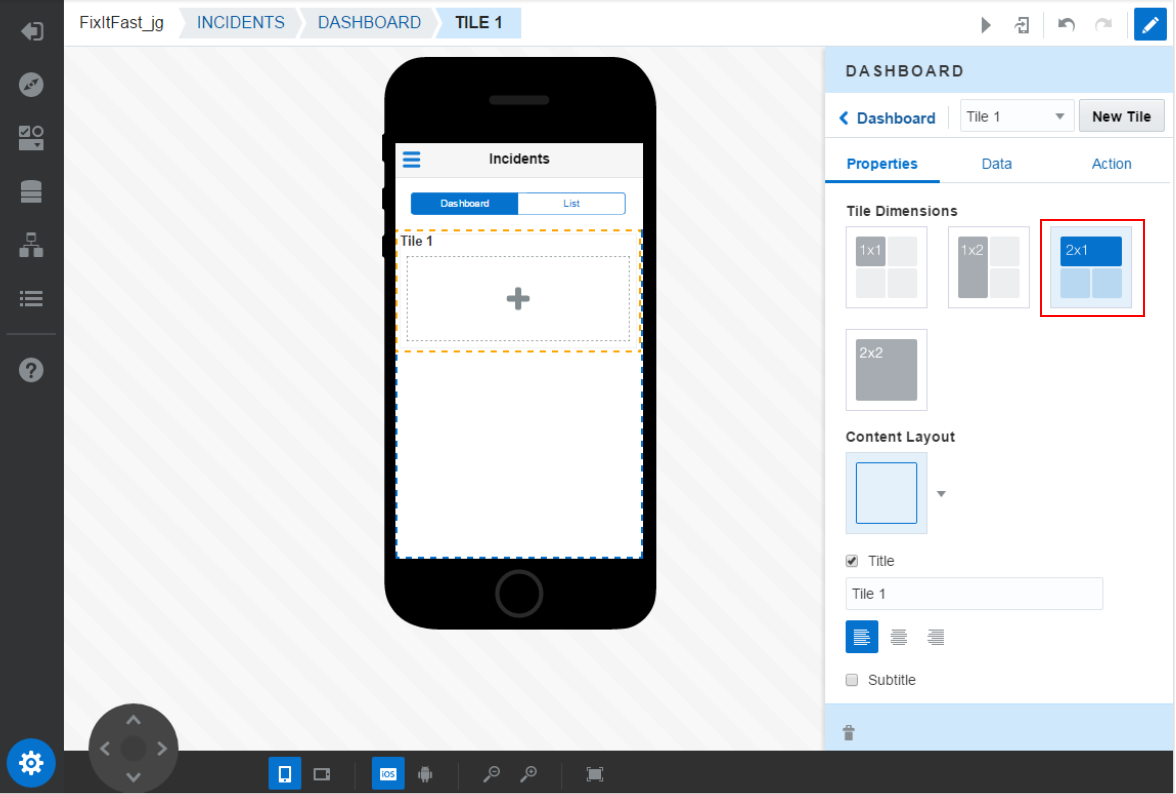
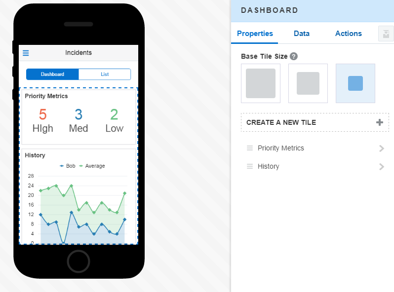
In the preview, select the Dashboard tab. Then in the Properties, click the Title 1 component.
Select the 2x1 option to make the tile bigger.
-
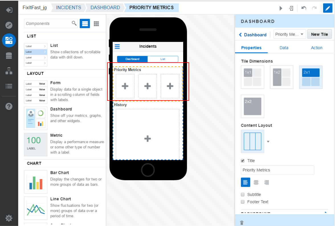
Then, split that single tile into three column layout.
In the Content Layout, click the down button to reveal the options. Select the one with three columns.
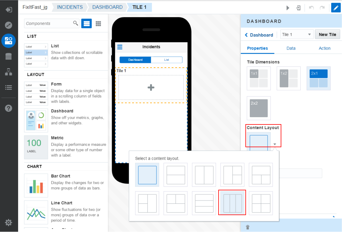
These three tiles will display the count of incidents with priorities of High, Medium and Low.
Set the Tile Title to Priority Metrics.
-
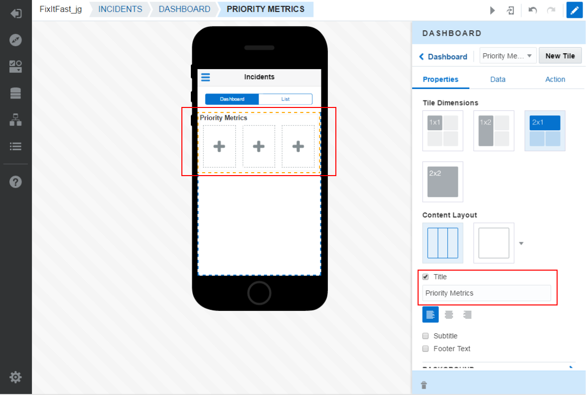
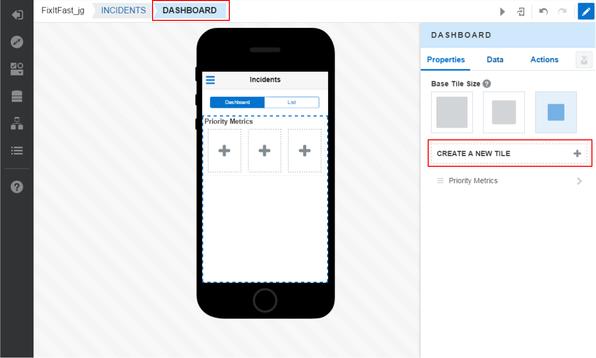
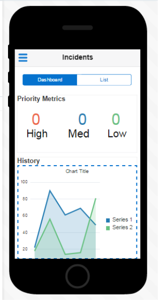
Next add another tile below the first one to display the History.
In the breadcrumbs, click DASHBOARD.
Then, click the CREATE A NEW TILE + icon.
-
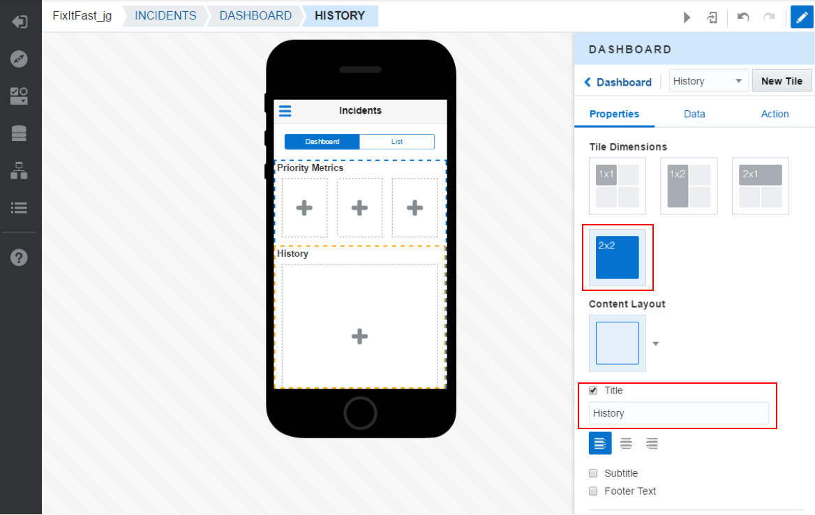
Set the Title to History and then set the Tile Dimension to 2x2.
-
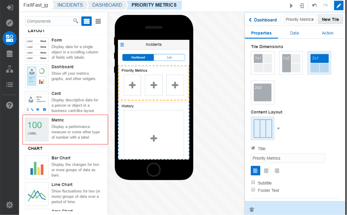
Next, modify the High, Medium and Low components of the first tile.
Click on the Priority Metrics tile and on the left, the Component palette slides out.
Tip: Pay attention to the “Saving Changes” at the bottom right when to do actions in MAX (Drag & Drop, change type of component …) . If you continue to add screens and fields before previous changes are saved, you might experience losing some of your last actions.
-
Slide down to see List and Dashboard components. Slide down further to see Data Visualization Components.

-
In the Components, slide down until you find the Metrics option.
-
Drag and drop that Metrics component into each of the three Priority Metric slots.
When complete, the Priority Metric tile and slots should look like the image below.

-
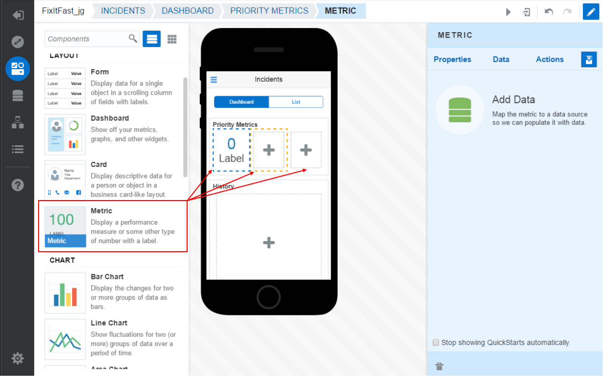
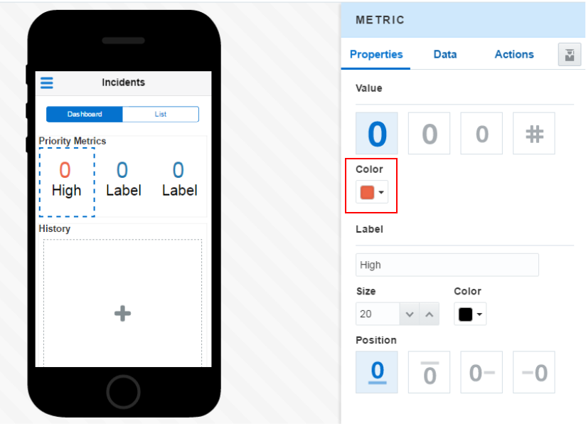
Now configure the UI for each of the Metric components to represent the High, Medium and Low priorities.
Select the first Metric component and then click the Properties tab. Set the Label property to High.
Notice how the preview reflects this change when exiting the field.
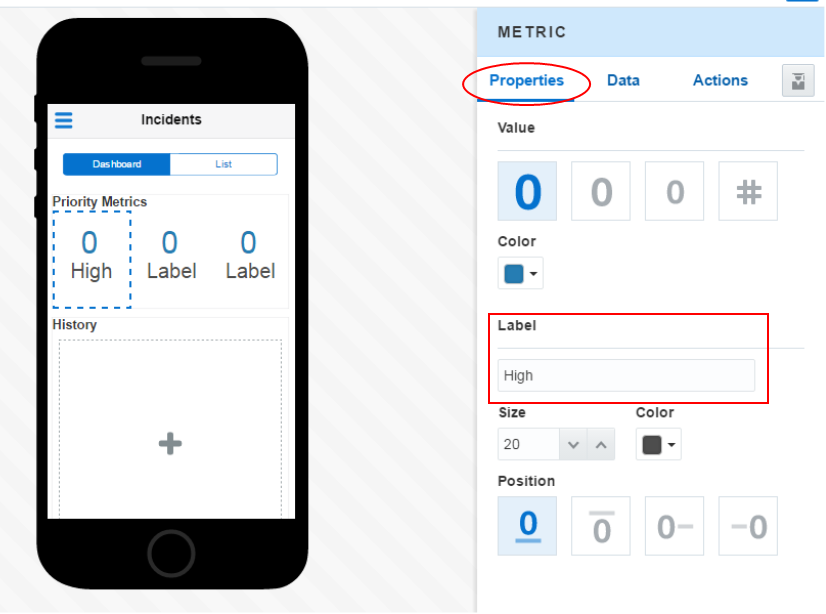
Then use the dropdown to set the Color of the value property to Red.
Notice how the preview reflects these changes.
-
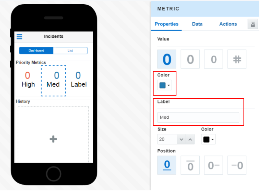
Set the second Metric Label to Med and the Color to Blue.
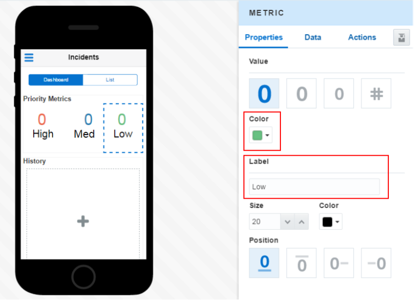
Finally, set the third Metric Label to Low and the Color to Green.
-
Now, lets work on the History tile.
Click on the History tile, then scroll down in the Component palette and find the Area Chart.
Then, drag and drop the Area Chart onto the History tile.
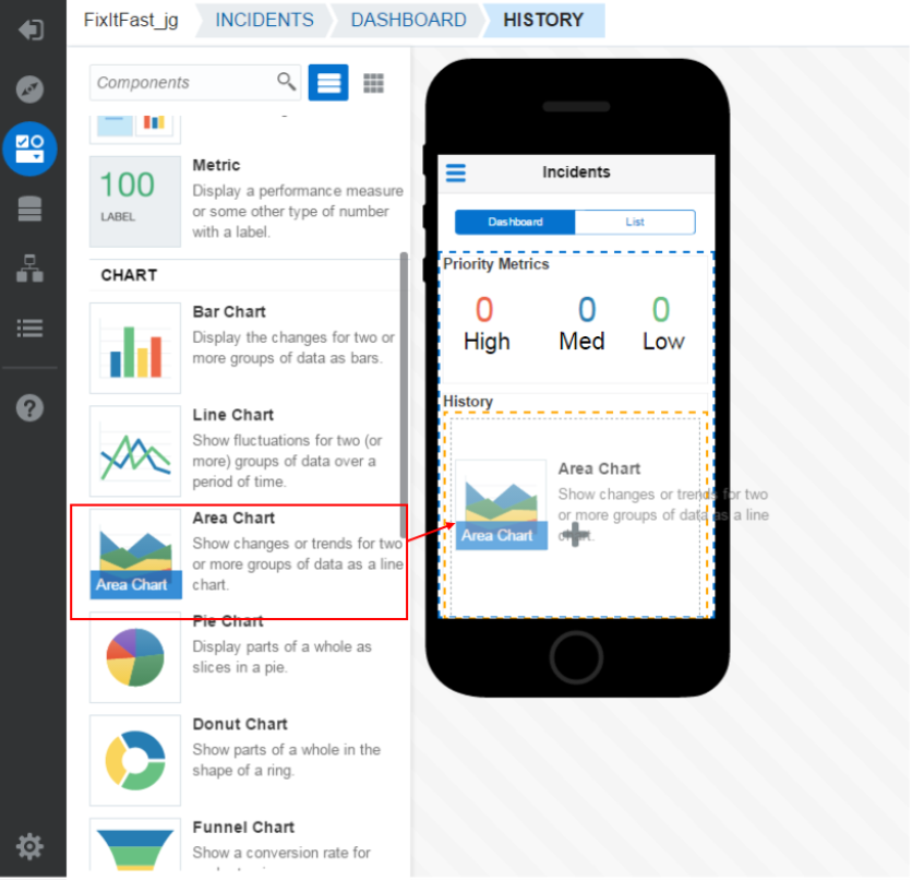
Below is what the Preview should now look like.
-
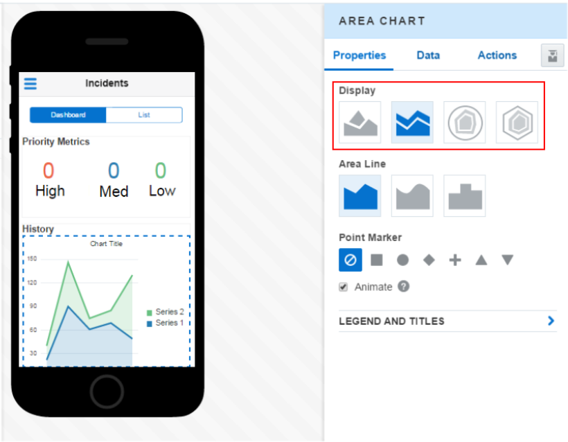
In the Area Chart properties, you may determine how it looks. It's Display may be Vertical, Stacked, Circular or Polygonal. For our purposes, the Stacked one (second option) works well.
-
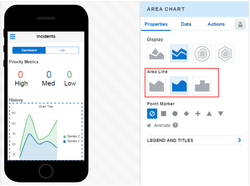
Then, set the Area Line to Curved (second option).
-
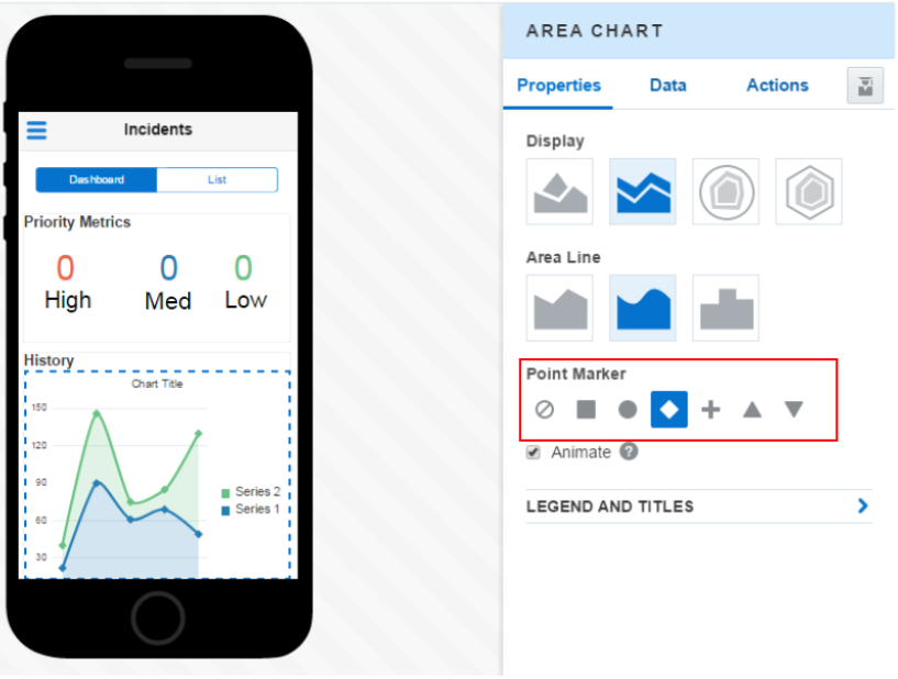
Next, set the Point Marker to the fourth option - Diamond.
-
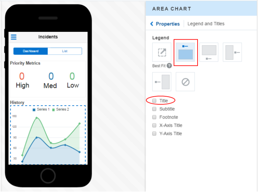
The Legend and Titles can also be set. However, in our case, we just want to turn the Title off and move the Legend.
Click the Legend and Titles text.
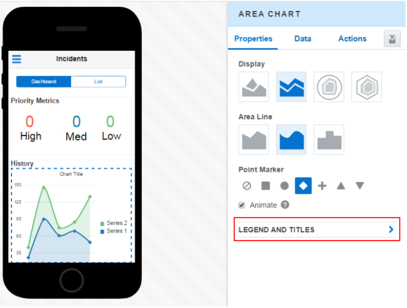
Put the Legend on Top and uncheck the Title checkbox.
Now that the UI is developed, you can add some data to the screen.
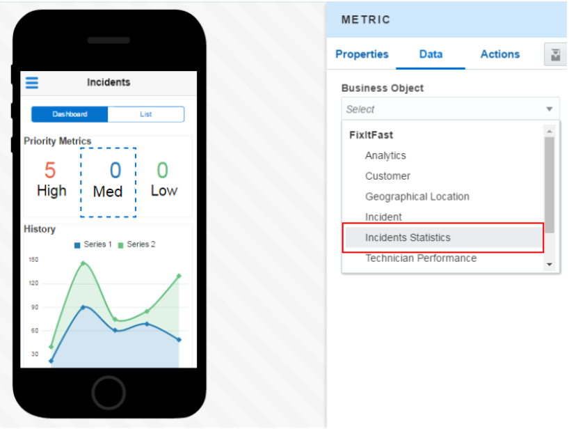
Step 3: Bind metric components to data
In this part of the tutorial, you add business objects to the screen for the three metric components. Each of the three metric components corresponds to the different levels of incident counts for the currently logged on technician. To access data, you need to have MCS populated with a custom API that is in the published state. If you do not have the Fix it Fast custom API imported into MCS, please follow the instructions found in MAX Prerequisites: Import and examine the MCS component definitions.
-
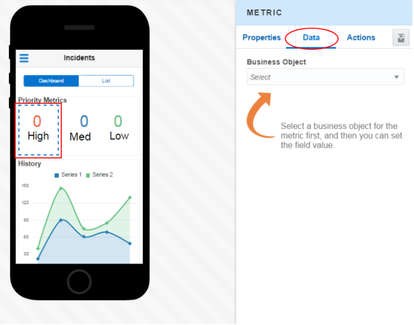
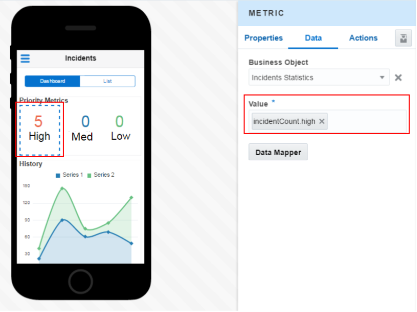
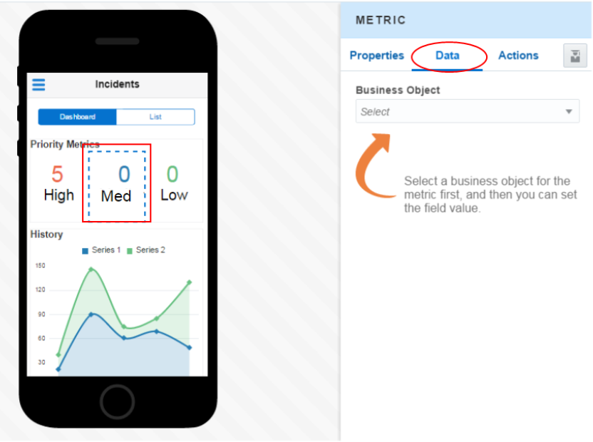
Select the first metric component you added earlier, High. Then, click the Data tab on the right.
-
Since this is the first time you are accessing data for this application, you have to do a couple extra things to get it set up.
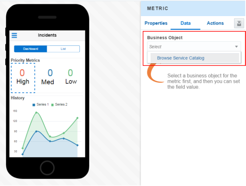
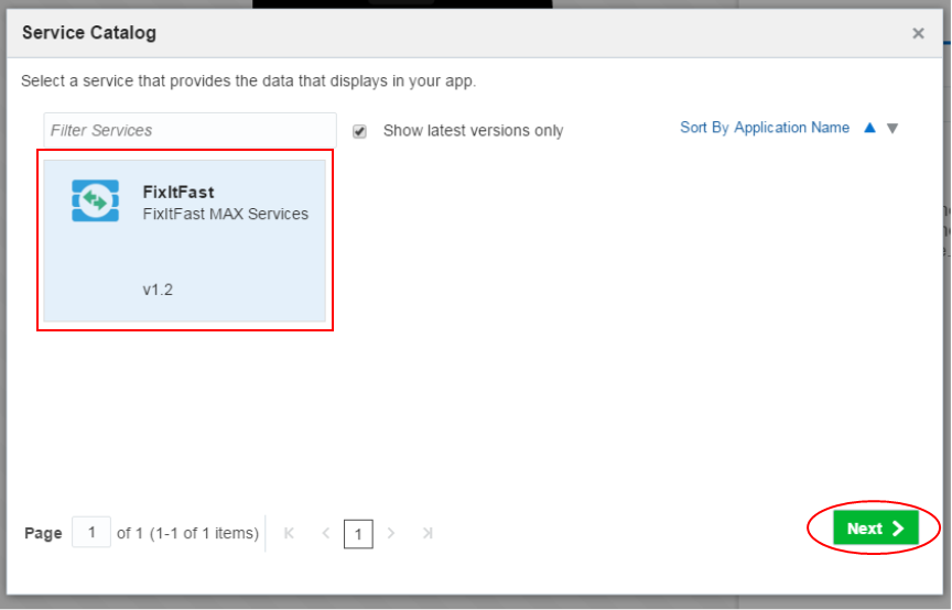
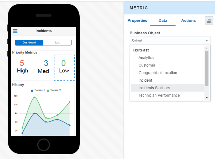
In the Business Object section, click the dropdown and select Browse Service Catalog.
-
The MCS API catalog is queried and you see the FixItFast service. Select the FixItFast service and then click Next.
Any Custom API that had been published would be available to use in your MAX application.
-
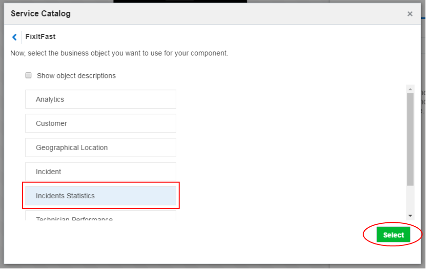
In the next step, you can select the specific business component you'd like to use on the screen.
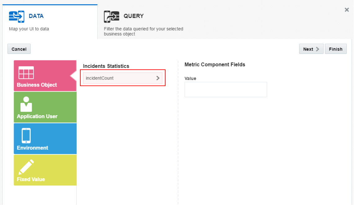
Click on Incidents Statistics and then click Select.
-
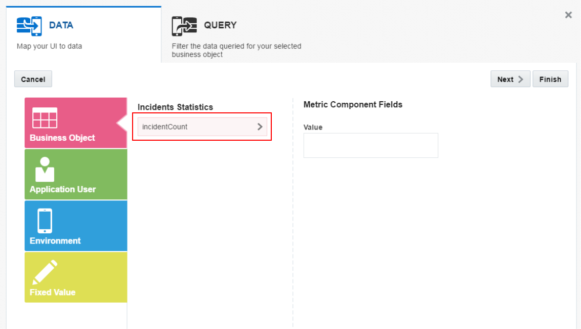
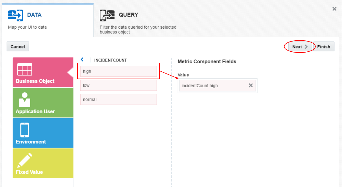
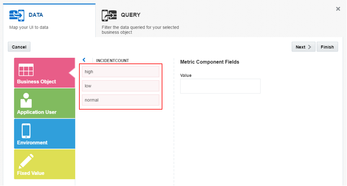
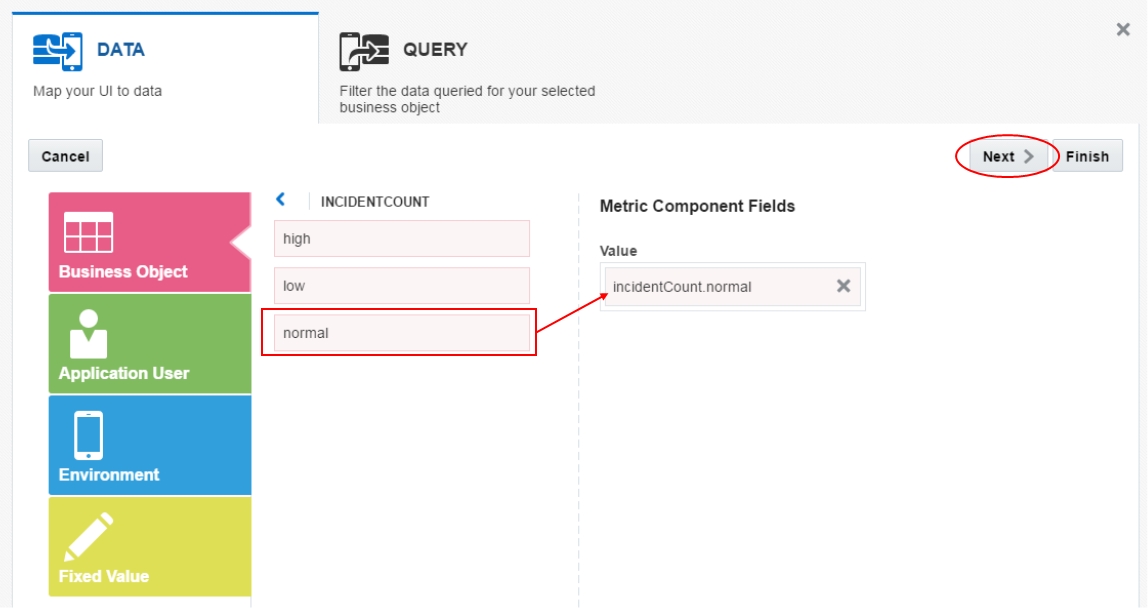
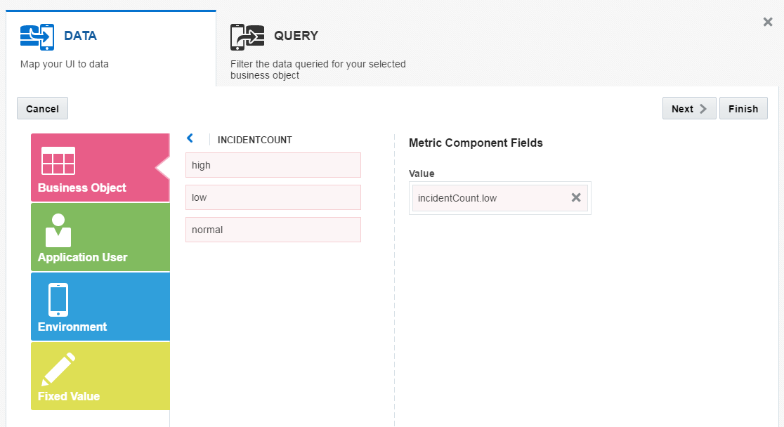
Now you need to set the attribute that will be used to populate the data. Click the incidentCount.
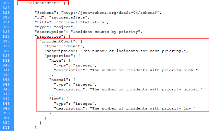
To get a better idea of where the data comes from, you could look at the RAML definition for the API.
Here you see a section about statistics on incidents and the incidentCount, with high, normal and low properties.
-
The different levels of incidentCount are now exposed.
Since we are working with the High metric drag and drop the high incident count into the Value property.
Then click Next.
-
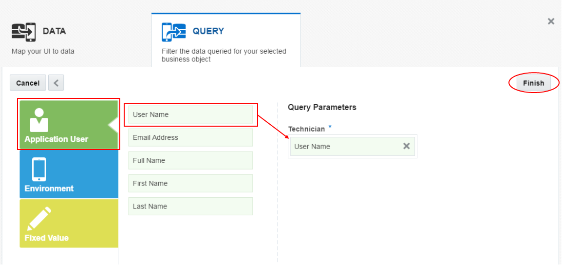
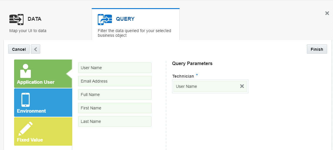
Next we want only those records marked as High from the currently logged in technician to appear in the metric.
Click the Application User box.
Drag and drop the Username attribute into the Technician parameter.
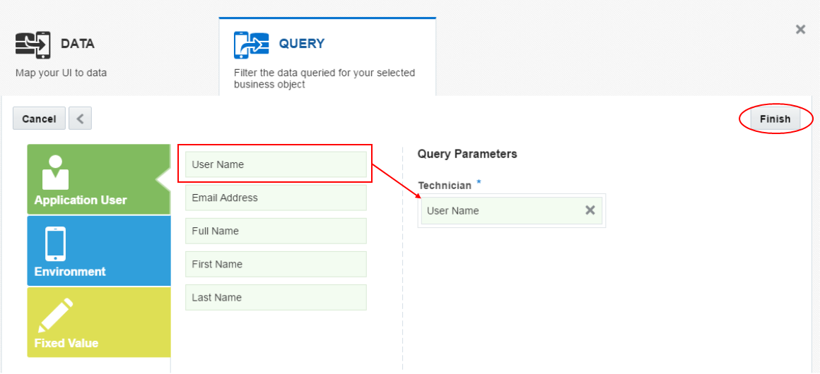
Then click Finish and you'll be taken back to the preview with sample data loaded into the metric component.
-
Next repeat the process for the Medium metric component.
Select the Med metric component and click the Data tab.
-
Since you’ve already loaded the Service from the catalog in the previous steps, all the available business objects are listed in the dropdown list. When you click the dropdown you will see all the available objects.
From the list select the same object as you did earlier - Incidents Statistics.
Like earlier, click the incidentCount ...
... to expose the three levels.
-
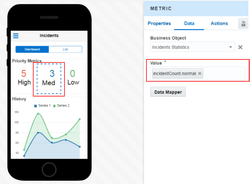
This time we are working with the Medium metric, so drag and drop the normal incident count into the Value property.
Then click Next.
You still want to show only those incidents for the currently logged in technician, so click the Application User and then drag and drop the User Name into the Technician parameter.
Then click Finish.
Again you are taken to the preview and can see sample data in the Med metric.
-
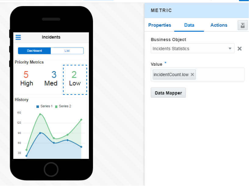
Finally, repeat the process for the Low metric.
Select the Low metric, and then the Incident Statistics Business Object.
Add the low incident count to the Value property.
Set the User Name as the Technician parameter.
Confirm that preview shows sample data for the Low metric.
In the next section you will wire up the Area Chart.
Step 4: Bind chart & list components to data
In this part of the tutorial, you set the Area Chart to display data.
-
Select the History tile and then the Data tab.
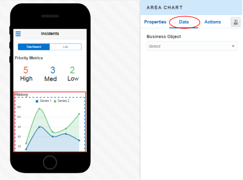
-
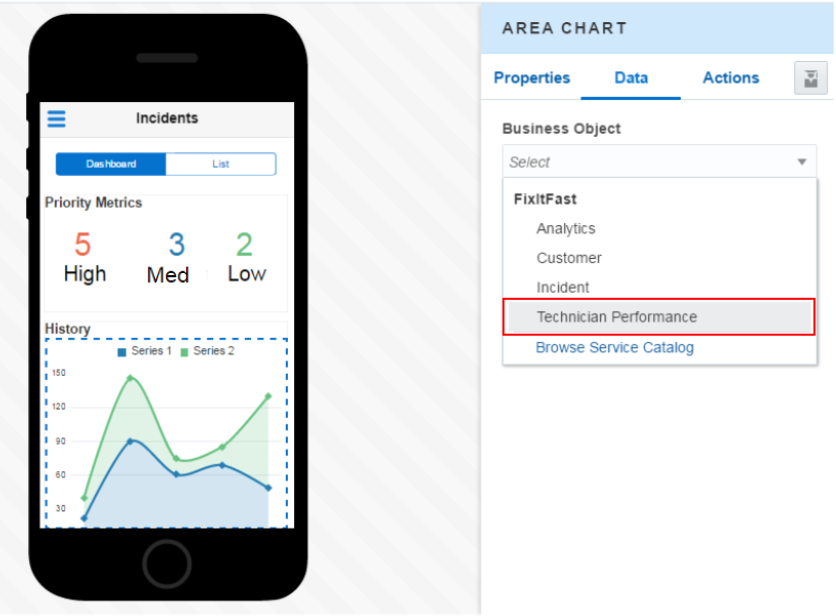
In the Business Object section, click the dropdown and select Technician Performance.
-
In the Technician Performance, drag and drop the following attributes into the Area Chart Component Fields.
incidentCount: Values (Y Axis).
month: Categories (X Axis).
technician: Colors (Series).
Click Next.
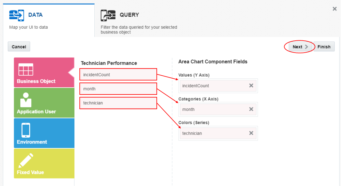
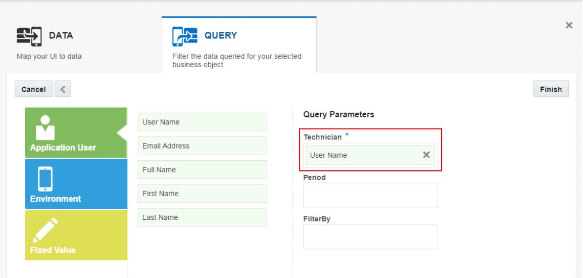
Move the User Name to the Technician query parameter and click Finish.
-
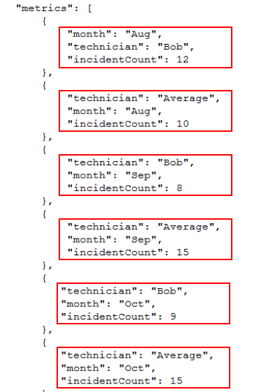
When finished with this task, you are taken back to the preview and the Area Chart is populated with sample data.
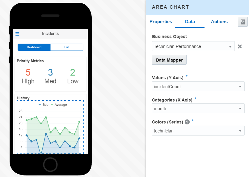
The sample data used in the preview can be found in the RAML document for the API. You can also find it in the Response section of the API definition in MCS.
-
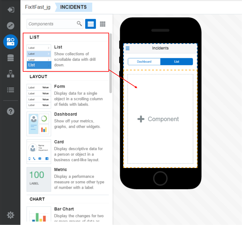
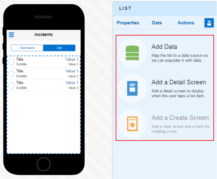
Now that the chart is wired up to data, do the same for the List screen.
Click the Incident breadcrumb and then click the List tab to start adding data to the screen.
-
We want to add a List component to the screen so, drag and drop a List component onto the middle of the List screen.
-
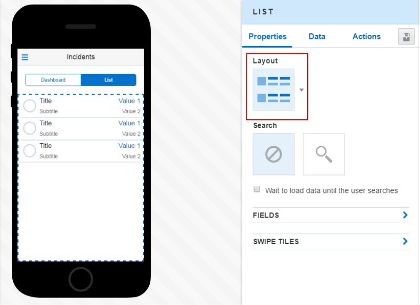
Click the Properties tab and notice the Layout is set to the Quadrant option shown below and will show data in an acceptable format.
-
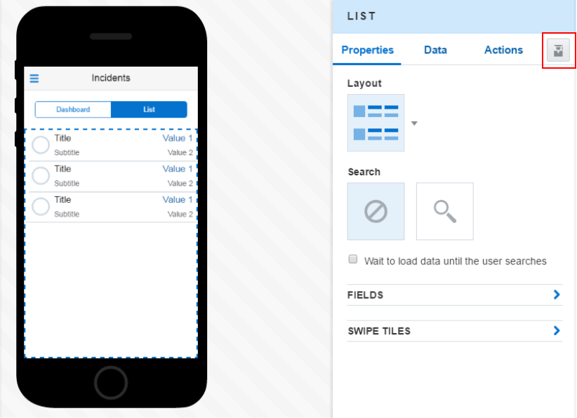
We could use the Data tab and add data the way we did earlier, but lets do it the Quick Start way.
At the far right of the page, click the Quick Start icon.
-
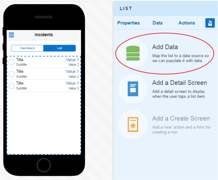
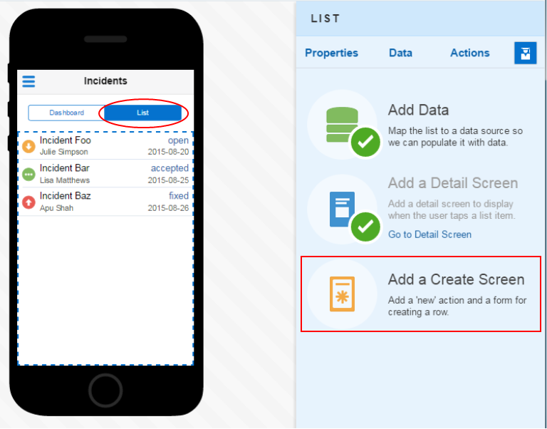
Here you see a set of Tools specialized for each component. You can use them to make it easier to add data to a screen.
There are three commonly used operations (Add Data, Add a Detail Screen and Add a Create Screen) you may include.
Tip: Take care to NOT click multiple times on the QuickStart Add a Detail Screen, Add an Edit Screen …. If this happens you might not be able to correct it as this version is not including yet the Delete screen functionality. It seems that the only solution is to rebuild the app from scratch…
First click the Add Data.
-
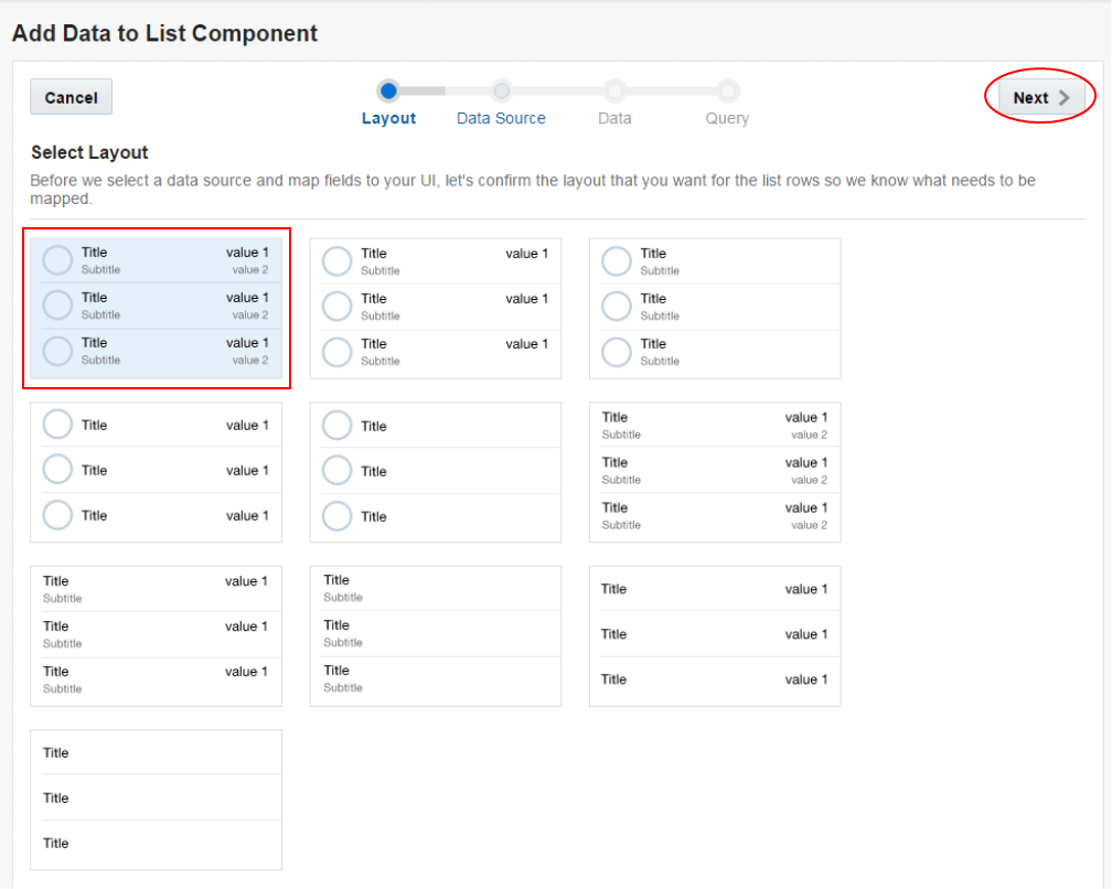
We can keep the layout as it's set.
Click Next.
-
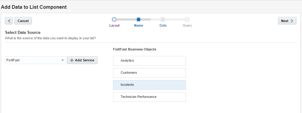
In the Data Source, select the Incidents business object.
Then, click Next.
-
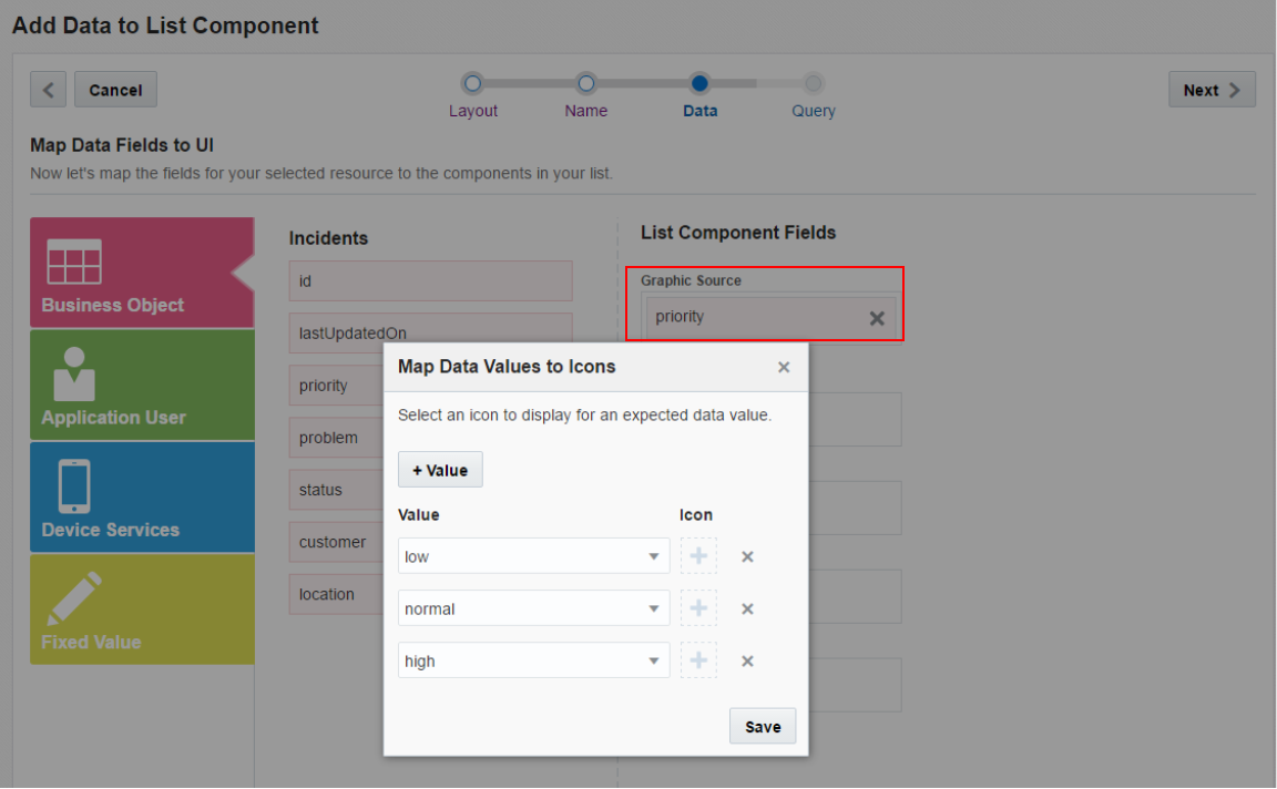
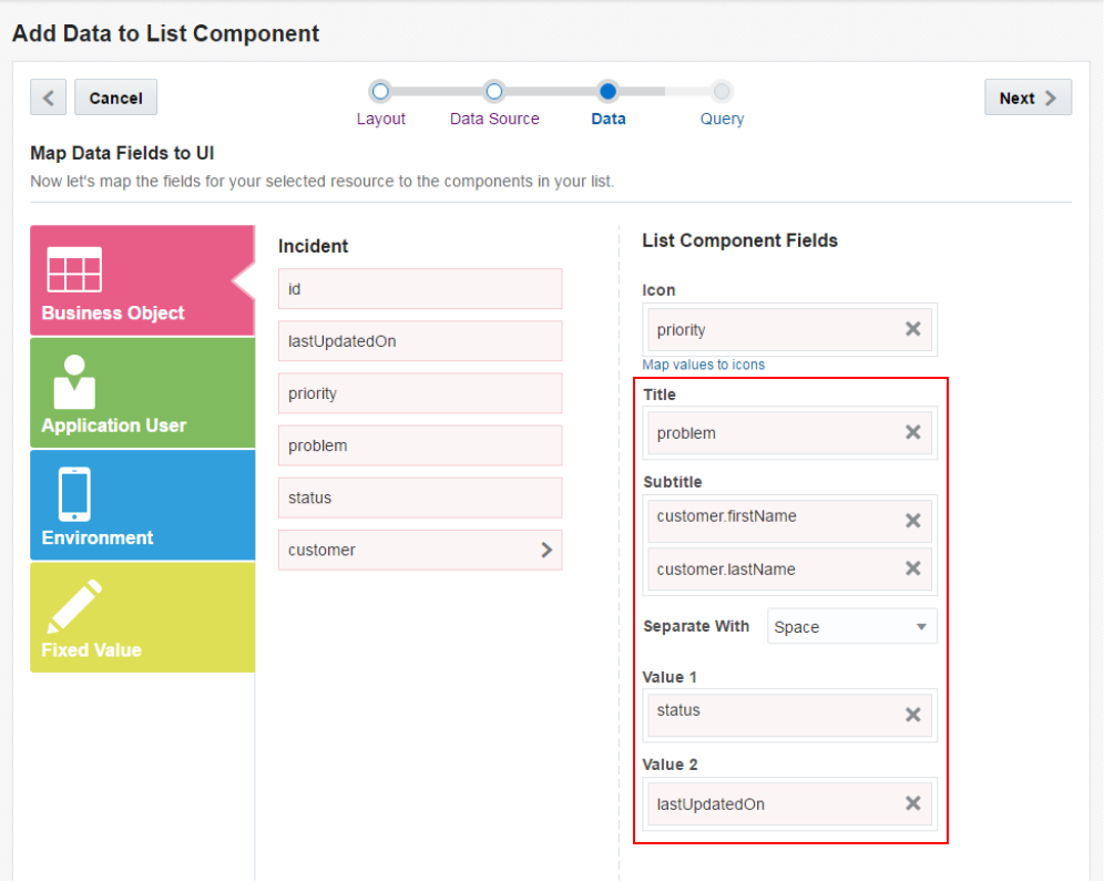
Then set which fields you want to see on the page. On the left, is what incident returns and on the right is what fields you wish to see on the screen. First set the Icon to priority.
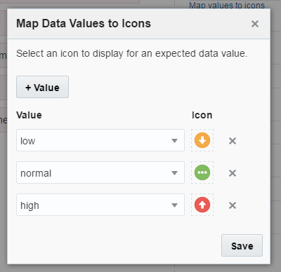
When you drag and drop the priority onto the Graphic Source property, a popup is displayed where you can specify the images that will be used for each of the priority values.
-
Click the plus sign next to the low value and you can select an image for any low priority incidents.
Select the Priority Low image and then click Select.
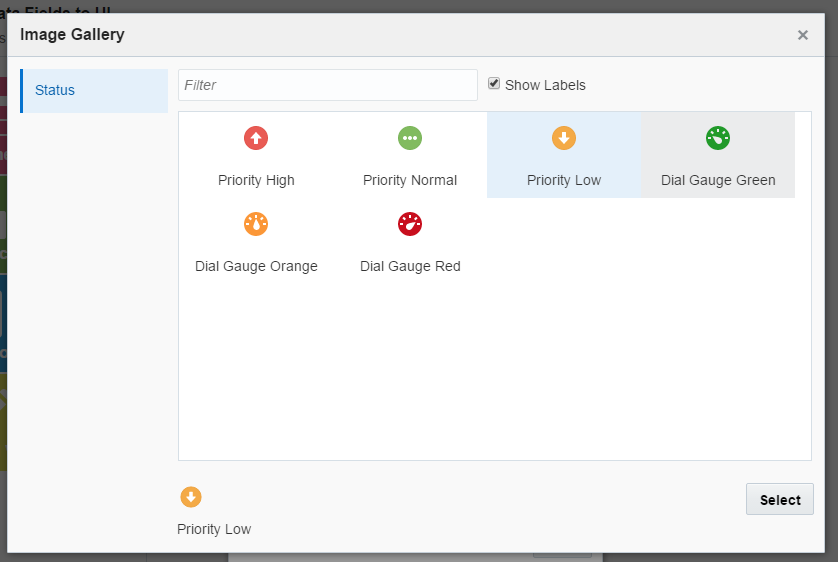
Set the normal priority to the Priority Normal image and the high priority to the Priority High image.
Then click Save.
-
For the rest of the values, set them accordingly. When you get to the Subtitle, click the customer to reveal all the customer attributes. You can drag and drop two attributes to the Sub Title filed and they will be concatenated. By default a space will be used to separate them.
Title: problem
Subtitle: customer.firstName & customer.lastName
Value 1: status
Value 2: lastUpdatedOn
Then click Next.
-
Finally, like with the Metric components, set the Technician parameter to the Application User's Username.
Then click Finish.
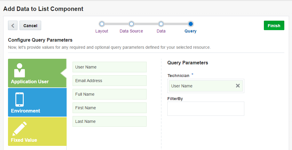
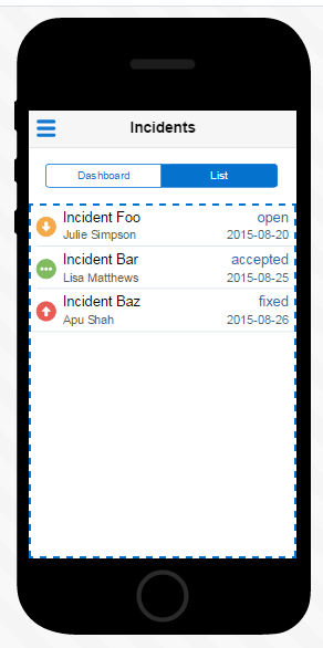
Again, you are taken to the preview where some sample data is displayed.
In the next section you will wire up two additional pages.
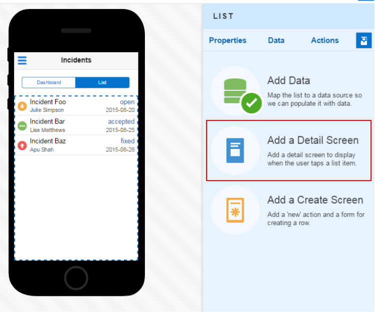
Step 5: Add a View and Edit screens
In this part of the tutorial, you use the Quick Start tool to add a detail screen and an edit screen.
-
Back in the Quick Start menu, select the Add a Detail option.
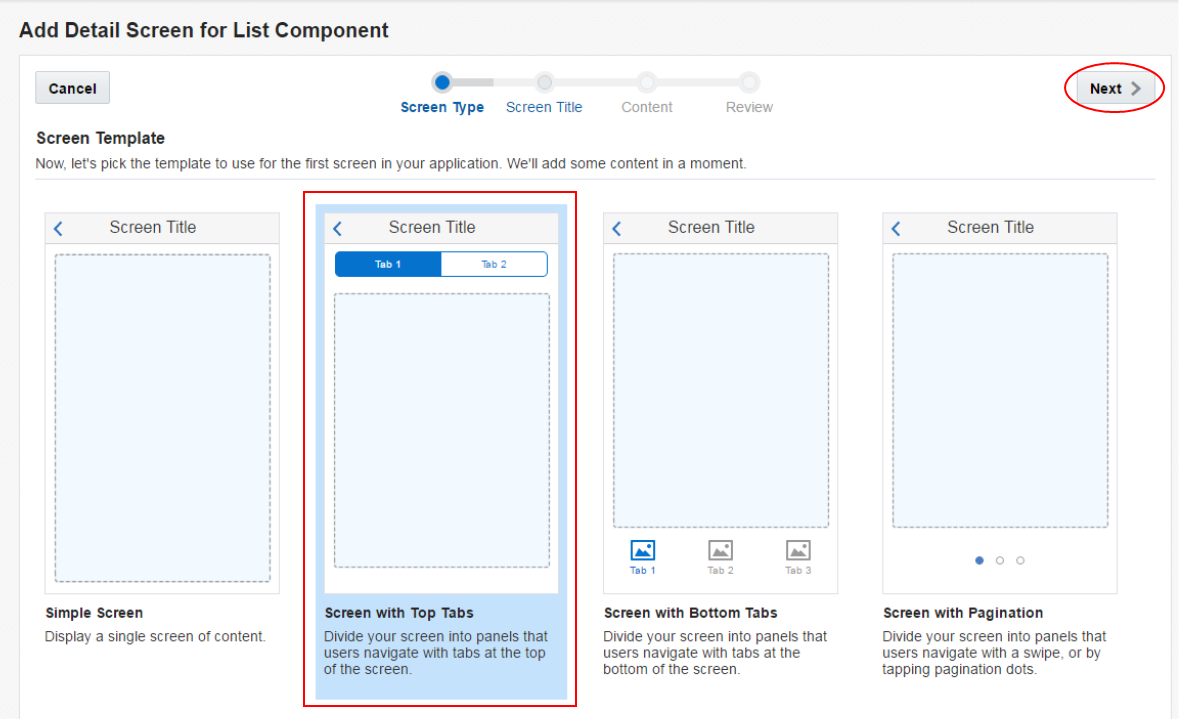
-
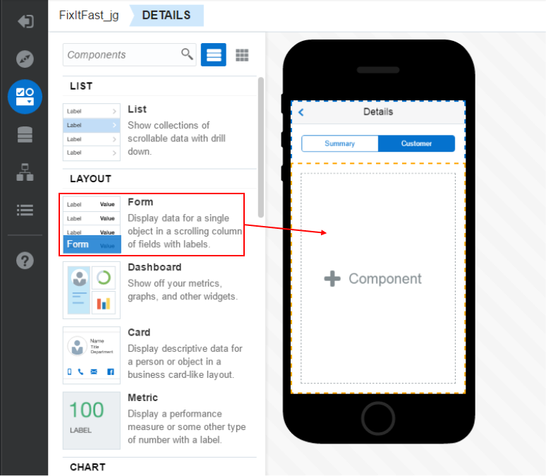
We'd like to display Summary and Customer information on this screen, so the Screen with Top Tabs will work just fine.
Select it and click Next.
-
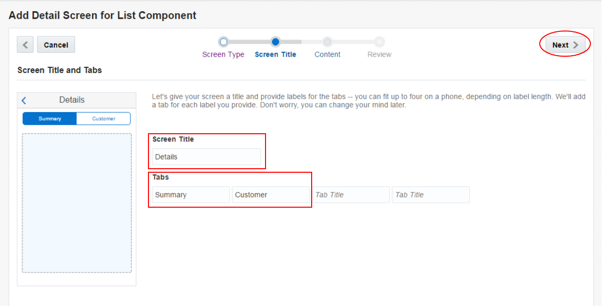
In the Screen Title page, set the Screen Title to Details and the two Tabs to Summary and Customer.
Then click Next.
-
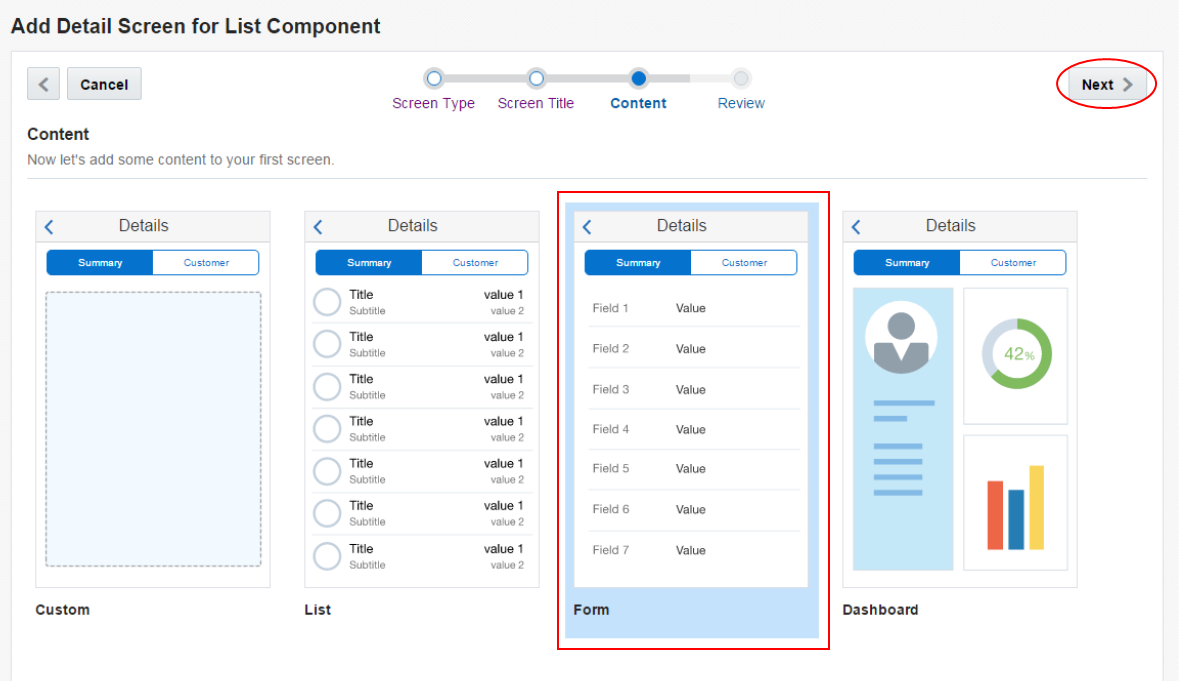
For the Details screen, a Form will work just fine. Select it and click Next.
Then on the Review page, click Finish and you'll be taken back to the Designer.
-
In the Designer, click the Go to Details Screen to work on it's contents.
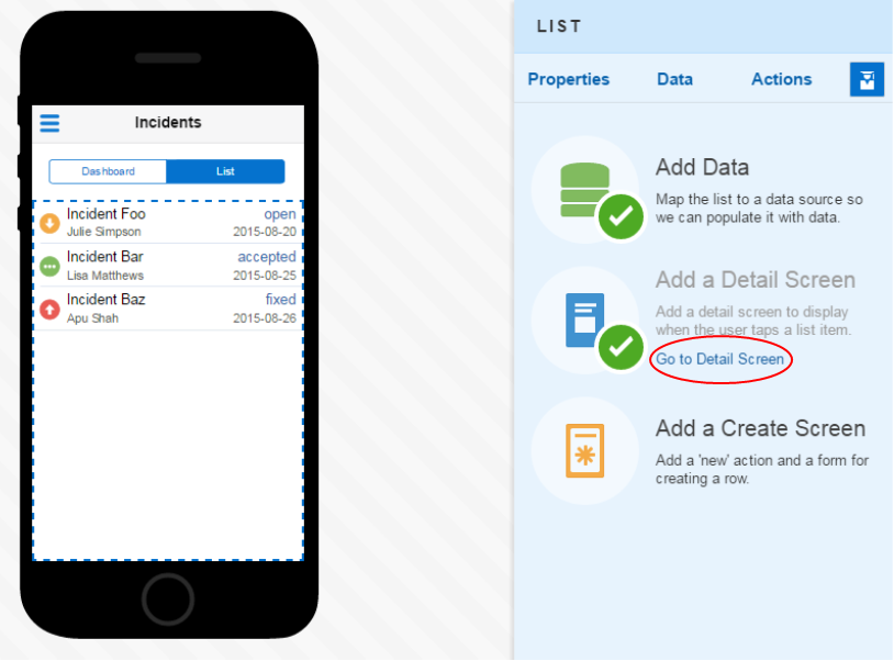
Then we'll continue to use the Quick Start option, so click the Add Data option.
-
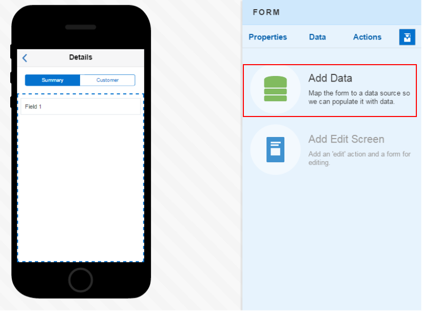
We want to base this screen on the Incident business object, so select it and then click Next.
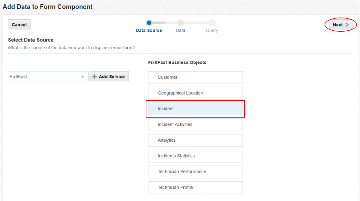
-
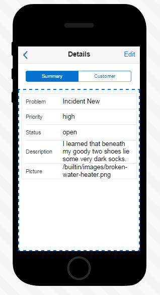
Now you can add fields. Drag and drop them to the right in the following order.
problem - priority - status - description - picture
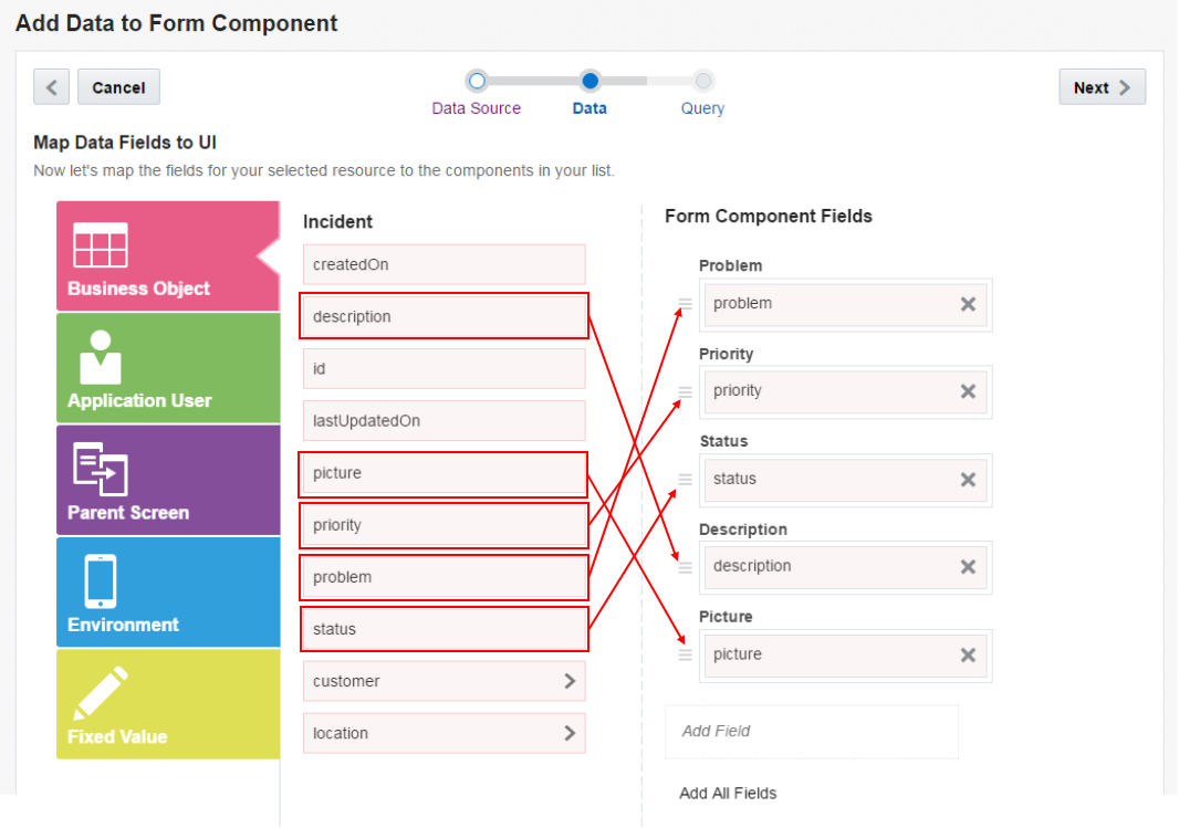
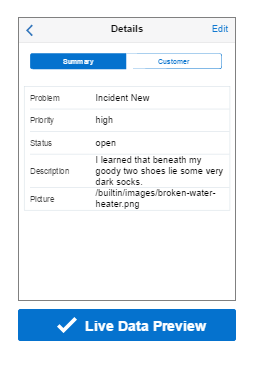
Scroll down or to the right to see the Live Data Preview. Click the button to see sample data from the Custom API displayed.
Then to continue, click Next.
-
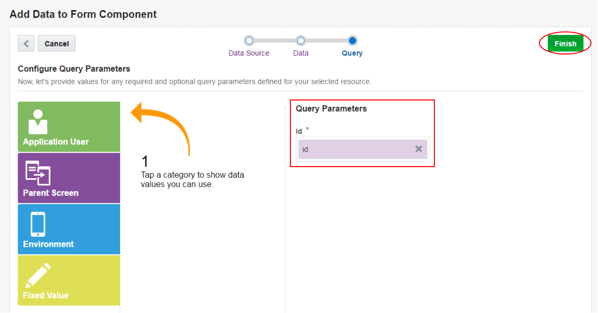
Since the screen is a detail, the query parameter is already populated with the id. Click Finish.
You are taken back to the Designer and can see your screen.
-
Change a couple of the field properties. Select each field and then set the Field Type property.
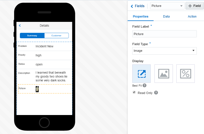
Set Priority and Status to Text, Description to Text Area, and Picture to Image. Also select the Best Fit for the Display field.
-
Now, lets add data to the Customer tab. Click the Customer tab.
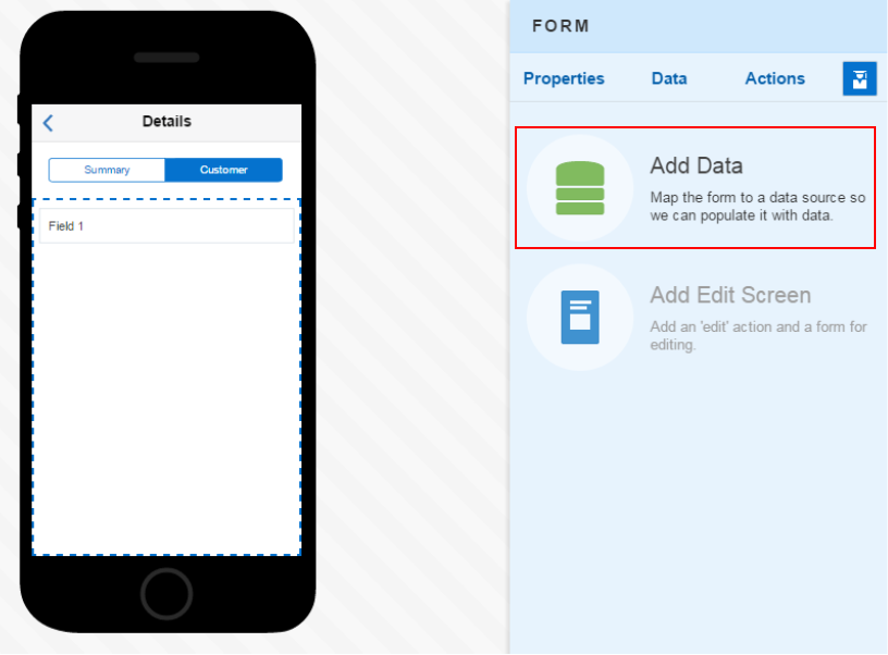
From the Component palette, drag and drop a Form component onto the Customer tab.
Then click the Add Data text on the right.
-
We want to add Customer data, from the selected Incident, to this Form, so select the Incident business object and then click Next.
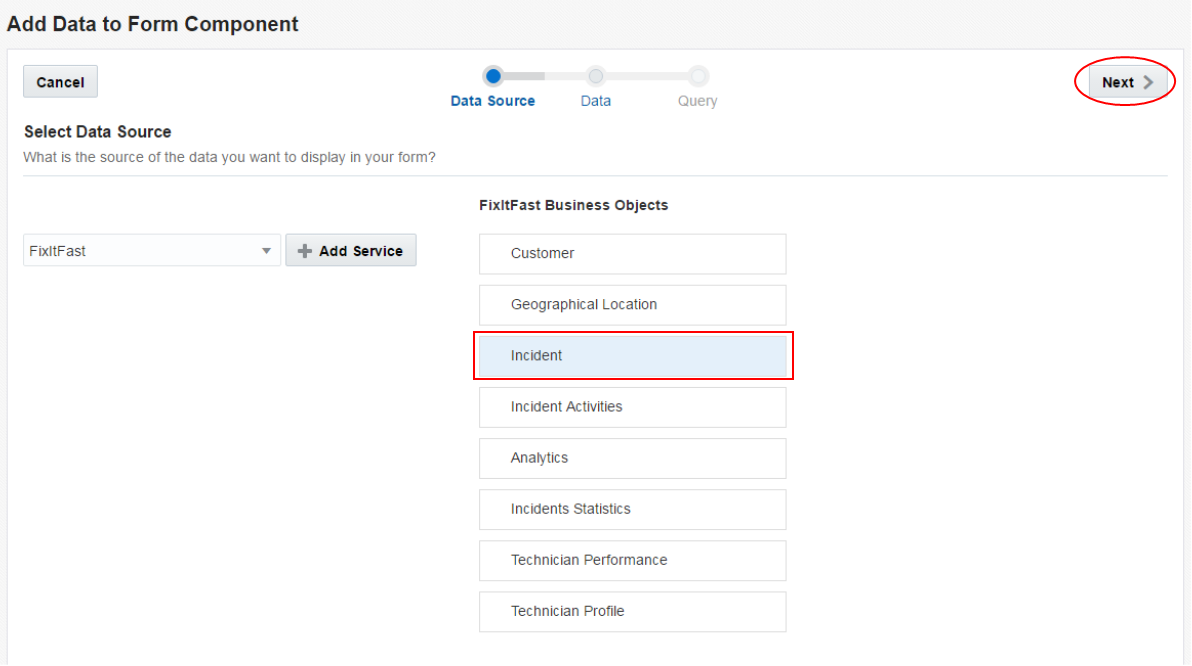
Then click customer to expose all the fields.
-
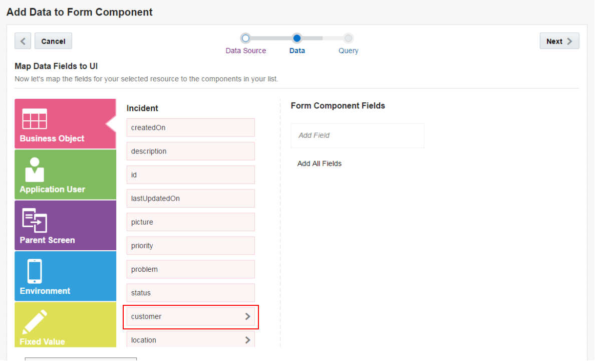
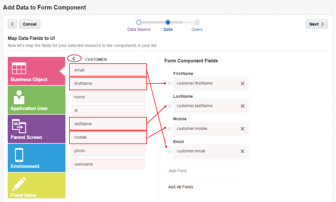
In the Data page, drag and drop the following fields onto the page.
firstName - lastName - mobile - email
Then click the blue greater than sign to the left of the CUSTOMER label. We need to add some address information.
-
Click location to see all the avaialable fields.
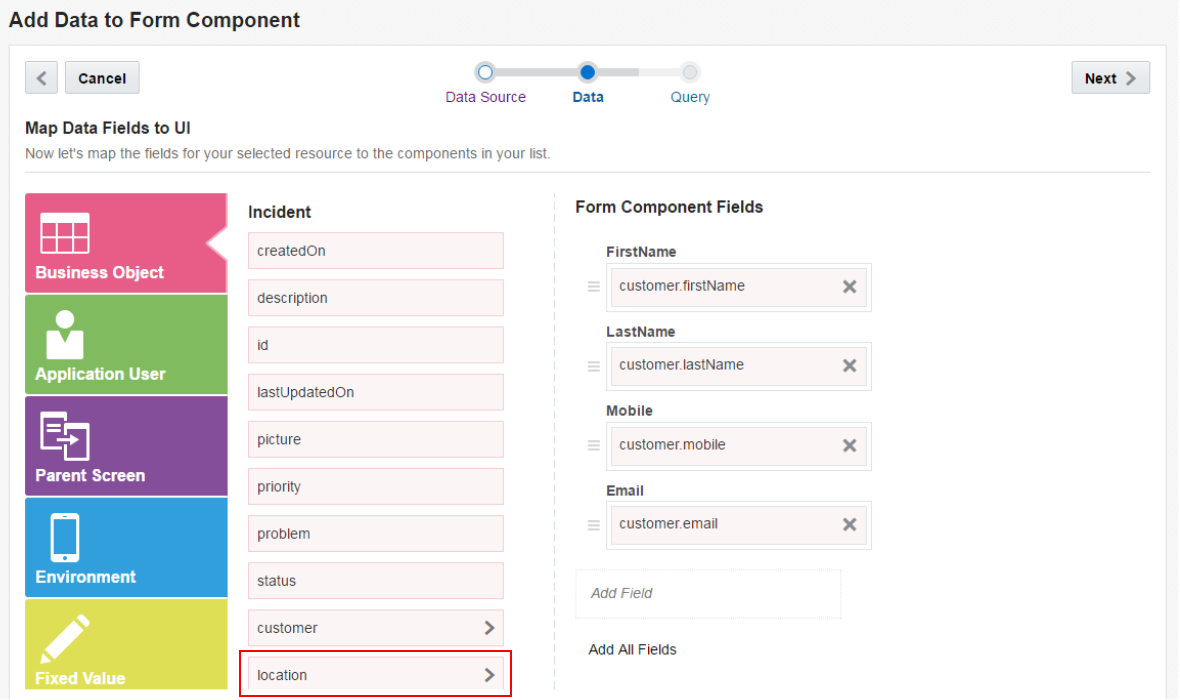
Then drag the formattedAddress below the Email field.
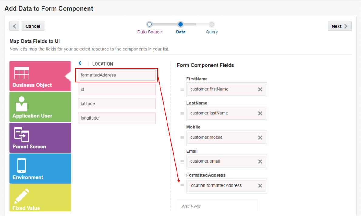
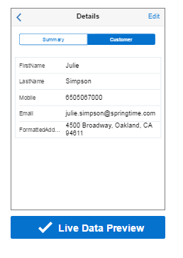
Again, find the Live Data Preview button and click it to display sample data.
Then click Next.
-
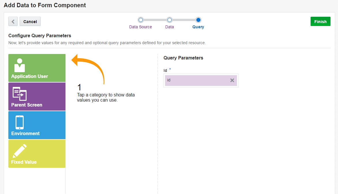
In the Query page, the id should be populated in the Query Parameter field.
Click Finish.
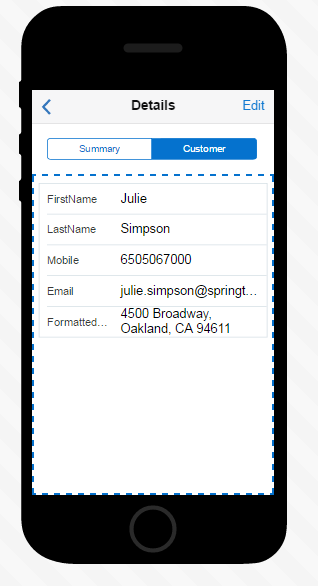
Like before, you are taken to the Designer where you can see your screen.
-
Change the Field Type for Mobile to Phone and Email to Email.
Users can now click these fields to activate the associated application.
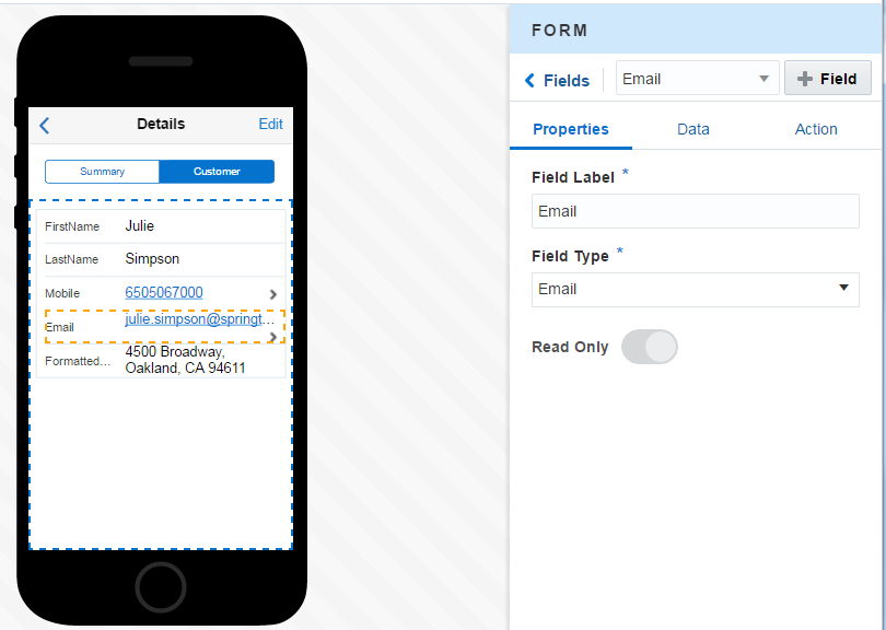
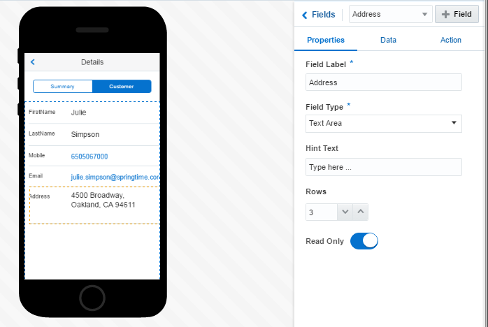
Then set the Field Label for the ForamttedAddress to Address and the Field Type to Text Area.
-
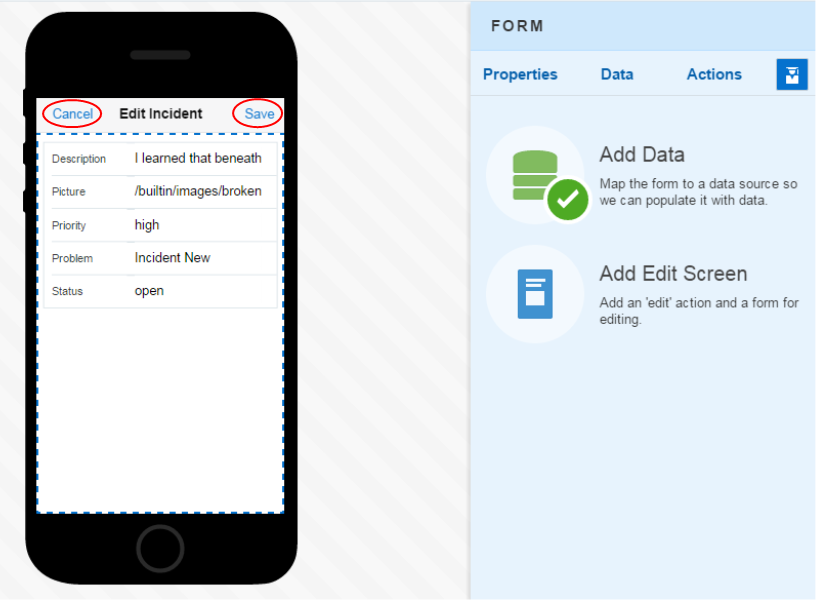
We also want to allow for editing of the Summary information. Select the Summary tab.
In the Quick Start menu, select the Add Edit Screen.
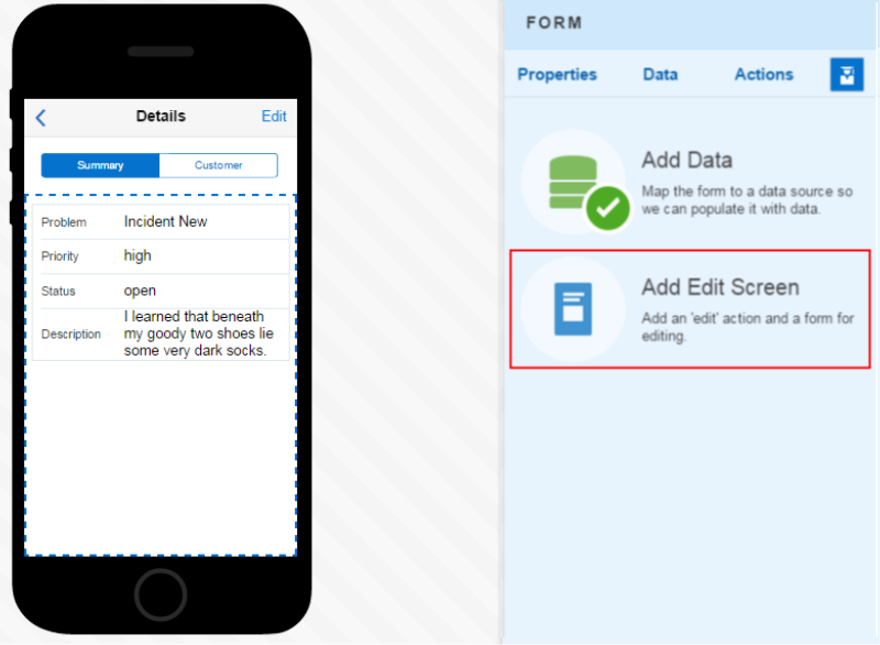
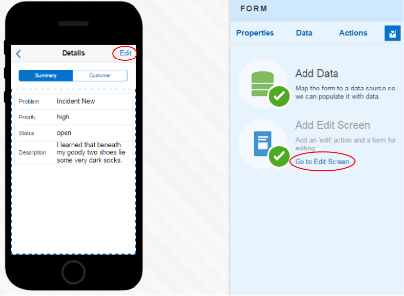
Notice on the upper right of the screen an Edit text has been added. This will allow users to access the Edit screen. To make modifications to the Edit screen, click the Go to Edit Screen text.
In the Edit screen, Cancel and Save texts are added at the top.
-
Lets make a few changes to a field on the Edit screen.
Select the Form and on the right side, the Properties will appear.
Then, select the FIELDS property.
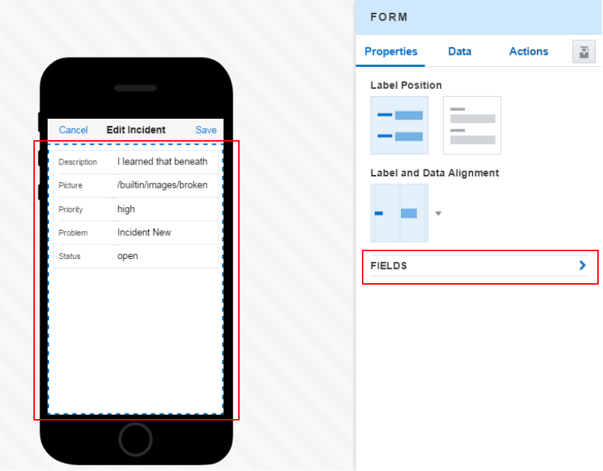
Drag and drop the fields to change the order and use the burger icon on the left of each field as the handle to move it.
Put the fields in this order: Problem - Priority - Status - Description - Picture

-
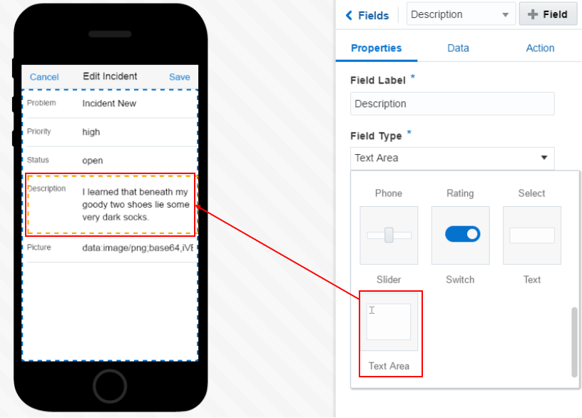
Next change the characteristics of the Description field.
In the preview, click the Description field. Then in the properties, click the Field Type. Select Text Area and notice the preview changes to show you the new field type.
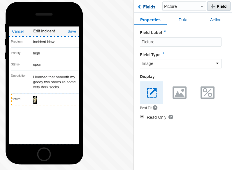
Also, set the Picture Field Type to image and select the Best Fit display option.
Finally, set the Priority and Status Field Type to Select.
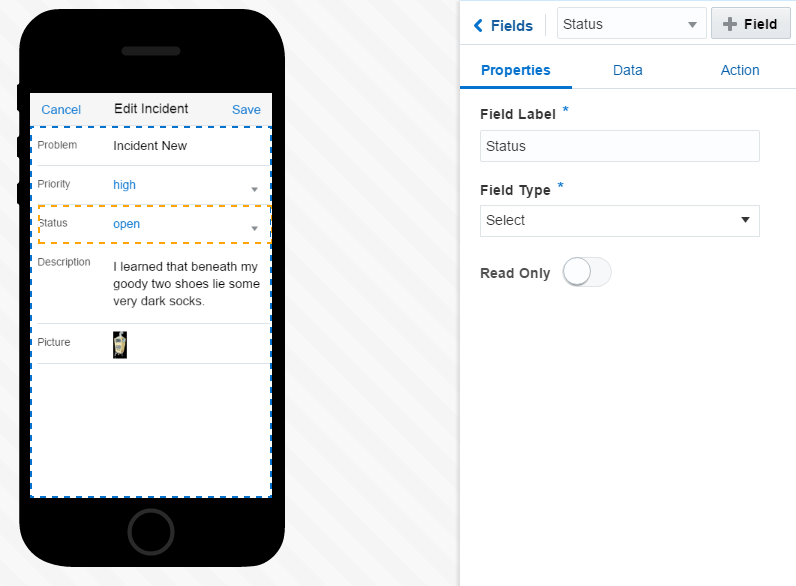
-
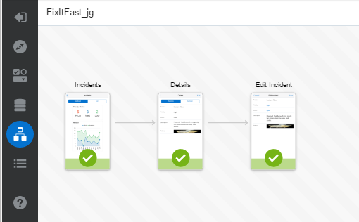
You can also work on the flow of the screens by clicking the Screen Flow icon on the left toolbar.

Click it to see the Incidents - Details and Edit screens.
In the next section you will add a Create screen.
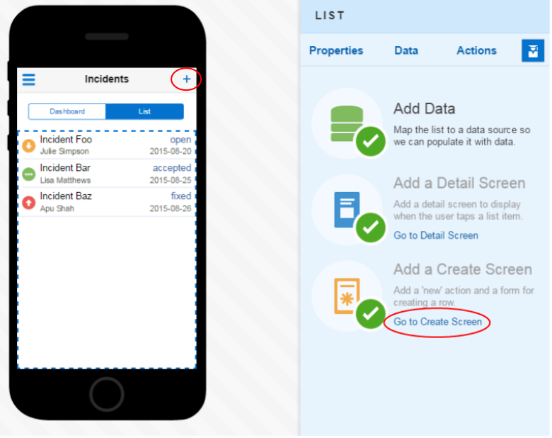
Step 6: Add a Create screen
In this part of the tutorial, you use the Quick Start tool to add a create screen.
-
In the Screen Flow, double click the Incidents screen and you're taken back to the Designer.
-
Click the List tab and you'll see the Quick Start options on the right.
Click the Add a Create Screen option.
Then click the Go to Create Screen option. Notice in the upper right of the Incidents a blue plus sign has been added to navigate to the create screen.
-
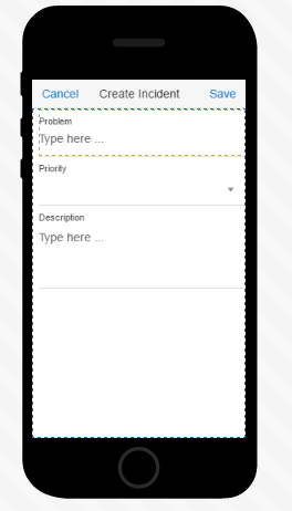
Here you see the fields that are needed to create an incident.
Click the Properties tab and set the Label Position to show the labels above the value.
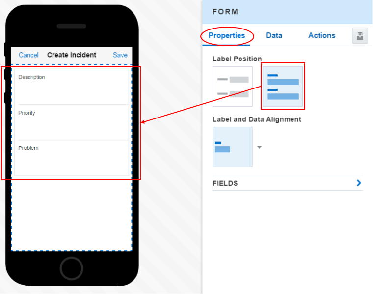
Also, reorder and set the field type to the following: Problem: (Text), Priority: (Select list): Description (Text Area).
-
On the left toolbar, click the Screen Flow icon again to see the Create screen is now included.
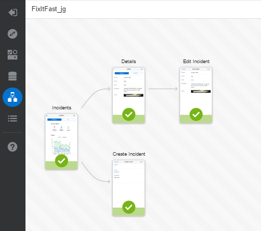
At this point we are done developing the application.
In the next section you will build, test deploy the application Test and Deploy a MAX application.