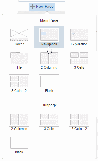
4 Adding Pages
Mobile App Designer provides several pages with built-in interactive features.
4.1 Cover Pages
Cover pages are useful in presentation-style apps. Use a cover to include corporate branding or images to enhance the impact of your app to your audience.

The default cover page has preset frames for images and text. You can redesign the page for your own requirements.
4.1.1 Updating the Cover Page Background Image
To update the cover page background image:
-
Double-click the image on the page.
-
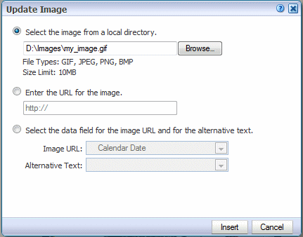
In the Update Image dialog, specify one of the following sources for the image:
-
Select the image from a local directory: Click Browse to specify the file name and directory of the image on a local directory to upload the image.
-
Enter the URL for the image: Enter the URL where the image is stored.
-
Select the data field for the image URL and for the alternative text:
Image URL: Select the field from the data that contains a URL to an image.
Alternative Text: If your data includes a field that contains alternative text for the image, you can select that field to define the alternative text that is displayed for the image.
-
-
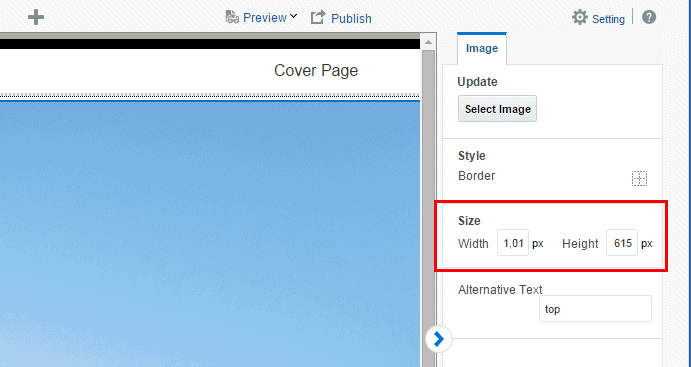
Optionally resize the image in one of these ways:
-
Drag the right bottom corner of the image. To preserve the aspect ratio when resizing an image, press and hold the Shift key before starting to drag the corner.
-
Modify the width and height in the Properties pane. With the image selected, you can enter precise height and width values in pixels.
-
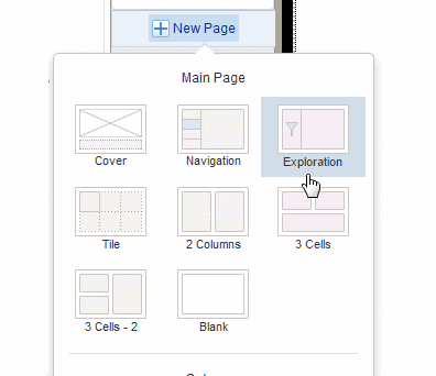
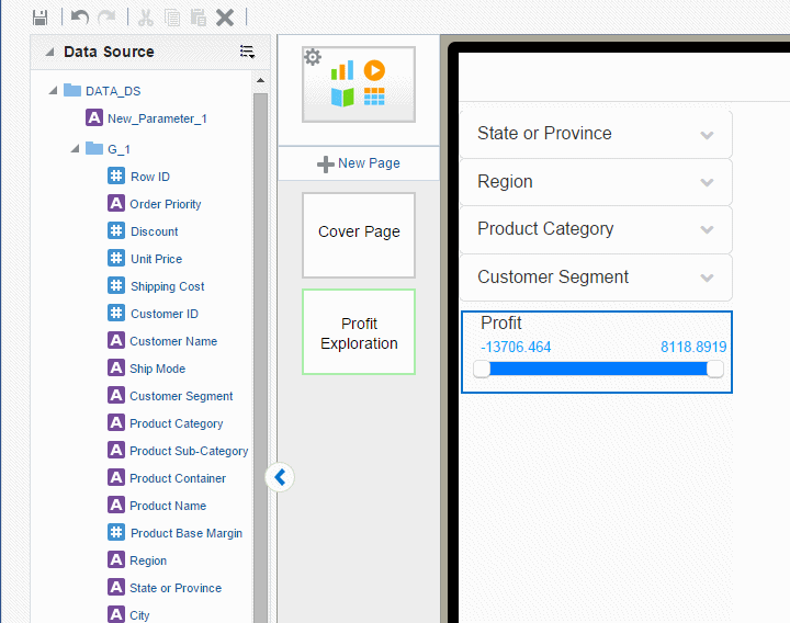
4.2 Exploration Pages
Use an Exploration page to provide your tablet app consumers the most flexibility in choosing combinations of data to visualize.
Exploration pages provide multiple filters to enable easy exploration of the data presented on the page. Any text or numeric fields (including calculated fields) can be added as filters enabling your users to mix and match the data that interest them to provide new and personal views of the data.
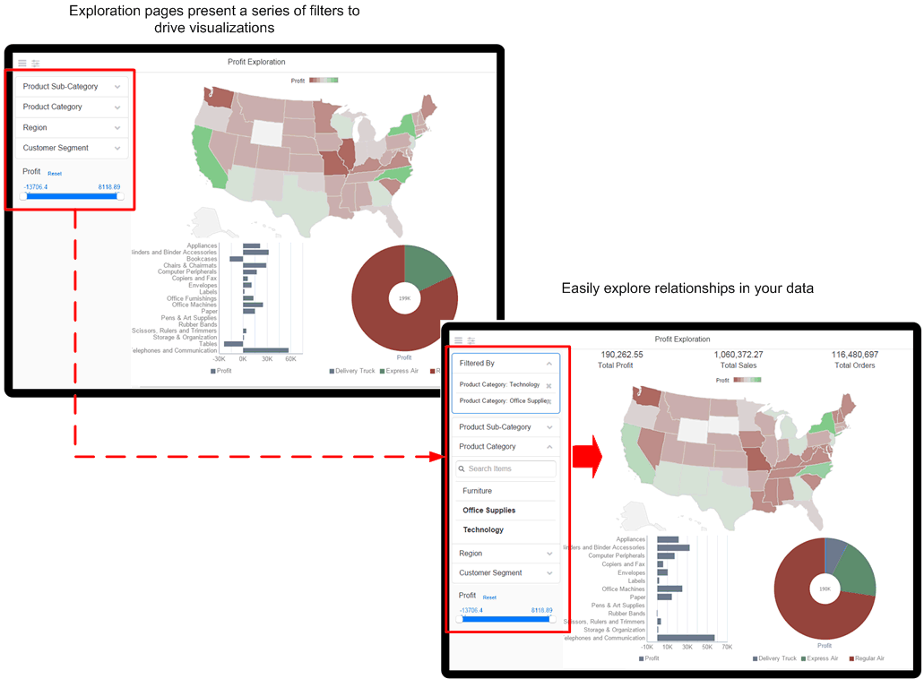
Numeric fields (such as Sales, Salary, Units Sold) are presented as sliders. You can customize the operator that defines the slider.
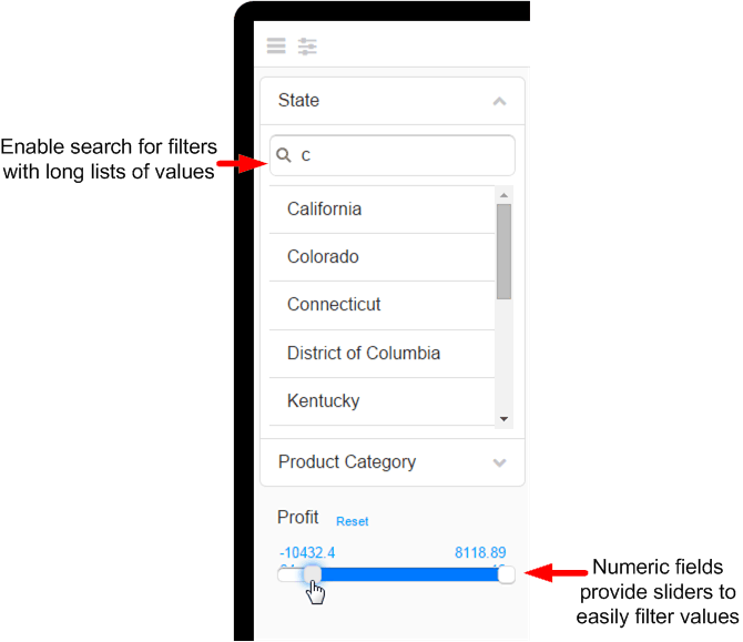
For text filters with long lists of values, you can enable a search option. The search option prompts you to start typing text to narrow the choices.
At run time you can select multiple values from each filter list. You can also define default values for filters so that when the page launches, it is initially filtered by one or more values.
Note that date fields are not supported.
-
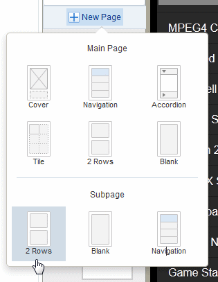
Click New Page and then click Exploration.
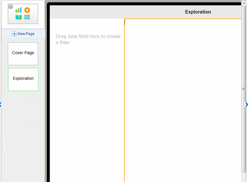
The inserted page is divided into two sections. The left section is where you drag data fields to create filters. The wider, right hand section is where you insert the visualizations that will be driven by the filters.
-
Drag text or numeric data fields from the Data Source pane or from the Calculated Fields pane and drop them on the left side of the page to create as many filters as desired for your app page.
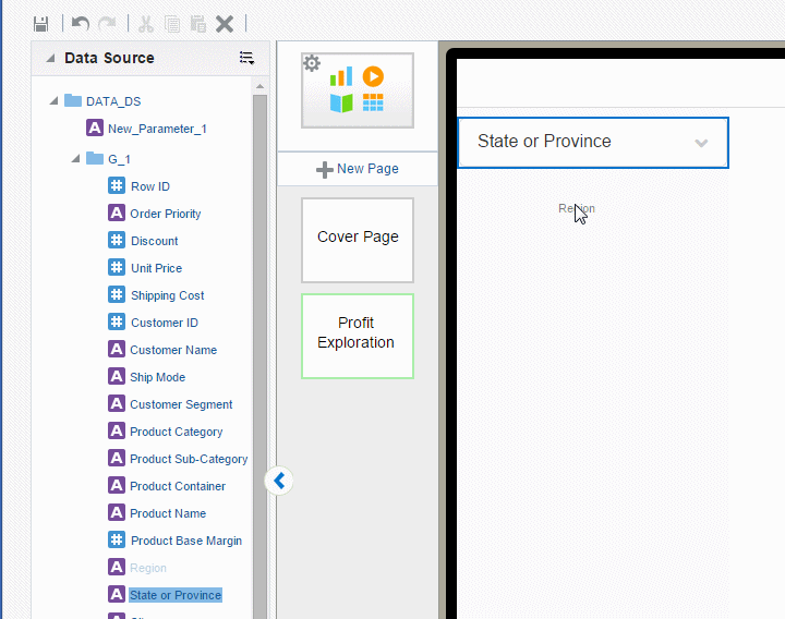
The field labels from the data source are displayed by default. You can update the filter label on the Properties pane. Numeric fields display as a slider-style filter.
-
Add the visualizations (charts, maps, tables) to the right side of the page. All the visualizations are filtered when you make selections on the left side.
-
Optionally customize the filters:
4.2.1 Customizing Text Filters on the Exploration Page
Use the Properties pane to apply the following customizations to text filters:
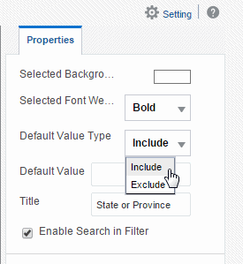
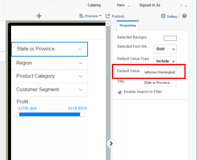
4.2.1.1 Specify Default Values for Text Filters
You can set default values for filters so that when users open the page specific values are already applied. You can remove the defaults as you explore the data, choosing different values. You can define values to include by default, or values to exclude by default.
To specify default values:
-
Select the Filter to display its Properties.
-
In the Default Value Type property, choose whether to Include or Exclude the specified values.
-
In the Default Value property, enter the values. Enter multiple values separated by a comma. (Important: Do not enter spaces between the values.)
4.2.1.2 Enable or Disable Search for Text Filters
By default text filters include the Search option (see Figure 4-6) to enable you to more easily navigate long lists of values. For shorter lists you can disable this feature by deselecting the Enable Search in Filter option.
4.2.1.3 Customize Selected Background Color and Font Weight
The selected background color and font weight define how the filters that are selected display in the list. Set these properties to highlight the active filter selections.
To change the background color: On the Properties pane, click the Selected Background color bar, then choose a new color from the color picker.
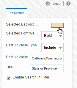
To change the default Selected Font Weight: On the Properties pane, select Bold, Light, or Normal from the list.
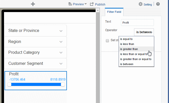
4.2.2 Setting the Operator and Values for Numeric Filters on the Exploration Page
By default, the Operator "is between" is applied with the Minimum and Maximum values applied dynamically from the lowest and highest values present in the data. You can select a different operator as well as configure filters to display static minimum and maximum values.
To specify values and operator for numeric fields:
-
Select the numeric Filter to display its Properties.
-
To change the Operator, select from the list. Supported operators are:
-
is less than
-
is greater than
-
is less than or equal to
-
is greater than or equal to
-
is between (default)
-
-
To set absolute minimum and maximum values for the slider, rather than have the values set dynamically from the minimum and maximum values present in the data, select Set static Min/Max Value, and then enter the absolute minimum and maximum values.
4.3 Tile Pages
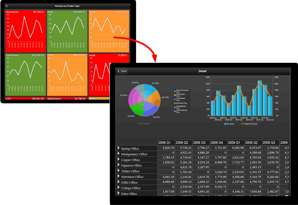
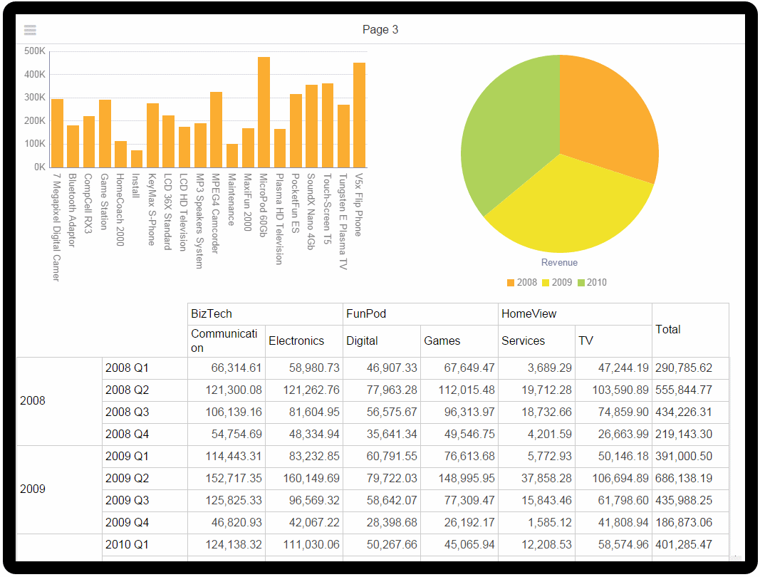
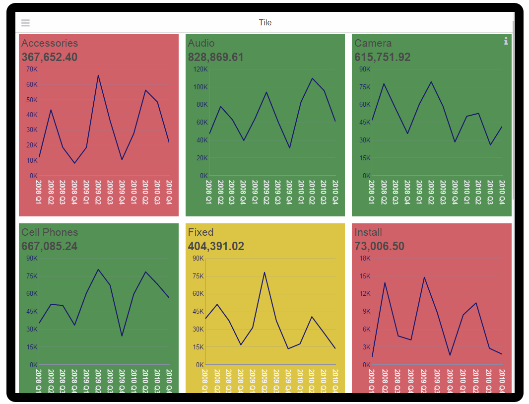
Tile pages provide a scrollable set of tiles each containing the same components repeated for a specific field in your data. Use a tile page to provide an instant view of a key measure across a specific dimension. This view not only provides a complete picture within each tile, but also enables an at-a-glance comparison across your data set.
 Video: Adding Tile Pages to Apps
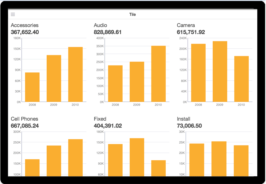
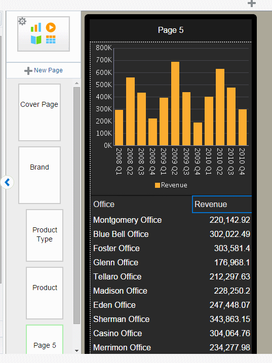
The example tiles shown in Figure 4-12 provide an overview of revenue for a set of products. Each tile displays the overall revenue and a chart showing revenue by quarter. When you design a tile page you can include any visualization in each tile.
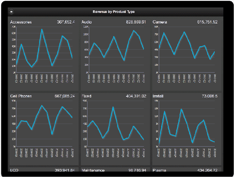
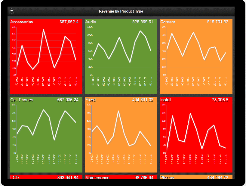
To enhance the visual impact of the values represented in each tile, you can add stoplight formatting to highlight tiles with results that fall outside the range of specific threshold values.
When a tile page is paired with a subpage, each tile is a touch point to open the subpage filtered by the tile value. This combination enables your users to quickly assess areas that require attention and drill down for deeper analysis.
Features of tile pages include:
-
Each tile is a touch point. When you associate a subpage with a tile page, tapping a tile opens the detail subpage.
-
Tiles load dynamically as you scroll down.
-
Tile width is based on the number of columns specified and your device type display area. You can define the number of columns up to four across.
-
You can customize the tiles to include any component.
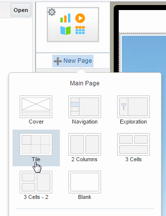
4.3.1 Creating a Tile Page
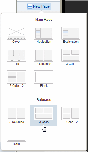
When you insert a new page, Tile is available as a page template selection. You can also insert a tile into a specific page area using the option on the Add Component menu.
To insert a tile page:
-
Click New Page and then click Tile.
-
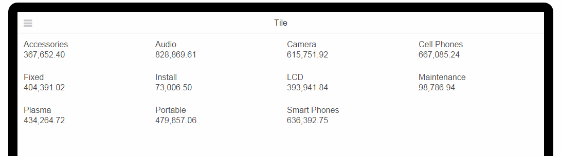
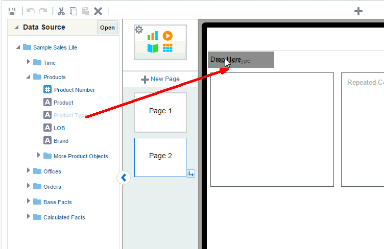
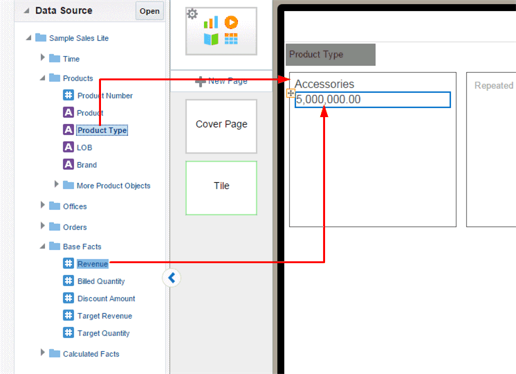
In the Tile page, drag the data field that you want grouped for each tile. The example tile page in Figure 4-15 will display one tile for each Product Type.
-
To add contents to the tiles, select the first tile, and drag the components from the Insert menu to the first tile. Note that in the app designer, only the first tile displays the contents. Use Preview when you want to see content across all tiles.
Tip:
For precise placement of components within a tile, use Frames to position your contents. See Inserting Frames.A common use case is to add the data field label to the tile with a measure. For example, drag Product Type from the Data Source pane to the first tile and then drag Revenue from the Data Source pane to the first tile.
-
Preview your tile page to view the contents so far. Click Preview.
To finish your tile page, add the components to the first tile. For example, to add a chart, simply drag the chart component from the Insert menu and customize the chart as desired. An example is shown in Figure 4-17. For information about more customizations you can apply to your tile page, see Customizing Tiles.
4.3.2 Adding a Subpage to a Tile Page
A common use case is to add a subpage to a tile page to provide more detailed information about the data provided in a specific tile. The detail subpage opens when you tap a tile.
To add a subpage:
-
Select the Tile page.
-
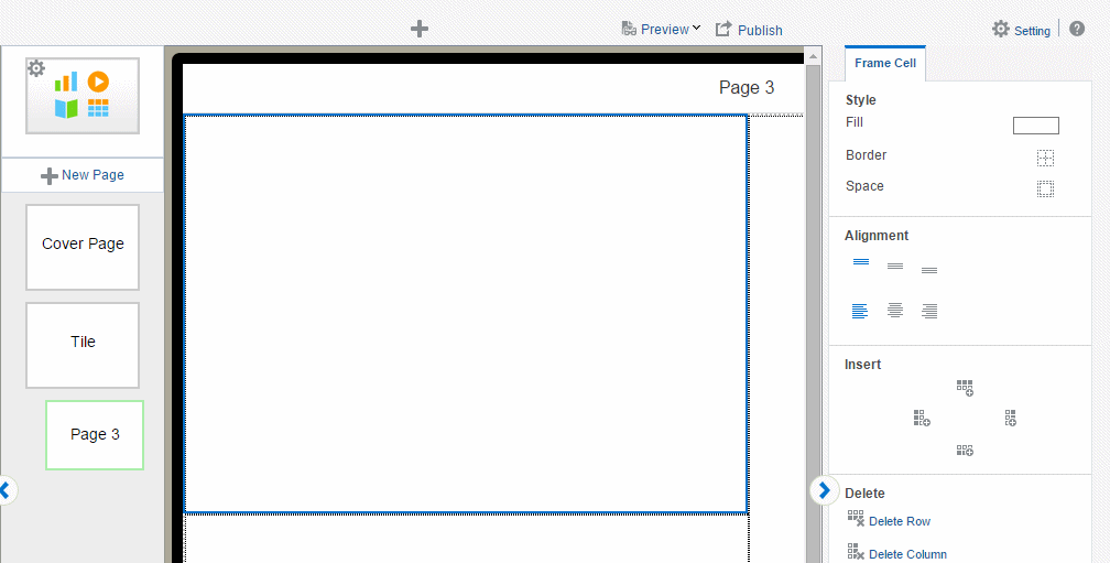
Click New Page and then select one of the Subpage options from the menu.
-
The empty subpage is inserted for you to add content.
-
Add components to your subpage. The example in Figure 4-18 shows a subpage with two charts and a pivot table. At run time, when you tap a tile on the tile page, the components on this page show detail for the tapped item only.
4.3.3 Customizing Tiles
You can insert any combination of components to the tiles. To accommodate the components you choose you can apply the following customizations:
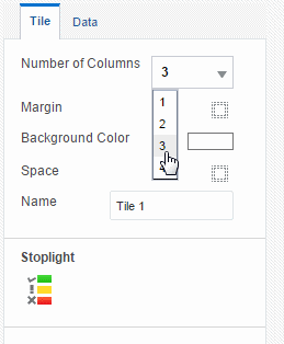
Select the first tile to display the Tile Properties pane.
4.3.3.1 Specify Number of Columns
To change the number of columns that display across the page, click the Columns option and select the number of columns. Supported values are one through four.
The column width automatically adjusts depending on the size and type of mobile device used to view the app.
4.3.3.2 Apply a Background Color
To change the default background color: On the Properties pane, click the Background Color bar, then choose a new color from the color picker.
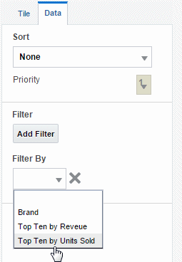
4.3.3.3 Apply Filters
Apply a filter to refine the items displayed in the tile page. For example, you can apply a filter to limit the display to only:
-
The top 10 salaries
-
The bottom 25 store sales
-
Employees in the IT department
-
Sales that are between $10,000 and $20,000 and in the Southern region
You can add multiple filters and manage the order in which they are applied to the tile page.
The Apply Filter option is available from the Data tab of the properties pane.
See Filtering Data for information about creating filters.
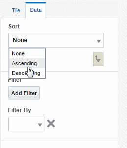
4.3.3.4 Sort
The Sort option sorts the tiles by the field you selected as the tile grouping field. For example, if you chose Product Type as the tile grouping field, and then select Sort ascending, the tiles will be sorted from A - Z by the Product Type name.
To sort the tiles:
-
Select the first tile to view the Tile properties.
-
In the Tile properties pane, click the Data tab.
-
From the Sort menu choose None to apply no sort, Ascending, or Descending.
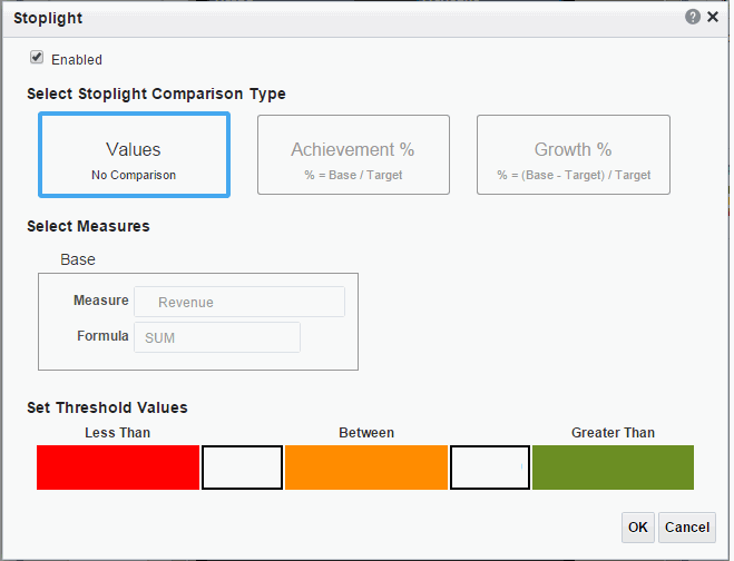
4.3.3.5 Add Stoplight Formatting
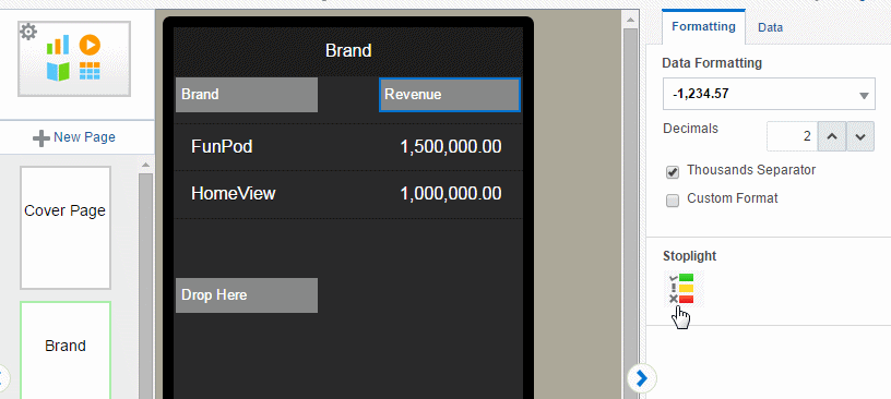
Stoplight formatting applies one of three distinct background colors to each tile depending on the value of a chosen aggregated field in your data. You can customize the colors or use the default colors red, amber, and green. Use stoplight formatting to quickly assess an indicator as unacceptable, acceptable, or desirable.
The Stoplight feature enables you to highlight values conditionally based on static threshold values, a comparison to a target value, or a comparison to another field.
4.3.3.5.1 Apply Formatting Based on Static Values
Use this option when the unacceptable, acceptable, and desired values are the same for the aggregated field for all items. You can customize the colors for each range.
To apply conditional formatting based on static values:
-
Select the first tile to view the Tile properties. On the Tile properties pane, click Stoplight.
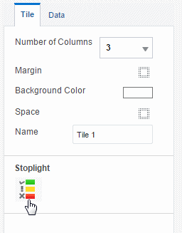
-
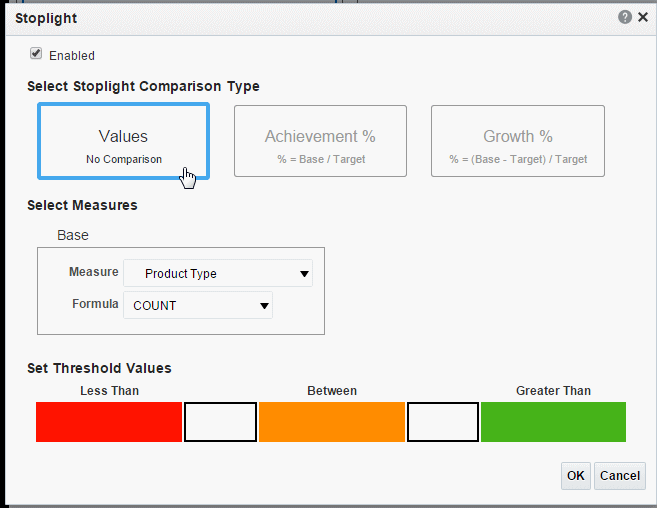
In the Stoplight dialog select Values.
-
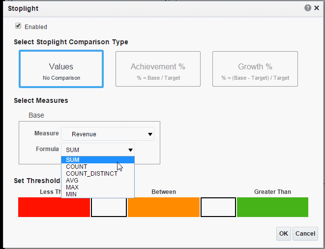
Select the Measure field on which to base the formatting and then select the formula to apply to the Measure.
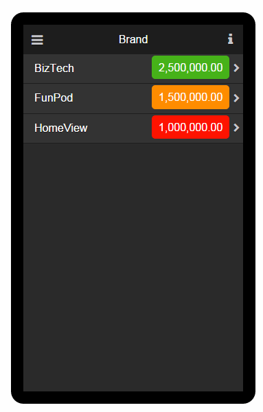
For example, assume you have grouped tiles by Product Type. You want to apply formatting to each tile based on the value of Revenue for each product type. Select Revenue as the Measure and Summation as the Formula.
-
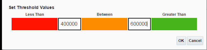
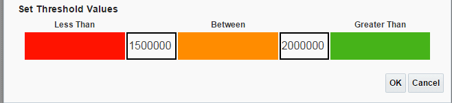
Enter the threshold values for the background colors. Values less than the left entry will display the Less Than background color. Values greater than the right entry will display the Greater Than background color. Values between display the Between color.
To change the default colors, see Customizing the Colors.
-
Click OK.
Note that for Tile pages the stoplight formatting does not display in the design workspace.
-
Click Preview to view how the formatting will display at run time.
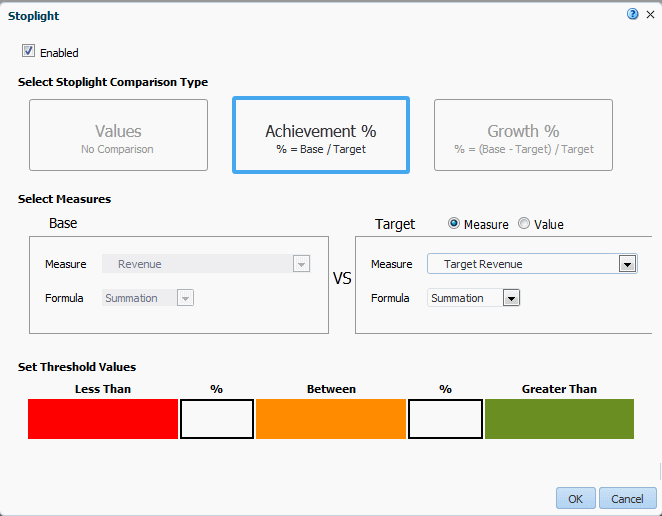
4.3.3.5.2 Apply Formatting Based on Percent Achievement
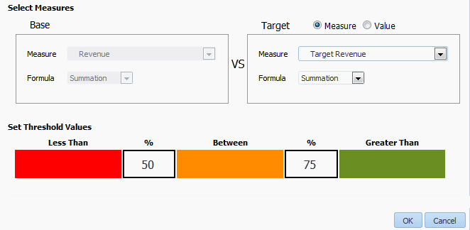
This option enables you to conditionally highlight the aggregate value based on the percentage of a target value. For example, you want to highlight sales that are less than 50 percent of target to display as red, sales that are 50-75 percent of the target as amber and sales that are greater than 75 percent of the target to display as green.
To apply conditional formatting based on the percent achievement of a target:
-
Select the first tile to view the Tile properties. On the Tile properties pane, click Stoplight.
-
In the Stoplight dialog select Achievement %.
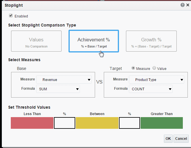
-
Select the Base Measure from the data field list and the Formula to apply to the measure field. In this example, Revenue will be summed for each tile to establish the base measure.
-
Choose the Target Measure or enter a Value.
-
Measure - select a field from the data to supply the target value for comparison.
-
Value - enter a static value to supply the target value for comparison.
The app calculates what percentage the calculated Base measure value is of the Target value. In the example below, the Revenue column (Base) is compared to the Target Revenue column (Target). The calculation performed is:
Revenue/Target Revenue X 100%
Therefore if your Revenue is $8,000 and your Target Revenue is $10,000, the percent achievement is:
8,000/10,000 X 100% = 80%
-
-
Enter the Less Than and Greater Than percentage values for the background colors.
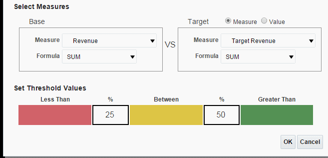
If the Base value percentage of the Target value is less than the percentage you enter on the left, the Less Than color displays. If the Base value percentage of the Target value is greater than the value you enter on the right, the Greater Than color displays.
-
To change the default colors, see Customizing the Colors.
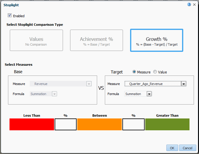
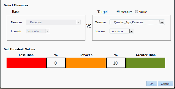
4.3.3.5.3 Apply Formatting Based on Percent Growth
This option enables you to conditionally highlight the aggregate value based on the percent difference of the base value from the target value. The calculation applied is:
(Base - Target)/Target X 100%
For example, you want to compare sales from the current and previous quarters and you want to see when sales in the current quarter showed less than 10% growth from the previous quarter. When sales showed 10% growth you want to display the value in green, when 0-10% growth display amber, and when less than 0% growth display red.
To apply conditional formatting based on percent growth:
-
Select the first tile to view the Tile properties. On the Tile properties pane, click Stoplight.
-
In the Stoplight dialog select Growth %.
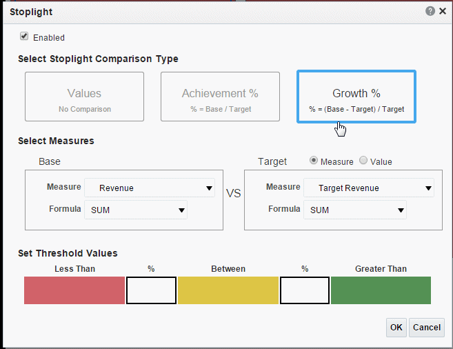
-
Select the Base Measure from the data field list and the Formula to apply to the measure field. In this example, Revenue will be summed for each tile to establish the base measure.
-
Choose Target Measure or Value.
-
Measure - select a field from the data to supply the target value for comparison.
-
Value - enter a static value to supply the target value for comparison.
The app calculates the percent difference that the Base column value is from the Target value. In the example below, the Revenue column (Base) is compared to the Quarter Ago Revenue column (Target). The calculation performed is:
((Revenue - Quarter Ago Revenue)/Quarter Ago Revenue) X 100%
Therefore if your Revenue is $11,000 and your Quarter Ago Revenue is $10,000, the percent growth is:
((11,000 - 10,000)/10,000) X 100% = 10%
-
-
Enter the Less Than and Greater Than percentage values for the background colors.
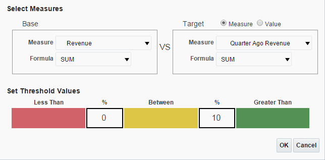
If the Base value percentage difference from Target value is less than the percentage you enter on the left, the Less Than color displays. If the Base value percentage difference from the Target value is greater than the value you enter on the right, the Greater Than color displays.
-
To change the default colors, see Customizing the Colors.
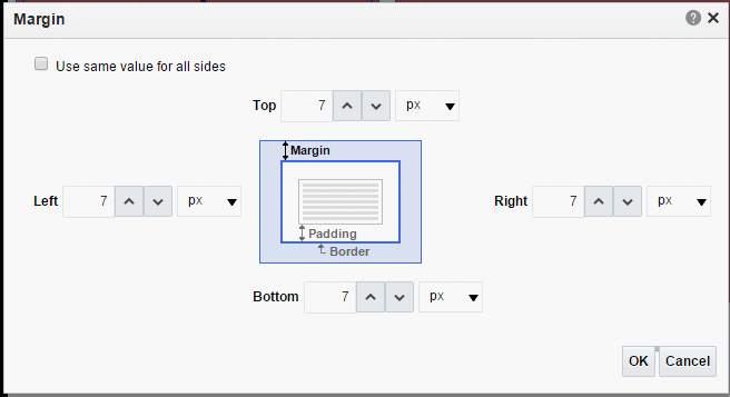
4.3.3.6 Resize Tile Margins
You can adjust the space around each tile to make the tiles closer together or further apart.
To customize the margin area between tiles:
-
Select the first tile to display the tile properties.
-
Click the Margin tool.
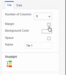
-
Enter the new margin values and select the unit of measurement.
-
Click OK.
4.4 Analytics Pages
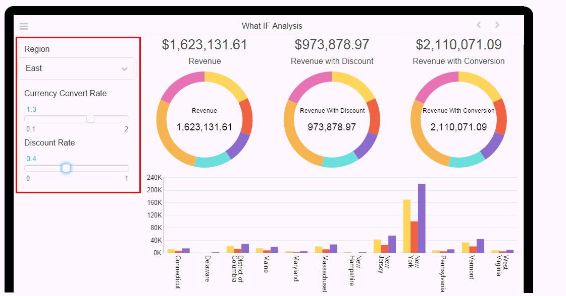
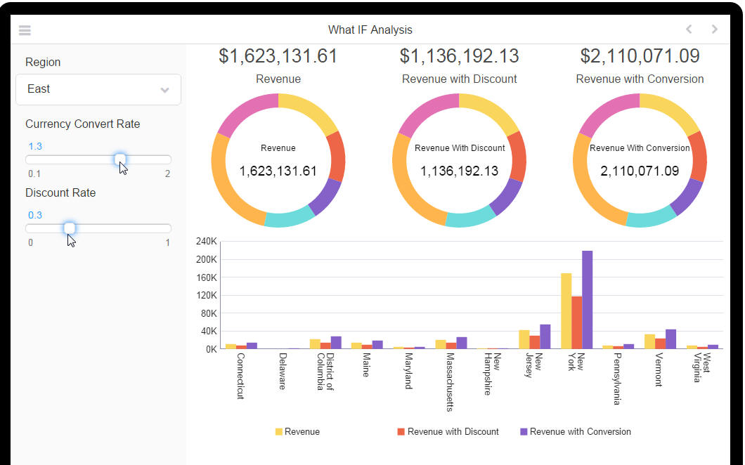
Use the Analytics page to create interactive what-if analyses. Analytics pages support user input of variable data values enabling you to visualize the results based on variable conditions and factors. This page is unique in that it allows your users to enter their own values to drive the visualizations, rather than simply make selections from predefined lists or filters.
In this example, you can analyze how varying values for Currency Conversion Rate and Discount Rate impact Revenue.
The following worked example demonstrates the steps to create an Analytics page.
4.4.1 Analytics Page: Worked Example
Follow the steps shown in this example when creating an Analytics page:
-
Create the Calculated Fields and Filters to User on Your Analytics Page. These will use the Variable values as arguments.
-
Drag the Variables to display on the Analytics page.
-
Add Components (charts, tables, maps, and so on) to the Analytics page
-
Apply the Filters to or use the Calculated Fields in the components.
Preview your app: When you update the variable values, the components refresh to show the updated results.
4.4.1.1 Create the Variables
This example uses three variables. The variable is what holds the value entered by the app user. For more information about variables, see also Creating Variables.
4.4.1.1.1 Create the Region Variable
-
Create a new Variable:
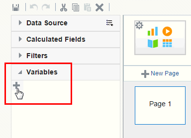
On the left-side accordion pane, click Variables and then click Add Variable.
-
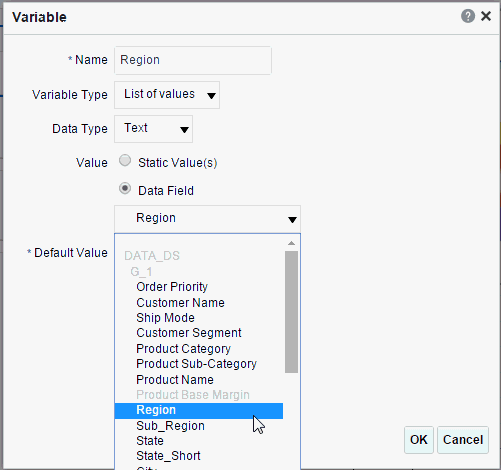
Enter the following for your Variable:
-
Name - enter Region
-
Variable Type: select List of Values
-
Data Type: select Text
-
Value: choose Data Field then select Region from the list of Data Fields
-
Default Value: enter East
-
Click OK
-
4.4.1.1.2 Create the Discount Rate Variable
-
Create a new Variable:
On the left-side accordion pane, click Variables and then click Add Variable.
-
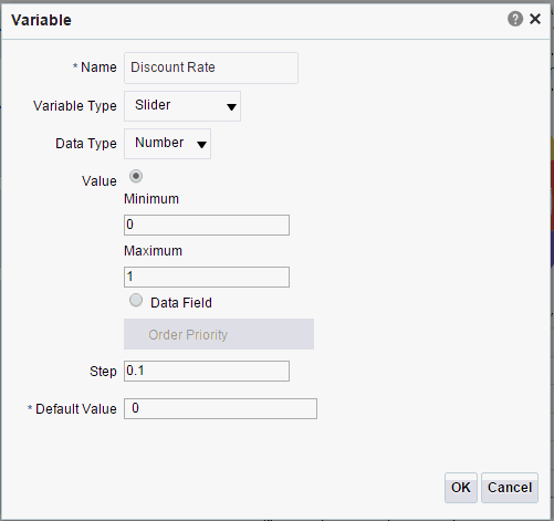
Enter the following for your Variable:
-
Name - enter Discount Rate
-
Variable Type: select Slider
-
Data Type - select Number
-
Value - choose Static and then enter 0 for the Minimum and 1 as the Maximum.
-
Step - enter .1
-
Default Value - enter 0
-
Click OK
-
4.4.1.1.3 Create the Currency Convert Rate
-
Create a new Variable:
On the left-side accordion pane, click Variables and then click Add Variable.
-
Enter the following for your Variable:
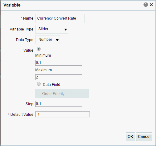
-
Name - enter Currency Convert Rate
-
Variable Type: select Slider
-
Data Type - select Number
-
Value - choose Static and then enter .1 for the Minimum and 2 as the Maximum.
-
Step - enter .1
-
Default Value - enter 1
-
Click OK
-
4.4.1.2 Create the Calculated Fields and Filters to User on Your Analytics Page
Once you create the variable, you use it as input to either a filter or a calculated field to drive the visualizations on the page.
4.4.1.2.1 Create the Region Filter
-
On the left-side accordion pane, click Filter and then click Add Filter.
-
In the Filter dialog, enter the following to create the Region Filter.
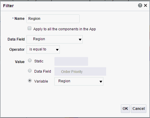
-
Name - enter Region
-
Data Field - select Region from the list of data fields
-
Operator - select is equal to
-
Value - choose Variable and then select your Region variable from the list
-
Click OK
-
4.4.1.2.2 Create the Discount Rate Calculated Field
-
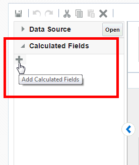
On the left-side accordion pane, click Calculated Fields and then click Click Add Calculated Fields.
-
In the Calculated Fields dialog, enter the following to create the Revenue with Discount Calculated Field.
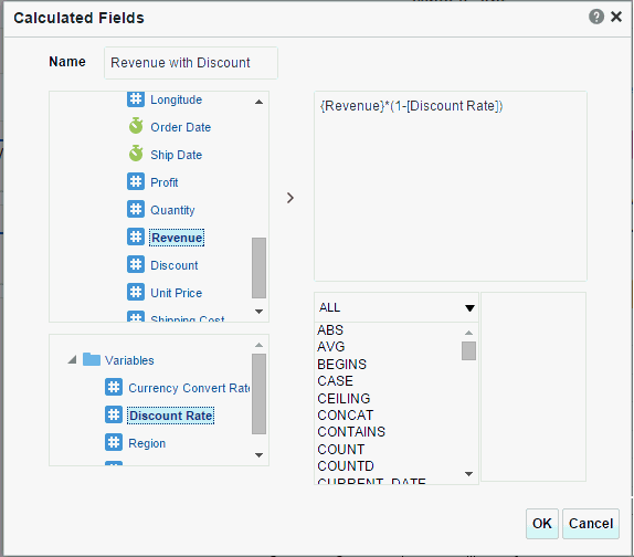
-
Name - enter Revenue with Discount
-
Enter the following formula: {Revenue}*(1-[Discount Rate])
where {Revenue} is added from the Data Source list of fields
and
[Discount Rate] is added from the Variables list
-
Click OK
-
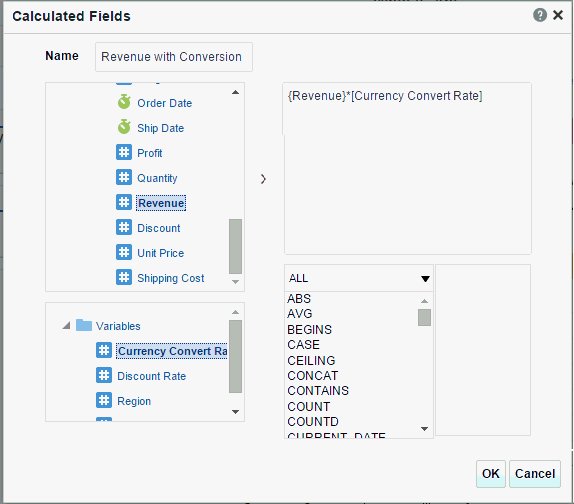
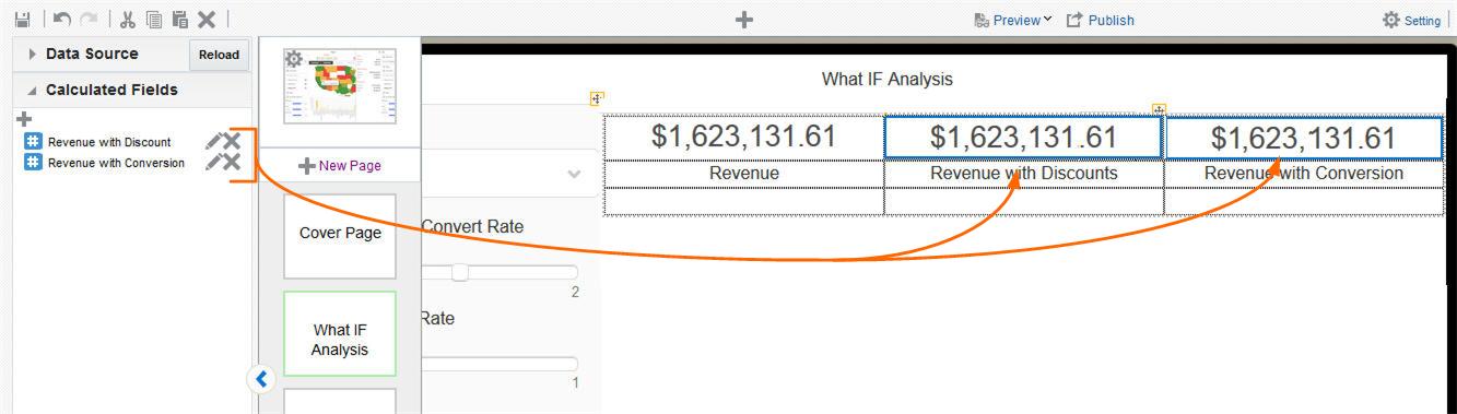
4.4.1.2.3 Create the Revenue with Conversion Calculated Field
-
On the left-side accordion pane, click Calculated Fields and then click Click Add Calculated Fields.
-
In the Calculated Fields dialog, enter the following to create the Revenue with Conversion Calculated Field.
-
Name - enter Revenue with Conversion
-
Enter the following formula: {Revenue}*[Currency Convert Rate]
where {Revenue} is added from the Data Source list of fields
and
[Currency Convert Rate] is added from the Variables list
-
Click OK
-
4.4.1.3 Create the Analytics Page
Now create your Analytics page and add your Variables.
-
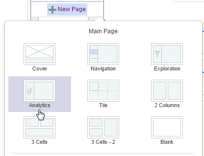
Click New Page and then select Analytics.
-
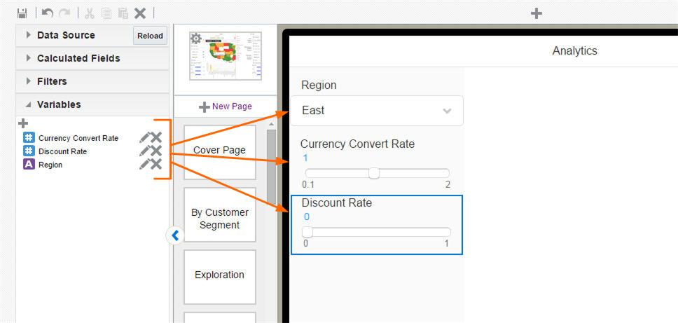
The blank Analytics page has two regions. In the left page region, drag your variables. This is where you interact with the values for your variables. The right side of the page is for your visualizations.
-
Drag the three variables you created to the left region of the page.
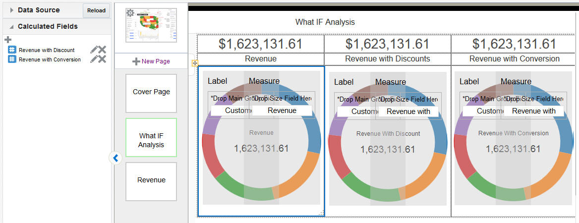
4.4.1.4 Add Components
Add the components you want to visualize on the right region of the page.
-
In this example, the page displays the values for:
-
Revenue (from our Data Source)
-
Revenue with Discount (our Calculated Field)
-
Revenue with Conversion (our other Calculated Field)
Add the Frame component and enter Text labels, then drag the three fields to the page as shown:
-
-
Next add your three charts, each showing the appropriate Revenue by Customer Segment.
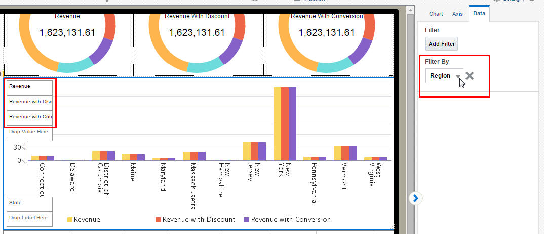
-
Finally, for this example, add a chart that shows the Revenue results filtered by your Region variable.
Insert the Chart component, and add Revenue, Revenue with Discount, and Revenue with Conversion as the Measure fields. Add State as the label field.
Now to filter this chart by the Region variable value, apply the Region filter to the chart.
-
Preview your app. Interact with the controllers to update the variable values and observe the results.
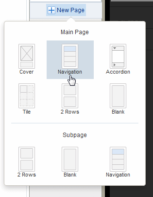
4.5 Adding Navigation Pages
The creation process for the navigation page is different for tablets and phones. See the appropriate section for your app:
4.5.1 Navigation Page for Tablet
The Navigation page defines a master-detail relationship between a navigable set of filters and the visualizations displayed on the page. The navigation area of the page contains a hierarchy of filters that you tap through to drive the display on the detail side of the page. As you tap, you can see successively more refined sets of data, or you can stop within a level to see data just for its members, or a particular member. You can navigate up and down the hierarchical filters to see just the subset of data that interests you.
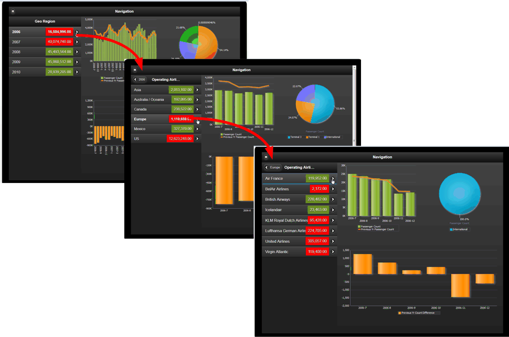
To insert a Navigation page:
-
Click New Page and then select Navigation.
The Navigation page displays.
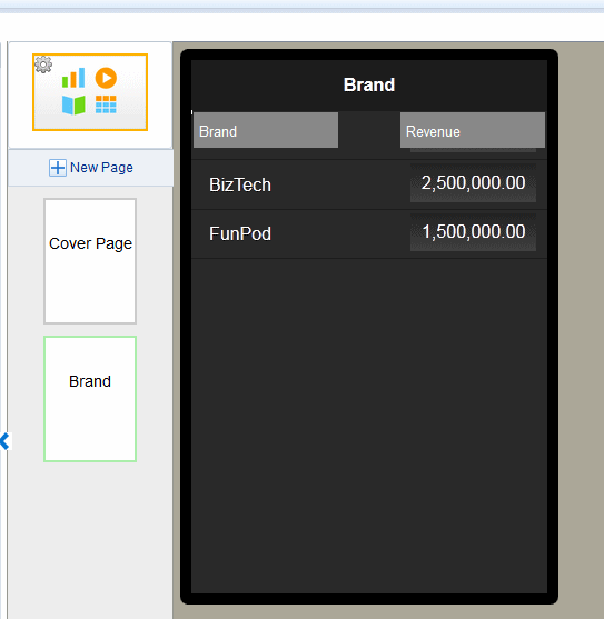
-
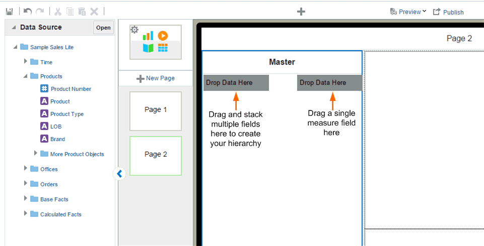
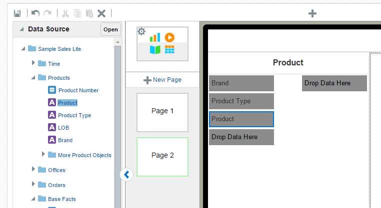
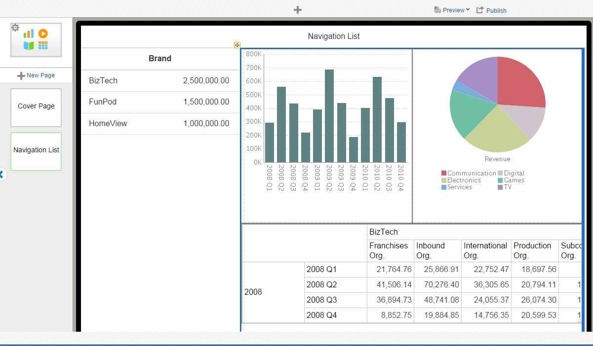
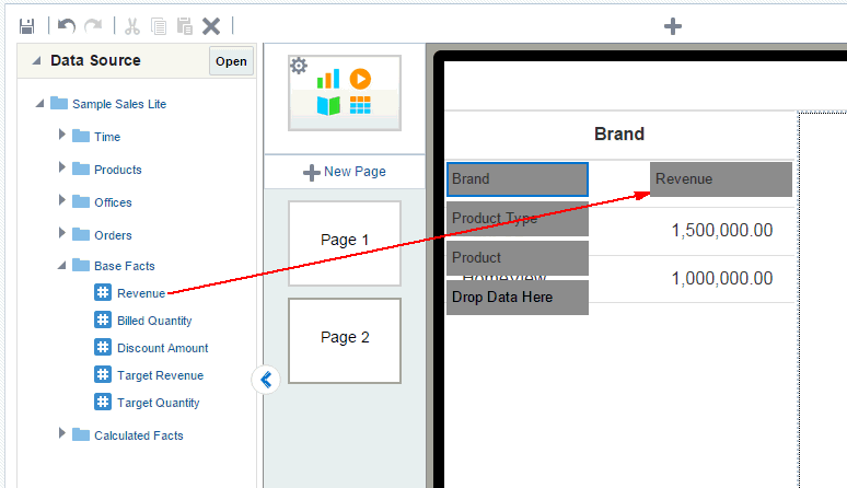
Drag and drop the data fields to define the hierarchy of the navigation menu. This example shows Brand, Product Type, and Product.
-
Next drag a measure data field to aggregate for the fields you placed on your menu. This example shows Revenue.
By default the aggregation field is summed.
-
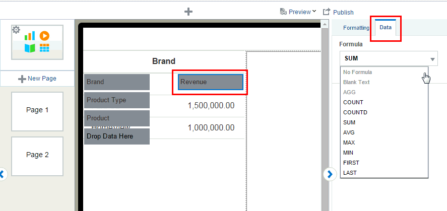
To change the aggregation formula click the measure field to select it. On the Properties pane, click Data. Choose a new Formula from the list.
-
To add stoplight formatting to your navigation list, see Stoplight Formatting for Navigation and Accordion Pages.
-
Add the components to the detail region of the page. At run time, these components refresh as items on the navigation list are tapped. The example shows two charts and a pivot table.
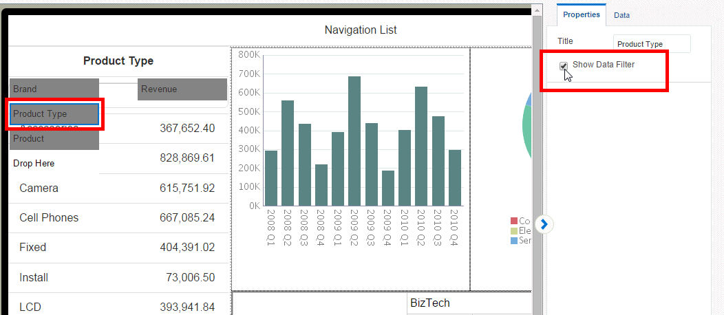
4.5.1.1 Adding a Search Filter
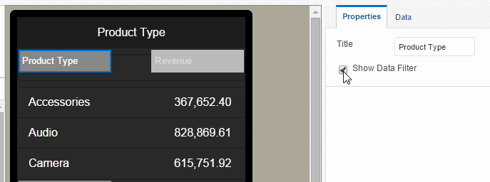
If a level in your navigation list includes many members (for example, States or Products) you can add a search filter to enable your app users to more easily find a specific item.
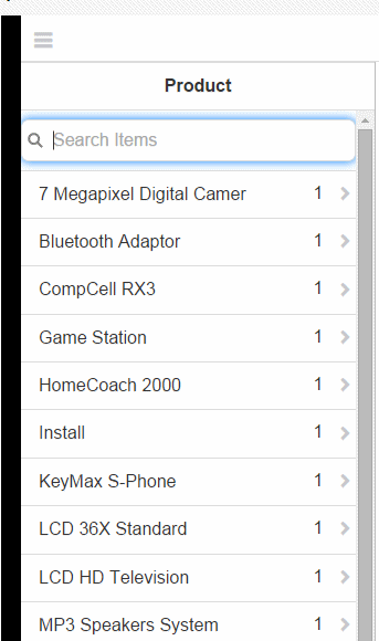
You can enable the search filter independently for each level.
To add a search filter to a navigation list level:
-
Select the navigation item for which you want to add a search filter.
-
In the Properties pane, enable the Show Data Filter property.
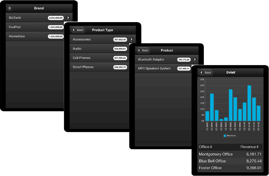
4.5.2 Navigation Page for Phone
The navigation page for phone enables you to create a hierarchical list of filters that you can navigate to see a detail display of the specific items that interest you.
Tutorial: Creating Navigation Pages for Phone Apps
-
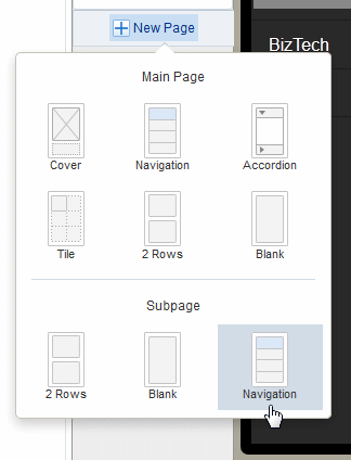
Click New Page and then select Navigation.
-
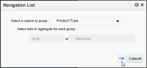
Select the data field from the list to define the top level of the navigation menu. In the example, the first level of the navigation list is grouped by Brand.
-
Next choose the measure field to aggregate for the group element. In this example, Revenue is summed for each Brand (shown in Figure 4-34).
When you click OK the data element you selected displays as a list with the aggregated measure as shown in Figure 4-35.
-
To add a second level to the navigation list, create a subpage under the first navigation list page as shown in Figure 4-36.
-
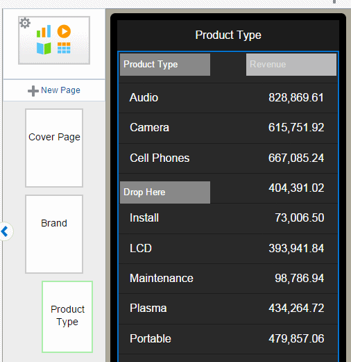
Select the data field to group for the second level of the navigation list. In this example (Figure 4-37), Product Type is the second level. Every child level uses the same aggregation selected for the first level. In the child levels the aggregation selection is for display only and cannot be updated.
When you click OK, your subpage displays the members of the group you selected as shown in Figure 4-38.
-
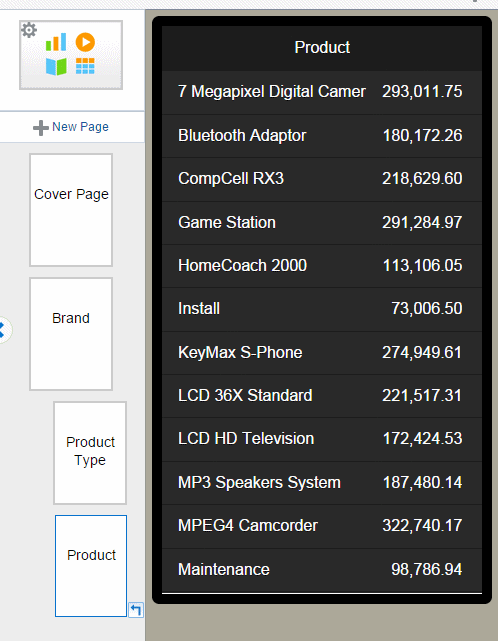
To create another level, add a Navigation type subpage under the subpage you just created. Select the group element for this page as described in the previous step. Figure 4-39 shows the navigation page created for the Product field.
You can continue adding subpages to create as many levels as your app requires.
-
To add a detail page with results driven by the selections on the previous pages, add a new subpage beneath the final navigation page.
-
Add components to the detail page. The following example shows a detail page with a chart and table.
4.5.2.1 Adding a Search Filter
If a level in your navigation list includes many members (for example, States or Products) you can add a search filter to enable your app users to more easily find a specific item.
You can enable the search filter independently for each level.
To add a search filter to a navigation list level:
-
Select the navigation item for which you want to add a search filter (such as Product Type).
-
In the Properties pane, enable the Show Data Filter property.
4.5.3 Stoplight Formatting for Navigation and Accordion Pages
The Stoplight feature enables you to highlight values conditionally based on static threshold values, a comparison to a target value, or a comparison to another field.
See also:
Video: Formatting Navigation Lists
4.5.3.1 Apply Formatting Based on Static Values
Use this option when the unacceptable, acceptable, and desired values are the same for the aggregated field at each level of the navigation. You can customize the colors for each range.
To apply conditional formatting based on static values:
-
On the navigation or accordion page, select the measure field and click Stoplight. In this example the measure field is Revenue.
-
In the Stoplight dialog select Values. The Base Measure and Formula that you chose when you defined the navigation or accordion page are displayed, but are not editable.
-
Enter the threshold values for the background colors. Values less than the left entry will display the Less Than background color. Values greater than the right entry will display the Greater Than background color. Values between display the Between color.
To change the default colors, see Customizing the Colors.
-
Preview your app.
4.5.3.2 Apply Formatting Based on Percent Achievement
This option enables you to conditionally highlight the aggregate value based on the percentage of a target value. For example, you want to highlight sales that are less than 50 percent of target to display as red, sales that are 50-75 percent of the target as amber and sales that are greater than 75 percent of the target to display as green.
To apply conditional formatting based on the percent achievement of a target:
-
On the navigation or accordion page, select the aggregation field and click Stoplight. In this example the aggregation field is Revenue.
-
In the Stoplight dialog select Achievement %. The Base Measure and Formula that you chose when you defined the navigation or accordion page are displayed, but are not editable.
-
Choose Target Measure or Value.
-
Measure - select a field from the data to supply the target value for comparison.
-
Value - enter a static value to supply the target value for comparison.
The app calculates what percentage the Base column value is of the Target value. In the example above, the Revenue column (Base) is compared to the Target Revenue column (Target). The calculation performed is:
Revenue/Target Revenue X 100%
Therefore if your Revenue is $8,000 and your Target Revenue is $10,000, the percent achievement is:
8,000/10,000 X 100% = 80%
-
-
Enter the Less Than and Greater Than values percentage values for the background colors.
If the Base value percentage of the Target value is less than the percentage you enter on the left, the Less Than color displays. If the Base value percentage of the Target value is greater than the value you enter on the right, the Greater Than color displays.
-
To change the default colors, see Customizing the Colors.
4.5.3.3 Apply Formatting Based on Percent Growth
This option enables you to conditionally highlight the aggregate value based on the percent difference that the base value is from the target value. The calculation applied is:
(Base - Target)/Target X 100%
For example, you want to compare sales from the current and previous quarters and you want to see when sales in the current quarter showed less than 10% growth from the previous quarter. When sales showed greater than 10% growth you want to display the value in green, when 0-10% growth in amber, and when less than 0% growth in red.
To apply conditional formatting based on percent growth:
-
On the navigation or accordion page, select the measure field and click Stoplight. In this example the measure field is Revenue.
-
In the Stoplight dialog select Growth %. The Base Measure and Formula that you chose when you defined the navigation or accordion page are displayed, but are not editable.
-
Choose Target Measure or Value.
-
Measure - select a field from the data to supply the target value for comparison.
-
Value - enter a static value to supply the target value for comparison.
The app calculates the percent difference that the Base column value is from the Target value. In the example above, the Revenue column (Base) is compared to the Quarter Ago Revenue column (Target). The calculation performed is:
((Revenue - Quarter Ago Revenue)/Quarter Ago Revenue) X 100%
Therefore if your Revenue is $11,000 and your Quarter Ago Revenue is $10,000, the percent growth is:
((11,000 - 10,000)/10,000) X 100% = 10%
-
-
Enter the Less Than and Greater Than values percentage values for the background colors.
If the Base value percentage difference from Target value is less than the percentage you enter on the left, the Less Than color displays. If the Base value percentage difference from the Target value is greater than the value you enter on the right, the Greater Than color displays.
-
To change the default colors, see Customizing the Colors.
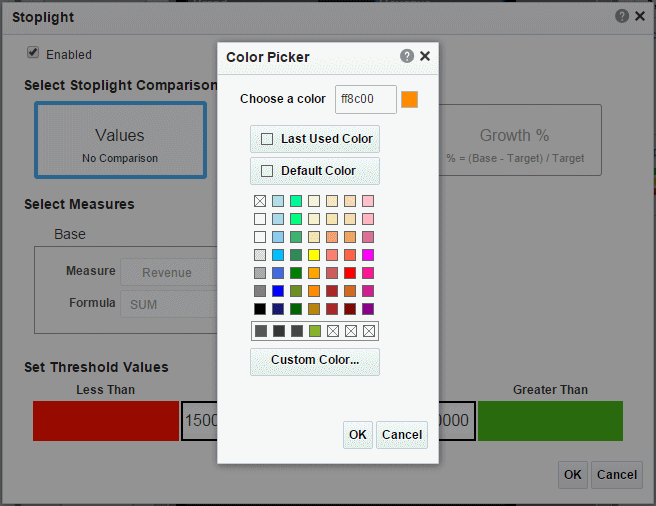
4.5.3.4 Customizing the Colors
When the default colors do not suit the needs of your app, you can customize them to any color you require. For example, in some apps, the Less Than values should display as green and the Greater Than values as red; or, you may choose to display a different color scheme altogether.
To customize a color:
-
Click the color bar to open the color picker and choose the color desired.
4.6 Adding Accordion Pages
The accordion page provides an expandable display of a specific data dimension and a key measure (such as Product and Revenue). Add visualizations to the expansion area that you can view and interact with easily from a mobile phone.
The Accordion page is available for phone apps.
The accordion component is available for insertion to a tablet page.
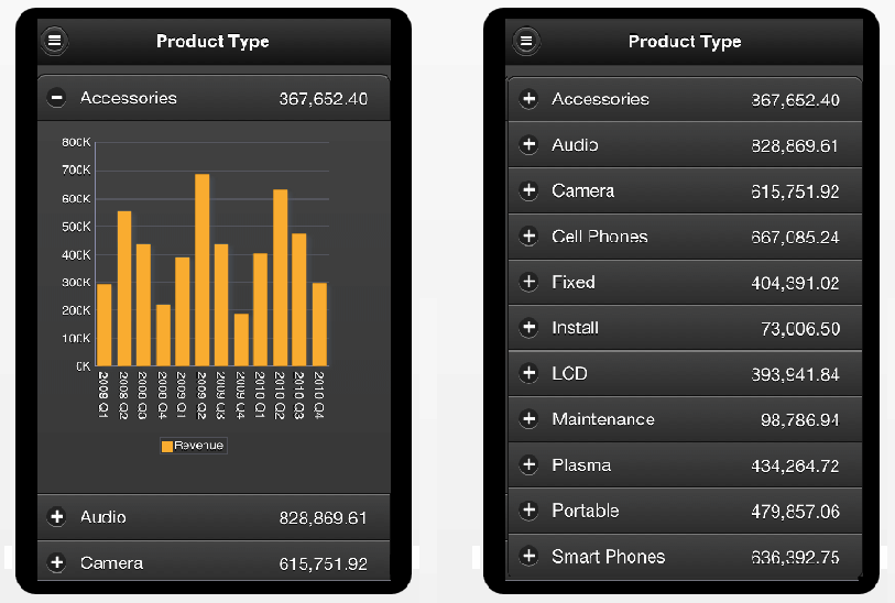
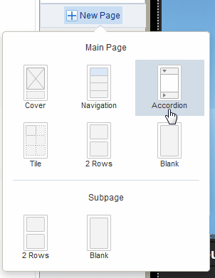
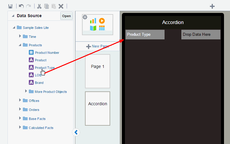
To create an accordion page:
-
Click New Page and then click Accordion.
-
Select the data column to define each section of the accordion. In this example, an accordion section is created for each Product Type.
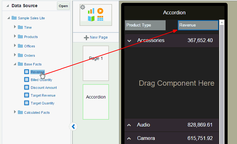
-
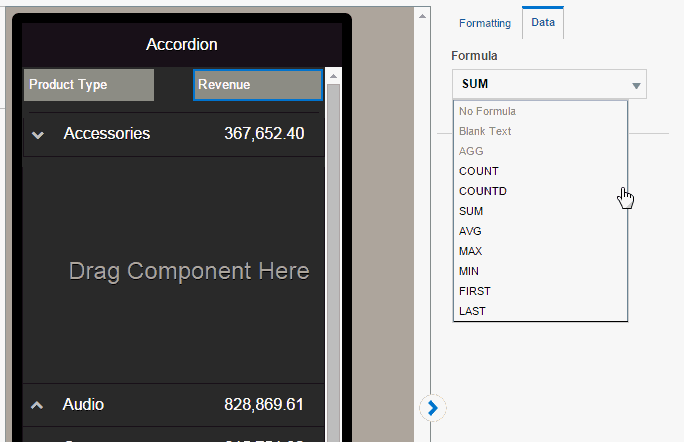
Next select the measure field to aggregate for each section and select the aggregation type: Summation, Count, or Count Distinct. In this example, Revenue is summed.
More formula types are supported for the measure field, see Section 8.6, "Features of Metric Fields."
-
Click OK to insert the accordion.
-
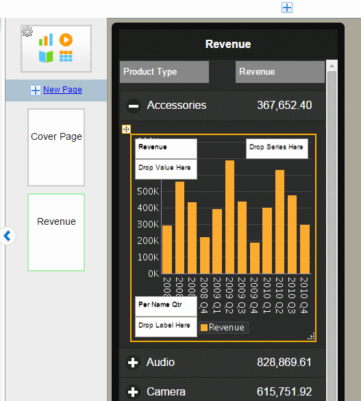
Now you can insert the components you want to display when each section is expanded. Simply drag the component to the Drag Component Here area of the first expanded accordion section and follow the procedures for inserting the specific component. To design your accordion page you only insert components in the first accordion section. In this example a chart showing revenue by quarter is inserted.
-
To preview your accordion page, click Preview. The example displays in the Preview page as shown in the figure. Expand and collapse the accordion sections to see the data for each section.
4.6.1 Adding Stoplight Formatting to the Accordion Page
See Stoplight Formatting for Navigation and Accordion Pages for steps on adding stoplight formatting to your accordion page.