8 Component Property Features
This chapter describes component properties of the BI Mobile App Designer.
This chapter includes the following sections:
8.1 Working with Tables
The following sections describe additional features of tables in the Mobile App Designer:
8.1.1 Customizing Alternating Row Colors
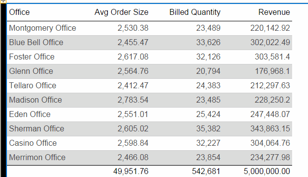
You can apply an alternating table row color to enhance table readability, as shown in Figure 8-1:
To set an alternating row color:
-
Select the table to display its properties.
-
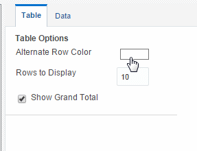
Under Table Options, click the value shown for Alternate Row Color to launch the color picker. Figure 8-2 shows the Alternate Row Color option.
-
Choose a color and click OK.
8.1.2 Setting Table Options
Figure 8-3 shows the Table properties
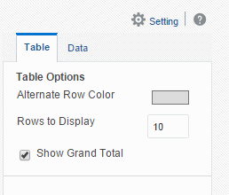
Use the Table properties to:
8.1.2.1 Set the Number of Rows to Display
The Rows to Display property controls the number of rows of data displayed as follows:
-
When designing an app, this property sets the number of rows that are displayed for the table within the app designer.
-
When viewing the app, this property sets the size of the scrollable region for the table.
The default is 10 rows of data.
Note:
Displaying more rows of data can impact the performance of the app designer.8.1.2.2 Filter Data Displayed in the Table
8.1.2.3 Show or Hide the Total Row
By default, the app designer inserts a total row in a table that sums numeric columns. To remove the total row, deselect the Show Grand Total Row option.
The total row can be further customized using the Total Cell properties. For more information see Section 8.1.5, "Customizing Table Totals."
8.1.3 Customizing Column Headers
Figure 8-4 shows the Table Column Header properties.
Use the Table Column Header options to:
-
Edit the font properties of the table header
-
Edit the cell properties of the table header including border weight, style, and color and background fill color
-
Set the vertical and horizontal alignment of the table header
-
Apply a background fill color to the header cell
8.1.4 Customizing Table Data Display
The Column properties display when you select a column in a table. Figure 8-5 shows the Column properties
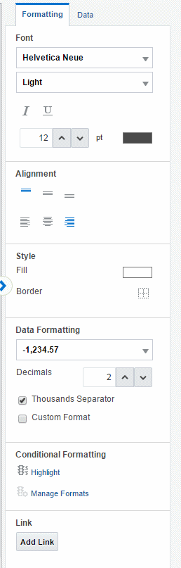
Use the Column Formatting properties to:
-
Edit the font properties of the column including style, size, and color
-
Edit the style properties of the column including border weight, style, and background fill color
-
Set the vertical and horizontal alignment of the column contents
-
Format the column data (see Section 8.1.4.3, "Setting Table Data Formatting Options")
-
Apply formatting to the column based on a condition (see Section 8.1.4.1, "Applying Conditional Formats to a Table Column")
-
Create links for table column data (see Section 8.5, "Adding Links")
Use the Column Data properties to:
-
Apply grouping (see Section 8.1.4.9, "About Grouping")
-
Apply sorting and sort precedence (see Section 8.1.4.7, "Sorting")
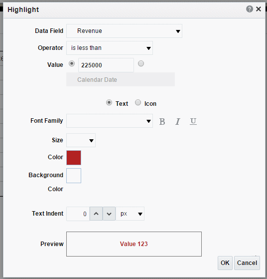
8.1.4.1 Applying Conditional Formats to a Table Column
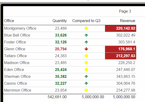
Your data can conditionally display with a predefined text format or an icon.
To apply a conditional format:
-
Select the table column to display its properties.
-
On the Formatting properties tab, click Highlight.
-
Enter the fields to define a condition and format to apply, as described in Table 8-1.
Table 8-1 Fields to Define Conditions and Formats
Field Description Data Field
Select the data field to apply the condition to. All elements are available regardless of whether they are included as table columns. For example, you may want to highlight in red all employees with salaries greater than $10,000, but not actually include the salary element in the table.
Operator
Select from the following operators: is equal to, is not equal to, is less than, is greater than, is less than or equal to, is greater than or equal to, is between
Value
Enter the value or values appropriate for the operator selected. You can enter a static text value or choose a data field
Important: If entering a date value, use one of the following XSL date or time formats: YYYY-MM-DD or YYYY-MM-DDTHH:MM:SS.
Text / Icon
Choose a conditional indicator. You can choose either conditional text formatting or a conditional icon to display.
Font Family/Icon
If you chose Text: Select the font to apply to the row of data that meets the condition. You can also apply bold, italic, or underline emphasis.
If you chose Icon: Select the icon to display for the condition. Choose from Up Arrow, Down Arrow, Dash, or Circle.
Size
Select the size of the text or icon in points.
Color
Click the color box to open the Color Picker. Choose one of the predefined colors or click Custom Color to define a color to apply to the text or icon.
Background Color
Click the color box to open the Color Picker. Choose one of the predefined colors or click Custom Color to define the background color to apply to the table cell.
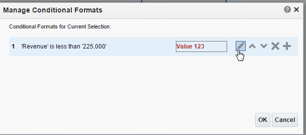
8.1.4.2 Managing Formats
After you have added conditional formats, use the Manage Formats command to edit or delete a format.
To manage formats:
-
Select the table column and click Manage Formats on the Properties pane.
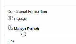
-
Hover the cursor over an item to display the actions toolbar. Use the toolbar buttons to edit the format, move the format up or down in the order of application, delete, or add another format. The order of the conditions is important because only the first condition that is met is applied.
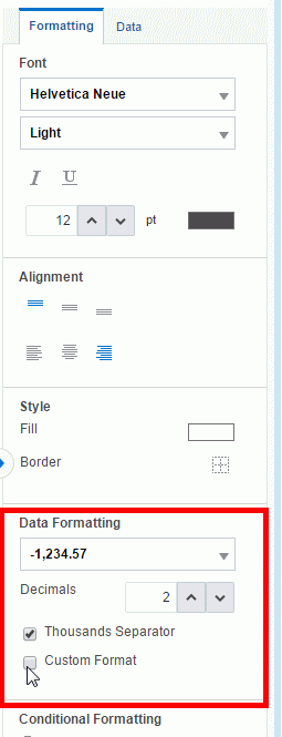
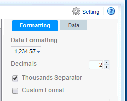
8.1.4.3 Setting Table Data Formatting Options
The options you see in the Data Formatting region depend on the data type of the column you selected. These features are described in the following sections:
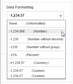
8.1.4.4 Formatting Numeric Data Columns
If the column contains numeric data, the following formatting options are available:
-
Format - Select one of the common number formats from the list. The format is applied immediately to the table column. The formats are categorized by Number, Percent, and Currency, as shown in Figure 8-9.
-
Decimal position - Use the arrow buttons to increase or decrease the number of decimal positions displayed to the right of the decimal point.
-
Thousands Separator - Select this checkbox to show the grouping separator (for example, 1234.00 displays as 1,234.00).
-
Select Custom to specify a custom format, see Section 8.1.4.6, "Custom Data Formatting."
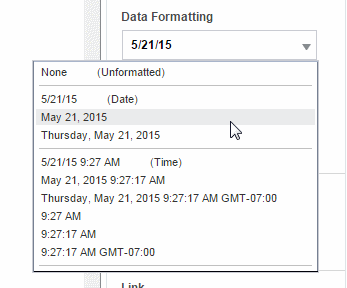
8.1.4.5 Formatting Date Type Data Columns
If the column contains dates, the following formatting options are available:
-
Format - Select one of the common date formats from the list. The format is applied immediately to the table column. The formats are categorized by Date and Time, as shown in Figure 8-10.
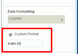
8.1.4.6 Custom Data Formatting
BI Mobile App Designer supports the use of format masks for custom data formatting. The display of the output depends on the locale selected for viewing the app.
To apply custom data formatting:
-
Select a data field or column.
-
The data formatting Properties. are displayed as shown in Figure 8-11.
-
Under Data Formatting, select Custom Format
-
Enter the format mask in the text box. For example, for a column that contains product totals, you can enter #,###.00 formatting mask to display total values with two zeros to the right of the decimal place. See Custom Number and Date Formats for the list of supported formats.
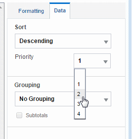
8.1.4.7 Sorting
To sort the data in a column, select the column, then in the Properties pane, select the Data tab. Under the Sort group select None, Ascending, or Descending.
To sort by more than one column, select the column, the sort order, and then assign a Priority to each column.
To apply multiple sort orders to a table:
-
Select the column.
-
On the Column properties, click the Data tab. Under Sort, select Ascending or Descending.
-
From the Priority list, select 1.
Figure 8-12 shows the Priority list.
-
Select the next column you want to sort by.
-
On the Column properties, click the Data tab. Under Sort, select Ascending or Descending.
-
From the Priority list, select 2.
-
Repeat Steps 1 - 6 for each column you want to sort by, applying the appropriate priority for each column.
8.1.4.8 Removing a Sort Order
To remove a sort order applied to a column:
-
Select the column.
-
On the Column properties, click the Data tab. Under Sort, select None.
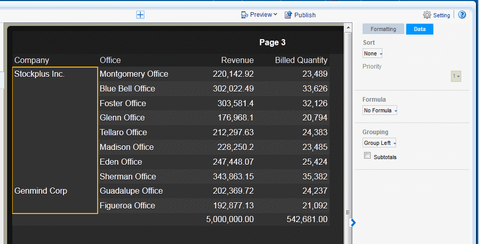
8.1.4.9 About Grouping
"Grouping" groups together elements in the data of the same value. In a table, applying grouping can make the table easier to read. After you group elements in a table, you can also add a subtotal row for each group. Grouping can be applied to a table column header or to a table column.
8.1.4.10 Apply Group Left
To apply group left to a table column:
-
Select the Table Column to display its properties.
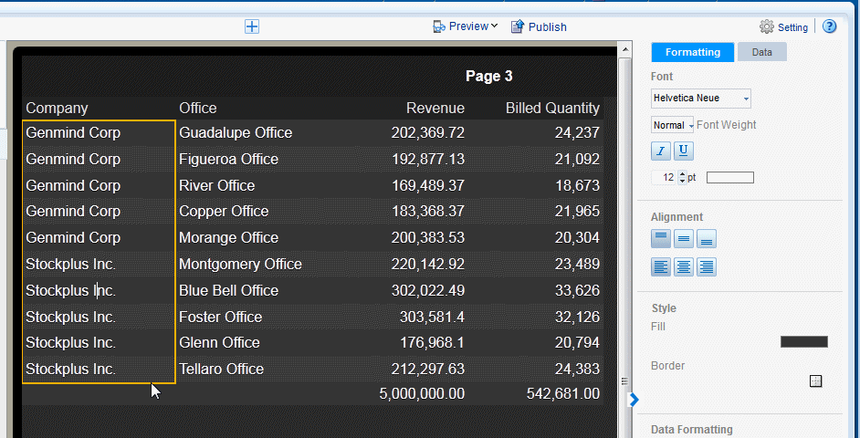
-
Click the Data tab of the properties pane. Under the Grouping properties, select Group Left.
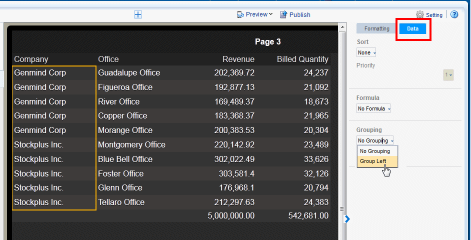
Like values are now grouped together for the selected column of your table.
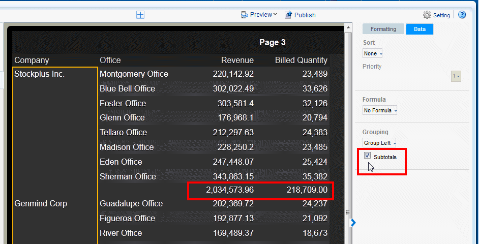
8.1.4.11 Applying Subtotals
To further enhance a table, you can add a subtotal row to display for each grouped occurrence of the element.
To apply subtotals for a grouped column:
-
Select the table column of the grouped column.
-
On Data tab of the properties pane, select Subtotals. Your table now shows a subtotal row for each group.
8.1.5 Customizing Table Totals
The app designer automatically inserts a grand total row when you insert a table. As shown in the section on grouping, you can also insert subtotal rows within the table based on a grouping field. To edit the attributes of the cells in a grand total or subtotal row, select the cell that displays the total and use the options in the Total Cell properties shown in Figure 8-13.
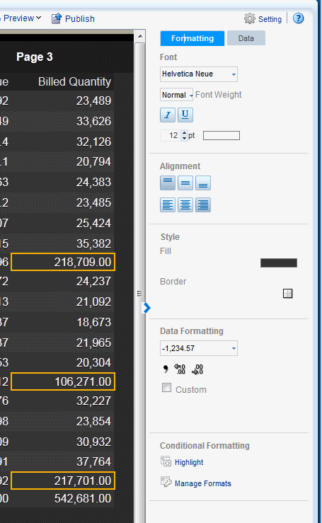
On Total Cell Formatting properties tab you can:
-
Edit the font properties of the total cell
-
Edit the cell properties of the total cell including border weight, style, and color and background fill color
-
Set the vertical and horizontal alignment of the cell contents
-
Apply formatting to the cell data
-
Apply a formula to the cell
-
Apply conditional formatting to the cell
On Total Cell Data properties tab you can:
-
Apply a formula to the data
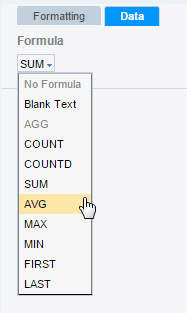
8.1.5.2 Applying a Formula
By default, the formula applied to a Total Cell within a numeric column is a sum of the column items. The Formula option enables you to apply a different formula.
On the Total Cell Properties Data tab, you can select from a list of alternative formulas.
8.2 Working with Pivot Tables
This section includes the following topics about working with pivot tables in the Mobile App Designer:
8.2.1 Customizing the Pivot Table
Use the Pivot Table properties to:
-
Apply filters to the pivot table data
-
Customize the display of total rows
8.2.1.1 Applying Filters
See Section 5.13, "Filtering Data" for a description of adding filters to tables.
8.2.1.2 Customizing the Display of Totals
You can customize the display of grand total and subtotal rows.
By default, the pivot table displays the grand total rows, but not subtotal rows:
-
Row Grand Total - Inserted at bottom of table
-
Row Subtotal - Inserted at top of each subgroup, with no row header
-
Column Grand Total - Inserted at the far right
-
Column Subtotal - Inserted to the left of each column subgroup, with no header
Change the positioning and display of totals and subtotals by clicking the appropriate tab in the properties and selecting the desired properties.
8.2.2 Customizing Pivot Table Headers
Select the column or row header of the pivot table and use the Pivot Table Header properties to perform the following:
-
Customize the fonts, colors, alignment and other display features of the header
-
Apply a sort order (for more information see Section 8.1.4.7, "Sorting")
-
Apply data formatting for numbers and dates (see Section 8.1.4.3, "Setting Table Data Formatting Options")
8.2.3 Customizing Pivot Table Data
Select the data area of the pivot table and use the Pivot Table Data properties to perform the following actions. The commands in the Pivot Table Data properties are the same as the corresponding commands in the table Column properties. See the references for more information on their use.
-
Customize the fonts, colors, alignment and other display features of the data
-
Apply conditional formatting to the data (see Section 8.1.4.1, "Applying Conditional Formats to a Table Column")
-
Apply data formatting (see Section 8.1.4.3, "Setting Table Data Formatting Options")
-
Apply a formula (see Section 8.1.5.2, "Applying a Formula")
8.3 Adding Filters to Tiles, Charts, Tables, and Pivot Tables
Apply a filter to refine the items displayed in tiles, charts, tables, and pivot tables. For example, apply a filter to:
-
Display only the top 10 salaries
-
Display only the bottom 25 store sales
-
Display only employees in the IT department
-
Display only sales that are between $10,000 and $20,000 and in the Southern region
You can add multiple filters and manage the order in which they are applied to the page component. See Section 5.13, "Filtering Data."
8.4 Adding a Search Filter to Navigation and Accordion Lists
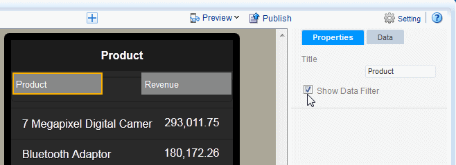
If the column that you select to create a navigation list or accordion list has many items, you can add a search filter to enable users to find specific items in the list more quickly. Figure 8-15 shows the data search filter option enabled for a navigation page.
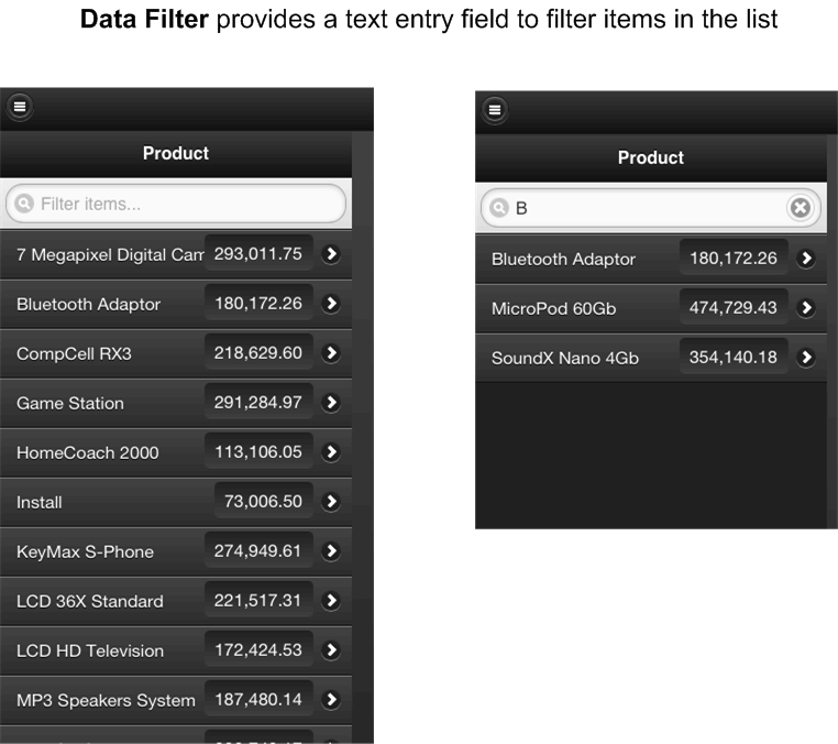
To add a search Data Filter for a Navigation or Accordion list:
-
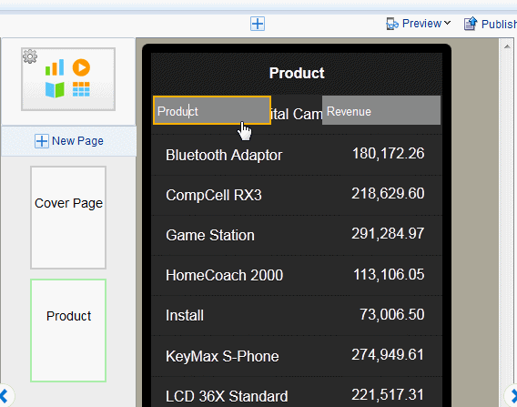
Select the Label field on your Navigation or Accordion page. Figure 8-16 shows selecting the Label field of a Navigation page.
-
On the Properties pane, set the Show Data Filter property to True.
Note that the data filter does not display during design time. To see how the data filter displays at run time, Preview the app.
8.5 Adding Links
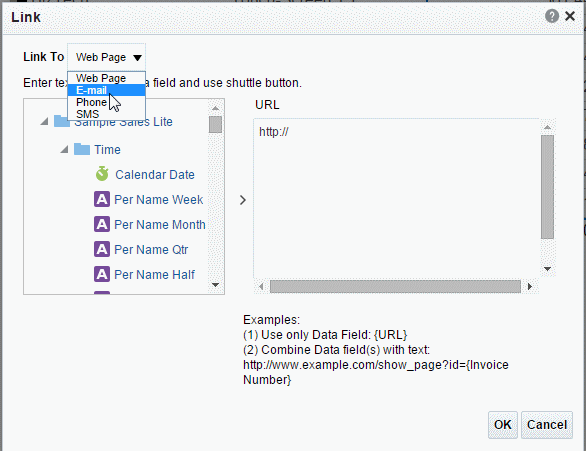
You can add links to Data Field components or table Columns. Links can be to any of the following:
-
Web page - tapping the linked item in the app page opens a Web page in your mobile device browser.
-
E-mail - opens the mobile device mail app and populates the To: field with the e-mail address provided in the link.
-
Phone - when tapped on a phone, displays an alert to initiate dialing the number.
-
SMS - launches the message app to initiate a text message to the number.
Tip:
See a worked example in the blog entry: Call, Text or Mail with a Tap from Your App on http://www.oracleappdesigner.com/To add links:
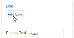
-
Select the Data Field or the table Column in the app page for which you want to add a link. Figure 8-17 shows the Add Link option from the Properties pane.
-
In the Link dialog, choose the type of link to add from the Link To menu. When you make a selection, the region where you define the link content displays the appropriate prompts.
-
Specify the link to associate with the data field or column data. You can specify a static link or build a dynamic link using fields from your data. You can combine static text with data fields. To use a data field in your link definition, select the data field from the list and use the shuttle button to move it to the link definition.
When you click OK, the link displays in the Link region of the Properties pane.
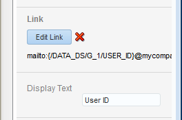
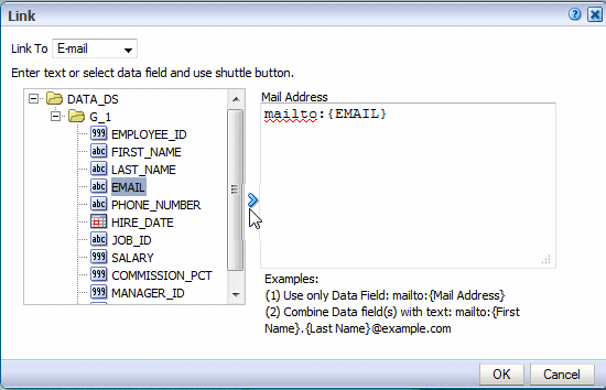
Example: Create E-Mail Link with Data Field Source
Assume your app includes a table of employees. Your app data includes e-mail address as a data field. To add the e-mail link to each employee name:
-
Select the table column to enable the Column properties
-
Click the Link command.
-
In the Link dialog, select E-mail from the Link To list.
-
Position your cursor to the right of
mailto: -
Select the data field that contains the e-mail address and click the shuttle button to move it to the link definition area. as shown in Figure 8-18.
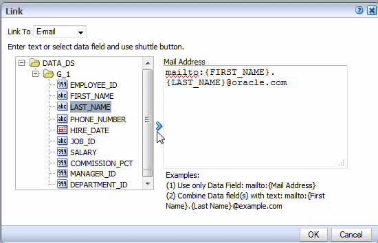
Example: Create E-Mail Link from Combination Static Text and Data Field Source
Now assume you want to include the e-mail address for each employee, but the data does not contain the e-mail address field. Instead, you must construct the e-mail address from a combination of the FIRST_NAME and LAST_NAME fields and static text.
To construct the e-mail link:
-
Select the table column to enable the Column properties
-
Click the Link command.
-
In the Link dialog, select E-mail from the Link To list.
-
Position your cursor to the right of
mailto: -
To construct the link:
-
Select the data field that contains FIRST_NAME and click the shuttle button to move it to the link definition area.
-
Enter a period.
-
Select the data field that contains LAST_NAME and click the shuttle button to move it to the link definition area.
-
Enter the domain:
@example.com
-
8.6 Features of Metric Fields
Metric fields are fields that calculate a measure, such as sum of revenue or count of orders. Examples of metric fields are the aggregated data fields you define for navigation and accordion pages.
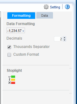
When you select the measure field on an app page, the metric field properties enable you to customize display and calculation options. Figure 8-20 shows the Metric Field properties.
The properties enable you to:
8.6.1 Apply Data Formatting
-
Data Formatting - Select one of the common number formats from the list. The format is applied immediately to the field. The formats are categorized by Number, Percent, and Currency, as shown in Figure 8-21.
To apply a format not available from this list, see Section 8.6.2, "Apply Custom Data Formatting."
-
Decimal position - Enter the number of decimal positions to show to the right of the decimal point.
-
Show/Hide Thousands Separator - Enable this checkbox to show the grouping separator (for example, 1234.00 displays as 1,234.00).
8.6.2 Apply Custom Data Formatting
To apply custom data formatting:
-
Select the data field or table column. to display its properties.
-
Under Data Formatting, select Custom Format
-
Enter the format mask in the text box. For example, for a column that contains product totals, you can enter #,###.00 formatting mask to display total values with two zeros to the right of the decimal place. See Custom Number and Date Formats for the list of supported formats.
8.6.3 Update the Formula
To update the formula, click the Data tab. The formula option is available for several components including:
-
Column
-
Table Total Cell
-
Chart Measure Field
-
Pivot Table Data
Not all options are applicable to each component type.
8.6.3.1 Predefined Formulas Available from the Menu
The menu provides the predefined formulas described in Table 8-2.
| Formula | Description |
|---|---|
|
No Formula |
Removes any mathematical formula from a numeric column. |
|
Blank Text |
Removes the display of any data, text or numeric. |
|
Count |
Returns the count of the number of occurrences of the element in the current group. |
|
Count Distinct |
Returns a count of the distinct values of an element in the current group. |
|
Summation |
Sums the values of the element in the current group. |
|
Average |
Displays the average of the values in the current group. |
|
Maximum |
Displays the highest value of all occurrences in the current group. |
|
Minimum |
Displays the lowest value of all occurrences in the current group. |
For non-numeric data, only the following formula options are supported:
-
Blank Text
-
Count
-
Count Distinct
8.6.3.2 Applying Custom Formulas
To apply a custom formula to a field, use the Calculated Fields feature. For more information, see Section 5.12, "Calculated Fields."
8.6.4 Add Stoplight Formatting
For details on adding stoplight formatting, see Section 4.5.3, "Stoplight Formatting for Navigation and Accordion Pages."
8.7 Setting Borders
Several components enable setting a border around the item. For example:
-
Table columns
-
Table column headers
-
Table total cells
-
Frame cells
-
Text items
-
Lists
To set the border around a component:
-
Select the component to display its properties.
-
Click the Border icon.
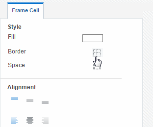
-
In the Border dialog set the following values for each border:
-
Width - enter a value in pixels (px), points (pt) inches (inch), or centimeters (cm)
-
Style - select from Solid, Double, Dotted, or Dashed
-
Color - click the color to launch the color picker
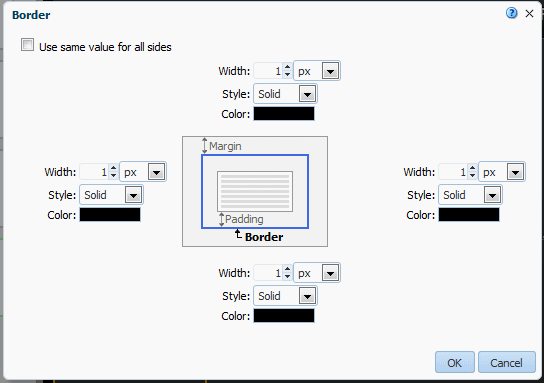
To use the same values for all borders, select Use same value for all sides and set the values for the top border only.
-
-
Click OK.
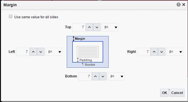
8.8 Setting Margins
Several components allow you to customize the margins around the component, these include tiles, tables, and charts.
To set margins:
-
Select the component to display its properties.
-
Click the Margin tool.
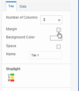
-
Enter the new margin values and select the unit of measurement.
-
Click OK.
8.9 Using the Color Picker
The Color Picker enables you to change the color of the selected item.
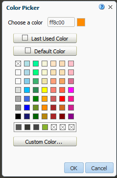
You can select a new color in any of the following ways:
-
Enter the hexadecimal value for the color in the Choose a color text box.
-
Select the Last Used Color.
-
Select the Default Color.
-
Choose one of the common colors presented or recently used colors.
-
Click Custom Color to define a custom selection.
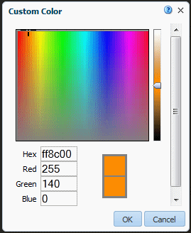
To define a custom color:
-
Drag your mouse over the color palette to the color desired; or, enter the Red, Green, and Blue color model values.
-
Use the slider bar to increase or decrease the color saturation.
-
Click OK.
8.10 Custom Number and Date Formats
Mobile App Designer supports a set of number and date format masks to enable you to customize how your data displays.
8.10.1 Supported Number Format Mask Definitions
Table 8-3 lists the supported number format mask definitions.
Table 8-3 Supported Number Format Mask Definitions
| Symbol | Location | Meaning |
|---|---|---|
|
0 |
Number |
Digit. Each explicitly set 0 appears, if no other number occupies the position. Example: Format mask: 00.0000 Data: 1.234 Display: 01.2340 |
|
# |
Number |
Digit. When set to #, only the incoming data is displayed. Example: Format mask: ##.#### Data: 1.234 Display: 1.234 |
|
. |
Number |
Determines the position of the decimal separator. The decimal separator symbol used is determined at runtime based on locale. Example: Format mask: #,##0.00 Data: 1234.56 Display for English locale: 1,234.56 Display for German locale: 1.234,56 |
|
- |
Number |
Determines placement of minus sign for negative numbers. |
|
, |
Number |
Determines the placement of the grouping separator. The grouping separator symbol used is determined at runtime based on locale. Example: Format mask: #,##0.00 Data: 1234.56 Display for English locale: 1,234.56 Display for German locale: 1.234,56 |
|
E |
Number |
Separates mantissa and exponent in a scientific notation. Example: 0.###E+0 plus sign always shown for positive numbers 0.###E-0 plus sign not shown for positive numbers |
|
; |
Subpattern boundary |
Separates positive and negative subpatterns. See the Note that follows the table. |
|
% |
Prefix or Suffix |
Multiply by 100 and show as percentage |
|
' |
Prefix or Suffix |
Used to quote special characters in a prefix or suffix. |
Note:
Subpattern boundary: A pattern contains a positive and negative subpattern, for example, "#,##0.00;(#,##0.00)". Each subpattern has a prefix, numeric part, and suffix. The negative subpattern is optional. If absent, the positive subpattern prefixed with the localized minus sign ("-" in most locales) is used as the negative subpattern. That is, "0.00" alone is equivalent to "0.00;-0.00". If there is an explicit negative subpattern, it serves only to specify the negative prefix and suffix. The number of digits, minimal digits, and other characteristics are all the same as the positive pattern. That means that "#,##0.0#;(#)" produces precisely the same behavior as "#,##0.0#;(#,##0.0#)".8.10.2 Supported Date Format Mask Definitions
Table 8-4 lists the supported Mobile App Designer date format mask definitions.
Table 8-4 Supported Date Formats
| Symbol | Meaning |
|---|---|
|
d |
The day of the month. Single-digit days do not have a leading zero. |
|
dd |
The day of the month. Single-digit days have a leading zero. |
|
ddd |
The abbreviated name of the day of the week. |
|
dddd |
The full name of the day of the week. |
|
M |
The numeric month. Single-digit months do not have a leading zero. |
|
MM |
The numeric month. Single-digit months have a leading zero. |
|
MMM |
The abbreviated name of the month. |
|
MMMM |
The full name of the month. |
|
yy |
The year without the century. If the year without the century is less than 10, the year is displayed with a leading zero. |
|
yyyy |
The year in four digits. |
|
gg |
The period or era. This pattern is ignored if the date to be formatted does not have an associated period or era string. |
|
h |
The hour in a 12-hour clock. Single-digit hours do not have a leading zero. |
|
hh |
The hour in a 12-hour clock. Single-digit hours have a leading zero. |
|
H |
The hour in a 24-hour clock. Single-digit hours do not have a leading zero. |
|
HH |
The hour in a 24-hour clock. Single-digit hours have a leading zero. |
|
m |
The minute. Single-digit minutes do not have a leading zero. |
|
mm |
The minute. Single-digit minutes have a leading zero. |
|
s |
The second. Single-digit seconds do not have a leading zero. |
|
ss |
The second. Single-digit seconds do have a leading zero. |
|
f |
Displays seconds fractions represented in one digit. |
|
ff |
Displays seconds fractions represented in two digits. |
|
fff |
Displays seconds fractions represented in three digits. |
|
ffff |
Displays seconds fractions represented in four digits. |
|
fffff |
Displays seconds fractions represented in five digits. |
|
ffffff |
Displays seconds fractions represented in six digits. |
|
fffffff |
Displays seconds fractions represented in seven digits. |
|
tt |
The AM/PM designator. |
|
z |
Displays the time zone offset for the system's current time zone in whole hours only. (This element can be used for formatting only) |
|
zz |
Displays the time zone offset for the system's current time zone in whole hours only. (This element can be used for formatting only) |
|
zzz |
Displays the time zone offset for the system's current time zone in hours and minutes. |
|
: |
The default time separator. |
|
/ |
The default date separator. |
|
' |
Quoted string. Displays the literal value of any string between two ' characters. |
|
" |
Quoted string. Displays the literal value of any string between two " characters. |