5 Designing Apps
This chapter describes how to use the design features of Mobile App Designer to build purposeful, engaging apps based on your data.
 Video: Starting and Exploring BI Mobile App Designer
Tutorial: Creating Mobile Apps with Oracle BI Mobile App Designer Version
Tutorial: Creating an Advanced Mobile App with Oracle BI Mobile App Designer
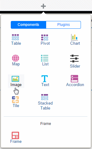
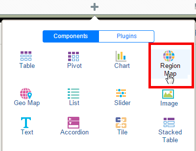
5.1 Inserting Images
You can add images to your app pages using any of these methods:
-
Static image: Upload a static image that is saved in the app. An uploaded image file must be in one of the following graphic file formats: GIF, JPEG, PNG, or BMP. The image file cannot be larger than 10 MB.
-
Static URL: Specify a static link to a URL where an image is stored. At run time the image is retrieved from the stored location.
-
Dynamic URL: When the image URL is provided in a data field, specify the field that contains the URL. The value of the data field is evaluated at runtime enabling dynamic insertion of an image.
To insert an image:
-
Click Insert, and then drag the Image component to the page.
-
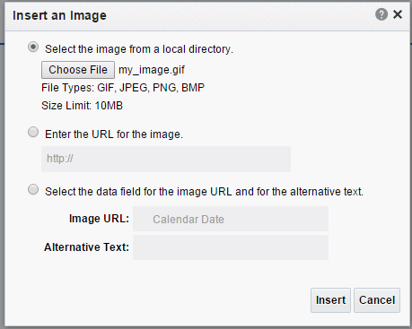
In the Insert an Image dialog, specify one of the following sources for the image:
-
Select the image from a local directory: Click Browse to specify the file name and directory of the image on a local or mapped drive to upload the image.
-
Enter the URL for the image: Enter the URL where the image is stored.
-
Select the data field for the image and for the alternative text:
Image URL: Select the field from the data that contains a URL of an image.
Alternative Text: If the data includes a field that contains alternative text for the image, then select that field to display alternative text.
-
-
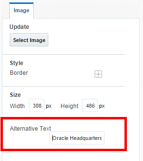
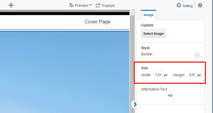
Add alternative text for the image. Click the Properties pane and enter text in the Alternative Text field as shown in Figure 5-2.
-
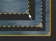
Optionally resize the image in one of these ways:
-
Drag the right bottom corner of the image. To preserve the aspect ratio when resizing an image, press and hold the Shift key before starting to drag the corner.
-
Modify the width and height in the Properties pane. The Properties pane enables you to enter precise height and width values in pixels, centimeters, inches, or points.
-
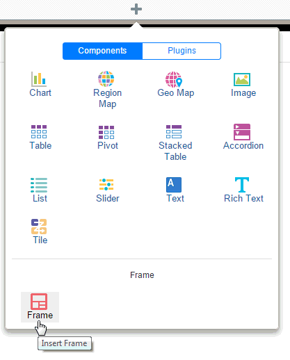
5.2 Inserting Frames
Use frames to divide your app page into sections for the precise positioning of components. When you start from a Blank page, typically you insert a frame before you begin inserting components. When you choose a preformatted template you can edit a default frame by selecting the frame and using the Frame properties. You can insert a frame inside another frame.
To insert a frame:
-
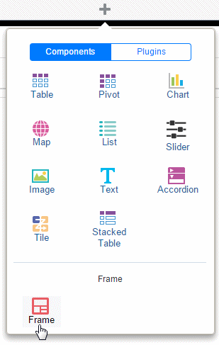
Select the area of the page where you want to insert the frame. On the Insert Component menu click Frame.
-
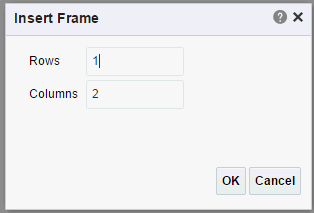
Enter the number of rows and columns for the frame and click OK.
Figure 5-5 shows the Insert Frame dialog.
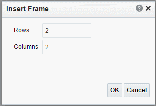
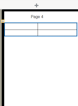
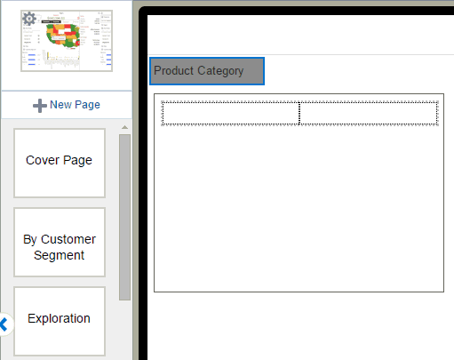
Figure 5-6 shows the inserted frame.
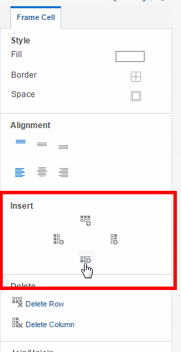
Features of frames include:
-
By default, frame columns are sized equally across the insertion area and frame row height defaults to the height of one row of text.
When you insert a component to a frame, the frame automatically resizes to accommodate the component.
-
You can adjust the column width and height by either positioning the mouse pointer over the border and dragging the blue resize bar, or by changing the frame column properties in the Properties pane.
-
You can insert a frame inside another frame.
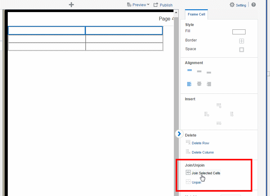
When you select a frame cell, the Frame Cell properties display to enable additional customization of fonts, alignment, borders, and background colors.
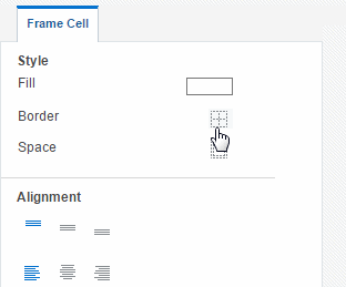
5.2.1 Adding a Border or Background Color
By default, the gridlines are displayed in the design area only and are not shown during run time.
To display the gridlines in your app:
-
Select the frame to display the Frame Cell properties.
Click the Border icon.
-
Choose the border style from the Border dialog. See Section 8.7, "Setting Borders" for more information about the Border dialog.
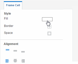
To add a background color to a frame cell:
-
Click the Fill color bar to launch the Color Picker.
-
Select a color and click OK.
See also: Using the Color Picker.
5.3 Inserting Tables
A default table includes a header, data columns, and a total row. The table supports "group left" functionality (outlines) that merges fields with the same values as well as subtotals, grand totals, and custom calculations.
For detailed information about table options see Section 8.1, "Working with Tables."
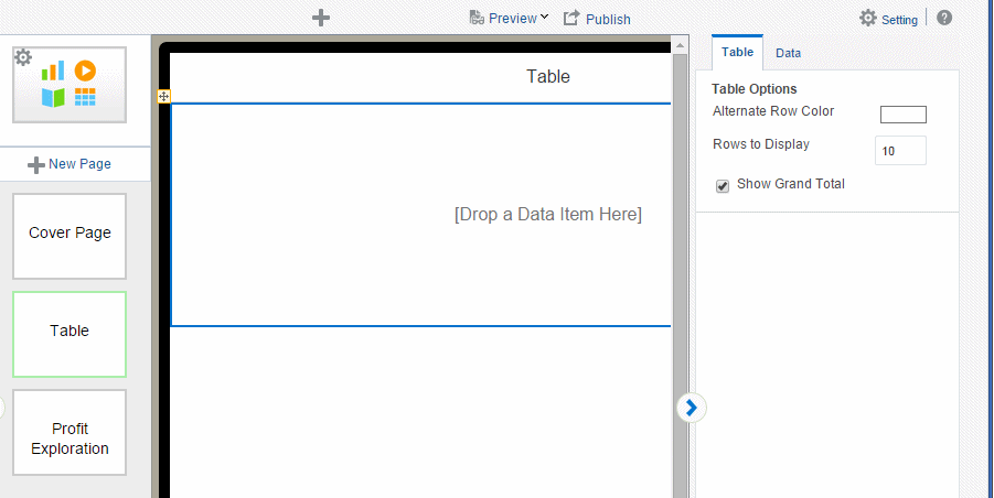
To insert a table:
-
Click Insert, and then drag the Table component to the page.
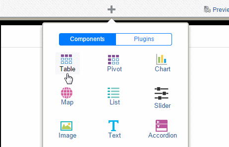
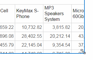
Figure 5-7 shows an inserted, empty data table. Notice that the Table properties now display.
-
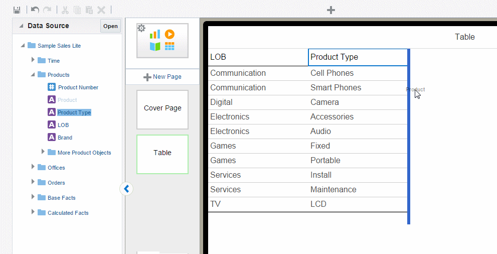
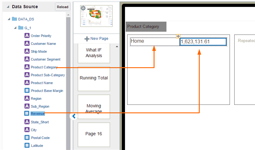
To add data columns to the table, select a field from the Data Source pane and drag it to the table.
Figure 5-8 shows adding columns to the table. Notice that when you drop a field on the table the sample data immediately displays.
-
Continue to drag the fields from the Data Source pane to form the columns of the table. If you must reposition a column that you have already added, select it and drag it to the correct position.
To resize columns, position the cursor over the column border until the cursor switches to a handler, then drag the column border to the desired width. Notice that as you drag the column edge the width in pixels displays to enable precise sizing.
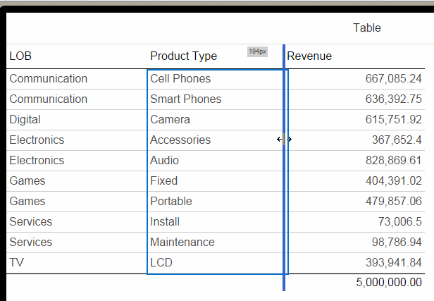
Some formatting is applied to the table, specifically:
-
The inserted table includes a total row that displays the sum of the items in numeric columns. You can remove this row or edit the display and calculation applied. See Section 8.1.5, "Customizing Table Totals."
-
Numbers and dates display default formatting and alignment. To change the formatting, see Section 8.1.4.3, "Setting Table Data Formatting Options."
5.3.1 Customizing Tables
Edit the table properties using the Properties pane. As you select different areas of the table, notice that the Properties pane changes to display specific for properties for the area selected. The following palettes are available to customize the display of your table. For details see Section 8.1, "Working with Tables."
-
Table
-
Table Column Header
-
Column
-
Total Cell
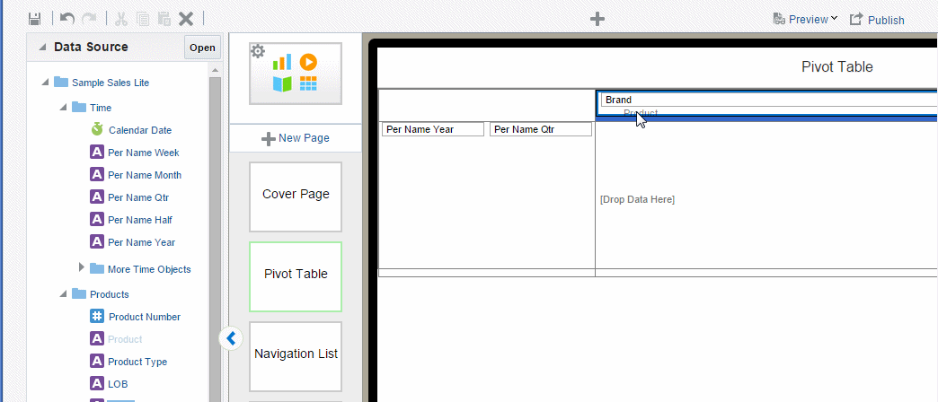
5.4 Inserting Pivot Tables
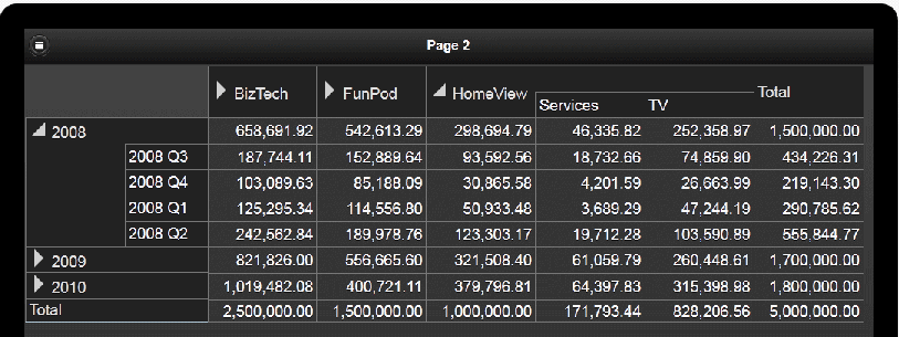
A pivot table provides views of multidimensional data in tabular form. It supports multiple measures and dimensions and subtotals at all levels. Figure 5-10 shows a pivot table.
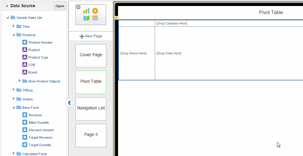
5.4.1 Inserting a Pivot Table
To insert a pivot table:
-
On the Insert tab, drag the Pivot component to the page. Figure 5-11 shows the empty pivot table structure.
-
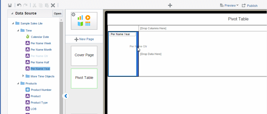
Drag and drop data fields from the Data Source pane to the row, column, and data positions.
To create multiple dimensions, precisely drop each level to its position in the pivot table structure as shown in Figure 5-12.
You can stack multiple dimensions in both rows and columns.
-
Optionally resize the pivot table by clicking and dragging the handler in the lower right corner of the pivot table, as shown in Figure 5-13.
For more details about pivot table options, see Section 8.2, "Working with Pivot Tables."
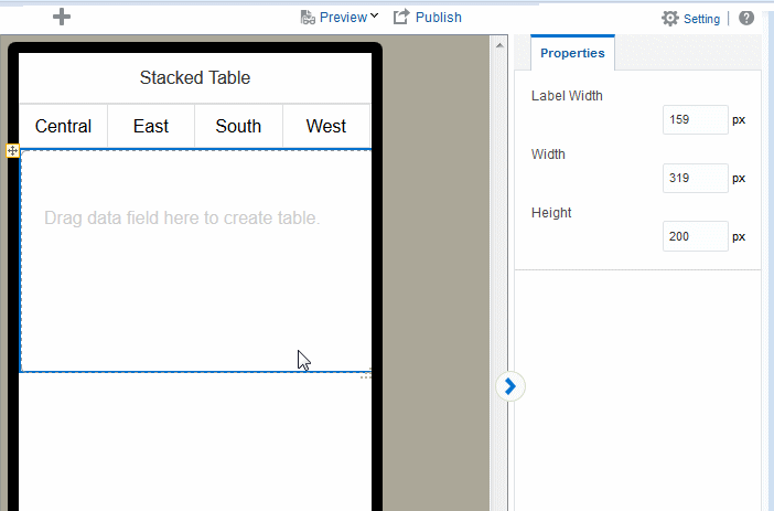
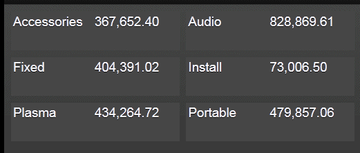
5.5 Inserting Stacked Tables
Stacked Tables enable you to show tabular data in a single column, stacked format. This feature is particularly useful for phone apps when you need to display a set of key values for quick access on this smaller device. This option is also useful to display tabular data within a tile.
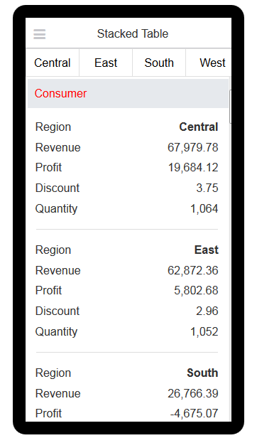
Notice how the stacked table enables quick viewing of key data. Data can also be easily grouped.
To insert a stacked table:
-
Click Insert, and then drag the Stacked Table component to the page.
The component is inserted.
-
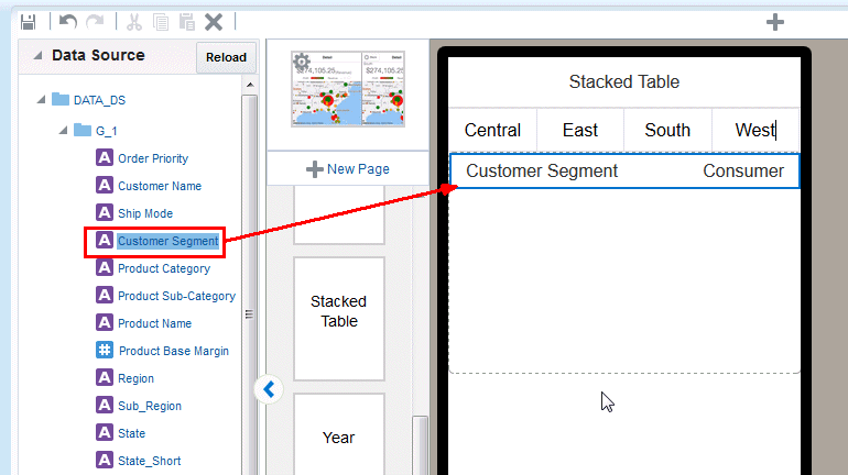
Drag data fields from your Data Source to the table.
-
Continue to drag the fields you want displayed in the stacked table. If you want to reposition a field that you have already added, select it and drag it to the correct position.
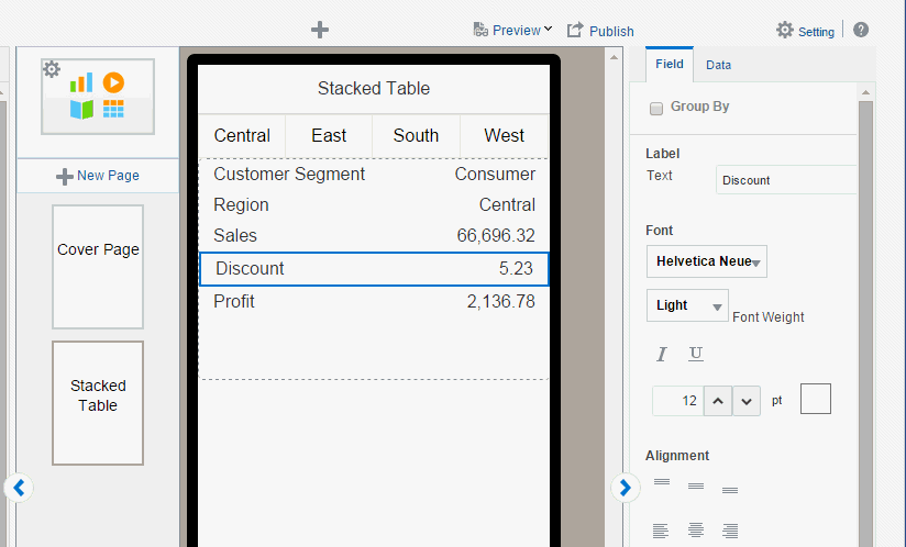
-
Format or group the fields as desired. Each field in the table can be formatted separately. Select a field in the table to edit its properties.
5.6 Inserting Charts
The Mobile App Designer supports a variety of chart types and styles to present rich visualizations of your data.
After you insert a chart, you can edit the chart properties using the Properties pane.
5.6.1 Inserting a Chart
To insert a chart:
-
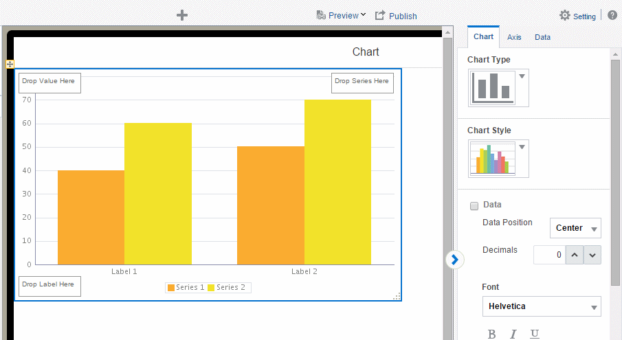
From the Insert menu, drag the Chart component to the page.
By default a vertical bar chart is inserted and the Chart properties are displayed, as shown in Figure 5-19.
-
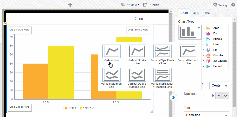
To change the chart type, click the Chart Type list to select the chart type required for your app. Figure 5-20 shows changing the chart type to Pie.
-
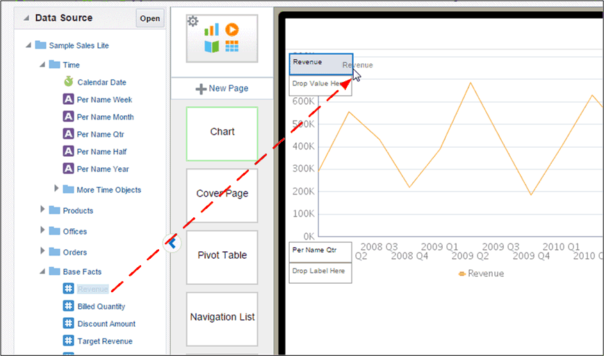
Drag the data fields from the Data Source to the appropriate areas in the chart. Where you drag a data element depends on the chart type and on the information you want to display.
For example, a vertical bar chart includes the following options:
-
Label
-
Value
-
Series
The chart immediately updates with the preview data, as shown in Figure 5-21
-
-
To resize the chart, drag and drop the resize handler on the lower right corner of the chart, as shown in Figure 5-22.
To preserve the aspect ratio when resizing a chart, press and hold the Shift key before dragging the handler.
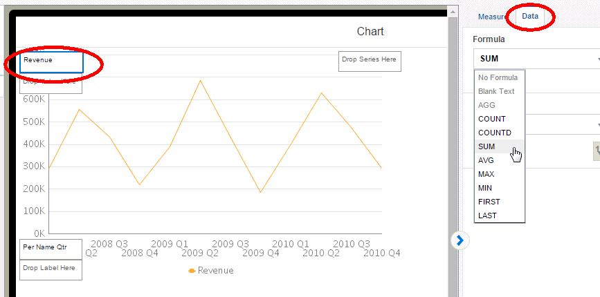
5.6.2 Changing the Formula Applied to a Chart Measure Field
By default, the chart displays a sum of the values of the chart measure. You can change the formula applied to a chart measure field using the Measure properties.
To change the chart measure field formula:
-
Select the measure field in the chart. This displays the Measure properties as shown in Figure 5-23.
-
Click the Data tab and select a formula from the Formula list. To include a more complex formula, use a Calculated Field. See Calculated Fields.
5.6.3 Sorting by an Alternative Field
You can sort the chart label or series by an alternative field in your data or by a calculated field. For example, assume you insert the following chart that shows Revenue by Month:
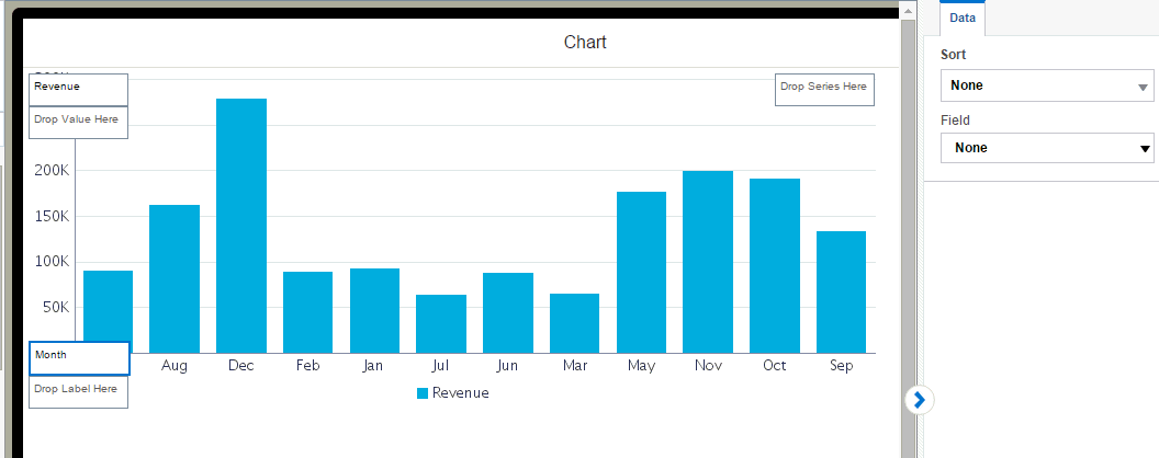
The Month names sort alphabetically by default, which is undesirable.
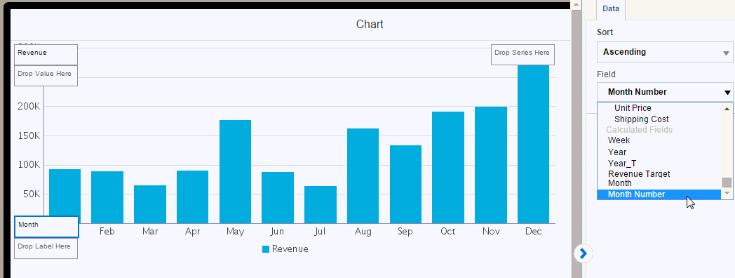
To sort chronologically, you can sort by an alternative field:
-
Select Label or Series as appropriate.
-
On the Data properties pane, select Ascending or Descending.
-
From the Sort by menu, select the Data field or Calculated Field by which you want to sort.
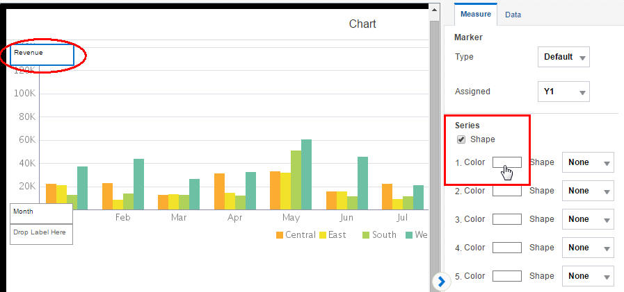
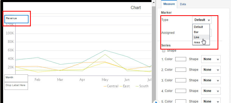
5.6.4 Changing the Series Color in a Bar or Line Chart
You can customize the appearance of your line or bar chart by updating the colors displayed.
To change the color of the lines or bars in a chart:
-
Select the measure field in the chart. This displays the Measure properties as shown in Figure 5-24.
-
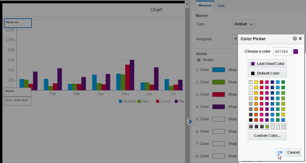
Click the Color box for the series member that you want to customize.
-
Use the Color Picker to select the color you want displayed in the chart. Repeat for each series member.
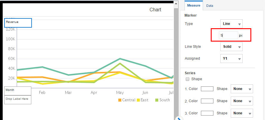
5.6.5 Changing the Width and Style of the Lines in a Line Chart
You can customize the appearance of your line chart by customizing the width and style of the lines.
To change the width of the lines in a line chart:
-
Select the measure field in the chart. This displays the Measure properties.
From the Type list, select Line as shown in Figure 5-26.
-
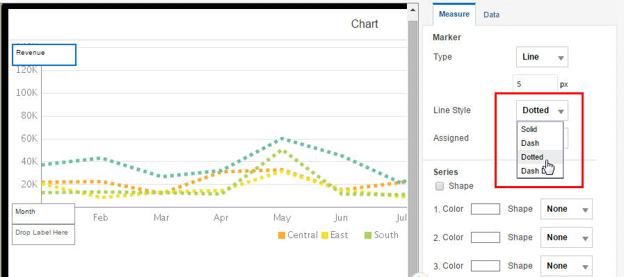
To customize the line width, update the pixel setting as shown in Figure 5-27.
-
To customize the Line Style, choose from Solid (default), Dash, Dotted, or Dot-Dash.
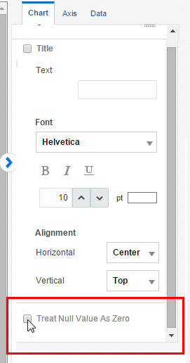
5.6.6 Setting the Treatment for Null Values
By default, null values are treated as a zero value. Depending on the nature of your data you may want to turn off this setting.
To turn off Treat Null Values as Zero:
-
Click within the chart to display the Chart properties tab.
-
Scroll to bottom of the Chart properties tab and deselect the Treat Null Values as Zero.
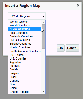
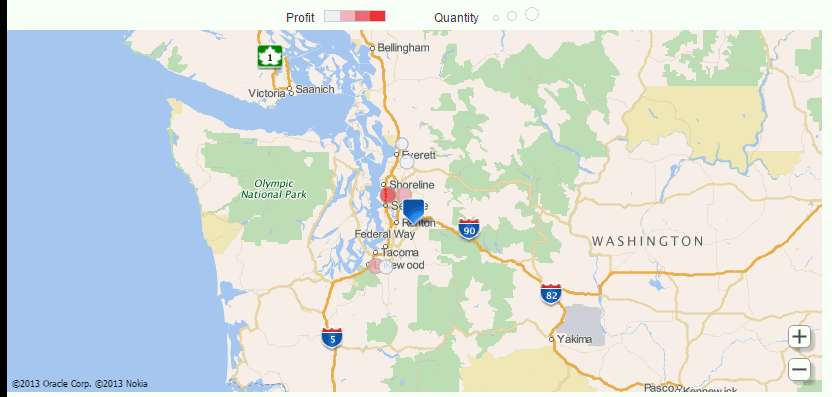
5.7 Inserting Maps
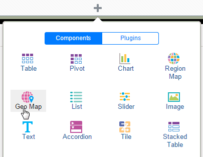
Use maps to show how data is distributed across geographic locations. Mobile App Designer offers two types of maps from the components menu:

Choose Region Map when your data includes the regional identifies for how you want your data grouped -- such as U.S. States, world countries, Canadian provinces, Japanese prefectures, Australian territories, and so on. Mobile App Designer provides a set of maps with preset region identifiers to match to your data.
Choose Geo Map when your data includes latitude and longitude values.
5.7.1 Region Maps
Region maps include at least one preset region identifier that specifies how data is mapped to a region. For example, the region identifiers for the US States map are:
-
the full state name (for example, "Florida")
-
the two-letter state abbreviation (for example, "FL")
So if your data identifies the state as "Florida" or "FL" the mapping engine aggregates that data for Florida on the map.
If your data does not include the region identifiers shown for the provided maps, you can edit the map files to meet your requirements.
To edit the map files to add identifiers that match your data, see Chapter 6, "Customizing Region Maps." To use custom maps with custom identifiers, see Section A.7, "Adding Custom Maps."
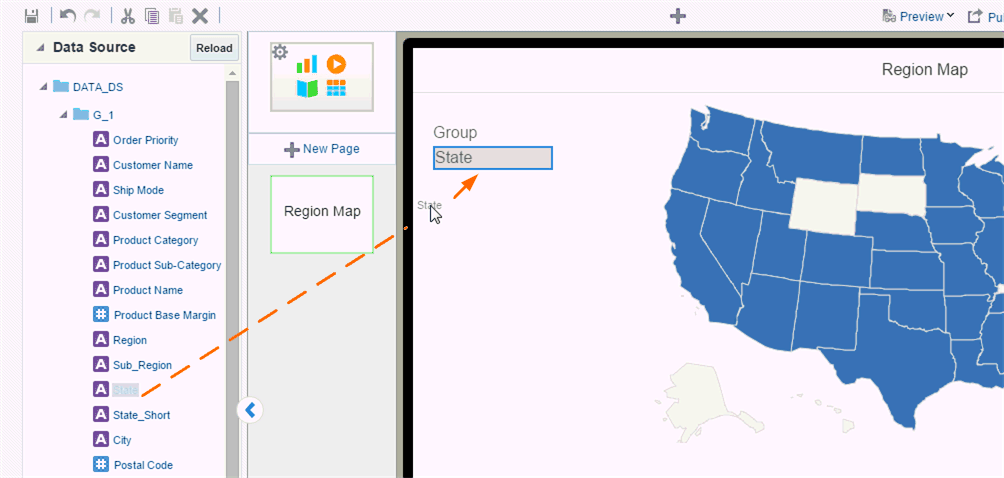
To insert a Region map on your app page:
-
Click Insert Component, and then drag Region Map to the area of the page you want to insert it.
-
On the Properties pane, select the Map Region.
-
Drag the data source field for which the data is to be aggregated to the Group field.
Group is the geographical entity for which data is aggregated. For example, in a United States map you would aggregate the data by state.
The values in your data for this field must match a supported region identifier for the map. For example, if you choose the US States map, the data field you assign to Group must contain either the full state names (such as "Wyoming") or the two-letter state abbreviations (such as "WY").
Some examples are shown in the following table:
Map Type Group Level Identifiers for the Group Level World Countries Country Country Name, for example: "France" ISO3 three-letter country code, for example: "FRA"
ISO2 two-letter country code, for example: "FR"
US States State Full state name, example: "Wyoming" Two-letter state abbreviation, example: "WY"
US Counties County Two-letter state abbreviation _county name, for example: "IL_COOK" and "CA_ORANGE" All others Varies See http://www.oracle.com/technetwork/middleware/bi-foundation/map-code-2408077.htmlIf your data does not include a supported identifier, you can edit the map files. See Chapter 6, "Customizing Region Maps."
The Marker specifies how the data displays on your map. You can choose either Area or Circle.
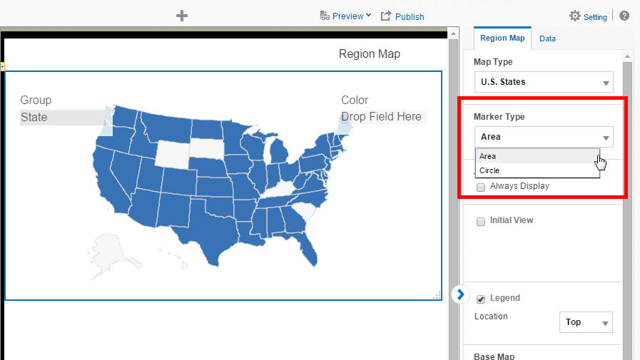
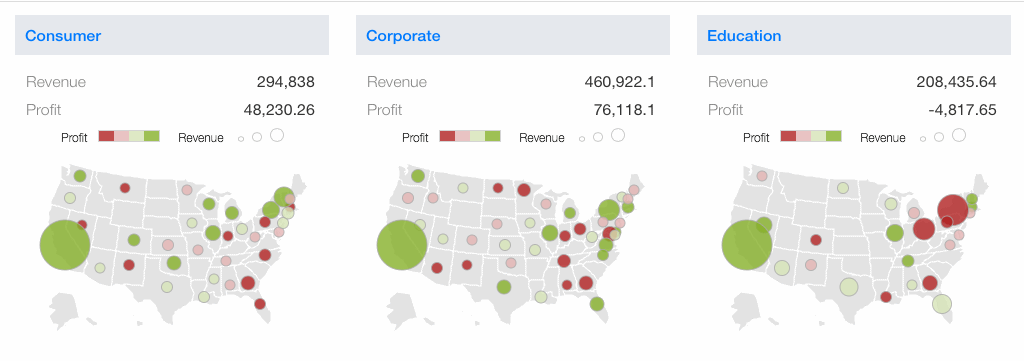
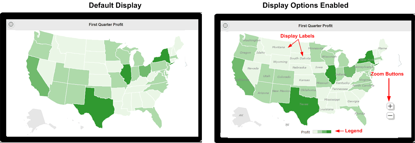
Area - In Area maps, the color of the region signifies the aggregated value. Drop the data value to be aggregated in the Color field. In the following example, the color of each State signifies the aggregated Profit.
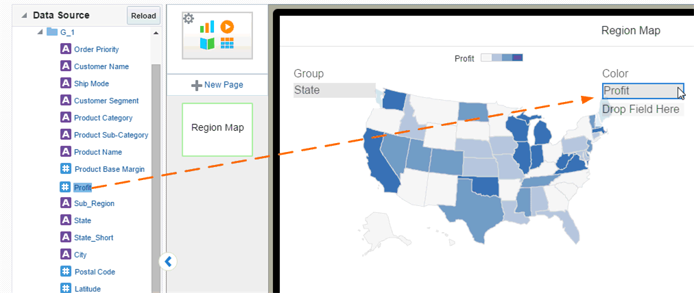
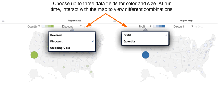
You can assign up to three measures to the Color field and specify distinct properties for each.
Circle - A circle displays at each location in the data that corresponds to the Aggregation Level. Circle markers can represent two dimensions by color and size.
In the following example, the color of the circle represents Profit while the size of the circle represents Sales.
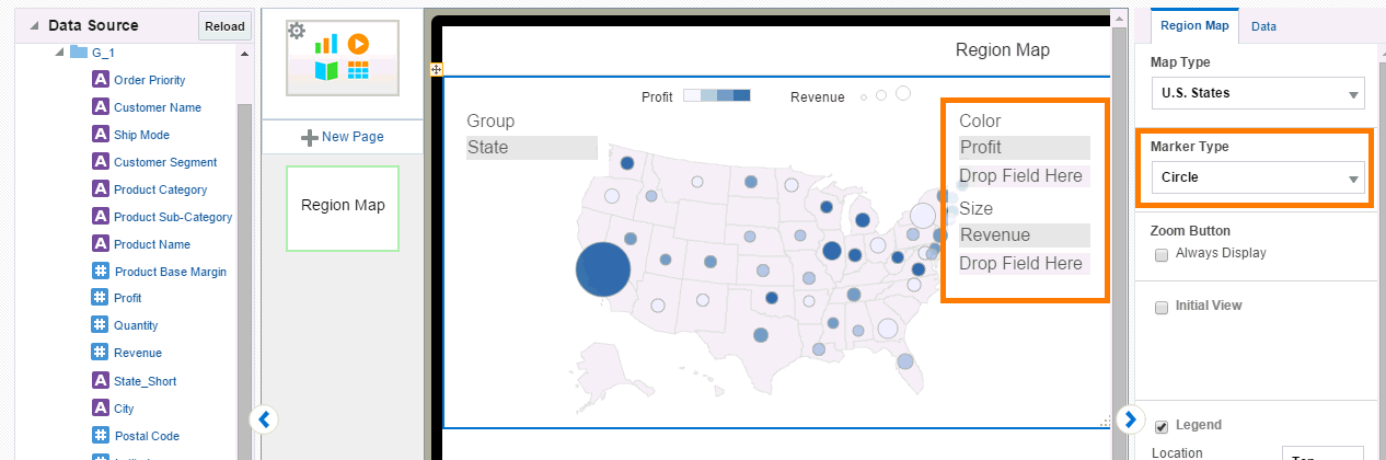
Like the Area marker, you can select up to three measures for color and size. You can choose different properties for each measure (such as color, cut point, and # of steps). At run time, you can then view different combinations.
5.7.2 Setting Region Map Properties
Properties you can set for maps include:
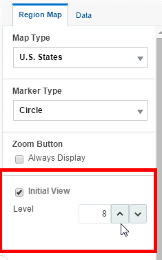
5.7.2.1 Setting the Initial Zoom Level and Map Center
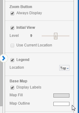
You can configure the initial zoom level of the map when a user first opens it.
To configure the initial zoom level:
-
Select the map to display the map properties.
-
Select Initial View.
-
Zoom in by increasing the Level (up to 18). Zoom out by decreasing the Level.
5.7.2.2 Customizing the Base Map Display
You can customize your map to display a legend, the zoom buttons, and geographical labels.
To set display options:
-
Select the map to display the map properties.
-
To display the Zoom Button, select Always Display.
-
Legend - displays the legend to show the value of the markers. When Area marker is used, the color scale displays. When Circle marker is used, circle size scale displays as well.
You can set the Location of the legend to be the Top or the Bottom of the map,
-
Display Labels - displays the label (for example, Country Name or State Abbreviation) for each geographic element. The label used can be configured in the map configuration file (see Section A.7, "Adding Custom Maps").
-
5.7.2.3 Setting the Color Distribution of Circle or Area Markers
Use the color distribution properties to specify how the marker color is distributed across the data points.
The Cut Point sets the way the color distribution is calculated based on either an equal range of values or equal number of members.
By default the scale is Linear.
If your data points are mostly distributed near the maximum value, choose Power to enhance the color distinction between the higher numbers.
If your data points are mostly distributed near the minimum value, choose Square Root to enhance the color distinction between the lower members.
Scale cannot be set when the Cut Point is set to equal number of members.
Sets 0 as the center point of the color distribution.
Number of color steps between the lowest and highest values.
When set to Sequential, choose the Start and End colors to display. The lowest value displays the Start color and the highest values displays the End color. Values in between display color between the two according to your selections for Cut Point, Scale, and Number of Steps.
When set to Diverging, choose Start, Center, and End colors. The Center color is the mid point of the data values. The higher values diverge from the Center toward the End color, the lower values diverge from the Center color toward the Start color.
Set the slider to configure the opacity level.
5.7.2.4 Setting the Size Distribution of Circle Markers
You can configure how the circle size represents your data.
By default the scale is Linear.
If your data points are mostly distributed near the maximum value, choose Power to enhance the size distinction between the higher numbers.
If your data points are mostly distributed near the minimum value, choose Square Root to enhance the size distinction between the lower members.
Manually set the start (lowest value) and end (highest value) size of the circles in pixels.
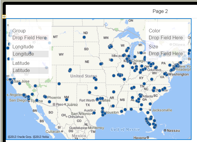
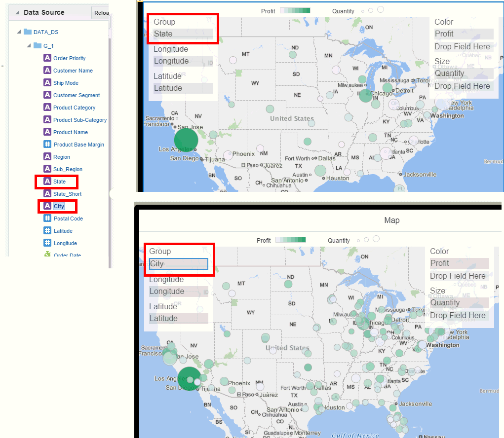
5.7.3 Geo Maps
Use Geo Maps when your data includes latitude and longitude values.
-
Click Insert Component, and then drag Geo Map to the area of the page you want to insert it.
-
Drag and drop your latitude and longitude data fields to the map.
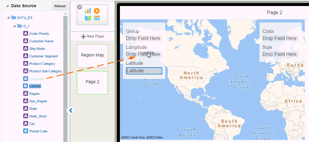
Your map now shows a single dot per coordinate location.
-
Drag the data source field for which the data is to be aggregated to the Group field.
The Group is the geographical entity for which data is aggregated. The following example shows the same data For example, in a United States map you would aggregate the data by state. Table 5-0 shows how you can group your location coordinates by different elements in your data. In this case, City or State.
5.7.4 Setting Geo Map Properties
Properties you can set for maps include:
5.7.4.1 Setting the Initial Zoom Level and Map Center
You can configure the initial zoom level of the map when a user first opens it.
To configure the initial zoom level:
-
Select the map to display the map properties.
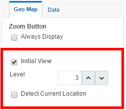
-
Select Initial View.
-
Zoom in by increasing the Level (up to 18). Zoom out by decreasing the Level.
Geo Maps: Use Current Location as Initial View
This option is enabled for Geo Maps only (maps that use latitude and longitude values).
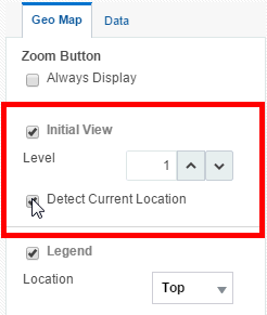
When you select Use Current Location as the Initial View, the app detects the user's current location from the browser and uses it as the center point of the map. For example, if you design a Sales app using latitude and longitude data, then when your app user gets off a plane in Seattle and views the app, the map is centered in Seattle. Another user of the same app in Miami will see her map centered in Miami.
5.7.4.2 Enabling Display of Zoom Buttons and Legend
You can customize whether your map displays the zoom buttons and legend.
To set display options:
-
Select the map to display the map properties.
-
To display the Zoom Button, select Always Display.
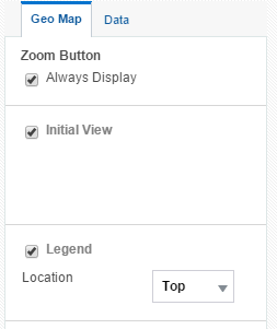
-
Legend - displays the legend to show the value of the color and size markers.
You can set the Location of the legend to be the Top or the Bottom of the map,
-
5.7.4.3 Setting the Color Distribution of Circles
Use the color distribution properties to specify how the marker color is distributed across the data points.
The Cut Point sets the way the color distribution is calculated based on either an equal range of values or equal number of members.
By default the scale is Linear.
If your data points are mostly distributed near the maximum value, choose Power to enhance the color distinction between the higher numbers.
If your data points are mostly distributed near the minimum value, choose Square Root to enhance the color distinction between the lower members.
Scale cannot be set when the Cut Point is set to equal number of members.
Sets 0 as the center point of the color distribution.
Number of color steps between the lowest and highest values.
When set to Sequential, choose the Start and End colors to display. The lowest value displays the Start color and the highest values displays the End color. Values in between display color between the two according to your selections for Cut Point, Scale, and Number of Steps.
When set to Diverging, choose Start, Center, and End colors. The Center color is the mid point of the data values. The higher values diverge from the Center toward the End color, the lower values diverge from the Center color toward the Start color.
Set the slider to configure the opacity level.
5.7.4.4 Setting the Size Distribution of Circle Markers
You can configure how the circle size represents your data.
By default the scale is Linear.
If your data points are mostly distributed near the maximum value, choose Power to enhance the size distinction between the higher numbers.
If your data points are mostly distributed near the minimum value, choose Square Root to enhance the size distinction between the lower members.
Manually set the start (lowest value) and end (highest value) size of the circles in pixels.
5.8 Inserting Lists
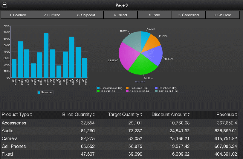
The List component displays all values of a data field in a vertical or horizontal interactive list that behaves as a filter for the other components on the page. Tap a list item to update the results in all other tables, charts, or other visualizations on the page. Figure 5-37 shows a page that displays two charts and a table. The list component across the top of the page displays order status. Tapping an order status updates the other components to show only results for the item tapped.
You can define default values for the list to be applied when a user first opens the page. This feature is useful when the unfiltered data set is large.
5.8.1 Inserting a List
To insert a list:
-
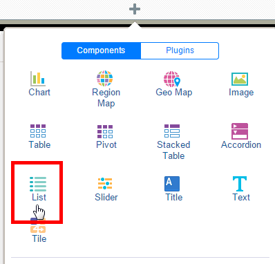
Click Insert Component and then select List.
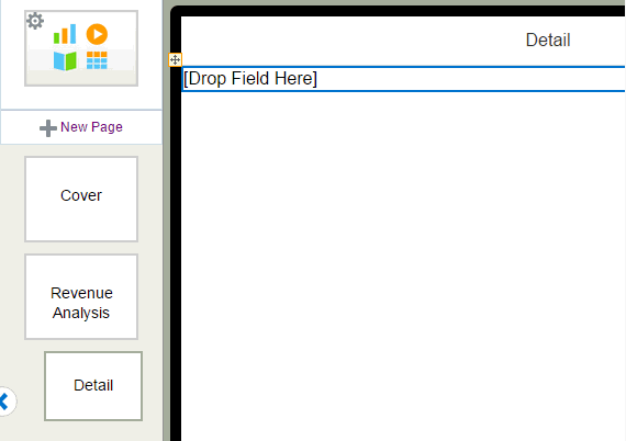
This inserts an empty list to the design area.
-
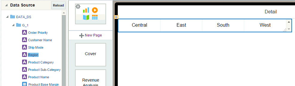
Drag an element from the Data Source pane and drop it on top of the empty list in the layout.
Figure 5-39 shows a list of Region values.
-
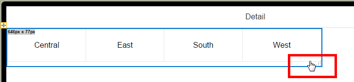
To change the size of the list in the page, click and drag the handler in the bottom right corner.
-
(Optional) Customize the appearance of the list and set defaults. See Customizing Lists.
5.8.2 Customizing Lists
Use the List Properties set to:
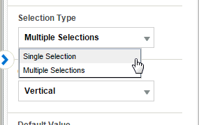
5.8.2.1 Enable Multiple Selection or Single Selection
By default the List supports multiple selection, but you can restrict it to single selection by choosing the Selection Type.
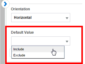
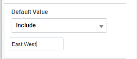
5.8.2.2 Specify Default Values for the List
You can configure your list to display only specific values when users first open the app page.
To specify default values:
-
Select the List to display its Properties.
-
In the Default Value property, choose whether to Include or Exclude the specified values.
-
Enter the default values. Enter multiple values separated by a comma. (Important: Do not enter spaces between the values.)
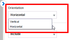
5.8.2.3 Change List Orientation
The list can display either horizontally across the page or frame or vertically down the page. To change the orientation of the list:
-
Select the List component on the page to display its Properties.
-
Under Orientation, select Horizontal or Vertical.
Figure 5-42 shows the Orientation property.
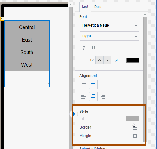
5.8.2.4 Customize Font and Background Styles
You can customize the list font and background styles for selected and nonselected modes.
To customize the font and background style when no list items are selected:
-
Select the list component in the design area to display its Properties.
-
Set the following properties in the Font region:
-
Font type and Font weight
-
Font Size
-
Border
-
Background Color
-
Font Color
-
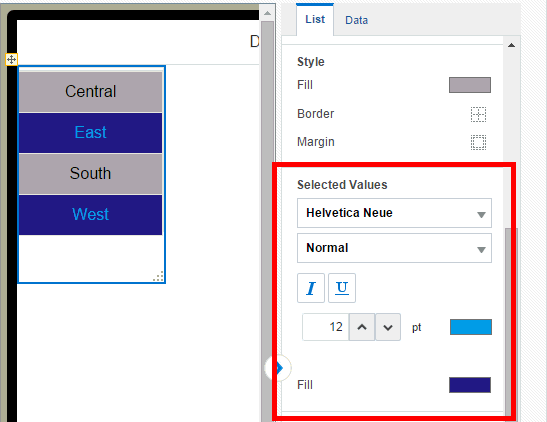
The Selected Values properties control the appearance of the item in a list when it is selected. By default, the selected item displays as dark grey.
To customize the font and background style of the selected item:
-
Select the list component in the design area to display its Properties.
-
Set the following properties in the Selected Values region:
-
Font type, Weight, and Style
-
Font size
-
Font Color
-
Fill color when selected
-
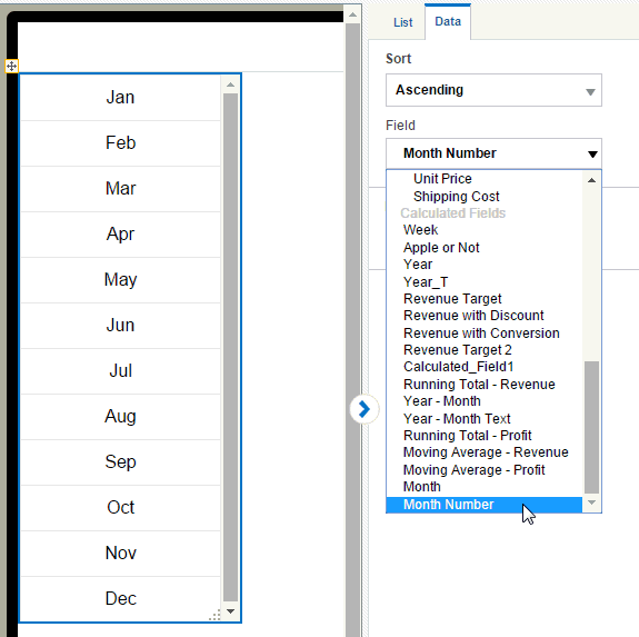
5.8.2.5 Specify List Sort Order and Sort by Field
To specify the list sort order, click the Data tab on the Properties pane and choose Ascending, Descending, or None.
To sort by a different field than the display field, you can choose a different Sort by Field. In the following example, the list uses Month Name as the filter field, but uses Month Number as the Sort by field to achieve the correct chronological sorting of months.
5.9 Inserting Sliders
A slider enables you to interactively filter charts and tables on a page by a data field range of values by dragging the slider handle along a horizontal bar. In the following example as you move the slider to the right the charts refresh to include only members with salaries greater than the value the slider is resting on.
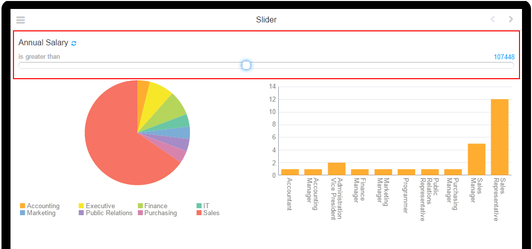
You can choose from several operators such as greater than, less than, or is between. Sliders support numeric and date data fields only. Text fields are not supported.
5.9.1 To Insert a Slider:
-
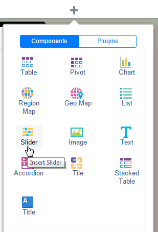
Click Insert and then drag the Slider component to the app page.
-
Drag a numeric or date field to the Slider on the app page.
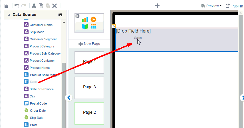
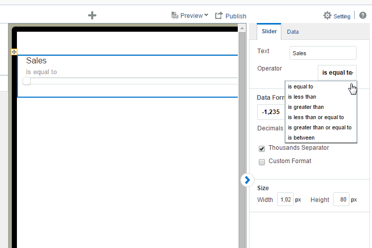
-
In the Properties pane, select the Operator for your slider. Supported operators are:
-
is equal to
-
is less than
-
is greater than
-
is less than or equal to
-
is greater than or equal to
-
is between
-
5.9.2 Customizing Sliders
You can apply the following customizations to your slider using its Properties:
-
Edit the Text field to change the display name on the slider
-
Apply formatting to the numeric or date field. Choose a predefined format, or enter a custom format. See Section 8.6.1, "Apply Data Formatting."
-
Adjust the width and height of the slider on the app page.
-
Apply a filter to the slider. Click the Data tab and select the filter to apply. See Applying Filters.
5.10 Inserting Data Fields
You can insert a data field to display in your app by simply dragging it from the Data Source pane to the app page where you want it to display. To position data fields more precisely, or to insert fields side-by side, insert a frame first. See Inserting Frames.
5.10.1 Insert Data Fields
To insert a data field:
-
Select the area in the page where you want to insert the field.
-
Drag the field from the Data Source pane to the position in the app page.
5.10.2 Display Data Fields Side-by-Side
To display data fields side-by-side as shown in Figure 5-46, insert a Frame first to position the data fields.
-
Select the area of the page to display the data fields. In this example, the area is a Tile.
-
On the Add Component menu, drag the Frame component to the desired position on the page (in this example, to the first tile).
-
In the Frame dialog, enter 1 Row and 2 Columns.
The Frame displays in the page.
-
Drag the data fields from the Data Source pane to the frame cells where you want the data to display.
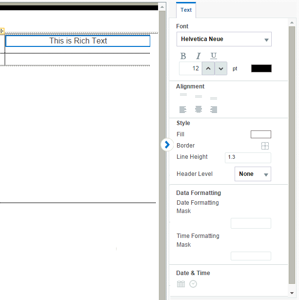
5.11 Inserting Text or Rich Text
Use the Text or Rich Text component to enter free-form text in the layout.
The differences between Text and Rich Text:
Text:
-
Supports the Light font weight in addition to Bold and Normal.
-
All formatting must be applied to the entire string.
-
Has fewer formatting options, shown here:
Rich Text:
-
Does not support the Light font weight.
-
Formatting can be applied differently to parts of the string.
-
Has more formatting options, including insertion of date and time, shown here:
To insert text:
-
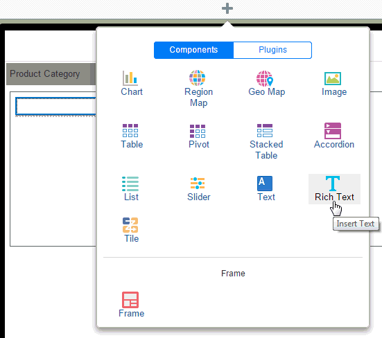
From the Add Component menu, select Insert Text or Insert Rich Text.
-
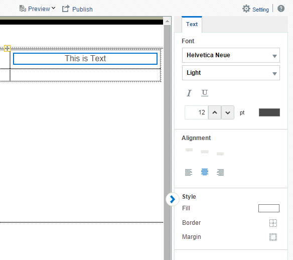
Double-click the default inserted text to enter your text.
-
Use the Properties pane to customize the text display.
5.11.1 Display Text Items Side by Side
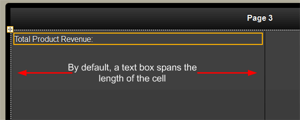
By default, when you insert a text item to a frame cell, the text box spans the length of the frame cell.
To arrange text fields side by side with data fields or other text fields, use a frame to align the elements. You can insert multiple frames inside outer frames.
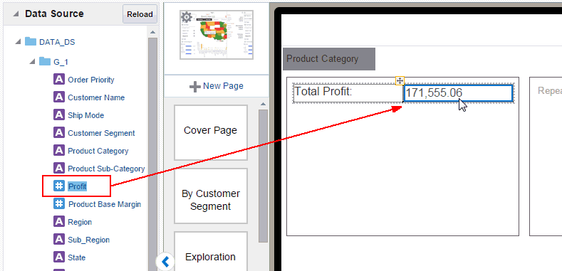
Example: To display a data field in line with the text item:
-
Insert a frame.
-
Specify the columns and rows. This example uses a single row frame with two columns.
-
Select the frame cell and insert a text component.
-
Enter your text string in the Text field, for example: Total Profit.
-
Drop a data field inline with the text as shown in Figure 5-50.
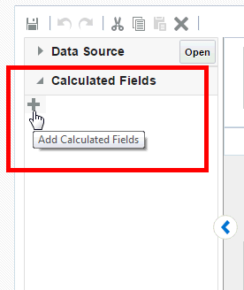
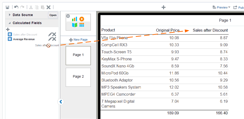
5.12 Calculated Fields
The calculated fields feature enables you to create a calculated field using common expressions and then use it throughout your app. You define calculated fields by applying formulas or functions to the existing data fields in your app. You then drag this calculated field to the component in your app (charts, tables, tiles, sidebars, pivot tables) just as you would any other field in your data source.
Video: Adding Calculated Fields and Filters
5.12.1 Adding Calculated Fields
To create a calculated field:
-
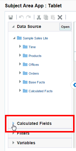
On the left-side accordion pane, click Calculated Fields.
-
Click Add Calculated Fields.
-
In the Calculated Fields dialog, enter a Name for your calculated field.
-
Select the functions and data fields to construct the calculated field:
Double-click the function name to add it to the calculation box. To add data fields, select the field and then use the shuttle button to position it in your formula.
When you select a function, the Syntax, Description, and an Example display on the right.
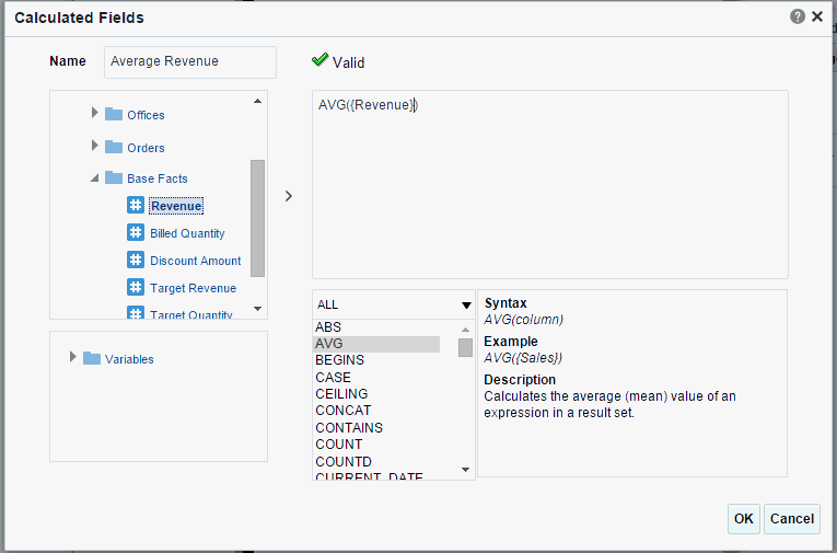
The expression is validated as you enter it.
-
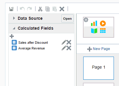
When you click OK the expression displays in the Calculated Fields list.
5.12.2 Adding Calculated Fields to App Components
To add a calculated field to a component, simply drag and drop it from the Calculated Fields pane the same way you would a data field from the data source pane. Add calculated fields to tables, charts, lists, maps, pivot tables, sidebars, exploration page filters, and tile pages.
5.12.3 Editing Calculated Fields
To edit a calculated field:
-
Open the Calculated Fields pane.
-
Click the Edit icon.
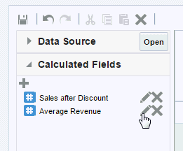
-
In the Calculated Fields dialog, edit the calculation and click OK. See Adding Calculated Fields for descriptions of the dialog fields.
5.13 Filtering Data
You can create named filters and then apply these filters either to the entire app or just to specific components in the app, such as charts, tables, and tiles.
-
Example: Apply the filter to the entire app:
Apply the filter to the entire app when you want the app to include only a subset of the data from your data source. For example, if your data includes results for three brands FunPod, BizTech, and HomeView and you want an app that shows only results for FunPod, you can create a filter for Brand and apply it to all components in the app.
-
Example: Apply the filter to specific components
Apply the filter to only specific components when you want your entire app to include data from your full set of data but only certain components to be filtered. For example, on one page of your app you want to show a chart that shows data for each specific brand only. In this case, create a filter for each Brand (FunPod, BizTech, and HomeView) and apply one each Brand filter to its chart on the app page.
Filters can be based on:
-
static values (for example, Sales > 10,0000)
-
data field values (for example, Sales > Target Sales)
-
values supplied by Variables
Watch the following video for more tips:
Video: Adding Calculated Fields and Filters
Use the following procedures to add filters to your apps:
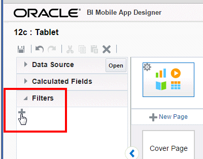
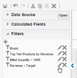
5.13.1 Creating Filters
To create a filter:
-
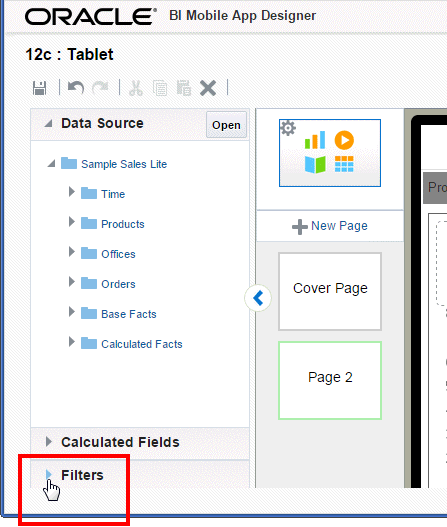
On the left-side accordion pane, click Filters to open the Filters pane.
-
Click Add Filter.
-
Enter a Name for your filter.
-
To filter all components in your app by this filter, select Apply to all the components in the App. When you select this option you do not need to apply the filter again.
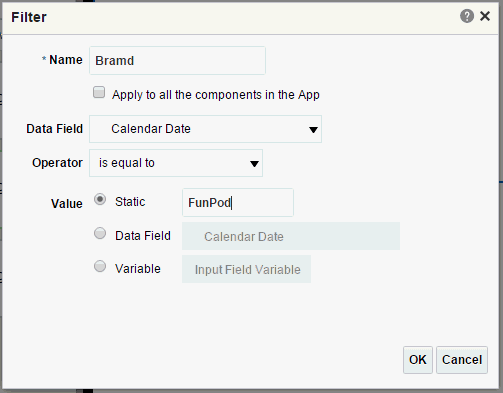
-
Select the Data Field, Operator, and Value to define the filter.
Table 5-1 Fields to Define Filters
Field Description Data Field
Select the data field to define the filter. All fields from your data source are available.
Operator
The available operators depend on the data type of the Data Field selected (numeric, text, or date). Not all operators listed display for each data type. Select the operator to define the qualifying criteria for your filter:
is equal to
is not equal to
is less than
is greater than
is less than or equal to
is greater than or equal to
is between
is in top
is in bottom
is null
is not null
is in
is not in
contains
not contain
starts with
ends with
is in last N days
is in next N days
Value
In the Value field, specify one or more values to use when applying the filter or condition. You can enter:
-
Static value
for example:
Brand
is equal to
FunPod
-
Data Field
for example:
Revenue
is less than
Target Revenue.
-
Variable - filter by a value supplied by a variable. See Creating Variables.
-
5.13.2 Applying Filters
You can apply filters to any page component. If you selected Apply to all the components in the App the filter is automatically applied throughout your app and you can skip this step.
For Filters based on a Variable value: The value of the variable can either be set by default in the variable definition or set from an Analytics page. When the variable value is updated on an Analytics page, it is applied to all components in your app that use the variable value as a filter.
To apply a filter to a chart, table, tile, or map:
-
Select the chart, tile, table, or map in the work area to display the properties for the component.
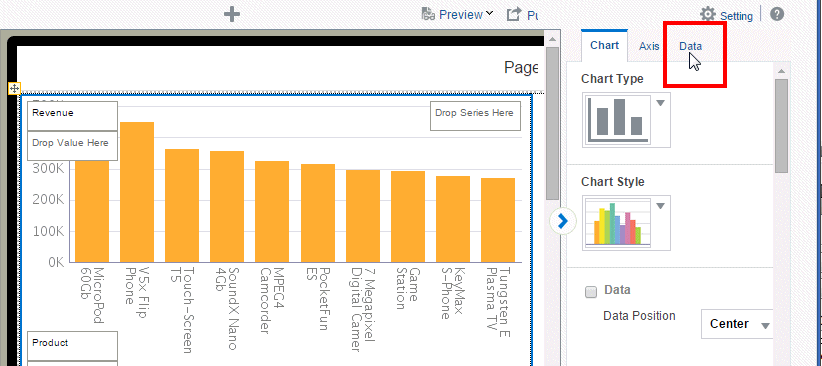
-
On the Properties palette, select the Data tab.
-
On the Data tab, click Add Filter.
-
Choose the filter to apply from the list.
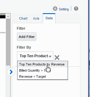
-
To apply more filters to the component, click Add Filter again and select another filter from the list. Filters are applied in the order you select them.
5.13.3 Editing Filters
To edit a filter:
-
Open the Filters pane.
-
Click the Edit icon.
-
In the Filters dialog, edit the criteria and click OK. See Creating Filters for descriptions of the dialog fields.
5.14 Creating Variables
Variables are used exclusively on the Analytics page. Use the Analytics page to create "what if?" scenarios that enable user input of values to drive the visualizations on the page. You create variables to hold the data that users can input, and then use the variable as an argument in a calculated field or filter.
For example, you could create a variable for interest rate. You then create a calculated field that uses the value of your interest rate variable to calculate interest on a given input. Add this variable to an Analytics page to enable your apps users to input different values for interest rate.
See Analytics Pages for details on how to use variables in your apps.
To create a variable:
-
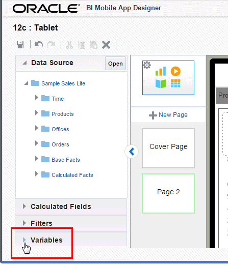
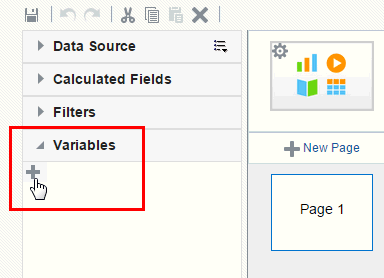
On the left-side accordion pane, click Variables.
-
Click Add Variable.
-
Enter a Name for your variable
-
Select the Variable Type.
-
Input Field
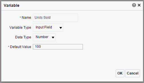
-
Select a Data Type: Number or Text. (Date is not supported in this release.)
-
Enter a Default Value.
-
-
Text Area
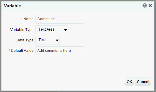
-
The Data Type is preset as Text.
-
Enter a Default Value.
-
-
List of Values
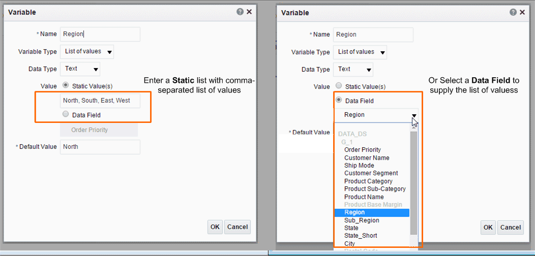
The values can be a static list that you enter or from a data field.
-
Choose Static and enter a comma-separated list of values; or choose Data Field and then select the data field to supply the values.
-
Enter a Default Value.
-
-
Slider
-
-
To use your Variable in your app
5.15 Customizing Background Images
You can add an image to an app page background and configure the display characteristics of the image. Use a background image when you want to layer other app components on top of it.
To add a background image to a page:
-
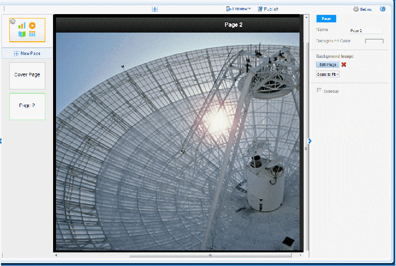
Select the page to enable the Page properties. The example in Figure 5-52 shows the Page properties.
-
Under Background Image, click Select Image to choose an image.
-
In the Insert an Image dialog, specify the source for the image:
-
Select the image from a local directory: Click Browse to specify the file name and directory of the image on a local or mapped drive to upload the image.
-
Enter the URL for the image: Enter the URL where the image is stored.
-
Select the data field for the image URL and for the alternative text:
Image URL: Select the field from the data that contains a URL to an image.
Alternative Text: If the data includes a field that contains alternative text for the image, then select that field to display alternative text.
-
-
Click Insert to insert the image to the app page. By default, the image is scaled to fit the page.
You can now add app components on top of the background.
5.15.1 Sizing the Background Image
To configure the size of the background image:
-
Select the page to enable the Page properties
-
Select a fit option from the menu.
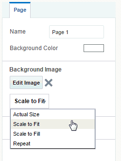
-
Actual Size - displays the image according to the actual pixel dimensions.
-
Scale to Fit - expands the image maintaining the scale until one dimension reaches the edge. If one dimension reaches the edge of the canvas and the other dimension has not, then that area of the canvas is not covered.
-
Scale to Fill - expands the image maintaining the scale to cover the entire canvas. If one dimension extends past the canvas for the other dimension to reach the edge, the image dimension that extends past the canvas is cropped.
-
Repeat - repeats the image at actual size to fill the canvas. Use this option to use a small image to create a pattern or texture in the background.
-
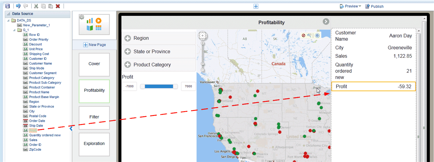
5.16 Adding Sidebars
A sidebar provides pop-up detail information when you tap a chart, a map, or tile on ta page. The following figure shows a page with sidebar enabled. Tapping a value on the page, such as the city of Miami on the map, launches the sidebar on the right side of the page showing detail information for the selection.
Video: Adding Detail Information Using Sidebars and Subpages
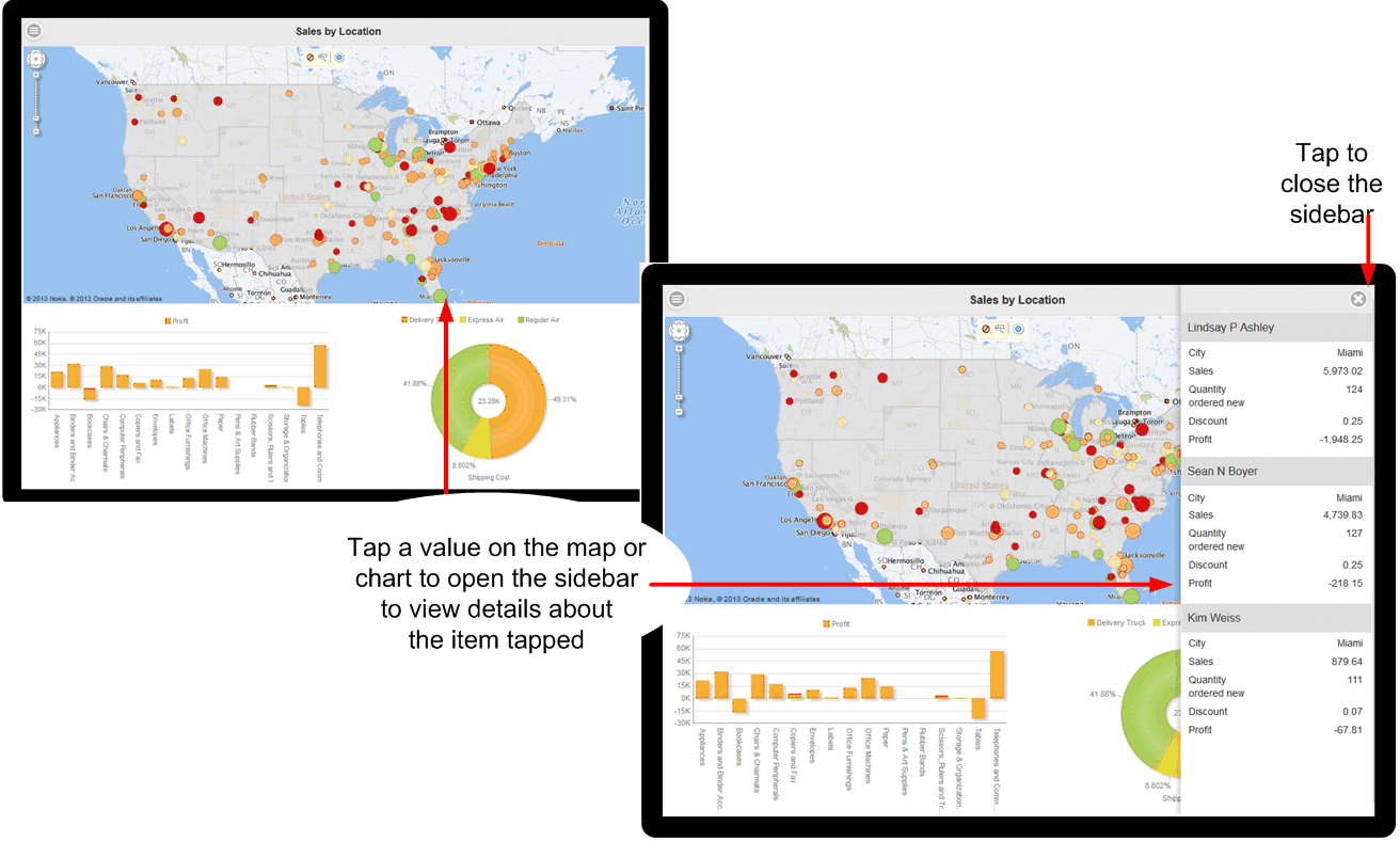
To close the sidebar, click the close icon in the upper right corner.
Use the sidebar when you want to provide a set of detail information about the values shown on your page and still maintain the context by staying on the app page. If you want to provide a full set of drill-down visualizations, consider using a subpage instead (see Main Pages and Subpages).
Design Note:
A page can support either a sidebar or a subpage, but not both. When designing your page, consider the amount and type of information you want to display from each touch point. If you want to supply a simple table-style list of additional data, then a sidebar is most likely appropriate. If you want to supply additional visualizations, such as charts and tables driven by the touch point, then a subpage would be more appropriate.Note the following about sidebars:
-
A sidebar is enabled at the page level. If you want every page of your app to display a sidebar, you must set up the sidebar for each page.
-
The sidebar is activated at run time when you tap a value on a chart, a map, or a tile.
-
You can define one sidebar per page; therefore, all items that can activate the sidebar display the same set of fields. In the example in Figure 5-56 the fields Customer, City, Sales, and so on display when you tap a value on either the charts or the map.
To add and customize a sidebar to your app page see the following sections:
5.16.1 Inserting a Sidebar
To add a sidebar to an app page:
-
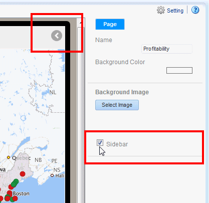
Select the app page.
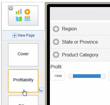
-
On the Properties pane, set the Sidebar property to True. After you set the property, the Sidebar indicator displays in the upper right corner of the page, as shown in the following figure.
-
Click the Sidebar indicator to open the sidebar panel for editing.
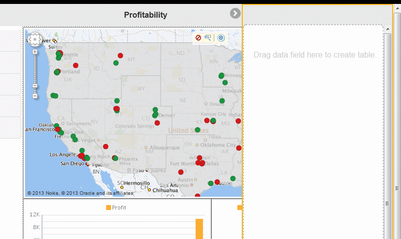
-
Drag the data elements that you want to provide detail for from the Data Source pane to the Sidebar panel.
The sidebar presents the data as a table. You can customize how the data displays and also apply grouping.
-
(Optional) Adjust the label field size for the sidebar label column. To adjust the space allowed for the label field
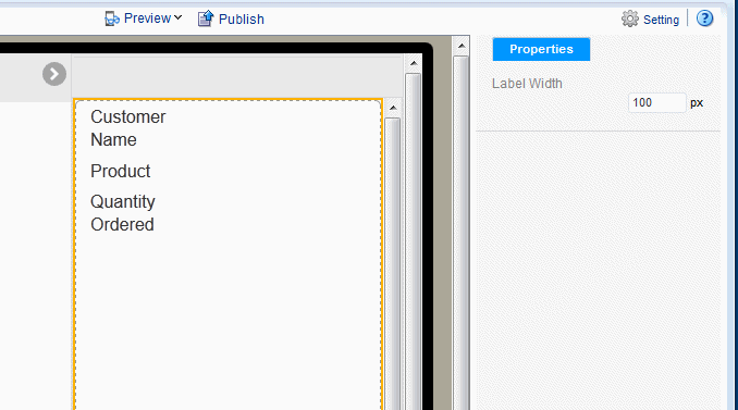
5.16.2 Adjusting the Label Field Width
By default the label field width is 100 pixels. The label field width is set for the entire sidebar and cannot be adjusted individually for data fields.
To adjust the label column width for the sidebar:
-
Click the edge of the sidebar component to select the entire component.
-
In the Properties pane, enter the width in pixels for the label field.
5.16.3 Customizing the Fields in the Sidebar
You customize each field in the sidebar individually. When you select a field, the Field properties display. Use the Field Properties set to group data fields and customize the display. You can perform the following for a data field in the sidebar:
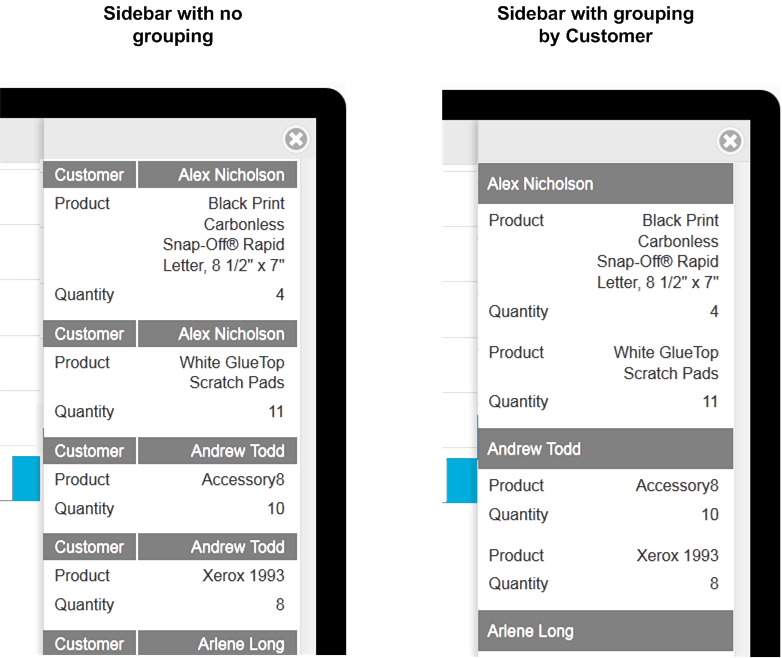
5.16.3.1 Group By a Data Field
The Group By feature groups occurrences of the specified data field together, aggregating the values of the other fields. For example, suppose in your sidebar you place the data fields:
-
Customer
-
Product
-
Quantity Ordered
If you Group By Customer, the sidebar shows one entry per customer with all the customer products grouped below the single entry. See the example in Figure 5-58. The ungrouped sidebar shows multiple entries for a single customer, the grouped entry creates one entry per customer.
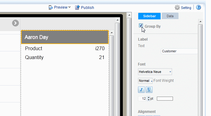
To group the fields in your sidebar:
-
Select the data field in the sidebar to display its Properties.
-
Select Group By.
5.16.3.2 Apply a Formula
By default, numeric fields are summed. You can change the formula in the Properties pane to a basic predefined formula.
To change the formula:
-
Select the data field in the sidebar to display its Properties.
-
Click the Data tab.
-
Choose from the list of formulas. The following formulas are supported: No Formula, Blank Text, Count Distinct, Sum, Average, Maximum, and Minimum.
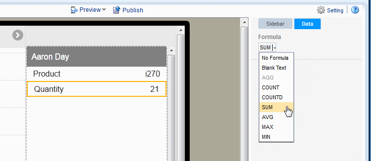
To apply a more complex formula to a data field, use the Calculated Fields feature to create the field then add it to the sidebar. See Calculated Fields.
5.16.3.3 Customize Data Formatting
Customize the formatting applied to a number, date, or currency field. See Section 8.6.1, "Apply Data Formatting."
5.16.3.4 Customize Labels, Fonts, and Background
Use the Properties for the sidebar Field for customizations such as:
-
Edit the label shown. The default label comes from the data, for example "Quantity ordered new". Use the Label property to edit the display name.
-
Edit font, font color, font background for both the data and the label.