You can filter the data within a specific visualization, to select what data is displayed on the visualization. For example, a bar graph displays data for all your geographical regions. You can select a single region to focus on the data for that region, or display the data for the top five most profitable regions.
Any filters applied to data in the sheet are also applied to the data in the visualization. (A sheet is a layer of data, filtered independently of other sheets on the dashboard; for background information, see Adding, modifying, and deleting sheets in a dashboard and Creating filters for a sheet of data.)
Use the table below as a reference when choosing how to create a filter for a visualization, to help you display the data that you want to analyze in your dashboard.
| Goal | Example | Steps |
|---|---|---|
To filter the data in your visualization based on attribute values that you select |
In your Profits by Region graph, you can select a single geographical region to display data for that region only. |
Create an attribute filter for the visualization. A filter displays all attribute values in the original visualization, not just those that you have selected, so that you can easily change your selection. For steps, see Creating a filter on the data in a visualization or another filter. |
To filter the data in your visualization based on metric values or ranks |
In your Profits by Region grid, you can choose to display the top five most profitable geographical regions. |
Create a metric filter for the visualization. For a more detailed example, with images, see A metric filter on the data in a visualization. For steps, see Creating a filter on the data in a visualization or another filter. |
To filter the data in your visualization based on multiple business attributes |
The rectangles in your heat map represent year and geographical region. You can select several regional rectangles to focus on that data. You can select a larger year rectangle to display the data for all regions in that year. |
Filter the visualization on the fly, by selecting objects to include or exclude from display. For steps, see Filtering data in a visualization. |
To filter the data in multiple visualizations in the same way |
You can select a geographical region, and the data in both your Profits by Region bar graph and Revenue by Region grid are updated. |
Create a single filter that filters multiple visualizations. For steps, see Creating a filter on the data in a visualization or another filter. |
To filter the objects displayed in a filter that targets a visualization |
Your grid displays revenue values for items. A filter lists subcategories and targets the visualization. You have to scroll through many subcategories to find what you are looking for. To reduce the number of subcategories that have to be displayed, add a second filter, on Category, that affects the first filter, but not the visualization. |
Create the first filter, that targets the visualization. Create another filter, that targets the first filter. For a more detailed example, with images, see Filtering the objects displayed in a filter for a visualization. For steps, see Creating a filter on the data in a visualization or another filter. |
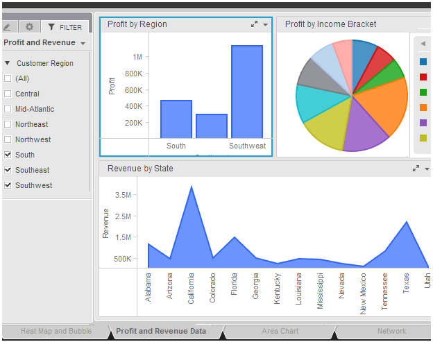
For example, the Profit and Revenue Data sheet displays three sets of data:
Your profit data broken out into the customer’s geographical regions, shown as a bar graph
Your profit data broken out into customer income brackets, shown as a pie graph
Your revenue data broken out into the customer’s states, shown as an area graph
The sheet is filtered by customer region (shown in the Filter panel on the left). The South, Southeast, and Southwest regions are selected in the filter.
This means that all three graphs display data for only those regions, as shown below:
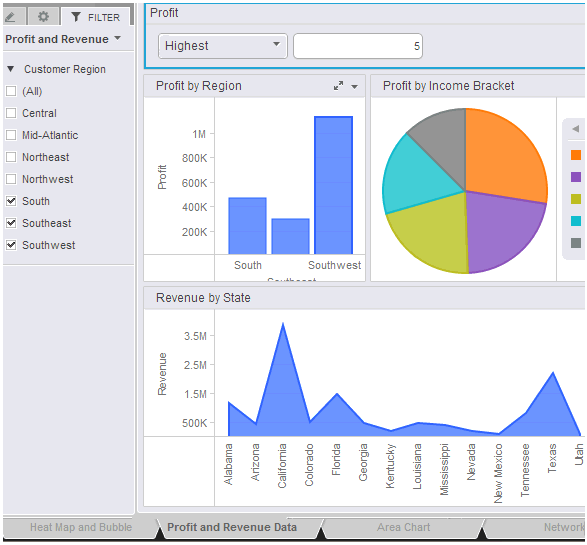
You want the pie graph to focus on the income brackets that have the highest profit in the selected regions. Since you do not want to change the other two graphs, you cannot add the profit filter to the sheet’s filter, on the Filter panel. Instead, add a filter that targets only the pie graph. In the following image, the Profit filter has been added to the sheet, targeting only the Profit by Income Bracket graph. The two other graphs display the same metric values, regions, and states, but the pie graph is now split into only five sections, instead of ten. These are the five most profitable income brackets.
For steps to create a filter that targets the set of a data in a specific visualization, see Creating a filter on the data in a visualization or another filter.
Creating a filter on the data in a visualization or another filter
Filtering the objects displayed in a filter for a visualization
Limiting the data displayed in a dashboard: Filters, sheets, and pages
_____________________________
Copyright © 2019, Oracle and/or its affiliates. All rights reserved.
Legal Notices