3 Getting Started with the Designer Workspace
This section introduces the Mobile App Designer workspace and describes how to perform basic tasks like adding pages, setting properties, editing your cover page and adding content to pages.
3.1 The Oracle BI Mobile App Designer Workspace
Figure 3-1 shows the Oracle BI Mobile App Designer workspace.
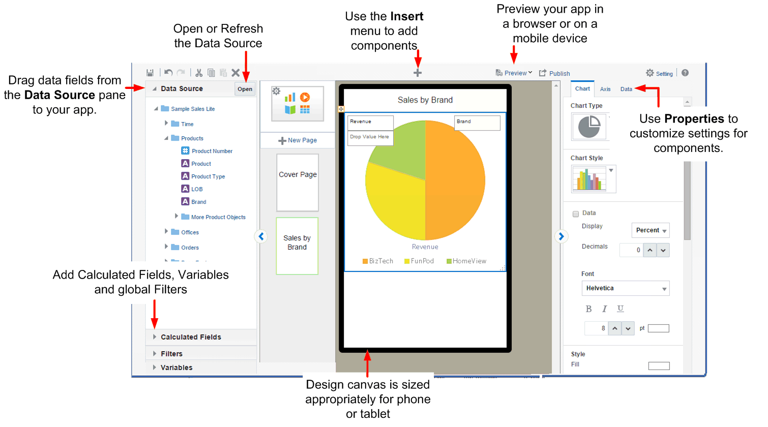
Note the following features of the app designer:
-
The workspace displays the canvas area as a phone or a tablet-sized screen depending on the target device type you chose. The tablet area is 1024 x 768 pixels. The phone area is 320 x 480 pixels. This design area size does not constrain the run time display. Mobile App Designer's responsive display engine detects the device screen size and adjusts the viewing area appropriately for the device an app is being viewed with.
-
Click Insert to add new components to your app.
-
The right hand pane is the Properties palette to modify and fine-tune settings for the component selected in the design area. You can collapse the Properties pane using the handle on the left edge.
-
The left hand pane is an accordion pane where you access your Data Source fields, and create Filters, Calculated Fields and Variables. You can collapse the pane using the handle on the right edge.
-
Use the Data Source pane to select and drag data fields to the visualizations you insert to your app.
-
Use Filters to define filters that you can apply to the entire app or to specific components in your app. For more information, see Filtering Data.
-
Use Calculated Fields to construct new fields combining your data source fields with functions that you can then reuse throughout your app like any other data field. For more information, see Calculated Fields.
-
Use Variables define the conditions to visualize in the Analytics pages. See
-
-
Preview your app at anytime during the design phase in the mobile device simulator, and even share the preview with others. See Chapter 7, "Previewing, Sharing, and Publishing Apps."
-
When your app is complete, click Publish to publish your app to your site's Apps Library to make it available to users. See Section 7.4, "Publishing Apps to the Apps Library" for more information.
3.1.1 Setting Properties
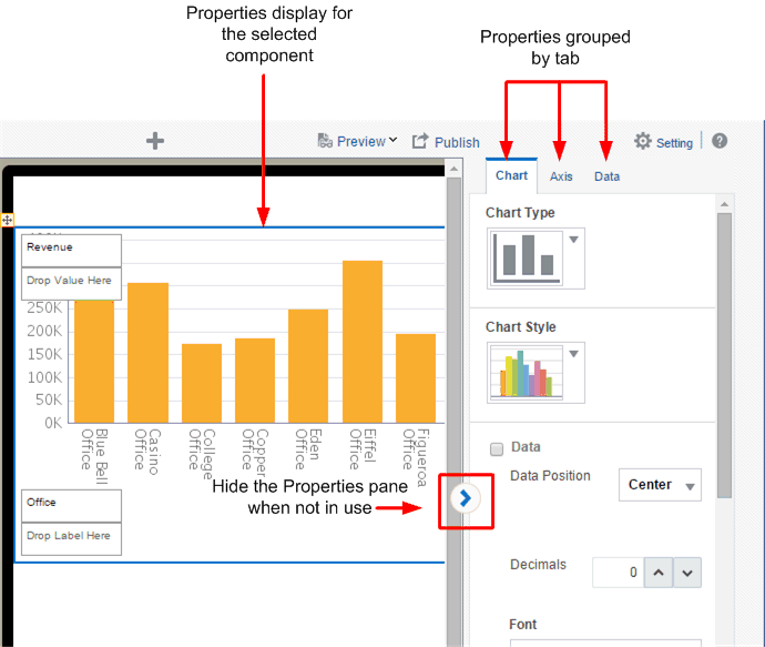
The Properties pane or palette displays the properties for the component currently selected in the workspace. For example, when you select a table in the workspace, the Table properties display.
When not using the Properties palette you can hide it using the arrow handler on the left edge of the pane.
Components with many available property settings are organized on tabs within the Properties palette, for example, when you select a chart, the properties are organized by Row, Axis, and Data tabs.
The most commonly used settings are described in the sections for each component and in Chapter 8, "Component Property Features."
Figure 3-2 shows properties available for a Chart.
3.2 Setting App Properties
To set app-level properties, click the app icon at the top of the page list as shown in Figure 3-3.
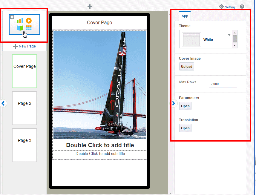
You can set the following for your app:
For information about the Parameters, Translation, and Data Cache settings, see Chapter 9, "Configuring App Settings."
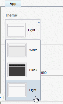
3.2.1 Setting the App Color Theme
You can set your app color theme to be black, white, or light. App components (charts, tables, filters, and so on) display complementary default coloring depending on your chosen theme.
Tip:
Ensure to choose your app color theme before you begin inserting components. Components take on the color theme at the time your insert them. If you change the color theme after inserting components, you may need to reinsert them to reset the coloring appropriately.To set the App theme:
-
Select the App icon to display the app properties.
-
From the Theme menu, select Black, White, or Light. (Note that the Light theme currently only governs the display of the Navigation page.
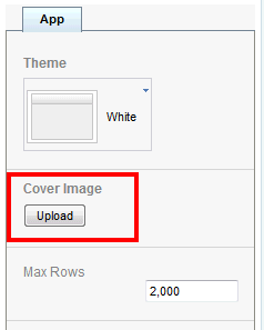
3.2.2 Adding a Cover Image
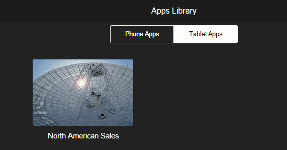
The cover image is the image that displays for your app in the apps library as shown inFigure 3-4.
To change the background image on the cover page of your app, see Updating the Cover Page Background Image.
To add the cover image to display in the Apps Library:
-
Select the App icon to display the app properties.
-
Under the Cover Image property, click Upload.
-
Select the image (jpeg, gif, png, or bmp) file and click Upload.
3.2.3 Limiting Data Rows to Return for Design and Preview
The Mobile App Designer populates the components of your app with data from your data source during design and preview. If your data source is large, you can enhance design-time interaction by limiting the number of rows that are used for design and preview. By default, the Max rows is set to 2000.
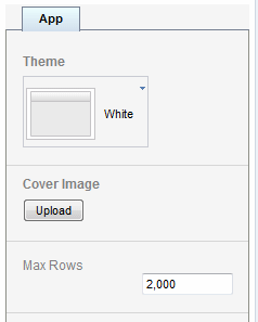
To edit this number, enter the number of rows to return in the app property setting.
3.3 Adding and Editing Pages
 Video: Adding Pages to Your App
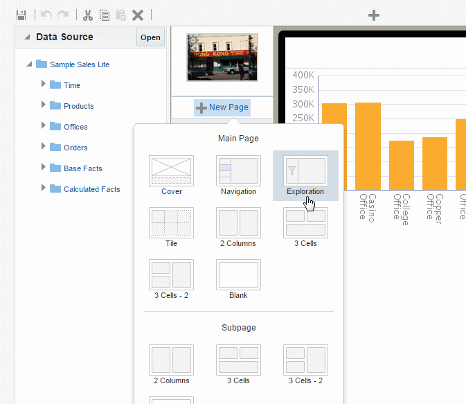
The New Page menu provides several preformatted page templates. When you insert a page, first choose a Main Page or a Subpage.
A main page is a page at the top level of your app. A main page displays in the app menu. You can navigate through the main pages of the app by swiping through the app sequentially, or you can navigate directly to a specific page using the page menu.
A subpage presents detail information of its parent page. A subpage does not display in the app page menu. Typically you navigate to a subpage by tapping a data item on its main page (such as a tile or a chart value). The data presented on the subpage is automatically filtered based on the item you tapped on the main page. When you access a subpage by swiping the previous page, the subpage displays all data received from the previous page.
When you create a subpage beneath another subpage, each subpage treats the subpage before it as its parent page; that is, the data presented on the subpage is automatically filtered based on the item you tapped on the previous subpage.
Video: Adding Detail Information Using Sidebars and Subpages
3.3.1 Selecting a Page Template
The Mobile App Designer provides several preformatted page templates to help you get started with your design:
-
Cover
Use a cover page to introduce your app. See Cover Pages to customize your cover page.
-
Navigation
A navigation page provides a master-detail interaction between a set of hierarchical filters that users select to control the display of the detail region of the page. The detail region contains visualizations you define that automatically update based on the selection in the navigation region. See Adding Navigation Pages.
-
Exploration (available for tablet apps only)
An exploration page provides dynamic filtering based on fields from your data source that you choose. This design provides your app consumers the most flexibility for exploring combinations of dimensions and measures. Users can easily mix and match filters in new and different ways to gain insights through exploration. See Exploration Pages.
-
Analytics (available for tablet apps only)
Use the Analytics page to create "what if?" scenarios. The Analytics page visualizations are driven by variables the values of which users can manipulate to see how different values can impact outcomes. See Analytics Pages.
-
Tile
A tile page provides a set of dynamic, scrollable tiles containing visualizations that enable easy comparison of key measures across your data set. A tile is generated for each occurrence of a specific item in your data. See Tile Pages.
-
Accordion (available for phone apps only)
The accordion page provides an expandable display of a specific data dimension and a key measure (such as Product and Revenue). Add visualizations to the expansion area that you can expand and collapse easily to accommodate the mobile device viewing area. See Adding Accordion Pages.
-
Columns or cells
Choose from several column-cell design patterns to arrange your app components.
-
Blank
To design a custom page layout, choose Blank. You can stack components by simply dragging and dropping them to the blank page or, insert Frames to create your own column and cell arrangement for side-by-side and more precise placement of components. See Inserting Frames.
3.3.2 Changing the Page Name
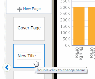
The page name displays at the top of the page and in the app menu. To edit the page name:
-
Double-click the page name text on the page icon in the left column as shown in Figure 3-6 to enable the text for editing. Enter the new name.
3.3.3 Changing Between Main Page and Subpage
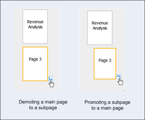
A main page can be demoted to a subpage by clicking the right-arrow icon. A subpage can be promoted to a main page by clicking the left-arrow icon.
3.3.5 Copying Pages
To copy a page, select and the page and click Copy.
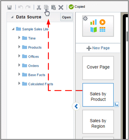
Click Paste to paste the copied page in your app. The page is inserted in the final position. Move the copied page to the desired position.