| Oracle® Retail Predictive Application Server Cloud Edition User Guide Release 19.0 F24877-28 |
|

 Previous |
 Next |
| Oracle® Retail Predictive Application Server Cloud Edition User Guide Release 19.0 F24877-28 |
|
Previous |
Next |
You can use the charting feature to generate a visual representation of the data in the form of charts. This chapter describes the available chart types and provides instructions on the various tasks you can perform with charts.
If a chart view exists in the View Management Drawer, you can drag the view to the content area to view it. This action is similar to dragging the views from the View management drawer to the content area for viewing.
You can view the existing chart views in the Full View, 2-Horizontal View, 2-Vertical View, or 4-View layout. You can also create a new view with View type as chart.
You can view the chart in the Full view mode.
Figure 9-2 Chart in 2-Horizontal View Mode
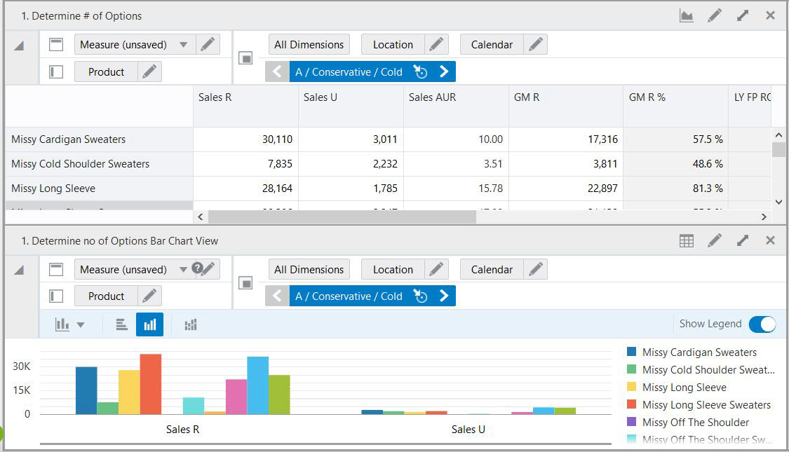
Figure 9-3 Chart in 2-Vertical View Mode
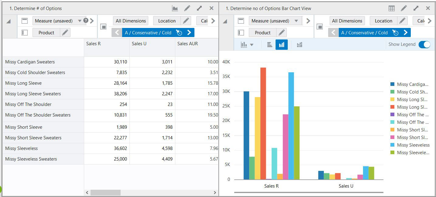
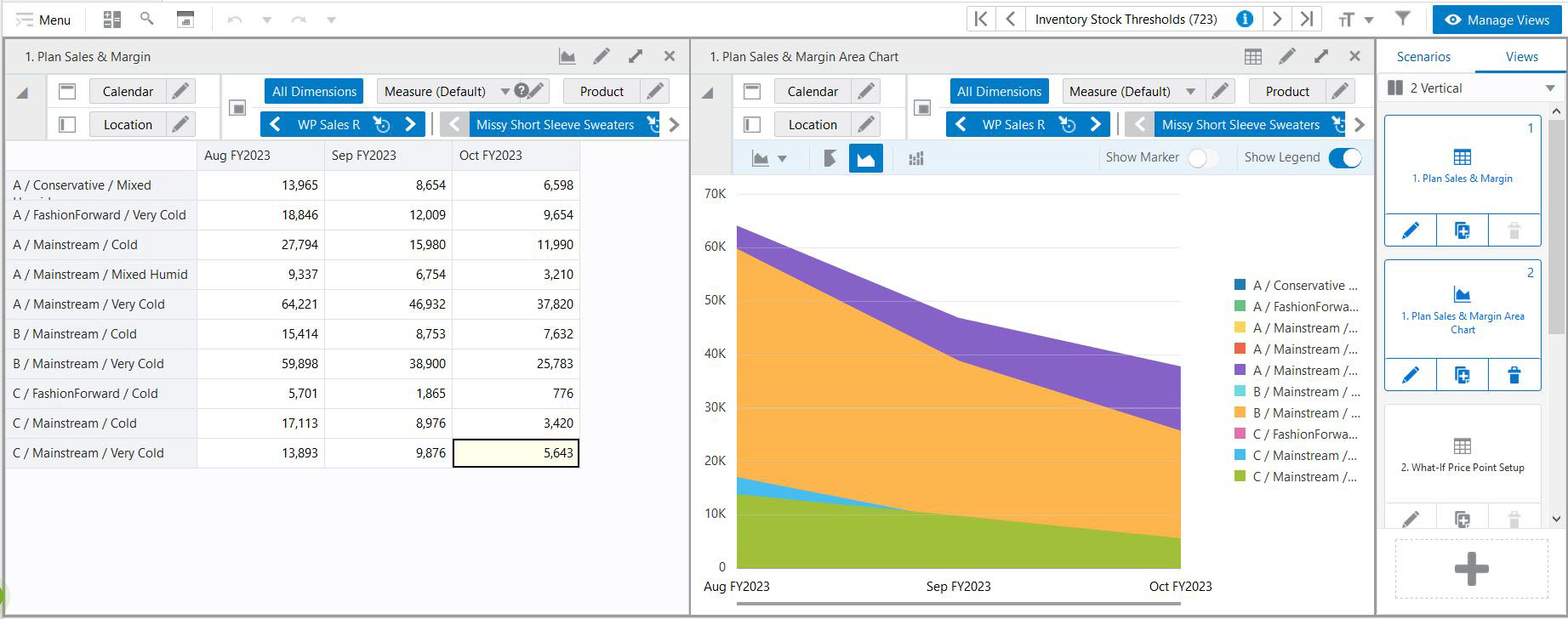
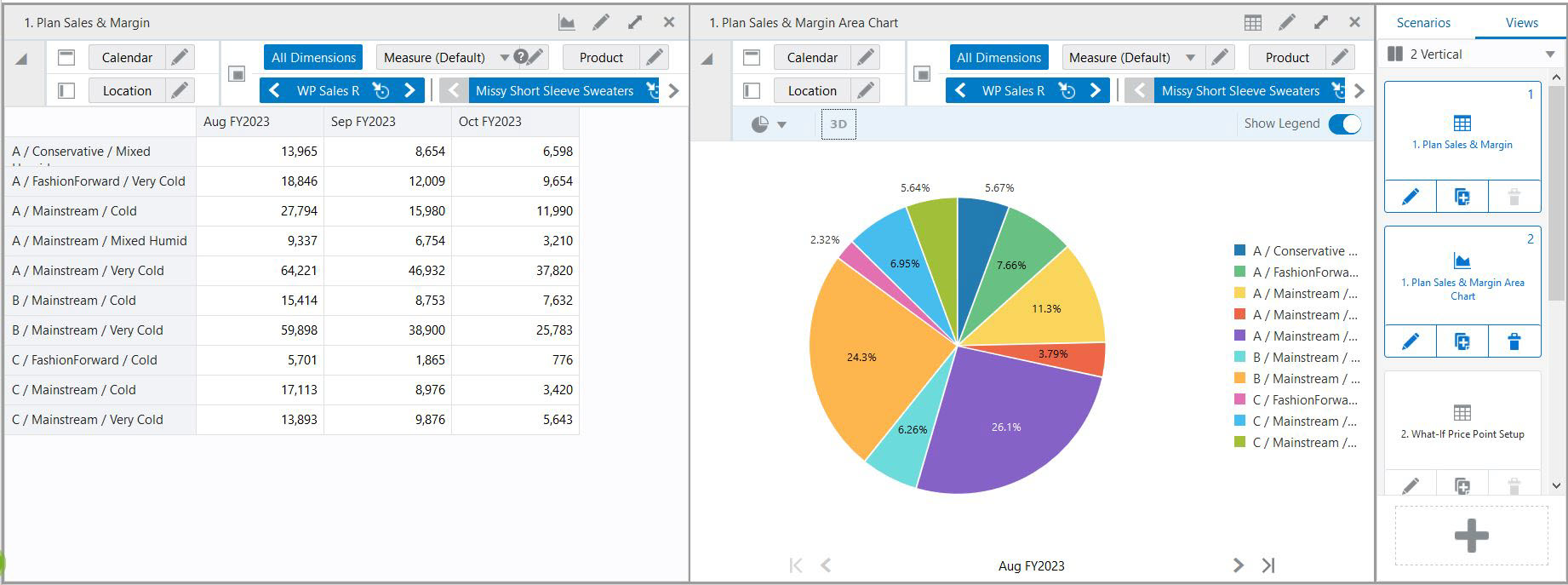
You can create a chart for any of the existing views containing the same or different data. It can be helpful to have a pivot table view and a chart view open at the same time to make changes to the pivot table values and see the results in the chart value.
Click Plus in the View Management Drawer.
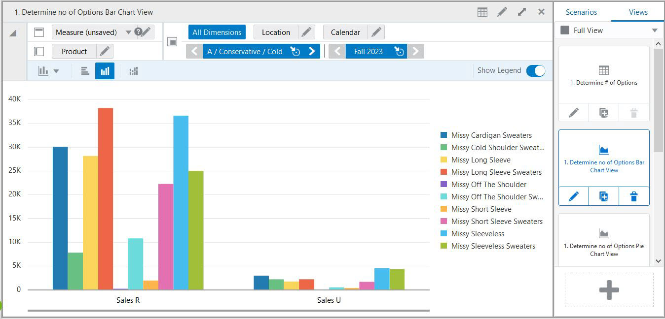
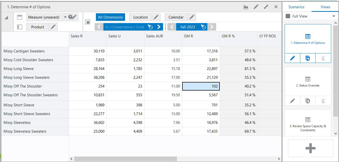
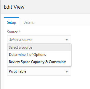
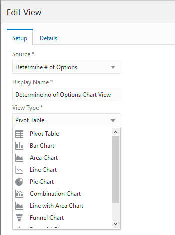
In Edit View, Select a Source and select from the existing views. This example uses Determine # (number) of Options as the source. All data that exists in the Determine # (number) of Options view is available in the new chart view being created.
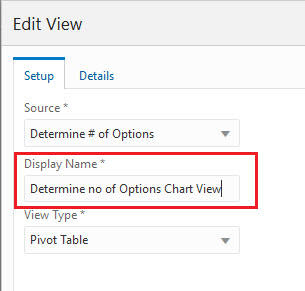
In the Edit View window, enter a name for the new view. Here, it is a name similar to the source.
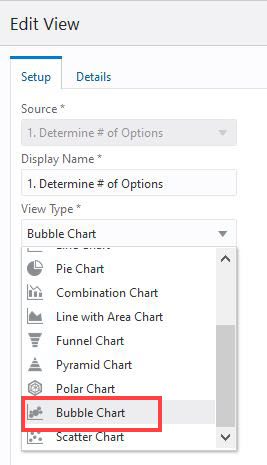
Select the type of chart from the list.
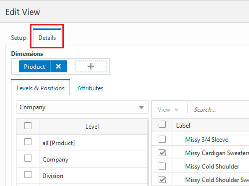
Click the Details tab to add, remove, or rearrange any levels or positions on the chart and click OK.
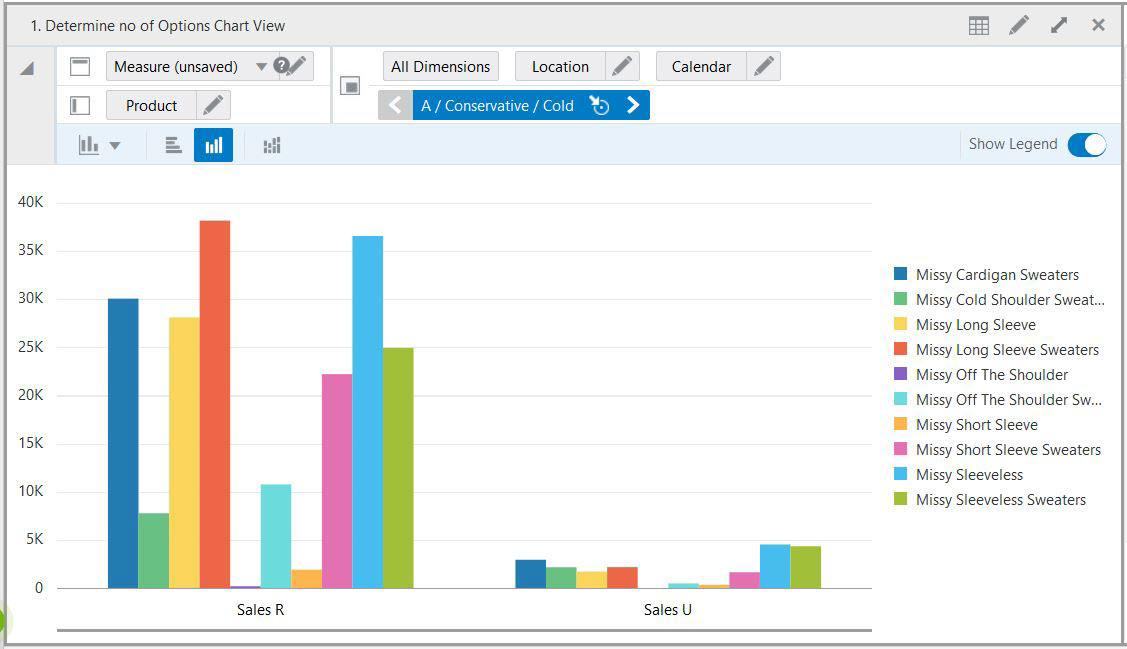
Drag the new Chart view tile into the content area to view the chart.
Another way to create charts in the existing tile view is to click the Charts icon (Figure 9-10 on the content area. This option helps you to switch between pivot table and charts with just one click. It allows you to view data in a graph format for analyzing data. You can revert back to the pivot table when you click the Pivot Table icon (Figure 9-11).
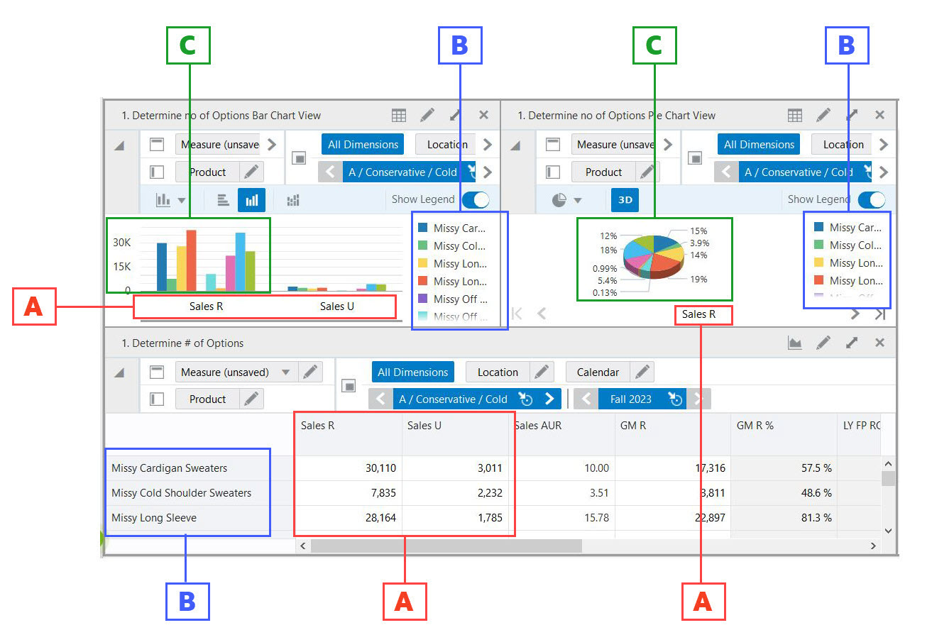
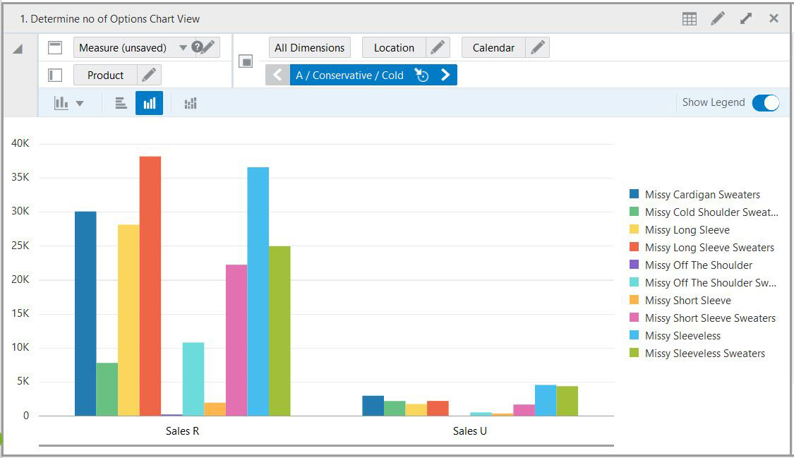
In chart view, the positions on row are represented as series. The data values in a column are plotted together as a group.
Key for Figure 9-12:
A:X-axis Data Mapped as a Group (red)
B: Y-axis Data Mapped as a Series (blue)
C: Data for all the Series belonging to a Group (green)
You can customize a chart using Edit View, just like any other view. You can change the data representing dimension levels, change axes, measures, and so on. For more information, see Chapter 7, "Editing Views.".
To change the orientation of the x-axis labels, an administrator can set the orientation in self-service configuration feature. The orientation of the chart can be set either as horizontal or auto-orientation to manage the space of the chart view. For more information, see the Oracle Retail Predictive Application Server Cloud Edition Administration Guide.
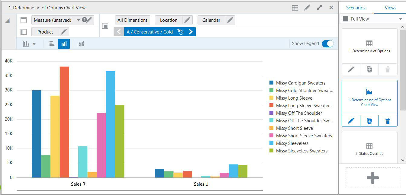
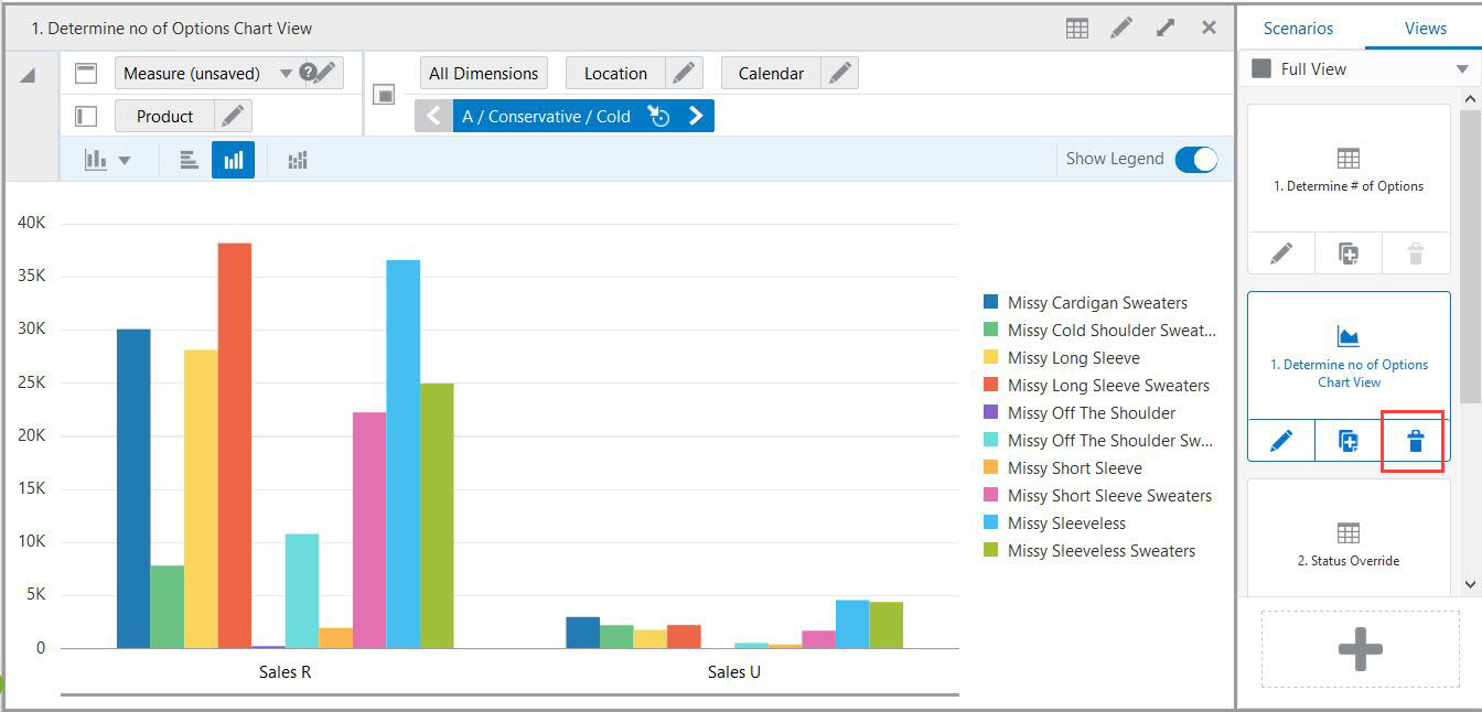
To delete a chart, you delete the chart view from the View Management Drawer. Default views cannot be deleted.
Click Delete on the chart view in the View Management Drawer:
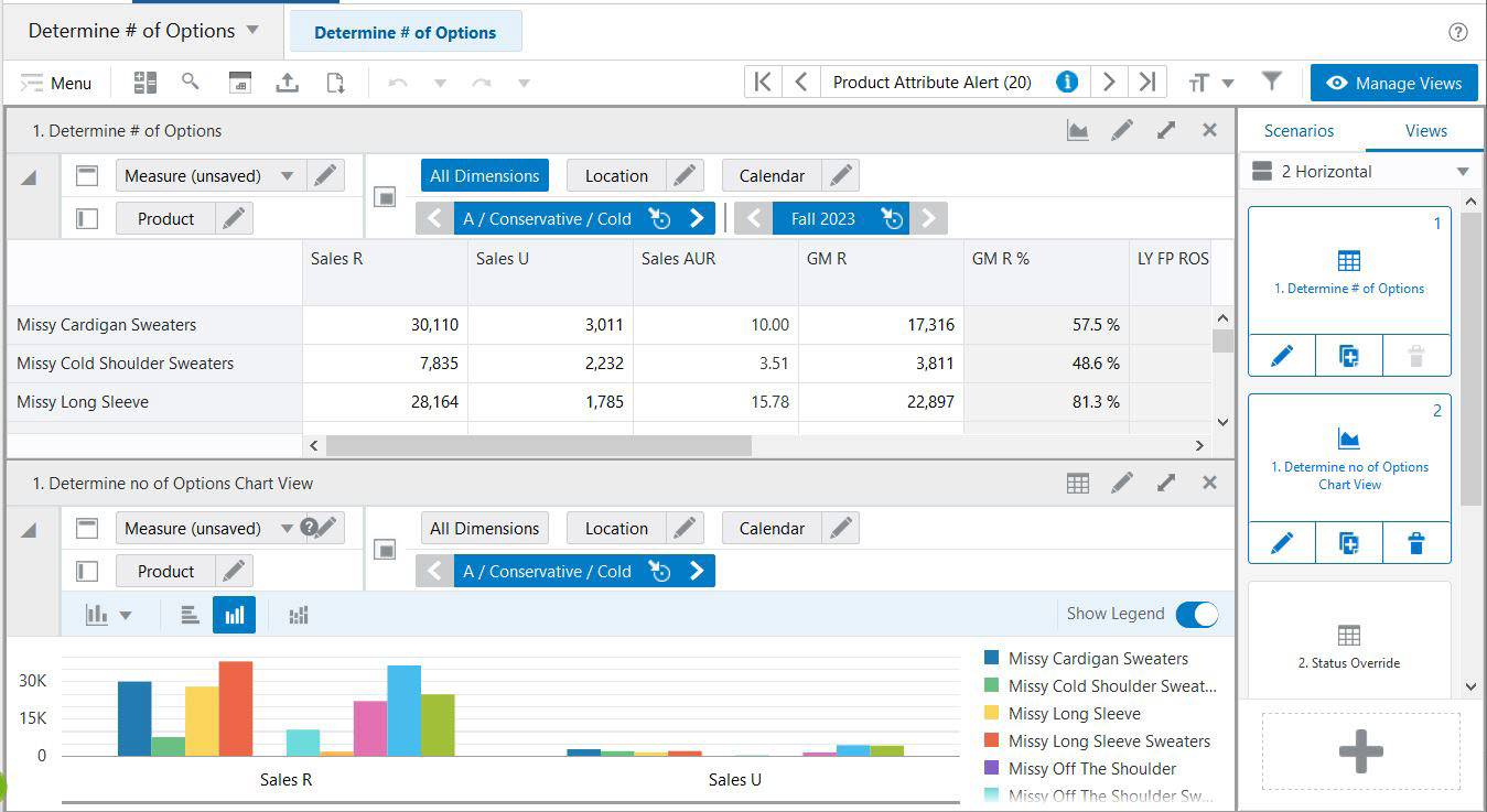
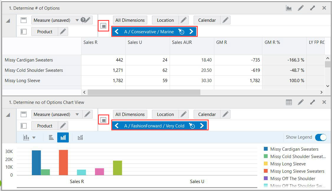
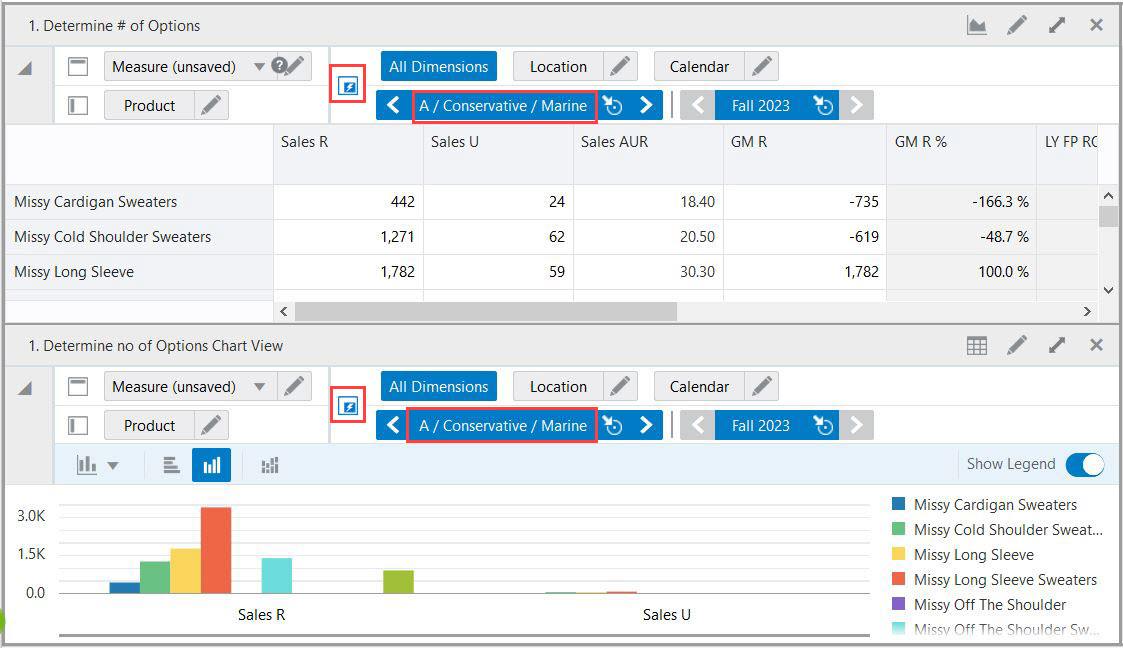
It can be helpful to have a pivot table view and a chart view open at the same time to make changes to the pivot table values and see the results in the chart value. By enabling the Synchronize Z Axis button with both views displayed, you can scroll through positions on the Z axis, and both views will stay in synch.
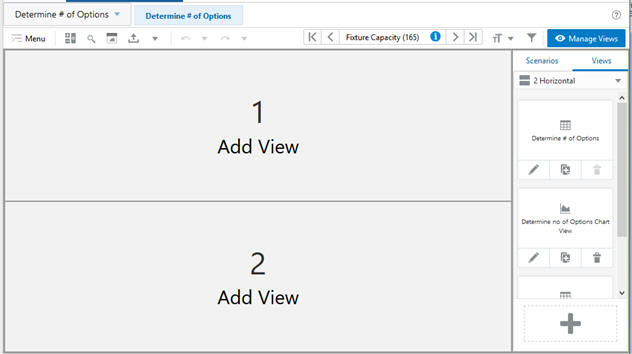
In the View Layout list, select any option except for Full View. In this example, 2 Horizontal has been selected.
Add at least two views to a layout by dragging the View Tiles from the View Management Drawer. In this example, the Determine no of Options tile and the Determine no of Options Chart View Cluster A tile have been dragged into the layout.
Click Synchronize Z Axis to activate it.
The activated Synchronize Z Axis button displays in blue on both tiles. Both views have scrolled to the same Product position.
The data in the pivot table can be edited from charts views. It can be helpful in making changes to data without navigating to pivot table. Changing data value in the chart view gives a quick look at the graph trend and planner can make faster decisions. You can edit charts by two ways:
Perform the following steps to edit a chart by Dragging the chart line:
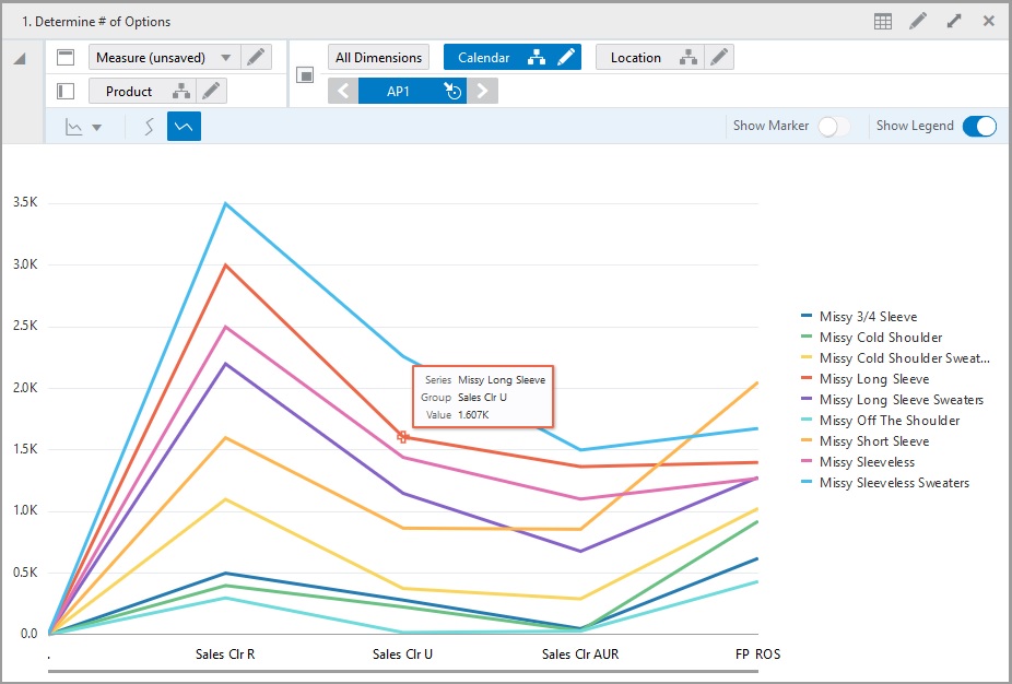
Change the view to the chart view. When you bring the cursor to the point of intersection, the marker is highlighted and the cursor changes to pointer finger.
Figure 9-19 Chart View - Marker Point Highlight
Double -click and then hold and drag the marker point where the data change is required. To increase the value of data, drag upwards and to decrease drag the point of intersection downwards on the chart layout.
When you move the point of intersection, you can see the value of the current selection changing on the chart tool bar.
Figure 9-20 Drag the Chart Line Upward to Increase the Data Value
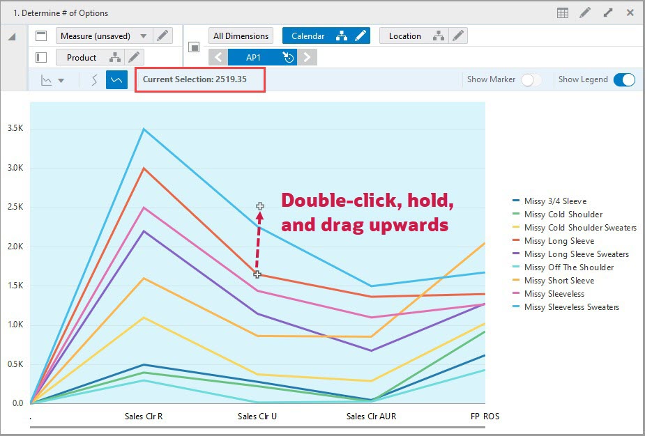
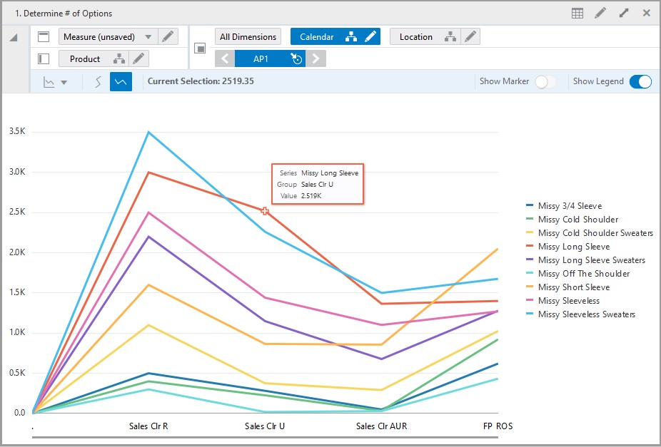
Figure 9-21 Edit Result after Dragging a Chart Line
|
Note: When you edit the numeric value in the chart view, the value may display in decimal points but in pivot table the value is rounded off. |
Perform the following steps to edit charts using the Edit Window:
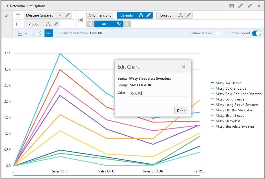
Change your view to the chart view. Bring the cursor to the point of intersection, the marker ID is highlighted and the cursor changes to pointer finger.
Click the point of intersection where the data change is required and an Edit Chart dialog box opens. The edit chart dialog box shows the description of Series, Group and text input box for Value.
Figure 9-22 Chart View - Edit Chart Dialog Box
Enter the data value in the Value input box and click Done to accept. To cancel, click X and the value is not updated.
Figure 9-23 Edit Value in the Dialog Box
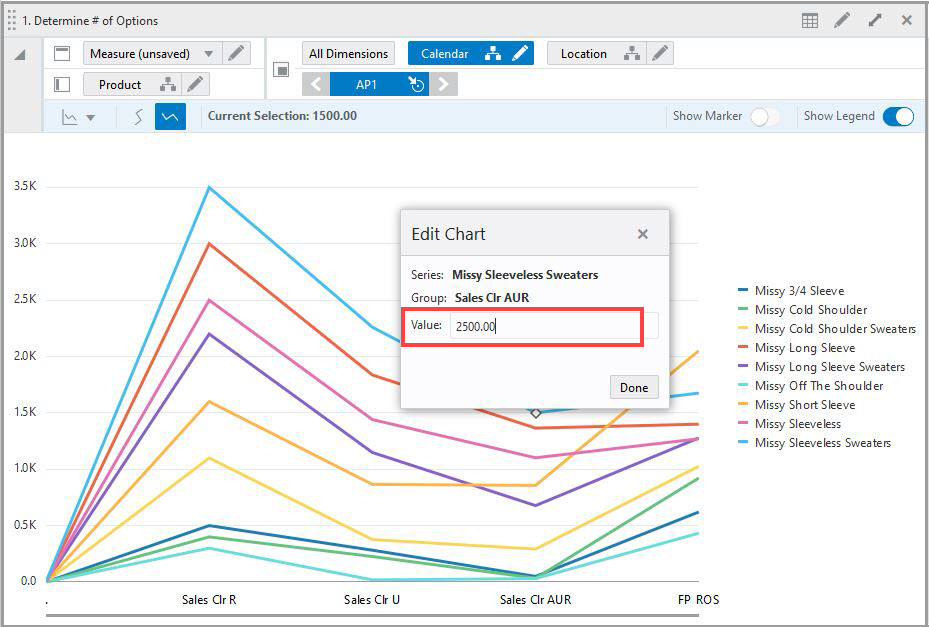
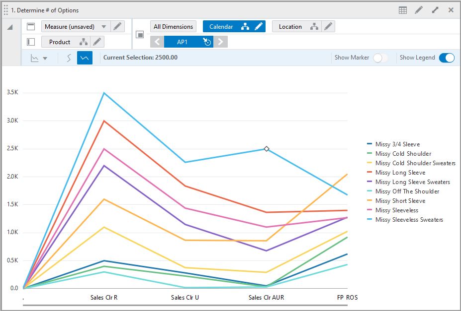
Figure 9-24 Edit Result in the Chart View
|
Note: When you enter a decimal value in the Edit dialog box, the value is rounded off in the pivot table. |
Consider the following points when you edit data values in the Chart Views:
The data edited in chart is reflected in the pivot table.
You can edit only the bar graph, line, area, line and area, combination charts, bubble, and scatter charts.
Edit in Scatter chart—Drag and drop functionality enables to edit both the measure which are plotted at the x-axis and y-axis by dragging the point of intersection vertically and horizontally. The edit of value can also be made by using Edit Window functionality.
Edit in Bubble chart—Drag and drop functionality enables to edit two measure which are plotted at x-axis and y-axis of chart. The third measure representing the size of bubble can be edited using Edit window functionality. You can edit the value of all three measures by within the Edit Window.
You can use Undo, Redo function in chart view as well.
You can edit chart in Horizontal orientation.
You can right- click on the point of intersection to access the Edit chart option from chart context menu.
You can edit only numeric values in graph. SHS, pick list, date, date time, Boolean measures will not be edited from chart.
You cannot edit the read-only, protected and or locked data values from chart view. When you click the locked, protected or read only data point in chart view, and alert message is shown. The value cannot be edited as it is read-only, protected, or locked.
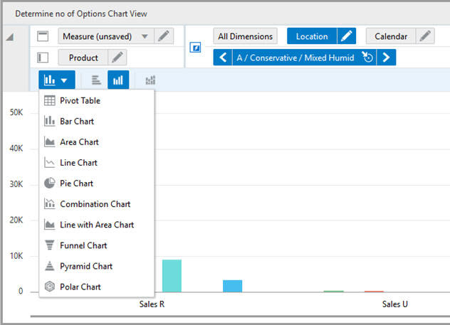
The following chart types are available:
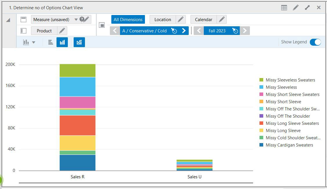
A multi-group chart shows data for multiple columns or groups. For example, the chart in Figure 9-25 plots WP Sales R values for Missy Short Sleeve Sweaters across 10 different locations over time (three months).
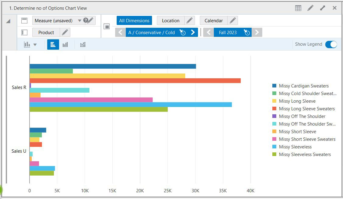
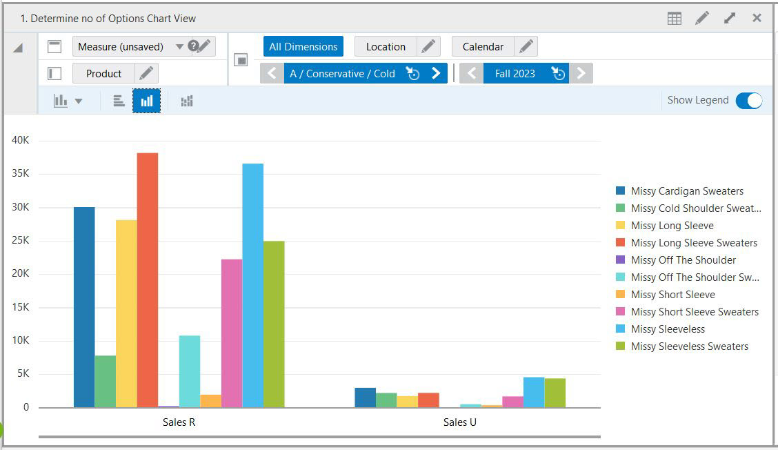
In a Bar Chart, the data is represented as a series of vertical or horizontal bars. It can be used to examine trends over time or compare items at the same time (for example, sales for different products in different quarters).
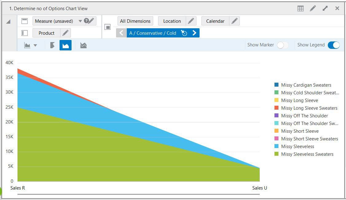
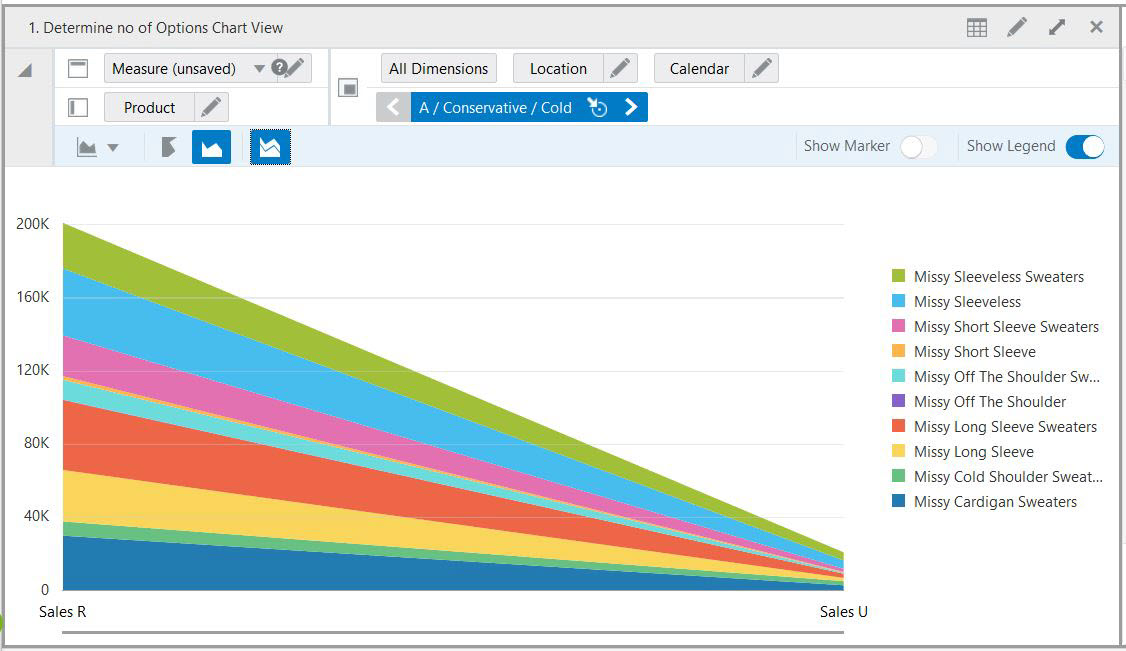
In an Area chart, the data is represented as a filled-in area. An area chart can be used to show trends over time, such as sales for the past 12 months. Area charts require at least two groups of data along an axis.
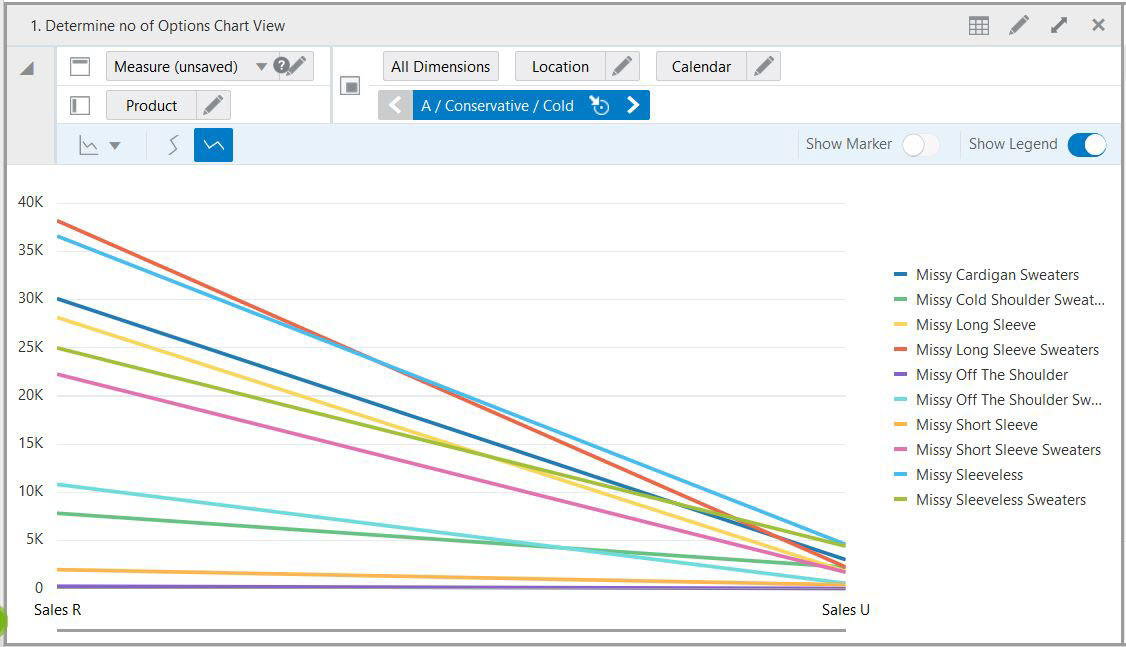
In a Line Chart, the data is represented as a line, a series of data points, or data points connected by a line. Line Charts require data for at least two points for each member in a group.
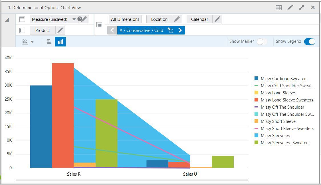
The Combination Chart uses three different types of data markers to display different kinds of data items. The Combination Chart can be used to compare bars and lines, bars and areas, lines and areas, or all three combinations. Combination charts require at least two groups of data for the chart to render an area marker or a line marker.
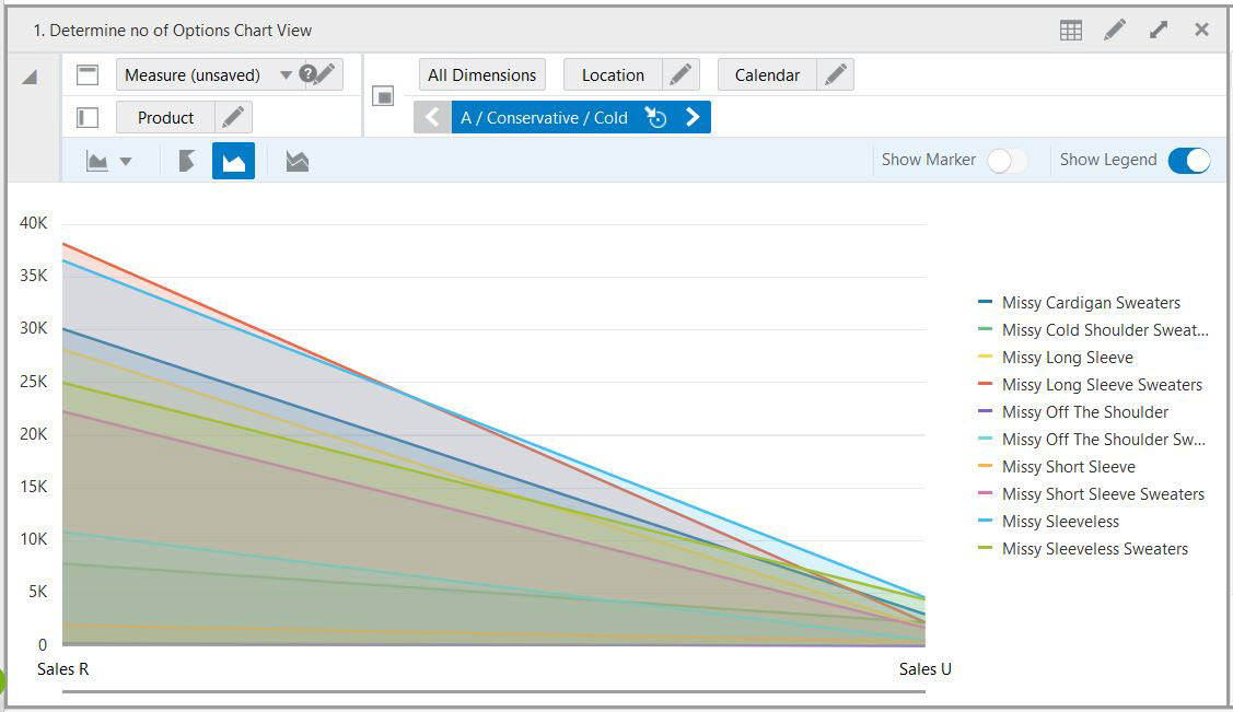
Line with Area Chart is a combination of Line Chart and Area Chart. In a Line with Area Chart, the data is represented as a line, series of data points, or data points connected by a line, with a filled-in area. Line with Area Charts require data for at least two points for each member in a group.
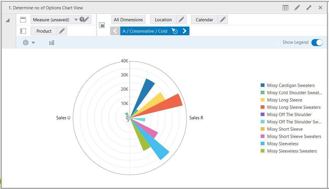
A Polar Chart is a diagram in which a point of origin is surrounded by a curve whose radius at any given point is proportional to the magnitude of some property measured in the direction of that point.
Area markers are stacked, and the values of each set of data are added to the values of previous sets. The size of the stack represents a cumulative total. This type of chart has the following variations.
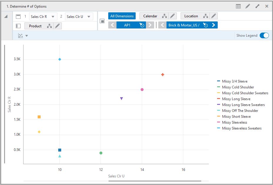
A Scatter chart displays two variable for a set of data which helps in comparison of data and understand the relationship between two variables. Usually the independent variable is plotted along the horizontal axis (x-axis) and the dependent variable is plotted on the vertical axis (y-axis). The scatter chart has a different view as scatter chart needs two measure values to display the chart.
Perform the following steps to plot scatter chart:
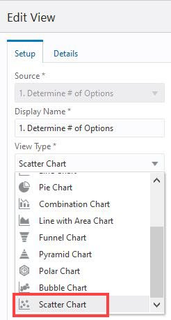
Select the chart type Scatter Chart from the chart drop-down list in Edit view.
Figure 9-34 Edit View Scatter Chart Type
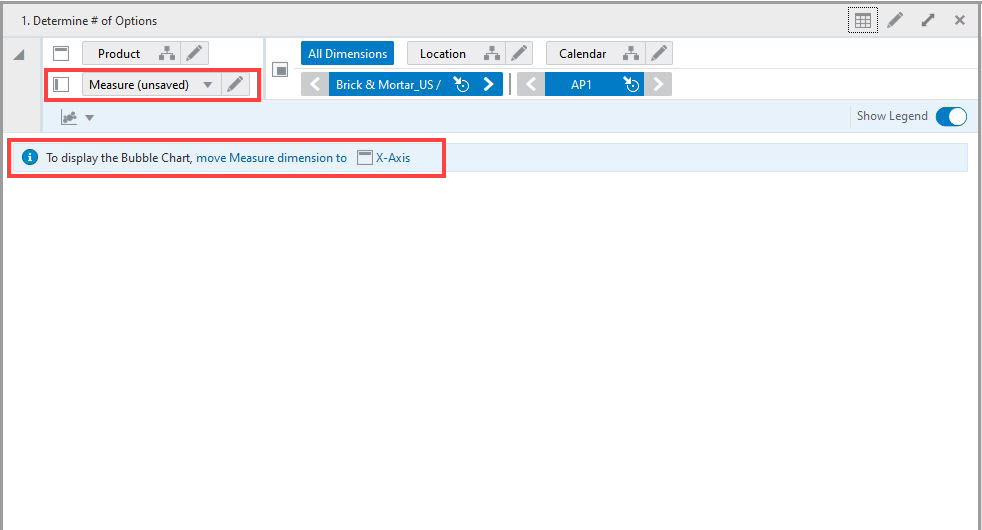
To plot a scatter chart, bring the Measure dimension to X-axis in the workspace view. In case the measure dimension is in different axis then a message appears on the chart area to move the measure dimension to X-axis.
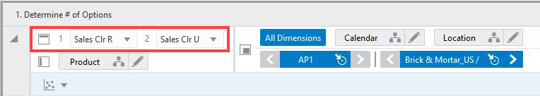
Select two measures for which you need to plot the scatter chart using the drop-down list 1 and the drop-down list 2. Measure 1 is the plot at y-axis on the chart and Measure 2 is plot at x-axis on the chart.
Figure 9-36 Scatter Chart Measure Drop-down List
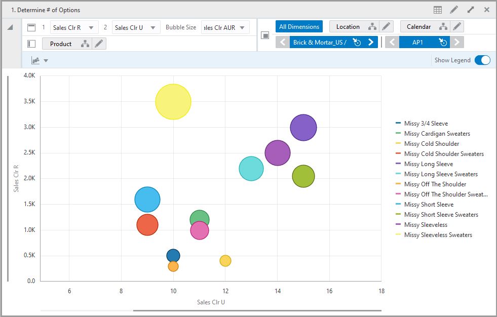
A Bubble chart is a multi-variable graph where three variables of the data display as bubbles in the chart. Two variables are plotted through the x-axis and y-axis. The third variable is represented by the size of the bubble. You can use a Bubble chart to compare and show the relationship between categorized bubbles by the use of positioning and proportions or size of bubbles.
Perform the following steps to plot a bubble chart:
Select the chart type Bubble Chart from the chart drop-down list in Edit view.
To plot a bubble chart, bring the Measure dimension to the X-axis in the workspace view. In case the measure dimension is in a different axis then a message appears on the chart area to move the measure dimension to X-axis. The Bubble size will plot size of the bubble.
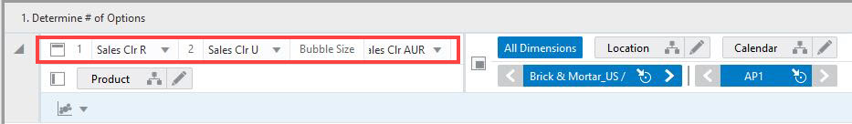
Select three measures for which you need to plot the bubble chart using the drop-down list 1, the drop-down list 2 and the Bubble Size drop-down list. Measure 1 is the plot at y-axis on the chart and Measure 2 is plot at x-axis on the chart. The Bubble Size plots size of the bubble.
Figure 9-41 Bubble Chart Measure Drop-down List
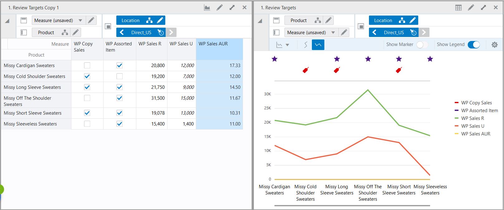
Boolean data can also be represented in chart along with other measures. Boolean measure data is represented in chart if the value of Boolean is True. Visual representation of Boolean in a chart helps the user to understand the data better and enables the ability to review the data visually.
Examples of Boolean data include calendar events such as promotion weeks, selling weeks, stock-outs, and so on.
The Boolean measure is plotted on the top area of the chart to display separately. This provides a clear indication of the Boolean measure and make it easier for you to read the Boolean measures along with other measures. The Boolean data is presented by colored symbols in the charts. Multiple Boolean measures in a single chart represented by different color symbols.
For example, the Figure 9-43, "Boolean Data in Chart" shows WP Assorted Item and WP Copy Sales - Boolean Measure against Sales R, Sales U and Sales AUR.
In the chart the Purple Star symbol represents the assorted items that is, WP Assorted item Boolean Value = True.The Red Tag symbol represents the WP copy sales Boolean value = True.
The Boolean measure WP Assorted Item and WP Copy Sales are represented separately on the chart area along with Sales U, Sales R and Sales AUR.
The Boolean data can be represented in following charts:
A single-group chart shows data for only one column or group. For example, the chart in Figure 9-44 compares WP Sales R values for Missy Short Sleeve Sweaters across 10 different locations for one month.
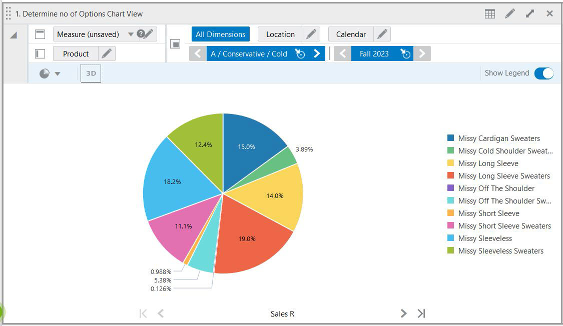
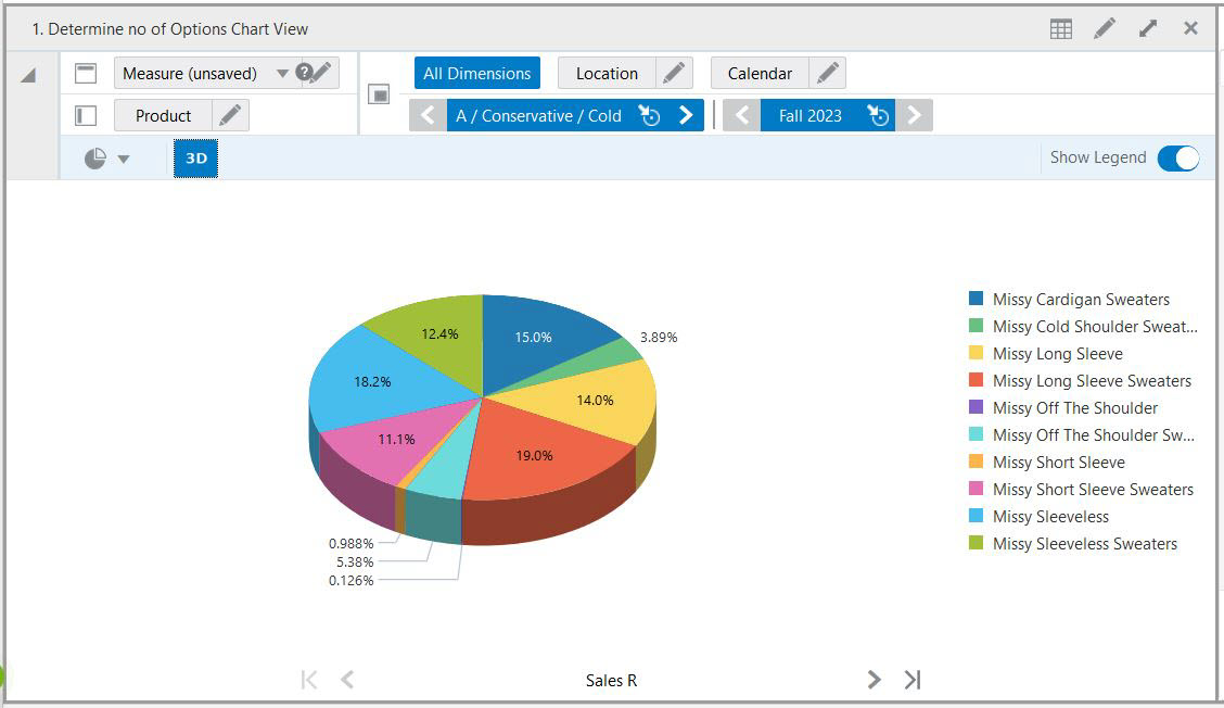
In a Pie Chart, the data is represented as sections of a circle. Pie charts can be used to show the relationship of parts to a whole.
In Figure 9-45, because this is a single-group chart, only one quarter is shown at a time.
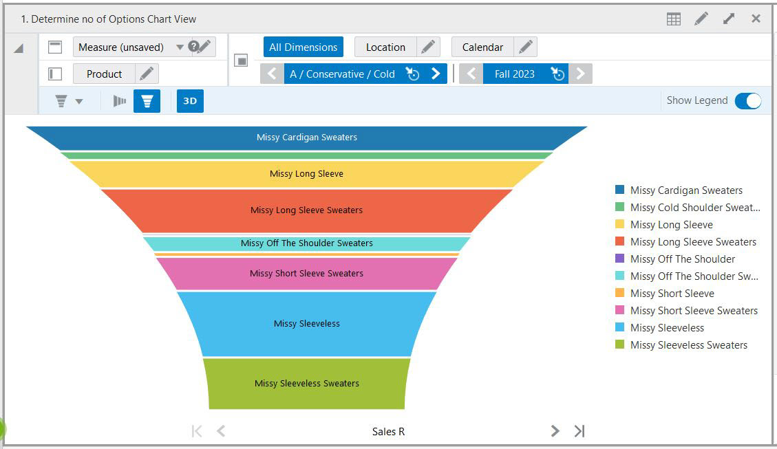
Funnel charts are useful for viewing data for stages of a process, such as the stages of a sales process. The area of a funnel slice is proportional to its value for the corresponding stage.
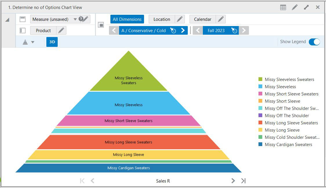
A pyramid chart has the form of a triangle with lines dividing it into sections. Each section contains a related topic or idea. Because of the triangular shape, each section is a different width from the others; this width indicates a level of hierarchy among the topics. For example, the widest section may contain a general topic and the narrowest section may contain a much more specific topic from within that general topic. However, the width is not visually representative of the quantity beyond larger or smaller.
Each of the chart types has different types of formatting options. To change the chart format, click one of the buttons beneath the Dimension Tiles area. Note that not all formatting options work with all chart types:
Stacked charts help in displaying the cumulative magnitude of two or more data series. They are useful in representing a data value as a sum of two or more values. Each data series can be distinguished by the color of its section in the stack.
The 3-D charts icon shown in Figure 9-49 rotates the chart into a 3-D display.
The Horizontal icon shown in Figure 9-50 rotates the chart from vertical to horizontal.
The Vertical icon shown in Figure 9-51 rotates the chart from vertical to horizontal.
The Change Chart Type icon shown in Figure 9-52 allows you to quickly change the chart type to any of the other types not currently displayed.
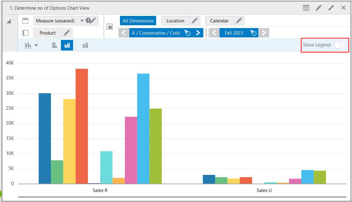
The Show Legends toggle button shown in Figure 9-53 allows you to show or hide the legends of charts. Hiding the legend gives more space to view the graph on the layout.
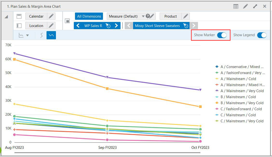
The Show Marker toggle button shown in Figure 9-54 allows you to show or hide the markers on the chart. This option is enabled only for line, area, combination and line with area chart. This marker points makes it easy to read data on the chart.
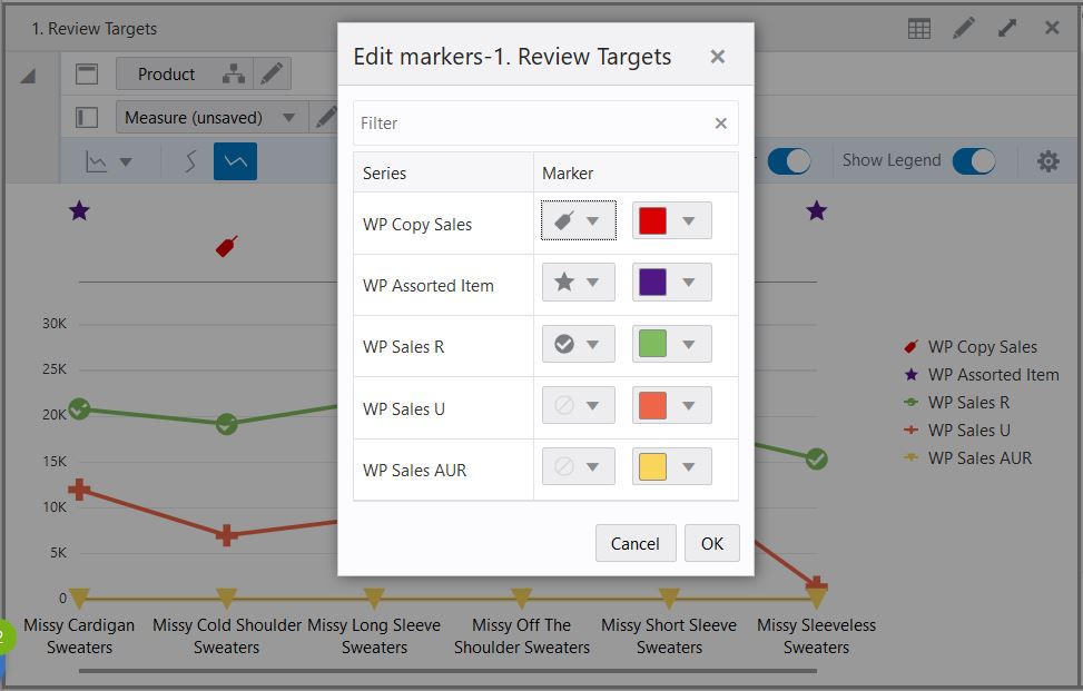
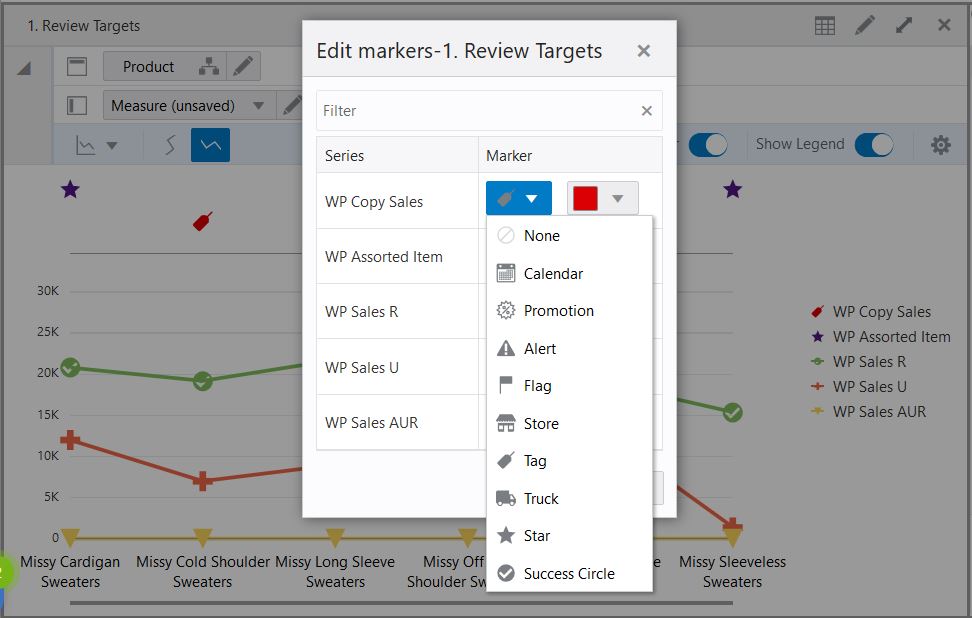
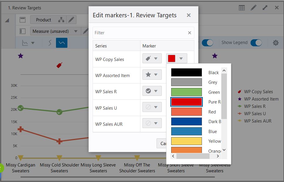
Chart setting allows you to edit the marker symbol and color for the series mapped on the chart. Ability to assign the different symbols helps you to identify the markers clearly for measures plotted on the charts. You can also assign colors to the series mapped on the charts.
The Edit Marker window shown in Figure 9-55 has the list of the series mapped on the chart. You can edit the marker symbol and color from the available list shown in Figure 9-56 and Figure 9-57 next to each series.