| Oracle® Retail Predictive Application Server Cloud Edition User Guide Release 19.0 F24877-28 |
|

 Previous |
 Next |
| Oracle® Retail Predictive Application Server Cloud Edition User Guide Release 19.0 F24877-28 |
|
Previous |
Next |
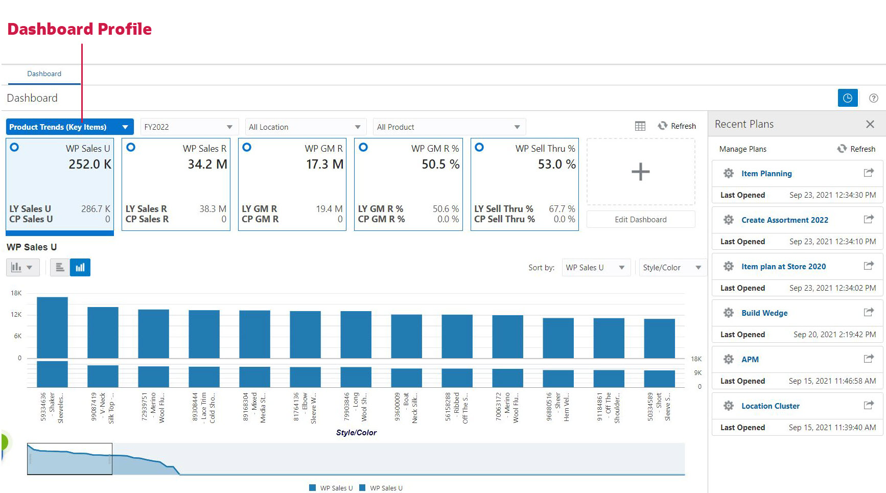
The RPASCE Dashboard is the central page of any RPASCE based product. It is the first page that you see after logging into the application. It can be used to locate issues that need attention. It can also be used for data analysis, allowing you to examine your data at any scale and for any time frame. In addition, the dashboard can be used to open your most recently used workspaces with a single click.
The dashboard must be refreshed periodically, as new products, locations, and so on, are added. This typically happens weekly, but depends on the nature of the RPASCE application. Measure information in a dashboard can be refreshed at any time.
Metric and Exception Dashboard profiles can both be configured without the calendar dimension. This allows the user to focus on the current period and take appropriate planning actions.
Figure 3-1 highlights the different section in the dashboard.
|
Note: If there is no dashboard profile configured, then a non-administration user only sees an empty window instead of the dashboard. An administration user will only see the Administration dashboard. |
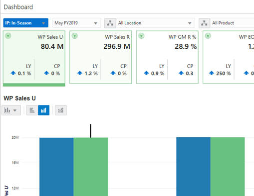
Dashboard information comes packaged in metric tiles. These tiles are arranged at the top of the dashboard on a carousel (a set of components that can scroll horizontally).
These metrics can include KPIs, as well as basic metrics such as sales figures. In many cases, the information present in a metric tile is supplemented with one or two additional metrics. These often serve as references to provide a contextual indication of how the value presented compares to some other value. These comparison metrics can be the corresponding values for the prior period or some planned performance expectations.
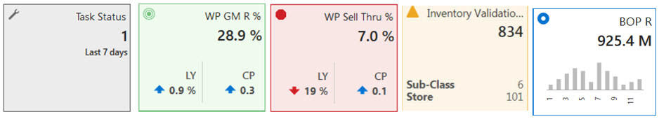
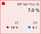
There are several styles of metric tiles. Figure 3-2 represents a variance tile. A variance tile shows one or more measures representing the absolute or percent differences between two quantities. Some tiles can represent information. An informational tile just displays the existing measure data.
Every tile has certain common characteristics. For example,
Value. In Figure 3-2, WP Sell Thru % is the title.
An aggregate quantity. In Figure 3-2, 7.0% and 19% and 0.1%. This number reflects the filter selections.
Comparison Values. When defining comparison metrics in configuration, it is desirable to provide configured thresholds.
A color state and icon. When the value of the metric is greater or lesser than a configured threshold, the color of the metric tile indicates:
Blue: no defined thresholds for tile
Green: threshold defined but values within the boundaries of the thresholds
Yellow: values exceed the defined medium threshold but within the boundaries of the defined severe threshold
Red: values exceed the defined severe threshold
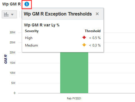
When an application is configured with tile color state information the information badge will show next to the title in the chart area. Clicking the information badge will show information on the configured thresholds.
In Figure 3-3, WP Sell Thru % is shown in a red octagon (indicating a problem) because the working plan value is 19% below the Last Year value. The grey tile is used for administrative information.
Figure 3-3 Tiles Showing Color State and Icon
The arrow beneath a tile, shown in Figure 3-4, indicates that this measure is displayed in the chart area in more detail. Clicking on a different tile refreshes the data in the chart area and places the arrow under the clicked tile.
Metric tiles must represent the basic quantities that are used to indicate the health of your business. An implementer can create new metric tiles, modify existing ones, or delete tiles entirely.
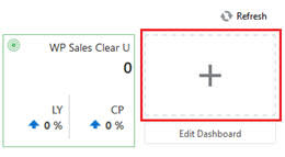
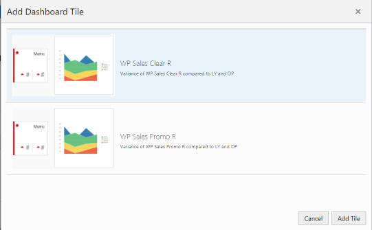
You can add a metric tile from an existing pool of tiles. To add a new tile, click Plus on the right hand side of the metric tile carousel (some scrolling may be required).
This brings up a window showing all available metric tiles. Click the desired tile and click Add Tile. The tile is added to your tile carousel.
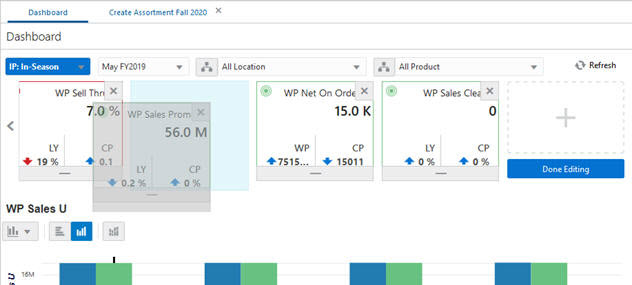
You can change the order in which tiles are displayed. To do this, the metric tile carousel must be in edit mode. To access edit mode, click Edit Dashboard under the Plus icon to the far right of the carousel. Once in edit mode, each tile displays a drag bar at the bottom of the tile. You can drag the tile to the place you want it on the carousel and drop it.
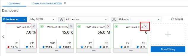
To remove a tile, enter edit mode by clicking the Edit Dashboard. In addition to the drag bar, each tile also displays a Delete icon in the upper right corner. Click Delete to remove the measure. Note that the measure can still be added from the metric tile pool.
All changes to the metric tile carousel are automatically remembered by RPASCE. The system remembers the desired order and content until you change it.
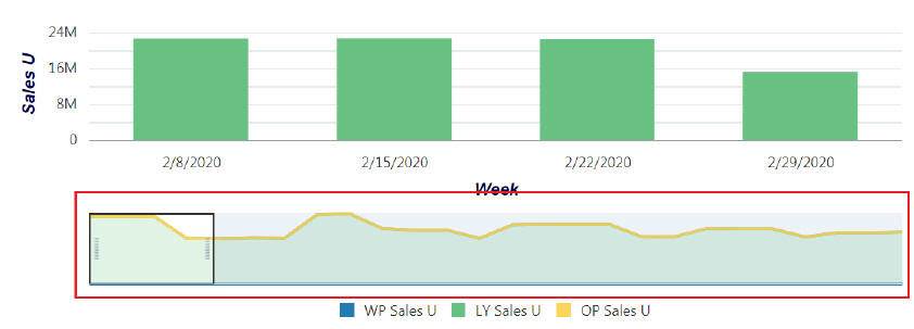
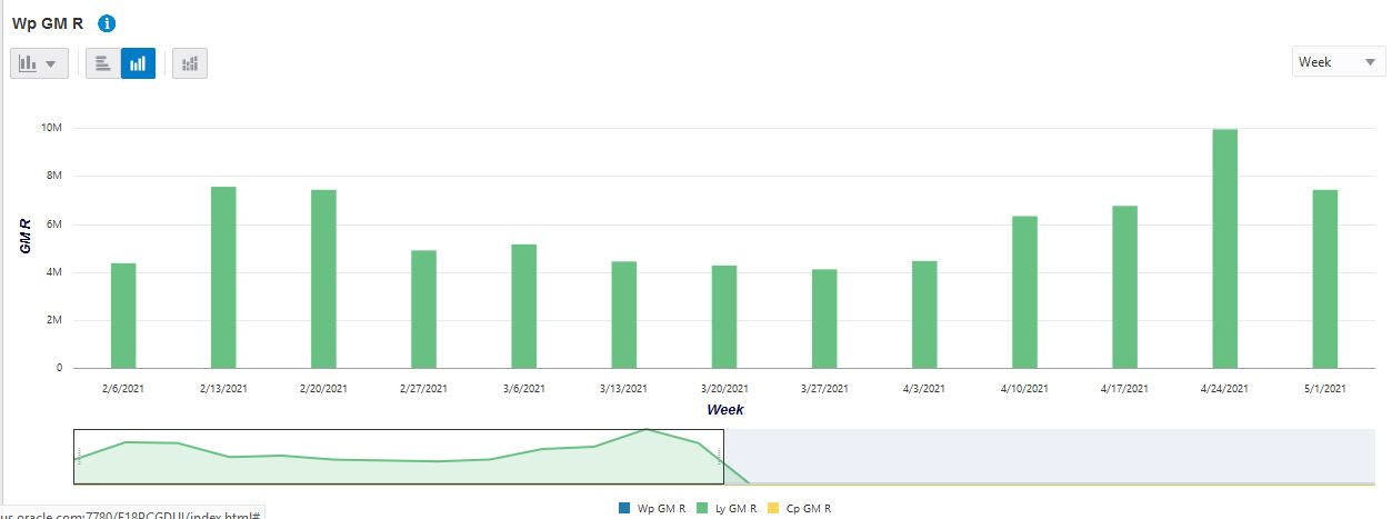
Selecting a tile displays detailed information for the measures represented by the tile in the main chart area. The information is presented with time on the horizontal axis and the measure quantity on the vertical axis.
If the use zoom on the main chart or scroll through it, it might extend beyond the scope of the top filter and RPASCE displays this message, Dashboard chart is out of sync with Calendar filter. The Calendar label in the message will be based on the dimension used on X-axis. A link to Sync the chart to match the top filter selection is provided with to the message.
The number of data points for charts are configurable. See the Oracle Retail Predictive Application Server Cloud Edition Administration Guide for further details.
The metric information badge on the dashboard is available next to the metric name. Click the Information icon, as shown in Figure 3-10, to display more detailed information, such as the thresholds that determine the tile's priority-state and the color when a tile is selected. This information can help you determine the magnitude and importance of a plan variance.
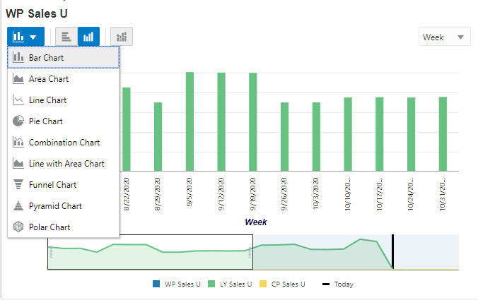
Click Chart to display the List of values that show the allowed chart types that you can select and view in the specific chart view.
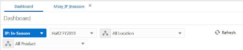
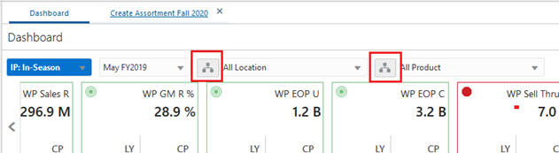
You can change the positions shown for each dimension by making selections in the filters at the top of the screen above the metric tiles. The season profile can have more than a year time period.
You can change the time horizon used to calculate each metric tile by changing the time horizon at the bottom of the screen. You can drag the start and end dates to impact the calculations.
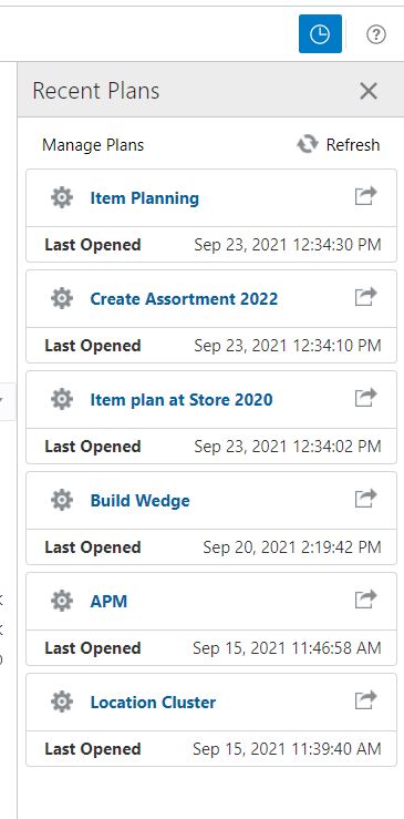
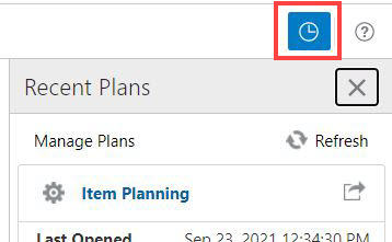
You can view and select from a list of most recently visited workspaces by choosing a workspace from the Recent Plan/Workspaces section in the top right of the screen. This does not list all available workspaces, only the most recent. Use Refresh to update the list with the most recent plans. You can collapse or expand the recent plans list by using the Recent Plans icon (Figure 3-15). The Recent Plans icon provides more space to view the chart and assist in reviewing the dashboard.
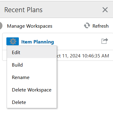
By clicking the Action Menu icon next to each plan, you can perform the following actions:
Edit - Opens the wizard for the corresponding workspace for you to make edits in the position selection.
Build - Initiates the building process for the corresponding workspace.
Rename - Renames the corresponding workspace.
Delete Workspace - Only deletes the workspace and retains the segment which allows you to save the selections made during wizard selection.
Delete - Deletes the corresponding segment.
You can also view the last opened date and time for the workspace. Click the plan name to open the workspace within the application window or click the Launch in separate tab icon to open it in a new browser tab.
The dynamic roll-up of the Dashboard using the required product attributes and the roll-up of data happen dynamically within the dashboard. This helps the planner to view the dashboard using different product attributes and to analyze how to view the data. The placeholder positions created might have some of the attributes unassigned with values, so there is also support for the unassigned values and the roll-up happens accordingly for the selected attribute values.
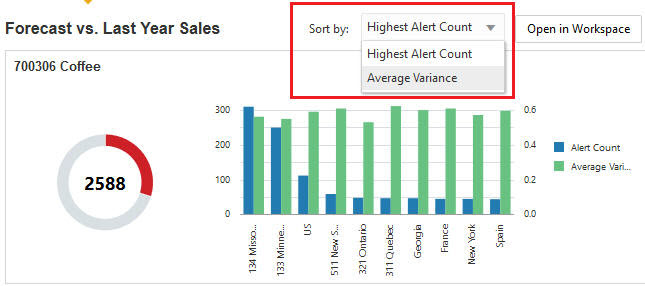
In the charts, you can sort the positions on the X axis by an available measure. You can also sort by Alert count in case of exception dashboard profile.
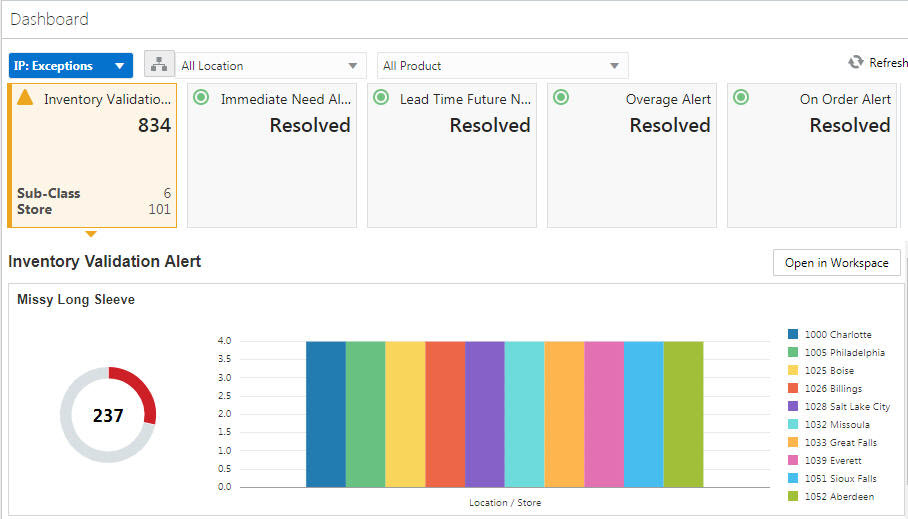
As a planner, you may want to see information about exceptions. You can select the Exception profile in the dashboard to add all the exceptions defined for the application as the Exception dashboard tiles. These exception dashboard tiles provide you with a quick summary of the exception hits. You can view the recent plans and refresh the dashboard.
Exception tiles provide a summary of how many exceptional conditions exist within the plans you created and provide secondary information describing roughly the distribution of the exceptions across the data segments.
As shown in Figure 3-20, the selected tile has a total of 834 exceptions at four different subclasses. In the detail section under Alert Inventory Validation Count you can see four different graphs, one for each subclass with locations as the legend.
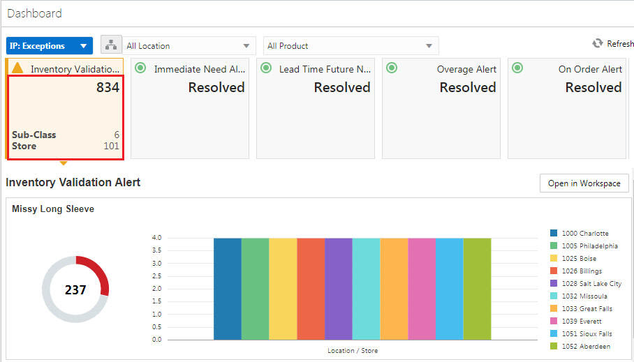
The detail pane associated with an Exception Tile provide a more granular description of the location of exceptions and leverages dashboard filtering to allow you to direct the sequence in which to visit the exceptions.
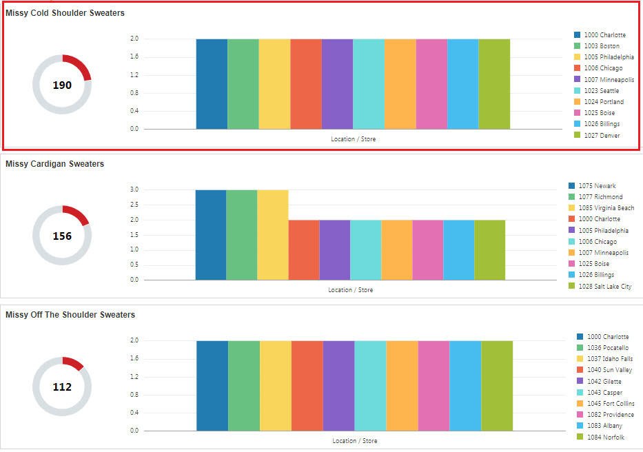
In Figure 3-21, the Missy Cold Shoulder Sweaters subclass has 190 exceptions across several location that are displayed in the graph legend.
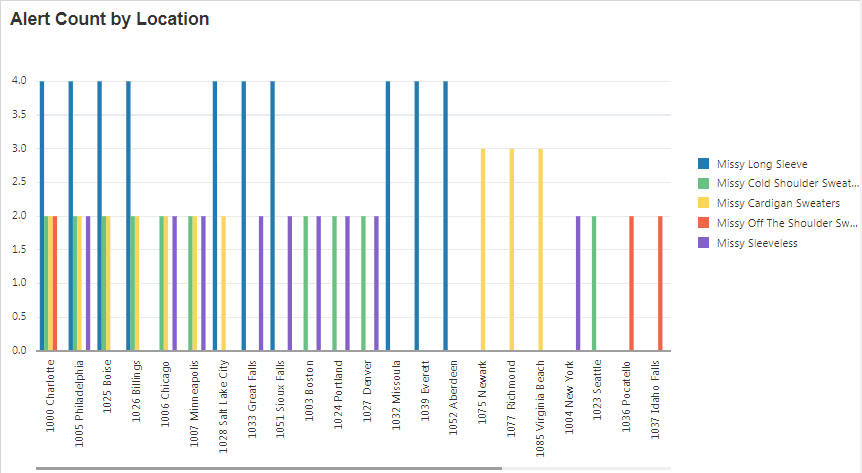
As shown in Figure 3-22, the selected alert has total 834 exceptions at 12 different locations. You can see in the detail section graph for Alert Count by Location with legend as the subclass.
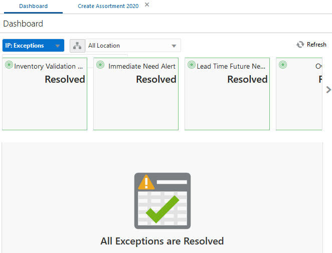
When all the exceptions are resolved, you will see the following message on the Exception Dashboard.
Figure 3-24 All Exceptions Resolved Message
When you interact with the dashboard, you see summary information detailing the status of the data for which you are responsible. The dashboard provides access to all of the data visible to you and provides a set of filter controls you can use to limit the scope of reporting to a meaningful portion of that data (for example, a single department or class).
When examining the metrics and exception counts in the dashboard, you can resolve issues or adapt your plans to actual results by launching a taskflow workspace that is associated with an exception displayed in the dashboard.
You can do one of the following actions:
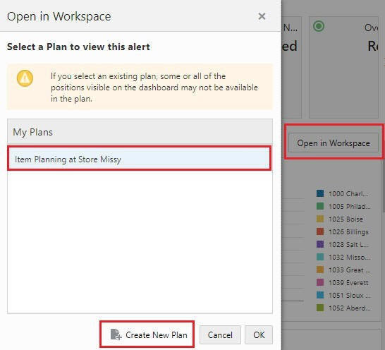
Open a pre-built segment workspace.
You can launch a segment workspace that has already been built with the selected alert. The workspace focuses on data from the positions selected in dashboard filters.
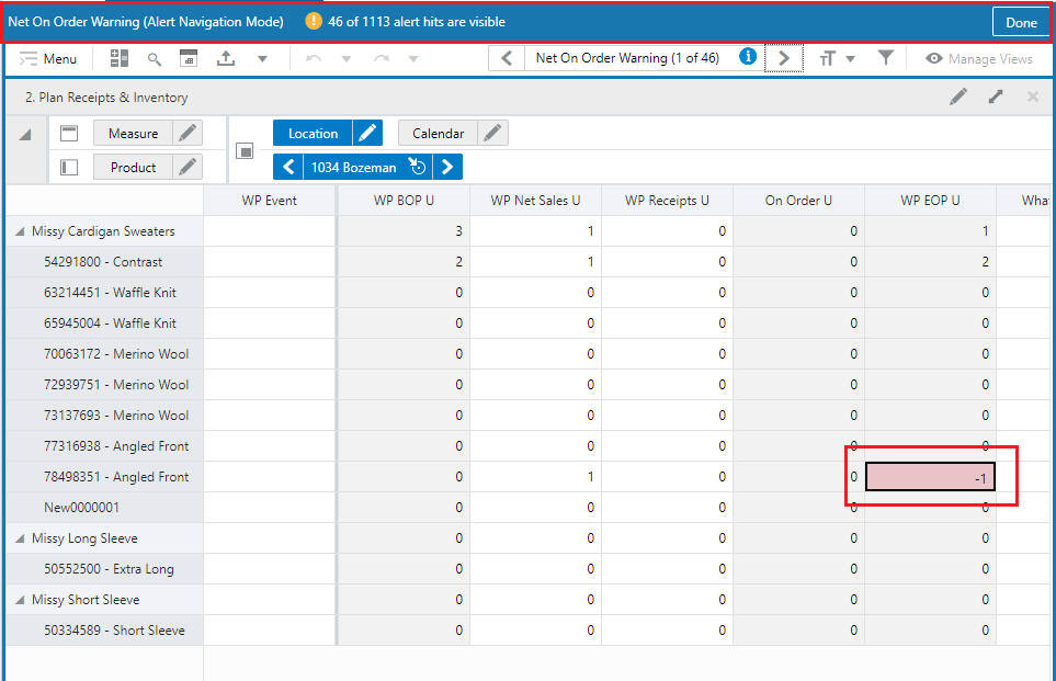
Click Open in Workspace to access the window. Select the plan in which you want to view the alert and then click OK. The workspace opens in alert navigation mode. If you select a plan that is missing some or all of the positions selected in the dashboard filters, you see a warning snackbar.
Create a new segment workspace.
You can define a new segment workspace to work with. The new segment is built with the positions selected in the dashboard filters. The workspace then opens with the selected alert.
Click Open in Workspace to access the window. Click Create New Plan and complete the process to create the segment while verifying the selections. When no calendar dimension is supported, you can select from an available pre-range mask to filter only the calendar positions in the wizard. Once the plan is built, you can open the workspace and resolve the alert in Alert Navigation mode. The workbook opens in Alert Navigation mode.
See Chapter 14 for more information on alert navigation.
If you use contextual action on Main chart for these actions, then the positions displayed in the workspace will be based on the area focused on when you right- click on the chart. The selection in the dashboard filters is overridden. For example, if you right- click on:
The first donut chart, that product will override the selection in the product filter.
A location bar in the top charts, the selected product and location will override the selection in the filters.
The background of the top chart, the product will override the selection in the product filter.
A bar on the last or overview chart, the selected product and location will override the selection in the filters.
Figure 3-26 Create and Open in Workspace (Contextual Action)