| Oracle® Retail Predictive Application Server Cloud Edition User Guide Release 19.0 F24877-28 |
|

 Previous |
 Next |
| Oracle® Retail Predictive Application Server Cloud Edition User Guide Release 19.0 F24877-28 |
|
Previous |
Next |
Visual Planning helps the planner to visualize the assortments and plan by viewing the actual assortment with images of style and colors. The ability to view images associated with dimensions, attributes, and style/colors is critical for planning. A planner can use the Visual Planning capability to create, analyze, and modify the plans as the visualization can reduce the time required for analysis.
Visual Planning is supported by the Available and Shopped/Assorted Styles view. It is a specific type of view (Aggregate view layout) that supports visual planning using the Cards Add and Remove functionality shown in Figure 17-1.
The user can use Cards Add and Remove to add and remove one or more cards and add them from Available Options sub-view to the Shopped/Assorted Options sub-view. The Available Styles and Shopped/Assorted Styles views are side by side with some of the key measures configured from the application.
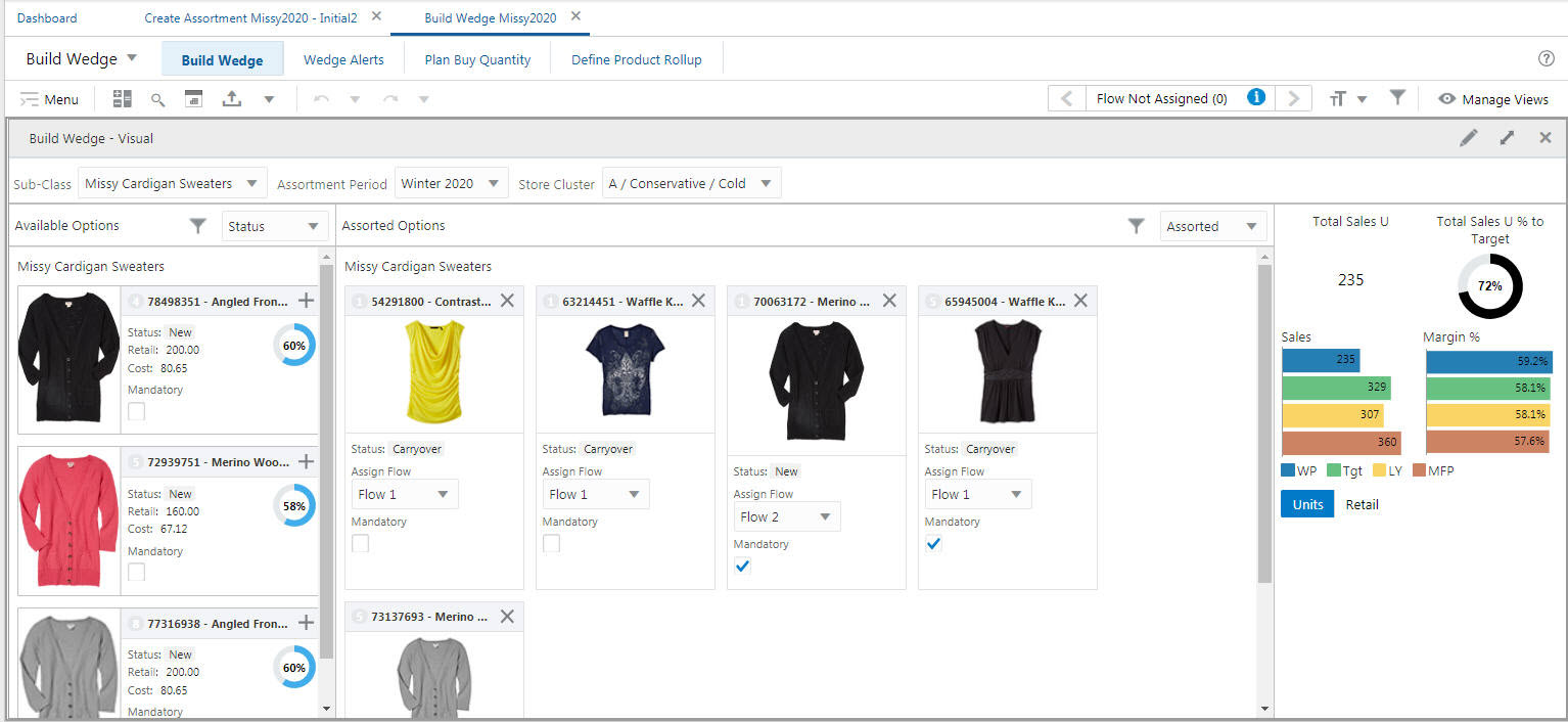
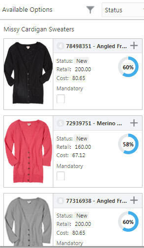
The Available and Shopped/Assorted Styles view is an aggregated view that contains the four labeled sections shown in Figure 17-2. These four sections are described in this chapter.
Figure 17-2 Aggregated View: Available and Assorted Styles View
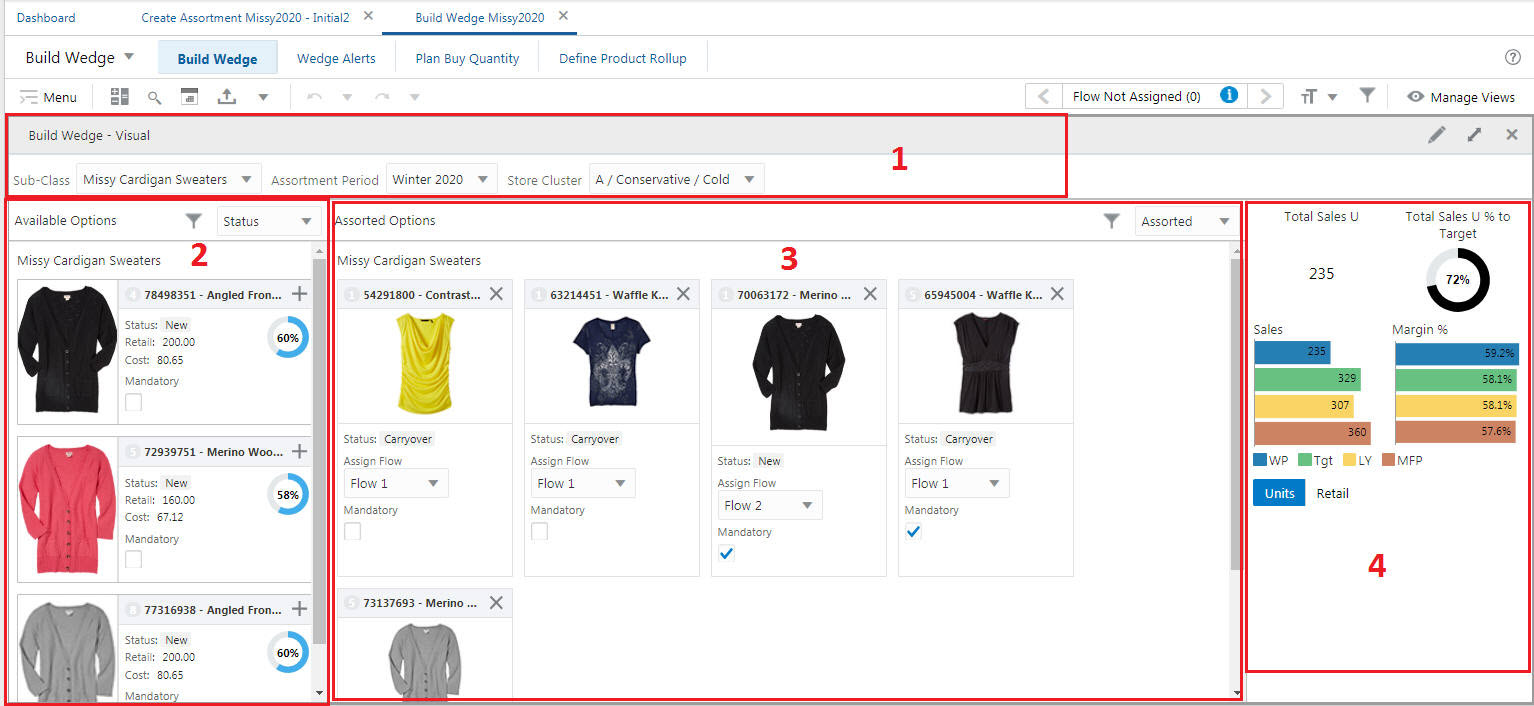
Section 1
Section 1 contains the filters for the Product, Calendar, and Location dimension hierarchies. These can be selected by user, depending on position level security. If a parent level is selected, then all the children are selected automatically. The Positions are chosen according to the hierarchy levels involved. Visual Planning can be used at the levels defined in the view, either the lowest or any higher levels of the hierarchy, depending upon what the user selects. In Figure 17-2, the Product and Location Hierarchy's lowest level of selection depends on the lowest level visible in the workbook. The Calendar Hierarchy's lowest level of selection is Assortment Period and is restricted to the assortment periods that are included within the workbook.
Section 2
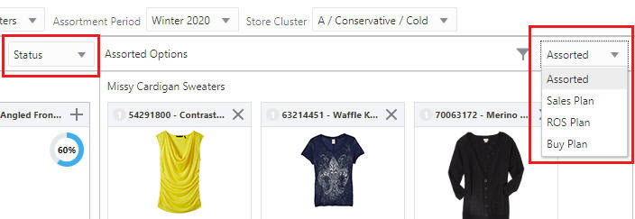
Section 2 displays the Available Options sub-view. It contains all the available options represented in the form of a Card View, depending on the selection criteria. In order to modify the assortment, the senior buyer can select one or more options from Available Options, then add or delete them in Assorted Options or use the Add or Delete icons to move the options to the Available Options sub-view. The items are added to the appropriate row in Assorted Options, updating that assortment for the cluster, depending on the Option ranking. Similarly, the planner can move a style from the Assorted Options sub-view back to the Available Options view in order to remove that option from that assortment. The results are auto-saved and can be committed.
The available options are displayed according to the selection criteria for dimension hierarchies, position level security, and any position query definitions that are in effect for adding or deleting into the Assorted Options sub-view. Adding or deleting a card updates the underlying measures directly, and the changes are reflected in the UI immediately.
Section 3
Section 3 displays the Assorted Options sub-view. It contains all the options those are included in the assortment represented in the form of the Card View, depending on the selection criteria. In order to modify the assortment, the Planner can either add one or more options from Available Options or delete (X icon next to the card) one or more options from Assorted Options. The options are added or removed to or from the Assorted Options, updating that assortment for cluster. Similarly, the planner can add and delete a style from Available Options view back to the Assorted Options view in order to add that option to the assortment. The results are auto saved and can be committed.
If there are more tiles in a row than can fit on a single line, the extra tiles are wrapped onto lines below. The Assorted Options are displayed according to the selection criteria for dimension hierarchies, position level security, and any position query definitions that are in effect and for adding or deleting into the Available Options sub-view. Adding or deleting a card updates the underlying measures directly, and the changes are reflected in the UI immediately.
Once the user adds the card to the Available Options sub-view, the card is deleted from the Assorted Options sub-view and is displayed in the Available Options sub-view and vice versa.
You can undo and redo the add/delete cards operation using the Undo-Redo functionality.
Section 4
Section 4 displays the Total Summary sub-view. This sub-view is dependent on the Assorted Options sub-view. It provides an overall summary of the assorted options with respect to budgets, target receipts, target margins, and so on. Whenever changes are made to the Assorted Options sub-view, the Total Summary is recalculated to display new results. The measures cannot be altered and are non-configurable. The measures can be viewed either in units or retail value, depending on the user selection. The Total Summary sub-view can be used to quickly highlight the target budget, receipts, and margin between the current assortment, target, and last year.
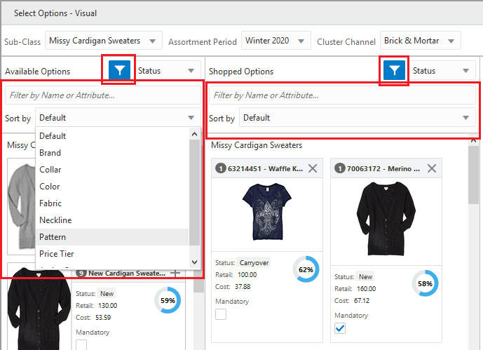
You can filter the tiles by clicking on the Filter icon and then entering the text in the Filter text box. You can sort the tiles based on attributes by selecting the desired attribute from Sort by picklist. This can help the planner to select and validate the assortment options based on attributes.
This section describes filtering and sorting cards.
Figure 17-5 Enable Filter Option: Filter and Sort Tiles
Filtering by Attribute
You can filter cards by attribute in order to pay more attention to the products with important attribute values in your assortment. As a buyer, you can view your plan data for a particular attribute value and make sure the plan reflects your requirements. You can filter both Available and Shopped/Assorted options.
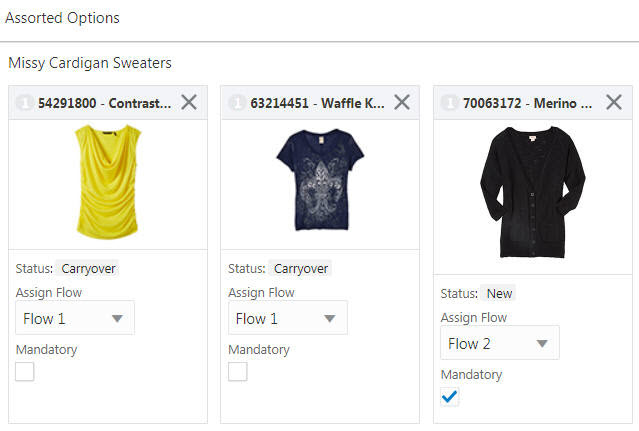
Click the Filter icon in the Available or Shopped/Assorted options section. Click the Filter by Name or Attribute text field, type in an attribute value, and click Enter, Alternatively, you can select from the auto-suggest in the list. The filter is applied, and all the cards with attribute values or labels that contain the entered text are displayed. Click Cross (X) to clear the filter.
If no matching data is found, you see the following message, Applied Filter is hiding all items. No items to display.
|
Note: If a PQD or other attribute filter has been defined in the top filter bar, then that will be applied first before the attribute value entered into the filter field. |
Sorting by Attribute
You can sort the cards by attribute in the container view to organize your available options as well as see the makeup of your assortment for each style/subclass for different attribute values.
Click the Filter icon in Available or Shopped/Assorted options section. Select the attribute from the Sort by list. The cards are sorted, based on the selected attribute.
You can select from different card definitions to help you make better decisions while selecting options in the planning process. You can select card definitions that contain different measures or attributes.
The app configurer can define more card definitions for a Card View, so that more attributes and measures are visible to the end user in a structured way. For details about defining card definitions, see the Oracle Retail Predictive Application Server Cloud Edition Configuration Tools User Guide.
Each card definition can specify an attribute, up to three read-only measures, up to two editable measures, as well as an optional gauge measure and an optional badge measure.
You can switch between these card definitions by selecting the required card definition from the list next to the Filter icon in Available or Shopped/Assorted options sections. If only one card definition is available, the list is not available.
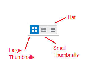
If more than one size (small, large, list) of card is available for the selected card definition, you will see icons that let you choose the size of cards. Typically, only list is used for the available options and only small and large thumbnails for the shopped and assorted options.