Customer Management Reports
Customer Acquisition
This area includes the reports:
Customer Acquisition
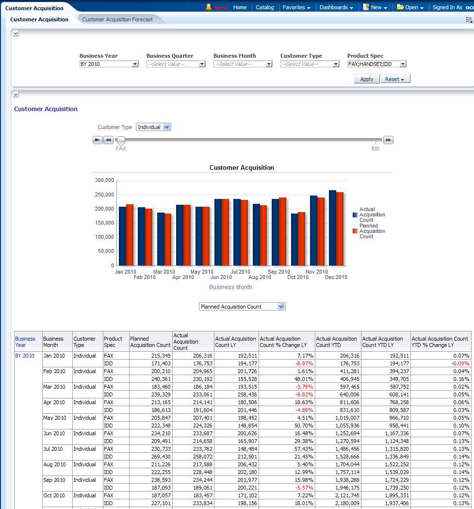
This report, as shown in Figure 13-1 provides the yearly and monthly number of customers to be acquired compared with actual customers acquired by product and with respective to customers type. All time transformation variation of Customer Acquisition numbers are displayed, including Last Year (LY) and Year to Date (YTD). Users can select certain products, organizations, and customer's type to narrow down the customer numbers.
Report dimensions are:
-
Business Time
-
Product Spec
-
Customer Type
Customer Acquisition Forecast
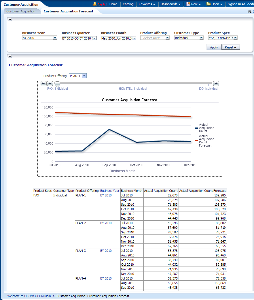
This report, as shown in Figure 13-2 provides the yearly and monthly level forecasting of customers count to be acquired versus the actual customers acquired by product offering and customers type.
Report dimensions are:
-
Business Time
-
Product Offering
-
Customer Type
-
Product Spec
Figure 13-2 Customer Acquisition Forecast Report
Description of "Figure 13-2 Customer Acquisition Forecast Report"
Customer Growth Rate
This area includes the reports:
Customer Growth Rate
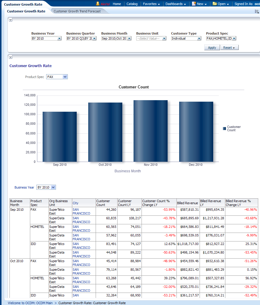
This report, as shown in Figure 13-3 provides the yearly and monthly customer count and revenue growth rate over products and geographical boundaries
Report dimensions are:
-
Business Time
-
Organization
-
Customer Type
-
Product Specification
Customer Growth Trend Forecast
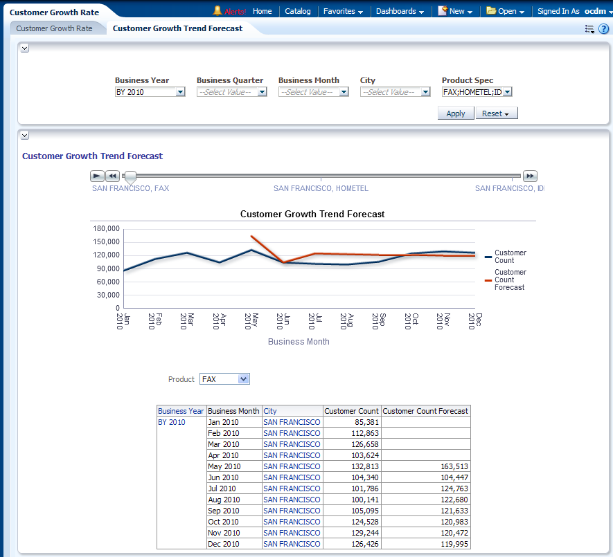
This report as shown in Figure 13-4 provides the month level number of customers for organization, products, and geographical boundaries. The future number of customers forecast for the next six months, or twelve months, can be forecast by Oracle OLAP forecast settings.
Report dimensions are:
-
Business Time
-
Product Specification
-
Geography
Figure 13-4 Customer Growth Trend Forecast Report
Description of "Figure 13-4 Customer Growth Trend Forecast Report"
Customer Segmentation
This area includes the reports:
Customer Segments
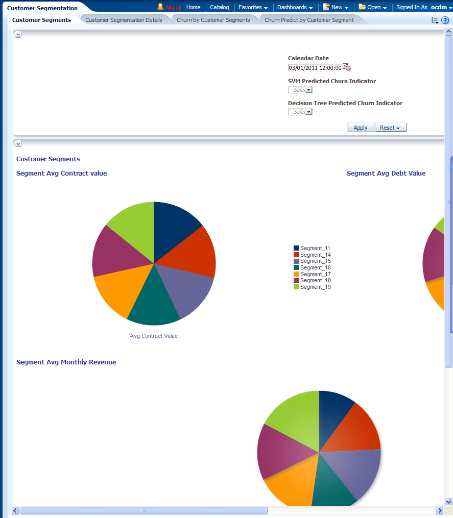
This report, as shown in Figure 13-5 shows customer segments.
This report displays the customer segmentation model result. The customer segmentation model groups customers into ten segments according to how similar they are to each other. The similarity is calculated based on customer demographic value (education, income, and so on), usage pattern and list of telecom products they subscribe to (customer subscriber history). The grouping rules are derived automatically by K-Means algorithm implemented inside Oracle Database. Business Analysts can look into each segment to further understand the customer group discovered by the algorithm and name each segments.
By default, the summary information about each segment is displayed in the bottom table. For each segment, the Average Contract Value, Avg Debt Value, and Avg monthly revenue (in last 6 months) are displayed. Those three values are depicted in three pie charts above the table respectively, to show the distribution among customer segments.
The prompt "SVM Predict Churner Indicator" can be used to filter the customer. If user select "1", then for each segment, only those customer who were predicted as "churner" by SVM churn model is counted in. Then the number would be less than all customers in the segment.
Similarly, "DT Predict Churner Indicator" can filter customers to be only those who were predicted as "churner" by Decision Tree churn model
Note: This groups all the customers, not only churners.
Report dimensions are:
-
Customer
Customer Segmentation Details
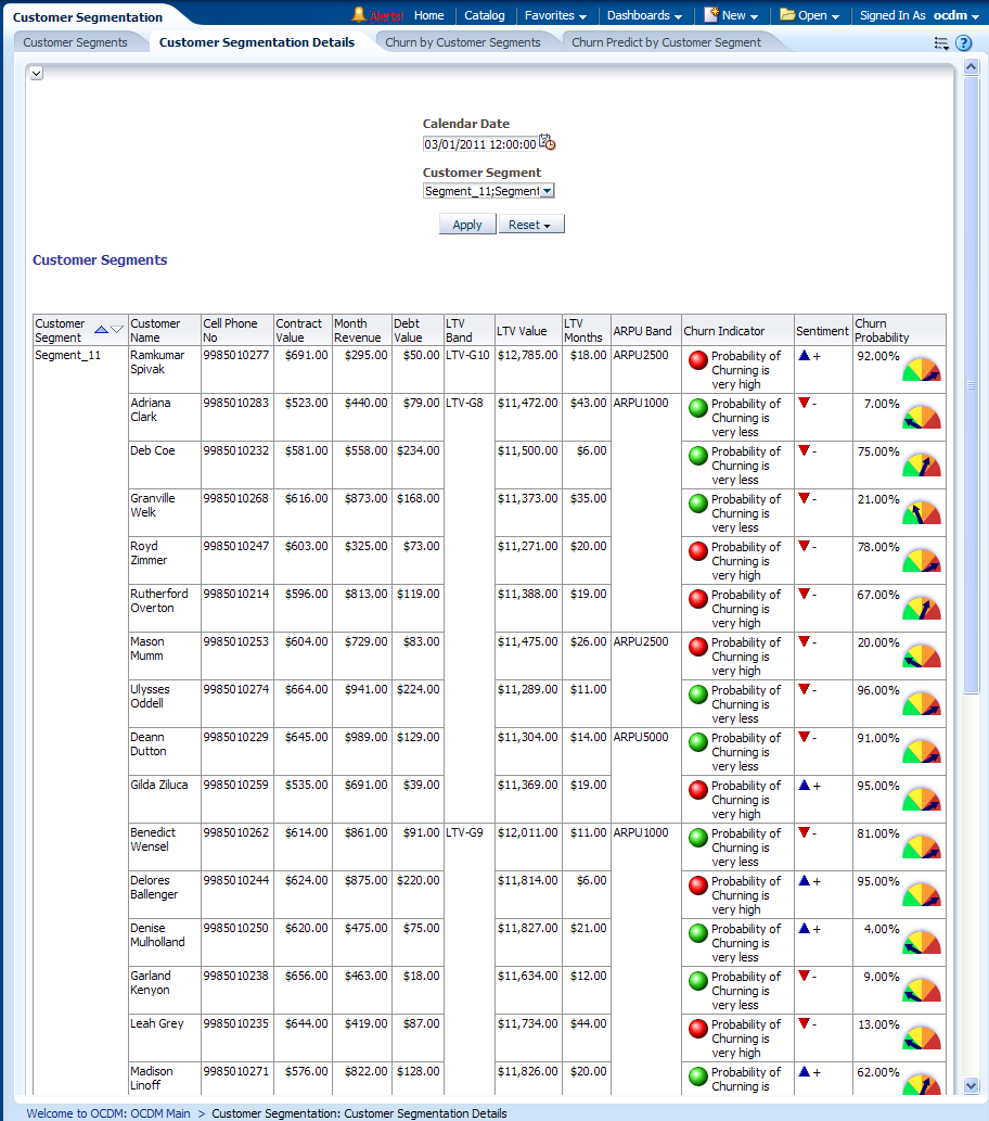
This report, as shown in Figure 13-6 provides the customer segmentation details on basis of certain customer statistical metrics such as contract value, month revenue, debt value and so on.
For the given customer, the report also displays the contract value, month revenue, debt value and so on. In fact, the end user can easily extend this report by adding any relational aggregated information about the customer into this report. For example, number of calls, number of complaints, and so on. They can use BIEE Answers to add those additional measures into the report.
Report dimensions are:
-
Customer
Figure 13-6 Customer Segmentation Details Report
Description of "Figure 13-6 Customer Segmentation Details Report"
Churn by Customer Segments
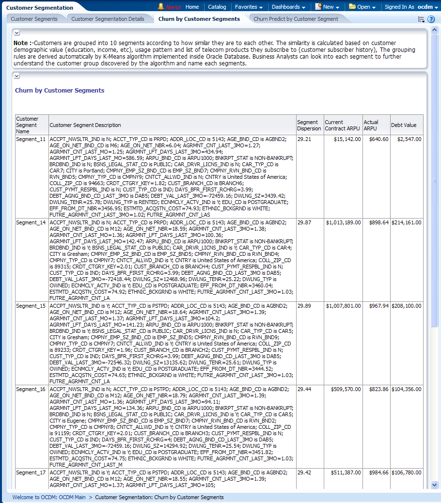
This report, as shown in Figure 13-7 shows customer segments.
This report displays the customer segmentation model result. The customer segmentation model groups customers into ten segments according to how similar they are to each other. The similarity is calculated based on customer demographic value (education, income, and so on), usage pattern and list of telecom products they subscribe to (customer subscriber history). The grouping rules are derived automatically by K-Means algorithm implemented inside Oracle Database. Business Analysts can look into each segment to further understand the customer group discovered by the algorithm and name each segments.
Report dimensions are:
-
Customer
Figure 13-7 Customer Segmentation Churn by Customer Segments Report
Description of "Figure 13-7 Customer Segmentation Churn by Customer Segments Report"
Churn Predict by Customer Segment
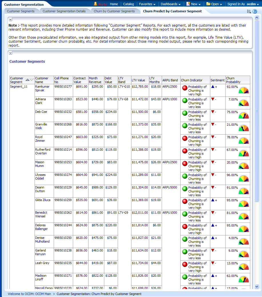
This report, as shown in Figure 13-8 shows customer segments.
This report displays the customer segmentation model result. The customer segmentation model groups customers into ten segments according to how similar they are to each other. The similarity is calculated based on customer demographic value (education, income, and so on), usage pattern and list of telecom products they subscribe to (customer subscriber history). The grouping rules are derived automatically by K-Means algorithm implemented inside Oracle Database. Business Analysts can look into each segment to further understand the customer group discovered by the algorithm and name each segments.
Report dimensions are:
-
Customer
Figure 13-8 Churn Predict by Customer Segment Report
Description of "Figure 13-8 Churn Predict by Customer Segment Report"
Customer Life Time Value
This area includes the reports:
Customer Life Time Value
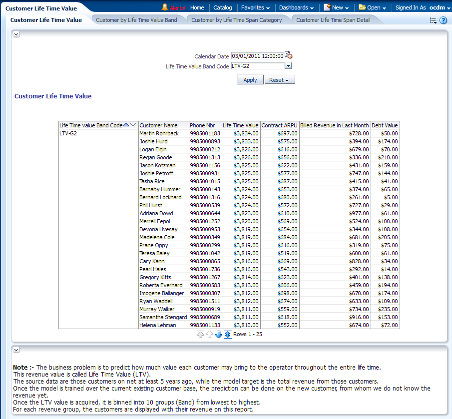
This report as shown in Figure 13-9 provides the predicted Life Time Value (LTV) for all customers grouped by LTV Band Code. It also shows some additional aggregated information about the customer.
Report dimensions are:
-
Customer
-
Customer Mining
Figure 13-9 Customer Life Time Value Report
Description of "Figure 13-9 Customer Life Time Value Report"
Customer by Life Time Value Band
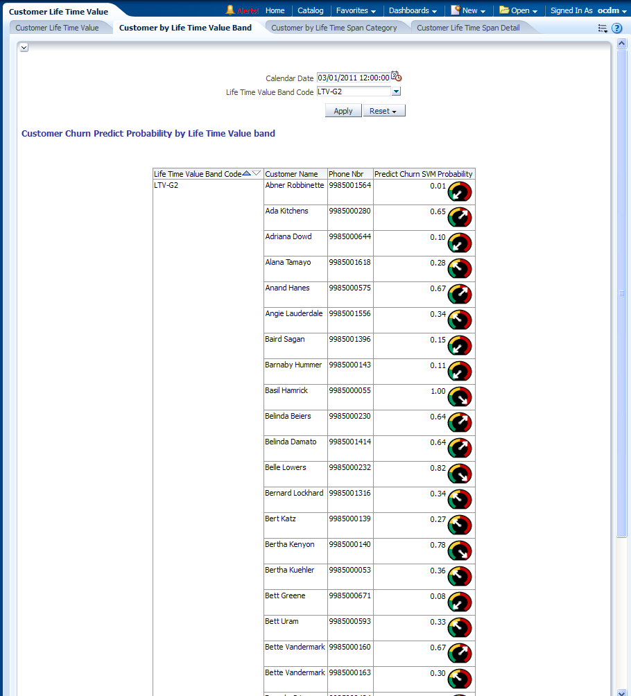
This report, as shown in Figure 13-10 provides the churn prediction result for the customers belonging to a certain Life time Value Band (that is, the customers likely to be with the service provider compared with the customers that already left the service provider.)
Report dimensions are:
-
Customer
-
Customer Mining
Figure 13-10 Customer by Life Time Value Band Report
Description of "Figure 13-10 Customer by Life Time Value Band Report"
Customer by Life Time Span Category
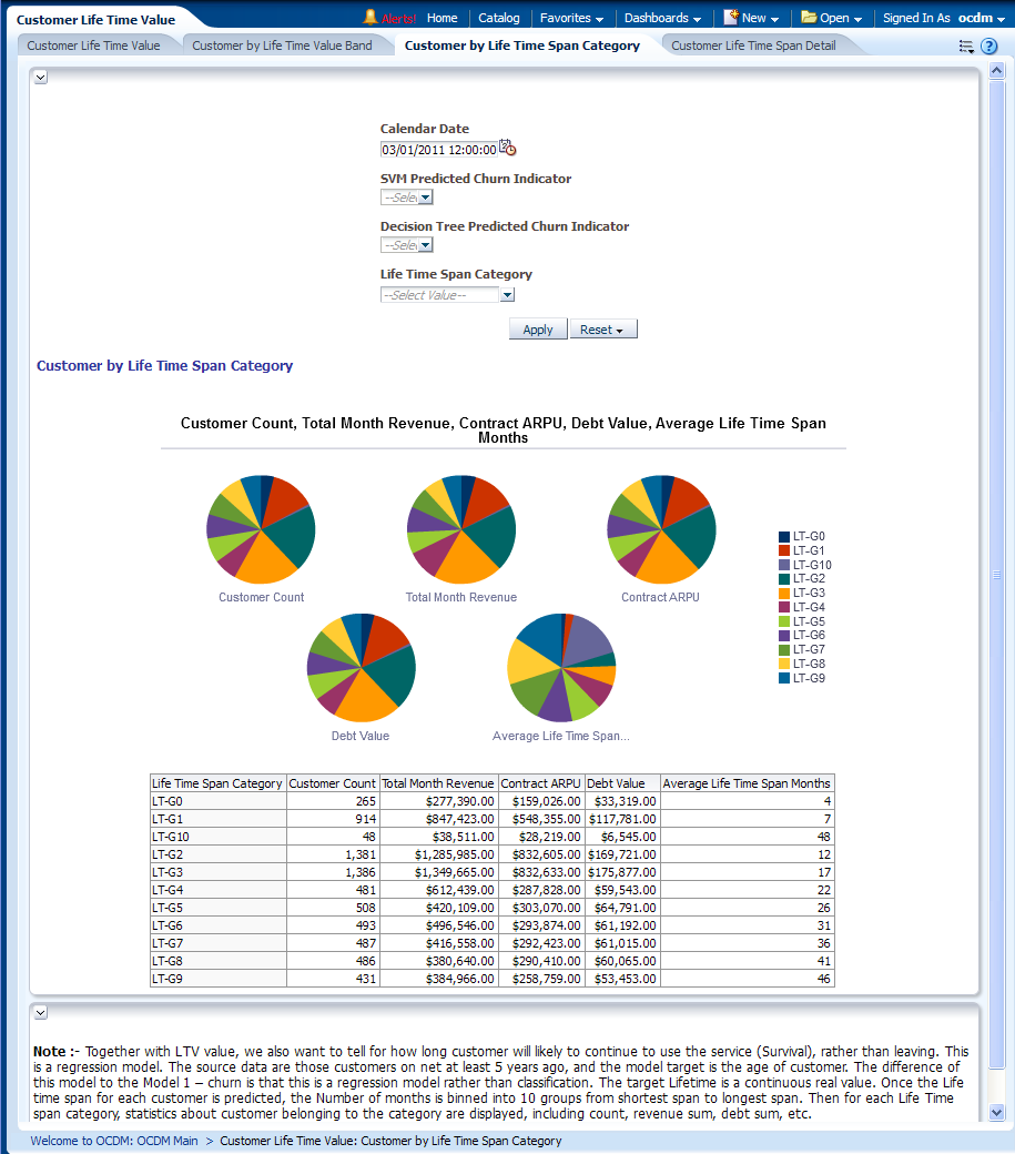
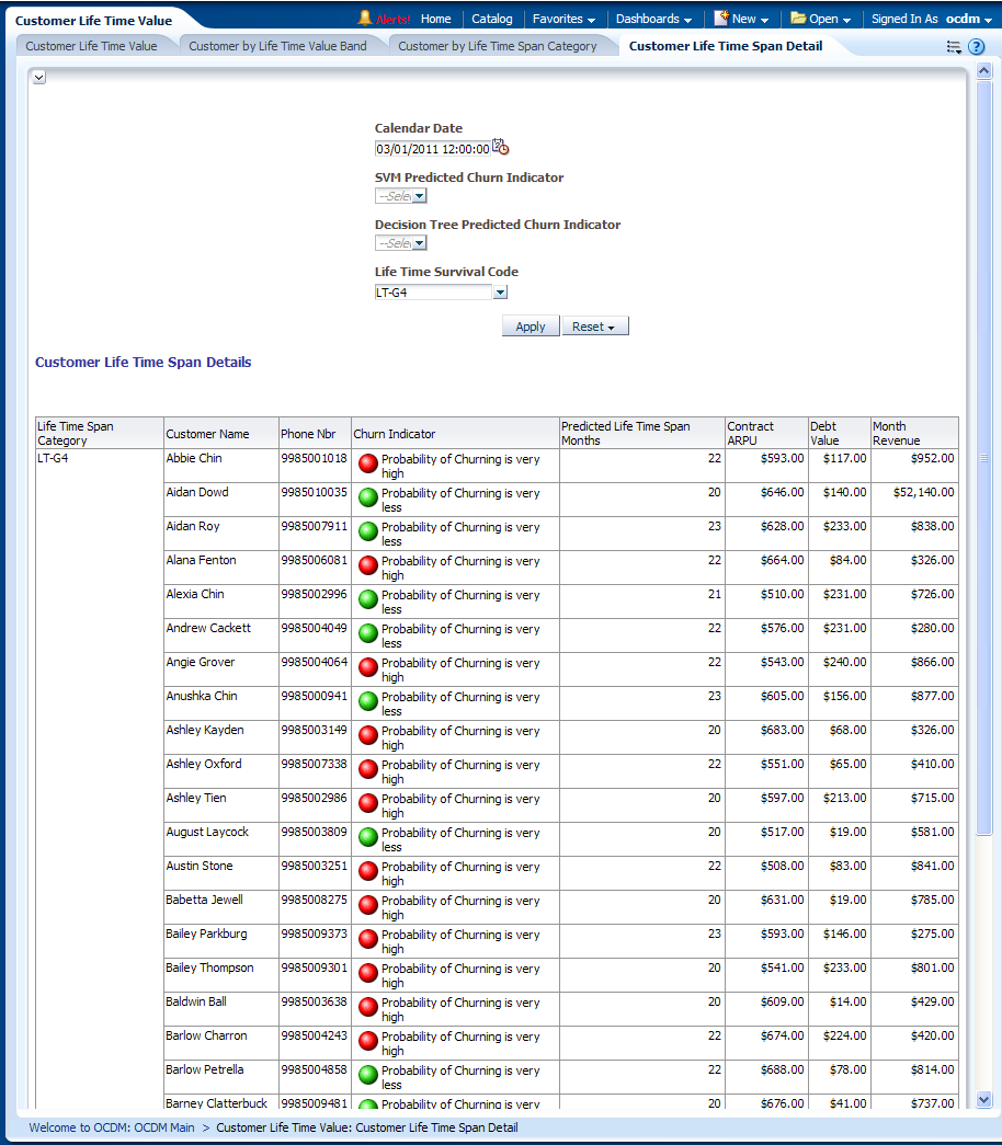
This report, as shown in Figure 13-11 provides the customer life time span with the service provider on the basis of certain mining metrics such as average life time span months, total month revenue, contract Average Revenue Per User (ARPU) and so on. The Life time span value is measured by Months, therefore, a value of "22" in "Avg Life Time Span Months" means the customer is very likely to use the services for at least 22 months. The customers are binned into Life Time Span Category according to the value of Life time span.
Report dimensions are:
-
Customer
-
Customer Mining
Figure 13-11 Customer by Life Time Span Category Report
Description of "Figure 13-11 Customer by Life Time Span Category Report"
Customer Life Time Span Detail
This report, as shown in Figure 13-12 provides more information about the customers in each life time span category.
Report dimensions are:
-
Customer
-
Customer Mining
Figure 13-12 Customer Life Time Span Detail Report
Description of "Figure 13-12 Customer Life Time Span Detail Report"
Customer Churn Analysis
This area includes the reports:
Customer Churn Rate
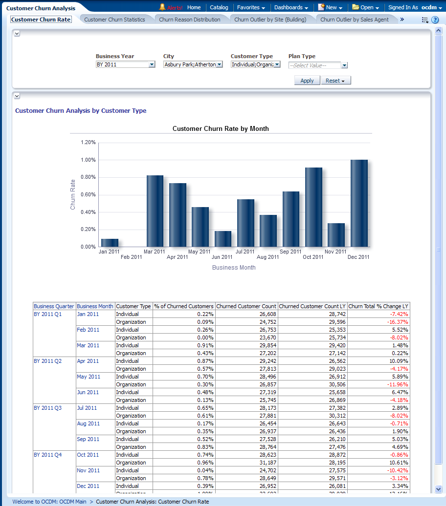
This report, as shown in Figure 13-13 provides year-level churn rate information of an organization based on Customer type. It also shows the Last year information for the user to see differences.
Report dimensions are:
-
Organization
-
Business Time
-
Customer
Customer Churn Statistics
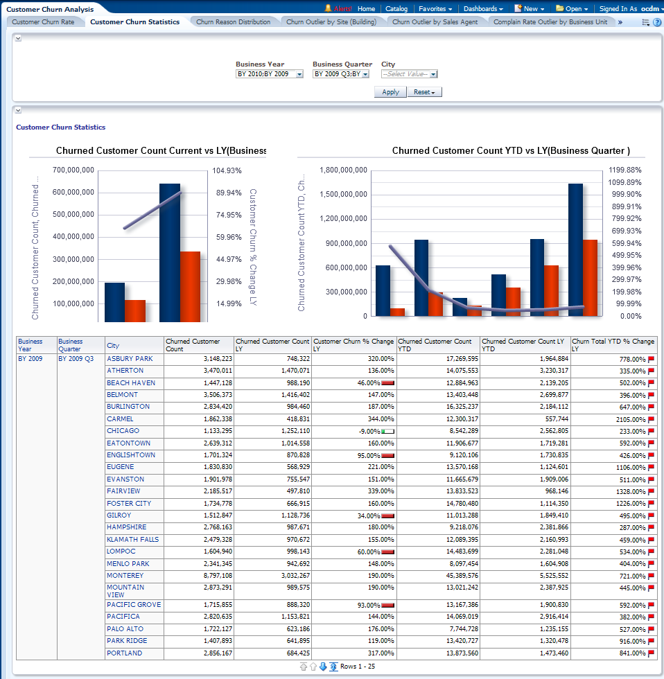
This report, as shown in Figure 13-14 provides year-level subscription performance based on churn statistics relating to a Customer, such as high churn rate analysis for a subscription, and so on. Oracle Communications Data Model provides certain operational measures such as forecasting, prediction, and so on, to over come this problem This data can be analyzed with LY and YTD data.
Report dimensions are:
-
Organization
-
Business Time
-
Customer
Figure 13-14 Customer Churn Statistics Report
Description of "Figure 13-14 Customer Churn Statistics Report"
Churn Reason Distribution
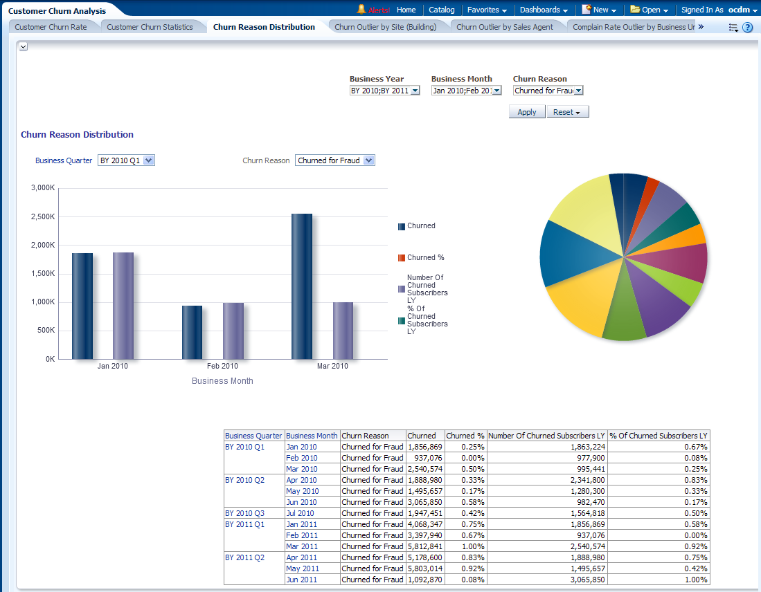
This report as shown in Figure 13-15 identifies the year level top reasons that lead the customers to move out of the service providers. It also gives the flexibility to compare the same with last year churn information. Thus, it gives the service providers a way to analyze the churn situation according to customer stated churn reasons.
Report dimensions are:
-
Business Time
-
Churn Reason
Figure 13-15 Churn Reason Distribution Report
Description of "Figure 13-15 Churn Reason Distribution Report"
Churn Outlier by Site (Building)
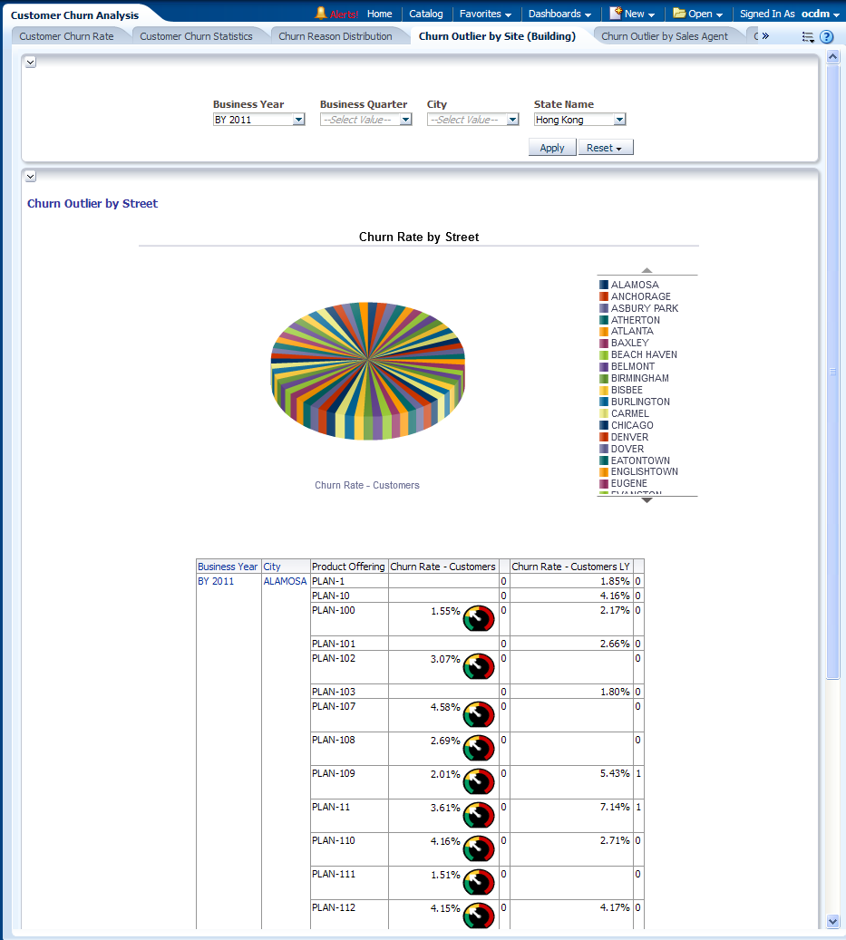
This report, as shown in Figure 13-16 mainly speaks about the broadband or Fix Line related churn analysis pertaining to one building or an area. The churn rates are displayed for all building in selected area, and those extremely high churn rates are identified as “Churn Outlier" beside the churn rate, marked by number “1" and background as RED.
It can help identify the churn related problem such as network problems, arrival of new competitors, and so on. For example, when competitors launch a promotion or your network fails, the churn rate may go up. This report can help identify the problem before revenue loss occurs.
Report dimensions are:
-
Business Time
-
Geography
-
Product Offering
Figure 13-16 Churn Outlier by Site (Building) Report
Description of "Figure 13-16 Churn Outlier by Site (Building) Report"
Churn Outlier by Sales Agent
This report, as shown in Figure 13-17 identifies the extremely high churn rate in the customers brought in by certain sales representative agents. For example, the sales agent may introduce the package to those incapable of paying the bill, or to his friends who churn right after acquiring the promotion gifts. Thus it enables a service providers to identify fraud cases by sales agents.
Report dimensions are:
-
Business Time
-
Organization
-
Product Offering Type
-
Sales Channel Representative
Figure 13-17 Churn Outlier by Sales Agent Report
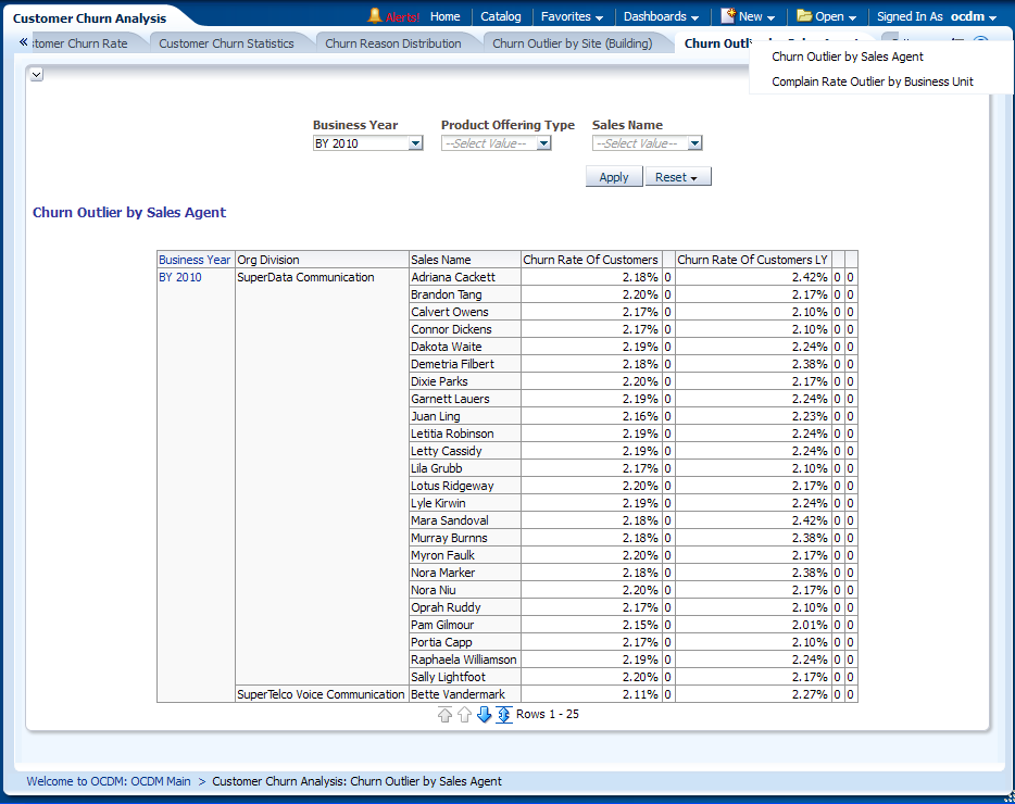
Description of "Figure 13-17 Churn Outlier by Sales Agent Report"
Complain Rate Outlier by Business Unit
This report, as shown in Figure 13-18 works in the same way as the report “Churn Outlier by Building". However, instead of detecting a high churn rate, which already incurred revenue loss, this report tries to identify those areas where an extremely high compliant rate is observed. The report also shows the complaint rate in LY, YTD and LY YTD.
Report dimensions are:
-
Business Time
Figure 13-18 Complain Rate Outlier by Business Unit
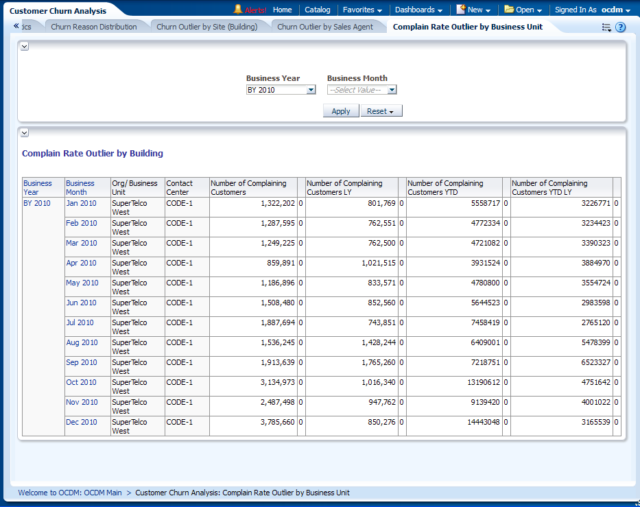
Description of "Figure 13-18 Complain Rate Outlier by Business Unit"
Customer Churn Prediction
This area includes the reports:
- Retention Cumulative Gain
- Retention Cumulative Gain & Lift Prepaid
- Retention Cumulative Gain & Lift Postpaid
- Model Performance Metrics Prepaid
- Model Performance Metrics Postpaid
- Prepaid Customer Churn Factor Rank
- Postpaid Customer Churn Factor Rank
- Predicted Churn Customer Report by Revenue Band
- Churn Profile DT (Decision Tree) Rule
- Churn Prediction by (SVM result)
Retention Cumulative Gain
This report as shown in Figure 13-19 shows the Oracle Communications Data Model Churn prediction Model performance; this helps you determine a threshold for the percent of customers to run in the retention program. This retention can be done using phone calls or email. For example, according to the details in Figure 13-19, if the service provider selects 20% of MOST Likely churners according to the Oracle Communications Data Model Churn Prediction model, they can cover about 74% of real churners.
The chart here shows the accuracy of customers so identified under retention program prediction rather than picking on random selection of customers (shown as a straight line).
Report dimensions are:
-
Churn SVM ROC
Figure 13-19 Retention Cumulative Gain Report
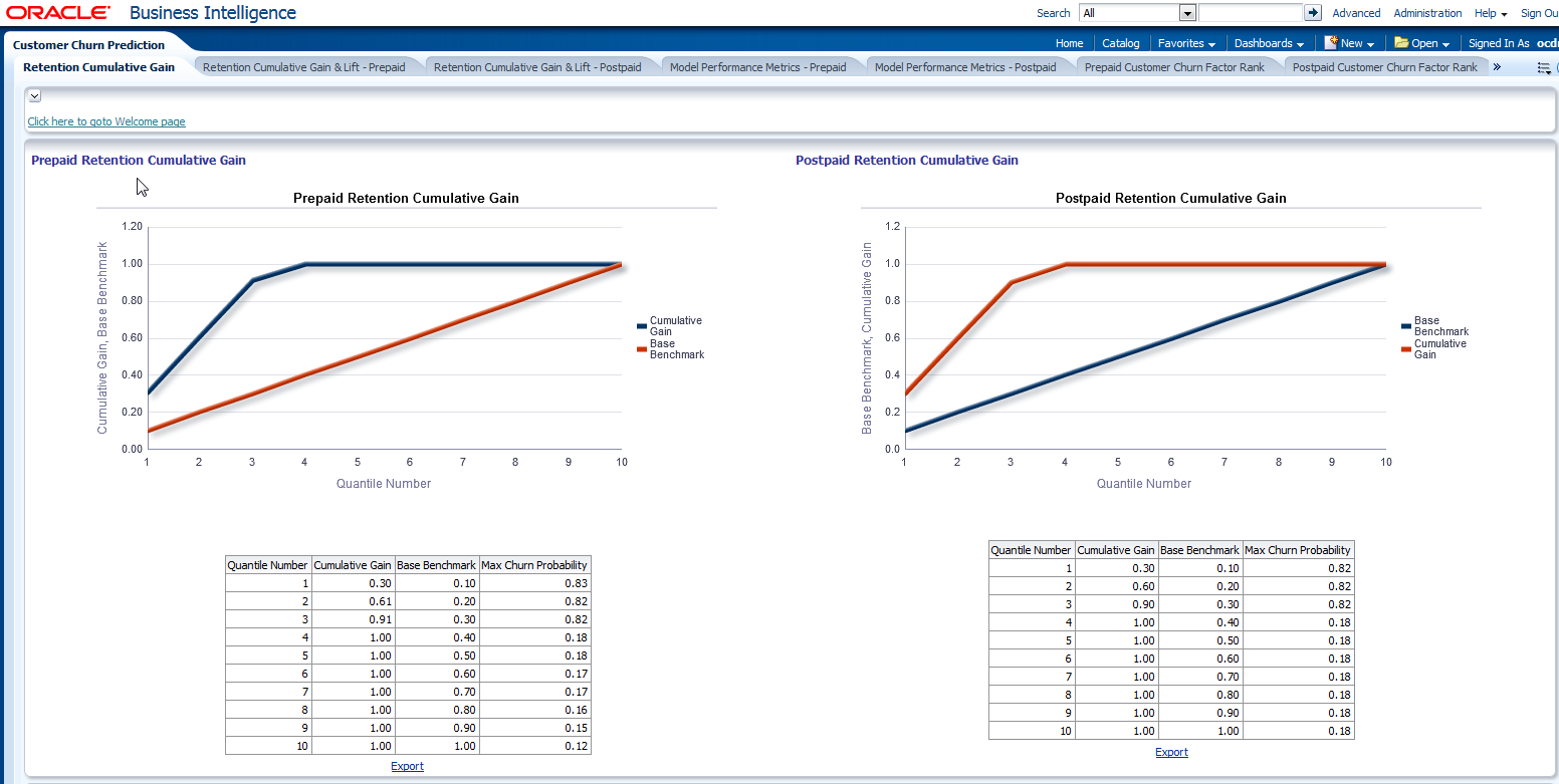
Description of "Figure 13-19 Retention Cumulative Gain Report"
Retention Cumulative Gain & Lift Prepaid
This report as shown in Figure 13-20shows the Oracle Communications Data Model Customer Churn prediction Model retention and cumulative gain and lift prepaid; this helps you determine a threshold for the percent of customers to run in the retention program.
Gain and Lift: Gain or lift is a measure of the effectiveness of a classification model calculated as the ratio between the results obtained with and without the model . Gain and lift charts are visual aids for evaluating performance of classification models.
Lift chart: The lift chart shows how much more likely we are to receive positive responses than if we contact a random sample of customers. For example, by contacting only 10% of customers based on the predictive model we will reach 3 times as many respondents as that of if we use no mode l(random guess).
Report dimensions are:
-
Churn SVM ROC
Figure 13-20 Customer Churn Prediction:: Retention Cumulative Gain and Lift Prepaid
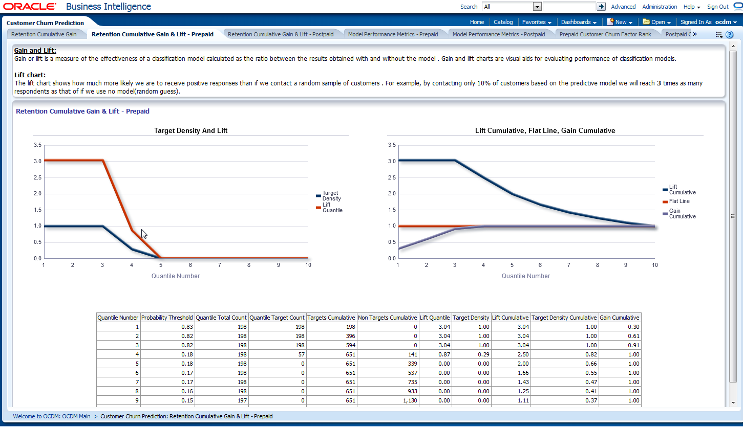
Description of "Figure 13-20 Customer Churn Prediction:: Retention Cumulative Gain and Lift Prepaid"
Retention Cumulative Gain & Lift Postpaid
This report as shown in Figure 13-21shows the Oracle Communications Data Model Customer Churn prediction Model retention and cumulative gain and lift postpaid; this helps you determine a threshold for the percent of customers to run in the retention program.
Gain and Lift: Gain or lift is a measure of the effectiveness of a classification model calculated as the ratio between the results obtained with and without the model . Gain and lift charts are visual aids for evaluating performance of classification models.
Lift chart: The lift chart shows how much more likely we are to receive positive responses than if we contact a random sample of customers . For example, by contacting only 10% of customers based on the predictive model we will reach 3 times as many respondents as that of if we use no model(random guess).
Report dimensions are:
-
Churn SVM ROC
Figure 13-21 Customer Churn Prediction: Retention Cumulative Gain and Lift Postpaid
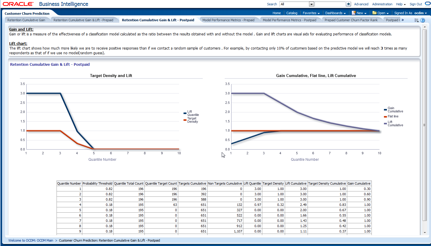
Description of "Figure 13-21 Customer Churn Prediction: Retention Cumulative Gain and Lift Postpaid"
Model Performance Metrics Prepaid
This report as shown in Figure 13-22shows the Oracle Communications Data Model Customer Churn prediction Model retention and cumulative gain and lift postpaid; this helps you determine a threshold for the percent of customers to run in the retention program.
Confusion Matrix: A confusion matrix shows the number of correct and incorrect predictions made by the classification model compared to the actual outcomes (target value) in the data. The matrix is NxN, where N is the number of target values (classes). Performance of such models is commonly evaluated using the data in the matrix. For Churn classification, there are two target values (1 - Churner, 0 - Active). So, confusion matrix is a 2x2 matrix for two classes (Churner and Active).
Accuracy: The proportion of the total number of predictions those were correct. Sensitivity or Recall: The proportion of actual positive cases which are correctly identified.
Specificity: The Proportion of actual negative cases which are correctly identified. Customer is predicted to churn if churn prediction probability is greater than OR equal to
Probability Threshold. The Probability Threshold can be chosen by analyzing LIFT and ROC data. Probability Threshold should be chosen such that it will result in low Misclassification Cost and High Efficiency mining model . Efficiency = (Sensitivity + Specificity) / 2 Sensitivity = #True Positives / (#true Positives + #False Negatives) Specifitity= #True Negatives / (#True Negatives + #False Positives) Accuracy = (#True Positives + #True Negatives) / #Total Customers For this model, Probability Threshold = 0.5
Report dimensions are:
-
Churn SVM ROC
Figure 13-22 Customer Churn Prediction Model Performance Metrics Prepaid
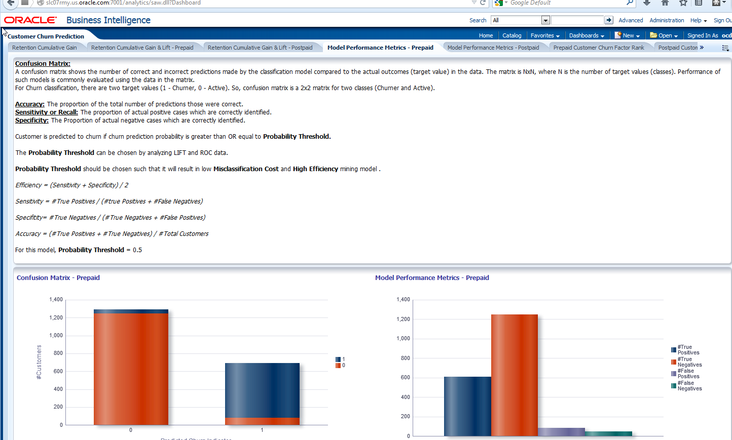
Description of "Figure 13-22 Customer Churn Prediction Model Performance Metrics Prepaid"
Model Performance Metrics Postpaid
This report as shown in Figure 13-23shows the Oracle Communications Data Model Customer Churn prediction Model retention and cumulative gain and lift postpaid; this helps you determine a threshold for the percent of customers to run in the retention program.
Confusion Matrix: A confusion matrix shows the number of correct and incorrect predictions made by the classification model compared to the actual outcomes (target value) in the data. The matrix is NxN, where N is the number of target values (classes). Performance of such models is commonly evaluated using the data in the matrix. For Churn classification, there are two target values (1 - Churner, 0 - Active). So, confusion matrix is a 2x2 matrix for two classes (Churner and Active). Accuracy: The proportion of the total number of predictions those were correct. Sensitivity or Recall:
The proportion of actual positive cases which are correctly identified. Specificity: The Proportion of actual negative cases which are correctly identified. Customer is predicted to churn if churn prediction probability is greater than OR equal to Probability Threshold. The Probability Threshold can be chosen by analyzing LIFT and ROC data. Probability Threshold should be chosen such that it will result in low Misclassification Cost and High Efficiency mining model . Efficiency = (Sensitivity + Specificity) / 2 Sensitivity = #True Positives / (#true Positives + #False Negatives) Specifitity= #True Negatives / (#True Negatives + #False Positives) Accuracy = (#True Positives + #True Negatives) / #Total Customers For this model, Probability Threshold = 0.5
Report dimensions are:
-
Churn SVM ROC
Figure 13-23 Customer Churn Prediction Model Performance Metrics Postpaid
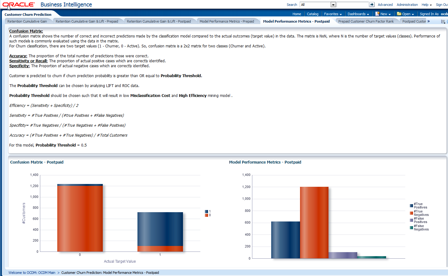
Description of "Figure 13-23 Customer Churn Prediction Model Performance Metrics Postpaid"
Prepaid Customer Churn Factor Rank
This as shown in Figure 13-24 can help you understand which attribute is more important in determining a prepaid customer churning pattern. The factors are ranked according to the SVM Coefficients from the Churn prediction model. The chart can help marketing understand the customers for a better campaign strategy.
Report dimensions are:
-
Churn SVM ROC
Figure 13-24 Prepaid Customer Churn Factor Rank Report
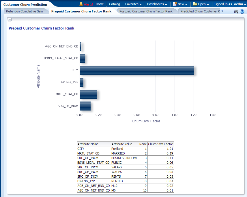
Description of "Figure 13-24 Prepaid Customer Churn Factor Rank Report"
Postpaid Customer Churn Factor Rank
This as shown in Figure 13-25 can help you understand which attribute is more important in determining a postpaid customer churning pattern. The factors are ranked according to the SVM Coefficients from the Churn prediction model. The chart can help marketing understand the customers for a better campaign strategy.
Report dimensions are:
-
Churn SVM ROC
Figure 13-25 Postpaid Customer Churn Factor Rank Report
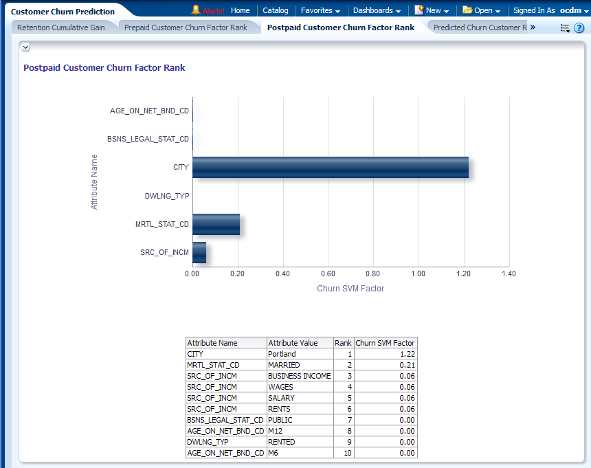
Description of "Figure 13-25 Postpaid Customer Churn Factor Rank Report"
Predicted Churn Customer Report by Revenue Band
This report, as shown in Figure 13-26 shows the summary of customers and the summary of who may churn in the next month. The customers are binned into ARPU Band according to their last month revenue ARPU. In each ARPU band, the total revenue, debt value and Number of Predicted churners are displayed.
You can drill down into each ARPU band by clicking the ARPU band to see a customer list belonging to that ARPU band.
Report dimensions are:
-
ARPU Band
Figure 13-26 Predicted Churn Customer Report by Revenue Band Report
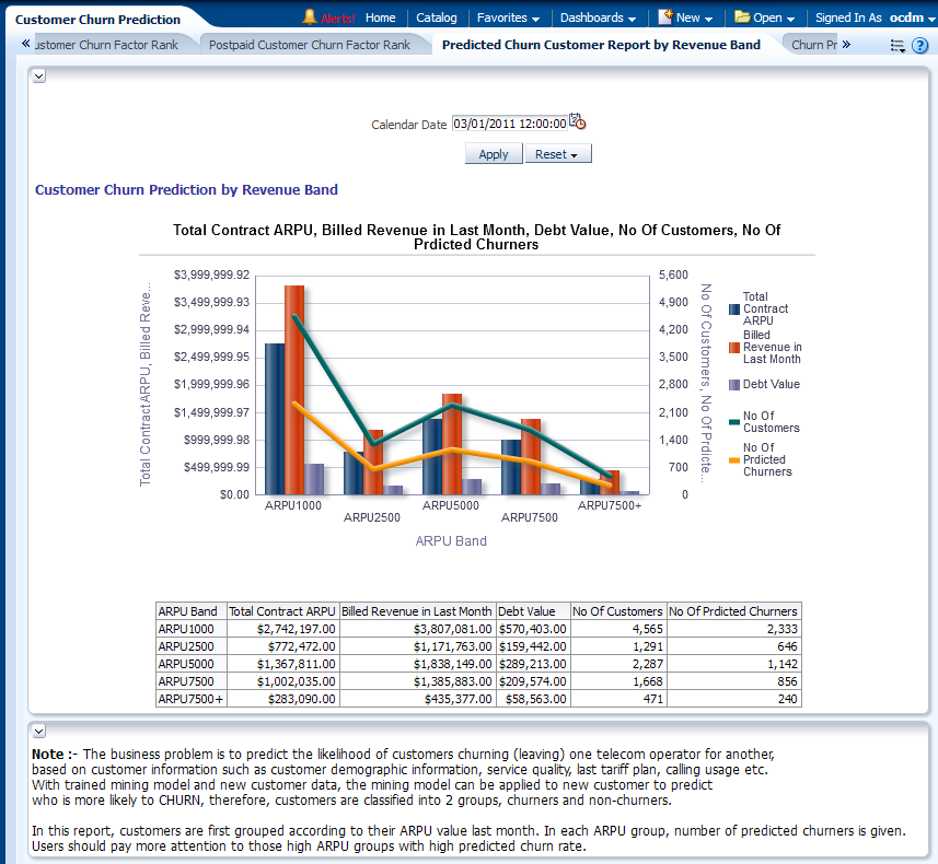
Description of "Figure 13-26 Predicted Churn Customer Report by Revenue Band Report"
Churn Profile DT (Decision Tree) Rule
This report as shown in Figure 13-27, mainly speaks about the customers churn profiling for each Decision Tree node generated by the decision tree Churn Prediction model.
Figure 13-27 Churn Profile DT (Decision Tree) Rule Report

Description of "Figure 13-27 Churn Profile DT (Decision Tree) Rule Report"
Churn Prediction by (SVM result)
This as shown in Figure 13-28, identifies the patterns of customers churning (leaving) based on customer information such as customer demographic information, service quality, last tariff plan, calling usage, and other factors. Base lining on these patterns, the model can also do the calculation over current customer base (called 'Apply') to predict who the customers are mostly like to churn in next few months. With these predictions, operators can initiate certain retention programs to reduce the customer churn rate.
Report dimensions are:
-
Business Time
-
Organization
-
Customer
Figure 13-28 Churn Prediction by (SVM Result) Report
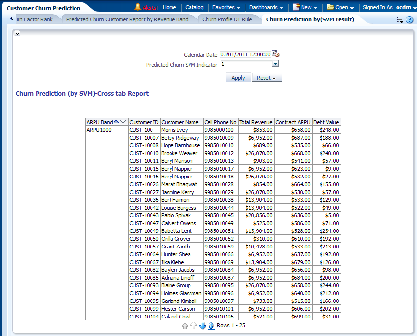
Description of "Figure 13-28 Churn Prediction by (SVM Result) Report"
