Types of Graphs
STA uses multiple graph types to display data.
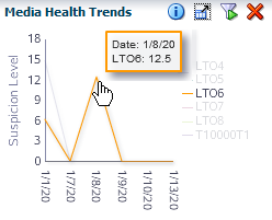
Line Graphs
Line graphs display actual values for one or more resources over a period of time.
Each line represents a resource (drive or media) or other category of data. Time is always shown on the horizontal axis. Each point on the line represents an actual value at a point in time. There must be at least two data points available for a line graph. If there is only one data point, the graph will display as a bar chart. The default date range for most STA line graphs (libraries, complexes, drives, and media) is the last 30 days. For exchanges, the default is one day—the current date.
Area Charts
Area charts show percentage values for two or more resources over a period of time.
An area chart is similar to a line graph, but the area under the line is filled in with a color or pattern. Each line represents a resource or other category of data, and the size of the area under the line represents the resource's percentage of the total. Time is always displayed on the horizontal axis. Each point on the line represents an actual data value at a point in time. The default date range for most STA area charts (libraries, complexes, drives, and media) is the last 30 days. For exchanges, the default is one day—the current date.
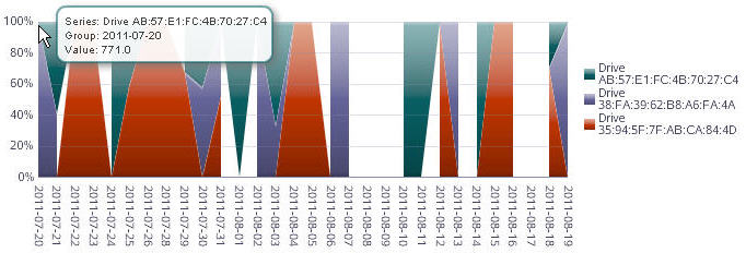
Description of the illustration ''if_areadetail.jpg''
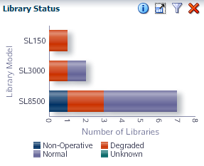
Bar Charts
Bar charts display actual values for one or more resources at a point in time.
Each bar represents a resource (drive, media, library) or other category of data, and the size of the bar represents the resource's actual value.
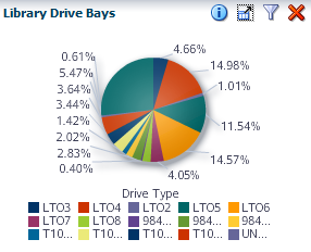
Pie Charts
Pie charts show the percentage of a resource compared to the total.
Each section of the pie represents a resource or other category of data. The size of the section represents the resource's percentage of the total. To be meaningful, pie charts require graphing at least two resources.
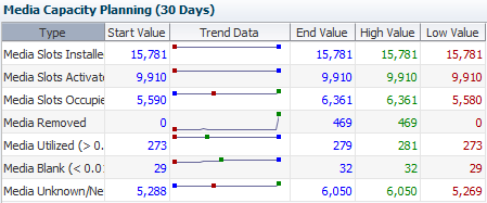
Spark Charts
A spark chart is a small line graph that plots up to four key values—Start, End, High, and Low—for a selected date range. Spark charts can help you to see patterns in data values over time.
Some dashboard panes contain embedded spark charts. Depending on the date range selected and the variation among the key values, a given chart may have only two or three dots plotted, rather than four. This is because the dot for one value may hide the other if two key values are close in date and value. Filtering for a shorter date range may reveal more detail.