Best Practices for Using Graphs
Follow best practices when working with graphs in STA to maximize their usefulness.
- Hide graphs to make space for the table
-
Collapse the graphs area of the screen to provide more space to view a table. You can save this view as a default template if the table details are more useful in your environment than the graphical overview.
See Resize or Collapse Areas of the Screen.
See Create a Template and Set the Default Template for a Screen.
- Compare to the system average
-
The dotted black line shown by default in all graphs shows a summary or average across your tape library system. This provides a good comparative baseline.
- Add individual resources to graphs
-
Add specific resources (drives, media, and so on) to the graphs. This is a powerful tool for comparing resources within your tape library system.
- Synchronize the date and time range on graphs
-
Synchronize date and time ranges on the Overview screen graphs to provide a good way to compare resources across multiple data ranges. Change the date and time range in one graph and then synchronize the other graphs to it.
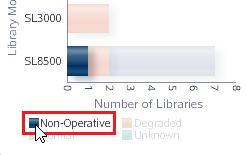
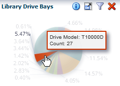
- Display Detailed Values
-
Move the mouse over a areas of a graph to display the value in a tooltip. Other items within the graph are dimmed.
- Highlight Values
-
Move the mouse over an area of the legend to highlight that entry in the graph. All other entries remain on the graph but are dimmed.