Modify the Data Displayed By Graphs
Modify the data displayed on one or more graph panes to help with analysis.
Change the Graphed Attribute
Change the resource attribute displayed in a graph on an Overview screen.
-
Click Change Graphed Attribute
 in the graph's toolbar.
-
From the drop-down, select the attribute to display.
The menu lists all available attributes for this resource type. You may need to scroll down within the list.
Set the Date Range of a Graph
Change the date range of a graph on an Overview screen. You can specify a new range or a point in time (single day).
-
Click Choose Date Range
 in the graph's toolbar.
-
Complete the dialog box, specifying either:
-
Single Date — Either type the date manually or click Select Date
and choose the date. The date format is yyyy-mm-dd. -
Date Range — In the Starting Date and Ending Date fields, enter the first and last dates of the range. Type the dates manually or click Select Date
and choose the dates. The date format is yyyy-mm-dd.
-
-
Click OK.
Single date graphs are displayed as bar charts. Date range graphs are displayed as line graphs
Synchronize a Date Range Across All Graphs
Synchronize all graphs to the same date range on an Overview screen. This can help compare data.
-
In one of the graphs, set the date range.
-
Click Synchronize Date Range
 in the graph's toolbar.
-
Confirm you want to synchronize all graphs.
The page reloads with all graph panes synchronized to display the same date range. All other data characteristics (graphed attribute, actual versus percentage values, added resources) remain unchanged.
See Also:
Add Library Resources to Graphs
Initially graphs only show the system average. Add library resources (such as libraries, drives, or media) to all graphs on an Overview screen to view trends.
-
In the table, select a row (or use shift-click/ctrl-click to select multiple rows).
-
Click Apply Selection
 in the table toolbar. The graphs update with the selected resources.
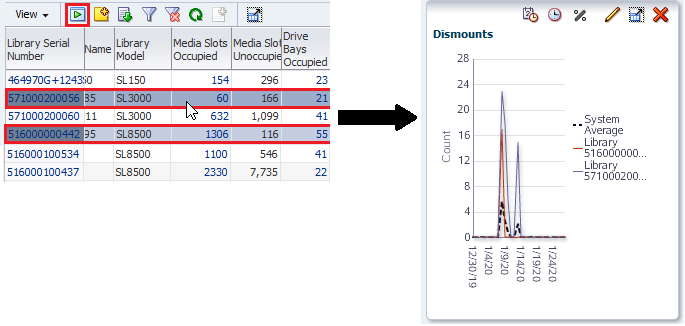
Description of the illustration ''compare_system_avg.png''
-
To remove all resources from the graphs and display only the System Average, deselect all the selected resources in the table and click Apply Selection again.
Switch Between Actual and Percentage Values
Switch between actual and percentage values on the graphs of an Overview or Analysis screen.
Actual values are displayed by default. Percentage values compare resources, therefore you should have at least two resources added to the graph when displaying percentage values.
-
Add two or more resources to the graph.
-
Click Show Percentages
 on the graph's toolbar.
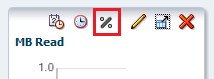
-
Click Show Percentages
 again to switch back to actual values.
See Also:
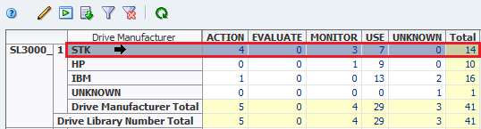
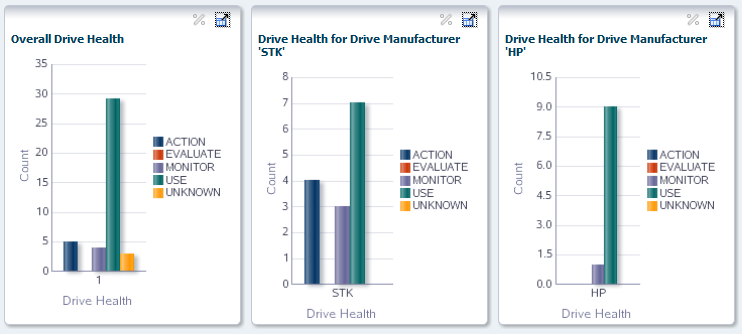
Graph Data for a Pivot Table Attribute
Graph detail data for a pivot table attribute.
-
Navigate to an Analysis screen (such as Drives Analysis).
-
In the pivot table, select a row (in the example below, the "STK" value for the Drive Manufacturer attribute is selected).
If you select a column edge attribute, or if you select multiple rows, you will see the error, "Please select one and only one row."
-
Click Apply Selection
in the Pivot Table Toolbar.The selected attribute value is displayed in a single graph pane.
See Also:
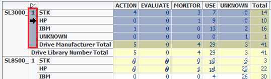
Graph Aggregated Data From a Pivot Table
Graph aggregated data from a pivot table to view multiple graph panes: one for the aggregated totals and one each for the attribute values included in the totals.
-
Navigate to an Analysis screen (such as Drives Analysis).
-
In the pivot table, select a layer that aggregates multiple attribute values (in this example below, the nesting layer "Library Number" is selected, which aggregates data for multiple drive manufacturers).
-
Click Apply Selection
above the table.The Graphics Area is updated as follows:
-
The left-most pane shows the summary data for the attribute.
-
The panes to the right show detail for each attribute included in the aggregation, one pane per attribute.
-
See Also: