Modify a Pivot Table
Analysis screens contain pivot tables to help breakdown data. Modify the layout of pivot tables to aggregate data in different ways.
What Are Pivot Tables?
Pivot tables show data aggregated into different layers to help breakdown data without the need to open multiple windows or export data to a spreadsheet.
Each layer in a pivot table represents filter criteria. Pivot tables can display from two to seven filter criteria. Two is the minimum because there must be one for each table edge. For example, you can use pivot tables to look at the health of drives, not just by library location, but also by drive type, firmware level, and many other attributes.
The format of a pivot table is dynamic in that you can change the way the data is organized simply by dragging and dropping (also known as pivoting) the layers from one area to another. Moving a layer within the same edge changes the nesting order. Moving a layer to the opposite edge (moving a layer from row to column edge, for example) adds the layer there.
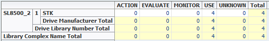
Below is a sample pivot table:
-
There is one column layer on the top edge of the table: Drive Health Indicator with Action, Evaluate, Monitor, Use, Unknown, and Total.
-
There are three row layers on the left edge of the table: Library Complex Name, Library Number, and Drive Manufacturer. The layers are nested from left (outer) to right (inner). In this example, Library Complex Name is the outermost layer, and Drive Manufacturer is the innermost.
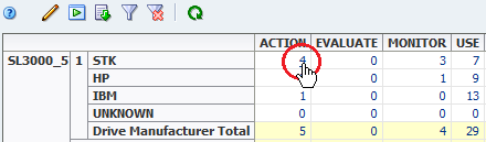
The aggregate counts in each table cell are the result of the filter criteria intrinsic to each table layer, joined by "AND" statements. For example, in the table above the cell at the intersection of the SL8500_1, STK row and USE column has the aggregate count value "4". This value is the result of the following filter criteria:
-
Library Complex Is SL8500_2, AND
-
Library Number Is 1, AND
-
Library Manufacturer Is STK, AND
-
Drive Health Indicator Is USE
The aggregate counts in each pivot table cell are active links. These links provide access to additional details about the items included in the count.
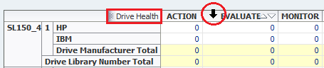
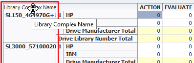
View the Name of a Pivot Table Layer
Display the attribute name for a pivot table layer.
-
Hover over a row or column to view the corresponding attribute name.
The attribute name displays at the top (for columns) or to the left (for rows).
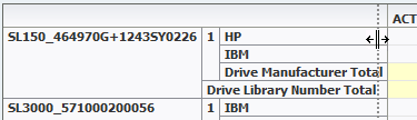
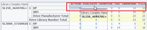
Change the Size of a Column or a Row of a Pivot Table
Adjust the width and height of the columns or rows to better view the data.
-
Hover over the heading border.
-
Click and drag the border. A dotted line appears to indicate the pending size.
-
When the cell is properly sized, release the cursor.
-
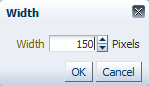
Right-click a heading, and then select Height... or Width...
-
Set the new Pixel size.
-
Click OK.
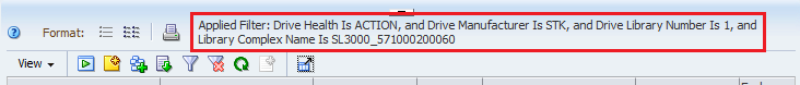
Display Details for an Aggregate Count
Click a link for an aggregate count to view more details about the associated resources.
-
Click the active link of the aggregate count
The associated Overview screen displays with a filter applied that corresponds to the aggregate count.
-
Click any active links on this screen to get to additional information.
Rearrange Pivot Table Layers
Rearrange pivot table layers to better analyze data.
-
Hover over a heading, until the layer's name appears.
-
Click and drag the layer to a new location.
When you release the cursor, the table is reorganized and the aggregate counts in the data cells are re-calculated.
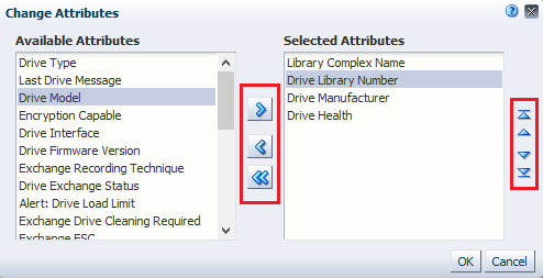
Change Pivot Table Attributes and Order
Choose which attributes to display in the pivot table. Change the order in which they are nested.
-
Click Change Attributes
 in the pivot table toolbar.
 -
Select an attribute (shift- or ctrl-click to select multiples).
Use the left and right arrows to move the attributes between the Available and Selected lists. Use the up and down arrows to order the selected attributes.
Pivot tables can have between two and seven attributes.
-
Verify the attributes you want are in the Selected Attributes list and in the proper order. Click OK.