Modify the Appearance and Arrangement of Graphs
Adjust how graphs display within STA to help analyze data.
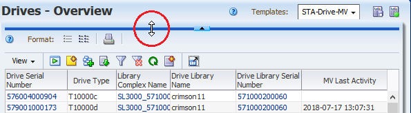
Restore the Graph Area
Some templates and pages do not automatically display the graph area. If clicking the collapse pane icon has no effect, you must manually unhide the graph area.
-
Toggle the collapse pane icon so that it is up
 .
. -
Hover the cursor to the left or right of the icon, then click and drag the bar down.
See also:
Detach a Graph Pane
Detach a pane to view the graph in closer detail.
-
Click Detach Pane
 in the graph's toolbar.
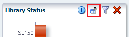
-
To move the detached pane, click and drag the top border.
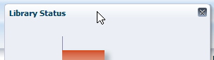
-
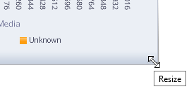
To resize the detached pane, click and drag an edge or corner.
-
To restore the graph pane to its normal position, click Close. If you navigate to another screen, the pane is automatically closed.
Move Graph Panes on an Overview Screen
Rearrange graph panes on an Overview screen to change the order of the graphs.
-
Hover over the top of the graph. The Move Object cursor appears.
-
Click and drag the pane to its new location.
-
Once the pane is near the position you want, release the cursor. The pane snaps into place. You do not need to position it exactly.
Add or Remove a Graph Pane on an Overview Screen
Add or remove graphs in the graph area of an Overview screen.
-
Click Add Graph
 near the top of an Overview screen.
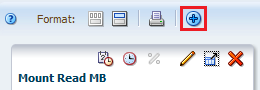
-
STA adds a graph with the default attribute and places it at the end of the graph area. You may need to scroll down to locate it.
-
To adjust the graph, see:
-
To remove the graph, click Remove Pane
 on the graph's toolbar.
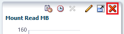
How a Newly Added Graph Displays Data
-
The graph displays the default attribute for the resource type. You can change the attribute to any available attribute for the resource.
-
If the existing graph panes have all been synchronized to the same date range, the new graph uses the synchronized range. Otherwise, the graph uses the system default date range of the previous 30 days.
-
The new graph displays actual values, even if all the existing graphs display percentages.
-
If individual resources have been applied to the existing graphs, the new graph displays the those resources as well.
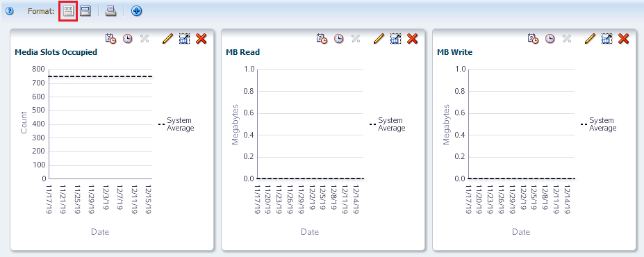
Switch Between Narrow and Wide View
On Overview or Analysis screens, you can display graphs in narrow or wide format.
Narrow view is the default, and it allows side-by-side comparisons. Wide view allows you to see each graph in greater detail.
-
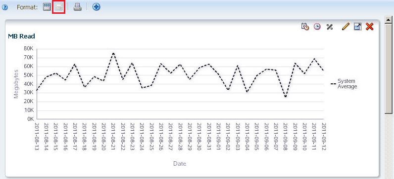
Click Wide View
 on the graphics area toolbar.
The graphs display individually across the width of the screen. Scroll down to view the graphs.
-
To switch back to narrow view, click Narrow View
 in the graphics area toolbar.
The graphs display side-by-side.
Print Graphs
Print all graphs currently displayed.
-
For best results, you might want to display the graphs in Wide View mode. This will allow you to see more detail in the printed graphs.
-
Click Printable Graphs
 on the graphics area toolbar.
 -
A new tab is created in your browser window, showing all graphs in a printable format. Use the browser's print function to send this display to a printer.