Using Push Buttons and Links
This section provides an overview of push buttons and links and discusses how to:
Insert push buttons or links.
Specify type properties for push buttons or links.
Specify label properties for push buttons or links.
Specify use properties for push button or link.
Programmatically change hover text for push buttons or links.
PeopleSoft Pure Internet Architecture supports these features for push button and link controls:
Selecting link style.
Selecting these types of push buttons and links:
External link.
Instant messaging action.
Internal link.
Page anchor.
PeopleCode command.
Process.
Prompt action.
Scroll action.
Secondary page.
Toolbar action.
Selecting these image options:
On mouse over.
When disabled.
After you add a push button or link control to your page, you can define the attributes by opening the Push Button/Hyperlink Properties dialog box.
To insert a push button or link:
Select
Click where you want the upper, left-hand corner of the control to begin.
A push button of small image size appears.
Double-click the push button to access the Push Button/Hyperlink Properties dialog box.
On the Type tab, select whether the control appears as a push button, hyperlink, or action widget.
Select a destination type from the Destination drop-down list box.
Select the record and field names with which you want to associate the push button or link.
Select any of the remaining Type options based on your destination type.
On the Use tab, select the purpose of the control.
Save the page.
Access the Push Button/Hyperlink Properties dialog box.
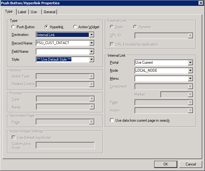
Image: Push Button/Hyperlink Properties dialog box: Type tab
This example illustrates the fields and controls on the Push Button/Hyperlink Properties dialog box: Type tab. You can find definitions for the fields and controls later on this page.
Type Tab
Each destination type that you select enables a different region on the Type tab, enabling you to further define your push button or link. Select one of these values from the Destination drop-down list box:
|
Field or Control |
Definition |
|---|---|
| Type |
Select a type of push button or hyperlink. Options are:
|
| External Link |
Accesses a uniform resource locator (URL). You can select a value from the URL table or use the value of a record field to define the destination. Selecting this option enables the External Link group box. You can choose to have the URL encoded or not by selecting the Encoded by Application check box. Selecting this option applies an external link to your page in the form of a push button or link that accesses a new page, taking the user to the external web site that you designate. To return to the primary page, the user closes the new page. When setting the record and field name, consider these points:
|
| Internal Link |
Accesses a PeopleSoft page. Parameters include the menu path to the page and a check box to specify whether data from the current page should be used in the search dialog box. Selecting this option enables the Internal Link group box. Selecting this option adds an internal link in the form of a push button or link that you can use to access another component or page from within the system or another PeopleSoft database or node. You can even specify the type of action mode to open in for that page. To control the push button or link in PeopleCode, enter the record and names. Like the external link, if you associate a record and field name with this link, the tool tip that appears at runtime draws from the RFT long label for the record field. However, the RFT long label only appears if it is different from the assigned display value of the link. |
| Instant Messaging Action |
Select to add an instant messaging button to the page. Associate the button with a record field that contains entries in the form of <user>@network (such as John@Yahoo). For this purpose, we provide the MCFIMNETWORKS table. The MCFIMDOMAIN field is the source for the instant messaging network providers. This table contains only three network providers: AOL, Yahoo, and SameTime Connect. You should never enter additional networks not already in this table. |
| Page Anchor |
Enables the user to jump to the anchor tag that you designate for a page field on the General tab of the properties dialog box for that field. Selecting this option enables the user to jump from one destination (the link that you assign as the page anchor) to another (the field that you enable as the page anchor) in your page. When you select this option, the page fields that you previously set as page anchors on the General tab of the properties dialog box appear in the Related Control drop-down list box in the Actions group box. You can place as many page anchor buttons or links on the page as necessary. |
| PeopleCode Command |
Associates a record field, so when the user clicks the push button or link, the system runs any FieldChange PeopleCode that is associated with that field. Enter the record and field names. The field must have PeopleCode in the FieldChange event. Important! The combination of record and field names associated with the action widget must be 28 characters or less. |
| Process |
Runs processes that you set up previously with PeopleSoft Process Scheduler. Associate process push buttons with a specific process definition; the process is run each time that a user clicks the button. Selecting this value enables the Process group box, where you can specify the type and name of the process that you want to run. |
| Prompt Action |
Displays a prompt dialog box for a specific control field. Adds a custom prompt button or link next to a field on the page in place of the standard prompt that is associated with that field. For example, you might want the prompt to read Find an Airport Code. Selecting this value enables the Actions group box. In the Related Control drop-down list box, select the field that you want to associate with the prompt. The systems sets the action type, Prompt, automatically. Set the text label properties for the link on the Label tab. |
| Scroll Action |
Represents certain actions that a user can perform on a grid, scroll area, and scroll bar, such as bottom, top, insert row, and so on. Use to provide action buttons for the grid, scroll area, or scroll bar in areas outside of that control, such as at the bottom of the page or outside the borders of the control. Selecting this value enables the Actions group box, where you can specify the action type and related control. The Action Type field enables you to select the action to be performed in the specific level. The level is specified in the Related Control field. Specify one of the following scroll actions: Bottom, Next, Previous, Row Delete, Row Insert, and Top. For example, if you want a user to be able to move through a page at runtime, set the action type to Next or Previous and specify which scroll area you want those actions to control. |
| Secondary Page |
Access an existing secondary page. After you design a secondary page, you must associate it with a control on the primary page. The secondary page push button or link is the starting point for the user of that secondary page. Selecting this option enables the Secondary Page group box, where you can select the name of the secondary page that you want to associate with the push button or link. |
| Toolbar Action |
Represents the various toolbar actions available to the user. A user can perform several actions on a page, such as save, display the next page in a group, correction mode, and so on. These normally reside on the toolbar at the bottom of each PeopleSoft Pure Internet Architecture page. Use this type of push button or link for placing save, next in list, or other toolbar functions on the page. Selecting this value enables the Actions group box, where you can specify the action type: Add, Correction, Next in List, Next in Worklist, Next Page, Notify, Previous in List, Previous in Worklist, Previous Page, Refresh, Return to List, Save, Update/Display, Update/Display All, or View Worklist. Note: (Fluid) Do not select the Pin action type. It should not be used, and it will be removed in a future update. Note: (Fluid) The following options appearing in the Action Type list for a Destination of Toolbar Action should not be selected. These options are reserved for internal use until a future release: Back, Clear Prompt, Home, IN Prompt, Logout, and Nav Bar. |
External Link Group Box
In this group box, select Dynamic or Static and enter the URL ID, if necessary. Select a value from the URL Maintenance table of a record field to define the destination. For example, a derived record field might be used to set the destination value dynamically at runtime. The value of the derived record field is placed in the <HREF> tag of the HTML.
See URL Maintenance.
Internal Link
|
Field or Control |
Definition |
|---|---|
| Portal |
Select the portal to which you want the internal link to point. Use Current is the default. Valid values include all of the values in the PORTAL_NAME column of the PSPRDMDEFN table. |
| Node |
Select the PeopleSoft database to which you want the internal link to point. Local stands for the node that is marked as the default only. If the content reference you need is registered with a non-default local node, make sure you choose the exact same value from this drop-down list box. Valid values include all of the values in the MSGNODENAME column of the PSMSGNODEDEFN table. If you select a node other than Local, the Use data from current page in search check box is deselected. The node that you select should match the node for the destination component in the Registration Wizard or on the Content Ref Administration page. Select . Click the Edit link to access the Content Ref Administration page. |
| Menu |
Select the menu name in which the destination page is contained. |
| Component |
Select the component in which the destination page is contained. These values depend on the menu that you select. |
| Market |
Select the market of the destination component. |
| Page |
Select the page that should be active. These values depend on the component that you select. |
| Action |
Select the action mode in which you want the page to begin. |
| Use data from current page in search |
Select if you want data from the current page to be used in the search dialog box. This option ensures that the new page inherits the proper keys from the context of the current page. The process is almost identical to the Transfer( ) PeopleCode function, and it performs a similar function. If this check box is selected, the system discards the existing keylist; builds a new keylist from the current component buffer using the context of the field (when a choice exists between rows in a scroll area); and uses this keylist to start the new component. If this option is deselected, the system uses the existing keylist in the normal manner. |
Action Widget Settings Group Box
The default usage for the action widget is to add a control to a page that when clicked displays a drop-down menu, containing the related actions associated with that widget. However, this widget can also be used to trigger custom JavaScript.
|
Field or Control |
Definition |
|---|---|
| Use Default JavaScript |
Select to make the Custom JavaScript edit box read-only and populate the edit box with the with the default JavaScript, RelatedActionJS. If you want to revert the field to the default, just select this check box and the system repopulates the field with the default value. |
| Custom JavaScript |
When enabled, enter the name of the custom JavaScript to execute. |
This section discusses how to:
Specify a text label.
Specify an image label.
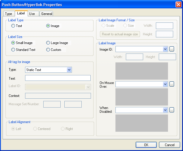
Image: Push Button/Hyperlink Properties dialog box: Label tab
This example illustrates the fields and controls on the Push Button/Hyperlink Properties dialog box: Label tab. You can find definitions for the fields and controls later on this page.
Specifying a Text Label
To specify a text label for a push button or link:
Note: For an action widget, only a Label Type of Text is valid.
Access the Push Button/Hyperlink Properties dialog box.
Select the Label tab.
In the Type group box, select Text.
Select the size.
Standard push buttons can be one of three sizes, depending on what kind of text or image you want to display on the button face.
Field or Control
Definition
Small Image Creates toolbar-sized buttons that handles small 16 × 16 pixel images.
Large Image Handles 32 × 32 pixel images.
Standard Text Matches the Microsoft standard dimensions for text push buttons.
Custom Select if none of these sizes meets your needs. When you click OK, the push button displays selection handles that you can use to resize it.
Specify the type of label text.
Depending on the destination type that you selected, the values in the Type drop-down list box differ.
Field or Control
Definition
Message Catalog Select to reference a message that exists in the message catalog. Enter the message set and number. Message catalog items are all translatable.
RFT Short (record field table short)RFTsetting button/link labels Select to label the push button with the short name for the field from a record definition. The RFT stores attributes for fields in a record definition. Use this option only if you specified a record definition and field name on the Type tab in the Push Button/Hyperlink Properties dialog box. The RFT short name appears on the push button when you click OK and return to the page. Select the label ID if you do not want to use the default label if more than one label has been set for the record field.
RFT Long (record field table long) Select to label the push button with the long name for the field. Use this option only if you specified a record definition and field name on the Type tab in the Push Button/Hyperlink Properties dialog box. The RFT long name appears on the push button when you click OK and return to the page. Select a different label ID if you do not want the default label if more than one label has been set for the record field.
The system uses the RFT long label as the tool tip at runtime for links if it is different from the assigned display value of the link and it is not null. If more than one label is stored for the record field, you can select an alternate tool tip from the Label ID drop-down list box.
Static Text Select to enter the text to appear on the label.
URL Description Select if you selected External Link as the destination on the Type tab. Select the style from the drop-down list box.
Select the alignment.
This option is only available if you selected Hyperlink for the type on the Type tab. Push button text is automatically centered for controls that appear as push buttons. Push buttons with text and images are automatically center-aligned when used in grids.
Note: Some browsers do not support customized push buttons.
See Troubleshooting Browser Limitations available on the My Oracle Support website: support.oracle.com.
Specifying an Image Label
To specify an image label for your push button or link:
Access the Push Button/Hyperlink Properties dialog box.
Select the Label tab.
Select Image for the type.
Specify the size.
If you select Custom, the Image/Format Size group box becomes available.
Field or Control
Definition
Scale Select to adjust the width and height as percentages.
Size Select to set the image size by altering the width and height in pixels.
Reset to actual image size Resizes the image according to its natural size. That is, the image size is not manipulated by custom width or height values.
Specify the image ID.
Select one of the predefined image definitions or click the Browse button to view push button images.
In the Alt tag for image group box, specify the hover text type.
Field or Control
Definition
Message Catalog Select to reference a message that exists in the message catalog. Enter the message set and number. Message catalog items are all translatable.
RFT Long (record field table long) Select to use the long name of the record field as the hover text. Use this option only if you specified a record definition and field name on the Type tab in the Push Button/Hyperlink Properties dialog box.
The system uses the RFT long label as the tool tip at runtime for links if it is different from the assigned display value of the link and it is not null. If more than one label is stored for the record field, you can select alternate hover text from the Label ID drop-down list box.
RFT Short (record field table short) Select to use the short name of the field as the hover text. Use this option only if you specified a record definition and field name on the Type tab in the Push Button/Hyperlink Properties dialog box. If more than one label is stored for the record field, you can select alternate hover text from the Label ID drop-down list box.
Static Text Select to enter the text that will appear on the label.
(Optional) Select the image that will appear on a mouse over.
For example, you might want to highlight an image so that users can easily see which option they are selecting.
(Optional) Select an image that will appear when the button is disabled.
Access the Push Button/Hyperlink Properties dialog box and click the Use tab.
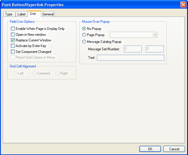
Image: Push Button/Hyperlink Properties dialog box: Use tab
This example illustrates the fields and controls on the Push Button/Hyperlink Properties dialog box: Use tab. You can find definitions for the fields and controls later on this page.
Field Use Options
This table describes the Field Use options:
|
Field or Control |
Definition |
|---|---|
| Enable When Page is Display Only |
Select to make the push button or link available to users who have display-only access to this page. Display-only access is set in the permission list properties. |
| Open in New Window |
Select to open the target content page in a new browser window. This option is enabled when the destination type is either Internal Link or External Link. This option and Replace Current Window are mutually exclusive. |
| Replace Current Window |
Select to replace the existing content in the target area. This option is enabled when the destination type is either Internal Link or External Link. This option and Open in New window are mutually exclusive. |
| Activate by Enter Key |
Select to activate the push button or link when the user presses the Enter key. You can have more than one push button or link with this feature set per page, as long as only one of these fields is enabled at runtime. Otherwise, only one push button or link with this attribute enabled is allowed per page. This feature is available for all control types except external links. When using Activate by Enter Key in a scroll area or grid with an occurs count greater than one, the Enter key triggers the first row only. Note that on a secondary page with the standard OK and Cancel buttons enabled, the Enter key activates the OK button rather than a custom button or link. |
| Set Component Changed |
Enables the system to issue a save warning for the field if the user changes the value and attempts to exit the page before saving. This setting reinforces current save warning behavior. This option is set by default for edit boxes, long edit boxes, radio buttons, check boxes, and drop-down list boxes. Deselecting this option overrides the save warning that normally appears to users. The user will not see a save warning after changing the value of the field and attempting to exit the page. An example of when this might be necessary is for a drop-down list box that includes links to another page. If the user selects a link from this field to transfer to another page but has not made any other changes to the page, then the system is not required to issue a save warning. By deselecting the Set Component Changed flag, you ensure that no save warning message is issued for this field. This option works for fields associated with a derived work field or database record field. For the push button/hyperlink control, the default setting is deselected instead of selected, unlike with other page controls. |
| Persist Grid Column in Menu |
Select to include the field as a list box item in the persistent search results grid. You must also select the Persist in Menu grid property for the grid that contains the field. This property is disabled on check boxes and radio buttons. You must enable recent search results caching at the system level in the web profile for this property to take effect. Note: This property applies only to fields that appear in grids on pages that are used as custom, application-specific search pages. |
Grid Cell Alignment
Push buttons with images or text are center-aligned automatically when in a grid. Otherwise, select Left, Centered, or Right.
Note: Grid cell alignment properties are only enabled when the control is contained within a grid and the control type is configured as a text hyperlink.
Mouse Over Popup
Select the Display Only check box to enable the Mouse Over Popup options.
Note: The mouse over option is intended for hyperlinks and display-only edit box fields, not for Push Buttons.
Select from these mouse over pop-up options:
|
Field or Control |
Definition |
|---|---|
| No Popup |
Select to have no pop-up page. This value is the default. |
| Page Popup |
Select to associate this control with a pop-up page that you select from the drop-down list box. Only pop-up pages appear in the Page Popup drop-down list box. |
| Message Catalog Popup |
Select to associate this control with a system-defined message pop-up page that displays a message from the Message Catalog. You can design and implement Message Catalog pop-up pages to be context sensitive. When you select this option, the Message Set/Number fields are enabled. See PeopleBooks and the Online PeopleSoft Library, Managing the PeopleSoft Online Library and PeopleBooks Integrating Context Sensitivity. See Message Catalog. |
| Message Set/Number |
Enter the message set and message number of the message. These fields are enabled when you select Message Catalog Popup. |
| Text |
Displays the message text of the message set/number that you select. This field is display-only. |
Note: Attempts to make a push button/hyperlink editable at runtime when it has a mouse over pop-up page associated with it, for example, using PeopleCode, will fail.
Hover text or mouse over text enables you to display additional or supplemental information about a button or link. Under certain circumstances, you might want to vary the hover text based on the context of application data on the page.
You can alter hover text by using the PeopleCode HoverText Field property. This property sets the hover text for any buttons or links associated with the field. The maximum length of hover text is 100 characters. You can use the Message Catalog to store hover text.
Example: Changing Hover Text Programmatically
To set hover text for
a push button or link at runtime, use PeopleCode to define the HoverText property
for a field definition.
QE_ABSENCE_HIST.QE_ABSENCE_TYPE.HoverText
= MsgGetText(95, 5037, "Personalize Layout");
Note: The HoverText Field
class property is available for the push button/hyperlink page control
only.