Understanding Navigation Collections
Navigation collections provide a flexible tool for building alternative groupings of the contents stored in your portal registry. These alternative groupings of links to portal content can then be deployed to different users or groups of users, creating navigation that specifically addresses your users' business needs.
The links in navigation collections provide an alternate method of accessing content in the portal registry. A navigation collection is a published compilation of these links. A link in a navigation collection is a pointer to a content reference or folder reference in the portal registry; however, it does not store the contents of the content reference or folder reference. Navigation collection links store only the references needed to construct a URL at runtime to redirect output to the original content reference or folder reference. These references include the portal link, folder reference link, or content reference link.
When you define and save a navigation collection, the system automatically stores it in the hidden Navigation Collections folder under Portal Objects in the portal registry.
After being defined, a navigation collection can be published as a custom navigation page or as a navigation pagelet for use on a homepage, dashboard page, or WorkCenter page. In addition, navigation collections can be accessed through a tile that has been defined to display the navigation collection and links in an activity guide.
When you publish navigation collections, you can choose to publish navigation collections as public content. If you do not choose to provide public access to a navigation collection, you can choose one of these two options for setting security access to published navigation collections:
A security synchronization process that will apply content reference and folder security as it is defined in the portal registry to the content reference definition for published navigation pages or pagelets.
A manual process that entails you configuring the security access to published navigation pages and pagelets.
Note: Public access is allowed by default.
Navigation collections enable you to distribute the creation and maintenance of collections to subject matter experts in your organization, such as functional administrators and business analysts. The subject matter experts creating navigation collections should understand the content that their user communities need to access on a frequent basis. They should also know where to find links to this content, and whether the content is accessed by portal navigation or external URLs.
Navigation collections can contain these elements:
Links to existing, nonhidden content references in the portal registry.
Links to existing, nonhidden folders in the portal registry.
The navigation collection will contain all contents of the menu folder and its subfolders.
Links to remote, component-based content references.
Note: Remote links are supported only on PeopleSoft Interaction Hub systems with unified navigation configured to include the remote content provider system.
Custom (user-defined) folders that can be used to group combinations of any of these elements, including other user-defined folders.
Navigation Collection Published as a Navigation Page
Image: Navigation collection published as a custom navigation page
The following example shows a navigation collection that is published as a custom navigation page:
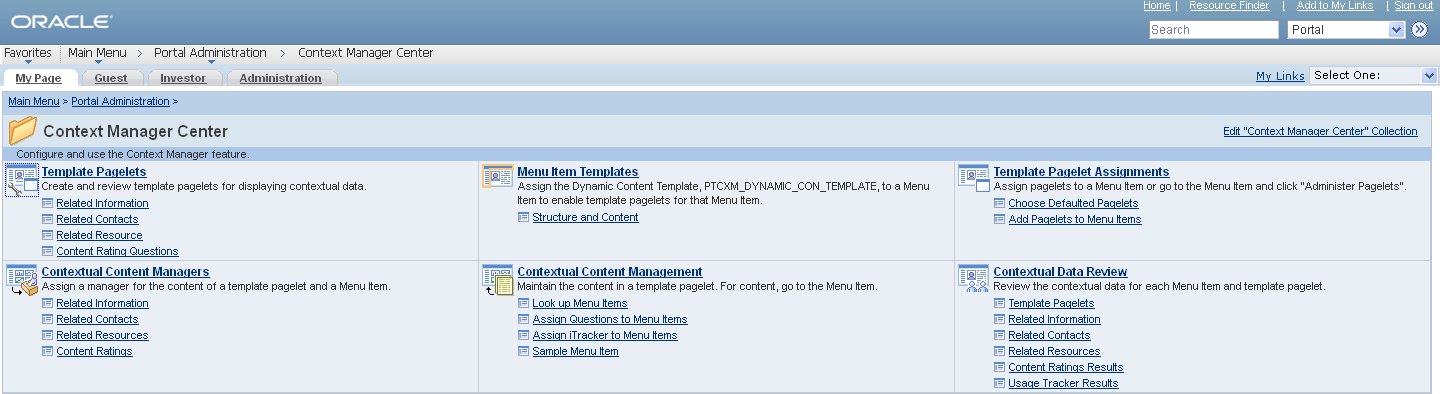
Top-level folders in the navigation collection appear as bold and linked section headings that organize the folders and content references they contain, as shown in these examples. However, the appearance of your published navigation collections depends on the assigned style sheet. The assigned style sheet must use style classes contained in the PTPP_SCSTYLEDEF style class definition.
Click any folder link to access another navigation page that contains any folders and content references nested in the parent folder.
Note: Click the Edit <collection name> Collection link in the upper right corner of the navigation page to access the navigation collection definition on the Maintain Collection page. This link appears only for users who can access the navigation collection definition component.
Navigation Collection Published as a Navigation Pagelet
Image: Navigation collection published as a navigation pagelet
The following example shows a navigation collection that is published as a navigation pagelet:
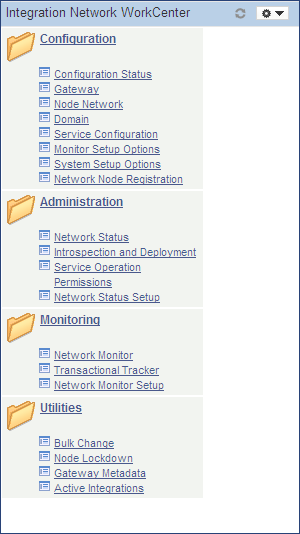
Folders and content references work in much the same way as they do for the published navigation page.
PeopleTools provides several features that combined together allow you to display what are referred to as “fluid navigation collections.” These features allow you to launch navigation collections in a fluid activity guide wrapper. You can choose to re-present existing navigation collections consisting entirely of classic content references as well as add fluid content references to new or existing navigation collections. Navigation collections are created and maintained exactly the same way that they always have been. After a navigation collection has been defined, you can determine whether to launch that navigation collection inside a fluid wrapper as a “fluid navigation collection.” These fluid navigation collections are another way that you can create WorkCenter-like functionality in fluid applications.
The PeopleTools features that support fluid navigation collections include:
The activity guide framework, which is the wrapper used to display the navigation collection links and target content.
The PTPP_NAVCOLL activity guide data source and supporting templates.
Tile Wizard, which can be used to create a tile definition to launch the fluid navigation collection. (See Step 2: Data Source Information - Navigation Collection for more information.)
There are two ways to launch a fluid navigation collection from a tile:
In an optimized, non-guided, non-sequential activity guide (using the PTPPNAVCOL activity guide template).
In a non-optimized, non-guided, non-sequential activity guide (using the PTPPNONOPT activity guide template).
In addition, you can create a NavBar tile from the navigation collection to display the navigation collection links within the NavBar.
Note: By design, on a smart phone, a fluid navigation collection is displayed as the links only (that is, what is displayed in the left panel on other devices). Also by default, clicking a link transfers you to the target component and exits the fluid navigation collection. You can return to the navigation collection using the Back button. To override this behavior, you can add the JumpPage=N query string parameter to the URL that launches the navigation collection.
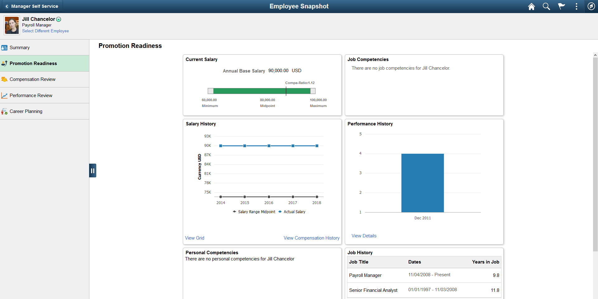
Image: Navigation collection displayed in an optimized activity guide
The following example shows the Employee Snapshot navigation collection displayed in an optimized activity guidė. With an optimized activity guide, folders and navigation links are displayed in the left panel.
Guidelines for Creating Fluid Navigation Collections
Note the following guidelines and limitations for fluid navigation collections:
While classic content references can be included in fluid navigation collections, there are differences when these classic pages are viewed on smartphones. The text and content of the classic page will be displayed at a readable size. However, these classic pages will often exhibit other usability issues on smartphones since the fixed page layout may still require horizontal scrolling to view additional fields on the page.
If the navigation collection is to be rendered in the optimized format, then any fluid components must adhere to the guidelines for optimized activity guides. See Guidelines and Limitations for Using Fluid Components in Activity Guides for more information.
-
If the link target is a fluid component that employs an internal two-panel construct (that is, it either includes a Side Page 1 page, was built from the PeopleTools 8.54 PSL_TWOPANEL layout page, or was designed with an internal left panel similar to PSL_TWOPANEL), you must employ one of these methodologies to accommodate this link target:
Specify either the Replace Window option or the Open in a new window option for the link.
Enable the slide-out left panel on the fluid navigation collection. See Left Panel Collision Handling with Slide-out Left Panels for more information.
Note: This accommodation is not required for a non-optimized rendering of the navigation collection.
-
If the link target is a fluid component that opens the component search page (that is, the search type is not set to None), specify either the Replace Window option or the Open in a new window option. Alternatively, create a translator component to handle search initialization. See Creating a Translator Component to Handle Search Initialization for more information.
-
If the link target is a fluid wrapper component—that is, a master/detail component, a fluid activity guide, or another fluid navigation collection—specify either the Replace Window option or the Open in a new window option.
Important! A fluid wrapper component can never be displayed inside another fluid wrapper component.
By default, the first component in the navigation collection is opened automatically when the navigation collection is launched. Therefore, the first component should be the most frequently used component and ideally should be quick to load. More importantly, the first component cannot be a fluid component with a two-panel layout.
For fluid dashboards, edit the content reference definition for the dashboard link (the location of the dashboard in the menu structure) to remove the NAVTOPWIN content reference attribute.
For classic dashboards, specify either the Replace Window option or the Open in a new window option for the dashboard item within the navigation collection definition.
For classic WorkCenters, specify the Replace Window option (or the Open in a new window option).
For a classic component that has been configured with the Related Content frame, specify the Open in a new window option.
Fluid navigation collections and activity guides do not support conditional navigation.
The images that you define for your navigation collections are published and displayed on navigation collection pages. You can associate images with navigation collections themselves, as well as with navigation collection folders and content references. You can define these images at the system, registry, source, and individual navigation collection levels.
Image: Example of navigation collection images
The following navigation collection illustrates the different ways in which images can be used:
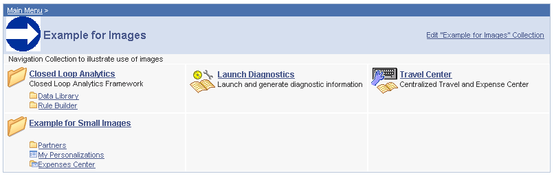
In the sample navigation collection, suppose that the following images have been defined for the different image types:
|
Field or Control |
Definition |
|---|---|
 |
This image was defined as the collection image for this specific navigation collection. |
 |
This image was defined as the default large folder image on the System Options page, and was not overridden at the source reference, registry, or navigation collection level. Large folder images appear for folders at the top level of a navigation collection publication. |
 |
This image was defined as the content image in the navigation collection definition. Large content images appear for content references at the top level of a navigation collection publication. |
 |
This image represents a navigation collection that was added to this navigation collection. This image was selected as the collection image in the referenced navigation collection definition, and was not overridden in this navigation collection definition. Large collection images appear for navigation collections at the top level of a navigation collection publication. |
 |
This image was defined as the small folder image. Small folder images appear for folders nested within top-level folders on a navigation collection publication. |
 |
This image was defined as the small content image. Small content images appear for content references nested within top-level folders of a navigation collection publication. |
 |
This image was defined as the small collection image. Small collection images appear for navigation collections nested within top-level folders of a navigation collection publication. |
While large (parent) images can be set at the system or registry default levels and overridden with unique images defined at the source reference or navigation collection levels, small (child) images can be defined only at the system and registry default levels. This means that a small image displayed on navigation collection publications will always be the default small image defined at the system or registry level.
If the navigation collection content, folder, or navigation collection reference for which a small image is displayed has a unique image defined at the source reference or navigation collection level, this unique large image does not appear until the element is accessed as a top-level or parent-level element on a navigation collection page.
For example, while the Expenses Center is displayed with its default small image, when you access the Example for Small Images navigation page, the Expenses Center appears with its unique large image.