Applying Branding to Other Objects
This topic discusses how to:
Brand classic components.
Maintain pagelet branding attributes.
Important! The Component Branding page can be used with classic components only. If you attempt to add a value for a fluid component, an error message is displayed.
Use the Component Branding page to specify custom style sheet objects and JavaScript objects in addition to those specified by the component’s developer in Application Designer.
Important! If the current component has an associated component interface definition, then modifying the component definition by adding, deleting, or reordering style sheets or JavaScript objects will invalidate any associated component interface definition. A warning message will be issued when you save such a component on the Component Branding page. Therefore, you must also open and re-validate the associated component interface definitions in Application Designer.
Navigation
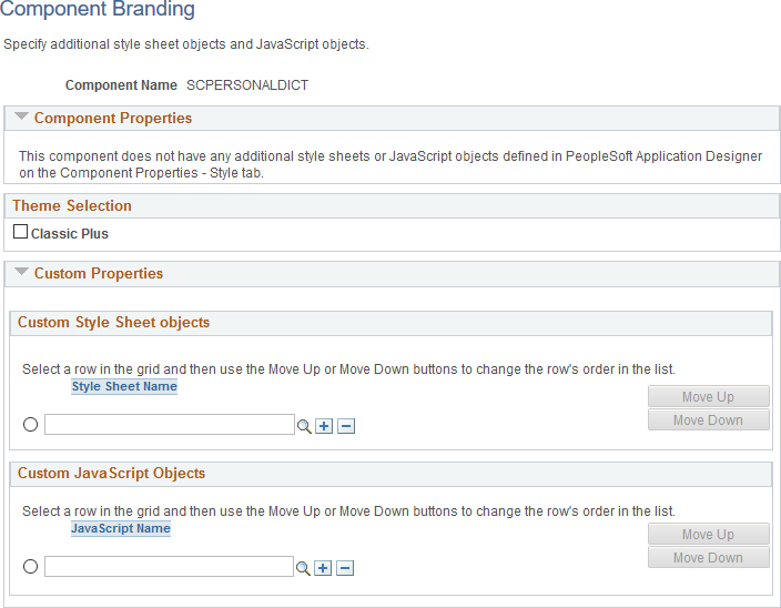
Image: Component Branding Page
This example illustrates the fields and controls on the Component Branding page.
|
Field or Control |
Definition |
|---|---|
| Component Name |
Displays the name of the component. |
| Component Properties |
The Component Properties group box displays the additional style sheet objects and JavaScript objects specified by the component’s developer in Application Designer. These values are display-only, and cannot be modified here. |
| Theme Selection - Classic Plus |
This option is selected when a classic component has been configured to display with fluid-like styling (which is also referred to as “classic plus”). For more information, see PeopleTools Components Delivered as Classic Plus. Note: While this option can be selected or deselected on this page, the best practice is to set the option on the Style tab of the Component Properties dialog box in Application Designer only after reworking each page in the component for fluid-like styling. |
| Custom Properties |
The Custom Properties group box displays the additional, custom style sheet objects and JavaScript objects specified by the portal administrator through the use of this Component Branding page. |
| Style Sheet Name |
Specify zero, one, or more custom style sheets to be loaded for this component. |
| JavaScript Name |
Specify zero, one, or more custom JavaScript objects to be loaded for this component. Important! JavaScript objects are stored as HTML objects in the database. The lookup does not differentiate between standard HTML objects and JavaScript objects. Therefore, it is your responsibility to ensure that you have selected valid JavaScript to be loaded with a component. |
| Move UpMove Down |
Select the row designating a style sheet or a JavaScript object, and then use the Move Up and Move Down buttons to change the order in which the objects are loaded with the component. |
Use the Pagelet Branding page to specify pagelet title bar, border, and layout options.
Navigation
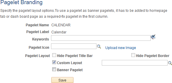
Image: Pagelet Branding Page
This example illustrates the fields and controls on the Pagelet Branding page.
Note: If a pagelet is already in use on a homepage tab or dashboard page, clear the application server cache so that these branding changes become visible to all users. Alternatively, for testing purposes, you can remove the pagelet from the homepage or dashboard page and then add it back to view the changes on a per-user basis.
|
Field or Control |
Definition |
|---|---|
| Pagelet Name |
Displays the ID of the selected pagelet. |
| Pagelet Label |
Displays the label of the selected pagelet. |
| Keywords |
Enter a keyword or keyword phrase to be stored as a content reference attribute. See Searching for and Importing Pagelets and Tiles for more information on how keywords are used to search for pagelet definitions. Note: Two content reference attributes are created: KEYWORD (to store the keywords in the base language) and KEYWORD_LNG (to store the keywords in the current session language). |
| Pagelet Icon |
Displays the ID of the pagelet icon if one has been selected for this pagelet. If an icon has been selected, then the image itself displays below this field. Note: Oracle recommends image sizes from 16x16 pixels to 32x32 pixels for use as pagelet icons. Click the Look Up Pagelet Icon button to select an image from the database. Clear the pagelet icon field to display a pagelet without an icon. The PT_PORTAL_PGLT_HDR_IMG content reference attribute is created to store the image ID. |
| Upload new image |
Click this link to access the Add Image Object page to upload a new image file. |
| Hide Pagelet Title Bar |
Select this option to hide the pagelet title bar. Hiding the title bar hides the pagelet’s label and all user interaction buttons to personalize, minimize, and remove the pagelet, or to get pagelet help. Note: When this option is selected for a pagelet, users will not be able to use drag-and-drop to reposition the pagelet. The Personalize Layout page must be used instead. The PORTAL_HP_COMPONENT content reference attribute is created to store this setting. |
| Hide Pagelet Border |
Select this option to hide the pagelet’s borders. The PORTAL_HP_COMPONENT content reference attribute is created to store this setting. |
| Custom Layout |
Select the Custom Layout check box to enable selection of a custom HTML layout object for this pagelet. Once this check box is selected, an additional unlabeled field and a lookup button are revealed allowing you to select an HTML object from the database. Note: When you select the Custom Layout check box, both the Hide Pagelet Title Bar and Hide Pagelet Border check boxes are cleared (if selected) and disabled. If this check box is itself cleared, then these check boxes are re-enabled; however, their former settings are not restored. |
| Banner Pagelet |
Select this option to identify this pagelet as one that can be used as a banner pagelet. Note: To use a pagelet as a banner pagelet, it has to be added to a homepage tab or dashboard page as a required-fixed pagelet in the first column. The PORTAL_BANNER_PGLT content reference attribute is created to store this setting. |