Setting Component Properties
This section describes the properties you can set for components.
To open the Component Properties dialog box:
Open the component definition.
Select
The Component Properties dialog box appears with the General tab active.
Access the Component Properties dialog box.
|
Field or Control |
Definition |
|---|---|
| Description |
Enter a descriptive name for the component. |
| Owner ID |
Select the application to which this component belongs. This list is helpful to identify the applications that are associated with the component during the application development phase. |
| Last Updated |
View the date and time of the last modification made to the component and the name of the user who made the modification. |
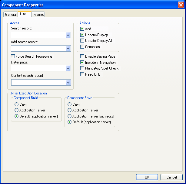
Access the Component Properties dialog box and select the Use tab.
Image: Component Properties dialog box: Use tab
This example illustrates the fields and controls on the Component Properties dialog box: Use tab. You can find definitions for the fields and controls later on this page.
Access
|
Field or Control |
Definition |
|---|---|
| Search record |
Specify the search record for this component. |
| Add search record |
Specify if you want a different search record specifically for add actions. For example, if you selected the auto-numbering option for employee IDs (EMPLID), do not include EMPLID in the search record. Likewise, you might want to create special security views for add actions that limit the rows that users can add based on specific search criteria. The system default is the standard search record if you do not specify an add search record. |
| Force Search Processing |
Select to always run search logic (SearchInit PeopleCode) for this component. The default is deselected. Note: If you select this option, all persistent search functionality for the component is disabled, regardless of system settings. |
| Detail page |
No longer used in PeopleSoft applications. This option appears for upgrade purposes only. |
| Context search record |
Specify the record that defines the service parameters that you must map for PeopleSoft component URL-related content services or content reference service types. The system uses the context search record only when no key fields are defined for the primary search record and only in a related content configuration. |
Note: To see a subset of search records, type a few characters first. The drop-down list box is populated with a list of all record definitions with names that begin with those characters, thus reducing access time and enabling you to find specific records faster.
Actions
|
Field or Control |
Definition |
|---|---|
| Add |
Select to add a new high-level key, such as a new employee ID or customer. Except in the case of effective dating, use Add to insert a new current row or to update future rows. |
| Update/Display |
Select to update existing rows only. |
| Update/Display All |
Select to update current and future rows in an effective-dated record. Use only with effective-dated records. Do not use these actions unless the main record that is associated with the page definitions is effective dated. This information is translated to include history at runtime. |
| Correction |
Select to update any rows (history, current, and future) in an effective-dated record. Use only with effective-dated records. This information is translated to correct history at runtime. |
| Disable Saving Page |
Select when you want
to hide the Save button in the toolbar and disable the Alt+1 (Save) hot key. Selecting this option prevents users from being
prompted to save when exiting a page. However, it does not prevent
using PeopleCode to save a page with the |
| Include in Navigation |
Select to include the component in the menu navigation at runtime. The default is selected. If you do not want the component included, deselect the check box. |
| Mandatory Spell Check |
Select to ensure that spell check is run on all eligible spell check enabled fields in the component when a user saves the page. A field is eligible if it has been changed (or its ReEdit flag has been set) and it has not already been manually spell checked since it was last changed. Note: Spell check is not currently supported in fluid applications. |
| Read Only |
Select to have the component run against the standby database, which is used in systems where Oracle Golden Gate or Oracle Active Data Guard have been configured. For more information, see Configuring Read-Only Components. |
Note: If you must add a new high-level key, such as a new employee number or customer, select both Add and Update/Display. If you are adding information to an existing high-level key, such as adding education data for an employee, select only Update/Display. You are not adding a new employee ID; it already exists on the database.
Three-Tier Execution Location
This section applies only to Windows client applications.
To partition application processing between the client and the application server, you must define units that, as a whole, run in one location or the other. We call these units processing groups. Processing groups can encompass one or more PeopleCode events.
|
Field or Control |
Definition |
|---|---|
| Component Build |
Specify where you want all processing to occur after the key list of a page is selected and before the user can interact with the page. Processing includes building component buffers and running many types of PeopleCode. |
| Component Save |
Specify where you want all processing to occur after the user saves the component and SaveEdit PeopleCode validations have succeeded. Processing includes SavePreChange, WorkFlow, SavePostChange PeopleCode, and updates to the database. |
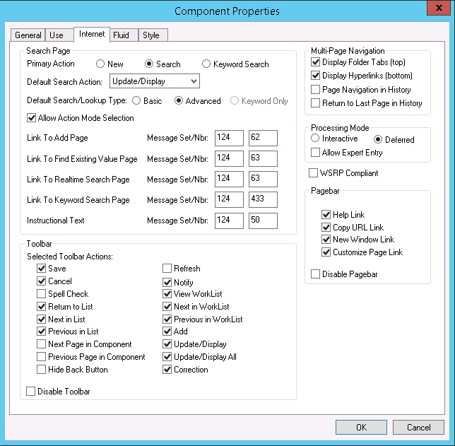
Access the Component Properties dialog box and select the Internet tab.
Image: Component Properties dialog box: Internet tab
This example illustrates the fields and controls on the Component Properties dialog box: Use tab. You can find definitions for the fields and controls later on this page.
Search Page
|
Field or Control |
Definition |
|---|---|
| Primary Action |
Select the default mode by which the user accesses the component. Select New to access the component in Add mode. Select Search to access the component in the mode that is specified in the Default Search Action field. Select Keyword Search to access the component using the Keyword Search page. The Keyword Search page is available only if you have configured the PeopleSoft Search Framework and mapped the component to a search definition. See Working with Search Pages. Specify where you want all processing to occur after the key of a page is selected and before the user can interact with the page. Processing includes building component buffers and running many types of PeopleCode. |
| Default Search Action |
Select from a list of the actions that you set in the Actions group box on the Use tab of the Components Properties dialog box. If you set only one action, this drop-down list box provides that choice as the default. The default search action determines the default that users see, but they can select another option from the toolbar at runtime. |
| Default Search/Lookup Type |
Specify the type of search or lookup which appears by default when users access the search page and lookup pages associated with the component. Select Basic display the Basic search page by default. The Basic search page provides access to a list of search key and alternate search key fields from which the user can choose one field to search. You should select Basic as the default search type for new users because a basic search page is easier to use than other types of search pages. Select Advanced to display the Advanced search page by default. The Advanced search page provide access to all search key and alternate search key fields simultaneously. You should select Advanced as the default search type for power users because an advanced search page enables complex searches. Select Keyword Only to display just the Keyword Search page by default. The Keyword Search page is availably only if you have configured the PeopleSoft Search Framework and mapped the component to a search definition. |
| Allow Action Mode Selection |
Select to display the Include History and Correct History check boxes on a search page. If a user selects Include History on a search page, the page appears in Update/Display All mode. If a user selects Correct History, the page appears in Correction mode. However, both of these check boxes appear only on the search page if Update/Display All and Correction were selected as actions in the Use properties for the component and the user has security access to the modes. This check box is selected by default. |
| Link to Add Page |
Enter the message set and number that stores the text that comprises the link which users click to access the standard add page. |
| Link to Find Existing Value Page |
Enter the message set and number that stores the text that comprises the link which users click to access the standard search page. |
| Link to Realtime Search Page |
Enter the message set and number that stores the text that comprises the link which users click to access the Realtime Search page. Because Realtime search functionality is disabled by default, these values are the same as the values associated with the Link to Find Existing Value Page. However, if you enable Keyword Search, you can enter different values so that the link text accurately indicates the type of search page that users access via the link. |
| Link to Keyword Search Page |
Enter the message set and number that stores the text that comprises the link which users click to access the Keyword Search page, which appears only when Keyword Search is enabled for the component. |
| Instructional Text |
You set this option to display the Find an Existing Value heading on the search page. You can change the default message or redirect the component to use another message that is more appropriate for your use. |
Toolbar
Select the toolbar actions that you want to appear on the component pages. When you select a check box, that item appears as a toolbar button at the base of the component at runtime. All toolbar actions are set to display by default with the exception of Next Page in Component , Previous Page in Component, and Notify. Note that the default settings for the Action and Save buttons are affected by settings on the Use tab of the Component Properties dialog box.
Disabling any of the toolbar options also disables the hot key for that option in the PeopleSoft Pure Internet Architecture.
|
Field or Control |
Definition |
|---|---|
| Save |
Adds a Save, OK, or Apply button to the toolbar, depending on the page type. |
| Cancel |
For modal components only. Deselecting this check box removes the Cancel button from the toolbar. |
| Spell Check |
Runs spell check for all spell check-enabled fields in the component, regardless of whether any changes were made to the field. Note: Spell check is not currently supported in fluid applications. |
| Return to List |
Returns users to the search page. |
| Next in List and Previous in List |
Populates the page with the next or previous row of data from the database as shown on the Search page. |
| Next Page in Component and Previous Page in Component |
Opens the next or previous page in the component if it has more than one page. |
| Hide Back Button |
Select to hide the Back button in the fluid-like portal header for classic components. This setting does not affect fluid components. In some situations, you may want to force end users to utilize only the navigation provided by the application, such as the Next or Previous buttons for example. Hiding the Back button enables you to keep the user within an expected procedural sequence and can avoid confusion between a Back and a Previous button if both are displayed. The Previous button would take the user to the previous page in the current application procedure, while the Back button takes the user entirely out of the current procedure to a previous location, such as a homepage or a search results page, without saving any entered data. Note: Hiding the back button is performed only with Application Designer. In the current release, there is no programmatic control over hiding or displaying the Back button. This property is a global setting at the component level. |
| Refresh |
Displays the page again without saving any entered data. |
| Notify |
Enables the user to send a notification to other users. |
| View Worklist |
Enables the user to view the worklist from the current component page. |
| Next in Worklist and Previous in Worklist |
Enables the user to access the next or previous item in the worklist. |
| Add, Update/Display, Update/Display All, and Correction |
Select each option to enable these toolbar buttons for this component. |
| Disable Toolbar |
Select if you do not want the toolbar to appear on the component pages. |
Multi-Page Navigation
|
Field or Control |
Definition |
|---|---|
| Display Folder Tabs |
Select to display folder tabs at the top of the component page. |
| Display Hyperlinks |
Select to display links at the bottom of the component page. |
| Page Navigation in History |
Enables the system to store the visited pages in the Back button history. This setting applies to the pages within the current component. This can be enabled also using the SetTransferAttributes PeopleCode built-in function. For more information, see SetTransferAttributes. |
| Return to Last Page in History |
Select to return the user to the last viewed page within a component after being transferred to a different component. This setting applies in the event of a transfer between components. The default behavior when using the Back button to return from a transfer between components is to display the initial page of the component, regardless if it was the last viewed page. For example, with Return to Last Page in History selected, if the user was on the third page within the component prior to the transfer to another component, the system displays the third page in the original component after using the Back button to return from the transfer. This can be enabled also using the SetTransferAttributes PeopleCode built-in function. For more information, see SetTransferAttributes. |
Processing Mode
|
Field or Control |
Definition |
|---|---|
| Interactive |
Select to send messages to the server whenever logic must be run. When the user presses Tab to exit a field-level event, a transmission to the application server occurs to run that field-level event and the page is refreshed. |
| Deferred |
Selected as the default. This mode reduces transmissions to the application server. |
| Allow Expert Entry |
This option is available for both processing modes. See Enabling the Expert Entry Feature in the Security Component. |
WSRP Compliant Option
Select the WSRP Compliant option to enable the component for Web Services for Remote Portlets (WSRP) publishing. If the component is enabled for WSRP publishing, then users can render the component in-line within the WSRP consuming portal.
If the component is not enabled for WSRP, when users navigates to the component from within a WSRP portlet the system will direct them to the PeopleSoft Portal, which loads the component. The user will effectively leave the WSRP consuming portal page and navigate to the PeopleSoft system.
Note: This option enables you to distinguish between components that are known to function only in the PeopleSoft Portal and those that are WSRP-compliant.
Note: The WSRP Compliant option applies only to classic applications. In the current release, fluid applications are not WSRP producible.
For more information, see Understanding WSRP.
Pagebar
The pagebar is a small menu bar that appears at the top of each component page just below the universal navigation header. You can select which options appear to the user for each component. All options are selected by default. Select the Disable Pagebar check box to disable the pagebar.
|
Field or Control |
Definition |
|---|---|
| Help Link |
Opens the online help PeopleBook entry for the current page. |
| Copy URL Link |
Copies the current page URL to the clipboard. The copied URL includes page, action, and search key information that appears in the context of the portal if the user passed through the portal. If the user did not pass through the portal, then only the page appears, without the portal frames. This option adds a small http button to the pagebar. |
| New Window Link |
Opens a new browser window with the search page for the current component. Users can view or enter data in the new window. |
| Personalize Page Link |
Opens the Page Personalizations page, which allows users to control the initial appearance of the component. This option enables users to:
Users can also elect to copy and share their settings for the component with other users. Note: If you set this option for a particular component, all users accessing the component are able to personalize the pages in the component unless their personalization options prevent them from customizing pages. Security permission list settings or personalization options do not allow the option to be enabled or disabled per end user per component. See Personalizing Pages. |
You can also enable or disable any of these options using PeopleCode.
Note: To enable the Print link in the pagebar, select the Enable Print option on the General page of the web profile and ensure Disable Pagebar is not selected. The appearance of the Print link is controlled by the web profile, not the component-level settings.
Personalize Page Option
For the page personalization option to appear to users, the following criteria, in addition to the selection of the Page Customization Link in the Pagebar, must be met:
A PeopleSoft Pure Internet Architecture page, including search and secondary pages, must be visible to the user.
The page cannot be a PeopleTools-generated page, such as the Page Personalization page or the Personalize Column and Sort Order page for grids.
The current page cannot be an iScript.
The Personalize Pagelink cannot be hidden using PeopleCode for the current component.
The Personalize Page Settings, CUSTOMPGSET, personalization option on the Define Personalizations page must be enabled.
This option is enabled by default. If this option is disabled, the end user cannot define, share, or copy page personalizations and all existing page personalizations for the user are deleted.
The current page must allow some form of personalization based on the end user's security profile and meet at least one of these conditions:
Display more than one page element with a TABINDEX >=1 supporting personalization (assume that all collapsible sections are expanded when determining visibility).
Contain at least one visible scroll area or grid with a visible View All link, enabled or disabled.
Contain at least one visible collapsible section.
Access the Component Properties dialog box and select the Fluid tab.
The properties on the Fluid tab apply only to fluid components. These settings are ignored for classic components.
For more information on creating fluid components, see Setting Component Properties for Fluid Components.
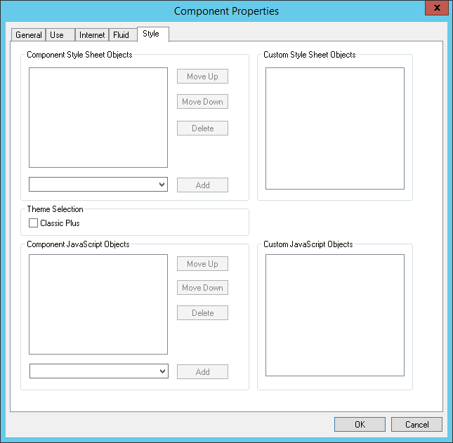
Access the Component Properties dialog box and select the Style tab.
The Style tab enables you to apply custom style sheets and JavaScript at the component level as part of your branding configuration.
Note: In addition, the Component Branding page can be used to specify custom style sheet objects and JavaScript objects in addition to those specified here in Application Designer. For more information on this PeopleTools branding feature, see Branding Classic Components.
Image: Component Properties dialog box: Style tab
This example illustrates the fields and controls on the Component Properties dialog box: Style tab. You can find definitions for the fields and controls later on this page.
|
Field or Control |
Definition |
|---|---|
| Component Style Sheet Objects |
Create the “developer’s list” of style sheets applied to this component. The developer list refers to the style sheets added on the Style tab by a developer using Application Designer. Use the Add drop-down list to add style sheets to the list. |
| Custom Style Sheet Objects |
Displays style sheets applied to the component by a portal administrator using the Component Branding page (PeopleTools, Portal, Branding, Component Branding). The portal administrator list is read-only in Application Designer. |
| Classic Plus |
Select for this component to display with fluid-like styling, which is also referred to as classic plus. If your end users are interacting with both fluid and classic components, having classic components and fluid components display with similar styling creates a more uniform experience. This component property takes effect only when the Theme Style Type has been set to Classic Plus on the Branding Systems Options page. The Branding System Options page setting enables classic plus at the system level, while selecting this property enables classic plus display for the individual component. See Configuring Branding System Options. PeopleTools and PeopleSoft applications deliver numerous components pre-configured for classic plus display. Refer to the product documentation for your PeopleSoft applications for a list of delivered classic plus components. For a list of delivered PeopleTools classic plus components, see PeopleTools Components Delivered as Classic Plus. If you have custom components that end users interact with along with classic components, you can enable this property, however, you will first need to test, and possibly adjust page layout so that pages and page elements display as desired in classic plus. See Reworking Components for Classic Plus Display. |
| Component JavaScript Objects |
Create the “developer’s list” of JavaScript objects applied to this component. The developer list refers to the JavaScript added on the Style tab by a developer using Application Designer. Use the Add drop-down list to add JavaScript to the list. Note: JavaScript is stored in HTML definitions. |
| Custom JavaScript Objects |
Displays style sheets applied to the component by a portal administrator using the Component Branding page (PeopleTools, Portal, Branding, Component Branding). The portal administrator list is read-only in Application Designer. |
| Add |
For the Component Style Sheet Objects list and the Component JavaScript Objects list, use the Add drop-down list to add objects to the lists. |
| Move Up |
To adjust the order of the listed branding objects, use Move Up to move the object toward the top of the sequence. |
| Move Down |
To adjust the order of the listed branding objects, use Move Down to move the object toward the bottom of the sequence. |
Note: The list of style sheet objects and JavaScript objects entered on the Style tab in Application Designer, referred to as the developer list, is separate from the list entered through the Component Branding page, which is the portal administrator list. The system loads the objects in the developer list before the portal administrator list.
Note: The Style tab applies only to classic components. It does not appear for fluid component definitions.
If you have custom classic components that your end users access along with fluid components and you want to provide a uniform experience, you can set your components to display in classic plus as described in the previous section. Before end users access classic plus components in a live system, verify that the classic plus rendering continues to meet your requirements and reconfigure any of the page elements as needed.
The following list provides a set of guidelines to assist in the transition from classic to classic plus for your custom components:
Perform side-by-side comparisons with the page in classic and classic plus to help identify rendering, alignment, and behavior issues.
Classic plus incorporates larger font sizes and larger control sizes, which means the page layout requirements can increase up to 20% in some situations. In addition, PeopleTools adds some vertical padding to reduce clutter between page controls, which increases overall page height. Look for overlapping issues, text truncation issues, alignment issues and so on. Typically, you can adjust the page controls slightly in the page definition to resolve these issues.
If the page appears to have grown too big when rendered in classic plus, try to reduce the white space in the page layout and look for ways to use the space more efficiently.
The PeopleTools Save button (the delivered Save button), renders as the primary button in classic plus by default. If you do not have the Save button on a page, or you have a set of custom buttons on your page, you need to set one button as the primary button.
To make the Save button a primary button, open the Push Button/Hyperlink Properties dialog, and select Activate by Enter Key. With this selection, the system renders the Save button as the primary button on the page, which end users recognize by its green color. In addition, when an end user presses the Save button or presses the Enter key, the system executes the save functionality.
If you have custom buttons, remove any images in the buttons for classic plus rendering.
If you are using images in your page, they must be scalable vector graphics (SVG).
Make sure to test all page control types, such as grids, scroll areas, group boxes, drop-down lists, date selectors, hyperlinks, and so on.
Test classic plus pages in all of the browsers used by your organization.
If a page contains HTML areas, custom style classes, or custom style sheets, you need to update the custom HTML and CSS manually to match the classic plus experience.