The application's data entry controls are convenient and easy to use.
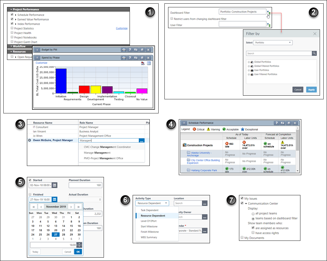
Table of Common Data Entry Controls
Item | Description |
|---|---|
| Expandable sections: Often visual clutter is reduced on a screen by hiding fields and other controls. Expand these regions to show the fields. In the sample images, we say that the Project Performance section and Spend by Phase portlet are expanded or opened, and the Workflow section and Budget by PM portlet are collapsed or closed. |
| Select a Value from an Extended List: Click |
| Auto-Complete: Also known as type-ahead. As you type in a field that must be assigned a value from a pre-defined list of acceptable values, the closest single matching value is automatically selected for you. If multiple values match your typed input, they appear in a list. To select a value, click one or press the up or down arrow keys on your keyboard and then press Enter. |
| Indicators: To help you readily identify the meaning of a given metric, these color-coded graphics appear. You can also define your own custom user-defined indicators. |
| Dates: You can type a date in a valid format directly into a date field. Or, you can select a date, including the time, from a small pop-up calendar. Also of note, you can directly modify the Planned Duration field but the Actual Duration field information is read-only. Note: Data you enter can later become read-only for you or other users. |
| Select a Value from a Short List: In this example, the Activity Type field is shown. Below that, after the user has selected the field's list, its values appear. For these kinds of fields, you will see references in the documentation to selecting a value from the Activity Type list. |
| Options: For simplicity's sake, both radio buttons and check boxes are referred to as options. |
 to select a field value from a Select a Value dialog box listing only valid values. You cannot type in your own entry in fields where the Select from Value List icon appears. This convention is used whenever a field's value must be logically constrained and validated against a pre-defined set of values. To illustrate this point, consider the following example. You can type whatever you want in a Name field for a new item you are creating; however, in a User field, you must enter a valid user.