Purpose
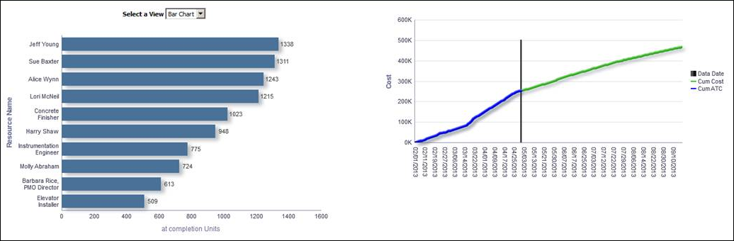
Use the Select a View list to determine whether the At Completion Units for a resource displays in a bar chart or pie chart.
The bar chart shows the ten resources that had the highest At Completion Units for that year. The x-axis shows the At Completion Units. The y-axis shows Resource Name.
The pie chart shows the ten resources that had the highest At Completion Units for that year. The sections of the pie chart show the percentage of At Completion Units for each resource. The percentage for each resource is dynamically determined based on the total At Completion Units.
The line chart shows the cost for various dates.
The x-axis shows the month, day, and year. The vertical bar on the chart shows the Data Date. The y-axis shows Cost. The blue line shows Cumulative Cost and the green line shows Cumulative At Completion Total Cost.
Location
- On the Home page, click Dashboards.
- Under Primavera, select Project Health.
- On the Project Health dashboard, click the Schedule page.
- On the Schedule page, expand the Completion section.
Subject Area
Resource Assignment