Setting Page Field Properties for Controls
For each page control that you add to a page you can control how it looks and functions in your application page by setting page field properties. In most cases, you access the property settings by double-clicking the control. Alternatively, you can highlight the control and select Page Field Properties from the Edit menu or the pop-up menu, which is activated by right-clicking the control.
This section discusses how to:
Use the property window.
Set record properties.
Set label properties.
Set use properties.
Set general properties.
Set option properties.
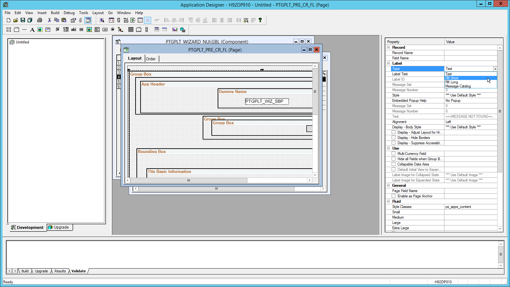
Use the property window to view and update page field properties. The property window can be used in lieu of or in addition to using the page field properties dialog box.
Image: Property window for page field properties
In the following example, the property window displays the page field properties for the selected group box. In addition, the Type field has been selected illustrating that properties can be updated directly in the property window.
These operations affect the use and display of the property window:
The property window is enabled by default.
To disable or re-enable the property window, select . Then select the General tab. See Setting PeopleTools Options.
The property window is visible by default.
To hide or view the property window, select . Alternatively, to hide the property window when it’s already visible, right-click anywhere on the property window, then select Hide from the pop-up menu.
The property window is docked by default.
To undock the property window, right-click anywhere on the property window, then deselect Allow Docking from the pop-up menu. See “Dockable Windows and Toolbars” in Configuring the Application Designer User Interface for more information.
For most controls, you must set record properties to assign the control to a specific field in a record definition. No distinct correlation exists between the field types in a record definition and the controls in a page definition.
Use this table to select the appropriate page control type to associate with the corresponding field in your record definition:
|
Record Definition Field Type |
Page Definition Control Type |
|---|---|
|
Character |
Edit box |
|
Character (Yes or No Table Edit) |
Check box Edit box |
|
Character (Translate Table Edit) |
Radio button Edit box Drop-down list box |
|
Long Character |
Long edit box, HTML area Note: Do not associate Long Character fields to edit box controls; use a long edit box control. Associating a Long Character field to an edit box control can produce unexpected behavior on the page. |
|
Number |
Edit box |
|
Signed Number |
Edit box |
|
Date |
Edit box |
|
Time |
Edit box |
|
DateTime |
Edit box |
|
Subrecord |
Not applicable Note: A direct association to subrecords is not available. |
|
Image |
Image |
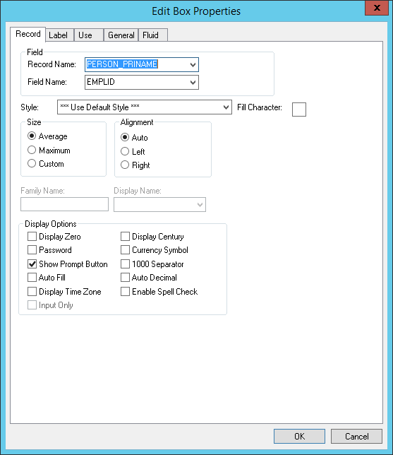
To set the record properties for a page control, access the page field properties for the control and select the Record tab:
Image: Edit Box Properties dialog box: Record tab
This example illustrates the fields and controls on the Edit Box Properties dialog box: Record tab. You can find definitions for the fields and controls later on this page.
Note: This section applies to both edit boxes and long edit boxes. Other controls may contain only a few, if any, of the properties listed in the following tables. Refer to the discussion of the specific control for more information.
|
Field or Control |
Definition |
|---|---|
| Record Name |
Select the record name of the record definition where the field is located. If you already added a field to your page and associated it with a record definition, the system uses the last record definition name that you entered. |
| Field Name |
Select the field name. If the field is a related display field that contains a long name or short name from the Translate Table, use PSXLATDEFN as the record definition name. The field name is either a long name (30 characters) or a short name (10 characters). |
| Style |
Set the font and color attributes of your control data. The default style class for an edit box is PSEDITBOX, which controls how the data portion of the edit box appears. Control the color, font, and other characteristics of an edit box by specifying a different style class. Note: Certain browsers always display the background of an edit box as white. See "Troubleshooting Browser Limitations" on Customer Connection. |
Size
After you link a control with a record name and field, the system automatically calculates the page control size. The size is based on the length of the field that is defined in your record definition, the font metrics of the field style, and any formatting options (currency symbol, 1000 separators, and so on) that apply. Because many fonts have variable width characters (for example, a W character is wider than a l character) three size options are available.
Note: Some browsers do not support custom sizing for edit boxes, long edit boxes, drop-down list boxes, and push buttons.
See Troubleshooting Browser Limitations available on the My Oracle Support website.
|
Field or Control |
Definition |
|---|---|
| Average |
Select to provide sufficient space to display the field control length in average-width characters. |
| Maximum |
Select to provide enough space to display the field control length in maximum-width characters. |
| Custom |
Select to define a custom size for edit boxes that are not display-only. If you set a display-only edit box to Custom, it appears as its defined length. If your edit box is in a grid, this field wraps. |
Alignment
Alignment indicates the runtime alignment of data within a page field. These settings have no affect on the relative alignment of page fields.
|
Field or Control |
Definition |
|---|---|
| Auto |
Select to left-justify the content of character fields and right-justify the content of number and signed number fields. This value is the default. |
| Left |
Select to left-justify the content of a field. Note: If the field is not display-only, the alignment is always left-justified. If the field is display-only, the system uses the alignment that you specify. |
| Right |
Select to right-justify the content of the field. Do not use this option in the PeopleSoft Pure Internet Architecture for fields that are not display-only. |
| Family Name |
Displays the current family name, which was set when the field was created, if it is applicable to your control. |
| Display Name |
Select an option to override the display format that is associated with a field. |
Display Options
|
Field or Control |
Definition |
|---|---|
| Display Zero |
Select if the content of the page control are numeric and you want to display a zero value instead of a blank field. Sometimes, seeing a zero helps users remember that a page control is not blank. For example, in a tax table you might show the lowest tax bracket as starting at zero instead of leaving it blank. |
| Display Century |
Select for date fields to enable users to enter a date with a four-digit century, as in 1999. Dates are always stored with the four-digit century in the database, but only the last two digits appear unless you select Display Century. If this option is not selected, the century is automatically set to the century of your system date. |
| Password |
Select to hide the value that is entered or displayed in a page control. When selected, characters in this control appear online as black dots. The component processor stores the actual value, making it available for normal processing, such as PeopleCode. Use this option for pages that capture sensitive information, such as personal identification numbers (PINs), passwords, and so on. For more information on options for displaying sensitive field data, see Protecting Sensitive Field Data Online. |
| Currency Symbol |
Select to display a currency symbol in the field. This selection expands the display length of the field by the length of the currency symbol. |
| Show Prompt Button |
Select to display a prompt button next to the edit box, which enables the user to look up valid values for that field. |
| 1000 Separator |
Select if the content of the page control is numeric and you want to insert thousand separators to make the numbers easier to read. The system automatically calculates the number of thousand separators to insert and determines where they should be positioned. This selection expands the display length of the edit box by one character for each separator. |
| Auto Fill |
Select to have the system automatically populate the page control with the character specified in the Fill Character field. The direction in which it populates depends on the alignment that you select. If a field is left-aligned, then it populates from left to right. If a field is right-aligned, it populates from right to left. For example, suppose that you define a six-character control as left-aligned, specify a fill character of 0, and activate Auto Fill. When you type 123 in the control online, the system displays 123000. Similarly, if you changed the alignment to right, the system would display 000123. Note: Auto Fill can affect the actual value of the control, not just its visual representation. |
| Auto Decimal |
Select to insert a decimal point automatically if none is provided in the data that is entered into the control. Where the system inserts the decimal point depends on how you define the control. For example, in a record definition if you define a numeric field with a length of 4.2 (allowing four characters to the left of the decimal and two to the right) and activate Auto Decimal, the system inserts a decimal at the second digit from the right. This option applies only to numeric field controls and affects the actual value of the field control, not just its visual representation. |
| Display Time Zone |
Select if you are setting the properties for a Time or a DateTime field and you want to display the related time zone. This setting helps users understand whether the time reflects the base time zone of the database or of some other time zone. This setting does not determine which time zone is actually used, only whether the time zone appears. The record field properties determine which time zone is used. |
| Input Only |
Select for edit boxes containing sensitive information that you want to protect by:
The component processor stores the actual value, making it available for normal processing, such as PeopleCode. Use this option for pages that capture sensitive information, such as personal identification numbers (PINs), passwords, and so on. For more information on options for displaying sensitive field data, see Protecting Sensitive Field Data Online. |
| Enable Spell Check |
Note: Spell check is not currently supported in fluid applications. For edit boxes and long edit boxes only, this option enables the user to check spelling on field content. This feature supports 17 languages using 36 dictionaries. Users have the option of selecting the appropriate dictionary to meet the language needs. The behavior of this feature is as follows:
|
| Fill Character |
Enter a character to replace blank spaces in an edit box when the system displays the content of the field. For instance, if the length of a Net Pay field is 8.3 and you specify a fill character of *, then a value of $1,250 appears as: *****$1,250.000 You can use any character as a fill character. |
Example: Auto Decimal
This table shows how the Auto Decimal option affects a numeric field control with a length of 4.2, depending on what you enter online:
|
Entered |
Displayed |
|---|---|
|
100 |
1.00 |
|
100. |
100.00 |
|
1 |
0.01 |
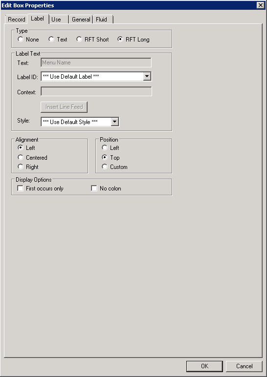
The Label tab enables you to set the label that appears on a control. This label can be the long or short name that is specified in the record definition or in other text. Use this tab to verify the label ID that is used as the internal reference.
Access the page field properties for the control and select the Label tab.
Image: Edit Box Properties dialog box: Label tab
This example illustrates the fields and controls on the Edit Box Properties dialog box: Label tab. You can find definitions for the fields and controls later on this page.
Note: This section applies to the following controls: edit boxes, long edit boxes, check boxes, drop-down list boxes, group boxes, radio buttons, and static text.
Type
Select the type of label. If you want the label to remain blank, you must first set up a blank label in the field definition that you are using. The blank label then appears as an option in the Label ID drop-down list box.
|
Field or Control |
Definition |
|---|---|
| None |
Select to display no control label on the page. Use this option for controls such as related displays. |
| Text |
Select to display text that you enter in the Text field. The default text is the long name for the field from the associated record definition. For translation purposes, avoid using this option if possible. |
| RFT Short (record field table short) |
Select to display the RFT short name for the field from the associated record definition. |
| RFT Long (record field table long) |
Select to display the RFT long name for the field from the associated record definition. This value is the default. |
Label Text
|
Field or Control |
Definition |
|---|---|
| Text |
Enter the text exactly as it should appear on the page. The default is Dummy Name until you assign a record and field to the control. This field is only enabled if you selected Text as the type. Otherwise, the system displays the label text assigned to the field for the Label ID you select. |
| Label ID |
Select from the drop-down list box the label you want to appear for the page field. The available choices are based on the Label ID column and the Long Name column for the selected field definition. The default setting for this option is Use Default Label. This default is determined by the label you select as the default for the field definition. |
| Context |
Displays text to assist the translation team determine the context of the field label to be translated. The context is determined by the field name and label ID combination. If no contextual information exists in the database, then no text appears in this field. This property appears on edit box, long edit box, drop-down list box, push button, image, chart, tree, group box, and check box page controls. Application users define the contextual information on the Context Information page. See Providing Context Information. |
| Insert Line Feed |
Click to split your control label into multiple lines at the position of the cursor in the Text field. A thick vertical bar character appears in the Text field. When you close the properties dialog box, the label is split into multiple lines. This option is only active when you select Text for the type. |
| Style |
Select an option to control the color, font, and other characteristics of a label. If you do not select a label style that is different than the default, Use Default Style, then the system uses the label style specified on the style sheet on the PeopleTools Options page. |
Alignment
The label alignment in the page field properties controls the alignment for both page fields placed on a page and page fields as grid columns. For a grid column, the label becomes the column heading and is aligned within the column boundaries as specified by this attribute, either left, centered, or right.
|
Field or Control |
Definition |
|---|---|
| Left |
Select to align the label to the left-of-center horizontally. This value is the default. |
| Centered |
Select to center the label horizontally. |
| Right |
Select to align the label to the right-of-center horizontally. |
Note: By default, the system uses left label alignment. To make all new page field labels use right label alignment (design time), set the Right Align Field Labels check box on the PeopleTools Options page.
Note: Push buttons with images or text are automatically center aligned when in a grid. Push buttons with images or text are automatically left aligned when not in a grid.
Position
These position options are available for edit boxes, long edit boxes, and drop-down list boxes only.
|
Field or Control |
Definition |
|---|---|
| Left |
Positions label immediately adjacent to the left side of the field. Left is the default position of the label for fields newly added to the page. If you move the label on the page from the left position, PeopleSoft Application Designer changes the selection to Custom. |
| Top |
Positions label above the field. Selecting this option automatically moves the label to the top of the field. If you later move the label on the page from the top position, PeopleSoft Application Designer changes the selection to Custom. |
| Custom |
Indicates that the label was manually moved on the page. Labels can be adjusted using the keyboard arrows. Selecting this option does not automatically move the label on the page. |
To set labels to the left position for individual page fields:
Select the control that you want to affect.
Select
The Left Label Position option is only enabled if the label is set to the custom position. The system moves the label for the selected control to the left position. The position indicator in the page field properties does not change from Custom. Note that you may need to readjust the positioning of other fields and labels to accommodate this change.
Note: If you move a page field label manually on the page, the label position in the page field properties dialog box automatically updates to Custom.
Display Options
|
Field or Control |
Definition |
|---|---|
| First occurs only |
Select to display the label only with the first occurrence of a child page field in a scroll area. |
| No colon |
Select this option if you do not want a colon to appear at the end of the label text. This option is selected by default for edit boxes and long edit boxes. |
Special Label Considerations
If you add a related display page control with a label type of None, enter an information-only label that identifies the related field but that is not identical to the label on the control field. A little documentation now can save you time in the future if you modify this page again. For example:
|
Control Label |
Related Field Label (Information-Only) |
|---|---|
|
Department |
Department Description |
|
Jobcode |
Jobcode Description |
|
Regular/Temporary |
Regular/Temporary XLAT (XLAT is from the Translate Table) |
When defining labels for columnar controls in a multi-occurrence scroll, you can apply several techniques. The first technique is to select First occurs only. This selection limits the appearance of the label to the first scroll occurrence on the control, allowing the label to be used as a column heading. The second technique is to select No colon to omit the colon from the label (column headings typically do not need a colon).
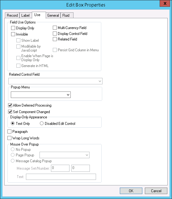
The Use tab defines how a field functions on a page. Use this tab to disable or hide fields; to define the display and related control fields and the processing of the control; and to define a field as a mouse over pop-up field.
Access the page field properties for the page control and select the Use tab.
Image: Edit Box Properties dialog box: Use tab
This example illustrates the fields and controls on the Edit Box Properties dialog box: Use tab. You can find definitions for the fields and controls later on this page.
Note: These controls contain the same or similar use properties: edit boxes, drop-down list boxes, check boxes, images, long edit boxes, push button/hyperlinks, and radio buttons.
Field Use and Other Options
Note that long edit boxes have slightly different field use options.
|
Field or Control |
Definition |
|---|---|
| Display Only |
Select to prevent users from modifying the content of the control during application data entry. The system automatically selects Display Only when you select Related Field. |
| Invisible |
Select to make the control physically present on a page but invisible to users. Typically, you add an invisible control because it is required for a PeopleCode program that is associated with the page. An invisible control can also be used as a display control field. When you select the Invisible check box, the Show Label, Modifiable by JavaScript, and Enable When Page is Display Only fields are enabled. |
| Show Label |
Select to make the control label visible while the control itself is invisible. This option is useful if you add an invisible display control field to a page to show its related description. Show Label is enabled only if Invisible is selected. Important! The Show Label option is not supported for page controls on fluid pages. |
| Modifiable by JavaScript |
This feature is security related and should always be deselected unless you are familiar with modifying an invisible field using JavaScript in an HTML area. If the Invisible check box is deselected, then Modifiable by JavaScript is deselected and unavailable for entry. If the Invisible check box is selected, then the Modifiable by JavaScript check box is deselected by default. |
| Enable When Page is Display Only |
Select to enable hyperlink actions on read-only pages. This check box is active when the Invisible check box is selected. This check box is deselected by default. Note: This property appears on Edit box, Long Edit box, and Image controls. |
| Generate in HTML |
Select to generate an invisible field (hidden field) on the HTML page sent to the browser where it can be manipulated by JavaScript in the browser. Only use this option if you are familiar with modifying an invisible field using JavaScript due to potential security concerns. This check box is active only when the Invisible check box is selected. This check box is deselected by default. If you want the application server to update the invisible field with data sent back from the browser, in addition to having the Generate in HTML check box selected, also make sure to select the Modifiable by JavaScript check box. This option is available for edit boxes, long edit boxes, check boxes, radio buttons, and drop-down list boxes (only list boxes with a single value for selection). |
| Expand Field when Page is Display Only |
Select to automatically resize a disabled (display-only) long edit box so that all text within the field is visible at runtime. The field automatically enlarges to accommodate text. This check box is deselected by default. When selected, this option enables the Wrap Long Words option. |
| Multi-Currency Field |
Select to identify the control as associated with multicurrency processing. This selection causes the field to appear at runtime only if Multi-Currency is selected on the PeopleTools Options page. |
| Display Control Field |
Select to indicate that the field controls another field at the same page level. The controlled field is a related field. For example, on many pages Department ID is the display control field and Department Name is the related field. The system uses Department ID to retrieve Department Name from the Department table to display on the page. |
| Related Field |
Select to specify that the content of this control is controlled by another field on the same page level, one that you selected as a display control field. When you select this check box, the system automatically selects the Display Only option. It also makes the Related Control Field drop-down list box available for you to select the related control field. When you select Related Field, Display Only is automatically selected. If the related field is located on a record definition with multiple keys, relate the display field to the lowest order key field that both record definitions have in common, with the exception of EFFDT and EFFSEQ, in the control record definition. The system searches for the higher order keys by matching field control names on the current level and all higher levels for the other keys. If the related display field contains a long name or short name from the Translate Table, use PSXLATDEFN as the record definition name. |
| Enable When Page is Display Only |
Select this check box to enable the user to select radio buttons and check boxes on runtime pages to perform certain tasks and processes despite the entire page being in display-only mode. Note: This property appears on Check Box and Radio Button controls only. |
| Paragraph |
The Paragraph property applies only to these page field controls:
If Paragraph is selected,
PeopleTools generates a text field for the supported controls and
inserts the page field content within a paragraph tag ( The Paragraph property applies to classic and fluid applications. For classic pages, PeopleTools generates a paragraph tag if the Paragraph property is selected or the controls have one of the following styles applied.
PeopleTools suppresses any label generation for the paragraph fields; field values are generated, but field labels are omitted. PeopleTools ignores the Paragraph property in these conditions:
|
| Wrap Long Words |
Select to wrap long words that do not contain spaces, such as long URLs, in a page field at runtime for Microsoft Internet Explorer only. The word wraps to the length of the field set at design time. Other browsers automatically stretch the width of the page to accommodate the longer text. This option has no effect at runtime to applications running on browsers other than Microsoft Internet Explorer. This setting is deselected by default. The Wrap Long Words option is available for edit boxes, long edit boxes, and drop-down list boxes only. You can apply it to standalone page fields and grid columns. For edit boxes and drop-down list boxes, this option is disabled if Disabled Edit Control is selected. For long edit boxes, this option is available only if the Expand Field When Display Only option under Field Use Options is selected. Note: The system does not restrict an edit box or drop-down list box that is configured as Display Only and Text Only to one line of height. The text is wrapped to the next line as necessary. Also, the Wrap Long Words property does not affect the word wrapping behavior of shorter words that can be accommodated by the page field size at runtime. This text automatically wraps at word boundaries in accordance with the page field size, regardless of whether this option is set. |
| Persist Grid Column in Menu |
Select to include the field as a list box item in the persistent search results grid. You must also select the Persist in Menu grid property for the grid that contains the field. Note: This property applies only to fields that appear in grids on pages that are used as custom, application-specific search pages. This property is disabled on check boxes and radio buttons. You must enable recent search results caching at the system level in the web profile for this property to take effect. |
| Related Control Field |
When you select Related Field, a list of all controls on the page that are marked as display control fields appears in this drop-down list box. Select the field to which this control is related. You must define the use of the initial control field before it appears as an option in the Related Control Field drop-down list box. For example, after the Pay Group field is designated as a display control field, it appears in the Related Control Field drop-down list box for the control that you set as the related field. Note: The number that appears before each entry in the Related Control Field drop-down list box is the page field order number associated with that entry. |
| Set Component Changed |
Enables the system to issue a save warning for the field if the user changes the value and attempts to exit the page before saving. This setting reinforces current save warning behavior. This option is set by default for edit boxes, long edit boxes, radio buttons, check boxes, and drop-down list boxes. Deselecting this option overrides the save warning that normally appears to users. The user will not see a save warning after changing the value of the field and attempting to exit the page. An example of when this might be necessary is for a drop-down list box that includes links to another page. If the user selects a link from this field to transfer to another page but has not made any other changes to the page, then the system should not issue a save warning. By deselecting the Set Component Changed flag, you indicate that no save warning message is issued for this field. This option works for fields associated with a derived work field or database record field. For the push button/hyperlink control, the default setting is deselected instead of selected, unlike most other page controls. |
| Allow Deferred Processing |
Deselect this option to allow this field to operate in interactive mode. Typically, set a field to interactive only if you want to perform a server trip for an action that can be deferred otherwise—for example, to execute FieldEdit or FieldChange PeopleCode, when data is entered in a field with a prompt table edit, or in a field with a related display. The setting of this field is ignored if either the page or the component is set to run in interactive mode. See Understanding Processing Modes for more information. Note: The default setting is selected. |
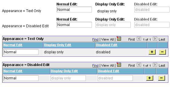
Display-Only Appearance Option
The Display-Only Appearance option attributes, Text Only option, and Disabled Edit Control option apply only to edit boxes and drop-down list boxes. These properties, in conjunction with other attributes you apply to the field, such as Display Only on the Use tab, or the Gray function or the Enabled property in PeopleCode to disable the field, and whether or not the field is in a grid control the base style that the system uses to render these controls at runtime.
The default base style for a normal edit box, meaning editable and enabled (as opposed to display-only or disabled), is PSEDITBOX. The default base style for drop-down list boxes is PSDROPDOWNLIST. The base style then changes depending on the attributes that you select and where you place your field, as shown by the default base style examples in the following table.
If you choose a custom base style for the field on the Record tab of the control properties, then the system uses the associated display-only and disabled variants of the style as appropriate to create the additional looks. For example, if you select XYZ base style and set the field as display-only, then the related XYZ_DISPONLY style is used if it exists; otherwise, the base XYZ style is used.
|
Display-Only Appearance Option |
Normal Edit Field |
Display-Only Edit Field |
Disabled Edit Field |
|---|---|---|---|
|
Text Only |
Non-Grid: PSEDITBOX Grid: PSEDITBOX |
Non-Grid: PSEDITBOX_DISPONLY Grid: PSEDITBOX_DISPONLY |
Non-Grid: PSDISABLED Grid: PSEDITBOX_DISPONLY |
|
Disabled Edit Control |
Non-Grid: PSEDITBOX Grid: PSEDITBOX |
Non-Grid: PSDISABLED Grid: PSDISABLED |
Non-Grid: PSDISABLED Grid: PSDISABLED |
Note that for Text Only disabled edit boxes using the default PSEDITBOX base style, the system applies PSDISABLED to non-grid fields and PSEDITBOX_DISPONLY to fields in a grid. As a result, these fields render differently at runtime, as shown in the following example. If the field is outside of a grid, for example, selecting the Display Only field use option with the Text Only appearance option displays the field value as disabled text within a grayed border, whereas if the field is located in a grid with the same attributes, the field value renders as display only text without a border.
Image: Example of Display-Only Appearance settings at runtime using the base PSEDITBOX style
This example illustrates the fields and controls on the Example of Display-Only Appearance settings at runtime using the base PSEDITBOX style. You can find definitions for the fields and controls later on this page.
Note: Depending on the style sheet that your application uses, the appearance of your pages and fields might deviate slightly from the appearance of the page and fields in the previous example.
Mouse Over Popup Options
Select the Display Only check box to enable the Mouse Over Popup options. Select from these mouse over pop-up options:
|
Field or Control |
Definition |
|---|---|
| No Popup |
Select to have no pop-up page. This value is the default. |
| Page Popup |
Select to associate the edit box with a pop-up page that you choose from the drop-down list box. Only pop-up pages appear in the Page Popup drop-down list box. |
| Message Catalog Popup |
Select to associate this edit box with a pop-up page that displays a message from the message catalog. You can design and implement message catalog pop-up pages to be context sensitive. See PeopleBooks and the Online PeopleSoft Library,“Managing the PeopleSoft Online Library and PeopleBooks,” Integrating Context Sensitivity. See Enabling Message Catalog Pop-up Pages. See Message Catalog. |
| Message Set/Number |
Enter the message set number and the message number of the message whose text you want to appear in the pop-up window. |
| Text |
This field displays the message of the message catalog entry that you enter in the message set/number fields. |
Note: If you associate a mouse-over pop-up page to an edit box, then do not attempt to make the edit box editable at runtime, for example by using PeopleCode; the operation will fail.
The General tab enables you to specify an optional internal page field name that is referenced by the page.
Access the page field properties for the control and select the General tab.
Image: Edit Box Properties dialog box: General tab
This example illustrates the fields and controls on the Edit Box Properties dialog box: General tab. You can find definitions for the fields and controls later on this page.
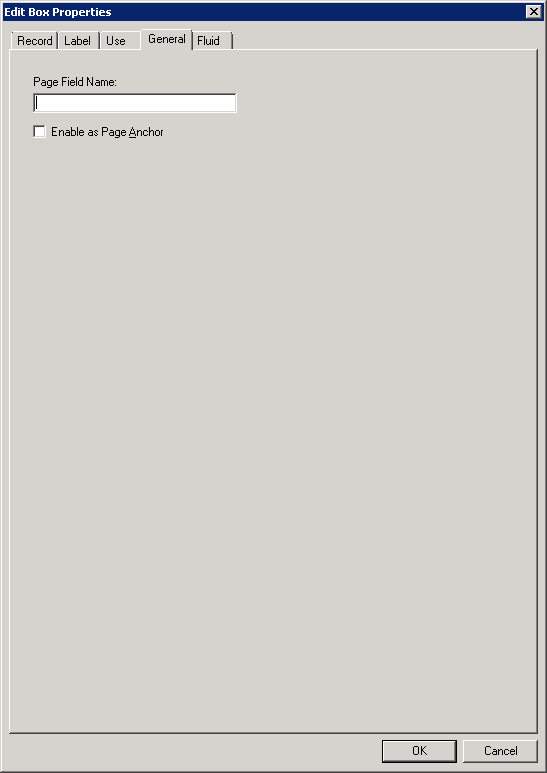
Note: For most controls, the General tab contains only the Page Field Name and Enable as Page Anchor settings. Grids and scroll areas have additional settings on the General tab that are described later. The Enable as Page Anchor check box is available for all controls that have a page field name.
|
Field or Control |
Definition |
|---|---|
| Page Field Name |
Enter a name for the page field that you are creating. This is a system-only setting. It does not appear as the label for the page field. The page field name enables you to refer to a particular field on a page using PeopleCode. This setting is optional unless you select the Enable as Page Anchor check box. |
| Enable as Page Anchor |
Select to apply an anchor tag to the current page field on the page. If you select this check box, you must add a page field name to identify this field when setting the related control for the link. This check box is deselected by default. |
The Options tab enables you to add rich text editing capabilities to the long edit box.
Access the page field properties for the long edit box page control and select the Options tab.
Note: This section applies to long edit boxes only.
Image: Long Edit Box Properties dialog box: Options tab
This example illustrates the fields and controls on the Long Edit Box Properties dialog box: Options tab. You can find definitions for the fields and controls later on this page.
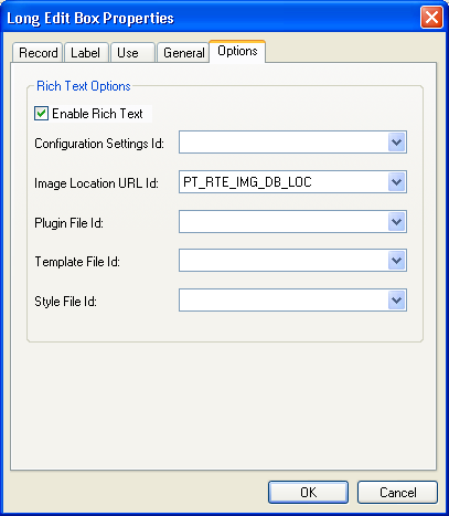
Note: At design time, standard long edit boxes and rich text-enabled long edit boxes look the same.
|
Field or Control |
Definition |
|---|---|
| Enable Rich Text |
Select to enable rich text editor functionality for the long edit box. Selecting this check box enables the remaining fields on this tab. Note: When you select this option the Multi-Currency and Wrap Long Words properties on the Use tab are disabled; and the Allow Deferred Processing property on the Use tab is selected and disabled. |
| Configuration Settings Id |
Select a value to use a custom configuration file that modifies the editor toolbar. By default, this field is blank and the system uses the default configuration file with the default toolbar settings. HTML definitions that are prefixed with PT_RTE_CFG appear in this drop-down list box. |
| Image Location URL Id |
Select a value to indicate the storage location of any images inserted as part of the text in the long edit box. The default value for this field is the PT_RTE_IMG_DB_LOC URL. URL IDs that are prefixed with PT_RTE_IMG appear in this drop-down list box. The URLs must be stored in the application by using the URL Maintenance page. See URL Maintenance. Note: The URL format for file attachments stored in the database is record://recordname, as in record://PTRTDB. |
| Plugin File Id |
Select a value to enable plug ins for this instance of the rich text editor. By default, this field is blank. HTML definitions that are prefixed with PT_RTE_PLUGIN appear in this drop-down list box. |
| Template File Id |
Select a value to enable an alternative template definition for this instance of the rich text editor. By default, this field is blank. HTML definitions that are prefixed with PT_RTE_TMPL appear in this drop-down list box. |
| Style File Id |
Select a value to enable an alternative style sheet definition for this instance of the rich text editor. By default, this field is blank. HTML definitions that are prefixed with PT_RTE_STYLE appear this drop-down list box. |
Data Conversion Considerations
The rich text editor is an HTML editor that converts rich text to HTML, which the application stores in the database. When you access your data, the editor decodes the HTML at the time that it appears on the transaction page. Existing data is stored as plain text, which can cause unexpected warnings the first time the data is accessed after rich text support is enabled on a long edit box page field. Your test plan should include either updating the data to prevent the warnings or communicating with users to expect this warning.
To update the data, you must access the page; change the data in some way, such as adding a Space; and then save the component. The editor automatically encodes and updates the data.