Special Considerations for Charts
This section discusses special considerations for using the PeopleSoft charting classes.
Sometimes, records at level zero on a page are considered work records, even when they are not specified as such in Application Designer. Work records are not updated by the database and are skipped when the component is run.
A level-zero record is marked as a work record when any of these conditions is true:
The record is designated as a work record in Application Designer.
All fields for the record are used as read-only fields.
All values for these fields can be read from the input keys.
When a chart area is attached to a level-zero record field of a record considered to be a work record, it is also skipped when the system determines that record's 'work' status.
If you hard code a value for a label, a title, a data hint, and so on, then that value is not translated. Be sure to specify field values as message catalog entries that will be translated.
Text can be found at the following locations in a Chart class chart:
Chart title.
Chart subtitle.
Chart footnote.
Chart data item labels.
X-axis and y-axis titles.
X-axis and y-axis labels.
Legend descriptions.
Pie chart segment labels.
Data hints (hover or mouse over text).
Font types and sizes for chart titles, subtitles, footnotes, axis titles, and axis labels in charts are defined as style classes in PeopleSoft style sheets. The delivered style classes are designed to work with the overall theme of the PeopleSoft user interface. The delivered style classes apply to all charts in the system. Although they are changeable in the Application Designer, Oracle recommends that you keep them as delivered unless you have a good reason to change them.
Axis labels are positioned by the charting engine as part of the overall rendering of the chart graphic. The general pattern for axis and pie chart segment label display is this:
The font size of the label text remains constant.
The charting engine will try to maximize the size of the chart graphic while fitting all label text around the graphic.
The chart graphic area will shrink to a minimum threshold size as the text for labels grows longer.
After the minimum chart graphic area threshold size is reached, the chart graphic no longer shrinks and labels are displayed in an unpredictable fashion.
There are special considerations depending on whether the type of label is for an x-axis, a y-axis, or a pie chart segment.
Best Practices for Managing Chart Text
The best ways to minimize the chance of unpredictable text are:
Use the smallest font that is readable for text labels. PeopleTools is delivered with a small point size for axis labels in order to allow more characters to be rendered.
The larger the chart area is defined, the more room will be available for labels.
Try to build your charts using short (but descriptive) fields for axis labels.
Make sure that data hints are always used in your charts to compensate when labels cannot be displayed.
Tooltips (Data Hints or Hover Text)
Each data item in a chart (a bar in a bar chart, for instance) has a tooltip. A default tooltip is created automatically based on the composition of the chart.
Image: Bar chart displaying default tooltips
The following example displays a bar chart with the default tooltip for the selected data item:
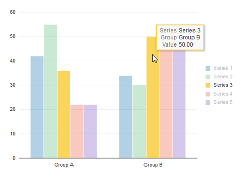
Image: Bubble chart displaying default tooltips
The following example displays a bubble chart with the default tooltip for the selected data item:
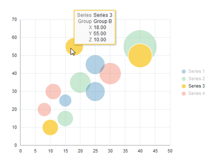
The default tooltip text that appears is constructed from information about the composition of the chart that you have defined and the row of data being charted.
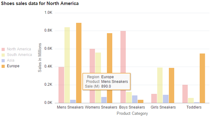
You can modify the labels for the tooltip items by using the TooltipLabel class in conjunction with the Chart class. Your custom labels will be displayed in the default format.
Image: Bar chart displaying custom tooltips
The following example displays a bar chart with custom tooltips for the selected data item generated using the TooltipLabel class:
Alternatively, to fully customize tooltips for chart data items you can use the SetDataHints method of the Chart class.
For Gantt charts, use double quotes to correctly display the use of single quotes in your label, if applicable.
Because mobile devices such as mobile phones, the Apple iPad, or Windows tablets do not use a mouse and rely on touch interactions instead, you interact with charts differently on these devices. To click a button, link, or chart object, tap the touch screen with one finger. To display tooltips for a chart, tap the touch screen twice (double-tap). Tooltips disappear after a few seconds or when you tap another object with a tooltip.
To move a node in a rating box chart, tap once to select the node. Then, tap once in a different grid box to move the node to that box.
Note: Drag-and-drop on Gantt charts is not supported on mobile devices.
Defining charts and gauges for fluid pages is very similar to defining charts and gauges for classic mode. There are some key differences that you need to take into account.
The following information is specific to the following classes:
Chart class
DialGauge class
LEDGauge class
RatingGaugeChart class
StatusMeterGauge class
SparkChart class
Each Chart Must be Enclosed by a Dedicated Group Box
In Application Designer, always place the chart control within a group box and ensure that no other controls are within the group box.
Image: Separate group boxes for each chart control
In this example, there are three charts on this fluid page. Each is in its own group box, and all three charts and their group boxes are within a containing group box:
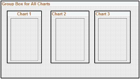
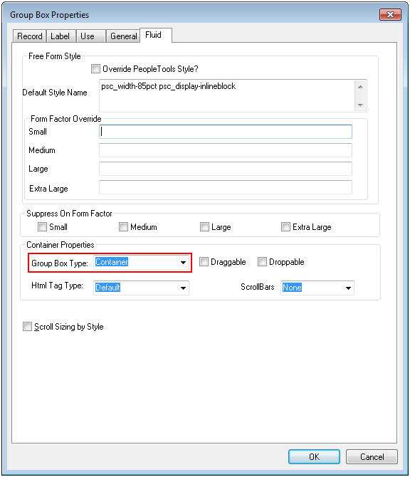
Image: Setting the group box type to Container
The group boxes that immediately contain the chart controls must be defined as Container group boxes:
You can specify other styles as well to help position the chart or gauge within the page.
Specifying Chart Dimensions
When a chart or gauge is placed on a fluid page, the width, height, and aspect ratio are all considered when determining its size. Each chart should be contained by a group box that only has that chart within it.
The width of the chart is determined by the width of the parent group box that contains the chart. The width of the group box (and therefore the chart) can be further controlled by applying a style in the Fluid tab of the group box control in Application Designer.
The height of the chart is determined by the width of the chart and the AspectRatio property. The height will be calculated as the width multiplied by the aspect ratio. If no AspectRatio property is provided, the Height property will be used to determine the fixed height of the chart or gauge.
Note: The AspectRatio property does not apply to the DialGauge class; use the Height property instead.
Important! If both the Width and Height properties are supplied with no AspectRatio property, they will be used to produce a fixed size chart or gauge. This chart will not be realizable once its rendered.
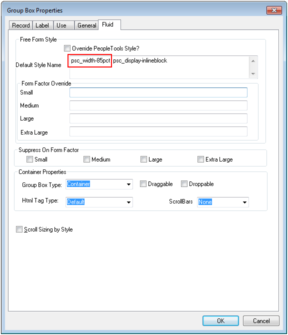
Image: Adding a style that specifies the width of the container
On the Fluid tab of the enclosing group box, add a style that specifies the width of the container. The chart will use this information to dynamically determine its width. In this example, the containing group box is styled to use 85% of the container (that is, the group box) that contains it:
psc_width-85pct
If necessary, you can specify overrides for different form factors to achieve an appropriately sized chart or gauge.
Typically, you specify the height of the chart or gauge as a proportion of the width by assigning a value to the AspectRatio property in PeopleCode. Here’s an example:
&cChart.AspectRatio = 0.8;The AspectRatio property value should be greater than 0. If this property is not specified, the default value of 1 is used. AspectRatio is a property of the following classes:
Chart class: AspectRatio
LEDGauge class: AspectRatio
RatingGaugeChart class: AspectRatio
StatusMeterGauge class: AspectRatio
SparkChart class: AspectRatio
When a chart or gauge is placed on a classic page, the size of the chart or gauge is determined in one of two ways:
By the Height and Width properties, which specify the dimensions in pixels.
By the dimensions of the chart page control in Application Designer.
PeopleSoft charts are flexible in terms of styling. Styling covers colors and fonts that you see when you look at a chart. Style specifications are generally defined in Application Designer style sheets so that they are accessible to application developers. Specifically, they are defined in sub style sheets that are then attached to high-level system style sheets such as PSSTYLEDEF_TANGERINE which are used throughout a system ensuring consistent look and feel.
Charting Sub Style Sheet Organization
The organization of the charting sub style sheets is straightforward. Each chart class has its own set of styles. These styles are in one or more sub style sheets that have a naming convention as shown in the table below.
|
Charting Class |
Sub Style Sheet Begins With |
|---|---|
|
Chart DialGauge LEDGauge ReferenceArea ReferenceLine Series StatusMeterGauge Threshold ToolTipLabel |
PSCHARTSTYLE, PSJET |
|
Gantt |
PSCHARTGANTT |
|
OrgChart |
PSORGCHART |
|
RatingBoxChart |
PSRATEBOX |
Different specifications of the styles will be in sub style sheets that are appended with a underscore (“_”) followed by a suffix, which is usually the name of the theme.
For instance, PSCHARTSTYLE and PSCHARTSTYLE_TANGERINE have the same styles but the specifications for these styles differ because PSCHARTSTYLE is used for the Swan user interface theme while PSCHARTSTYLE_TANGERINE is used for the Tangerine user interface theme. Similarly, the _FMODE suffix specifies fluid mode style sheets.
See Configuring Branding System Options for more information on how to specify the theme and default style sheet for your system..
Altering Style Specifications
The styles delivered for charting are designed to work harmoniously with the branding theme that they are associated with. There may be times, however, when you want a different look and feel from the delivered one. Scenarios may include:
You want to implement a system-wide change in theme (including not only charts but other visual elements such as headers, grids, and so on.
You want to implement a system-wide change in chart style specification within the context of one of the PeopleSoft delivered themes. An example might be to change the sequence in which colors appear on charts or to change the font size of one of the chart text elements such as the axis titles.
You want to implement a style modification on a particular chart or particular family of charts. For instance, there may be certain charts that appear on pagelets in which you want the main title to have a large font and be bold.
Different approaches lend themselves to these different scenarios.
Scenario 1: Implement system-wide change in theme
In this scenario you would most likely be creating a new system style sheet for your implementation probably by cloning one of the high level style sheets that PeopleSoft delivers. Once you have done this, follow the steps in Scenario 2 for the charting sub style sheets.
Scenario 2: System-wide change in chart style specifications
Identify the charting style classes that you want to change.
Identify the charting sub style sheet in which those style classes reside.
Clone those sub style sheets.
In the cloned sub style sheets, update the values of the style classes that you want to change.
Attach the cloned sub style sheets to the default style sheet for your PeopleSoft system.
Detach the delivered sub style sheets from the same default style sheet.
Test the results.
Important! Do not change the delivered style sheets and sub style sheets. The best practice is to clone them and make changes to the clones.
Important! Do not delete style classes from original or cloned style sheets or sub style sheets. Doing so may compromise chart creation.
There is no guarantee that the style sheet value changes that you make will work as expected in the application, as style class specification changes may impact chart creation. You must test the results of your changes to verify that they are working. If changes are not working as expected, you need to try a different style class value.
Scenario 3: Minor style modification
PeopleSoft charting provides a means to override delivered styles on a granular basis on the Chart class and gauge classes. If you need to override one or more delivered style class definitions found in a PSCHARTSTYLE* sub style sheet, do the following:
Create a new free form sub style sheet in Application Designer.
Open up the PSCHARTSTYLE* sub style sheet that contains the style class definitions.
Copy the specific style class definitions and paste them into the new free form sub style sheet.
Note: Putting the style class definitions into a new free form sub style sheet will simplify your future PeopleTools upgrades.
Append an underscore (“_”) to the end of the copied style class names followed by an identifier of your own choosing. These new style class definitions are the overriding styles. For example, an overriding style class name for the PSCHARTLEGEND style class could be PSCHARTLEGEND_NEW.
Edit the new style class definitions that you have created to suit your needs and save the sub style sheet.
Insert the new free form sub style sheet into the default system style sheet that your environment is using.
For any chart that you want to use your custom styles, set the AdditionalStyleSuffix property to the identifier you used in step 4.
When the chart is generated at runtime, it will first use any styles that have your override identifier. If such a style class definition is not found, the chart will use the base style that you copied instead.
See Chart class: AdditionalStyleSuffix, DialGauge class: AdditionalStyleSuffix, LEDGauge class: AdditionalStyleSuffix, and StatusMeterGauge class:AdditionalStyleSuffix.
Use the Chart Options page to specify system-wide accessibility settings by chart type. When accessibility is enabled for a chart type and the user signs in with screen reader mode on, the system generates the chart data in an HTML table that is in an accessible format for assistive technologies. For some chart types, this “accessible table” is in addition to the graphical rendering of the chart; in other cases, the accessible table is the only output generated:
For the Chart class and the gauge classes, the accessible table is in addition to the graphical rendering of the chart.
For the Gantt class, the accessible table is the only output generated.
Navigation
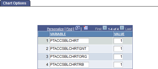
Image: Chart Options Page
This example illustrates the fields and controls on the Chart Options page.
|
Field or Control |
Definition |
|---|---|
| VARIABLE |
Specify the chart type by variable name:
|
| VALUE |
Specify the system accessibility setting:
Note: The delivered setting is for accessibility to be enabled. |
Web Services for Remote Portlets (WSRP) is a standard for communicating with remote portlets. For example, a PeopleSoft pagelet can be displayed as content within a non-PeopleSoft portal in the style of that portal.
While chart objects generated from the Chart class can be displayed in WSRP environments, chart objects generated from the Gantt class, OrgChart class, and RatingBoxChart class are not available for consumption in WSRP environments