Risks Identified by Total and By Process
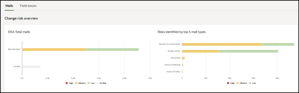
The Total Predicted Changes bar graph displays the total number of change risks identified for your project, organized by severity. The X-axis displays the number of change risks identified for your project. The Y-axis displays the risks identified by severity (High, Medium, Low, and No Risk). Hover over the bar graph to view more details.
The Risks Identified by Process bar graph displays the number of risks identified using a specific process within the organization. Use this information to understand which process is used extensively by the organization, which alternative process needs to be improved, or what makes it popular as a channel for routing change requests. The X-axis displays the number of change requests identified, and the Y-axis displays the various processes used to gather change requests by the organization. The color of the bar graph indicates the severity (High, Medium, and Low) of the change requests identified using each process.
Related Topics
Last Published Tuesday, December 24, 2024