Working with Fluid Pages and Controls
PeopleSoft fluid applications are designed to provide a simple, sleek look and feel, resembling many of the web applications used today on tablets and smartphones. In addition to the contemporary user interface, a fluid page can also be rendered differently depending upon the device accessing it. For example, the same page can be accessed on a tablet or a smartphone, yet the page layout will be different for each device. On the tablet, more fields may appear, with more space between them, while on the smartphone fewer fields may appear, and the display will adjust to the smaller space available on the smartphone. Presented in this topic are some examples of the controls and the look and feel of PeopleSoft fluid applications.
When you use a mobile device to access your PeopleSoft applications, your interactions will differ from how you interact when using a browser on a desktop or laptop computer. In part, this is due to the gestures used to interact directly with the mobile device. In addition, this can be due to how PeopleSoft applications are displayed on mobile devices.
Mobile devices use an interface that enables you to use finger gestures to interact with the device and its applications. This table describes the common gestures that you use to interact with PeopleSoft applications on mobile devices.
|
Gesture |
Description |
Purpose |
|---|---|---|
|
Tap |
Quickly touch your finger to the display and release. |
Use to click a link or select a page control or item. |
|
Drag |
Touch, hold, and then slide your finger on the page. |
Use to scroll the page vertically, or pan the page horizontally. Note: The term scrolling indicates vertical movement, while the term panning indicates horizontal movement. |
|
Swipe (or flick) |
Place your finger on the screen and quickly swipe it in the desired direction. |
Use to scroll or pan quickly. On a fluid homepage, swipe left or right to move through your available homepages. |
|
Two-finger drag |
Touch and hold two fingers to the display, and then slide both fingers. |
Use to scroll through scrollable grid rows, to pan through scrollable grid columns, or to scroll through content in an element with overflow capability (such as a long edit box in a grid). |
|
Double-tap |
Quickly tap and release your finger two times. |
Use to zoom quickly in on a section of the page and to zoom out if you are zoomed in currently. |
|
Pinch open |
Touch two fingers to the page then, spread the fingers apart. |
Use to zoom in. |
|
Pinch close |
Touch two fingers to the page then, bring the fingers together. |
Use to zoom out. |
The fluid banner is displayed on every fluid application page and contains many of the same controls displayed on fluid homepages. However, the controls displayed within the fluid banner can vary from component to component, depending on component settings, system settings, where you navigated from, and so on. In addition, which controls are displayed in the banner varies depending on the width of the browser window. As the width decreases, controls are moved from the banner to become links in the Actions menu.
The fluid banner is displayed on all fluid homepages and application pages. The fluid banner is divided into two sections. The upper section of the banner contains controls such as the back button, quick access bar items, global search, the home and notifications buttons, the actions menu, and the Navbar. The controls displayed within the lower section of the fluid banner include the title of the content you’re viewing and the contextual actions in the More Actions menu. See Using the Actions Menu.
The title of the homepage, dashboard, component, or transaction page appears in the lower section of the banner. The title is left justified and is wrappable.
However, small factor devices display an integrated banner and a single Actions menu on the banner.
Note: Classic pages also display a fluid-like portal header with similar buttons and controls. This fluid-like portal header creates a consistent look and feel between classic and fluid applications.
This example illustrates the fluid banner on a fluid application page. You can find definitions for the fields and controls in the banner later on this page.
Term |
Definition |
|---|---|
|
|
Back button (unlabeled). Use the Back button to navigate back to the previously visited component, homepage, activity guide, navigation collection, or WorkCenter. See Using the Back Button. |
|
Page title (display only). There is no action associated with clicking the page title. |
|
|
Home button. Use the Home button to return to your default homepage, which is the homepage that you arrive at directly upon signon. |
|
|
Global Search bar. Use the Global Search bar to perform global searches. See Working with Global Search. Note: When displayed on fluid dashboards and pages, the Global Search bar is muted and is activated when selected. |
|
|
Notifications button (displaying the new notifications indicator). Use the Notifications button to open the Notifications panel displaying any pending actions and alerts. See Using the Notifications Panel. |
|
|
Actions button. Use the Actions button to display the Actions menu. See Using the Actions Menu. |
|
|
More Actions button. Use the More Actions button to display the a list of menu items specific to the dashboard you are viewing. See Using the Actions Menu. Note: On small form factor devices, the More Actions menu does not appear and the items are integrated in the Actions menu, similar to PeopleTools 8.59. |
|
|
NavBar button. Use the NavBar button to display the NavBar (sometimes referred to as the navigation bar). See Working with the NavBar. |


The Back button is displayed on the left side of the fluid banner (or the left side of the fluid-like portal header on classic pages). Use the Back button to navigate back to the previously visited item (for example, component, homepage, activity guide, navigation collection, or WorkCenter).
Warning! In PeopleSoft applications, never perform back navigation using the browser’s or your smartphone’s back button. You will bypass standard component processing causing data loss, corrupt the navigation history stack used by the Back button, and possibly cause other processing errors.
Standard Behavior
The navigation history stack tracks navigation from component to component, including navigation from standard components, homepages, dashboards, activity guides, navigation collections, classic WorkCenters, and MAP applications. When you navigate from one of these items, the Back button will be labeled appropriately and will point back to that item. However, page transfers within a component are not tracked in the navigation history stack, unless overridden by the application developer.
In screen reader mode,
the aria-label attribute for the Back button is: Back to Back_button_label.
Note: Application developers can override the default Back button behavior (for example, specifying a custom Back button label or indicating that a specific transfer is to be ignored) using the SetTransferAttributes PeopleCode function, which alters the entries written to the navigation history stack. In addition, component property settings or the SetTransferAttributes function can be used to enable tracking of page-to-page transfers within a component.
When the Back Button Is Not Displayed
The Back button is not displayed on:
Fluid homepages, classic homepages, and classic dashboards. Navigating to any of these items is considered a navigation reset, and the navigation history stack is cleared.
Fluid activity guides. Instead, an Exit button is displayed, which allows you to exit the activity guide and return to the item visited before entering the activity guide.
Any component in which the Back button has been disabled in the component’s properties.
Any page displayed in a new browser window or tab, either as the result of clicking the New Window link or as the result of a PeopleCode program. This new window has a separate session and navigation history stack.
Similarly, any other initial content displayed to you (for example, as the result of clicking a link in an email or any other link to a component that requires you to login first).
The Back Button Within Two-Panel Items Constructs
Note: While the pagelet area and target content area of classic WorkCenters and classic activity guides are not “panels” strictly speaking, they function much in the same way as their fluid counterparts. For the purposes of this discussion of the Back button, classic WorkCenters and classic activity guides will be referred to as “two-panel constructs.”
When you access content that is displayed in any type of two-panel construct (classic WorkCenters, classic activity guides, fluid navigation collections, master/detail components, or 8.54 implementations of a two-panel fluid component), the Back button points to the item visited prior to accessing the two-panel construct. When you select a link from the left panel, the content is replaced in the right panel. However, the Back button is not affected and still points to the item visited prior to accessing the two-panel construct. When you navigate out of the two-panel construct, then the Back button points back to the two-panel construct. Clicking the Back button at this point will return you to the two-panel construct in its initial state—that is, you do not return to the last item visited within the two-panel construct.
The Items in the Actions menu are divided between two lists, one in the upper and one in the lower section of the banner. The upper section contains the Actions menu which lists system-wide items. The lower section of the banner contains the More Actions menu with an additional list of action items specific to the homepage, dashboard, component, or transaction page that you are viewing.
Note: On small factor devices, the menu items are integrated under a single Actions menu on the banner.
Actions Menu
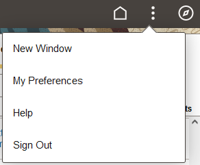
Press the Actions button in the upper part of the banner to reveal the Actions menu, which contains a list of actions you can take. The list of menu items depends on your permissions to perform certain actions.
For example, a fluid homepage contains menu items (New Window, My Preferences, Help, and Sign Out) that pertain specifically to the context of a fluid homepage. Some users, such as guest users, may not have the permission to set preferences on the homepage.
This example illustrates the options appearing on the Actions menu while accessing a fluid application homepage.
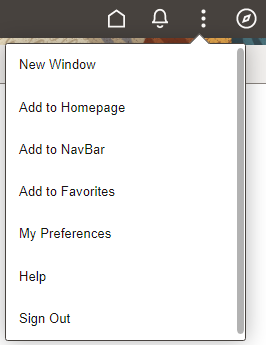
When you access the Actions menu from a dashboard or transaction page, the list of menu items displayed is specific to the dashboard or transaction page and based on the permissions associated to your user role.
This example illustrates the options appearing on the Actions menu while accessing a fluid application page.
|
Field or Control |
Description |
|---|---|
|
New Window |
Opens the currently displayed fluid component or fluid navigation collection in a new browser tab (or window). See Opening New Windows for more information on what is displayed in the new window. Whether the New Window menu item is displayed is determined by:
The New Window menu item is never displayed within a fluid activity guide. In addition, when update of the fluid banner and Actions menu is allowed, the visibility of the New Window menu item can be changed by PeopleCode. |
|
My Preferences |
Opens the My Preferences component, where you can modify settings that control a variety options in the PeopleSoft system based on your preferences. See Defining User Preferences. |
|
Help |
Opens the section in PeopleSoft Online Help for the current component in a new browser window. The Help menu item is displayed only if the Help option is configured in the component properties and Help has been configured for the system on the web profile. |
|
Sign Out |
Signs you out of the system, returning you to the PeopleSoft sign-in page. |
|
Add To Homepage |
Adds a tile on an ad hoc basis to the selected fluid homepage, enabling you to access the page directly from that homepage. See “Using the Add To Homepage Feature” in Managing Tiles on Fluid Homepages and Dashboards. Add To links enable you to personalize application navigation by adding access to any fluid or classic page as needed for your user experience. When you add a tile on an ad hoc basis to a homepage or the NavBar, or when you add a favorite, you can edit and personalize the label for the item. |
|
Add To NavBar |
Adds a tile on an ad hoc basis to the left-hand side of the NavBar, enabling you to access to that page directly from the NavBar. See “Using the Add To NavBar Feature” in Working with the NavBar. Add To links enable you to personalize application navigation by adding access to any fluid or classic page as needed for your user experience. When you add a tile on an ad hoc basis to a homepage or the NavBar, or when you add a favorite, you can edit and personalize the label for the item. |
|
Add To Favorites |
Adds a link to the Favorites section of the NavBar and the quick access bar, as well as the Favorites menu folder available from a classic homepage. See Working with Favorites. Add To links enable you to personalize application navigation by adding access to any fluid or classic page as needed for your user experience. When you add a tile on an ad hoc basis to a homepage or the NavBar, or when you add a favorite, you can edit and personalize the label for the item. |
Homepage Actions Menu
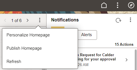
On fluid homepages, press the Homepage Actions button to reveal the Homepage Actions menu, which contains a list of actions specific to the homepage. The list of menu items depends both on what has been configured in the system as well as your permissions to perform certain actions.
For example, a fluid homepage contains menu items (Personalize Homepage, Publish Homepage, and Refresh) that pertain specifically to the context of a fluid homepage as well as the permissions granted to the signed on user. Some users, such as guest users, are not granted the permission to personalize homepages. Other users, such as portal administrators, are granted special permission to publish a personal homepage as a system homepage.
This example illustrates the options that appear while accessing a fluid application homepage.
|
Field or Control |
Description |
|---|---|
|
Personalize Homepage |
Allows you to personalize your fluid homepages, which can include:
|
|
Publish Homepage |
For users with permissions, allows you to publish a personal homepage as a system homepage. See (Fluid only) Publishing Personalizations as a New Fluid Homepage for more information. |
|
Refresh |
Refreshes the homepage content including refreshing the content of the tiles. |
Dashboard Actions Menu
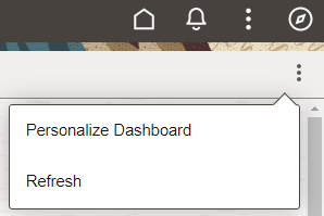
On fluid dashboards, press the Dashboard Actions button to reveal the Dashboard Actions menu, which contains a list of actions specific to the dashboard. The list of menu items depends both on what has been configured in the system as well as your permissions to perform certain actions, for example, personalizing your dashboard.
This example illustrates the options that appear while accessing a fluid application dashboard.
More Actions Menu
On fluid transaction pages, press the More Actions button to reveal the More Actions menu, which contains a list of actions specific to the transaction page. The list of menu items depends both on what has been configured in the system as well as your permissions to perform certain actions.
The More Actions menu lists items that are specific to the content you’re viewing, so the items vary depending on where you navigate. Application developers can change the label of the More Actions menu as per their business requirements. See Banner Class Methods.
This example illustrates the options appearing on the More Actions menu while accessing a fluid transaction page.
After clicking the NavBar button, the NavBar side page appears. Use this page to access additional navigational options.
This example illustrates how the NavBar appears after it is first selected. It hugs the right side of the page, displaying the available tiles and options. These items are discussed in the following sections.
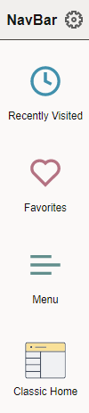
Field or Control |
Description |
|---|---|
|
|
Use to personalize the menu, and to add, reorder, or remove tiles from the NavBar. Such tiles are referred to as NavBar tiles, whereas those appearing on the homepage are homepage tiles. See Personalizing the NavBar for more information. |
|
|
Select the Recently Visited tile to view your recently visited items. See Working with Recently Visited Items for more information. |
|
|
Select the Favorites tile to view your favorites. See Working with Favorites for more information. |
|
|
Select the Menu tile to browse the menu structure and navigate to menu items. See Working with the Menu in the NavBar for more information. |
|
|
Select the Classic Home tile to navigate to your default classic homepage. Note: This tile is labeled Classic Home when the default system homepage is defined as fluid. However, this tile is labeled Fluid Home only when the default system homepage is defined as classic. In that case, selecting Fluid Home takes you to your default fluid homepage. Important! When a classic content reference is selected as the default custom homepage tab by your system administrators or through user personalization, you must add the Homepages tile to the NavBar in order to be able to navigate to any fluid homepages. |


This example illustrates the options available for personalizing the NavBar. Descriptions of the options appear after the example.
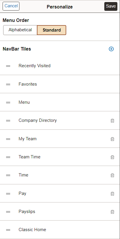
Field or Control |
Description |
|---|---|
Cancel |
Cancel the current selections and close the page. |
Save |
Save your personalization selections and close the page. |
Alphabetical |
When using the Menu tile, display the menu folders and items in alphabetical order. Note: Not all supported languages support alphabetical ordering of the menu. Your system administrator can configure additional languages disable menu sorting. See Managing General Portal Settings for more information. |
Standard |
When using the Menu tile, display the menu folders and items in the order that was standard prior to PeopleTools 8.59. |
|
|
Add a tile to the left pane of the NavBar. For more details on selecting tiles, see Managing Tiles on Fluid Homepages and Dashboards. |
|
|
Delete a tile from the NavBar. |


You can change the sequence in which the tiles appear in the NavBar using drag and drop. Click to select the tile, drag it to the desired position over another NavBar tile, then drop it. The dotted line indicates the tile you are dragging, and the solid line indicates the location where you are dropping the tile.
Note: Alternatively, you can use the keyboard to reposition NavBar tiles. Use the Tab key to highlight the tile you wish to reposition, press Ctrl + M to select it, use Tab or Shift + Tab to highlight the drop location, and then press Ctrl + Shift + M to drop it.
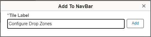
Using the Add To NavBar Feature
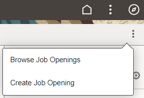
You can also add tiles to the NavBar on an ad hoc basis using the Add To NavBar link in the Actions menu.
Note: No actual tile definition will be created for these tiles if one does not exist already. The information is stored in the system as personalization data only.
When you use the Add To NavBar feature to add a tile to the NavBar, you can edit and personalize the label for the item. For example:
This example illustrates selecting Recently Visited from the NavBar. This tile displays the 10 most recent places in the PeopleSoft system you have been. Using this subset of links enables you to quickly choose from the application pages you have visited most recently.
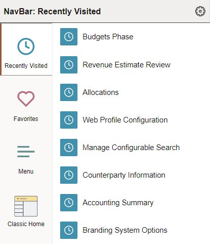
The recently visited items displayed in the NavBar are the same as those displayed via the Recently Visited button in the quick access bar on fluid homepages.
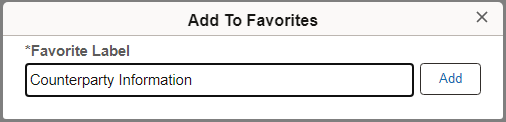
In the Actions menu, click the Add to Favorites link to add the current page as a favorite.
When you add a favorite, you can edit and personalize the label for the item. For example:
In the NavBar, click the Favorites tile to display your list of favorite pages.
This example illustrates links added to Favorites:
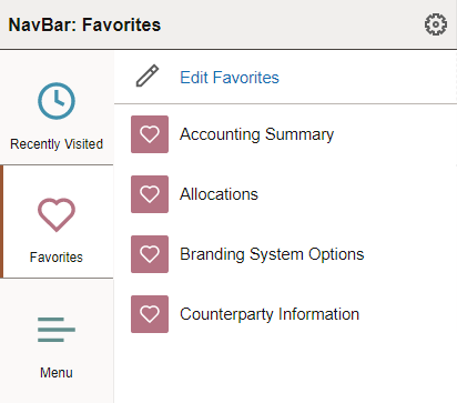
The favorites displayed in the NavBar are the same as those displayed via the Favorites button in the quick access bar on fluid homepages.
Click the Edit Favorites link to access the Edit Favorites page. On the Edit Favorites page you can re-label favorites, delete favorites, or modify the sequence in which they appear under Favorites.
This example illustrates the fields and controls on the Edit Favorites page.
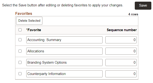
The Edit Favorites page displays a grid with the favorites that you’ve added and their sequence numbers.
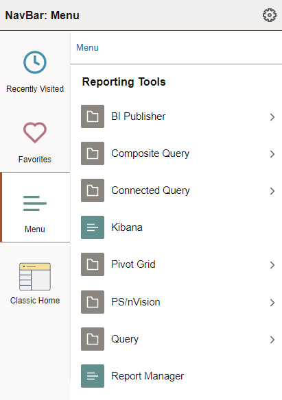
The Menu tile allows you to browse the menu structure and navigate to the selected menu item.
Note: NavBar personalization allows you to display the menu in alphabetical order (for supported languages that support alphabetical ordering) or in sequence number order, which was the standard order prior to PeopleTools 8.59. See Personalizing the NavBar for more information.
This example illustrates using the menu, which is displayed here in alphabetical order. You can navigate through the menu folders and menu items.
Field or Control |
Description |
|---|---|
Menu |
Click the Menu link in the breadcrumbs to navigate to the root of the menu structure. Click any other link in the breadcrumbs to browse the contents of the menu folder. |
|
|
Select a menu folder to open the folder and browse its contents. |
|
|
Select a menu item to navigate to that item. |


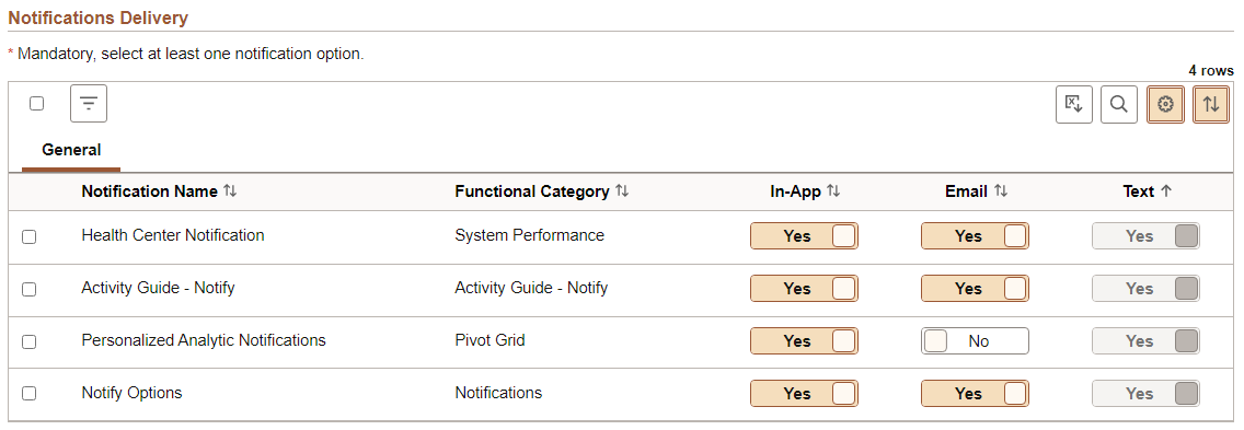
This example illustrates the appearance of a grid on a fluid page.
Term |
Definition |
|---|---|
|
|
Select All button Click to select all or deselect all rows in the grid. Note: The state displayed by the Select All button reflects the last user interaction with the button, and not interactions with individual grid rows. A server trip will clear the Select All button, but not the settings for individual rows. |
|
|
Filter button Click to open the Filter dialog box to allow you to select one or more filter criteria to limit the grid rows displayed. |
|
|
Download to Excel button. Click to download the grid contents to an Excel spreadsheet. Note: The downloaded file
is named |
|
|
Find button. The find feature looks for matches in edit boxes, display-only fields, disabled or shaded fields, dynamic links, and text in long edit boxes. It does not find column headings, field labels, text values on icons, static links, and hidden fields. It also does not search HTML areas that are on the grid or scroll area. See Finding Data for more information. |
|
|
Personalize button. Click to display the Grid Settings page in a modal window. See the following section, “Personalizing a Grid,” for more information. When no grid personalization is in effect, the button background color is white; when grid personalization is in effect, including a simple user sort, the button background color is brown. Note: The Personalize button does not appear on a "stacked" grid because personalization is disabled on a “stacked” grid. |
|
|
Sort button. Click to display the Sort pop-up menu. See the following section, “Sorting a Grid,” for more information. When the default sort is in effect, the button background color is white; when a user sort is in effect, the button background color is brown. |
Grid Column Heading |
Click a grid column heading to sort or resort the grid data. An up or down arrow indicates the direction of the active sort. Note: Sorting is disabled on columns consisting of radio button fields. |


Personalizing a Grid
This example illustrates the fields and controls on the Grid Settings page. You can find definitions for the fields and controls later on this page.
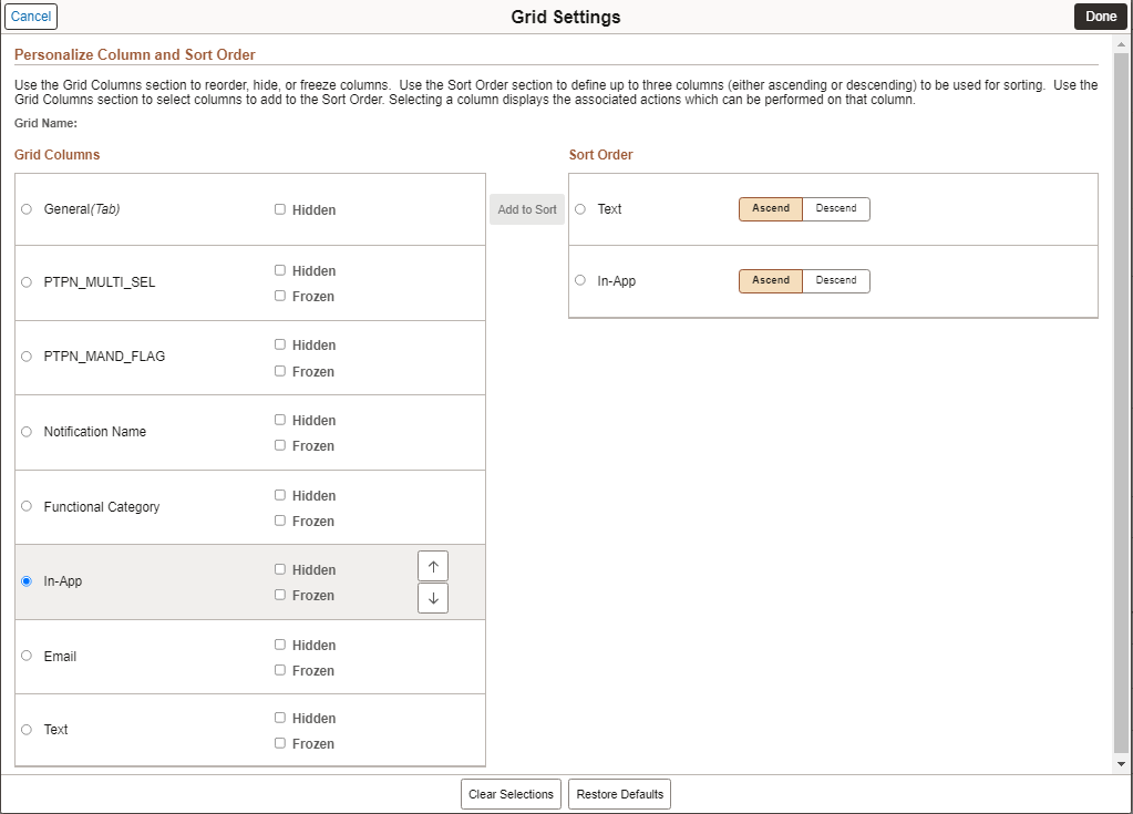
In both sections, selecting a column displays the associated actions which can be performed on that column. Use the Grid Columns section to reorder columns, hide or show columns, freeze or unfreeze columns, and to add columns to the Sort Order section. Use the Sort Order section to define up to three columns (either ascending or descending) to be used for sorting the grid.
Term |
Definition |
|---|---|
Hidden |
Select this option to hide a grid column. |
Frozen |
Select this option to freeze a grid column so that it appears on all tabs of a tabbed grid. Note: This option appears only on tabbed grids. |
Add to Sort |
When a column is selected in the Grid Columns section, use the Add to Sort button to add the column to the Sort Order section. |
Clear Selections |
Click the Clear Selections button to deselect all selected items in both the Grid Columns section and the Sort Order section. |
Restore Defaults |
Click the Restore Defaults button to restore the default column order, default sort order, and whether columns are visible. |
After you've personalized the columns in a grid and saved your settings, if your system administrator inserts a new column in that grid, the system preserves the column personalization in the grid and displays the newly inserted column as the last column in the grid.
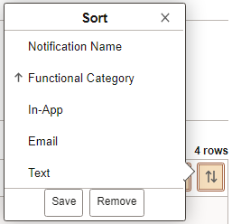
Sorting a Grid
This example illustrates the fields and controls on the Sort pop-up menu when save sort has been enabled. You can find definitions for the fields and controls later on this page.
Term |
Definition |
|---|---|
Grid Column Heading |
Click a grid column heading to sort or resort the grid data. An up or down arrow indicates the direction of the active sort. On a stacked grid, personalization is disabled, but you can use the sort button to sort multiple columns. The sort indicator arrow only appears on the primary sort column, but users can sort up to three columns. For example, if you want to sort two columns, you should first perform a sort on the secondary sort column and then on the primary sort column. You can then save the sort and the sorting on both columns will be saved. Any time a column is sorted on, it becomes the primary sort. Any previously sorted columns (in the same session) become secondary and tertiary sorted columns. In this way, you can sort multiple columns. Note: Sorting is disabled on columns consisting of radio button fields. |
Save |
Note: The Save button is available only when personalization has been enabled for the grid. The Save button is displayed only after a user sort is in effect. Click the Save button to save a user sort. |
Remove |
Note: The Remove button is available only when personalization has been enabled for the grid. The Remove button is displayed only after a user sort has been saved. Click the Remove button to remove a saved user sort. |
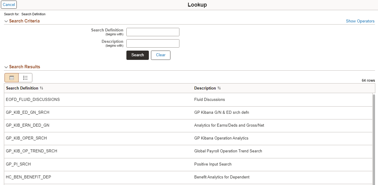
This example illustrates the look and feel of the controls on a fluid lookup page.
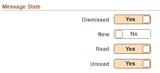
This example illustrates the use of contemporary controls widely used in modern web applications, specifically the toggle switch to indicate Yes/No values by tapping on the control.
The “slide-out” left panel is a feature that enables you to reveal the left panel of an outer, fluid wrapper (master/detail component, fluid activity guide, or fluid navigation collection) when the currently displayed component includes its own left panel.
When the slide-out left panel is enabled and an inner component without its own left panel is displayed, the left panel of the outer, fluid wrapper is displayed normally; there is no need for a slide-out left panel.
When the slide-out left panel is enabled and an inner component with its own left panel is displayed, the left panel of the outer, fluid wrapper is initially minimized as shown in the following example. The navigation links displayed are those from the inner component:
Clicking anywhere on the tab divider (labeled Detail, in this example) will slide open the left panel of the outer, fluid wrapper. The navigation links displayed are those from the outer, fluid wrapper: