Viewing Compensation Pivot Grids
This topic lists the common elements used in this section, and discusses how to view various compensation pivot grids.
|
Page Name |
Definition Name |
Usage |
|---|---|---|
|
WCS_ECM_MSS_SUM |
Access Compensation pivot grids. |
|
|
PTPG_PGVIEWER |
View the Salary Increase by Performance pivot grid. |
|
|
PTPG_PGVIEWER |
View the Variable Compensation by Performance pivot grid. |
|
|
PTPG_PGVIEWER |
View the Salary Analysis pivot grid. |
|
|
PTPG_PGVIEWER |
View the Compensation Distribution pivot grid. |
|
|
WCS_ECM_CYC_ADM |
Access Compensation pivot grids. |
|
|
PTPG_PGVIEWER |
View the Cycle Guideline Alert pivot grid. |
|
|
PTPG_PGVIEWER |
View the Cycle Tracking pivot grid. |
Field or Control |
Description |
|---|---|
|
Click to open the Options Menu and select an action to perform on the pivot grid model. |
View Grid |
Click to view data in the grid format in a new modal window. You can change how data is presented in the grid by dragging and dropping segment data to a different axis. |
Update Filters |
Click to add or remove filters to be available for use in the pivot grid model. |
Chart Options |
Click to open the Chart Options modal page where you can change the chart layout, and information displayed on chart axes. |
Export Data |
Click to export the underlying PSQuery data into a spreadsheet. |
Reset |
Select to delete all personalization of the current model and reset the model to the default layout, if applicable.. |
Save |
Click to save the current grid and chart layout as the default view of the current model. |
Save As |
Click to save copy the current pivot grid model and save it as a different one. |
Sort Option |
Click the update the current sort order, if applicable. |
Rows |
Displays the filters (maximum of 2) for the model that are used as its X-axis and series. If two filters are selected, the first one becomes the X-axis and the second one becomes the series (legend). |
Columns |
Displays all the facts for the model that you can select as its Y-axis. Click a fact to make it the model’s Y-axis. |
|
Click to display data in the chart type represented by the icon. Available chart types include vertical bar (default value), line, pie and horizontal bar. |
|
Click to show or hide the filters on the left panel. When a pivot grid model is loaded initially, filters are hidden by default. |
Filters or Facets |
They are displayed on the left panel if shown, as selected in the Update Filters option. Users can use the available filters to change the data to be displayed in the pivot grid model. |
|
Click to drag the corresponding filter to the Columns or Rows region above the model and change how the model is presented. A filter cannot be dragged if the Drag icon appears inactive (in lighter gray color). If a filter is active, orange dotted lines appear as the borders of the filter box when you drag it. |


See the Viewing Pivot Grid Models in Fluid Mode topic in PeopleTools: Pivot Grid product documentation for additional examples on the use of pivot grid controls.
Use the Salary Increase by Performance page (PTPG_PGVIEWER) to view the Salary Increase by Performance pivot grid.
Navigation:
Click the Analytics link of a salary plan (like Merit Increase) and then the Salary Increase by Performance link on the Allocate Compensation page.
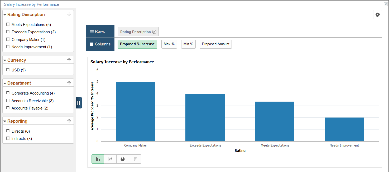
This example illustrates the fields and controls on the Salary Increase by Performance pivot chart.
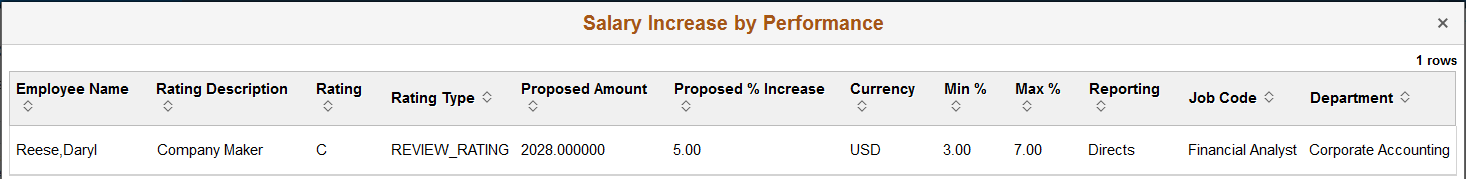
You can click a bar to see the detailed view of the data represented by that bar in a grid:
This example illustrates the fields and controls on the Detailed View of the Salary Increase by Performance pivot grid.
Information Displayed in the Salary Increase by Performance Pivot Grid
The Salary Increase by Performance pivot grid provides managers a snapshot of the proposed salary increase percentage for each performance rating. They can drill down into a performance rating to find out how many employees (direct and indirect reports) fall into that rating and who they are. Information provided in this pivot grid allows managers to reward their employees commensurate with their performance level.
Important! In order for performance data to be retrieved for use in this pivot grid, integration with PeopleSoft ePerformance is required.
When viewed in the grid format, this pivot grid displays the minimum and maximum percentages of salary increase available to an employee, which is defined on the Salary page of the compensation cycle definition. If such information is not available for the employee in the system, the values will be displayed as zero for the employee in the chart.
Data displayed in this pivot grid pertains to the compensation cycle from which the pivot grid is generated and it is available only for salary plans. It is not available to variable compensation plans.
The initial view of the pivot grid shows the count of all salary increase proposals, broken down by rating.
When you click a segment of the pivot grid, you can select to:
View the details of the segment in a grid format. For example, details of all salary increases initiated for the Exceeds Expectations rating.
View further drill-down of the segment data using these dimensions in the chart format:
Job Code
Employee Name
For example, a bar chart showing all salary increases initiated for the Exceeds Expectations rating, broken down by job code.
Use the Variable Compensation by Performance page (PTPG_PGVIEWER) to view the Variable Compensation by Performance pivot grid.
Navigation:
Click the Analytics link of a cash-type variable compensation plan (like Bonus Plan) and then the Variable Compensation by Performance link on the Allocate Compensation page.
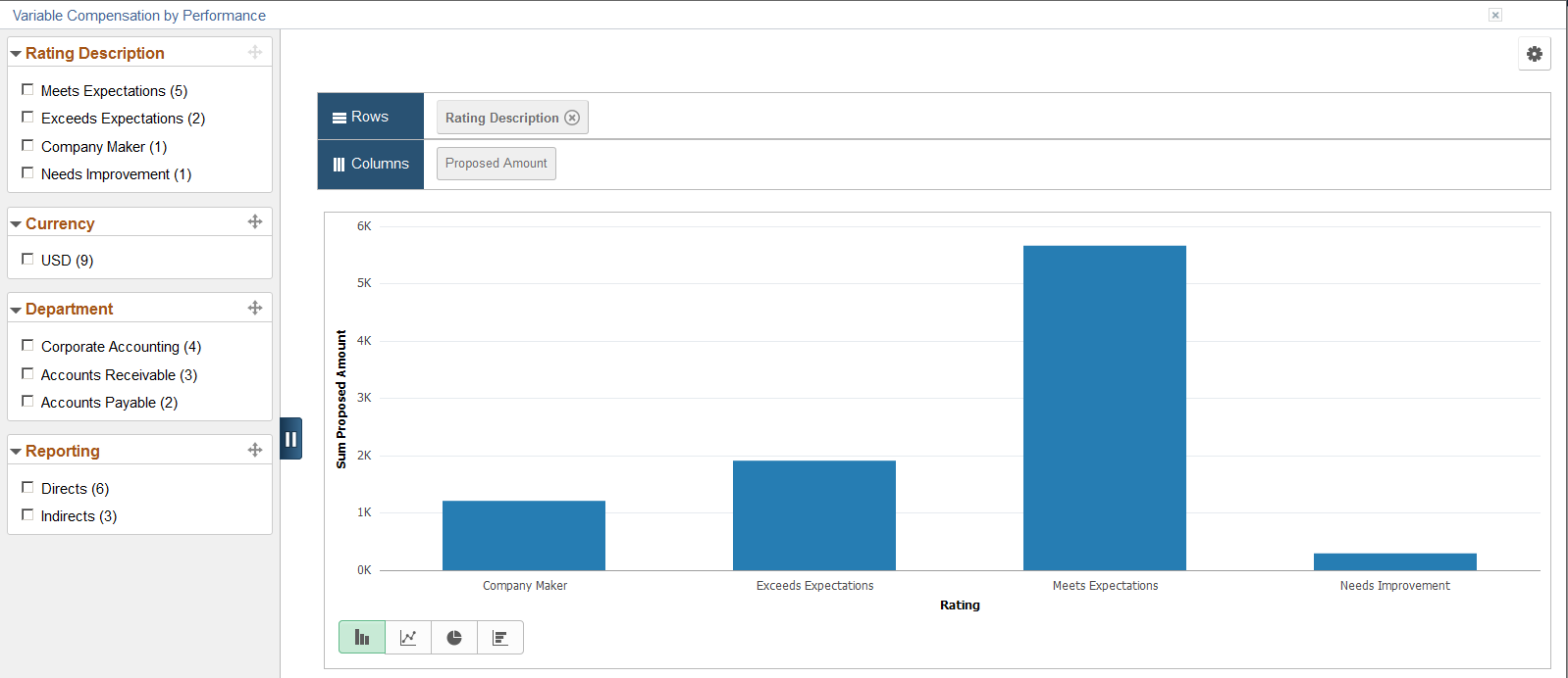
This example illustrates the fields and controls on the Variable Compensation by Performance pivot chart.
Information Displayed in the Variable Compensation by Performance Pivot Grid
The Variable Compensation by Performance pivot grid is similar to the Salary Increase by Performance pivot grid in purpose and functionality. The only differences are:
The Variable Compensation by Performance pivot grid is built for variable compensation (non-salary) plans that are cash type plans.
Proposed amount is shown as the only Y-axis. For the Salary Increase by Performance pivot grid, there are a number of facts you can select as the Y-axis..
Important! In order for performance data to be retrieved for use in this pivot grid, integration with PeopleSoft ePerformance is required.
The initial view of the pivot grid shows the summed proposal amounts of all cash-type variable compensation proposals, broken down by performance rating. When you click a segment of the chart, you can select to:
View the details of the segment in a grid format. For example, details of all variable compensation proposals initiated for the Exceeds Expectations rating.
View further drill-down of the segment data using these dimensions in the chart format:
Job Code
Employee Name
For example, a bar chart showing all variable compensation proposals initiated for the Exceeds Expectations rating, broken down by job code.
Use the Salary Analysis page (PTPG_PGVIEWER) to view the Salary Analysis pivot grid.
Navigation:
Click the Compensation Analytics link and then the Salary Analysis link on the Allocate Compensation page.
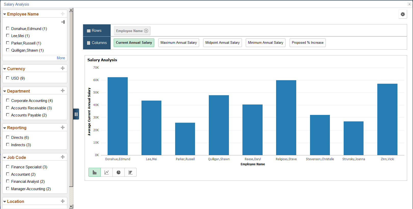
This example illustrates the fields and controls on the Salary Analysis pivot chart.
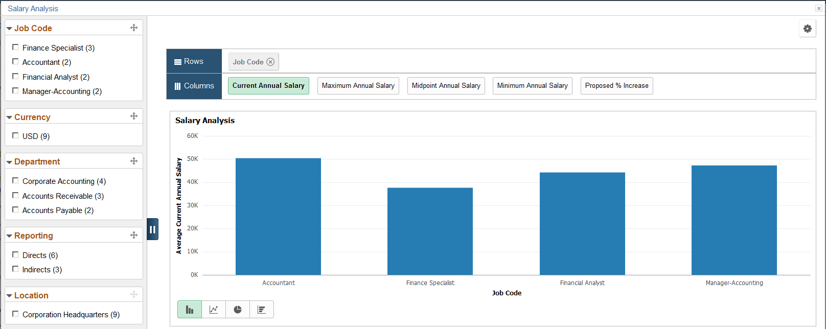
In addition to using filters, you can also change how data is displayed by changing the information represented in X-axis and Y-axis. To do so, drag a filter from the left panel and drop it in the Rows region, and remove the current filter if needed. For example, drag and drop the Job Code filter in the Rows region, and remove the Employee Name filter:
This example illustrates the fields and controls on the Salary Analysis pivot chart with Job Code as X-Axis.
Information Displayed in the Salary Analysis Pivot Grid
Managers can use the Salary Analysis pivot grid to compare salary compensation for all their direct and indirect reports. When viewed in the grid format, this pivot grid displays the salary minimum, maximum, and midpoint of an employee, which is defined on the salary grade assigned to each employee. If such information is not available for the employee in the system, the values will be displayed as zero for the employee in the chart.
Data displayed in this pivot grid pertains to the compensation cycle from which the pivot grid is generated and it covers all salary plans within that cycle. Variable compensation plans are not included.
The initial view of the pivot grid shows the average current annual salaries of all direct and indirect reports of the manager, broken down by employee name. When you click a segment of the chart, you can select to view the details of the segment in a grid format, which is the salary information the selected employee.
Use the Compensation Distribution page (PTPG_PGVIEWER) to view the Compensation Distribution pivot grid.
Navigation:
Click the Compensation Analytics link and then the Compensation Distribution link on the Allocate Compensation page.
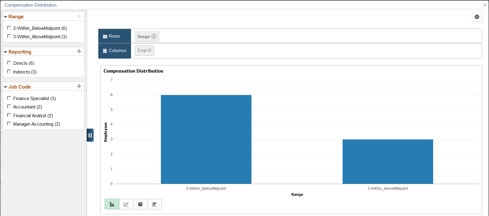
This example illustrates the fields and controls on the Compensation Distribution pivot chart.
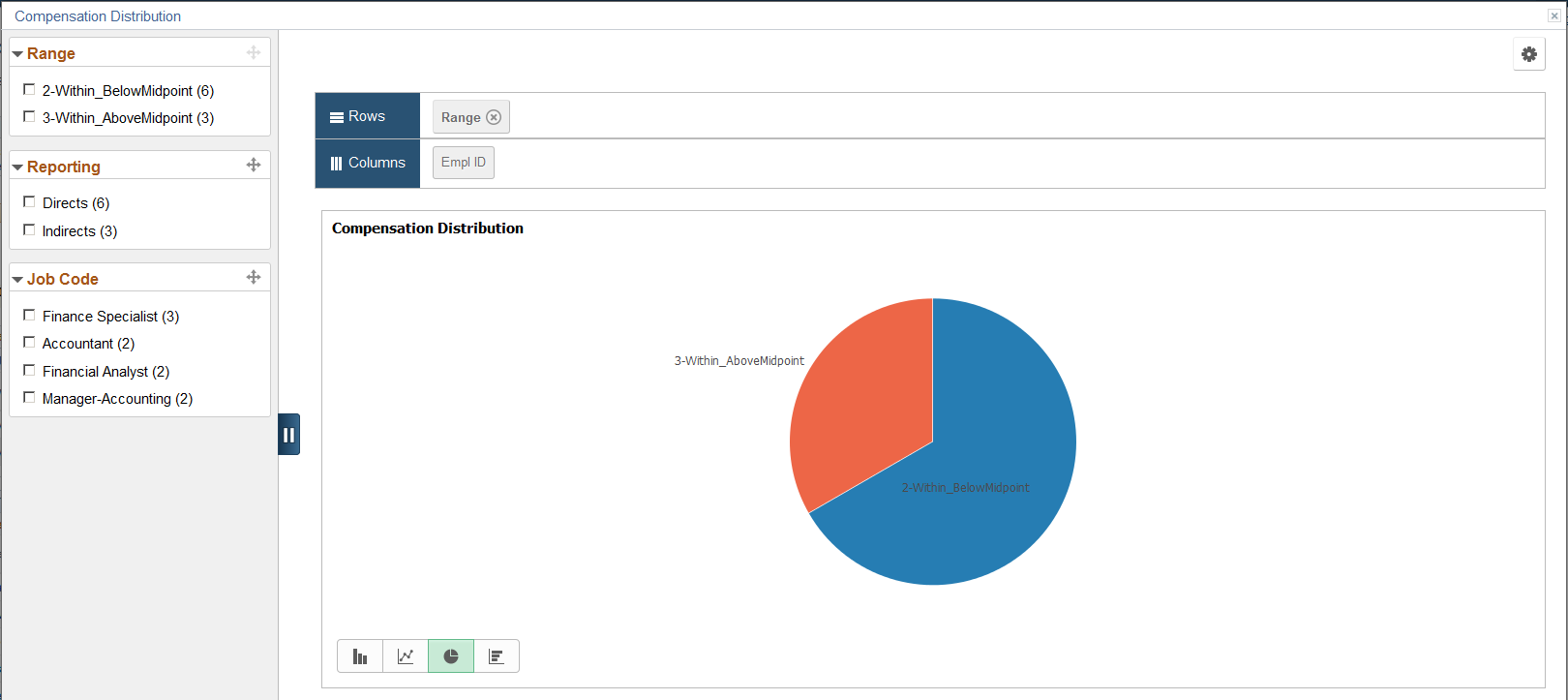
You can click the Pie Chart icon to change the display format to pie chart:
This example illustrates the fields and controls on the Compensation Distribution pivot grid displayed as pie chart.
Information Displayed in the Compensation Distribution Pivot Grid
From the Compensation Distribution pivot grid, managers can see how their employees are compensated in terms of salary pay, specifically, where they are in relation to their respective salary ranges.
Data displayed in this pivot grid pertains to the compensation cycle from which the pivot grid is generated and it covers all plans within that cycle.
The initial view of the pivot grid shows the employee count (direct and indirect reports of the manager) for each of these salary range categories:
Below the salary range minimum
Within the salary range, but below the salary midpoint
Within the salary range and at or above the salary midpoint
Above the salary range maximum
A salary range category is not visible if the corresponding count is zero.
When you click a segment of the chart, you can select to:
View the details of the segment in a grid format. For example, details of employees in the within or above mid-point category.
View further drilldown of the segment data using these dimensions in the chart format:
Group Status
Employee Name
Job Family
For example, a bar chart showing employee counts in the within or above mid-point category, broken down by job family code.
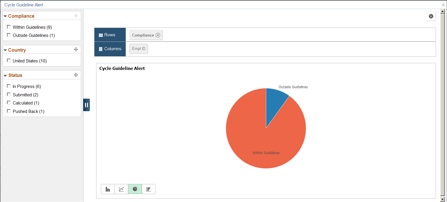
Use the Cycle Guideline Alert page (PTPG_PGVIEWER) to view the Cycle Guideline Alert pivot grid.
Navigation:
Click the Compensation Analytics link and then the Cycle Guideline Alert link on the Administer Cycle page.
This example illustrates the fields and controls on the Cycle Guideline Alert pivot chart.
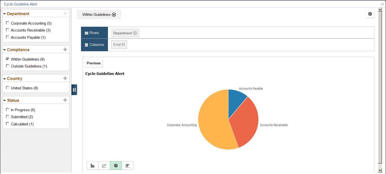
You can click a bar and select to drill down that piece of data further, for example, by department:
This example illustrates the fields and controls on the Cycle Guideline Alert pivot chart by Department.
Note: This pivot grid is not available to cycles that are in any status prior to Opened.
Information Displayed in the Cycle Guideline Alert Pivot Grid
From the Cycle Guideline Alert pivot grid, administrators can see the counts of salary allocation proposals that fall within, as well as outside of the recommended guidelines respectively. Data for this pivot grid is based on all salary proposals that are associated with the compensation cycle from which this pivot grid is generated.
Note: If none of the plans for the cycle contains a maximum allowed salary percentage increase, the pivot grid is not applicable and therefore not displayed under the Compensation Analytics link.
The initial view of the pivot grid shows the salary proposal counts, broken down by guideline compliance (Within Guidelines or Outside Guidelines). Within Guidelines refers to any proposals where the proposed percentage increase is equal to or greater than the minimum salary percent increase and either one of the following two conditions apply:
The proposed percentage increase is equal to or less than the maximum salary percent increase.
The maximum salary percent increase is zero.
Any proposals that do not meet these conditions are considered Outside Guidelines.
The system uses these formulas to calculate the proposed percentage increase for the Cycle Guideline Alert pivot grid:
Otherwise,
When you click a segment of the chart, you can select to:
View the details of the segment in a grid format, for example, details of all proposals that are within guidelines.
View further drill-down of the segment data using these dimensions in the chart format:
Group Node
Department
Salary Plan
Location
Job Code
Employee Name
For example, a bar chart showing all proposals that are within guidelines, broken down by department.
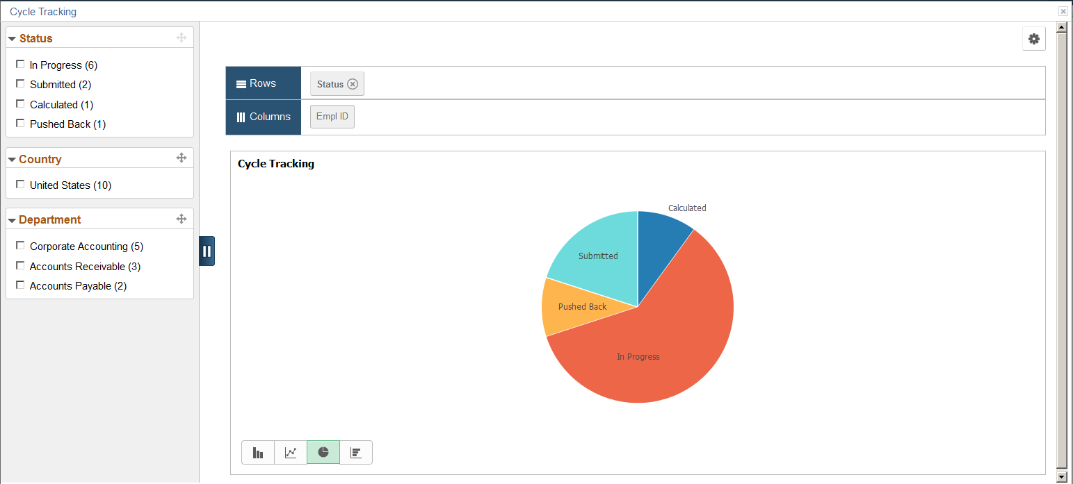
Use the Cycle Tracking page (PTPG_PGVIEWER) to view the Cycle Tracking pivot grid.
Navigation:
Click the Compensation Analytics link and then the Cycle Tracking link on the Administer Cycle page.
This example illustrates the fields and controls on the Cycle Tracking pivot chart.
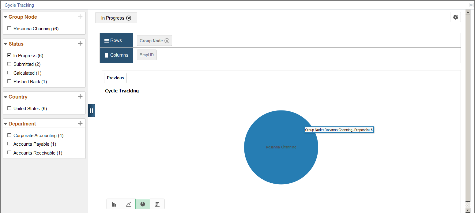
You can click a bar and select to drill down that piece of data further, for example, by group node:
This example illustrates the fields and controls on the Cycle Tracking pivot chart showing data by group node.
The Cycle Tracking pivot grid gives administrators a quick status view of all salary allocation proposals pertaining to the compensation cycle from which the pivot grid is generated. The initial view of the pivot grid shows the proposal counts, broken down by status (Calculated, In Progress, Submitted, Pushed Back, Confirm, Ready to Load, and so on).
Note: This pivot grid is not available to cycles that are in any status prior to Opened.
When you click a segment of the chart, you can select to:
View the details of the segment in a grid format, for example, details of all proposals in the Calculated status.
View further drill-down of the segment data using these dimensions in the chart format:
Group Node
Salary Plan
Location
Job Code
Employee Name
For example, a bar chart showing all proposals that are in the Calculated status, broken down by job code.