Viewing Vaccination Insights
PeopleSoft Vaccination Analytics dashboard provides administrators the ability to view and analyze Health and Safety vaccination data using PeopleSoft Insights visualizations.
Based on user privileges, administrators can access visualizations on the Vaccination Analytics dashboard to track the progress of vaccinations in the employee population and identify trends of vaccination occurrence by vaccine.
The Vaccination Analytics dashboard built on the PeopleSoft Insights platform, which relies on an underlying analytics engine and search engine. Vaccination data that is visible on the dashboard comes from the HC_HS_EMPL_VACC_DATA search index.
These videos provide an overview of PeopleSoft Insights for Health and Safety:
Video: Image Highlights, PeopleSoft HCM Update Image 37: PeopleSoft Insights for Health and Safety
Video: Image Highlights, PeopleSoft HCM Update Image 40: Employee Wellness
Video: Image Highlights, PeopleSoft HCM Update Image 41: Vaccination and Testing Tracking Analytics
Video: PeopleSoft Vaccination and Test Tracking with Analytics
This topic provides an overview of how to set up the dashboard for vaccination analytics, lists common elements and controls, and discusses the Vaccination Analytics dashboard.
Understanding PeopleSoft Insights
PeopleSoft Insights is an analytical engine that provides visual reports (visualizations) in the form of charts, tables, graphs and so on. The visualizations are based on queries that retrieve data from the PeopleSoft Search Framework.
These videos provide an overview of the PeopleSoft Insights feature:
Video: Insights with PeopleSoft
Video: PeopleSoft HCM Insights
For information on Insights dashboards, see:
PeopleTools Search Technology: "Monitoring PeopleSoft Search Framework and OpenSearch" and "Working with Insights Dashboards for PeopleSoft Application Data" documentation.
|
Page Name |
Definition Name |
Usage |
|---|---|---|
|
HC_HS_VACC_ANALYTICS_FL (this is the cref for the tile) |
Access the Vaccination Analytics dashboard. |
|
|
PTSF_KIBANA_COMP |
Review and analyze vaccination data using visualizations. |
Before administrators can access the visualizations for vaccination data, the following steps should be performed:
Deploy the HC_HS_EMPL_VACC_DATA (Employee Vaccination Details) index.
()
Build the HC_HS_EMPL_VACC_DATA search index.
()
Deploy the Vaccination Analytics Tile and Vaccination Analytics dashboard.
()
Note: The full index must be run before the dashboard can be deployed.
Assign these user roles to administrators to access and view Vaccination Analytics visualizations:
Health and Safety ADM Fluid, which provides access to the Vaccination Analytics tile and dashboard.
Health & Safety Administrator, which provides access to vaccination data components, allowing users to view vaccination data presented on visualizations.
Real Time Index for Vaccination Analytics Visualizations
The HC_HS_EMPL_VACC_DATA (Employee Vaccination Details) search index supports real time indexing (RTI) with PeopleTools version 8.59.13 or higher. When enabled, RTI allows real-time updates to the indexed data that is viewable in vaccination analytics.
For more information about Real Time Indexing, refer to PeopleTools Search Technology, "Administering Real Time Indexing."
This section lists the common elements and controls that are used in Insights analytics.
For more information on working with PeopleSoft Insights and filters, see PeopleTools Search Technology, "Working with Insights Dashboards for PeopleSoft Application Data" documentation.
Search and Filter Options:
Note: Filtering options apply to all visualizations, which allows users to drill down on all the charts at once.
|
Term |
Definition |
|---|---|
|
|
Click to save the current query text and filters that you want to reuse in the future, or select an existing query to use to update the visualizations. |
|
Search field |
Enter a query to filter data, if applicable. |
|
|
Enter criteria to filter data on the visualizations. You can apply filters in a number of ways:
Added filters are displayed next to the + Add filter link for reference. For example, when you click a pie chart item, such as Medical Exemption, the filter is automatically added to your filters list, and all visualizations are refreshed to show data for vaccinations that were declined due to medical reasons. Click the Change all filters icon for a list of actions that can be performed on all filters, for example, disable them temporarily, remove them permanently, or invert inclusion (show data that does not meet filter criteria). Click a filter item for a list of similar actions that can be performed on it individually. |
|
|
Select a different time period for the analytics. You can enter it manually, or choose from commonly used date ranges provided the system as well as recently used selections. When a new period is selected, all visualizations are refreshed automatically to reflect that change. If you have selected a commonly used date range, for example, This month, or Week to date, click the Show dates link to view the approximate date period in relation to the current date. For example, the current date is November 1 and the selected date range is Year to date. Clicking the Show dates link displays ~ 10 months ago —> now, which indicates that the selected date range started from approximately 10 months ago and ends on the current date. |
|
Organizational Relationship, Regulatory Region, Business Unit, Department, Work Location, Job Family, Vaccine, and Vaccination Location |
Select to filter vaccination data using these delivered filter fields. Selections in the Regulatory Region field control the values that are available in the Business Unit, Department, Work Location, Job Family, and Vaccine fields respectively. |
 (See saved queries)
 (Change all filters), and
  (Calendar) or
 Visualization Options:
When you pause over a visualization, the Options and Legend (if applicable) icons are displayed on the top right and bottom corners respectively. Use them to inspect the chart or table and view the details of that visualization, and toggle the legend display.
|
Term |
Definition |
|---|---|
|
|
Click the Options icon to select one of these options:
|
|
|
Click this icon to hide or display the legend for the chart, if available. You can click an item in the legend to change its color, or add it as a filter (if applicable). |
|
Chart item (bar, pie slice, and so forth) |
Pause over a chart item, such as a bar item or pie slice, to view a summary of details for that item. Select a chart item to add a filter for it to apply to all visualizations. |
 (Options)
 (Toggle legend)
Use the Vaccination Analytics tile to access the Vaccination Analytics dashboard.
Navigation:
From the Workforce Administrator home page, select the Manage Health and Safety tile.
The Vaccination Analytics tile is located on the Manage Health and Safety Dashboard.
This example illustrates the Vaccination Analytics tile.
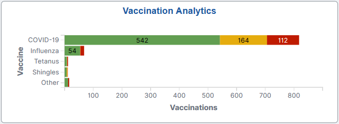
The Vaccination Analytics tile displays the Vaccination Status by Vaccine visualization, which gives a snapshot of the distribution of employee vaccinations by vaccine.
Click this tile to access the Vaccination Analytics Dashboard where you can use the visualizations provided to view and analyze Health and Safety vaccination data.
Use the Vaccination Analytics dashboard to review and analyze vaccination data using visualizations.
Navigation:
Select the Vaccination Analytics tile.
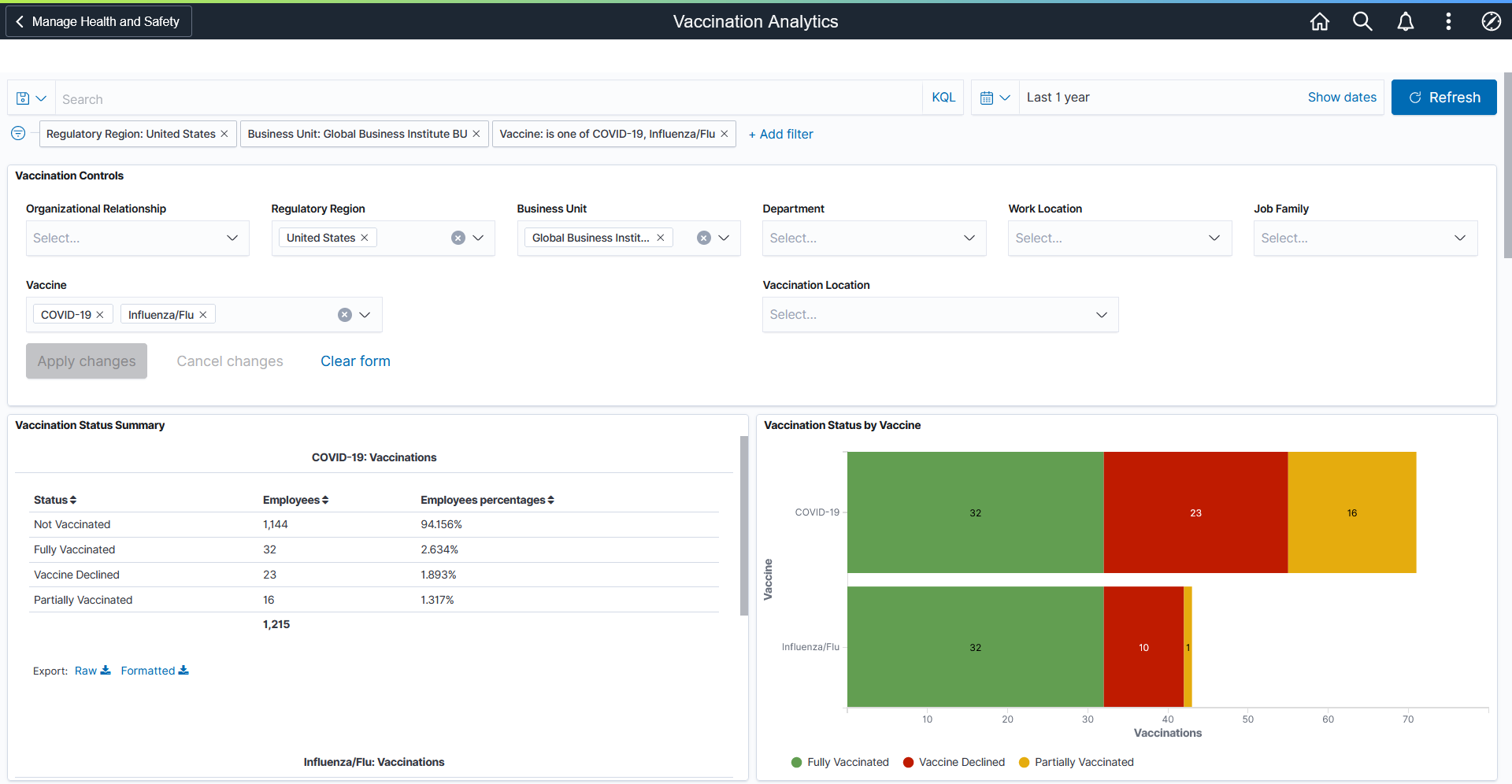
This example illustrates the Vaccination Analytics dashboard (1 of 4).
This example illustrates the Vaccination Analytics dashboard (2 of 4).
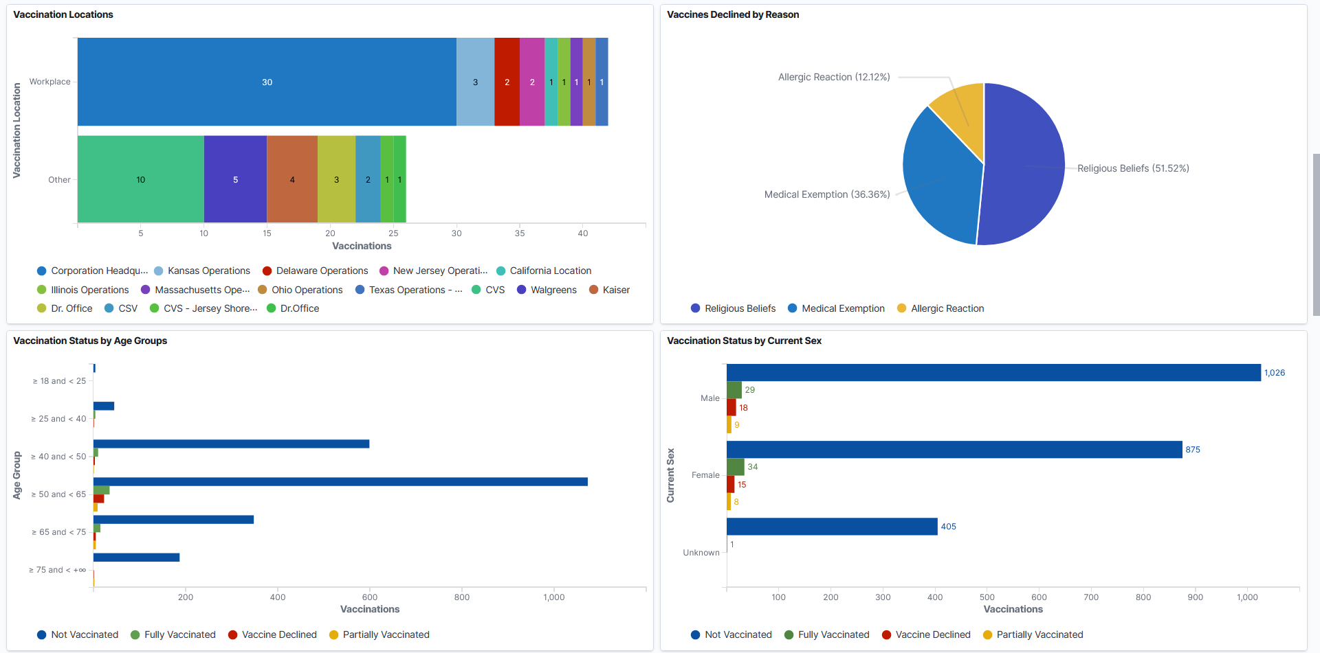
This example illustrates the Vaccination Analytics Dashboard (3 of 4).

This example illustrates the Vaccination Analytics Dashboard (4 of 4).

Warning! PeopleSoft Insights dashboards may not render properly if you access them using unsupported platforms.
The Vaccination Analytics dashboard provides a number of visualizations for you to view and analyze vaccination data. When you select filters or chart items, or modify the date range, PeopleSoft Insights dynamically updates all visualizations using the source from the index.
The dashboard uses role-level security to display permitted data to the user.
Vaccination Analytics Considerations
Review these points before you begin using the Vaccination Analytics dashboard:
By default, the Vaccination Analytics dashboard displays vaccination data for employees, contingent workers, and persons of interest (POIs). You can filter data using these values in the Organizational Relationship field.
For simplicity purposes, these individuals are collectively referred to as "employees" on the dashboard and in this topic.
The dashboard displays data only for regulatory regions that have vaccine setup to support vaccination tracking.
Each row in the Vaccination Details grid represents a dose that an employee took or a vaccine that they declined.
(For single-dose vaccine) The employee becomes fully vaccinated from the row reported for that one dose. A vaccine is considered single-dose if it is set as a 1-dose vaccine in the manufacturer setup, or does not have any manufacturer setup.
(For multi-dose vaccine) The employee becomes fully vaccinated from the row reported for the last dose of the vaccination series.
Important! When the employee has completed a vaccination series, any previous partially vaccinated row from the same vaccination series will be excluded automatically from the dashboard.
The Vaccination Details and Not Vaccinated Details grids can show up to 500 rows of data initially, whereas the charts support the display of more than 500 rows of data.
Use filters to refine the set of reported vaccination data you wish to visualize using this dashboard. For example, filter the data by a specific regulatory region and vaccine.
If a filter field contains multiple values, the drop-down list displays the first 10 values in alphabetical order. To look up additional values, type them in the field manually (case-sensitive).
|
Visualization |
Description |
|---|---|
|
Vaccination Status Summary |
For each vaccine selected or included in the Vaccination Analytics dashboard, this visualization displays a data table that shows the breakdown of employee vaccinations by these statuses (if applicable):
Scroll down to view the information for all vaccines included in the dashboard. |
|
Vaccination Status by Vaccine |
This stacked horizontal bar chart visualization displays the numbers of vaccinations by vaccine and applicable status (Fully Vaccinated, Partially Vaccinated, and Vaccine Declined). |
|
Vaccination Locations |
This stacked horizontal bar chart visualization displays the numbers of vaccinations by vaccination site (Workplace and Other) and location. |
|
Vaccines Declined by Reason |
This pie chart visualization displays the percentages of employee-declined vaccines by reason. |
|
Vaccination Status by Age Groups |
This horizontal bar chart visualization displays the distribution of vaccinations by age group and status. |
|
Vaccination Status by Current Sex |
This horizontal bar chart visualization displays the numbers of vaccinations by current sex and status. |
|
Vaccination History |
This area panel displays vaccination trends by vaccine during the specified time period. Pause over the X-axis to view the numbers of vaccinations by vaccine on a given date on the popup menu that appears. Pause over a vaccine in the legend to bring the area of that vaccine to focus. Click a vaccine in the legend to make the area of that vaccine invisible. |
|
Vaccinations by Work Location |
This stacked vertical bar chart visualization displays the numbers of vaccinations by work location and status. |
|
Vaccinations by Department |
This stacked vertical bar chart visualization displays the numbers of vaccinations by department and status. |
Vaccination Details
The Vaccination Details grid lists the vaccination data (presented in visualizations) in a tabular format.
|
Field or Control |
Description |
|---|---|

(Sort column heading) |
Click a column heading to sort grid rows by the column value in ascending or descending order. |
|
|
These filter icons appear when you pause next to a field value. These icons are available for all column values in the grid, and provide a quick way to add filters to the analytics. Click the Filter for value (+ magnify glass) icon to add the shown field value as a filter to all visualizations. For example, if you click to filter for the Fully Vaccinated status value, all visualizations will refresh to show data for fully-vaccinated rows. Click the Filter out value (- magnify glass) icon to remove the shown field value from the filter process for all visualizations. For example, if you click to filter out the Fully Vaccinated status value, all visualizations will refresh to show data for all rows except the ones that are fully vaccinated. Filters can be removed from the Filters area at the top of the page. |
|
Details |
Click the Go to Health Card link to access the corresponding employee health card in a new browser window or tab. See Health Card Page. Note: If you update the vaccination information of an employee in the health card, you need to rebuild the index for the changes to be reflected in the analytics. However, changes will be updated in the index in real time when RTI is enabled. See the Real Time Index for Vaccination Analytics Visualizations section in this topic for the index that is RTI-enabled for the Vaccination dashboard. |
|
Raw or Formatted |
Click to export data from the grid into a .csv file format. |
 (Filter for value) and
  (Filter out value)
 Not Vaccinated Details
The Not Vaccination Details grid lists the information of employees who do not have any vaccination information for the specified vaccine in the system. The status is shown as Not Vaccinated for these employees in the dashboard.