Administering System Branding
This topic discusses how to administer branding of your system.
Use the Branding System Options page to specify system-wide branding settings including the branding theme type (family), the branding theme, the default style sheet for classic components, and the default style sheet for fluid components.
Navigation:
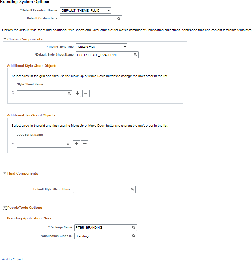
This example illustrates the fields and controls on the Branding System Options page. You can find definitions for the fields and controls later on this page.
Field or Control |
Description |
|---|---|
Default Branding Theme |
Select a default, system-wide branding theme. Important! In a cluster environment, ensure that all systems use the same setting for default branding theme. Warning! The branding theme selected must be compatible with the theme family selected in the Theme Style Type field. Otherwise, unexpected and undesirable results can occur. |
Default Custom Tabs |
Select a default, system-wide navigation collection that will be used to render custom homepage tabs. Note: Custom tabs are visible from classic homepages only. |
Compatible Branding Themes
Use the following table to determine which branding theme style type (family) is compatible with a specified theme.
|
Branding Theme |
Description |
Compatible Theme Style Types |
Classic Navigation |
Fluid Navigation |
|---|---|---|---|---|
|
DEFAULT_THEME_FLUID |
The default branding theme for PeopleTools 8.55 (and above) that uses the fluid header on all classic and fluid pages. |
|
NavBar: Menu |
NavBar: Menu |
|
PS_REVERT_TO_PRE858 Note: Do not use this theme. |
For PeopleTools 8.58, an alternative theme that reverts to the original fluid and classic plus styling delivered prior to PeopleTools 8.58. Note: Icons and images such as those found in the fluid banner and classic portal header are not reverted. |
Classic Plus Pre 858 |
NavBar: Menu |
NavBar: Menu |
|
DEFAULT_THEME_TANGERINE* |
The Tangerine theme for PeopleSoft 9.2 applications on PeopleTools 8.53 and PeopleTools 8.54. |
Tangerine |
Drop-down menu* |
NavBar: Menu |
|
DEFAULT_THEME_TANGERINE_ALT* |
For PeopleTools 8.54, an alternate Tangerine theme that includes a portal header that is similar to the look of PeopleSoft fluid pages. |
Tangerine |
|
NavBar: Menu |
|
DEFAULT_THEME_SWAN* |
The default theme for PeopleSoft 9.1 applications on PeopleTools 8.50 to 8.52. |
Swan |
Drop-down menu* |
NavBar: Menu |
|
DEFAULT_THEME_CLASSIC* |
The default theme for PeopleSoft 9.0 applications (and below) on PeopleTools releases prior to 8.50. |
Classic |
Drop-down menu* |
NavBar: Menu |
Important! * Classic branding themes (DEFAULT_THEME_TANGERINE, DEFAULT_THEME_TANGERINE_ALT, DEFAULT_THEME_SWAN, and DEFAULT_THEME_CLASSIC), their corresponding portal header definitions, the drop-down menu, and other forms of classic navigation are no longer supported. The default navigational interface for PeopleSoft applications in the current release is based on the fluid banner and the fluid-like portal header, both of which contain the NavBar and Menu tile for navigating from both classic and fluid pages. For information on working with the fluid user interface, see Working with Fluid Pages and Controls.
In addition, the Swan and Classic theme style types are not supported.
Classic Components
Field or Control |
Description |
|---|---|
Theme Style Type |
Important! Set the Theme Style Type field first. When the value of this field is changed, a compatible value is automatically specified for the Default Style Sheet Name field; and while other compatible options may be available, the Default Branding Theme field is automatically updated to DEFAULT_THEME_FLUID. Important! In a cluster environment, ensure that all systems use the same setting for the theme style type—that is, all systems must enable the same classic plus setting or disable classic plus using the Tangerine setting. Use this field to specify the theme style type (family):
|
Default Style Sheet Name |
Select a default, system-wide style sheet for classic components. The value selected here will also be visible on the PeopleTools Options page. Moreover, if the previous value of the default style sheet was also used on the System Options page or the Registry Options page for one or more portal registries, the value selected here is updated to each of those pages. Warning! The style sheet selected should be compatible with the theme family selected in the Theme Style Type field. Otherwise, unexpected and undesirable results can occur. Therefore, specify the Theme Style Type field first; then retain the automatically selected value of this field or select another style sheet that is compatible within the selected theme family. |
Style Sheet Name (Additional Style Sheet Objects) |
Specify zero, one, or more than one style sheet to be loaded with all classic components. |
JavaScript Name(Additional JavaScript Objects) |
Specify zero, one, or more than one JavaScript object to be loaded with all classic components. Important! JavaScript objects are stored as HTML objects in the database. The lookup does not differentiate between standard HTML objects and JavaScript objects. Therefore, it is your responsibility to ensure that you have selected valid JavaScript to be loaded with a component. |
Move UpMove Down |
Select the row designating a style sheet or a JavaScript object, and then use the Move Up and Move Down buttons to change the order in which the objects are loaded with all classic components. |
Fluid Components
Field or Control |
Description |
|---|---|
Default Style Sheet Name |
Select a default, system-wide style sheet for fluid components. Note: If no style sheet is specified, then PSSTYLEDEF_FMODE is used as the default style sheet for all fluid components. The value selected here will also be visible on the PeopleTools Options page. |
PeopleTools Options
The branding application class generates the portal headers, footers, and other aspects of the branding theme. The default branding application class is PTBR_BRANDING:Branding. If this delivered application class does not fully support your requirements, you can create your own by extending the delivered application class.
Field or Control |
Description |
|---|---|
Package Name |
Select the name of the application package that contains the application class that defines system-wide branding functions. The default value is: PTBR_BRANDING. The value selected here will also be visible on the PeopleTools Options page. |
Application Class ID |
Select the name of the application class that defines system-wide branding functions. The default value is: Branding. The value selected here will also be visible on the PeopleTools Options page. |
Add to Project
Click the Add to Project link to access the Add To Project page to insert the branding system options definition into an ADS project. See Adding Data Set Instances from Object Designer Pages and Migrating Branding Data Using ADSs for more information.
Use the Macro Set page to copy and manage macro sets.
Navigation:
This example illustrates the fields and controls on the Macro Set page.
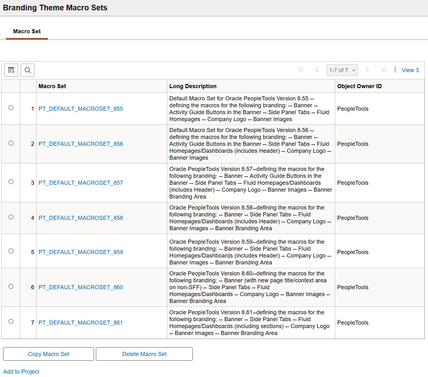
To create a new macro set that you can customize, select and copy a sample macro set—for example, PT_DEFAULT_MACROSET_858.
Warning! Do not modify or delete any PeopleTools-delivered macro sets.
Defining Macros
Use the Macro page to specify custom values for delivered macros.
Navigation:
On the Macro Set page, click the link for a macro set.
This example illustrates the fields and controls on the Macro page.
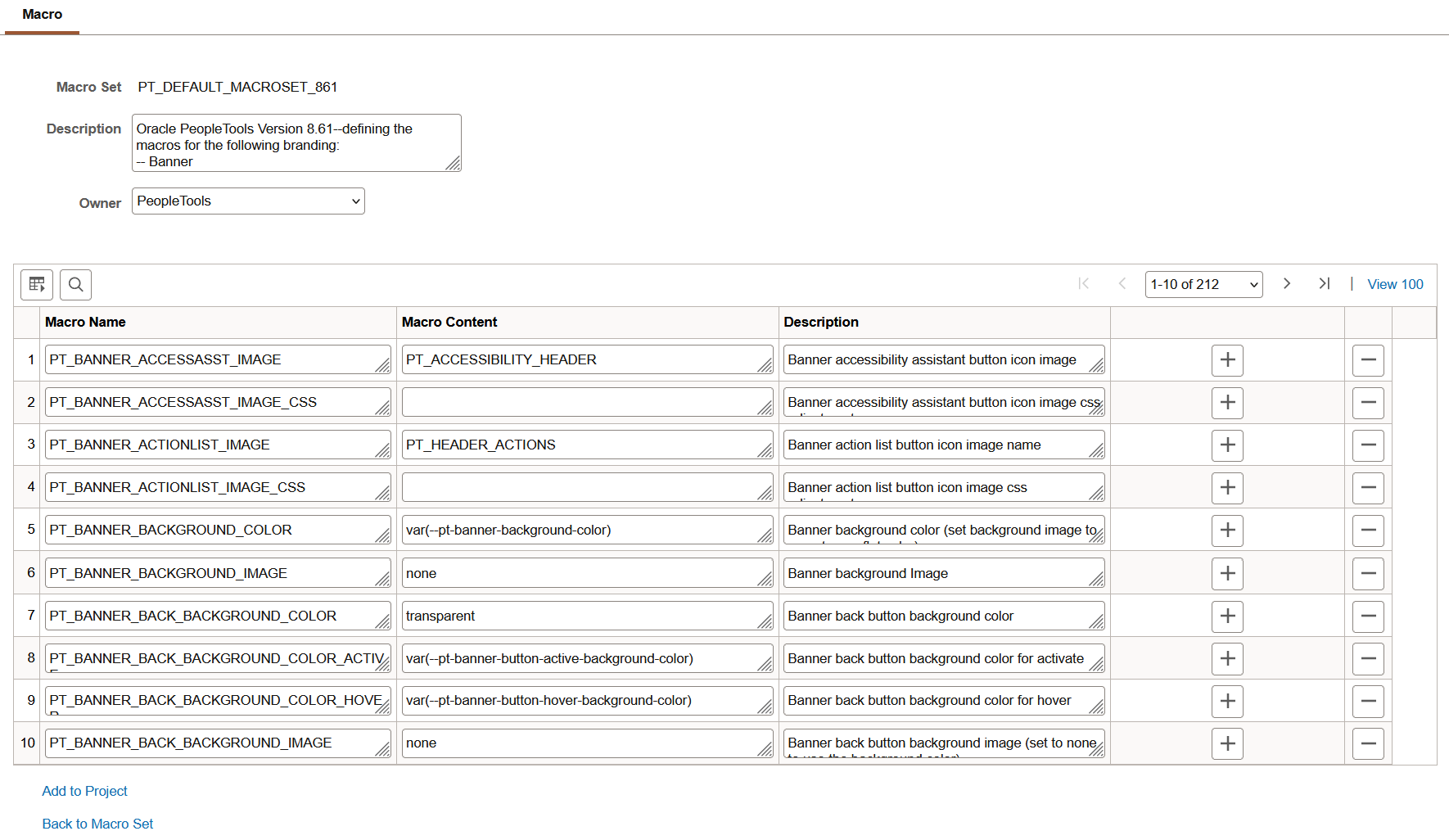
Some macros are used in the fluid banner only (displayed on fluid pages only) while other macros are used in both the fluid banner and in the header for classic pages. Therefore, when you make an update to a macro that is shared both by the fluid banner and by the header for classic pages, you will make updates to the look of all of your pages simultaneously. Prior to updating any macros, you can use the download to Excel button on the grid to export the grid contents to an Excel spreadsheet. You can examine and analyze the macros to determine which ones to modify.
Note: Because activity guide buttons were moved from the fluid banner into an activity guide sub-banner in PeopleTools 8.57, you can no longer brand these buttons. Ignore macros beginning with PT_BANNER_AG. If you previously branded these items, your customized macros will have no effect.
To customize the value for a delivered macro, change the value of the Macro Content field only.
Add to Project
Click the Add to Project link to access the Add Project page to insert one or more macro set definitions into an ADS project. See Adding Data Set Instances from Object Designer Pages and Migrating Branding Data Using ADSs for more information.
Configuring the System to Use a Custom Macro Set
To configure the system to use a custom macro set, you must assemble and apply a custom branding theme. Moreover, your custom branding theme must incorporate:
A custom theme style sheet for classic components that has been cloned from PT_BRAND_CLASSIC_TEMPLATE_861.
A custom override style sheet for fluid components that has been cloned from either global override style sheet: PT_BRAND_FLUID_NOIMG_TEMPL_861 or PT_BRAND_FLUID_TEMPLATE_861.
(Optional) A custom header definition cloned from DEFAULT_HEADER_FLUID.
To enable your custom macro set:
In Application Designer, open the PT_BRAND_CLASSIC_TEMPLATE_861 theme style sheet for classic components.
Save the classic theme style sheet as a cloned copy with a new name—for example, MY_BRAND_CLASSIC_TEMPLATE_861.
In Application Designer, open one of the global override style sheets:
If you do not need to brand images, select PT_BRAND_FLUID_NOIMG_TEMPL_861 because it is smaller, and therefore consumes less overhead.
If you do need to brand images, select PT_BRAND_FLUID_TEMPLATE_861.
Save the global override style sheet as a cloned copy with a new name—for example, (or MY_BRAND_FLUID_TEMPLATE_861).
In the browser, go to the Theme Macro Set page:
Select the PT_DEFAULT_MACROSET_861 macro set.
Copy and save the macro set with a new name—for example, MY_MACROSET_861.
(Optional) In the browser, go to the Define Headers and Footers page:
Open the DEFAULT_HEADER_FLUID definition.
Save the header as a cloned copy with a new name—for example, MY_HEADER_FLUID.
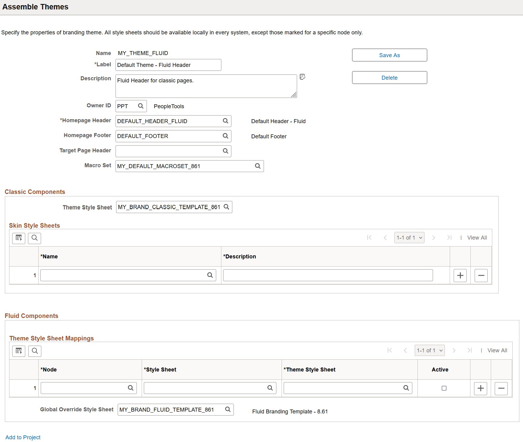
In the browser, go to the Assemble Themes page:
Open the DEFAULT_THEME_FLUID theme definition.
Save the branding theme as a cloned copy with a new name—for example, MY_THEME_FLUID.
Update this custom branding theme to include the following:
(Optional) Homepage Header: Your custom header definition.
Macro Set: Your custom macro set.
Classic Components – Theme Style Sheet: Your custom style sheet for classic components.
Fluid Components – Global Override Style Sheet: Your custom style sheet for fluid components.
This example illustrates the fields and controls on the Assemble Themes page for a custom branding theme.
Apply your custom branding theme either system-wide on the Branding System Options page or selectively by portal or by user attribute on the Assign Branding Themes page.
Note: PeopleSoft Interaction Hub provides a theme builder feature that simplifies the customization of macros. See PeopleSoft Interaction Hub: Branding, “PeopleSoft Fluid User Interface for Branding in PeopleSoft Interaction Hub” for more information.
If you have created a custom macro set, then you need to update that macro set with both the new macros introduced with each subsequent PeopleTools release as well as the existing macros that were updated in each subsequent PeopleTools release. Refer to each of the tables to determine the changes that you need to apply to your custom macro set. Alternatively, you could re-apply your branding to a cloned copy of the current release’s PT_DEFAULT_MACROSET macro set as described in the preceding section, “Configuring the System to Use a Custom Macro Set.”
Note the following regarding macro names and specifications:
Any macro with a name similar to *_FULL_CSS requires a full CSS specification in the form of:
CSSselector { cssProperty: cssValue; ...}Typically, any macro with a name similar to *_CSS (not *_FULL_CSS) requires a specification in the form of:
CSSProperty: CSSValue;[CSSProperty:CSSValue;...]
New Macros in PeopleTools 8.57
The following macros were added in PeopleTools 8.57:
|
Macro Name |
Macro Content |
Description |
|---|---|---|
|
PT_COMPINFO_BACKGROUND |
linear-gradient(rgb(23,54,81),rgb(57,106,144)) |
Company Information RTE background |
|
PT_COMPINFO_BOTTOMBORDER |
1px solid rgb(81,113,150) |
Company Information RTE bottom border |
|
PT_COMPINFO_CSS2 |
|
Company Information RTE generic CSS |
|
PT_COMPINFO_HEIGHTTHRESHOLD |
564px |
Company Information window height threshold value where a height below this value applies new macros |
|
PT_COMPINFO_HEIGHTTHRESH_CSS2 |
|
Company Information RTE generic CSS for window height threshold |
|
PT_COMPINFO_HEIGHTTHRESH_FULL_CSS1 |
|
Company Information CSS for window height threshold (full CSS selector plus property/value) |
|
PT_COMPINFO_ORIENTLAND_CSS2 |
|
Company Information RTE generic CSS for landscape mode |
|
PT_COMPINFO_ORIENTLAND_FULL_CSS1 |
|
Company Information CSS for landscape mode (full CSS selector plus property/value) |
|
PT_COMPINFO_ORIENTLAND_SFF_CSS2 |
|
Company Information RTE generic CSS for landscape mode for small form factor only |
|
PT_COMPINFO_SFF_CSS2 |
|
Company Information RTE generic CSS for small form factor |
|
PT_COMPINFO_TEXTCOLOR |
#ffffff |
Company Information RTE default font color |
New Macros in PeopleTools 8.58
The following macros were added in PeopleTools 8.58:
|
Macro Name |
Macro Content |
Description |
|---|---|---|
|
PT_BANNER_BACK_IMAGE_NARROW_CSS |
%AlignStart:4px; |
Banner Back Button image adjustment css when text disappears from button (only image) |
|
PT_BANNER_IMAGE_BUTTON_RADIUS |
1.2em |
Banner image button border radius |
|
PT_BANNER_SEARCH_PRESSED_ACTIVE_CSS |
background-color: rgba(0,0,0,0.8);background-image: linear-gradient(to bottom, #000, #6c7784); |
Banner button (search) depressed state general css on activate |
|
PT_BANNER_SEARCH_PRESSED_BOXSHADOW |
inset 1px 1px 0 0 #5c6570, inset -1px 0 0 0 #5c6570, inset 0 2px 0 0 #eee |
Banner button (search) depressed state box shadow |
|
PT_BANNER_SEARCH_PRESSED_HOVER_CSS |
background-color: rgba(255,255,255,0.35);background-image: linear-gradient(to bottom, #505862, #6c7784); |
Banner button (search) depressed state general css on hover |
|
PT_BANNER_UPPER_DECORATION |
linear-gradient(to %AlignEnd, #b4ec51, #53a0fd) |
Banner decorative border (actually a background) |
|
PT_BANNER_UPPER_DECORATION_HEIGHT |
0.25em |
Banner decorative border height |
|
PT_HOMEPAGE_PAGEIND_CONT_BACKGROUND |
#8b9197 |
Homepage/Dashboard page indicator container background color |
|
PT_HOMEPAGE_TILE_BORDER_HOVER |
#246FC7 |
Homepage/Dashboard Tile border color for hover |
|
PT_HOMEPAGE_TILE_BOXSHADOW_HOVER |
0 8px 20px 0 rgba(29,39,51,0.10) |
Homepage/Dashboard Title box shadow for hover |
|
PT_HOMEPAGE_TILE_TITLE_ALIGNMENT |
center |
Homepage/Dashboard Tile Title alignment (non-small form factor) |
|
PT_HOMEPAGE_TILE_TITLE_COLOR |
#1e5ca4 |
Homepage/Dashboard Tile Title text color |
|
PT_HOMEPAGE_TILE_TITLE_CSS |
|
Homepage/Dashboard Tile Title text general css adjustments |
|
PT_NAVBAR_TOP_OFFSET |
2.97em |
NavBar Offset from top of window |
|
PT_SEARCH_TRAY_BORDER_COLOR |
#5c6570 |
Banner Search Tray border color |
Updated Macros in PeopleTools 8.58
The following macros were updated in PeopleTools 8.58:
|
Macro Name |
Macro Content |
Description |
|---|---|---|
|
PT_BANNER_BACKGROUND_COLOR |
#1d2733 |
Banner background color (set background image to none to see flat color) |
|
PT_BANNER_BACKGROUND_IMAGE |
none |
Banner background Image |
|
PT_BANNER_BACK_BACKGROUND_COLOR_ACTIVE |
rgb(0,0,0,0.8) |
Banner back button background color for activate |
|
PT_BANNER_BACK_BACKGROUND_COLOR_HOVER |
rgba(255,255,255,0.35) |
Banner back button background color for hover |
|
PT_BANNER_BACK_BACKGROUND_IMAGE |
none |
Banner back button background image (set to none to use the background color) |
|
PT_BANNER_BACK_BACKGROUND_IMAGE_ACTIVE |
none |
Banner back button background image for activate |
|
PT_BANNER_BACK_BACKGROUND_IMAGE_HOVER |
none |
Banner back button background image for hover |
|
PT_BANNER_BACK_BORDER_BOTTOM_COLOR |
#3d444e |
Banner back button border color (bottom) |
|
PT_BANNER_BACK_BORDER_BOTTOM_COLOR_HOVER |
#3d444e |
Banner back button border color (bottom) for hover |
|
PT_BANNER_BACK_BORDER_COLOR |
#3d444e |
Banner back button border color |
|
PT_BANNER_BACK_BORDER_COLOR_HOVER |
#3d444e |
Banner back button border color for hover |
|
PT_BANNER_BACK_BOXSHADOW |
none |
Banner back button box shadow |
|
PT_BANNER_BACK_BOXSHADOW_ACTIVE |
none |
Banner back button box shadow for activate |
|
PT_BANNER_BACK_BOXSHADOW_HOVER |
none |
Banner back button box shadow for hover |
|
PT_BANNER_BORDER_COLOR |
#f0f0f0 |
Banner bottom border color |
|
PT_BANNER_BUTTON_BACKGROUND_COLOR_ACTIVE |
rgba(0,0,0,0.8) |
Banner button default background activate color |
|
PT_BANNER_BUTTON_BACKGROUND_COLOR_HOVER |
rgba(255,255,255,0.35) |
Banner button default background hover color |
|
PT_BANNER_BUTTON_BADGE_BG_COLOR |
#39C5A6 |
Banner badge background color (primarily for notifications) |
|
PT_BANNER_BUTTON_BADGE_BORDER_COLOR |
#39C5A6 |
Banner badge border color (primarily for notifications) |
|
PT_BANNER_BUTTON_BADGE_TEXT_COLOR |
#000 |
Banner badge text color (primarily for notifications) |
|
PT_BANNER_BUTTON_BOXSHADOW |
none |
Banner button box shadow |
|
PT_BANNER_BUTTON_BOXSHADOW_ACTIVE |
none |
Banner button default activate boxshadow |
|
PT_BANNER_BUTTON_BOXSHADOW_HOVER |
none |
Banner button default hover boxshadow |
|
PT_BANNER_BUTTON_BOXSHADOW_HOVER_RTL |
none |
Banner button default hover boxshadow (RTL) |
|
PT_BANNER_BUTTON_TEXT_COLOR |
rgba(255,255,255,0.95) |
Banner button default text color |
|
PT_BANNER_BUTTON_TRUE_BG_COLOR_ACTIVE |
rgba(0,0,0,0.8) |
Banner button actual activate color |
|
PT_BANNER_BUTTON_TRUE_BG_COLOR_HOVER |
rgba(255,255,255,0.35) |
Banner button actual hover color |
|
PT_BANNER_BUTTON_TRUE_BXSHADOW_ACTIVE |
none |
Banner button actual activate box shadow |
|
PT_BANNER_BUTTON_TRUE_BXSHADOW_HOVER |
none |
Banner button actual hover box shadow |
|
PT_BANNER_GUIDED_NOTIFICATION_SEPARATOR |
transparent |
Banner border color separator for the notification button from the guided buttons |
|
PT_BANNER_NAVBAR_BACKGROUND_ACTIVE |
transparent |
Banner NavBar button background (general background property) activate |
|
PT_BANNER_NAVBAR_BACKGROUND_HOVER |
rgba(255,255,255,0.35) |
Banner NavBar button background (general background property) hover |
|
PT_BANNER_NAVBAR_BACKGROUND_IMAGE |
none |
Banner NavBar button background image (set to none to use the background color) |
|
PT_BANNER_NAVBAR_BOXSHADOW |
none |
Banner NavBar button box shadow |
|
PT_BANNER_NAVBAR_IMAGE_CSS |
margin-top:-1px; margin-%AlignStart:0; |
Banner navbar button icon image css adjustments |
|
PT_BANNER_NAVBAR_SIDE_BORDER_COLOR |
transparent |
Banner NavBar button Left or Right Border Color |
|
PT_BANNER_SEARCH_PRESSED_BG_COLOR |
#6c7784 |
Banner button (search) depressed state background color |
|
PT_BANNER_SUBMIT_BACKGROUND_COLOR |
none |
Banner submit button background color |
|
PT_BANNER_SUBMIT_BACKGROUND_COLOR_ACTIVE |
none |
Banner submit button background color for activate |
|
PT_BANNER_SUBMIT_BACKGROUND_COLOR_HOVER |
none |
Banner submit button background color for hover |
|
PT_BANNER_SUBMIT_BORDER_COLOR |
none |
Banner submit button border color |
|
PT_BANNER_SUBMIT_BORDER_COLOR_ACTIVE |
none |
Banner submit button border color for activate |
|
PT_BANNER_SUBMIT_BORDER_COLOR_HOVER |
none |
Banner submit button border color for hover |
|
PT_BANNER_SUBMIT_BOXSHADOW_HOVER |
none |
Banner submit button box shadow for hover |
|
PT_BANNER_SUBMIT_TEXTSHADOW_ACTIVE |
none |
Banner submit button text shadow for activate |
|
PT_BANNER_SUBMIT_TEXTSHADOW_HOVER |
none |
Banner submit button text shadow for hover |
|
PT_BANNER_SUBMIT_TEXTSHADOW_RTL |
none |
Banner submit button text shadow (RTL) |
|
PT_BANNER_SUBMIT_TEXT_COLOR |
none |
Banner submit button text color |
|
PT_BANNER_SUBMIT_TEXT_COLOR_ACTIVE |
none |
Banner submit button text color for activate |
|
PT_BANNER_SUBMIT_TEXT_COLOR_HOVER |
none |
Banner submit button text color for hover |
|
PT_COMPINFO_BACKGROUND |
#1d2733 |
Company Information RTE background |
|
PT_COMPINFO_BOTTOMBORDER |
transparent |
Company Information RTE bottom border |
|
PT_COMPINFO_TEXTCOLOR |
rgba(255,255,255,0.95) |
Company Information RTE default font color |
|
PT_CONFIRMATION_TEXTSHADOW |
none |
Confirmation Area text shadow |
|
PT_CONFIRMATION_TEXTSHADOW_RTL |
none |
Confirmation Area text shadow (RTL) |
|
PT_HOMEPAGE_BACKGROUND |
#eff1f4 |
Homepage/Dashboard background |
|
PT_HOMEPAGE_BANNER_BORDER_COLOR |
#f0f0f0 |
Homepage/Dashboard Banner border color different from default banner bottom border |
|
PT_HOMEPAGE_DASHHDR_EMB_BORDER_COLOR |
#ced4da |
Dashboard Header Exterior border color when embedded in Activity Guide, Nav Collection, or MD |
|
PT_HOMEPAGE_DASHHDR_EXTPIN_BACKGROUND |
#f8f8f8 |
Dashboard Header Exterior pinned/fixed background (when interior has not yet rendered) |
|
PT_HOMEPAGE_DASHHDR_EXTPIN_BORDERTOP_CLR |
#fff |
Dashboard Header Exterior pinned/fixed top border color |
|
PT_HOMEPAGE_DASHHDR_EXTPIN_BORDER_COLOR |
#a8a8a8 |
Dashboard Header Exterior pinned/fixed border color |
|
PT_HOMEPAGE_DASHHDR_EXTPIN_BOXSHADOW |
0px 1px 16px rgba(0,0,0,0.35) |
Dashboard Header Exterior pinned/fixed shadow |
|
PT_HOMEPAGE_DASHHDR_EXT_BORDER_COLOR |
#ced4da |
Dashboard Header Exterior border color (default) |
|
PT_HOMEPAGE_DASHHDR_INT_PIN_BCKGRD |
#f8f8f8 |
Dashboard Header Interior pinned/fixed background |
|
PT_HOMEPAGE_DASHHDR_INT_UNPIN_LABEL_CLR |
#5a5a5a |
Dashboard Header Interior unpinned label text color |
|
PT_HOMEPAGE_FOOTER_BACKGROUND |
rgba(29,39,51,0.48) |
Homepage/Dashboard Footer background |
|
PT_HOMEPAGE_REFRESH_IMAGE_SCALE |
1 |
Homepage/Dashboard Refresh button image scale factor |
|
PT_HOMEPAGE_REFRESH_SIDE_ADJUST |
-1px |
Homepage/Dashboard Refresh button right (or left in RTL) positioning adjustment |
|
PT_HOMEPAGE_REFRESH_TOP_ADJUST |
1px |
Homepage/Dashboard Refresh button top positioning adjustment |
|
PT_HOMEPAGE_TILE_BORDER |
1px solid #ced4da |
Homepage/Dashboard Tile border |
|
PT_HOMEPAGE_TILE_BOXSHADOW |
none |
Homepage/Dashboard Tile box shadow |
|
PT_HOMEPAGE_TILE_BOXSHADOW_RTL |
none |
Homepage/Dashboard Tile box shadow (RTL) |
|
PT_LOGO_CSS |
transform: scale(0.75); |
Company Logo general image adjustments for non-small form factor |
|
PT_LOGO_CSS_SMALL |
transform: scale(0.75); |
Company Logo general image adjustments for small form factor |
|
PT_LOGO_TOP_PADDING |
0.5em |
Company Logo top padding for non-small form factor |
|
PT_LOGO_TOP_PADDING_SMALL |
0.4em |
Company Logo top padding for small form factor |
|
PT_PANEL_TAB_RC_IMAGE_CSS |
padding-%AlignStart:1px; |
Panel Tab Related Content image specific CSS adjustments |
|
PT_PANEL_TAB_RC_IMAGE_PADDINGTOP |
0.3em |
Panel Tab Related Content image top padding |
|
PT_PANEL_TAB_RC_IMAGE_TRANSFORM |
scale(1) |
Panel Tab Related Content image transformation (typically scalling) |
|
PT_PANEL_TAB_SIDE1_BACKGROUND |
#1d2733 |
Panel Tab (Side 1 or Navigation) background |
|
PT_PANEL_TAB_SIDE1_BACKGROUND_ACTIVE |
#1c579c |
Panel Tab (Side 1 or Navigation) background for active |
|
PT_PANEL_TAB_SIDE1_BACKGROUND_HOVER |
#1d2733 |
Panel Tab (Side 1 or Navigation) background for hover |
|
PT_PANEL_TAB_SIDE1_BORDER_COLOR |
#1d2733 |
Panel Tab (Side 1 or Navigation) border color |
|
PT_PANEL_TAB_SIDE1_BOXSHADOW_ACTIVE |
none |
Panel Tab (Side 1 or Navigation) box shadow for active |
|
PT_PANEL_TAB_SIDE1_BOXSHADOW_ACTIVE_RTL |
none |
Panel Tab (Side 1 or Navigation) box shadow for active (RTL) |
|
PT_PANEL_TAB_SIDE1_BOXSHADOW_HOVER |
none |
Panel Tab (Side 1 or Navigation) box shadow for hover |
|
PT_PANEL_TAB_SIDE1_BOXSHADOW_HOVER_RTL |
none |
Panel Tab (Side 1 or Navigation) box shadow for hover (RTL) |
|
PT_PANEL_TAB_SIDE1_IMAGE_CSS |
%AlignStart:2px; |
Panel Tab (Side 1 or Navigation) image specific CSS adjustments |
|
PT_PANEL_TAB_SIDE1_IMAGE_PADDINGTOP |
0.29em |
Panel Tab (Side 1 or Navigation) image top padding |
|
PT_PANEL_TAB_SIDE1_IMAGE_TRANSFORM |
scale(1) |
Panel Tab (Side 1 or Navigation) image transformation (typically scalling) |
|
PT_PANEL_TAB_SIDE2_BACKGROUND |
#b9ddfb |
Panel Tab (Side 2 or Related Content) background |
|
PT_PANEL_TAB_SIDE2_BACKGROUND_HOVER |
#d4eafc |
Panel Tab (Side 2 or Related Content) background for hover/active |
|
PT_PANEL_TAB_SIDE2_IMAGE_CSS |
padding-%AlignStart:1px; |
Panel Tab (Side 2) image specific CSS adjustments |
|
PT_PANEL_TAB_SIDE2_IMAGE_PADDINGTOP |
0.3em |
Panel Tab (Side 2) image top padding |
|
PT_PANEL_TAB_SIDE2_IMAGE_TRANSFORM |
scale(1) |
Panel Tab (Side 2) image transformation (typically scalling) |
|
PT_SEARCH_TRAY_BACKGROUND_COLOR |
#6a7481 |
Banner Search Tray background color |
|
PT_SEARCH_TRAY_GOBUTTON_IMAGE |
PT_NUI_EXECUTE_ARW |
Banner search tray go button icon image name |
|
PT_TITLE_SELECTOR_IMAGE_CSS |
transform:scale(1); |
Banner Title Selector popup indicator icon image css adjustments |
New Macros in PeopleTools 8.59
The following macros were added in PeopleTools 8.59:
|
Macro Name |
Macro Content |
Description |
|---|---|---|
|
PT_BANNER_BACK_BORDER_BOTTOM_COLOR_ACTIV |
#657081 |
Banner back button border color (bottom) for activate |
|
PT_BANNER_BACK_BORDER_COLOR_ACTIVE |
#657081 |
Banner back button border color for activate |
|
PT_HOMEPAGE_NAVAREA_BACKGROUND |
inherit |
Homepage Navigation Area background |
|
PT_HOMEPAGE_NAVAREA_BORDER_COLOR |
#848c94 |
Homepage Navigation Area border color |
|
PT_HOMEPAGE_NAVAREA_CSS |
|
Homepage Navigation Area generic CSS |
|
PT_HOMEPAGE_NAVAREA_TEXT_COLOR |
#1d2733 |
Homepage Navigation Area text color (default for area) |
|
PT_HOMEPAGE_NAV_NEXT_IMAGE |
PTNUI_NEXTPAGE_ICN |
Homepage Navigation Next Page image |
|
PT_HOMEPAGE_NAV_NEXT_IMAGE_CSS |
text-align:center;margin-top:0.345em; |
Homepage Navigation Next Page image position adjustments |
|
PT_HOMEPAGE_NAV_PREV_IMAGE |
PTNUI_PREVPAGE_ICN |
Homepage Navigation Previous Page image |
|
PT_HOMEPAGE_NAV_PREV_IMAGE_CSS |
text-align:center;margin-top:0.345em; |
Homepage Navigation Previous Page image position adjustments |
|
PT_HOMEPAGE_PANEL_BORDER_COLOR |
#848c94 |
Homepage SIDE PANEL border colors (QAB and Notification) |
|
PT_HOMEPAGE_POSITION_TEXT_COLOR |
inherit |
Homepage Page Positioning Text Color |
|
PT_HOMEPAGE_SEARCH_BORDER_COLOR |
#000 |
Homepage Search Area in Banner border color |
|
PT_HOMEPAGE_TITLE_SELECTOR_BACKGD_ACTIVE |
#b9ddfb |
Homepage Title Selector background for activate |
|
PT_HOMEPAGE_TITLE_SELECTOR_BACKGD_HOVER |
#f4f7fc |
Homepage Title Selector background for hover |
|
PT_HOMEPAGE_TITLE_SELECTOR_BORDER_ACTIVE |
#1d2733 |
Homepage Title Selector border color for activate |
|
PT_HOMEPAGE_TITLE_SELECTOR_BORDER_HOVER |
#868e96 |
Homepage Title Selector border color for hover |
|
PT_HOMEPAGE_TITLE_SELECTOR_IMAGE |
PTNUI_HPSEL_ARROW_ICN |
Homepage Title Selector image |
|
PT_HOMEPAGE_TITLE_SELECTOR_IMAGE_CSS |
|
Homepage Title Selector image generic CSS |
|
PT_HOMEPAGE_TITLE_SELECTOR_TEXT_ACTIVE |
#1d2733 |
Homepage Title Selector text color for activate |
|
PT_HOMEPAGE_TITLE_SELECTOR_TEXT_COLOR |
inherit |
Homepage/Dashboard title selector text color |
|
PT_HOMEPAGE_TITLE_SELECTOR_TEXT_HOVER |
#1c579c |
Homepage Title Selector text color for hover |
Updated Macros in PeopleTools 8.59
The following macros were updated in PeopleTools 8.59:
|
Macro Name |
Macro Content |
Description |
|---|---|---|
|
PT_BANNER_BACK_BORDER_BOTTOM_COLOR |
#657081 |
Banner back button border color (bottom) |
|
PT_BANNER_BACK_BORDER_BOTTOM_COLOR_HOVER |
transparent |
Banner back button border color (bottom) for hover |
|
PT_BANNER_BACK_BORDER_COLOR |
#657081 |
Banner back button border color |
|
PT_BANNER_BACK_BORDER_COLOR_HOVER |
transparent |
Banner back button border color for hover |
|
PT_BANNER_BUTTON_BADGE_BG_COLOR |
#53a0fd |
Banner badge background color (primarily for notifications) |
|
PT_BANNER_BUTTON_BADGE_BORDER_COLOR |
#53a0fd |
Banner badge border color (primarily for notifications) |
|
PT_BANNER_BUTTON_BADGE_TEXT_COLOR |
transparent |
Banner badge text color (primarily for notifications) |
|
PT_HOMEPAGE_DASHHDR_EMB_BORDER_COLOR |
#848c94 |
Dashboard Header Exterior border color when embedded in Activity Guide, Nav Collection, or MD |
|
PT_HOMEPAGE_DASHHDR_EXT_BORDER_COLOR |
#848c94 |
Dashboard Header Exterior border color (default) |
|
PT_HOMEPAGE_TILE_BORDER |
1px solid #848c94 |
Dashboard Tile border |
|
PT_HOMEPAGE_TILE_BOXSHADOW_HOVER |
0 8px 20px 0 rgba(29,39,51,0.30),inset 0 0 2px #246fc7) |
Dashboard Title box shadow for hover |
|
PT_HOMEPAGE_TITLE_SELECTOR_TEXT_COLOR |
inherit |
Dashboard title selector text color |
|
PT_LOGO_CSS |
transform: scale(0.8); |
Company Logo general image adjustments for non-small form factor |
|
PT_LOGO_CSS_SMALL |
transform: scale(0.8); |
Company Logo general image adjustments for small form factor |
|
PT_LOGO_IMAGE_NAME |
PTNUI_ORACLE_LOGO_SFF |
Company Logo image name for non-small form factor |
|
PT_LOGO_IMAGE_SIDE_MARGIN |
-0.5em |
Company Logo left (or right for RTL) side adjustment for non-small form factor |
|
PT_LOGO_IMAGE_SIDE_MARGIN_SMALL |
-0.5em |
Company Logo left (or right for RTL) side adjustment for small form factor only |
|
PT_LOGO_TOP_PADDING |
0.2em |
Company Logo top padding for non-small form factor |
|
PT_LOGO_TOP_PADDING_SMALL |
0.2em |
Company Logo top padding for small form factor |
New Macros in PeopleTools 8.60
The following macros were added in PeopleTools 8.60:
|
Macro Name |
Macro Content |
Description |
|---|---|---|
|
PT_BANNER_CONTEXTLIST_IMAGE |
PT_CONTEXT_MENU_ICN |
Banner context list button icon image name |
|
PT_BANNER_CONTEXTLIST_IMAGE_CSS |
margin-top: 0.15em;transform: scale(1.1); |
Banner context list button icon image css adjustments |
|
PT_BANNER_FAVORITES_IMAGE |
PT_FAV_HDR_ICN |
Banner Favorites button icon image name |
|
PT_BANNER_FAVORITES_IMAGE_CSS |
Banner Favorites button icon image css adjustments |
|
|
PT_BANNER_LOWER_DECORATION |
var(--pt-strip-background) |
Banner lower decorative separator |
|
PT_BANNER_LOWER_DECORATION_CSS |
Banner lower decorative separator css adjustments |
|
|
PT_BANNER_LOWER_DECORATION_CSS_SSF |
Banner lower decorative separator css adjustments for small form factor |
|
|
PT_BANNER_LOWER_DECORATION_HEIGHT |
var(--pt-strip-height) |
Banner lower decorative separator height for non-small form factor |
|
PT_BANNER_LOWER_DECORATION_HEIGHT_SFF |
var(--pt-strip-height) |
Banner lower decorative separator height for small form factor |
|
PT_BANNER_PAGETITLE_BACKGROUND_COLOR |
var(--pt-page-title-background-color) |
Banner non-small form factor page title background color |
|
PT_BANNER_PAGETITLE_BORDER_COLOR |
var(--pt-page-title-border-color) |
Banner non-small form factor page title bottom border color |
|
PT_BANNER_PAGETITLE_TEXT_COLOR |
var(--pt-page-title-text-color) |
Banner non-small form factor page title text color |
|
PT_BANNER_RECENTS_IMAGE |
PT_MRU_HDR_ICN |
Banner Recents button icon image name |
|
PT_BANNER_RECENTS_IMAGE_CSS |
Banner Recents button icon image css adjustments |
|
|
PT_BANNER_SEPARATOR_BORDER_COLOR |
var(--pt-banner-separator-color) |
Banner Back or Logo/QAB separator border color |
|
PT_HOMEPAGE_TITLE_SELECTOR_OUTLINE_HOVER |
1px dashed var(--pt-hover-outline-color) |
Homepage title selector outline(really border) styling |
|
PT_PANEL_TAB_SIDE2_BACKGROUND_ACTIVE |
var(--pt-panel-tab-alt-active-background-color) |
Panel Tab (Side 2 or Related Content) background for active |
|
PT_SEARCH_SUBDUED_BACKGROUND_COLOR |
transparent !important |
Banner subdued search background color |
|
PT_SEARCH_SUBDUED_BORDER_COLOR |
var(--pt-banner-text-color) |
Banner subdued search border color |
|
PT_SEARCH_SUBDUED_IMAGE |
PT_HEADER_SEARCH |
Banner subdued search image within search input |
|
PT_SEARCH_SUBDUED_IMAGE_CSS |
Banner subdued search image within search input css adjustments |
|
|
PT_SEARCH_SUBDUED_OPACITY |
var(--pt-banner-search-subdued-opacity) |
Banner subdued search opacity |
|
PT_SEARCH_SUBDUED_OPACITY_HOVER |
var(--pt-banner-search-subdued-hover-opacity) |
Banner subdued search opacity for hover |
|
PT_SEARCH_SUBDUED_TEXT_COLOR |
var(--pt-banner-text-color) |
Banner subdued search text/placeholder color |
Updated Macros in PeopleTools 8.60
The following macros were updated in PeopleTools 8.60:
|
Macro Name |
Macro Content |
Description |
|---|---|---|
|
PT_BANNER_BACKGROUND_COLOR |
var(--pt-banner-background-color) |
Banner background color (set background image to none to see flat color) |
|
PT_BANNER_BACK_BACKGROUND_COLOR_ACTIVE |
var(--pt-banner-button-active-background-color) |
Banner back button background color for activate |
|
PT_BANNER_BACK_BACKGROUND_COLOR_HOVER |
var(--pt-banner-button-hover-background-color) |
Banner back button background color for hover |
|
PT_BANNER_BACK_BORDER_BOTTOM_COLOR |
var(--pt-border-normal-color) |
Banner back button border color (bottom) |
|
PT_BANNER_BACK_BORDER_BOTTOM_COLOR_ACTIV |
transparent |
Banner back button border color (bottom) for activate |
|
PT_BANNER_BACK_BORDER_COLOR |
var(--pt-border-normal-color) |
Banner back button border color |
|
PT_BANNER_BACK_BORDER_COLOR_ACTIVE |
transparent |
Banner back button border color for activate |
|
PT_BANNER_BACK_IMAGE_CSS |
display:inline-block;margin-top:0.345em;transform:scale(1.5); |
Banner back button icon image css adjustments |
|
PT_BANNER_BACK_IMAGE_NARROW_CSS |
Banner back button image adjustment css when text disappears from button (only image) |
|
|
PT_BANNER_BORDER_COLOR |
transparent |
Banner bottom border color |
|
PT_BANNER_BUTTON_BACKGROUND_COLOR_ACTIVE |
var(--pt-banner-button-active-background-color) |
Banner button default background activate color |
|
PT_BANNER_BUTTON_BACKGROUND_COLOR_HOVER |
var(--pt-banner-button-hover-background-color) |
Banner button default background hover color |
|
PT_BANNER_BUTTON_BADGE_BG_COLOR |
var(--pt-badge-dot-alt-color) |
Banner badge background color (primarily for notifications) |
|
PT_BANNER_BUTTON_BADGE_BORDER_COLOR |
var(--pt-badge-dot-alt-color) |
Banner badge border color (primarily for notifications) |
|
PT_BANNER_BUTTON_TEXT_COLOR |
var(--pt-banner-text-color) |
Banner button default text color |
|
PT_BANNER_BUTTON_TEXT_COLOR_ACTIVE |
var(--pt-banner-text-color) |
Banner button default text activate color |
|
PT_BANNER_BUTTON_TEXT_COLOR_HOVER |
var(--pt-banner-text-color) |
Banner button default text hover color |
|
PT_BANNER_BUTTON_TRUE_BG_COLOR_ACTIVE |
var(--pt-banner-button-active-background-color) |
Banner button actual activate color |
|
PT_BANNER_BUTTON_TRUE_BG_COLOR_HOVER |
var(--pt-banner-button-hover-background-color) |
Banner button actual hover color |
|
PT_BANNER_IMAGE_BUTTON_RADIUS |
3px |
Banner image button border radius |
|
PT_BANNER_NAVBAR_BACKGROUND_ACTIVE |
var(--pt-banner-button-active-background-color) |
Banner NavBar button background (general background property) activate |
|
PT_BANNER_NAVBAR_BACKGROUND_HOVER |
var(--pt-banner-button-hover-background-color) |
Banner NavBar button background (general background property) hover |
|
PT_BANNER_TEXT_COLOR |
var(--pt-banner-text-color) |
Banner default font color |
|
PT_BANNER_UPPER_DECORATION |
var(--pt-strip-p860-background,none) |
Banner decorative border for reversion to pre-8.60 (see PT_CUSTOM_PROPS_PRE860) |
|
PT_BANNER_UPPER_DECORATION_HEIGHT |
var(--pt-strip-p860-height,0px) |
Banner decorative border height for reversion (use 0.25em to display) - (see PT_CUSTOM_PROPS_PRE860) |
|
PT_COMPINFO_BACKGROUND |
var(--pt-banner-background-color) |
Company information RTE background |
|
PT_COMPINFO_TEXTCOLOR |
var(--pt-banner-text-color) |
Company information RTE default font color |
|
PT_CONFIRMATION_BACKGROUND |
var(--pt-confirmation-background-color) |
Confirmation area background |
|
PT_CONFIRMATION_BORDER_COLOR |
var(--pt-confirmation-border-color) |
Conformation area border color |
|
PT_CONFIRMATION_TEXT_COLOR |
var(--pt-confirmation-text-color) |
Confirmation area text color |
|
PT_HOMEPAGE_BACKGROUND |
var(--pt-homepage-background) |
Homepage/Dashboard background |
|
PT_HOMEPAGE_BANNER_BORDER_COLOR |
var(--pt-page-title-background-color) |
Homepage/Dashboard banner border color different from default banner bottom border |
|
PT_HOMEPAGE_DASHHDR_EMB_BORDER_COLOR |
var(--pt-panel-border-color) |
Dashboard Header exterior border color when embedded in Activity Guide, Nav Collection, or MD |
|
PT_HOMEPAGE_DASHHDR_EXTPIN_BACKGROUND |
var(--pt-panel-background-color) |
Dashboard Header Exterior pinned/fixed background (when interior has not yet rendered) |
|
PT_HOMEPAGE_DASHHDR_EXTPIN_BORDERTOP_CLR |
var(--pt-panel-background-color) |
Dashboard Header exterior pinned/fixed top border color |
|
PT_HOMEPAGE_DASHHDR_EXTPIN_BORDER_COLOR |
var(--pt-panel-border-color) |
Dashboard Header exterior pinned/fixed border color |
|
PT_HOMEPAGE_DASHHDR_EXTPIN_BOXSHADOW |
0px 1px 16px var(--pt-modal-shadow-color) |
Dashboard Header exterior pinned/fixed shadow |
|
PT_HOMEPAGE_DASHHDR_EXT_BACKGROUND |
var(--pt-page-background-color) |
Dashboard Header exterior background (when interior has not yet rendered) |
|
PT_HOMEPAGE_DASHHDR_EXT_BORDER_COLOR |
var(--pt-panel-border-color) |
Dashboard Header exterior border color (default) |
|
PT_HOMEPAGE_DASHHDR_EXT_BORDER_RADIUS |
0 |
Dashboard Header exterior border radius (default) |
|
PT_HOMEPAGE_DASHHDR_INT_PIN_BCKGRD |
var(--pt-panel-background-color) |
Dashboard Header interior pinned/fixed background |
|
PT_HOMEPAGE_DASHHDR_INT_UNPIN_BCKGRD |
var(--pt-page-background-color) |
Dashboard Header interior unpinned background |
|
PT_HOMEPAGE_DASHHDR_INT_UNPIN_HEADER_CLR |
var(--pt-header-text-color) |
Dashboard Header interior unpinned groupbox header text color |
|
PT_HOMEPAGE_DASHHDR_INT_UNPIN_LABEL_CLR |
var(--pt-label-text-color) |
Dashboard Header interior unpinned label text color |
|
PT_HOMEPAGE_FOOTER_BACKGROUND |
var(--pt-modal-mask-background-color) |
Homepage/Dashboard footer background |
|
PT_HOMEPAGE_NAVAREA_BACKGROUND |
var(--pt-page-title-background-color) |
Homepage Navigation area background |
|
PT_HOMEPAGE_NAVAREA_BORDER_COLOR |
var(--pt-page-title-border-color) |
Homepage Navigation area border color |
|
PT_HOMEPAGE_NAVAREA_TEXT_COLOR |
var(--pt-page-title-text-color) |
Homepage Navigation area text color (default for area) |
|
PT_HOMEPAGE_PANEL_BORDER_COLOR |
var(--pt-panel-border-color) |
Homepage side panel border colors (QAB and Notification) |
|
PT_HOMEPAGE_REFRESH_SIDE_ADJUST |
2px |
Homepage/Dashboard refresh button right (or left in RTL) positioning adjustment |
|
PT_HOMEPAGE_REFRESH_TOP_ADJUST |
2px |
Homepage/Dashboard refresh button top positioning adjustment |
|
PT_HOMEPAGE_SEARCH_BORDER_COLOR |
var(--pt-border-contrast-color) |
Homepage Search area in banner border color |
|
PT_HOMEPAGE_TILE_BORDER |
1px solid var(--pt-tile-border-color) |
Homepage/Dashboard tile border |
|
PT_HOMEPAGE_TILE_BORDER_HOVER |
var(--pt-tile-hover-border-color) |
Homepage/Dashboard tile border color for hover |
|
PT_HOMEPAGE_TILE_BOXSHADOW_HOVER |
0px 8px 24px -6px var(--pt-tile-hover-shadow-color) |
Homepage/Dashboard title box shadow for hover |
|
PT_HOMEPAGE_TILE_TITLE_COLOR |
var(--pt-tile-header-text-color) |
Homepage/Dashboard tile title text color |
|
PT_HOMEPAGE_TITLE_SELECTOR_BACKGD_ACTIVE |
var(--pt-button-active-background-color) |
Homepage title selector background for activate |
|
PT_HOMEPAGE_TITLE_SELECTOR_BACKGD_HOVER |
var(--pt-button-hover-background-color) |
Homepage Title selector background for hover |
|
PT_HOMEPAGE_TITLE_SELECTOR_BORDER_ACTIVE |
var(--pt-button-active-border-color) |
Homepage Title selector border color for activate |
|
PT_HOMEPAGE_TITLE_SELECTOR_BORDER_HOVER |
var(--pt-button-hover-border-color) |
Homepage Title selector border color for hover |
|
PT_HOMEPAGE_TITLE_SELECTOR_TEXT_ACTIVE |
inherit !important |
Homepage Title selector text color for activate |
|
PT_HOMEPAGE_TITLE_SELECTOR_TEXT_COLOR |
inherit !important |
Homepage/Dashboard title selector text color |
|
PT_HOMEPAGE_TITLE_SELECTOR_TEXT_HOVER |
inherit !important |
Homepage Title selector text color for hover |
|
PT_LOGO_CSS |
margin-%AlignEnd:-0.4em; |
Company Logo general image adjustments for non-small form factor |
|
PT_LOGO_CSS_SMALL |
margin-%AlignEnd:-0.4em; |
Company Logo general image adjustments for small form factor |
|
PT_LOGO_IMAGE_SIDE_MARGIN |
0 |
Company Logo left (or right for RTL) side adjustment for non-small form factor |
|
PT_LOGO_IMAGE_SIDE_MARGIN_SMALL |
0 |
Company Logo left (or right for RTL) side adjustment for small form factor only |
|
PT_PANEL_TAB_SIDE1_BACKGROUND |
var(--pt-panel-tab-background-color) |
Panel Tab (Side 1 or Navigation) background |
|
PT_PANEL_TAB_SIDE1_BACKGROUND_ACTIVE |
var(--pt-panel-tab-active-background-color) |
Panel Tab (Side 1 or Navigation) background for active |
|
PT_PANEL_TAB_SIDE1_BACKGROUND_HOVER |
var(--pt-panel-tab-hover-background-color) |
Panel Tab (Side 1 or Navigation) background for hover |
|
PT_PANEL_TAB_SIDE1_BORDER_COLOR |
var(--pt-panel-tab-border-color) |
Panel Tab (Side 1 or Navigation) border color |
|
PT_PANEL_TAB_SIDE2_BACKGROUND |
var(--pt-panel-tab-alt-background-color) |
Panel Tab (Side 2 or Related Content) background |
|
PT_PANEL_TAB_SIDE2_BACKGROUND_HOVER |
var(--pt-panel-tab-alt-hover-background-color) |
Panel Tab (Side 2 or Related Content) background for active |
|
PT_PANEL_TAB_SIDE2_BORDER_COLOR |
var(--pt-panel-tab-alt-border-color) |
Panel Tab (Side 2 or Related Content) border color |
Macros Removed in PeopleTools 8.60
The following macros of prior PeopleTools versions were removed in PeopleTools 8.60:
|
Macro Name |
Macro Content |
Description |
|---|---|---|
|
PT_BANNER_AG_BTN_BACKGROUND_COLOR_ACTIVE |
#fff |
Banner Activity Guide all button background color for active |
|
PT_BANNER_AG_BTN_BACKGROUND_IMAGE_ACTIVE |
none |
Banner Activity Guide all button background image for active |
|
PT_BANNER_AG_BTN_BORDER_COLOR_ACTIVE |
#555 |
Banner Activity Guide all button border color for active |
|
PT_BANNER_AG_BTN_TEXTSHADOW_ACTIVE |
none |
Banner Activity Guide all button text shadow for active |
|
PT_BANNER_AG_BTN_TEXT_COLOR_ACTIVE |
#000 |
Banner Activity Guide all button text color for active |
|
PT_BANNER_AG_NEXT_BACKGROUND_COLOR |
#fae6b4 |
Banner Activity Guide Next and Submit button background color |
|
PT_BANNER_AG_NEXT_BACKGROUND_COLOR_HOVER |
#ffd28c |
Banner Activity Guide Next and Submit button background color for hover |
|
PT_BANNER_AG_NEXT_BACKGROUND_IMAGE |
linear-gradient(#fff,#ffd28c) |
Banner Activity Guide Next and Submit button background image gradient |
|
PT_BANNER_AG_NEXT_BACKGROUND_IMAGE_HOVER |
linear-gradient(#fff,#e6aa4b) |
Banner Activity Guide Next and Submit button background image gradient for hover |
|
PT_BANNER_AG_NEXT_BORDER_COLOR |
#e5be54 |
Banner Activity Guide Next and Submit button border color |
|
PT_BANNER_AG_NEXT_BORDER_COLOR_HOVER |
#cd8821 |
Banner Activity Guide Next and Submit button border color for hover |
|
PT_BANNER_AG_NEXT_IMAGE |
PT_GUIDED_NEXT_ICON_ALT |
Banner Activity Guide Next directional image |
|
PT_BANNER_AG_NEXT_IMAGE_CSS |
Banner Activity Guide Next directional image specific CSS adjustments |
|
|
PT_BANNER_AG_NEXT_IMAGE_DIMENSIONS |
width:17px;height:17px; |
Banner Activity Guide Next directional image dimensions (both width and height) |
|
PT_BANNER_AG_NEXT_IMAGE_EDGEOFFSET |
0.5em |
Banner Activity Guide Next directional image offset from the edge of the button |
|
PT_BANNER_AG_NEXT_IMAGE_PADDING_TOP |
1px |
Banner Activity Guide Next directional image top padding |
|
PT_BANNER_AG_NEXT_TEXTSHADOW |
1px 1px 0px #feeec2 |
Banner Activity Guide Next and Submit button text shadow |
|
PT_BANNER_AG_NEXT_TEXTSHADOW_HOVER |
0 1px 0 #fef1de |
Banner Activity Guide Next and Submit button text shadow for hover |
|
PT_BANNER_AG_NEXT_TEXTSHADOW_RTL |
-1px 1px 0px #feeec2 |
Banner Activity Guide Next and Submit button text shadow (RTL) |
|
PT_BANNER_AG_NEXT_TEXT_COLOR |
#000 |
Banner Activity Guide Next and Submit button text color |
|
PT_BANNER_AG_PREV_BACKGROUND_COLOR |
#ddd |
Banner Activity Guide Previous button background color |
|
PT_BANNER_AG_PREV_BACKGROUND_COLOR_HOVER |
#bbb |
Banner Activity Guide Previous button background color for hover |
|
PT_BANNER_AG_PREV_BACKGROUND_IMAGE |
linear-gradient(#fff,#ddd) |
Banner Activity Guide Previous button background image |
|
PT_BANNER_AG_PREV_BACKGROUND_IMAGE_HOVER |
linear-gradient(#fff,#999) |
Banner Activity Guide Previous button background image on hover |
|
PT_BANNER_AG_PREV_BORDER_COLOR |
#ccc |
Banner Activity Guide Previous button border color |
|
PT_BANNER_AG_PREV_BORDER_COLOR_HOVER |
#888 |
Banner Activity Guide Previous button border color for hover |
|
PT_BANNER_AG_PREV_IMAGE |
PT_GUIDED_PREV_ICON_ALT |
Banner Activity Guide Previous directional image |
|
PT_BANNER_AG_PREV_IMAGE_CSS |
Banner Activity Guide Previous directional image specific CSS adjustments |
|
|
PT_BANNER_AG_PREV_IMAGE_DIMENSIONS |
width:17px;height:17px; |
Banner Activity Guide Previous directional image dimensions (both width and height) |
|
PT_BANNER_AG_PREV_IMAGE_PADDINGTOP |
1px |
Banner Activity Guide Previous directional image padding top |
|
PT_BANNER_AG_PREV_TEXTSHADOW |
1px 1px 0px #fff |
Banner Activity Guide Previous button text shadow |
|
PT_BANNER_AG_PREV_TEXTSHADOW_RTL |
-1px 1px 0px #fff |
Banner Activity Guide Previous button text shadow (RTL) |
|
PT_BANNER_AG_PREV_TEXT_COLOR |
#000 |
Banner Activity Guide Previous button border color |
|
PT_BANNER_SEARCH_PRESSED_ACTIVE_CSS |
background-color: rgba(0,0,0,0.8);background-image: linear-gradient(to bottom, #000, #6c7784); |
Banner button (search) depressed state general css on activate |
|
PT_BANNER_SEARCH_PRESSED_BG_COLOR |
#6c7784 |
Banner button (search) depressed state background color |
|
PT_BANNER_SEARCH_PRESSED_BOXSHADOW |
inset 1px 1px 0 0 #5c6570, inset -1px 0 0 0 #5c6570, inset 0 2px 0 0 #eee |
Banner button (search) depressed state box shadow |
|
PT_BANNER_SEARCH_PRESSED_HOVER_CSS |
background-color: rgba(255,255,255,0.35);background-image: linear-gradient(to bottom, #505862, #6c7784); |
Banner button (search) depressed state general css on hover |
|
PT_BANNER_SUBMIT_BACKGROUND_COLOR |
none |
Banner submit button background color |
|
PT_BANNER_SUBMIT_BACKGROUND_COLOR_ACTIVE |
none |
Banner submit button background color for activate |
|
PT_BANNER_SUBMIT_BACKGROUND_COLOR_HOVER |
none |
Banner submit button background color for hover |
|
PT_BANNER_SUBMIT_BORDER_COLOR |
none |
Banner submit button border color |
|
PT_BANNER_SUBMIT_BORDER_COLOR_ACTIVE |
none |
Banner submit button border color for activate |
|
PT_BANNER_SUBMIT_BORDER_COLOR_HOVER |
none |
Banner submit button border color for hover |
|
PT_BANNER_SUBMIT_BOXSHADOW_ACTIVE |
none |
Banner submit button box shadow for activate |
|
PT_BANNER_SUBMIT_BOXSHADOW_HOVER |
none |
Banner submit button box shadow for hover |
|
PT_BANNER_SUBMIT_IMAGE |
PT_GUIDED_SUBMIT_ICON |
Banner submit button (guided activity guide) icon image name |
|
PT_BANNER_SUBMIT_IMAGE_CSS |
Banner submit button icon image css adjustments |
|
|
PT_BANNER_SUBMIT_TEXTSHADOW |
none |
Banner submit button text shadow |
|
PT_BANNER_SUBMIT_TEXTSHADOW_ACTIVE |
none |
Banner submit button text shadow for activate |
|
PT_BANNER_SUBMIT_TEXTSHADOW_HOVER |
none |
Banner submit button text shadow for hover |
|
PT_BANNER_SUBMIT_TEXTSHADOW_RTL |
none |
Banner submit button text shadow (RTL) |
|
PT_BANNER_SUBMIT_TEXT_COLOR |
none |
Banner submit button text color |
|
PT_BANNER_SUBMIT_TEXT_COLOR_ACTIVE |
none |
Banner submit button text color for activate |
|
PT_BANNER_SUBMIT_TEXT_COLOR_HOVER |
none |
Banner submit button text color for hover |
|
PT_HOMEPAGE_PAGEIND_CONT_BACKGROUND |
#8b9197 |
Homepage/Dashboard page indicator container background color |
|
PT_SEARCH_TRAY_BACKGROUND_COLOR |
#6a7481 |
Banner search tray background color |
|
PT_SEARCH_TRAY_BORDER_COLOR |
#5c6570 |
Banner search tray border color |
|
PT_SEARCH_TRAY_CATEGORY_CSS |
Banner search tray category dropdown allowing multiple css specifications |
|
|
PT_SEARCH_TRAY_GOBUTTON_CSS |
Banner search tray go/execute button allowing multiple css specifications |
|
|
PT_SEARCH_TRAY_GOBUTTON_IMAGE |
PT_NUI_EXECUTE_ARW |
Banner search tray go button icon image name |
|
PT_SEARCH_TRAY_GOBUTTON_IMAGE_CSS |
Banner search tray go button icon image css adjustments |
|
|
PT_SEARCH_TRAY_KEYWORD_CSS |
Banner search tray keyword search field allowing multiple css specifications |
New Macros in PeopleTools 8.61
The following macros were added in PeopleTools 8.61:
|
Macro Name |
Macro Content |
Description |
|---|---|---|
|
PT_BANNER_ACCESSASST_IMAGE |
PT_ACCESSIBILITY_HEADER |
Banner accessibility assistant button icon image name |
|
PT_BANNER_ACCESSASST_IMAGE_CSS |
Banner accessibility assistant button icon image css adjustments |
|
|
PT_HOMEPAGE_SECTION_HDR_COLPSE_IMAGE |
PT_COLLAPSE_NUI |
Homepage/Dashboard collapsible section collapsed icon |
|
PT_HOMEPAGE_SECTION_HDR_COLPSE_IMAGE_CSS |
Homepage/Dashboard collapsible section collapsed icon css adjustments |
|
|
PT_HOMEPAGE_SECTION_HDR_EXPAND_IMAGE |
PT_EXPAND_NUI |
Homepage/Dashboard collapsible section expanded icon |
|
PT_HOMEPAGE_SECTION_HDR_EXPAND_IMAGE_CSS |
Homepage/Dashboard collapsible section expanded icon css adjustments |
|
|
PT_HOMEPAGE_SECTION_HDR_FOCUS_CSS |
Homepage/Dashboard collapsible section focus css adjustments |
|
|
PT_HOMEPAGE_SECTION_HDR_TEXT_COLOR |
var(--pt-page-text-color) |
Homepage/Dashboard collapsible section text color |
|
PT_HOMEPAGE_SECTION_HDR_TEXT_COLOR_HOVER |
var(--pt-header-hover-text-color) |
Homepage/Dashboard collapsible section text hover color |
Important! Classic header definitions (DEFAULT_HEADER_TANGERINE, DEFAULT_HEADER_TANGERINE_ALT, DEFAULT_HEADER_SWAN, and DEFAULT_HEADER_CLASSIC), their corresponding branding themes, the drop-down menu, and other forms of classic navigation are no longer supported. The default navigational interface for PeopleSoft applications in the current release is based on the fluid banner and the fluid-like portal header, which can be used for both classic and fluid applications. For information on working with the fluid user interface, see Working with Fluid Pages and Controls.
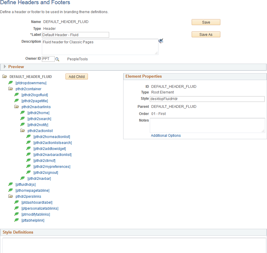
Use the Define Headers and Footers page to create and maintain header and footer definitions by adding elements to a tree structure. The tree structure is represented as:
Folders – These are container elements such as the root element (created automatically with the Root Element type) and other elements added as the Basic Container element type. Folders can contain children, which are leaves and other folders.
Leaves – These are other elements added with other element types including basic types (Basic Link, Basic Text, Basic Image, and others) as well as specialized element types (Home Link, Sign Out Link, Dashboard Label, and others).
Note: Header and footer definitions are used on classic homepages and classic pages only. While you cannot directly modify the fluid banner that is displayed on fluid pages, you can modify definitions in a macro set that will customize the look of both the fluid banner and the header that is displayed on classic pages. In addition, you can use the CompanyInfo element to configure a custom banner for classic, fluid, or both; see Configuring a Custom Banner for more information.
Navigation:
This example illustrates the fields and controls on the Define Headers and Footers Page. You can find definitions for the fields and controls later on this page.
Field or Control |
Description |
|---|---|
Name |
Displays the ID for the header or footer that was specified when the definition was created. |
Type |
Displays the type of the definition:
|
Label |
Enter a label for the header or footer definition. |
Description |
Enter a description for the header or footer definition. |
Owner ID |
Select which product, feature, or application owns this header or footer definition. |
Save |
Click the Save button to save changes to the current definition. |
Save As |
Click the Save As button to save the current definition with a new ID. |
Delete |
At the definition level, a Delete button will be displayed only for those definitions that are not included in a theme definition. Use this Delete button to delete the header or footer definition. |
Add Child (in tree structure) |
Select the root element or a container element and then click the Add Child button to add a child element. |
Delete (in tree structure) |
Select any element except the root element and then click Delete to delete the element (and any children). |
Style Definitions |
Enter any additional free form style class definitions in this long edit box. |
Add to Project |
Click the Add to Project link to access the Add To Project page to insert this branding header or footer definition into an ADS project. See Adding Data Set Instances from Object Designer Pages and Migrating Branding Data Using ADSs for more information. |
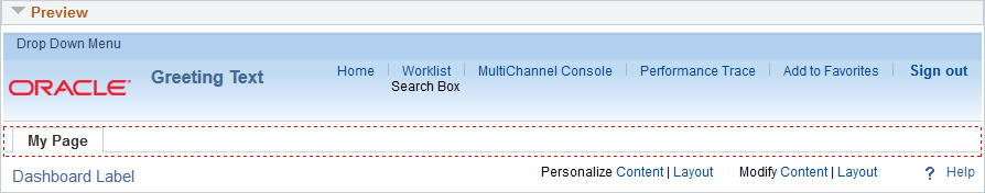
Preview Section
Expand the Preview section to review the look of the current header or footer definition. The preview is updated after changes are made to any of the elements or style classes used in the definition. Tab out of any changed field or element to see the updated preview.
Important! The DEFAULT_HEADER_FLUID definition or clones of this definition cannot currently be previewed correctly.
This example illustrates the preview of a header definition.
Element Properties
Use the Element Properties group box to review and set properties of the element selected in the tree.
This example illustrates the fields and controls on the Element Properties group box.
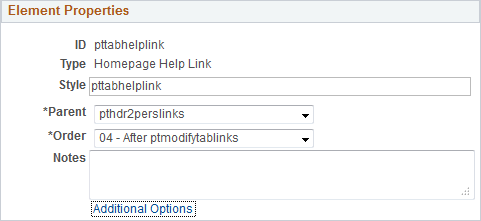
Field or Control |
Description |
|---|---|
ID |
Displays the ID of the element that was specified when the element was created. |
Type |
Displays the element type that was selected when the element was created. Valid element types are defined on the Define Element Types page. |
Style |
Enter one or more free form style class names separated by spaces to specify additional formatting for this element. |
Parent |
Select a new parent container for this element by container ID. Note: All container elements are listed except children of the current element. |
Order |
Select a new placement for this element among its sibling elements within the parent container. |
Notes |
Enter any optional notes about this element. |
Additional Options |
Click the Additional Options link to view the Additional Options page. |
Additional Options Page
This example illustrates some of the fields and controls that can be found on the Additional Options page.
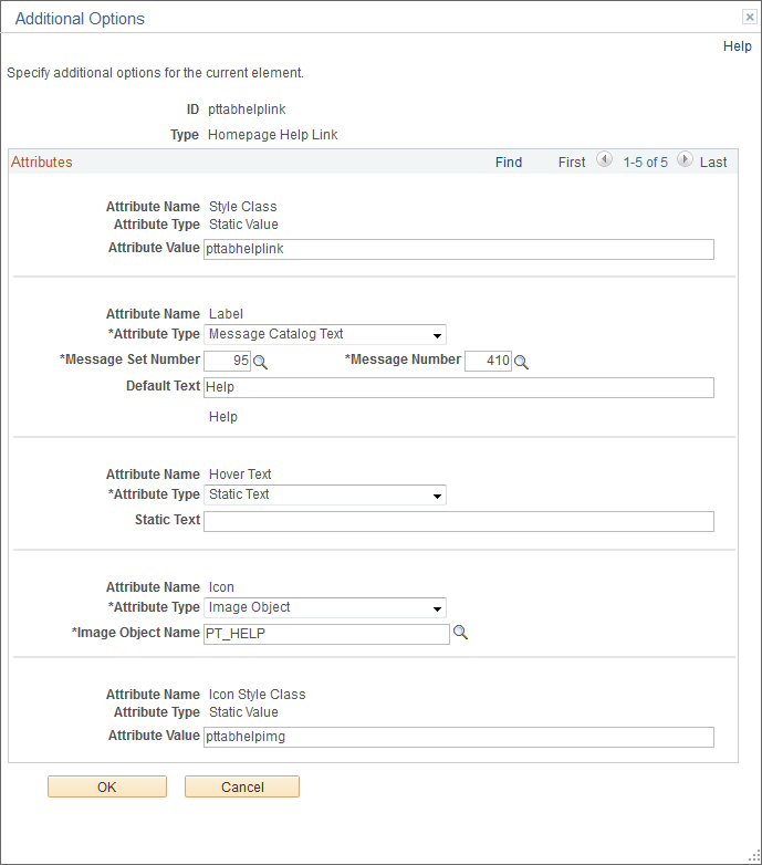
The fields displayed on the Additional Options page are controlled by the application class definition that supports this element type and will vary depending on the element type.
Field or Control |
Description |
|---|---|
ID |
Displays the ID of the element. |
Type |
Displays the element type. |
Attribute Name |
Displays the name of the attribute. |
Attribute Type |
Displays the attribute type. For some attributes, this value is not read-only and can be changed. Depending on the attribute type, additional fields are displayed showing the attribute value, static text, message set and number, default text, an object ID, and others. |
Important! The CompanyInfo element can only be configured in the DEFAULT_HEADER_FLUID header definition or a clone. While DEFAULT_HEADER_FLUID itself applies to classic components only, the CompanyInfo element within it can be configured for classic, fluid, or both.
You can configure a special CompanyInfo element in the DEFAULT_HEADER_FLUID header definition to create a custom banner that can include your own images, logos, and links. This custom banner is in addition to both the classic header and the fluid banner. The custom banner can be displayed above the system header on classic pages and homepages, above the fluid banner on fluid pages and homepages, or both.
When configuring the CompanyInfo element, be aware of these considerations:
Review and adhere to the general limitations for using the rich text editor found in Working With Rich Text Editor Fields.
Do not add new JavaScript functions–that is, do not use the <script> tag. However, you can reference PeopleSoft system JavaScript functions.
Design your custom banner to account for the adaptive and responsive nature of both fluid and classic pages. Depending the simplicity of the design of your custom banner, you may be able to create a single combined definition for both fluid and classic pages. However, because fluid application requirements for being both adaptive and responsive differ from classic applications, you may need to select the check box to enable separate banner definitions.
Avoid explicitly specifying font and other formatting using the rich text editor toolbar tools. Instead, create custom style classes for branding or use style classes delivered in your PeopleSoft system and apply those styles to the elements in your custom banner.
Similarly, avoid specifying image attributes (such as height, width, border, and others) to images uploaded through the rich text editor. Remove any such attributes on the Image Properties page and use style classes instead to modify image rendering.
Use the Source button to add <div> elements creating structure to which you can apply styling.
In addition, use the Source button to review the HTML code to remove spurious formatting, image attributes, and other code that is not HTML5 compliant.
Note: In order to view and configure the CompanyInfo element, the branding administrator requires the Company Info Administrator role, in addition to the roles required to define headers and footers. See Roles Required for PeopleTools Branding for more information.
To configure a custom banner:
Select .
Select the DEFAULT_HEADER_FLUID header definition to customize it. (Otherwise, if you have cloned the version of DEFAULT_HEADER_FLUID delivered in PeopleTools 8.57 or later, then select your cloned header definition.)
Click the CompanyInfo element.
Click the Additional Options link.
Complete the additional options for the CompanyInfo element:
This example illustrates the fields and controls on the Additional Options page for the CompanyInfo element. You can find definitions for the fields and controls later on this page.
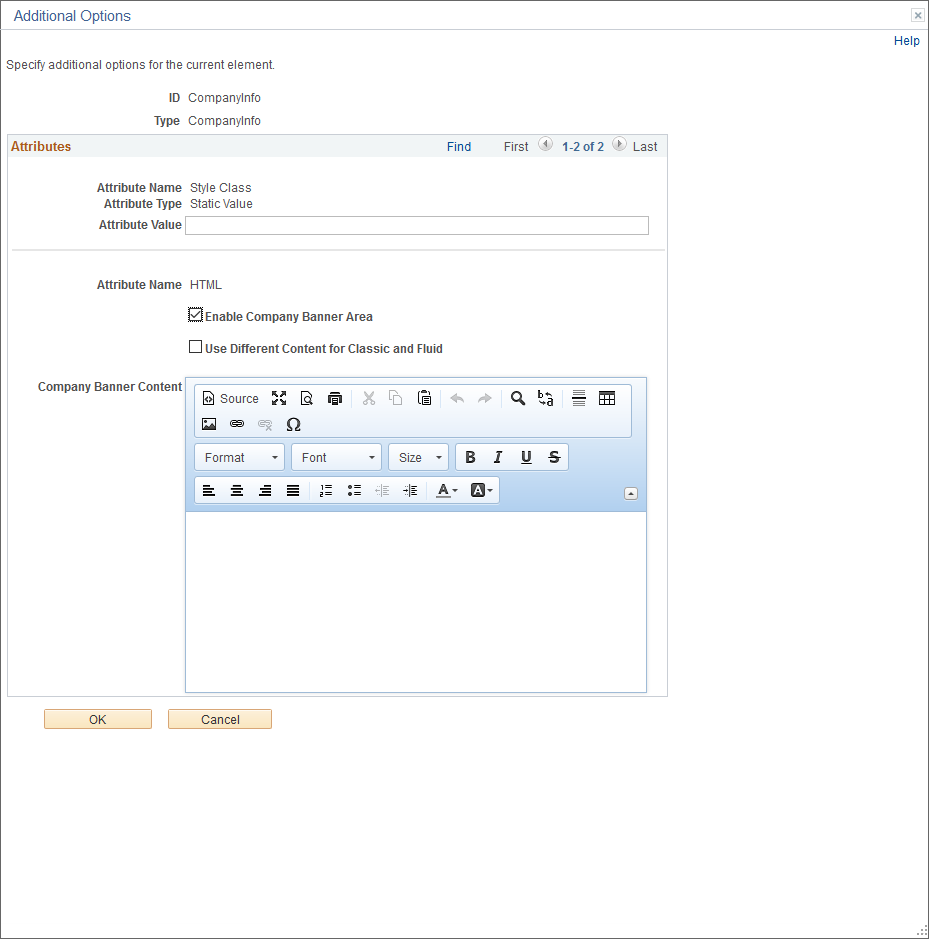
Field or Control
Description
Style Class: Attribute Value
Enter one or more free form style class names separated by spaces to specify additional formatting for the CompanyInfo element.
Enable Company Banner Area
Select this check box to enable the custom banner. Selecting this option will reveal the rich text editor, which allows you to create the content for the custom banner.
Use Different Content for Classic and Fluid
Select this check box to enable two separate rich text editor fields to create separate custom banners for classic and fluid.
Note: When this check box is deselected, the same banner will be displayed for classic and fluid.
Banner Content
Use each rich text editor field to define the text, images, and links to be displayed in your custom banner. When the Use Different Content for Classic and Fluid check box is selected, two rich text editor fields are displayed: one for classic, one for fluid. Otherwise, only one rich text editor field is displayed.
See Working With Rich Text Editor Fields for more information.
Click OK.
Click Save to save the header definition.
Test your custom banner by navigating to a classic page, a classic homepage, a fluid page, and a fluid homepage, depending on how you customized the content of the banner.
Optionally, use macros to define other aspects of the custom banner including its background color, bottom border, banner-specific style sheets and so on. See Updating Custom Macro Sets for the Current Release for the list of new macros added in PeopleTools 8.57 to support custom banners.
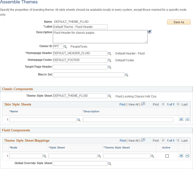
Use the Assemble Themes page to create and maintain the definitions of branding themes.
Navigation:
This example illustrates the fields and controls on the Assemble Themes page. You can find definitions for the fields and controls later on this page.
Field or Control |
Description |
|---|---|
Name |
Displays the ID of the theme that was specified when the theme was created. |
Save As |
Click the Save As button to save the current theme definition with a new ID. |
Delete |
Click the Delete button to delete the this theme definition. Note: The Delete button is displayed only for those theme definitions that are not assigned at the system, portal, or user attribute level. |
Label |
Enter a label for the theme definition. |
Description |
Enter a description for the theme definition. |
Owner ID |
Select which product, feature, or application owns this theme definition. |
Homepage Header |
Select a header definition to be used for classic homepages only. |
Homepage Footer |
Select a footer definition to be used for classic homepages only. |
Target Page Header |
Select a header definition to be used for classic pages only. Note: If no header is specified, then the header defined for homepages will also be used on target pages. |
Macro Set |
Select a custom macro set for this branding theme. |
Classic Components
Note: For a cluster of applications managed by PeopleSoft Interaction Hub, the theme style sheet and any skin style sheets must exist in all systems.
Field or Control |
Description |
|---|---|
Theme Style Sheet |
Select an override style sheet for the theme for classic components. Note: Theme style sheets can only be free form style sheets. |
Name(Skin Style Sheets) |
Identify one or more free form style sheets that can be made available to use with this theme as skin style sheets. The skin style sheets identified here are made available for use on the Assign Branding Themes page. |
Description |
Enter a description of the skin. |
Fluid Components
Use the Fluid Components group box to register a base style sheet and theme style sheet pair for a specific node. Alternatively, you can use the Register Fluid Theme Style Sheet Mappings page to perform this registration, which will ensure that the pair is mapped correctly. See Generating Theme Style Sheets for Fluid Components. The rows in the Theme Style Sheet Mappings grid specify a mapping of a theme style sheet to a base style sheet only; the grid does not specify that this base style sheet is in use. The base style sheet is assigned at the system level on the Branding System Options page, or at the component or page level through PeopleCode. Then, when the base style sheet is loaded by the system into the generated HTML, any mapped theme style sheet is loaded immediately after it.
Note: For a cluster of applications managed by PeopleSoft Interaction Hub, the global override style sheet and any mapped theme style sheets for a node specification of ANY must exist in all systems.
Field or Control |
Description |
|---|---|
Node |
Select the node to which the style sheet and theme style sheet is to be applied. You can select a specific node name, or one of the following values:
Note: The list of specific nodes includes non-local PeopleSoft nodes that have a defined content URI. |
Style Sheet |
Select the base style sheet for fluid components for the selected node. Note: The lookup lists style sheets on the current system. For remote nodes, you must ensure that the style sheet you select also exists in the remote system. |
Theme Style Sheet |
Select a mapped style sheet that has already been generated from the selected base style sheet. Note: The lookup lists style sheets on the current system. For remote nodes, you must ensure that the style sheet you select also exists in the remote system. |
Active |
Select this option to make the mapped pair active. |
Global Override Style Sheet |
Select an override style sheet for the theme for all fluid components on all nodes. |
Add to Project
Click the Add to Project link to access the Add To Project page to insert this branding theme definition into an ADS project. See Adding Data Set Instances from Object Designer Pages and Migrating Branding Data Using ADSs for more information.
Reverting Branding to Pre-8.60 Visuals
After upgrading to PeopleTools 8.60, you can revert the system branding to pre-8.60 visuals. The reversion mostly changes the colors to the PeopleTools 8.59 colors. Consider the following two scenarios before you revert the system branding to pre-8.60.
Scenario A: You've upgraded to PeopleTools 8.60, and you are using the delivered system branding theme.
In this scenario, to revert the system branding to pre-8.60:
Create a custom branding theme by cloning the delivered DEFAULT_THEME_FLUID theme.
Refer to Assembling Branding Themes for instructions.
Continue by completing the steps in Scenario B.
Scenario B: You've upgraded to PeopleTools 8.60, and you are using a custom system branding theme.
In this scenario, to revert the system branding to pre-8.60:
Select .
Select the custom system branding theme.
In the Classic Components group box, in the Skin Style Sheets grid, select PT_CUSTOM_PROPS_PRE860 and enter a description.
In the Fluid Components group box, in the Theme Style Sheet Mappings grid, select the following:
In the Node field, select ANY.
In the Style Sheet field, select PSSTYLEDEF_FMODE.
In the Theme Style Sheet field, select PT_CUSTOM_PROPS_PRE860.
In the Active field, select the check box.
Save your changes.
Sign out and sign back in.
Reverting Quick Access Bar (QAB) on Homepages to PeopleTools 8.59
In PeopleTools 8.60, by default, the quick access bar (QAB) is available on the banner. However, you can revert QAB to pre-8.60 on fluid homepages, for example, if you want to brand the logo area and require additional space for your logo in the banner. When you revert QAB to pre-8.60, QAB appears on the left on fluid homepages.
To revert QAB to pre-8.60:
Select .
Select Search.
From the search results, select PPTL.
Select the Format tab.
In the User Option column, locate HPQABPNL.
Select the Set Option Default Value link and change the value from "No" to "Yes."
Save your changes.
Sign out and sign back in.
On all fluid homepages, QAB appears on the left as a vertical bar. On classic pages, fluid pages, and classic homepages, QAB appears on the banner.
Use the Assign Branding Themes page to specify portal-specific branding options and defaults to override the system default settings. In addition, use this page to assign different themes, skins, custom tabs, and fluid homepages by user attribute.
Note: Once a portal-specific definition has been created, it cannot be entirely deleted. However, you can use effective dates to control whether a definition is currently in effect.
Navigation:
This example illustrates the fields and controls on the Assign Branding Themes page.
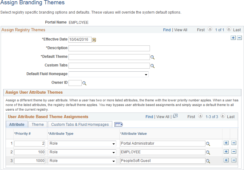
Field or Control |
Description |
|---|---|
Portal Name |
Displays the name of the current portal registry. Note: You can edit theme assignments for the current portal only. Therefore, sign into a different portal to modify its theme assignments. |
Effective Date |
Specify the effective date for this definition. |
Label |
Enter a label for the theme definition. |
Default Theme |
Select the default theme for this portal. |
Default Skin |
Select a default skin for all users who sign into this portal. Note: The list of available skins is specified on the Assemble Themes page. |
Custom Tabs |
Select the default custom tabs navigation collection for this portal. Note: Custom tabs are visible from classic homepages only. |
Default Custom Tab |
Select a default classic homepage tab from the custom tabs navigation collection for all users who sign into this portal. |
Default Fluid Homepage |
Select a default fluid homepage for all users who sign into this portal. Note: If the Fluid Homepage field on the Web Profile Configuration - Look and Feel page specifies both a component for rendering fluid homepage tabs and a specific homepage, then any value set on this page will be overridden. See Configuring Web Profile Settings for Fluid Applications for more information. |
Owner ID |
Select which product, feature, or application owns this definition. |
User Attribute Based Theme Assignments
Use the User Attribute Based Theme Assignments grid to override theme assignments, custom tabs, and default homepage tabs by user attribute. In PeopleTools, two user attribute types are delivered: by role or by permission list. You can use this grid to override the portal settings for the theme, skin, custom tabs collection, default custom tab, and default fluid homepage.
Important! Because user attribute based assignments override system-level and portal-level settings, you can create a custom user experience by user group. Moreover, you can set a classic custom tab as the default homepage for a group of users even when the system-wide personalization settings specify the fluid homepage as the default for all users, or vice versa. See the following section, “Setting the Default Homepage to be the Opposite of the System-Wide Setting,” for more information.
When you assign branding themes by user attribute, you also assign a priority sequence number to each attribute. The priority number dictates each attribute’s precedence in determining which theme will be displayed for each user. If a user has two or more attributes with a branding theme assignment, the attribute with the higher priority applies with 1 being the highest priority, 2 being the next highest priority, and so on. If a user has none of the attributes used in theme assignments, the portal-wide settings apply.
This example illustrates the fields and controls on the Attribute tab of the User Attribute Based Theme Assignments grid.
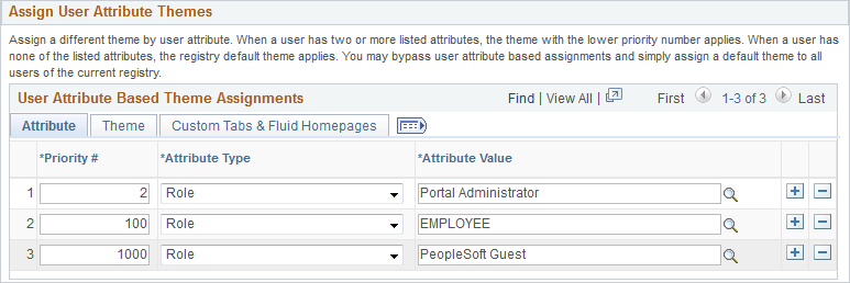
This example illustrates the fields and controls on the Theme tab of the User Attribute Based Theme Assignments grid.
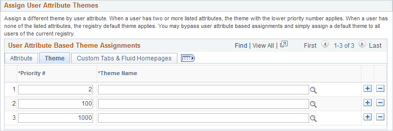
This example illustrates the fields and controls on the Custom Tabs & Fluid Homepages tab of the User Attribute Based Theme Assignments grid.
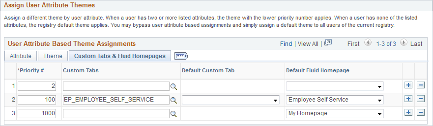
Field or Control |
Description |
|---|---|
Priority # |
Specify the priority for this attribute with 1 being the highest priority, 2 being the next highest priority, and so on. |
Attribute Type |
Specify the attribute type. The PeopleTools-delivered values are:
|
Attribute Value |
Select a value for the selected attribute type. |
Theme Name |
Select the theme for this attribute. |
Custom Tabs |
Select a custom tabs navigation collection for this attribute. Note: Custom tabs are visible from classic homepages only. |
Default Custom Tab |
Select a default classic homepage tab from the custom tabs navigation collection for this attribute. |
Default Fluid Homepage |
Select a default fluid homepage for this attribute. Note: If the Fluid Homepage field on the Web Profile Configuration - Look and Feel page specifies both a component for rendering fluid homepage tabs and a specific homepage, then any value set on this page will be overridden. See Configuring Web Profile Settings for Fluid Applications for more information. |
Add to Project
Click the Add to Project link to access the Add To Project page to insert this portal-specific branding definition into an ADS project. See Adding Data Set Instances from Object Designer Pages and Migrating Branding Data Using ADSs for more information.
Setting the Default Homepage to be the Opposite of the System-Wide Setting
System-wide personalization settings specify the default homepage type (fluid or classic) for all users. Fluid is set as the default homepage type for desktop and laptop (HPPC), and for tablet users (HPTABLET). (See Setting Device Homepage Defaults for more information on these system-wide settings.)
Note: The default homepage type for smartphone users is always a fluid homepage, which is not affected by the system-wide homepage settings.
To set the default homepage to be the opposite of the system-wide setting for a specific group of users:
Create a navigation collection for custom homepage tabs.
For example, when the system-wide personalization settings specify fluid as the default homepage type, include classic content references in the navigation collection.
Create a portal-specific branding theme assignment using the Assign Branding Themes page.
Create a user attribute based assignment in the User Attribute Based Theme Assignments grid:
Specify the user group by role or permission list.
Specify the custom homepage tabs navigation collection.
Select a specific item from this navigation collection as the default custom tab.
For example, select one of the classic content references.
Important! Selecting a default custom tab is an essential step. Otherwise, users will still see the default homepage type as specified by the system-wide settings.
Note: When a classic content reference is selected as the default custom tab here or through user personalization, the user must add the Homepages tile to the NavBar in order to be able to navigate to any fluid homepages.