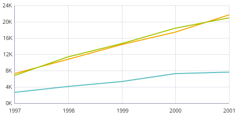
Line / Area chart
Line charts show one or more metric values aggregated across a group dimension. They are useful for showing changes or trends.

- Line — A basic line chart.
- Area — A line chart that fills in the area under the line, making it suitable for visually representing volume.
- Colored lines — A line chart that displays multiple metrics as different colored lines. This type of chart is generally preferable to an area chart if comparing metrics that do not contribute towards some total, or when showing a large number of metrics.
- Stacked area — An area chart that displays multiple metrics as filled areas. This type of chart makes it easier to see how multiple values contribute towards a cumulative total.
- Percentage stacked area — An area chart that displays multiple values atop each other to show percentages of a total by metric. The top of the chart represents 100%, so the visualization includes no whitespace unless a given X-axis value has no corresponding data.
About using a Line / Area chart
Mousing over a point on the line displays the X and Y axis values for that data point. Highlighting a color in the legend highlights the corresponding line or area.
You can refine displayed data by clicking a single point, or by clicking and dragging to select a set of points, then clicking a second time to apply the selection as a refinement. Alternately, hold the CTRL key and select multiple points, then click Apply refinements in the selection box when finished. You can also select or multi-select values directly from the X-axis.
Selected refinements display in the Selected Refinements Panel and can be toggled to set them as negative refinements. See About the Selected Refinements panel for details.
About configuring a Line / Area chart
Selecting a Color metric for a Line or Area chart automatically changes the sub-type to Stacked area. Switching to a Line or Area chart with a Color metric selected instead displays the metric as a Trellis.
For detailed configuration steps, see Configuring a Chart.