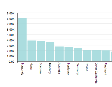
Bar chart
Bar charts show one or more metric values aggregated across a group dimension. They are useful for precise comparisons of one or more values.
Bar charts can display multiple metrics at the same time. Bar charts support both group dimensions (category axis) and series (color) dimensions. They can display either vertically (the default) or horizontally.

- Bar — A basic bar chart.
- Clustered bars — A bar chart that displays different metrics alongside each other for comparison. For example, you might want to plot review scores and production cost across different car models.
- Stacked bars — A bar chart that displays multiple values atop each other to show how they contribute towards a varying total. For example, you might want to plot total sales for three different regions across each fiscal quarter.
- Percentage stacked bars — A bar chart that displays multiple values atop each other to show percentages of a total by metric. All bars are scaled to the same height (100%) to emphasize the difference in percentages.
About using a Bar chart
Mousing over a bar displays the X and Y axis values for that data point. Highlighting a color in the legend highlights the corresponding bar.
You can refine displayed data by clicking a single bar, or by clicking and dragging to select a set of bars, then clicking a second time to apply the selection as a refinement. Alternately, hold the CTRL key and select multiple bars, then click Apply refinements in the selection box when finished. You can also select or multi-select values directly from the X-axis.
Selected refinements display in the Selected Refinements Panel and can be toggled to set them as negative refinements. See About the Selected Refinements panel for details.
About configuring a Bar chart
For variants that show multiple bars, you can either plot multiple Y-axis attributes (such as total sales and sales by region A, B, and C) or you can plot a single Color attribute that is automatically rendered as a separate bar for each attribute value. You cannot do both.
For detailed configuration steps, see Configuring a Chart.