Chart
The Chart component displays a graphical chart based on the project data. It supports several sub-types and includes options for selecting the specific data to display.
The chart sub-types are:
|
- Bar chart
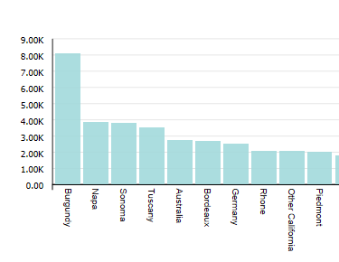
Bar charts show one or more metric values aggregated across a group dimension. They are useful for precise comparisons of one or more values. - Line / Area chart
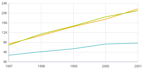
Line charts show one or more metric values aggregated across a group dimension. They are useful for showing changes or trends. - Pie / Sunburst chart
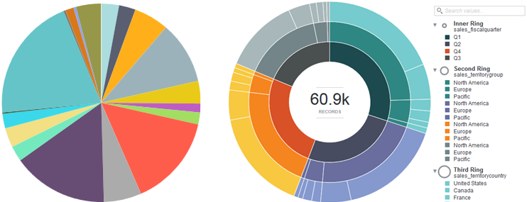
Pie charts show a single metric aggregated across a group dimension. They are useful for showing how each value contributes towards a total. Sunburst charts show concentric rings of metric values, in order to display contribution towards a total while also showing relationships between increasingly finer-grained metrics. - Scatter chart
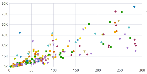
Scatter charts display data points, with each point representing a dimension value. Points can also be aggregated into bins in a binned scatterplot, or measured against a third metric and displayed as scaled bubbles in a bubble chart. These charts are useful for showing correlations between metrics. - Bar-Line chart
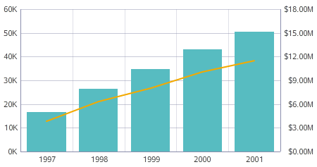
Bar-Line charts show two metric values aggregated across a group dimension. They are useful for showing quantity alongside changes in trends over time. - Thematic Map
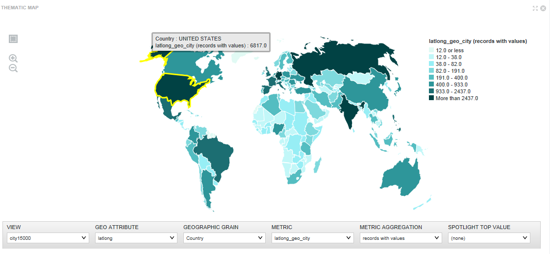
The Thematic Map component shows the data graphically and allows you to refine the data by regions including country, region, county, etc. You can refine data by drilling down into more granular regions in a thematic map and see the results associated with a sub-region. - Configuring a Chart
Studio creates a new Chart component based on a set of default values. You can re-configure the defaults with different chart data and chart display options. This is often necessary to change the X and Y-axis settings. - Saving a snapshot of a chart
You can create a snapshot of a displayed Chart component. The snapshot includes any current refinements to the chart data.
Parent topic: Working with Components
