Specifying Label Properties for Push Buttons or Links
This section discusses how to:
-
Specify a text label.
-
Specify an image label.
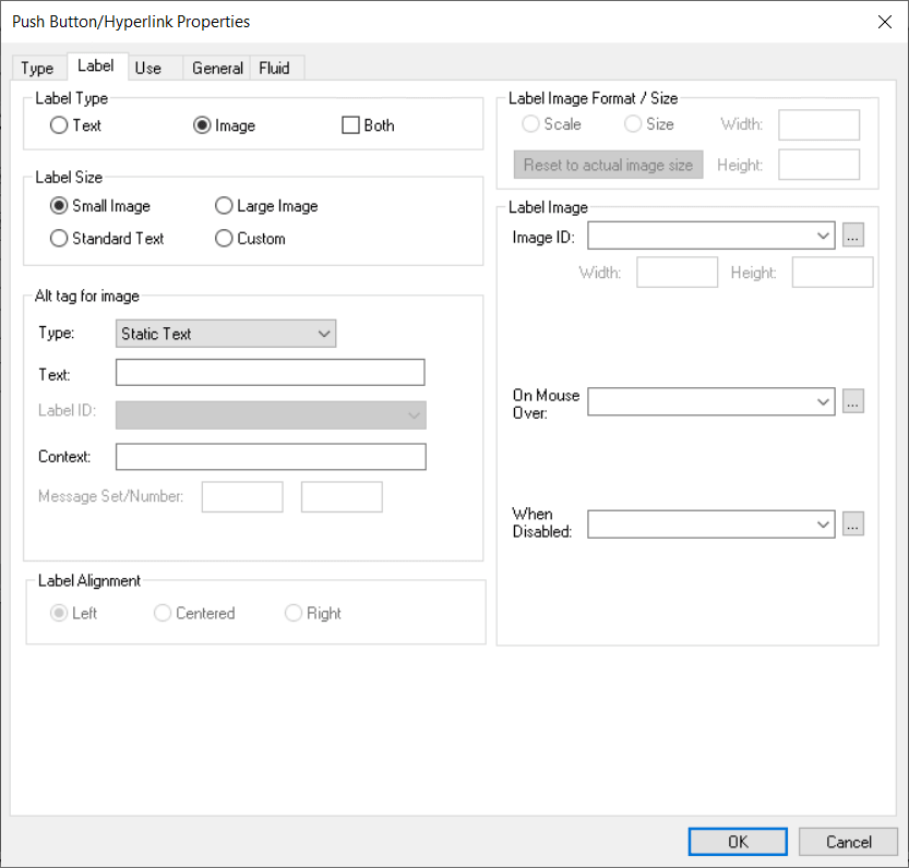
This example illustrates the fields and controls on the Push Button/Hyperlink Properties dialog box: Label tab. You can find definitions for the fields and controls later on this page.
Specifying a Text Label
To specify a text label for a push button or link:
Important:
For an action widget, Text is the only valid label type selection. Even though Both is presented as an option, do not select Both; if you do, the action widget will not be displayed.
-
Access the Push Button/Hyperlink Properties dialog box.
-
Select the Label tab.
-
In the Type group box, select Text.
-
Select the size.
Standard push buttons can be one of three sizes, depending on what kind of text or image you want to display on the button face.
Field or Control Description Small Image
Creates toolbar-sized buttons that handles small 16 × 16 pixel images.
Large Image
Handles 32 × 32 pixel images.
Standard Text
Matches the Microsoft standard dimensions for text push buttons.
Custom
Select if none of these sizes meets your needs. When you click OK, the push button displays selection handles that you can use to resize it.
-
Specify the type of label text.
Depending on the destination type that you selected, the values in the Type drop-down list box differ.
Field or Control Description Message Catalog
Select to reference a message that exists in the message catalog. Enter the message set and number. Message catalog items are all translatable.
RFT Short (record field table short)
Select to label the push button with the short name for the field from a record definition. The RFT stores attributes for fields in a record definition. Use this option only if you specified a record definition and field name on the Type tab in the Push Button/Hyperlink Properties dialog box. The RFT short name appears on the push button when you click OK and return to the page. Select the label ID if you do not want to use the default label if more than one label has been set for the record field.
RFT Long (record field table long)
Select to label the push button with the long name for the field. Use this option only if you specified a record definition and field name on the Type tab in the Push Button/Hyperlink Properties dialog box. The RFT long name appears on the push button when you click OK and return to the page. Select a different label ID if you do not want the default label if more than one label has been set for the record field.
The system uses the RFT long label as the tool tip at runtime for links if it is different from the assigned display value of the link and it is not null. If more than one label is stored for the record field, you can select an alternate tool tip from the Label ID drop-down list box.
Static Text
Select to enter the text to appear on the label.
URL Description
Select if you selected External Link as the destination on the Type tab. Select the style from the drop-down list box.
-
Select the alignment.
This option is only available if you selected Hyperlink for the type on the Type tab. Push button text is automatically centered for controls that appear as push buttons. Push buttons with text and images are automatically center-aligned when used in grids.
Specifying an Image Label
To specify an image label for your push button or link:
-
Access the Push Button/Hyperlink Properties dialog box.
-
Select the Label tab.
-
Select Image for the type.
-
Specify the size.
If you select Custom, the Image/Format Size group box becomes available.
Field or Control Description Scale
Select to adjust the width and height as percentages.
Size
Select to set the image size by altering the width and height in pixels.
Reset to actual image size
Resizes the image according to its natural size. That is, the image size is not manipulated by custom width or height values.
-
Specify the image ID.
Select one of the predefined image definitions or click the Browse button to view push button images.
-
In the Alt tag for image group box, specify the hover text type.
Field or Control Description Message Catalog
Select to reference a message that exists in the message catalog. Enter the message set and number. Message catalog items are all translatable.
RFT Long (record field table long)
Select to use the long name of the record field as the hover text. Use this option only if you specified a record definition and field name on the Type tab in the Push Button/Hyperlink Properties dialog box.
The system uses the RFT long label as the tool tip at runtime for links if it is different from the assigned display value of the link and it is not null. If more than one label is stored for the record field, you can select alternate hover text from the Label ID drop-down list box.
RFT Short (record field table short)
Select to use the short name of the field as the hover text. Use this option only if you specified a record definition and field name on the Type tab in the Push Button/Hyperlink Properties dialog box. If more than one label is stored for the record field, you can select alternate hover text from the Label ID drop-down list box.
Static Text
Select to enter the text that will appear on the label.
-
(Optional) Select the image that will appear on a mouse over.
For example, you might want to highlight an image so that users can easily see which option they are selecting.
-
(Optional) Select an image that will appear when the button is disabled.
Selecting Both Option
Select the Both check box to display a text label and an image label on your push button or hyperlink.
Important:
The Both option can be used only within fluid applications or pages; it is not supported on classic pages.
You can specify whether the text label appears before the image or after the image by using the Label Rendering group box on the Fluid tab. See Fluid User Interface Developer’s Guide: Setting Properties on the Fluid Tab.