Text Considerations for the Chart Class
Text can be found at the following locations in a Chart class chart:
-
Chart title.
-
Chart subtitle.
-
Chart footnote.
-
Chart data item labels.
-
X-axis and y-axis titles.
-
X-axis and y-axis labels.
-
Legend descriptions.
-
Pie chart segment labels.
-
Data hints (hover or mouse over text).
Font types and sizes for chart titles, subtitles, footnotes, axis titles, and axis labels in charts are defined as style classes in PeopleSoft style sheets. The delivered style classes are designed to work with the overall theme of the PeopleSoft user interface. The delivered style classes apply to all charts in the system. Although they are changeable in the Application Designer, Oracle recommends that you keep them as delivered unless you have a good reason to change them.
Axis labels are positioned by the charting engine as part of the overall rendering of the chart graphic. The general pattern for axis and pie chart segment label display is this:
-
The font size of the label text remains constant.
-
The charting engine will try to maximize the size of the chart graphic while fitting all label text around the graphic.
-
The chart graphic area will shrink to a minimum threshold size as the text for labels grows longer.
-
After the minimum chart graphic area threshold size is reached, the chart graphic no longer shrinks and labels are displayed in an unpredictable fashion.
There are special considerations depending on whether the type of label is for an x-axis, a y-axis, or a pie chart segment.
Best Practices for Managing Chart Text
The best ways to minimize the chance of unpredictable text are:
-
Use the smallest font that is readable for text labels. PeopleTools is delivered with a small point size for axis labels in order to allow more characters to be rendered.
-
The larger the chart area is defined, the more room will be available for labels.
-
Try to build your charts using short (but descriptive) fields for axis labels.
-
Make sure that data hints are always used in your charts to compensate when labels cannot be displayed.
Tooltips (Data Hints or Hover Text)
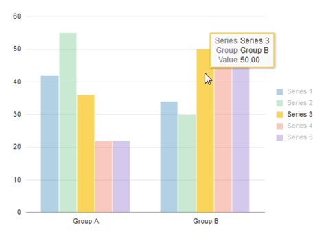
Each data item in a chart (a bar in a bar chart, for instance) has a tooltip. A default tooltip is created automatically based on the composition of the chart.
The following example displays a bar chart with the default tooltip for the selected data item:
The following example displays a bubble chart with the default tooltip for the selected data item:
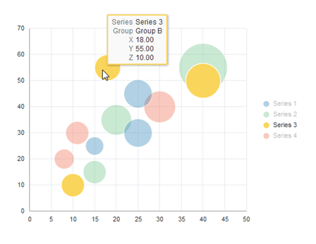
The default tooltip text that appears is constructed from information about the composition of the chart that you have defined and the row of data being charted.
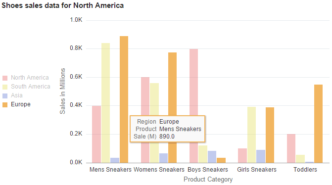
You can modify the labels for the tooltip items by using the TooltipLabel class in conjunction with the Chart class. Your custom labels will be displayed in the default format.
The following example displays a bar chart with custom tooltips for the selected data item generated using the TooltipLabel class:
Alternatively, to fully customize tooltips for chart data items you can use the SetDataHints method of the Chart class.
Related Topics