Working with Search Results in Global Search
End users use the Global Search bar available on the header to launch global search where they can enter their search criteria. Global Search provides a way for a user to search across all search indexes or a specific group of search indexes.
This example illustrates the Global Search bar.

After running a search using the Global Search bar, the system presents the search results in an intuitive display, enabling interactive filtering and further navigation.
This example illustrates the fields and controls on the Global Search results page. You can find definitions for the fields and controls later on this page.
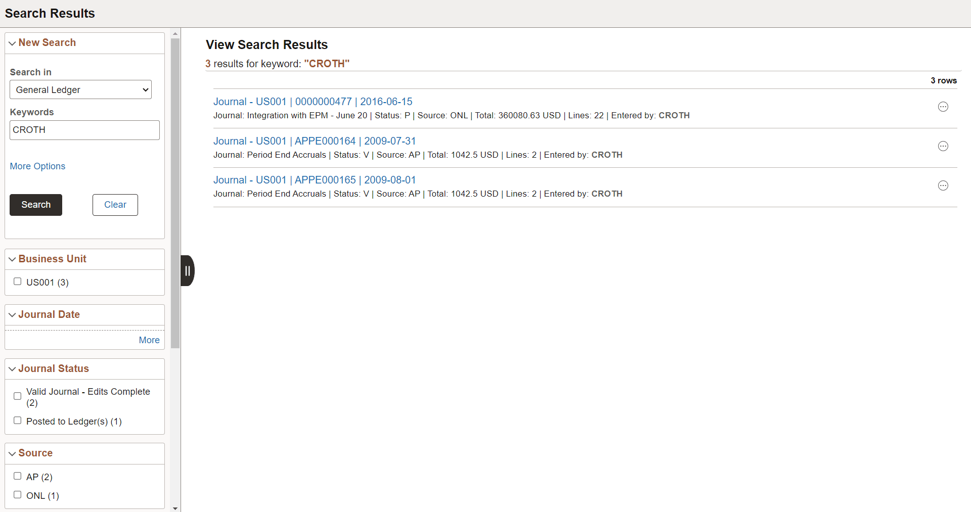
The search results page has two panels: the left panel to display search options and facets and the right panel to display the search results.
| Field or Control | Description |
|---|---|
|
New Search |
The new search area enables you to initiate a new search by selecting a search category and entering keywords. Note: A blank search is not supported. That is, you must enter valid search criteria. |
|
Facets |
Facets are attributes used to filter and narrow down a set of search results. You can select a single facet value or you can select multiple facet values. For more information on facets, see the section on Using Facets later in this topic. |
|
|
Use the Hide Filters button to collapse the left panel so that the right panel occupies the entire real estate of the page. Toggle the button to expand the left panel. |
|
Number of returned rows |
The total number of rows that match a keyword in the selected search category is displayed at the top of the search page. The Global Search results page shows only the first 50 rows (default) of search results for performance reasons. You can configure the search page to display more rows, that is, to intentionally change the default number of rows, navigate to the PeopleTools Options page. If the total number of rows is greater than 50 rows, you can use the facets in the left panel to filter the desired information. |
|
|
If any bulk related actions are defined for a component, the bulk related actions indicator appears at the top of the search results page. |
|
Images |
Images can be configured to appear with the search results. If any of the search results is configured to display an image, the title and summary of a search result is indented. See Working with Images. |
|
Related Actions Indicator |
If any related actions are defined for the pages of a component, the related actions indicator appears to the right of the search result. Clicking the related actions indicator displays a popup containing the defined related actions. |


Using New Search
Users select a search category and enter a search criteria to search for content. Advanced users can leave the search text box blank and click the Search button to display the advanced search options.
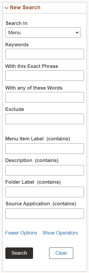
Use the More Options control to display additional fields to specify the search criteria. If a search category is not selected, the general set of search fields are displayed. If a search category is selected, the general set of search fields and a set of search fields specific to the selected search category are displayed. For example, if you select Navigator as the search category, you see the general set of search fields and additional fields that are specific to the Navigator search category. Clicking the Fewer Options control collapses the additional search fields.
The additional search fields display default operators for each search field. Use the Show Operators link to display additional operators for each search field. Clicking the Hide Operators control collapses the additional operators.
Note:
When you use the contains operator, enter a complete word or a set of words, for example desktop or desktop computer. You can also use wild card characters, but the wild card characters can be used only within a word or at the end of a word. Examples of valid search text containing wild cards: t*st, test*.
The Clear button allows you to clear the search criteria that you entered. However, along with the search criteria, the search results are also cleared enabling you to create a fresh search.
This example illustrates the advanced search fields.
Using Facets
By default, on Global Search results page and the component search results page, you can choose multiple facet values to filter or narrow down your search results. You can use the check boxes under a facet to select multiple facet values. For example, in the Department facet, you can choose multiple departments, such as Finance, Human Resources, and so on.
In hierarchical facets too, multi-facet selection is enabled by default. you can choose multiple facet nodes. In hierarchical facets, the facet nodes are displayed as a tree, and a blue check mark indicates the selected facet node. When you select a parent node, the child nodes are not selected by default. If you select a child node after selecting a parent node, then the parent node is deselected automatically. The tree nodes are collapsed by default. If a child node is selected, then the parent node is expanded.
Under a facet (including hierarchical facet), when you select a facet filter, the selected facet filter moves to the top of the facet filters, that is, the selected facet filter is displayed above the non-selected facets. The movement of selected facet filters to the top affects the order of the facet filters. Each time you select a facet filter, the order of facet filters is rearranged to display the selected facet filter above the non-selected facet filters.
Note:
The Category facet is set for single select. Multi-facet selection is always turned off for the Category facet.
Note:
Only fluid search pages support selecting of multiple facet values or tree nodes. Classic or classic plus search pages do not support this option.
For information on enabling multiple facet-value selection, see Selecting Facet Settings and Managing General Search Options.
As you drill into a set of facets, your path is expressed in the form of facet breadcrumbs.
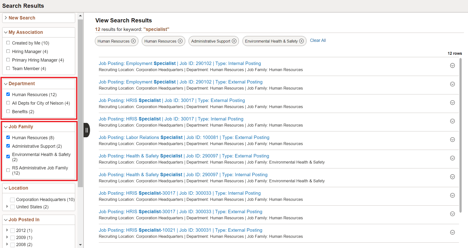
The selected facets appear as breadcrumbs in the order you choose the facets. For a hierarchical facet, individual breadcrumb is displayed for each selected tree node.
Facets display 10 values by default. If a particular facet has more than 10 facet values, More appears at the bottom of the list. To collapse the expanded facet list, select Less.
This example illustrates search results based on multiple facet values and illustrates the display of breadcrumbs.
If a facet contains sensitive or PII data, the facet is not displayed. For more information on masking sensitive data, refer to Masking of Data in Search Results.
Using Related Actions
For components, related actions can be defined at component level or at page level. End users can navigate to related actions defined for that component from search results without accessing the main result document.
When component-level and page-level related actions are available for a search result, the page-level related actions take precedence and you see the related actions indicator alongside a search result and the bulk mode indicator at the top of the search results.
By clicking the related actions indicator, a related actions popup appears, showing the possible related actions for that user, according to security access.
After clicking a related action, the system displays the target related action as configured by the application (as in, in a modal window, a new browser window, and so on). The system displays the related action interface with the information associated with the search result displayed.
This example illustrates the Related Actions indicator.

The bulk related actions indicator appears when a search result has bulk related actions defined at the component level. When you click the Bulk mode icon, you see an Actions button with the related actions indicator and check boxes to the right of the search results. You perform a bulk mode action by selecting a search result or search results and by selecting the required bulk action from the related actions list.