About Column Swapping
In Oracle Analytics, you can configure a visualization to allow consumers to change the columns used so they can explore the data and discover insights without editing the workbook canvas.
Column swapping is a way for consumers to interact with a canvas; it doesn't have any impact on the workbook itself. When a consumer selects a column to swap, the changes are only temporary for their session and they can't save them in a workbook state.
- Bar graphs
- Tables and Pivots (legend only)
- Line graphs
- Network graphs
- Pie and treemap graphs
- Scatter graphs
For example, you might have a simple bar graph using the column Sales for the vertical axis (Values), the column Product Category for the horizontal axis (Category), and the column Customer Segment to show the breakdown of customer segment for each product category using a legend (Color).
Description of the illustration column_swap_author_example1.png
You can make this visualization interactive for your consumers by enabling column swapping and then specifying which columns you want to make available for consumers to swap. You specify which columns are available for column swapping in the visualization by adding them to the Related Columns section of the Grammar pane.
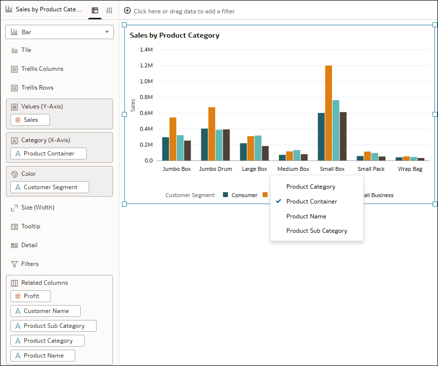
Consumers can then click the column name in the visualization, for example Product Category on the horizontal axis, and choose a different column from the list provided, for example Product Container. This way they can explore a different view of the data, in this case, the sales values for each product container instead of product category.
Description of the illustration column_swap_author_example2.png
The list of available columns displayed to the consumer to swap with the existing column in the visualization depends on the type of column it's possible to use for that Grammar element. For example, if the vertical axis uses Values, consumers can only choose from the measure columns you add to Related Columns. If it uses Category, consumers can only choose from the attribute columns you add to Related Columns. For a legend, consumers can usually choose from both measure and attribute columns if the legend uses Color, whereas they can only choose a measure if the legend uses Size.
You enable column swapping for the entire visualization, not for each individual element. This means if the visualization contains both vertical and horizontal axes as well as a legend, and you add attributes and measures to Related Columns, the consumer can swap columns for all three elements.
This tutorial shows you how to enable, configure, and test column swapping. ![]() Tutorial
Tutorial