Use Color and Size in a Gantt Chart
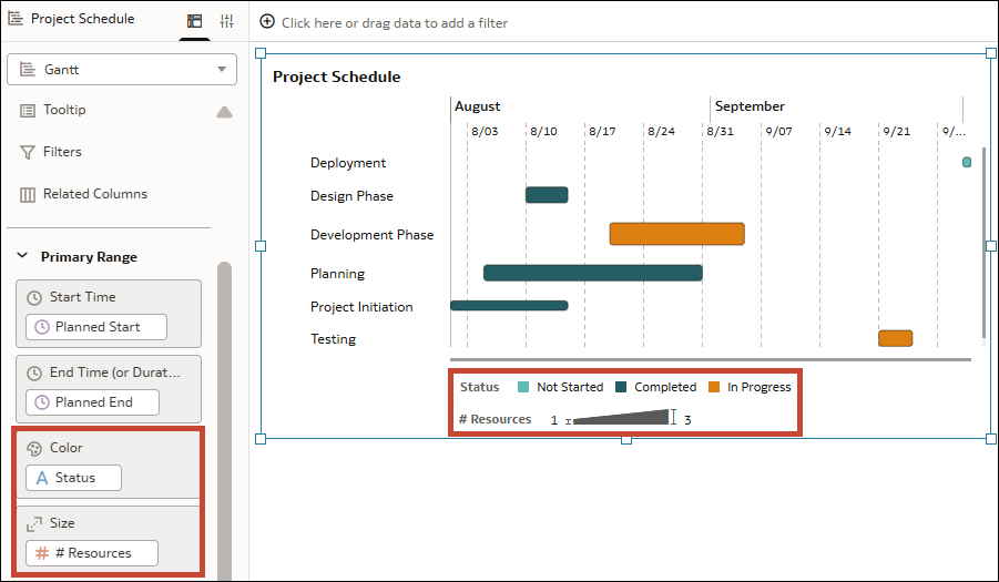
Add context to your Gantt chart, by adding columns to Color and Size in the Grammar pane. This changes the color and size of the bars in the chart and adds a legend to the visualization to indicate the meaning.
For example, you can use the color of the bars to indicate the status of the tasks using an attribute like Status. And you can use the size of the bars to indicate the number of resources consumed by the events using a measure like Resources.
Description of the illustration gantt_chart_color_and_size.png
You can add columns to Color and Size for both the Primary Range and Secondary Range. You can add multiple columns to Color, but only one to Size.
- On your home page, hover over a workbook, click Actions, then select Open.
- Click the Gantt visualization to select it.
- In the Data pane, drag an appropriate attribute or measure column to Color in the Grammar pane.
- In the Data pane, drag an appropriate measure column to Size in the Grammar pane.
- Click Save.