Use Explain to Get Immediate Descriptive Insights into Your Data
In Oracle Analytics, right-click a column in your dataset and select Explain. The Explain window defaults to the Basic Facts tab.
If You're Explaining a Measure Column
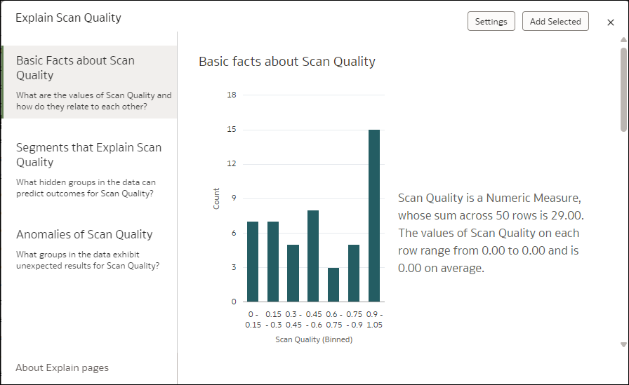
The Basic Facts page displays a histogram of your measure values indicating how records in your dataset distribute against values for this measure. A description next to the visualization summarizes the number of rows in your data as well as the total and average value of the measure. If you scroll down the page, you can see different visualizations displaying breakdowns of your target measure value against every attribute column in your dataset.
Description of the illustration explain-basic-facts-2.png
If You're Explaining an Attribute Column
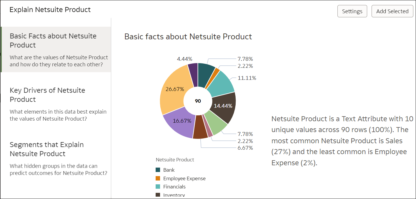
At the top of the Basic Facts page, a pie chart displays the distribution of your dataset records between the different member values of your target attribute. This provides a quick glimpse into how your records distribute for the attribute you selected, and which are the most and least frequent. The paragraph next to the pie chart gives a high-level description of how many rows are in your dataset. It also indicates how many distinct values your target attribute holds and the most and least common values.
Description of the illustration explain-basic-facts.png
As you scroll down the Basic Facts page, you can see different charts indicating how each measure in your data distributes against the values of the attribute you selected. Click Settings on the top right of the screen to change which measures are displayed in this descriptive statistics page.