Visualization Types Generated by Auto Insights
Auto Insights generate various types of visualizations that deliver specific insights into your data. Each of these visualizations leverages different columns from your data and is ranked depending on the value of the insight within the context of your data.
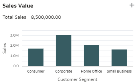
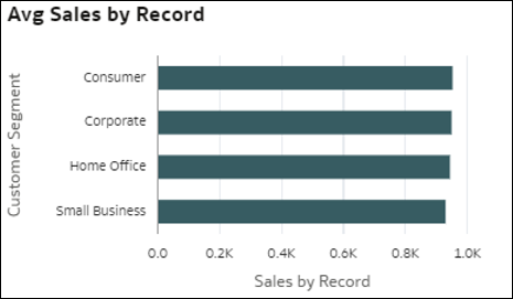
- Dimension Breakdowns - These visualizations aggregate a measure value for the various members of a dimension in your data. This lets you gain a quick view of how the selected metric is distributed against a given dimension. The measure can be a metric from your dataset, a count of records, or an average value of the metric per record.
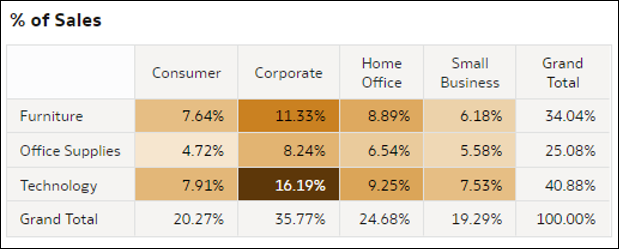
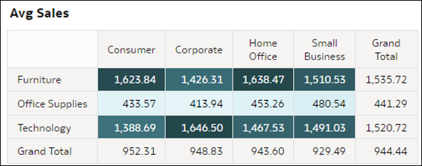
- Heatmap Pivot Tables - These visualizations aggregate a measure value for the intersections of two dimensions in your data. Each cell in the pivot table represents an intersection of the members of the two selected D2 dimensions. These visualizations help you quickly understand where the highest values are for the measure by looking at the darkest cells in the tables. Measures in this visualization can be a metric from your dataset, a count of records, an average value of metric per record, or a percentage representing any of these options (with the top right total equal to 100%).
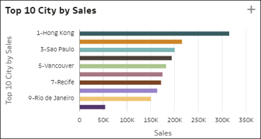
- Top 10 Individuals - This visualization shows the top members of a dimension by their decreasing value for a measure in your dataset. The last bar in the chart shows the average value of the measure for all the members that are not among the top nine. That is, the average value of M1 for all individuals that are not top ranking. This information shows how far ahead the top individuals are compared with the average of the rest of the population.
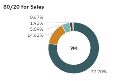
- 80/20 - This visualization shows, for a given measure, how much the records in the top 20% of your data weigh out of the total dataset. The top 20% is calculated based on detailed rows in your dataset. The donut chart shows the importance of the top individuals in your data for that measure. The arcs on the donut chart represent quintiles of records, that is, successive chunks of 20% of the records by decreasing number of rows (top 20% individuals, followed by the next 20%, and so on). The size of the arcs represents the total aggregated value of the measure for each quintile.
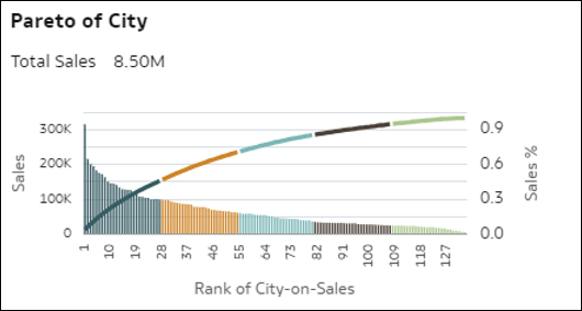
- Pareto - This Pareto chart visualization shows every member of a dimension (medium cardinality) ordered by decreasing value of a measure. Each bar represents this measure for a member, and the line represents the cumulative percentage of the measure value (summing up to 1.0 = 100%) as each member of the dimension is added cumulatively. A Pareto chart helps focus interest on the areas that offer the greatest relative value or frequency.
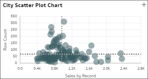
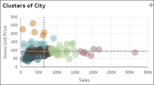
- Scatter Plots and Clusters - The scatter plot chart visualization shows all members of a dimension (medium cardinality) on a grid with two distinct measures from your data for the axes. Each measure is graduated by average unit value. The spread among all these records and the potential outliers represent interesting insights into your dimension members. This chart gives you a quick insight into how well the two metrics correlate with each other on B1 members, and lets you easily understand which members fall in which quadrant. A variant of the scatter plot shows an automatic clustering of your records into six coherent groups.
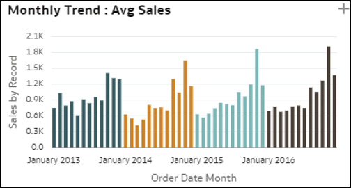
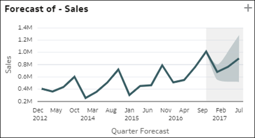
- Simple Trending Bar Charts - This visualization represents the trended evolution of a measure over a time column in your dataset. It can reveal interesting trending patterns such as growth or decline. The measure can be a metric from your dataset, a count of records, or an average value of a metric per record. The same insight can also display with an additional forecast line on the right side of the chart.
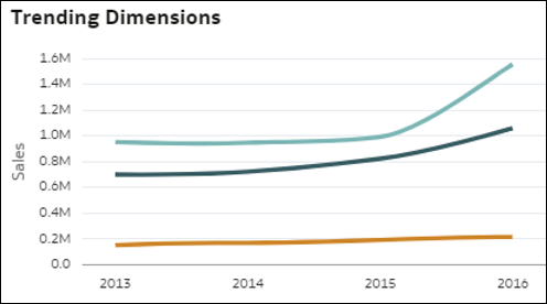
- Comparative Trending by Dimension - This visualization compares how a measure value has trended over time for each member of a dimension in your data. Each line in this chart shows the evolution of a measure for a given member of the dimension. The growth or decline in measure value may not be consistent across all members in the dimension, which could be an interesting insight: Which member trends differently from the others?
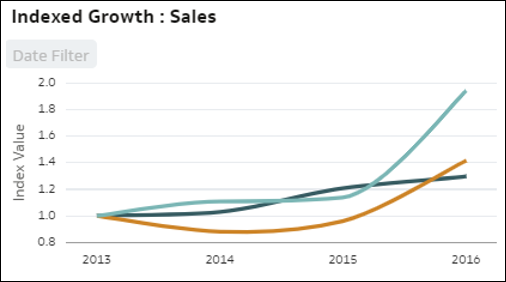
- Comparative Indexed Trending - This visualization compares relative growth of a measure over time for each member of a dimension column in your data. Each line represents a member of the dimension, with a base index value of 1.00 set at an initial time period. The evolution over time shows the relative value in the following periods compared to the index value 1.00 in the initial period. Using indexing instead of absolute values lets you make a fair comparison of various trends as the lines show true relative evolution, properly comparing growth of all members with each other. When looking at absolute values of the metrics instead of indexed values, discrepancies in values often make it impossible to properly compare growth or decline. Using indexes helps you understand actual relative behavior.
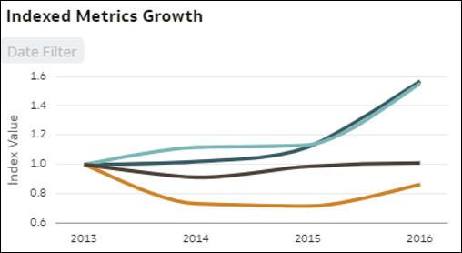
- Indexed Trending by Measures - This visualization compares the relative evolution of several measures in the dataset over time. The line chart visualizes the indexed value of various metrics in the dataset over time, with each line representing a measure. Using indexing instead of absolute values lets you make a fair comparison of various trends, as looking directly at the absolute values of the metrics often makes it impossible to properly compare growth or decline. The starting index value (1.00) is set for all metrics at an initial time period, and the line shows the relative evolution of each metric compared to its starting point in the chart (Index).
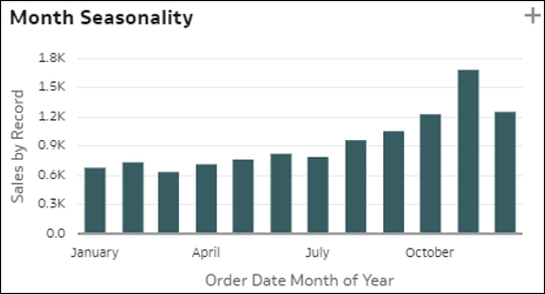
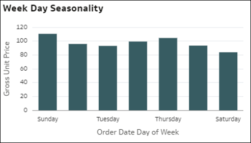
- Seasonalities - The bars in this visualization represent the distribution of a measure by Month-of-year, Day-of-month, or Day-of-week of a time object in your dataset. This gives you an indication of the possible seasonality of the ratio value over months. Seasonality charts are useful for identifying recurring patterns in data over specific periods. This can be crucial for understanding how measure values fluctuate seasonally.
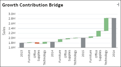
- Members Contribution Bridge - This bridge chart shows the contribution of each member of a dimension in your dataset to the variation of a measure value over time. It helps you understand which members were the biggest contributors to a variation over a period of time, for an increase or decrease. Each gray bar in the chart represents the total value of a measure for a period of T1. The green or red bars in between two periods indicate which members increased or decreased, and therefore how they contributed to the overall variation.
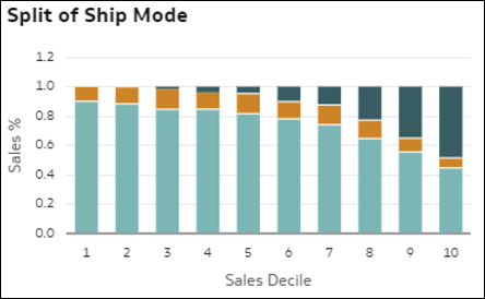
- Dimension Members Split (Mix) vs. Measure Value - This visualization helps you understand the mix (split) of all the members of a dimension in your data as the value of a measure grows. The bars represent relative values of the measure: Decile 1 = low measure value by record (first 10% records), Decile 2 = second 10%, up to Decile 10 = high measure value by record. In each bar, colors show the proportion (percent of total) of each member of the dimension in the total value of the measure, for that decile. This helps identify that the structure of the members mix changes as the measure value changes.
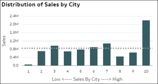
- Histogram of a Measure by Record Bins - This visualization shows how a measure distributes by the bins of another metric. The bars in the chart show the aggregation of the measure, and each bar represents a bin for a measure: Bin 1 = low measure value by record and Bin 10 = high measure value by record.
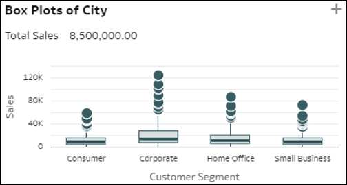
- Dimension Members Boxplot - This boxplot visualization compares the spread of individuals in a dimension D1 (medium cardinality) in your data (dots) with the value of a measure in your data, and is represented by each member of the other dimension D2 in your data (bars). Each vertical bar in the boxplot represents a member of D2, and each dot in a bar is a single D1 member, with the y-axis showing its measure's average unit value. Each bar represents three values for this member of D2: the first quartile value at the bottom of the bar, the average value in the middle of the bar, and the third quartile at the top. This visualization helps you understand the spread of records in a D1 dimension and compare differences in that spread with members of a D2 dimension.
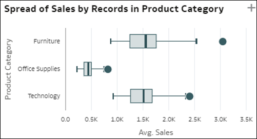
- Spread of Record Values By a Dimension - This chart visualization shows the dispersion (spread) of records on value of a measure, for each of the members of a dimension (bars). The x-axis shows the average value of the measure by record. The dots in each of the bars represent random groups of granular records from the dataset. This visualization helps you understand how the spread may vary between different members of a dimension (different horizontal bars on the visualization).
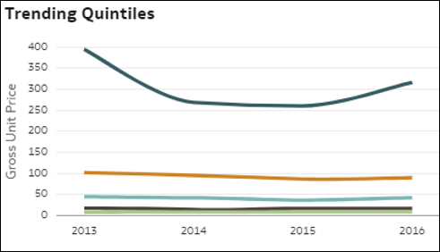
- Quintiles Trend Comparison - This visualization compares how each of the 20% groups of records in the data (sorted by the value of a measure) from toppers to bottomers (quintiles) have trended over time for their measure value. Was the growth or decline consistent among the top and bottom groups or not? For which population group is the measure trending different? Each line in the chart is a quintile showing the trending over time of M1 value. Quintiles are groups of 20% of the dataset records ordered by decreasing measure value: records with top 20% value, followed by the next 20%, and so on.
