- Building Sites with Oracle Content Management
- Creating and Editing Sites
- Use Built-In Components
- Basic Components
- Buttons
Buttons
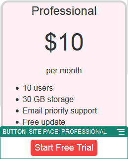
Use a button to make a link or other functionality more apparent on the page.
- Navigate to the page you want to edit and make sure that
 is set to Edit.
 - Add the component to the page.
- To adjust the properties for the button, click its menu icon
 and choose Settings.You can specify the text on the button (label), size, alignment and other display options for the button.
Note:
If you set the Width and Height fields to 0 (zero), the button will automatically size to the fit the text you specify for the label.To specify the background color, font, border, and other settings, click the Style tab. You can choose from the predefined styles in the current theme. Depending on your theme, you may also be able to click Customize to specify your own values.
- To associate a link or other actions with a button:
- In the Settings panel, click Link.
- Click Select Link Type and choose one of the following options:
- No Link: The button performs no action when the user clicks it.
-
Web Page: Specify a full URL to an external page or site, and select where to open the link.
-
Site Page: Use the page picker to select a page on the current site, and select where to open the link. You can specify additional URL parameters in the format key1=value1&key2=value2. Empty values are supported; for example, key1=&key2=value2. You can also specify a URL anchor, but need to add a special Anchor section layout to the place on the target site page where you want the anchor link to resolve, and specify the same anchor name in layout settings that you used when defining the trigger action.
Note:
The Anchor section layout required to use URL anchors is distributed in the Oracle Content Management Toolkit. For information on how to get the toolkit, see Develop with Oracle Content Management Toolkit. -
File Download: Download a selected file from the repository. Select a file.
If you select a digital asset, you can select a specific rendition. If you don't select a rendition, the original size will be used. If you want the latest version of the asset to be published when the site is published, select Use latest version of asset. If you don't select Use latest version of asset, then the most recent published version is used rather than a more recent draft version if there is one.
-
File Preview: Preview and optionally download a selected file in an overlay over a dimmed and inactive version of the page.
-
Content Item: Click
 to select a content item from an associated asset
repository. Choose the detail page you want displayed and
target the page to open in the same or new window.
-
Email: Specify a valid email address and, optionally, a subject. The resulting message is opened in and sent through the default email client.
-
Trigger Actions: Select one or more page actions to perform when the button is pushed. Page actions include:
-
Navigate to Site Page: Select a page on the current site.
-
Navigate to External URL: Specify a full URL to an external page or site.
-
Show Alert: Show a specified message in a window.
-
Show or Hide a Component: Select a component on the current page to show, hide, or toggle.
-
Show or Hide a Slot: Select a slot on the current page to show, hide, or toggle.
-
-
Map: Enter a valid address or coordinates, and select where you want the map to open in desktop and mobile browsers.
-
Phone call: Enter a valid phone number.
