Use Triggers and Actions
Button components can initiate one or more actions such as showing or hiding page components and showing messages. Certain components, such as folder and file lists, can initiate actions in the companion component based on the selection a user makes.
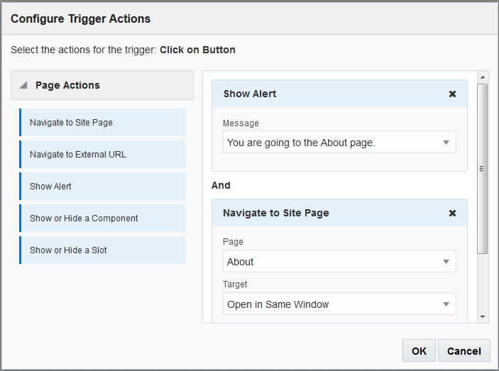
For example, you can configure a button so that when the button is pushed (the trigger), the user is directed to another page or external URL and an alert is shown that notifies them of the change (the actions). The display you see will change depending on what kinds of components are also used.

Description of the illustration trigger_action_page.png
If you use more than one action, consider the order of operation and put the actions in the order you want them performed. In the example above, list the alert action first. This will give the user time to read and dismiss the message before they are redirected to the page. If you list the redirect action first, the message may be replaced with the new page before the user has a chance to read it.
Page Actions
All components that support triggers and actions support page actions:
-
Navigate to Site Page: Select a page on the current site.
-
Navigate to External URL: Specify a full URL to an external page or site.
-
Show Alert: Show a specified message in a window.
-
Show or Hide a Component: Select a component from the list of components on the current page to show, hide, or toggle.
-
Show or Hide a Slot: Select a slot from the list of slots on the current page to show, hide, or toggle.
Component-specific actions
In addition to page actions, components can define their own actions. These actions can allow a component to communicate with other components and initiate actions in a companion component. For example, when a user selects a folder in the folder list component, the file list component can display the files in the selected folder. In this case, the folder list component supports the Folder Selected trigger and the file list component supports the Display Files action.
When you add components that support actions to a page, the component and any actions they support are added to the list of available actions. Some components support only actions or certain actions. Some component provide triggers, but do not themselves support any actions.
To learn how to create your own components, see Develop Components.
For example, to specify one or more actions for a button component:
-
Click the button’s menu icon
 and choose Settings.
-
In the Settings panel, click Link.
-
Click Select Link Type and choose Trigger Actions.
-
Under Available Triggers, click Click on Button.
-
In the Configure Trigger Action window, click and drag an action from the column on the left and drop it on the slot labeled Do something.