- Building Sites with Oracle Content Management
- Creating and Editing Sites
- Use Built-In Components
- Media Components
- Gallery Grid
Gallery Grid
Use a gallery grid to present a set of images at one time in rows and columns.
- Navigate to the page you want to edit and make sure that
 is set to Edit.
 - Add the component to the page. The gallery grid component shows a placeholder image until you select the images you want to use.
- To add one or more images to the gallery, double-click the component on the page to open the
image selection panel directly, or click its menu icon
 , choose Settings, and click
Images on the General
tab.
 - Click Add Images.
- Select one or more images from the site repository, from a documents folder
that's been shared with you, or upload images to a documents folder. You can
also add images to the repository first from the image selection panel by
clicking Add and selecting Add from
Documents or Add from this computer. Once
the images are added, you must then find and select the ones you want to
use.
Note:
The window displays all available files. You must choose the file type that’s appropriate for the context. For example, if you’re choosing an image file, you must select a file with a valid image format (GIF, JPG, JPEG, PNG, or SVG).- Locate and select the images you want to use.
If you don't see any digital assets, click
 , and change the collection filter to
All.
- If you selected an image from a documents folder, you can link to the file rather than copying it to the site. To link to the file, select Use a reference to the original file instead of copying the file to the site. If you don't select this option, a copy of the file is stored with the site and is referenced from the site. Linking to the original file avoids duplicating the content. The link allows site visitors to see the content even if the permissions on the file change or would otherwise restrict viewing.
- Once you selected the images, click OK to close the image selection panel.
- If you selected a digital asset, you can select a specific rendition. If you don't select a rendition, the original size will be used. If you want the latest version of the asset to be published when the site is published, select Use latest version of asset.
The selected images are added to the list of images. Drag and drop the images to reorder them in the list (and in the grid). The default title of each image is the file name without the extension. - Locate and select the images you want to use.
- To change the title, description, or other options for a particular image,
click the image to open additional settings and make the change. You can also associate a link or other actions with an image in the gallery:
- In the Settings panel for a particular image, click the Link field.
- Select one of the following options:
-
No Link: The image performs no action when the user clicks it.
-
Web Page: Specify a full URL to an external page or site, and select where to open the link.
-
Site Page: Use the page picker to select a page on the current site, and select where to open the link. You can specify additional URL parameters in the format key1=value1&key2=value2. Empty values are supported; for example, key1=&key2=value2. You can also specify a URL anchor, but need to add a special Anchor section layout to the place on the target site page where you want the anchor link to resolve, and specify the same anchor name in layout settings that you used when defining the trigger action.
Note:
The Anchor section layout required to use URL anchors is distributed in the Oracle Content Management Toolkit. For information on how to get the toolkit, see Develop with Oracle Content Management Toolkit. -
File Download: Download a selected file from the repository. Select a file.
If you select a digital asset, you can select a specific rendition. If you don't select a rendition, the original size will be used. If you want the latest version of the asset to be published when the site is published, select Use latest version of asset. If you don't select Use latest version of asset, then the most recent published version is used rather than a more recent draft version if there is one.
-
Content Item: Select a content item from an associated asset repository, choose the detail page you want displayed and target the page to open in the same or new window.
-
Email: Specify a valid email address and, optionally, a subject. The resulting message is opened in and sent through the default email client.
-
Image Preview: The selected image will appear as an overlay on the page.
-
Map: Enter a valid address or coordinates, and select where you want the map to open in desktop and mobile browsers.
-
Phone call: Enter a valid phone number.
-
- Click Back to return to the image settings panel. Click Back again to return to the image list to select another image to update.
- When you’re done updating individual images, click Back to specify gallery options.
- Use the Layout option to arrange the images in a grid.
- Masonry
- Columns
- Custom
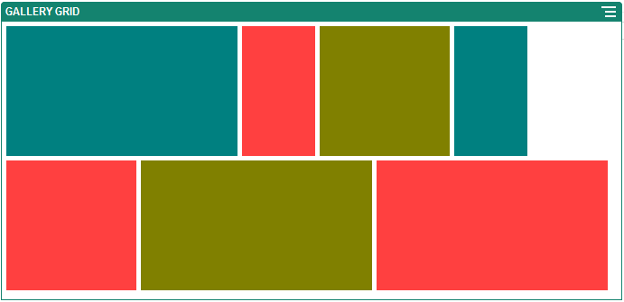
Each of these options is described in the steps that follow. - Choose the Masonry layout to automatically arrange the images in rows within the available space.The resulting rows have a uniform height, but no defined columns.

Description of the illustration grid_masonry.png- Specify Height to proportionately scale all images to the specified height in pixels.
- Specify Image Spacing to increase or decrease the space between images in the row.
- Choose the Column layout to arrange the images in rows and columns.
- Select a Scaling option to adjust the presentation of images in the grid:
-
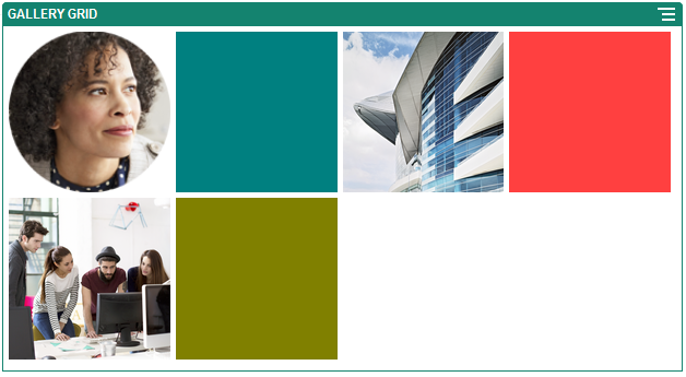
Crop: The smaller of the two dimensions (width or height) is scaled to fit the available space and the larger dimension is cropped to prevent stretching the image.
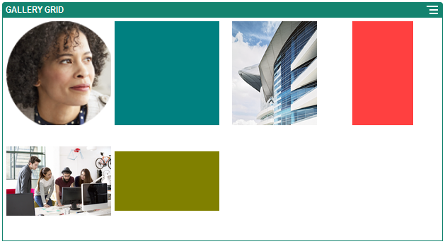
- Fit: Each image is scaled so the entire image fits in the available space without distorting the image.

Description of the illustration grid_column_fit.pngHere’s the same grid with the images cropped:

Description of the illustration grid_column_crop.png -
- Specify an Aspect Ratio to determine the shape of the cells in the grid.
-
Square: An aspect ratio of 1:1.
-
Landscape: An aspect ratio of 16:9.
- Portrait: An aspect ratio of 9:16.
-
Custom: Specify your own numeric values for the aspect ratio.
-
- Specify the number of Columns.The grid adjusts automatically to create columns of equal width.
- Specify Image Spacing to increase or decrease the space between images in both rows and columns.
- Select a Scaling option to adjust the presentation of images in the grid:
- Choose the Custom layout to arrange the images in rows and columns based on an image size and width that you specify.
- Select a Scaling option to adjust the presentation of images in the grid:
-
Crop: The smaller of the two dimensions (width or height) is scaled to fit the available space and the larger dimension is cropped to prevent stretching the image.
- Fit: Each image is scaled so the entire image fits in the available space without distorting the image.
-
- Specify an Image Height and Image Width to determine the shape of the cells in the grid.The grid adjusts automatically to create cells with the dimensions you specify.
- Specify Image Spacing to increase or decrease the space between images in both rows and columns.
- Select a Scaling option to adjust the presentation of images in the grid:
- Specify Alignment, Width, and Spacing options to position the grid within the slot.Use Width to specify the width, in pixels, of the gallery within the slot. Click an alignment option other than Fill to specify the width. After you set the width, you can use Fill to extend the image to the specified width.
- When you've finished, close the Gallery Grid settings dialog.