- Building Sites with Oracle Content Management
- Creating and Editing Sites
- Arrange Page Content
- Use Two and Three Column Layouts
Use Two and Three Column Layouts
You can use a multi-column section layout to automatically determine the spacing and arrangement of components you add to the layout.
To add a layout to a page:
- Navigate to the page you want to edit and make sure that
 is set to Edit.
 - Add the layout to the page.
- To place other content in the section layout, drag and drop the content onto the layout.
The layout highlights with a solid border and a banner that shows Add Item.

Description of the illustration section_layout_drop.pngYou can continue adding items to the layout and the layout will format them accordingly. You can even add other section layouts to create sophisticated layouts or add component groups.
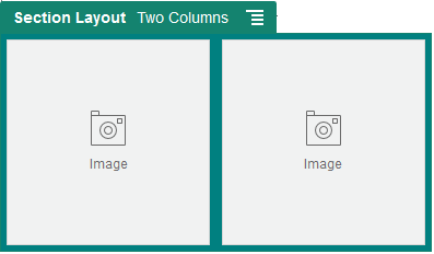
The following is a two-column layout with image components as placeholders:

Description of the illustration section_layout_2col.pngIf you add more items, they are shown in additional rows, each with a maximum of two items.
- To edit the component and its appearance, click its menu icon
 , and choose Settings.
 - Use the General tab to modify settings for the individual components in the layout.Click a component name to see the settings for that component.
- Use the Background tab to modify background settings for the layout.
- Choose Custom Settings to set additional defaults for the content that’s displayed.
-
First Column Width (%): Specify the column width as a percentage of the space available to the layout.
-
Second Column Width (%): Specify the column width as a percentage of the space available to the layout.
-
Third Column Width (%): Specify the column width as a percentage of the space available to the layout.
-
Responsive Breakpoint (in pixels): For responsive page designs that automatically reformat the content when the available display size varies, specify the width in pixels where the section layout switches between the standard two-column layout and the Responsive Behavior options you specify below.
-
Responsive Behavior: Select how the layout changes when the available display size is smaller than the Responsive Breakpoint value.
-
No Action: Do not adjust the layout behavior.
-
Stack the columns: Arrange the items from top to bottom in a single column with all items from column one, followed by items from column 2, and so on.
-
Hide the first column: Hide the content in the first column to provide more space for the remaining columns.
-
Hide the second column: Hide the content in the second column to provide more space for the remaining columns.
-
Hide the third column: Hide the content in the third column to provide more space for the remaining columns.
-
Hide both columns: Hide all the content in the layout.
-
Move the second column under the first column: Arrange items in a single column with all items from column one followed by all items from column two.
-
Move the first column under the second column: Arrange items in a single column with all items from column two followed by all items from column one.
-
-